
Vous pouvez lire le billet sur le blog La Minute pour plus d'informations sur les RSS !
Canaux
2723 éléments (41 non lus) dans 55 canaux
 Dans la presse
(21 non lus)
Dans la presse
(21 non lus)
-
 Décryptagéo, l'information géographique
-
Cybergeo
(10 non lus)
-
Revue Internationale de Géomatique (RIG)
-
SIGMAG & SIGTV.FR - Un autre regard sur la géomatique
(1 non lus)
-
Mappemonde
(10 non lus)
Du côté des éditeurs
(2 non lus)
-
Imagerie Géospatiale
-
Toute l’actualité des Geoservices de l'IGN
(2 non lus)
-
arcOrama, un blog sur les SIG, ceux d ESRI en particulier
-
arcOpole - Actualités du Programme
-
Géoclip, le générateur d'observatoires cartographiques
-
Blog GEOCONCEPT FR
Toile géomatique francophone
(8 non lus)
-
Géoblogs (GeoRezo.net)
-
Conseil national de l'information géolocalisée
-
 Geotribu
-
Les cafés géographiques
-
UrbaLine (le blog d'Aline sur l'urba, la géomatique, et l'habitat)
-
Icem7
-
Séries temporelles (CESBIO)
(1 non lus)
-
Datafoncier, données pour les territoires (Cerema)
-
Cartes et figures du monde
-
SIGEA: actualités des SIG pour l'enseignement agricole
-
Data and GIS tips
-
Neogeo Technologies
-
ReLucBlog
-
L'Atelier de Cartographie
-
My Geomatic
-
archeomatic (le blog d'un archéologue à l’INRAP)
-
Cartographies numériques
(6 non lus)
-
Veille cartographie
-
Makina Corpus
-
Oslandia
(1 non lus)
-
Camptocamp
-
Carnet (neo)cartographique
-
Le blog de Geomatys
-
GEOMATIQUE
-
Geomatick
-
CartONG (actualités)
Éléments non lus (31)
-
 14:23
14:23 Incident en cours
sur Toute l’actualité des Geoservices de l'IGN Incident en cours sur l'ensemble des Géoservices depuis 12h22
 -
14:23
Incident en cours (Résolu)
sur Toute l’actualité des Geoservices de l'IGN
Incident en cours sur l'ensemble des Géoservices depuis 12h22
-
7:00
[Equipe Oslandia] Quy Thy, ingénieur SIG
sur OslandiaChaque mois, nous avons le plaisir de vous présenter un membre de l’équipe, aujourd’hui c’est Quy Thy qui a répondu à nos questions

Ingénieur de l’ENSG -Ecole Nationale des Sciences Géographiques, une école qui forme les géomaticiens, Quy Thy poursuit son cursus avec une thèse au laboratoire LASTIG de l’IGN sur la détection du vandalisme cartographique. Elle a pour objectif de réaliser une étude des jeux de données collaboratives sur OSM et d’identifier des potentielles erreurs volontaires, notamment grâce au machine learning, une technologie encore peu utilisée dans le domaine cartographique.
[Lire son article de vulgarisation sur Geotribu]
Après sa thèse, elle effectue 1 an de post-doc dans le laboratoire IFSTTAR – Institut français des sciences et technologies des transports, de l’aménagement et des réseaux où elle développe un plugin QGIS pour aider au déblaiement des déchets suite à un ouragan à Saint-Martin et aux Antilles.
« J’ai connu Oslandia pendant ma thèse sur le carto-vandalisme, j’étudiais les données mais également les contributeurs OSM, et Oslandia avait publié des travaux sur la classification automatique de ces derniers. J’ai gardé l’entreprise dans ma tête et comme je n’avais pas envie de continuer dans le monde de la recherche, j’ai postulé ! »
Quy Thy est ingénieur SIG chez Oslandia depuis 2021
Ses projets emblématiquesQuy Thy a contribué à la mise en place de la Géoplateforme de l’IGN, une infrastructure publique qui permet aux utilisateurs de s’échanger des données, les partager, les héberger et d’accéder aux services de l’IGN comme « Remonter le temps » jusqu’ici accessible sur Géoportail. L’objectif est de migrer ces services sur la Géoplateforme. « J’ai développé des script permettant de vérifier les données qui entrent et de les traiter pour les mettre en base de données »
Quy Thy a également travaillé sur le Projet STC – Suivi des Trains Commerciaux pour la SNCF dont l’objectif est de détecter les déformations sur les rails, à partir de capteurs placés sur les trains.
Ses technologies de prédilection
« Les capteurs remontent beaucoup de données, nous avons intégré un programme développé en Python avec les librairies Pandas et Numpy qui permettent d’identifier les anomalies et de préconiser des actions de maintenance « .Python, SQL
Sa philosophiePlus que le côté technique, j’aime me dire que les projets réalisés servent un objectif utile et pertinent pour l’humain. Ce que je fais répond à un besoin, je me sens utile.
Oslandia en 1 motOuverture au sens open source mais aussi ouverture à d’autres valeurs notamment sur le fonctionnement de l’entreprise !
-
5:19
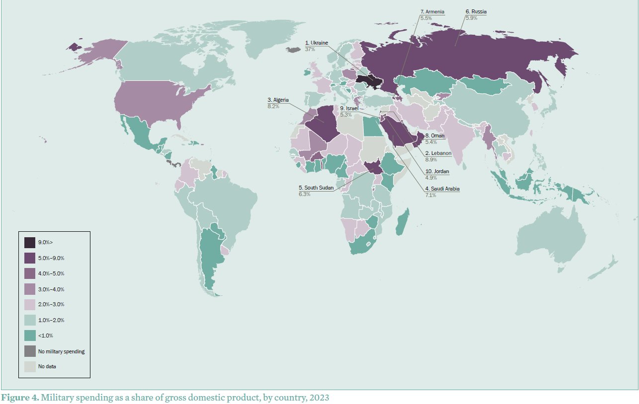
Les dépenses militaires dans le monde à partir des données du SIPRI
sur Cartographies numériquesL'Institut international de recherche sur la paix de Stockholm (SIPRI) est un institut indépendant dédié à la recherche sur les conflits, les armements, le contrôle des armements et le désarmement. Créé en 1966, le SIPRI fournit des données, des analyses et des recommandations, basées sur des sources ouvertes, aux décideurs politiques, aux chercheurs, aux médias et au public intéressé. Chaque année, il fournit un rapport sur les tendances concernant les dépenses militaires mondiales.
1) Une augmentation continue des dépenses militaires mondiales depuis 2009
Le rapport publié en avril 2024 fait apparaître une hausse des dépenses militaires mondiales pour la neuvième année consécutive. Celles-ci ont atteint un niveau record de 2 443 milliards de dollars en 2023. Pour la première fois depuis 2009, les dépenses militaires ont augmenté dans les cinq régions géographiques définies par le SIPRI, avec des augmentations particulièrement importantes enregistrées en Europe, en Asie, en Océanie et au Moyen-Orient. Les dépenses militaires mondiales augmentent dans un contexte de guerre, de tensions croissantes et d’insécurité.
« L'augmentation sans précédent des dépenses militaires est une réponse directe à la détérioration mondiale de la paix et de la sécurité », a déclaré Nan Tian, ??chercheur principal au programme de dépenses militaires et de production d'armes du SIPRI. « Les États donnent la priorité à la force militaire, mais ils risquent de se retrouver dans une spirale action-réaction dans un paysage géopolitique et sécuritaire de plus en plus instable. »
Lire le communiqué de presse en français
Télécharger le rapport du SIPRI en anglais
2) Des écarts notables selon les pays
Les cinq plus gros dépensiers en 2023 sont les États-Unis, la Chine, la Russie, l’Inde et l’Arabie Saoudite, qui représentent à eux seuls 61 % des dépenses militaires mondiales. Les dépenses militaires de la Russie ont augmenté de 24 % pour atteindre un montant estimé à 109 milliards de dollars en 2023, soit une augmentation de 57 % depuis 2014, année de l’annexion de la Crimée par la Russie. En 2023, les dépenses militaires de la Russie représentent 16 % des dépenses totales du gouvernement et son fardeau militaire (dépenses militaires en pourcentage du Produit Intérieur Brut) s’élève à 5,9 % du PIB. L’Ukraine est le 8ème plus grand dépensier en 2023, avec une hausse de 51 % de ses dépenses militaires, s’élevant à 64,8 milliards de dollars. Les États-Unis restent le plus grand dépensier de l’OTAN, mais les membres européens augmentent leur part En 2023, les dépenses militaires des 31 membres de l’OTAN s’élèvent à 1 341 milliards de dollars, soit 55% des dépenses militaires mondiales. Les dépenses militaires des États-Unis ont augmenté de 2,3 % pour atteindre 916 milliards de dollars en 2023, ce qui représente 68 % du total des dépenses militaires de l'OTAN. L’augmentation des dépenses militaires de la Chine entraîne celle de ses voisins. Les dépenses militaires de Taïwan ont également augmenté de 11 % en 2023 pour atteindre 16,6 milliards de dollars. Guerre et tensions au Moyen-Orient alimentent la plus forte hausse des dépenses de la dernière décennie. Les dépenses militaires d’Israël – les deuxièmes plus importantes de la région après celles de l’Arabie saoudite – ont augmenté de 24 % pour atteindre 27,5 milliards de dollars en 2023. Cette augmentation des dépenses est principalement due à l’offensive militaire d’ampleur menée à Gaza en réponse à l'attaque du Hamas dans le sud d’Israël en octobre 2023.
Dépenses militaires par pays en 2023 exprimées en part du PIB (source : SIPRI)
3) Base de données sur les dépenses militaires
La base de données du SIPRI fournit les dépenses militaires depuis 1949, permettant une comparaison des dépenses militaires entre pays et selon différents modes de calcul (en monnaie locale en prix courants, en dollars américains à taux de change constants, en part du PIB, en part par habitant, en part des dépenses publiques...)Rang
Country
Evolution
Dépenses en %
militaires ($),2023 2022–23
Dépenses en part du PIB (%)
SHAPE \* MERGEFORMAT

2014–23 2023
2014
Part des dépenses mondiales (%), 2023
2023 2022?
1 1
United States
916 2.3
9.9 3.4
3.7
37
2 2
China
[296] 6.0
60 [1.7]
[1.7]
[12]
3 3
Russia
[109] 24
57 [5.9]
[4.1]
[4.5]
4 4
India
83.6 4.2
44 2.4
2.5
3.4
5 5
Saudi Arabia
[75.8] 4.3
–18 [7.1]
[11]
[3.1]
Sous-total Top 5
1?481 . .
. . . .
. .
61
6 6
United Kingdom
74.9 7.9
14 2.3
2.2
3.1
7 7
Germany
66.8 9.0
48 1.5
1.1
2.7
8 11
Ukraine
64.8 51
1?272 37
3.0
2.7
9 8
France
61.3 6.5
21 2.1
1.9
2.5
10 9
Japan
50.2 11
31 1.2
1.0
2.1
Sous-total Top 10
1?799 . .
. . . .
. .
74
11 10
South Korea
47.9 1.1
34 2.8
2.5
2.0
12 12
Italy
35.5 –5.9
31 1.6
1.3
1.5
13 13
Australia
32.3 –1.5
34 1.9
1.8
1.3
14 19
Poland
31.6 75
181 3.8
1.9
1.3
15 15
Israel
27.5 24
44 5.3
5.6
1.1
Sous-total Top 15
1?974 . .
. . . .
. .
81
16 14
Canada
27.2 6.6
49 1.3
1.0
1.1
17 17
Spain
23.7 9.8
42 1.5
1.3
1.0
18 16
Brazil
22.9 3.1
–12 1.1
1.3
0.9
19 28
Algeria
18.3 76
59 8.2
5.5
0.7
20 21
Netherlands
16.6 14
56 1.5
1.2
0.7
21 20
Taiwan
16.6 11
56 2.2
1.8
0.7
22 23
Türkiye
15.8 37
59 1.5
1.9
0.6
23 22
Singapore
13.2 1.4
27 2.7
3.0
0.5
24 26
Mexico
11.8 –1.5
55 0.7
0.5
0.5
25 27
Colombia
10.7 1.4
20 2.9
3.1
0.4
26 33
Iran
10.3 0.6
34 2.1
2.1
0.4
27 25
Indonesia
9.5 –7.4
29 0.7
0.8
0.4
28 32
Sweden
8.8 12
63 1.5
1.1
0.4
29 30
Norway
8.7 3.5
49 1.6
1.5
0.4
30 24
Pakistan
8.5 –13
13 2.8
3.1
0.3
31 38
Denmark
8.1 39
108 2.0?c
1.1
0.3
32 31
Kuwait
7.8 –8.8
14 4.9
3.6
0.3
33 29
Greece
7.7 –17
51 3.2
2.4
0.3
34 34
Belgium
7.6 5.2
44 1.2
1.0
0.3
35 46
Finland
7.3 54
92 2.4
1.5
0.3
36 37
Switzerland
6.3 2.9
28 0.7
0.6
0.3
37 36
Oman
5.9 0.1
–34 5.4
8.9
0.2
38 35
Thailand
5.8 –6.5
0.6 1.2
1.4
0.2
39 40
Romania
5.6 –4.7
95 1.6
1.3
0.2
40 43
Chile
5.5 4.9
4.8 1.6
2.0
0.2
Sous-total Top 40
2?264
. . . .
. .
93
Monde
2?443 6.8
27 2.3
2.4
100
Pour compléter
ACLED
Le projet Armed Conflict Location & Event Data (ACLED) collecte, géolocalise, cartographie et analyse les données concernant les conflits dans le monde. L’ACLED a pour objectif de saisir les formes, les acteurs, les dates et les lieux de la violence politique et des manifestations. Les données, très régulièrement mises à jour, sont fournies par pays et par continent. Voir ce billet de présentation. [www.acleddata.com]
Uppsala Conflict Data Program (UCDP)Le Département de recherche sur la paix et les conflits (UCDP) de l'Université d'Uppsala recense toutes les formes de violence organisée (guerres, violences de gangs, attentats-suicides, fusillades de masse) depuis 1975.
[https:]]
Base de données sur la piraterie maritimeDepuis 1978, la National Geospatial-Intelligence Agency (NGA) recense les incidents liés à la piraterie maritime à l'échelle mondiale. Cette base de données est constituée à partir des messages envoyés par les navires menacés (Anti-Shipping Activity Messages). [https:]]
Base de données mondiale sur le terrorismeLa Global Terrorism Database (GTD) est une base de données open source contenant des informations sur les événements terroristes dans le monde de 1970 à 2020. La GTD comprend des données systématiques sur les incidents terroristes nationaux et internationaux qui se sont produits au cours de cette période, avec maintenant plus de 200 000 cas répertoriés. [https:]]
Articles connexes
L'Indice de paix mondiale est en baisse depuis plusieurs années
Cartes et données sur le terrorisme dans le monde (de 1970 à nos jours)
La carte, objet éminemment politique. L'annexion de quatre territoires de l'Ukraine par la Russie
Cartographier les dommages subis par les populations civiles en Ukraine (Bellingcat)
Le brouillage et l'usurpation de signaux GPS participent de nouvelles formes de guerre électronique
Mesurer le rayonnement des grandes puissances à travers leurs réseaux diplomatiques
Une carte animée des opérations militaires en Europe pendant la 2nde Guerre mondiale
Les ventes d'armes des Etats-Unis et de la de la Russie (1950-2017)
Les pays bénéficiaires de l'aide américaine depuis 1945
La géographie et les cartes : des outils pour faire la guerre ? (France Culture)
Comment cartographier la guerre à distance ?
-
2:28
Se déplacer en ville : quatre siècles de cartographie des transports en commun à Boston
sur Cartographies numériques
Le Leventhal Map & Education Center propose une très belle exposition en ligne sur la cartographie des transports en commun à Boston : Getting around Town. Four Centuries of Mapping Boston in Transit. L'exposition est organisée par Steven Beaucher, auteur du livre Boston in Transit (MIT Press). Elle associe les propres collections de Beaucher aux vastes fonds du Leventhal Center et de la Boston Public Library.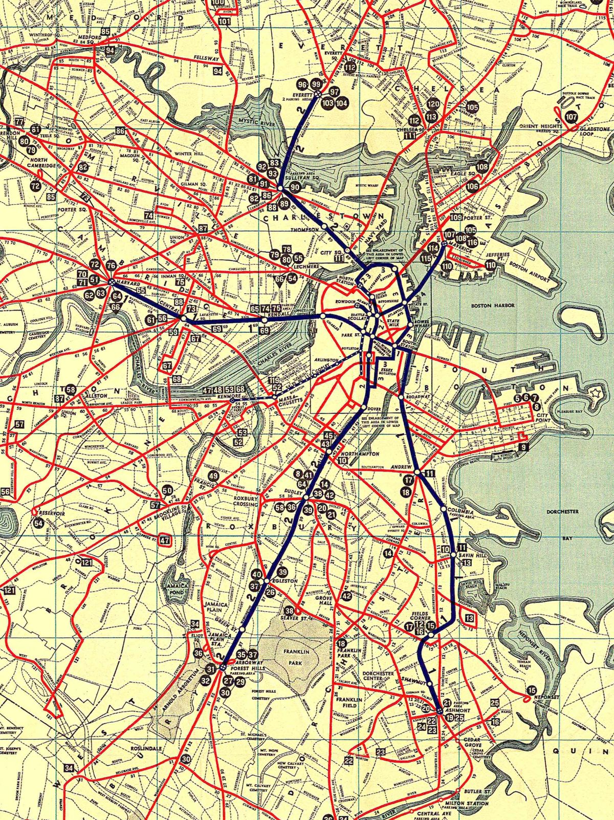
Les documents présentés permettent de suivre l'évolution des systèmes de transport en commun qui ont transporté les gens autour de Boston, relié les quartiers et façonné les géographies vécues par des générations de Bostoniens. Les cartes documentent les changements de ces réseaux de transport en commun et montrent également comment ces systèmes ont influencé la croissance de la ville. L'occasion de découvrir de très belles "transit maps" et de suivre toute l'histoire ayant conduit à la réalisation de la MBTA (Massachusetts Bay Transportation Authority) du Grand Boston, y compris à travers des projets non réalisés.
Les étapes de l'exposition :
- Établir des réseaux
- Des réseaux pour une ville en croissance
- Le premier métro américain
- Création des trains de banlieue
- Des améliorations sans précédent
- Vers un contrôle public
- Une période de nouveauté
- Outils de navigation personnels : des années 1820 à 1970
- Lignes de transport en commun non construites
- Possibilités non réalisées
Découvrir un plan des transports en commun de Boston datant de 1927 à travers une collection d'affiches.
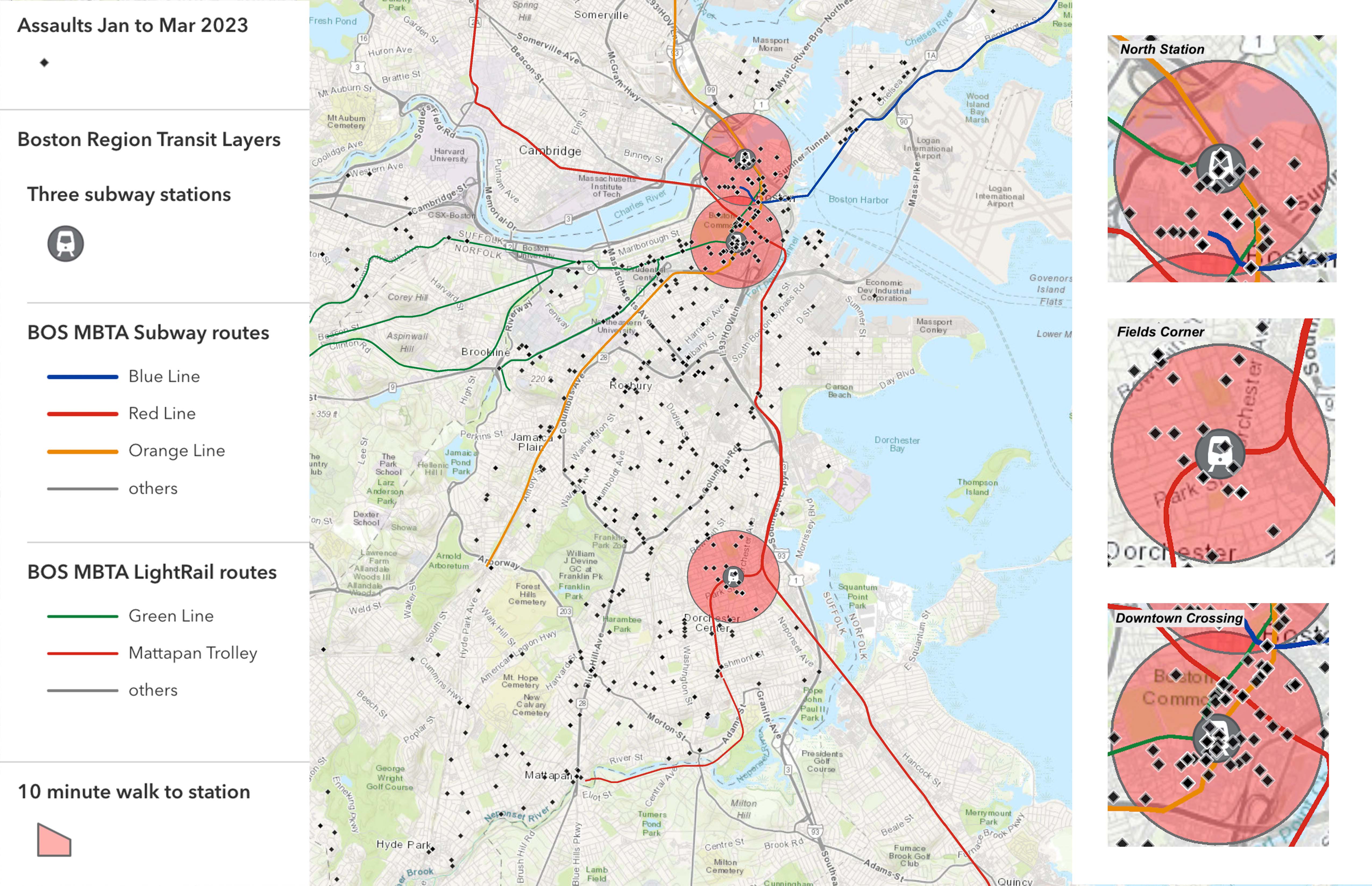
Les éducateurs du Leventhal Center K-12, en collaboration avec le Boston Private Industry Council, ont embauché des élèves des écoles publiques de Boston pour créer le contenu de cette exposition. Les étudiants ont appris comment l'information devient géospatiale en la reliant à des lieux géographiques, et comment elle est utilisée pour créer des visualisations basées sur des cartes à l'aide d'un système d'information géographique (SIG). Les étudiants se sont entraînés à interpréter et à évaluer des cartes basées sur des données. Ils ont rencontré des professionnels qui utilisent des cartes SIG dans leur travail. Enfin, ils ont utilisé la plateforme numérique ArcGIS Online pour créer leurs propres cartes des transports en commun à Boston.
Michael Chowdhury a produit une carte des zones adaptées aux piétons. Benjamin Bouchat a cherché à réaliser une carte du trajet le plus joli et le plus sûr de Boston. Makaya Vicks a réalisé une carte des lieux où de nombreuses agressions ont eu lieu de janvier à mi-mars 2023.
Les zones de danger sur les itinéraires de transport en commun à Boston (source : Boston Public Library)
Une carte réalisée par Gideon Neave, étudiant à la Boston Latin School, prend en compte le temps de trajet (en bleu) et le revenu du ménage (en rouge), et montre que les personnes ayant moins de revenus sont souvent soumises à des temps de trajet plus longs.
Temps de trajet et revenu des ménages (source : Boston Public Library)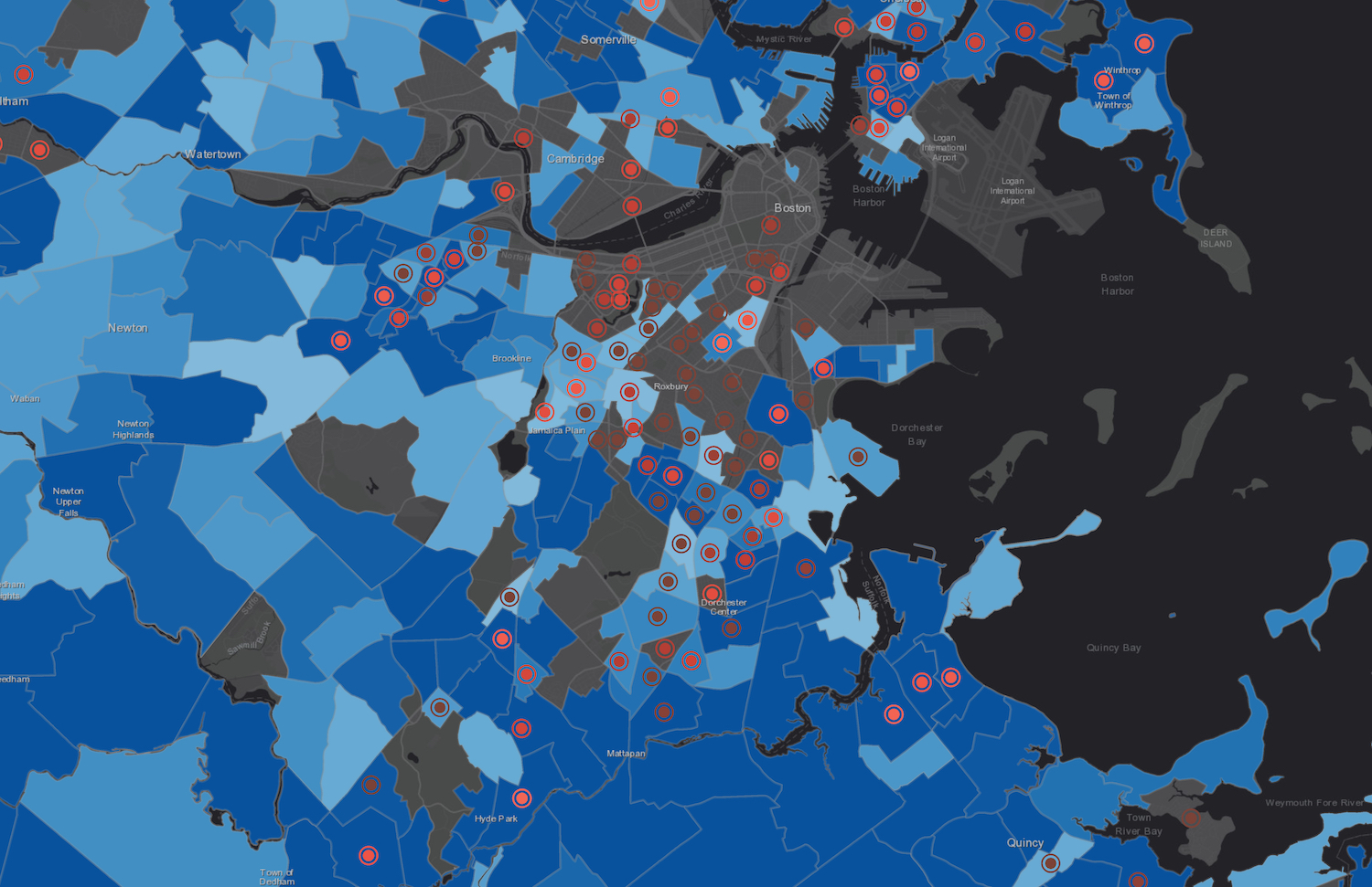
Articles connexes
L'histoire par les cartes : l'histoire de la rénovation urbaine de Boston depuis les années 1920
Environnement et justice dans les paysages anthropisés. Une exposition virtuelle du Leventhal Center
Bouger les lignes de la carte. Une exposition du Leventhal Map & Education Center de Boston
America transformed : une exposition cartographique organisée par le Leventhal Map & Education Center Itinéraires piétons et aménités urbaines à Boston. Le projet Desirable Streets du MIT
Explorer la cartographie des réseaux de transports publics avec des données GTFS
Cartographie en temps réel des transports publics
-
10:30
Le territoire est toujours vivant. Une analyse transversale de la littérature sur un concept central de la géographie
sur CybergeoLe concept de territoire fait l’objet d’une très abondante littérature en sciences humaines et sociales, qui alimente des sens et des usages apparemment très différents. Cet article dresse un état de l’art multidisciplinaire qui situe les uns par rapport aux autres les différents courants sur le concept de territoire. Dans le format synthétique qui est le sien, le but n’est pas d’approfondir chacune des discussions théoriques. Le premier objectif est plutôt de structurer, à travers un corpus d’environ 120 références, un panorama de la très abondante littérature francophone, anglophone et hispanophone sur le territoire. Le deuxième objectif est de tenter des rapprochements entre ces arènes de discussions qui échangent peu entre elles, autour de trois problématiques qui pourraient leur être communes. Enfin, en approfondissant la lecture transversale de la littérature et l’effort de synthèse, le troisième objectif est de soumettre à la discussion des caractéristiques fondamentales qui ...
-
10:30
Vers une transition des systèmes agricoles en France métropolitaine ? Une géographie contrastée et en mouvement (2010 et 2020)
sur CybergeoFace aux objectifs de décarbonation de l’agriculture, de préservation de l’environnement et aux enjeux de viabilité économique et de sécurité alimentaire qui en découlent, les politiques européennes (Farm to fork) et françaises encouragent une transition en profondeur des systèmes agri-alimentaires. Dans ce contexte, la transformation des modes de production agricole devient une nécessité. Cet article présente une géographie des exploitations agricoles en transition en France métropolitaine. Il repose sur une typologie des exploitations agricoles combinant mode de production agricole (biologique ou conventionnel) et mode de commercialisation des produits (circuit court ou filière longue) à partir des données des recensements agricoles de 2010 et 2020. L’analyse propose une cartographie à échelle fine (canton INSEE) des trajectoires d’évolution sur la période 2010-2020 des agricultures en transition, ouvrant la voie à discussion sur les facteurs favorables à l’émergence certains type...
-
10:30
Explorer la répartition spatiotemporelle des piqûres de tiques sur les humains en France : la température moyenne comme indicateur du risque acarologique
sur CybergeoParmi les maladies à transmissions vectorielles, les maladies à tiques (dont la Borréliose de Lyme) sont celles dont la fréquence des cas est en constante augmentation. L’Europe et l’Amérique du Nord sont particulièrement concernées dans les régions tempérées. Comme il existe une saisonnalité des piqûres de tiques, plus de signalement en été, moins en hiver, nous nous sommes demandés s’il existait des marqueurs climatiques permettant de connaître le début de la saison du risque acarologique pour en informer le public. Grâce à programme de sciences participatives de l’INRAe, CiTIQUE, 22 000 cas géolocalisés en France de piqûres de tiques sur des humains ont été collectés, entre juillet 2017 et avril 2020. Ces signalements ont été appairés avec les conditions météorologiques (issues des bases Météo-France et Dark Sky) qui régnaient au lieu et à la date de chacune des piqûres signalées. Parmi toutes les variables analysées, la température quotidienne moyenne est le meilleur indicateur....
-
10:30
Bernard Lahire, 2023, Les structures fondamentales des sociétés humaines, Paris, La Découverte, Collection sciences sociales du vivant, 970 p.
sur CybergeoL’ouvrage de Bernard Lahire est d’importance, par son volume, par son érudition qui en fait une véritable "somme" scientifique, et par sa position originale réaffirmant en la substantialisant la liaison entre les sciences sociales et les sciences de la nature. Il faut admirer le courage de l’auteur, qui mobilise un vaste corpus de données pour aller souvent à contre-courant des idées plus fréquemment reçues en sciences sociales, et identifier des éléments de savoirs cumulables pour construire une sociologie faite d’universaux et de lois. Je ne prétends pas faire ici la recension que mérite cet ouvrage, quant à ce qu’il représente en termes d’apport à la science sociologique, d’autres plus qualifiés s’en chargeront, et sa dimension et sa construction rendraient difficile autant qu’injuste une proposition de résumé. Chacune de ses trois grandes parties offre cependant une lecture qui sera du plus grand intérêt pour les géographes. La première partie "Des sciences sociales et des lois"...
-
10:30
Improving the perfomance of commercial mapping on the web : proposals for the web site of the French Forest Authority
sur CybergeoIn 1999 the Internet was used for the first time as a marketing medium by the ONF (France’s National Forest Office) to sell timber from state- and locally-owned forests. Using a search engine, this site enables visitors to locate items corresponding to their requests (species, available volume,...). The only map proposed by the ONF is a document indicating roughly the felling location. It seemed appropriate to suggest the addition of an atlas allowing sellers to increase the visibility of the products on sale and visitors to rationalize their purchases. Is the result more efficient? A questionnaire is provided for Cybergeo readers.
Keywords: geomatics, Internet, wood sale, applied cartography, ONF -
10:30
Le principe de solidarité dans les politiques françaises de l’eau : originalité, fonctionnement et fragilités
sur CybergeoPour répondre à la dégradation de la qualité de l’eau en France, le législateur a créé en 1964 des outils novateurs d’une gestion autonome de l’eau, à savoir les agences et les comités de bassin, délimités selon les bassins hydrographiques. Durant les cinquante années qui ont suivi, les lois françaises puis les directives européennes ont favorisé une solidarité unique en matière de politiques environnementales, fonctionnant à un triple niveau : hydrographique, financier et territorial. Cet article présente l’originalité de cette solidarité et son évolution, en s’appuyant sur l’évolution des règlementations et l’analyse du fonctionnement des agences et des comités de bassin à mesure de l’élargissement de leurs missions. La récente reconnaissance nationale d'une pression quantitative sur la ressource, matérialisée en 2023 par l'adoption de 53 mesures visant une gestion de l'eau résiliente et concertée, recentre les agences et les comités de bassin au cœur de la gouvernance de l'eau. C...
-
10:30
Déforestation au nord du Bénin : un éclairage par des enquêtes communautaires
sur CybergeoCet article part du constat d'une hétérogénéité spatio-temporelle de la déforestation dans le nord du Bénin au cours des quatre dernières décennies. Pour explorer les raisons sous-jacentes de ces disparités spatiales, nous avons mené une enquête approfondie auprès des résidents des territoires où le couvert ligneux a connu des évolutions s’écartant sensiblement de la tendance régionale. En utilisant des méthodes statistiques textuelles, notre analyse de ces entretiens a fourni des perspectives plus approfondies sur les nuances locales spécifiques dans les perceptions de la population concernant les transformations environnementales en cours au sein de leurs territoires. Nos enquêtes ont également mis en évidence une aggravation des inégalités sociales et foncières qui touche l’ensemble de la région. La poursuite de la déforestation au Nord du Bénin ainsi que le sentiment de vulnérabilité économique et sociale exprimé par les populations interrogées trouvent un écho à des situations ...
-
10:30
Georges Courade, 2023, "Comme le fleuve, la vérité se perd dans le désert". Faire de la recherche dans les Afriques en décolonisation, Paris, Les Indes savantes, 151 p.
sur CybergeoDans ce petit livre interrogeant sur un mode personnel les modalités de la recherche en Afrique subsaharienne entre les décennies 1960 et 2010, Georges Courade mène un projet devenu assez commun dans le monde de la géographie, l’égohistoire. Mais c’est un projet exigeant, visant à reconstituer la vérité d’un parcours scientifique, vérité pour soi, par rapport aux enjeux successivement formulés par l’institution de recherche "pour le développement" et en termes d’effets sur les sociétés étudiées. Ce récit de vie vise aussi à retracer une "aventure collective" menée par une "génération 1962-1968" dans le cadre d’une recherche finalisée au sein de l’ORSTOM puis de l’IRD. Mais surtout, il s’agit d’une autofiction, une analyse réflexive menée en fin de carrière sous le truchement du personnage de Basile Costal.
Le récit se déroule en dix chapitres. Les six premiers portent sur les débuts et sur le background du chercheur, encadrés par son "baptême" dans un coin peu connu de l’Afrique, le ...
-
10:30
La compensation écologique permet-elle vraiment de tendre vers l’absence de perte nette de biodiversité ?
sur CybergeoDepuis 2016, le droit français poursuit un objectif de non perte nette de biodiversité en imposant aux projets ayant des incidences sur la biodiversité d’éviter, de réduire, puis de compenser ces incidences. Les mesures compensatoires doivent générer des gains écologiques suffisants, ce qui suppose qu’elles soient réalisées sur des sites en mauvais état écologique. Cet article analyse le contexte écologique dans lequel ont été réalisées 1153 mesures compensatoires, entre 2017 et 2021, sur le territoire hexagonal français. En utilisant des données de la "naturalité potentielle de France métropolitaine", nous comparons d’une part les scores d’intégrité biophysique des sites choisis et d’autre part les scores de qualité écologique incluant un indice de connectivité du paysage autour des sites, par rapport aux scores nationaux. Nos résultats montrent que 64 % de la surface des sites de compensation se situe sur des espaces où le score d’intégrité biophysique est supérieur à la médiane f...
-
10:30
Rémi Rouault, Patrice Caro, 2022, Éducation et fractures scolaires. Questions de géographes à propos de l’école, Lyon, Chronique Sociale, 161 p.
sur CybergeoC’est parce qu’ils ont questionné l’école en géographes que Rémi Rouault et Patrice Caro ont été en mesure de proposer cet ouvrage, précieux et nécessaire, pour analyser la situation socio-spatiale de l’école française. Et c’est parce qu’ils s’appuient sur un matériau riche de données récentes aux échelles nationale, académique et départementale qu’ils restituent la multiplicité des enjeux posés par les questions scolaires et les inégalités du système éducatif.
Contribuant au renouvellement d’une géographie francophone de l’éducation dynamisée, depuis peu, par la publication d’un livre portant sur les espaces et les systèmes éducatifs dans le monde (Giband, Delage, Mary, Nafaa, 2023), l’étude présentée au fil des 161 pages de l’ouvrage sur le cas français, clairement rédigée par Rémi Rouault et Patrice Caro, est structurée en 8 chapitres. Ceux-ci évoquent les lieux, les espaces quotidiens et locaux de l’éducation (chapitres 1 à 3) puis les leviers et les acteurs clés de l’éducation (...
-
9:30
Les cartes de l’action publique. Pouvoirs, territoires, résistances
sur MappemondeLes cartes de l’action publique, ouvrage issu du colloque du même nom qui s’est déroulé en avril 2018 à Paris, se présente comme une recension de cas d’étude provenant de plusieurs disciplines des sciences sociales. Sociologues, politistes et géographes proposent au cours des 14 chapitres de l’ouvrage (scindé en quatre parties) une série d’analyses critiques de cartes dont il est résolument admis, notamment depuis J. B. Harley (1989), qu’elles ne sont pas neutres et dénuées d’intentionnalités. Cette position, assumée dès l’introduction, sert de postulat général pour une exploration de « l’usage politique des cartes, dans l’action publique et dans l’action collective » (p. 12).
Les auteurs de la première partie, intitulée « Représenter et instituer », approchent tout d’abord les cartes de l’action publique par leur capacité à instituer et à administrer des territoires.
Dans un premier chapitre, Antoine Courmont traite des systèmes d’information géographique (SIG) sous l’angle des scien...
-
9:30
Vulnérabilités à l’érosion littorale : cartographie de quatre cas antillais et métropolitains
sur MappemondeL’érosion littorale est un phénomène naturel tangible dont la préoccupation croissante, compte tenu du changement climatique, nous a menées à travailler sur la problématique de la cartographie de certaines composantes du risque d’érosion comprenant l’étude de l’aléa et de la vulnérabilité. Les terrains guadeloupéens (Capesterre-Belle-Eau et Deshaies) et métropolitains (Lacanau et Biarritz) ont été choisis, présentant une grande diversité d’enjeux. À partir d’un assortiment de facteurs, puis de variables associées à ces notions, la spatialisation d’indices à partir de données dédiées permettrait d’aider les décideurs locaux dans leurs choix de priorisation des enjeux et de mener une réflexion plus globale sur la gestion des risques.
-
9:30
La construction d’une exception territoriale : L’éducation à la nature par les classes de mer finistériennes
sur MappemondeLes classes de mer, inventées en 1964 dans le Finistère, restent encore aujourd’hui très implantées localement. Dépassant la seule sphère éducative, ce dispositif est soutenu par des acteurs touristiques et politiques qui ont participé à positionner le territoire comme pionnier puis modèle de référence en la matière à l’échelle nationale. Tout en continuant à répondre aux injonctions institutionnelles, poussant à la construction d’un rapport normalisé à la nature (développement durable, éco-citoyenneté), cette territorialisation du dispositif singularise la nature à laquelle les élèves sont éduqués.
-
9:30
Appropriations de l’espace et répression du mouvement des Gilets jaunes à Caen
sur MappemondeEn mobilisant différentes méthodologies de recherche issues principalement de la géographie sociale et de la sociologie politique, le présent article souhaite esquisser quelques pistes d’analyse et répondre à la question suivante : comment rendre compte par la cartographie des espaces de lutte du mouvement des Gilets jaunes dans l’agglomération caennaise ? En explorant ainsi sa dimension spatiale, nous désirons contribuer aux débats méthodologiques et analytiques qui ont accompagné ce mouvement qui s’est distingué par ses revendications et sa durée, mais aussi par sa géographie.
-
9:30
Les cartes dans l’analyse politique de l’espace : de l’outil à l’objet de recherche
sur MappemondeLa publication de la carte répertoriant les trajets d’utilisateurs de l’application de sport Strava, en 2017, a rendu identifiables des bases militaires dont les membres utilisaient Strava lors de leurs entraînements (Six, 2018). Cet exemple souligne à la fois l’omniprésence de l’outil cartographique dans nos vies et sa dimension stratégique. Aucune carte n’est anodine, quand bien même son objet semble l’être. Nos sociétés sont aujourd’hui confrontées à de nouveaux enjeux, liés à l’abondance des cartes sur Internet, dans les médias, au travail, que celles-ci soient réalisées de manière artisanale ou par le traitement automatisé de données géolocalisées. L’usage de la cartographie, y compris produite en temps réel, s’est généralisé à de nombreux secteurs d’activités, sans que l’ensemble des nouveaux usagers ne soit véritablement formé à la lecture de ce type de représentation, ni à leur remise en question. Dans ce cadre, le rôle du géographe ne se limite pas à la production de cartes...
-
9:30
Les stratégies cartographiques des membres de la plateforme Technopolice.fr
sur MappemondeConséquence de la transformation des cadres institutionnels du contrôle et de la sécurité, le déploiement de la vidéosurveillance dans l’espace public est aujourd’hui contesté par plusieurs collectifs militants qui s’organisent à travers des modes d’action cartographiques. Leurs pratiques entendent dénoncer, en la visibilisant, une nouvelle dimension techno-sécuritaire des rapports de pouvoir qui structurent l’espace. Grâce aux résultats d’une enquête de terrain menée auprès des membres de la plateforme Technopolice, nous montrons que le rôle stratégique de la cartographie collaborative dans leurs actions politiques réside dans ses fonctions agrégatives et multiscalaires. La diffusion de cartes et leur production apparaissent alors comme des moyens complémentaires, analytiques et symboliques, utilisés par les militants pour mieux appréhender et sensibiliser le public au phénomène auquel ils s’opposent.
-
9:30
La végétalisation de Paris vue au travers d’une carte : une capitale verte ?
sur MappemondeCet article s’intéresse à un dispositif cartographique en ligne proposant de visualiser les projets de végétalisation urbaine entrant dans la politique municipale parisienne. Avec une approche de cartographie critique, nous montrons comment la construction de la carte, et en particulier le choix des figurés et la récolte des données, participe à donner à la capitale française une image de ville verte. Le mélange de données institutionnelles et de données contributives composant la carte du site web Végétalisons Paris traduit l’ambiguïté de la politique de végétalisation parisienne, entre participation citoyenne et instrumentalisation politique.
-
9:30
Géopolitique de l’intégration régionale gazière en Europe centrale et orientale : l’impact du Nord Stream 2
sur MappemondeDépendante des importations de gaz russe, l’Union européenne tente de diversifier ses approvisionnements depuis la crise gazière russo-ukrainienne de 2009. En Europe centrale et orientale, cette politique se traduit par un processus d’intégration régionale des réseaux gaziers. Planifié depuis 2013, ce processus n’a pas connu le développement prévu à cause des divisions engendrées par le lancement du projet de gazoduc Nord Stream 2 porté par Gazprom et plusieurs entreprises énergétiques européennes. Ainsi la dimension externe de la politique énergétique des États membres a un impact sur la dimension interne de la politique énergétique européenne.
-
9:30
Les Petites Cartes du web
sur MappemondeLes Petites Cartes du web est un ouvrage de 70 pages de Matthieu Noucher, chargé de recherche au laboratoire Passages (Bordeaux). Il s’adresse à un public universitaire ainsi qu’à toute personne intéressée par la cartographie. Son objet est l’analyse des « petites cartes du web », ces cartes diffusées sur internet et réalisées ou réutilisées par des non-professionnel?les. Elles sont définies de trois manières :
-
historique, comme des cartes en rupture avec les « grands récits » de la discipline ;
-
politique, comme des cartes « mineures », produites hors des sphères étatiques et dominantes ;
-
technique, en référence aux « petites formes du web » d’É. Candel, V. Jeanne-Perrier et E. Souchier (2012), participant à un « renouvellement des formes d’écriture géographique ».
Ce bref ouvrage, préfacé par Gilles Palsky, comprend trois chapitres. Les deux premiers, théoriques, portent l’un sur la « profusion des “petites cartes” » et l’autre sur l’actualisation de la critique de la cartographie. L...
-
-
9:30
L’Amérique latine
sur MappemondeEn choisissant de commencer son ouvrage par la définition du terme « latine », Sébastien Velut donne le ton d’une approche culturelle et géopolitique de cette région centrale et méridionale du continent américain. Grâce à une riche expérience, il présente ce « grand ensemble flou » (p. 11), ce continent imprévu qui s’est forgé depuis cinq siècles par une constante ouverture au Monde. L’ouvrage, destiné à la préparation des concours de l’enseignement, offre une riche analyse géographique, nourrie de travaux récents en géographie et en sciences sociales, soutenue par une bibliographie essentielle en fin de chaque partie. L’exercice est difficile mais le propos est clair, explicite et pédagogique pour documenter l’organisation des territoires de l’Amérique latine. En ouverture de chaque partie et chapitre, l’auteur pose de précieuses définitions et mises en contexte des concepts utilisés pour décrire les processus en œuvre dans les relations entre environnement et sociétés.
En presque 3...
-
8:43
Lyon Métropole Habitat : un SIG qui joue sur toute la gamme
sur SIGMAG & SIGTV.FR - Un autre regard sur la géomatiqueDepuis 2009, l’organisme devenu Lyon Métropole Habitat a développé un fort intérêt pour le SIG. Basés sur l’ensemble des solutions ArcGIS, de nombreux outils servent quotidiennement en interne et à l’extérieur de LMH.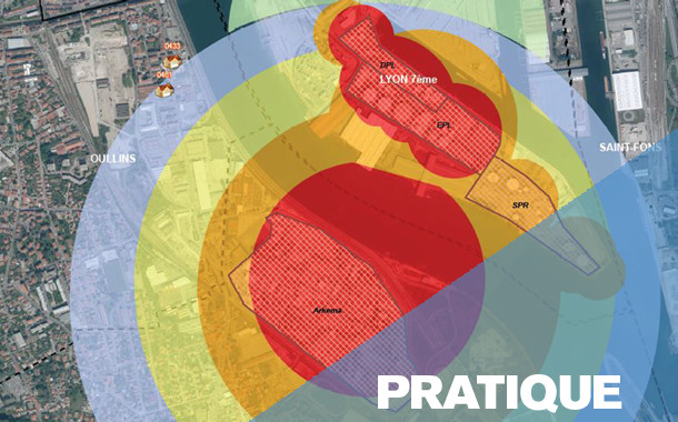 Lyon Métropole Habitat (LMH) est né en 2016 de la partition de l’OPAC du Rhône qui s’est séparé en deux entités afin de s’adapter à la nouvelle organisation territoriale de la Métropole. Premier bailleur public de la Métropole, avec plus de 33.400 logements sociaux, LMH accueille plus de 65.000 locataires occupants, dont près de 6.20 0 vivent dans des résidences spécialisées ou des logements adaptés comme des résidences pour personnes âgées ou logements étudiants… Aussi aménageur, l’organisme s’est fixé pour objectif de produire 450 nouveaux logements par an à partir de 2026. Toutes ces activités supposent de maîtriser de nombreuses données territoriales, tant pour le suivi du patrimoine que la prospection et les études préalables aux nouveaux projets.
Retrouvez la suite de cette enquête dans le magazine SIGMAG N°40
-
7:02
Festival Printemps des cartes (5e édition du 23 au 26 mai 2024)
sur Cartographies numériquesLe Festival Printemps des cartes organise sa 5e édition du 23 au 26 mai 2024 à Montmorillon.
Invité d’honneur 2024 : Le Comité français de cartographie

Le pré-programme du festival Printemps des cartes 2024 :
La cartographie pour comprendre...
Le Printemps des Cartes est un festival de médiation scientifique autour de la cartographie et de toutes les représentations géographiques, ouvert à toutes et à tous ! Le festival rassemble pendant 4 jours habitants, curieux de tous âges, citoyens, publics scolaires (du primaire à l’Université), associations, simples usagers, créateurs et passionnés de cartes ! Toutes et tous, nous utilisons des cartes dans notre quotidien : citoyens, habitants, collectivités, élus, dessinateurs, enseignants, chercheurs, cartographes, géographes, astrophysiciens, démographes, historiens, écrivains, urbanistes, géologues, sculpteurs, aménageurs, collectionneurs, romanciers, philosophes, archéologues, plasticiens, biologistes, randonneurs, aventuriers... Organisé depuis 2018 en collaboration, par l’Université de Poitiers, la Maison des Jeunes et de la Culture Claude Nougaro de Montmorillon et l’Espace Mendès France de Poitiers. Le Printemps des cartes n’a pas choisi de poser ses valises à Montmorillon au hasard. Située dans le département de la Vienne, cette commune de plus de 6 000 habitants, traversée par la Gartempe, est le berceau des cartes Rossignol qui ont longtemps orné les murs des écoles françaises. Aujourd’hui, Montmorillon est connue à travers la « Cité de l’écrit et des métiers du livre », un centre ancien regroupant des librairies indépendantes proposant d’innombrables ouvrages et créations artistiques, ainsi que de nombreux cafés et restaurants conviviaux.
...et faire le monde
Apprendre, comprendre et dessiner le monde dans lequel nous vivons au travers des cartes géographiques, le monde physique de l’environnement, les espaces sociaux. Les cartes sont des outils parfaits d’échanges et de débats sur les territoires, leur langage est intemporel et universel. La cartographie est un équilibre entre objectivité et subjectivité et se compose de trois éléments indissociables :
1. Les techniques méthodes de conception réalisation de cartes artisanales/industrielles ; numériques/manuelles, données numériques, GPS objets connectés...
2. L’approche artistique Sensibilités et subjectivités, codes esthétiques, graphiques et culturels…
3. La rigueur scientifique Mesurer et découvrir la Terre, les objets physiques, ainsi que les représentations et les traitements de phénomènes géographiques, géophysiques, sociaux, environnementaux...
Articles connexes
Festival Printemps des cartes (4e édition, 11-14 mai 2023) « Dépassons les frontières »
Le Printemps des cartes (19-22 mai 2022) : rendez-vous à Montmorillon pour sa 3e édition
Les nouvelles façons de « faire mentir les cartes » à l'ère numérique
La rhétorique derrière les cartes de propagande sur le coronavirus
La carte, objet éminemment politique : quel sens accorder à la carte officielle du déconfinement ?
La carte, objet éminemment politique : la cartographie du Moyen-Orient entre représentation et manipulation
L'histoire par les cartes : l'Atlas historique mondial de Christian Grataloup en partenariat avec la revue L'Histoire
-
20:59
Climate Trace, une plateforme pour visualiser et télécharger des données sur les émissions de gaz à effet de serre (GES)
sur Cartographies numériquesLe portail Climate Trace identifie les principales sources d'émissions de gaz à effet de serre (GES) dans le monde et fournit des estimations indépendantes concernant la quantité d'émissions de chacune. La base de données englobe les émissions d'origine humaine provenant des installations (centrales électriques, aciéries, navires, raffineries de pétrole) et d'autres activités émettrices (engrais, déforestation, incendies de forêt). Outre les grandes zones d'émission par région, la plateforme permet de visualiser plus de 352 millions de foyers actifs à l'échelle mondiale.

Les données sur les émissions Climate TRACE sont gratuites et accessibles au public en téléchargement ou via son API. Chaque package téléchargeable comprend les émissions annuelles au niveau national par secteur et par type de gaz à effet de serre entre 2015 et 2022, avec les sources d'émissions, leur propriété ainsi que le degré de confiance ou d'incertitude lorsque ces données sont disponibles. Les gaz couverts comprennent le dioxyde de carbone, le méthane et le dioxyde d'azote.
Les données proviennent des satellites, de différentes données de télédétection ainsi que de données publiques et commerciales supplémentaires. Climate TRACE regroupe des organisations à but non lucratif qui souhaitent dresser un inventaire commun, ouvert et accessible des émissions de gaz à effet de serre. Cet ensemble de données peut être très utile et constitue un bon exemple du Big Data, où des groupes indépendants issus d'organismes gouvernementaaux, d'universités ou d'entreprises privées se réunissent pour produire une ressource sur un sujet important.
Articles connexesJoli atlas pour un triste bilan de @ClimateTRACE pour l’“Atmosphere”: #30DayMapChallenge n°18. 56 milliards de tonnes équivalent CO2 émises en 2021 par les secteurs de l'énergie, l’agriculture, l’industrie,... Une double page à lire dans @Epsiloon_mag #19 [https:]] pic.twitter.com/kMSsdAXT25
— Léa Desrayaud (@Lea_Des) November 18, 2023
Les plus gros émetteurs directs de CO? en France
Climate Change Explorer, un outil cartographique pour visualiser les projections climatiques
Qualité de l'air et centrales thermiques au charbon en Europe : quelle transition énergétique vraiment possible ?Calculer le bilan carbone de nos déplacements aériens
La France est-elle préparée aux dérèglements climatiques à l'horizon 2050 ?
Rapport du Giec 2021 : le changement climatique actuel est « sans précédent »
Comment le changement climatique a déjà commencé à affecter certaines régions du monde
Quels sont les États qui ont le plus contribué au réchauffement climatique dans l’histoire ?
Atlas climatique interactif Copernicus


-
16:39
Training deep neural networks for Satellite Image Time Series with no labeled data
sur Séries temporelles (CESBIO)The results presented in this blog are based on the published work : I.Dumeur, S.Valero, J.Inglada « Self-supervised spatio-temporal representation learning of Satellite Image Time Series » in IEEE Journal of Selected Topics in Applied Earth Observations and Remote Sensing, doi: 10.1109/JSTARS.2024.3358066.
In this paper, we describe a self-supervised learning method to train a deep neural network to extract meaningful spatio-temporal representation of Satellite Image Time Series (SITS). The code associated to this article is also available.This work is part of the PhD conducted by Iris Dumeur and supervised by Silvia Valero and Jordi Inglada. In the last few years, the CESBIO team has developed machine learning models which exploit Satellite Image Time Series (SITS). For instance, the blog « End-to-end learning for land cover classification using irregular and unaligned satellite image time series » presents a novel classification method based on Stochastic Variational Gaussian Processes.
Context and IntroductionWith the recent launch of numerous Earth observation satellites, such as Sentinel 2, a large amount of remote sensing data is available. For example, the Sentinel 2 mission acquires images with high spatial resolution (10 m), short temporal revisit (5 days), and wide coverage. These data can be exploited under the form of Satellite Image Time Series (SITS), which are 4-dimensional objects with temporal, spectral and spatial dimensions. In addition, SITS provide critical information for Earth monitoring tasks such as land use classification, agricultural management, climate change or disaster monitoring.
In addition, due to SITS specific acquisition conditions, SITS are irregular and have varying temporal sizes. Indeed, as detailed in this blog, the areas located on different orbital paths of the satellite have different acquisition dates and have a different revisit frequencies, causing respectively the unalignment and irregularity of SITS. Finally, Sentinel 2 SITS are affected by different meteorological conditions (clouds, haze, fog, or cloud shadow). Therefore, pixels within a SITS may be corrupted. Although validity masks are provided, incorrectly acquired pixels may be wrongly detected. In short, the development of models adapted to SITS requires to:- Utilize the 4D temporal, spectral, and spatial information
- Deal with SITS irregularity and unalignement
- Ignore wrongly detected cloudy pixels
Moreover, while Deep Learning (DL) approaches have shown great performances in remote sensing tasks, these models are data greedy. In addition, building large labeled datasets is costly. Therefore, the training of DL models on large geographic and temporal scales is constrained by the scarcity of labels. Moreover, self-supervised learning has achieved amazing performance in other domains, such as image processing or natural language processing. Self-supervised learning is a branch of unsupervised learning in which the model is trained on a task generated by the data. In other words, the labels needed to supervise the task are generated thanks to the data. For example, in natural language processing, as illustrated in the following image, one common self-supervised pre-training task consists in training the model to recover masked words.
 Example of a Masked Language Model self-supervised training task (read upward)
Self-supervised learning can be used to pre-train a model on a large unlabeled dataset. Notably, during pre-training, the model learns representations of the input data, which are then used by a decoder to perform the self-supervised task. In a second phase, these latent representations can be used for various supervised tasks, denoted downstream tasks. In this case, as illustrated in the following image, a downstream classifier is trained on top of the latent representations generated by the pre-trained model.
 Description of the link between self-supervised pre-training and supervised downstream task
When the self-supervised pre-training is successful:
- The pre-trained model provides latent representations that are relevant for a various set of downstream tasks
- If the downstream task lacks of labeled data to train a Deep Neural Network (DNN) from scratch, loading a pre-trained model is expected to improve the performance.
Considering all of the above, we propose a new method, named U-BARN (Unet-Bert spAtio-temporal Representation eNcoder).
We present two main contributions:- A new spatio-temporal architecture to exploit the spatial, spectral and temporal dimensions of SITS. This architecture is able to handle irregular and unaligned annual time series.
- A self-supervised pre-training strategy suitable for SITS
Then, the quality of the representations is assessed on two different downstream tasks: crop and land cover segmentation. Due to the specific pre-training strategy, cloud masks are not required for the downstream tasks.
Method U-BARN architecture
As described in the previous image, U-BARN is a spectro-spatio-temporal architecture that is composed of two successive blocks:
- Patch embedding : which is composed of a spatial-spectral encoder (a Unet) that processes independently each image of the SITS. No temporal features are extracted in this block.
- Temporal Transformer : which processes pixel-level time series of pseudo-spectral features. No further spatial features are extracted in this block.
The details of the U-BARN architecture are given in the full paper. We have used a Transformer to process the temporal dimension, as it enables to process irregular and unaligned time series while being highly parallelizable. Lastly, the latent representation provided U-BARN has the same temporal dimension as the input SITS.
Self-supervised pre-training strategyInspired by self-supervised learning techniques developed in natural language processing, we propose to train the model to reconstruct corrupted images from the time series. As shown in the next figure, during pre-training, a decoder is trained to rebuild corrupted inputs from the latent representation. The way images are corrupted is detailed on the full paper.

A reconstruction loss is solely computed on corrupted images. Additionally, to avoid training the model to reconstruct incorrect values, a validity mask is used in the loss. If the pixel has incorrect acquisition conditions, the pixel is not used in the loss. We want to emphasize that the validity mask is only used in the loss reconstruction. Therefore, the validity mask is not needed for the supervised downstream tasks. Lastly, an important pre-training parameter is the masking rate, i.e., the number of corrupted images in the time series. Increasing the number of corrupted image, complicate the pre-training task.
Experimental setup DatasetsThree Sentinel 2 L2A datasets constituted of annual SITS are used:
- A large scale unlabeled dataset to pre-train U-BARN with the previously defined self-supervised learning strategy. This dataset contains data from 2016 to 2019 over 14 S2 tiles in France. The constructed unlabeled dataset is shared on zenodo : 10.5281/zenodo.7891924.
- Two labeled datasets are used to assess the quality of the pre-training. We perform crop (PASTIS) and land cover (MultiSenGE) segmentation.
 Description of the S2 data-sets used for pretext and downstream tasks. The unlabeled data-set for pre-training is composed of two disjoint data-sets: training (tiles in blue) and validation (tiles in red). S2 tiles in the labeled data-sets are shown in green and black respectively for PASTIS and MultiSenGE.
In all three datasets, the Sentinel 2 products are processed to L2A with MAJA. For these data-sets, only the four 10 m and the six 20 m resolution bands of S2 are used.
Experimental setupThe conducted experiments are summarized in the following illustration.
 Illustration of the conducted experiments. The loop means that the SITS encoder weights are updated during the downstream task. The red crossed-out loop indicates that the weights are frozen during the downstream task.
In the downstream tasks, the representations provided by U-BARN are fed to a shallow classifier to perform segmentation. The proposed shallow classifier architecture is able to process input with varying temporal sizes. We consider two possible ways to use the pre-trained U-BARN:
– Frozen U-BARN: U-BARNFR corresponds to the pre-trained U-BARN whose weights are frozen during the downstream tasks. In this configuration, the number of trainable parameters is greatly reduced during the downstream task.
– Fine-tuned U-BARN: U-BARNFT is the pre-trained U-BARN whose weights are the starting points for training the downstream tasks.
To evaluate the quality of the pre-training, we integrate two baselines:
– FC-SC: We feed the shallow classifier (SC) with features from a channel-wise fully connected (FC) layer. Although the FC layer is trained during the downstream task, if the U-BARN representations are meaningful, we expect U-BARNFR to outperform this configuration.
– U-BARNe2e: The fully supervised framework U-BARNe2e, where the model is trained from scratch on the downstream task (end-to-end (e2e)). When enough labelled data are provided, we expect U-BARNe2e to outperform U-BARNFR . The fully-supervised architecture is compared to another well known fully-supervised spectro-spatio-temporal architecture on SITS: U-TAE.
Results Results of the two downstream segmentation tasks
Segmentation tasks performances on PASTIS and MultiSenGE. The F1 score is averaged per class.Model Nber of trainable weights F1 PASTIS F1 MSENGE FC-SC 14547 0.509 0.323 U-BARN-FR 13843 0.618 0.356 U-BARN-FT 1122323 0.816 0.506 U-BARN-e2e 1122323 0.820 0.492 U-TAE 1086969 0.803 0.426
First, as expected, U-BARNFR outperforms FC-SC, showing that the features extracted by U-BARN are meaningful for both segmentation tasks. Second, we observe that in the MultiSenGE land cover segmentation task, the fine-tuned configuration (U-BARNFT) outperforms the fully-supervised one (U-BARNe2e). Nevertheless, when working on the full PASTIS labeled dataset, in contrast to MultiSENGE, we observe no gain from fine-tuning compared to the fully supervised framework on PASTIS. We assume that there may be enough labeled data for PASTIS task, to pre-train the model from scratch. Third, the results show that the newly proposed architecture is consistent with the existing baseline: the performance of the fully supervised U-BARN is slightly higher than that of U-TAE. Labeled data scarcity simulationWe have conducted a second experiment where the number of labeled data is greatly reduced on PASTIS. As expected, with a decrease in the number of labeled data, the models’ performances drop. Nevertheless, the drop in performance is different for the pre-trained architecture U-BARNFT, and the two fully-supervised architectures U-BARNe2eand U-TAE. Indeed, we observe that when the number of labeled data is small, fine-tuning greatly improves the performance. This experiment highlights the benefit of self-supervised pre-training in configuration when labeled data is lacking.
 The F1 and mIoU as a function of the number of training data. NSITS is the number of SITS of PASTIS labelled dataset used to train the various configurations. The lower NSits, the less information provided to train the downstream task. When NSITS equals 150, this is approximately 13% of the labeled dataset.
Supplementary results
The F1 and mIoU as a function of the number of training data. NSITS is the number of SITS of PASTIS labelled dataset used to train the various configurations. The lower NSits, the less information provided to train the downstream task. When NSITS equals 150, this is approximately 13% of the labeled dataset.
Supplementary results
Investigation of the masking rate influence, training and inference time as well as detailed segmentation performances are available in the full paper.
Conclusion and perspectivesWe have proposed a novel method for learning self-supervised representations of SITS. First, the proposed architecture’s performance is consistent with the U-TAE competitive architecture. Moreover, our results show that the pre-training strategy is efficient in extracting meaningful representations for crop as well as land cover segmentation tasks.
Nevertheless, the proposed method suffers from several limitations:
- The proposed architecture only processes annual SITS.
- The proposed architecture is less computationally efficient compared to the U-TAE, and further research should be done to reduce the number of operations in our architecture.
- The temporal dimension of the learned representation is the same as the input time series. In the case of irregularly sampled time series, the classifier in the downstream task must be able to handle this type of data.
Lastly, future work will focus on producing fixed-dimensional representations of irregular and unaligned SITS. Additionally, we intend to use other downstream tasks and integrate other modalities, such as Sentinel 1 SITS.
AcknowledgementsThis work is supported by the DeepChange project under the grant agreement ANR-DeepChange CE23. We would like to thank CNES for the provision of its high performance computing (HPC) infrastructure to run the experiments presented in this paper and the associated help.
-
8:08
Expositions sur la cartographie à Lyon (ICHC 2024)
sur Cartographies numériques
A l'occasion de la 30e Conférence Internationale sur l’histoire de la cartographie (ICHC 2024) qui se tiendra à Lyon en juillet 2024, plusieurs expositions sont proposées.
1) Représenter le lointain : une vision européenne (1450-1950)
Représenter le lointain : une vision européenne (Bibliothèque de la Part-Dieu, 2 avril 2024 - 13 juillet 2024). L'exposition est à découvrir sur place ou en ligne. Elle se déroule en plusieurs étapes : Repousser le lointain - S'approprier le lointain - Une autre dimension du lointain - Prolongements. A travers de nombreuses cartes et réprésentations paysagères, il s'agit de déconstruire le regard européen sur les autres continents et sur un temps long (1450-1950), comprendre comment se positionner par rapport à l'Autre entre domination et confrontation..jpg)
L'occasion d'aller découvrir le fonds numérique de la Bibliothèque municipale de Lyon (numelyon) qui contient de magnifiques cartes anciennes :- Isidore DE SEVILLE (560 ?-636), Mappemonde « T dans O »
- MACROBE (370 ?-443 ?), Mappemonde
- Claude PTOLEMEE (100 ? - 170 ?), Carte du monde
- Pietro VESCONTE (1280 ?-1330 ?), Méditerranée orientale
- Willem Jansz BLAEU, Le Flambeau de la navigation, Amsterdam : Jean Jansson, 1620, frontispice. BmL, Rés 321809
- Théodore DE BRY (1528-1598), Accostant pour la première fois en Inde, Colomb reçoit de nombreux présents des habitants
- Oronce FINE (1494-1555), Description nouvelle et complète du monde. Décrypter cette mappemonde
- Ssebastian MÜNSTER (1489-1552), Les îles nouvelles
- Giacom GASTALDI (1500 ?-1566), Carte de la Nouvelle France
- Franz HOGENBERG (1539 ?-1590 ?), Simon NOVELLANUS (15..-15..), Mexico, capitale et cité très peuplée de la Nouvelle Espagne - Cusco, capitale du royaume du Pérou dans le nouveau monde
- Giacomo GASTALDI (1500 ?-1566 ; cartographe) ? Carte de l’Afrique
- Atlas portulan du monde (France, 16e siècle, f. 23v-24), Carte de l’Asie du Sud-Est. Décrypter ce portulan
- Frans HOGENBERG (1539 ?-1590 ?), Ambroise ARSENIUS (15..-16..), Ferdinand ARSENIUS (15..-16..), Carte de la Tartarie ou grand royaume de Cham
- Rumold MERCATOR (1545-1599), Description réduite du monde
- Abraham ORTELIUS (1527-1598), Allégories des quatre parties du monde
- Jocondus HONDIUS (1594-1629) ?, Description de la terre soubs-australe
- Pierre DUVAL (1618-1683), Robert CORDIER (16..-16..), Planisphère, ou carte générale du monde
- Rigobert BONNE (1727-1795), Nicolas DESMARETS (1725-1815), Gaspard ANDRE (17..-1800), Mappemonde sur le plan de l’équateur, Hémisphère méridional
- Willem CORNELISZ SCHOUTEN (158.-1624), Descripsion de la grande mer du Sud monstrant par quel chemin Guillaume Schouten a navigué et quelles isle et terres il a descouvertes en icelles
- William HODGES (1744-1797), WILLIAM WOOLLETT (1735-1785),Monumens dans l’isle de Pâques
- BRADDOCK MEAD, alias John GREEN (1688 ?-1757), Thomas JEFFERYS (1719 ?-1771) Amérique du Sud avec les îles proches dans l’Océan du Sud et la Mer du Sud
- Gérard MERCATOR (1512-1594) Description des terres septentrionales
- Philippe D’AUVERGNE (1754-1816), John CLEVELEY LE JEUNE (1747-1786), James MASON (17..-1805), Deux profils de côtes au Nord-Ouest du Spitzberg
- G. LEMAITRE (17..-18..), Carte des régions polaires boréales
- A. PETERMANN (18..-18..), Les voyages du docteur H. Barth dans le Nord et le Centre de l’Afrique, feuille n° 1, schéma général de l’Afrique montrant les périples du docteur Barth 1850-1855
- Paul VIDAL DE LA BLACHE (1845-1918), Carte physique de l’Afrique
- Emil HOLUB (1847-1902), Sieben Jahre in Süd-Afrika. Erlebnisse, forschungen und jagden, Vienne : Hölder, 1881
- François COILLARD (1834-1904), Sur le Haut-Zambèze : voyages et travaux de mission, Paris et Nancy : Berger-Levrault, 1899
- Louis LE BRETON (1818-1866), LEON JEAN-BAPTISTE SABATIER (1827 ?-1887), Débarquement sur la Terre Adélie le 21 janvier 1840
- Robert EDWIN PEARY (1856-1920), Le Triomphe – Le Pôle est enfin conquis, après trois siècles d’efforts. Peary et ses compagnons poussent des hurrahs de victoire
- Eugène TH. RIMLI (19..-....), LOUIS VISINTIN (1892-1958), Mappemonde physique
- Jean DE COURBES (1592 ?-1641 ?), Frontispice
- Théodore DE BRY (1528-1598), Boucherie de chair humaine
- Louis Armand DE LOM D’ARCE LA HONTAN (1666-1715 ?), Embuscade des Iroquois au Long Coteau
- Henri-Abraham CHATELAIN (1684-1743), Mappemonde pour connoitre les progrés & les conquestes […] des Provinces-Unies
- Jean-Baptiste LABAT (1663-1738), Comptoirs des Européens à Xavier
- Erhard FRÈRES (18..-1916), Dakar en 1850 et Dakar en 1888
- Nicolas TAMAGNO (1862-1933), Exposition coloniale de Lyon. Villages annamites
- Onésime RECLUS (1837-1916), Planisphère – Les puissances étrangères et leurs colonies
- Nicolas SANSON (1600-1667), Guiane divisée en Guiane, et Caribane
- MARC-AUGUSTE PICTET (1752-1825), Carte de la partie des Alpes qui avoisine le Mont Blanc
- JENOTTE (18..-18..?), Hauteur des principales montagnes au-dessus du niveau de l’océan
- Aexander VON HUMBOLDT (1769-1859), Aimé BONPLAND (1773-1858), Adolphe SCHÖNBERGER (1768-1847), Pierre TURPIN (1755-1840), Louis BOUQUET (1765-1814), CLAUDE-LOUIS BEAUBLE (1755 ?-1817), Géographie des plantes équinoxiales : tableau physique des Andes et pays voisins
- Johannes DE SACRO BOSCO (11..-1256 ?), Sphères et paradis célestes autour de la Terre
Le site de la Bibliothèque municipale de Lyon propose également une rubrique Décrypter des cartes anciennes. Travaux numériques réalisés par Paul Goullencourt, Myriam Moustaid et Oscar Uhry, étudiants en master "Géographies numériques" des universités Jean Monnet Saint-Étienne et Lumière Lyon 2. Sous la direction de Claire Cunty et d’Emmanuelle Vagnon-Chureau.- Décrypter un portulan du 14e siècle : la Méditerranée orientale
- Décrypter un portulan du 16e siècle : l’Asie du Sud-Est
- Décrypter une mappemonde de la Renaissance
- L’exploration du Pacifique du 16e au 18e siècle
2) Le détail et le tout. Cartes et images du Rhône et de Lyon
Le détail et le tout. Cartes et images du Rhône et de Lyon (Archives du département du Rhône et de la métropole de Lyon, 4 avril 2024 - 12 juillet 2024)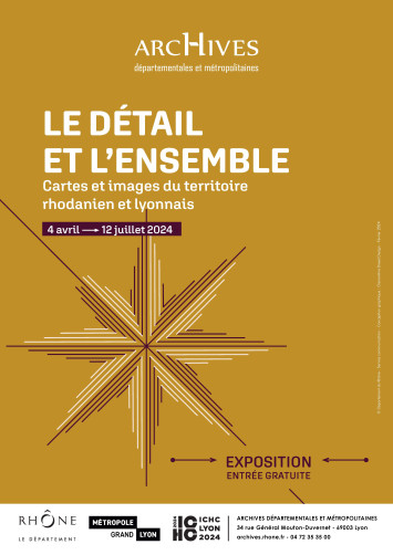
À l’occasion du Congrès international de la Cartographie qui se tient à Lyon en juillet 2024, les Archives départementales du Rhône et de la métropole de Lyon proposent de suivre au fil du temps, la façon dont la représentation de l’espace du département du Rhône a évolué. On mesure ainsi l’influence des transformations de la société sur la cartographie : les cartes doivent répondre à des fonctions différentes, de plus en plus variées et complexes. Certaines demandes s’observent cependant à toutes les périodes, comme lorsqu’il s’agit de valoriser des terres ou de fortifier des places. Dans ce territoire rhodanien, Lyon occupe naturellement une place à part : les villes ont très tôt fait l’objet de l’attention du politique et du militaire, et les enjeux de cartographie y sont particulièrement importants. Sur ce point, la comparaison se fait plutôt avec d’autres villes importantes comme Genève ou Marseille. La beauté des cartes proposées, le soin apporté à leur établissement, la variété des procédés permet à cette réflexion historique d’offrir également un véritable plaisir esthétique, et de considérer ainsi des territoires familiers avec un autre regard.
3) Vulnérabilité... que disent les cartes ?
Vulnérabilité... que disent les cartes ? (Archives Municipales de Lyon, 3 mai 2024 - 28 septembre 2024)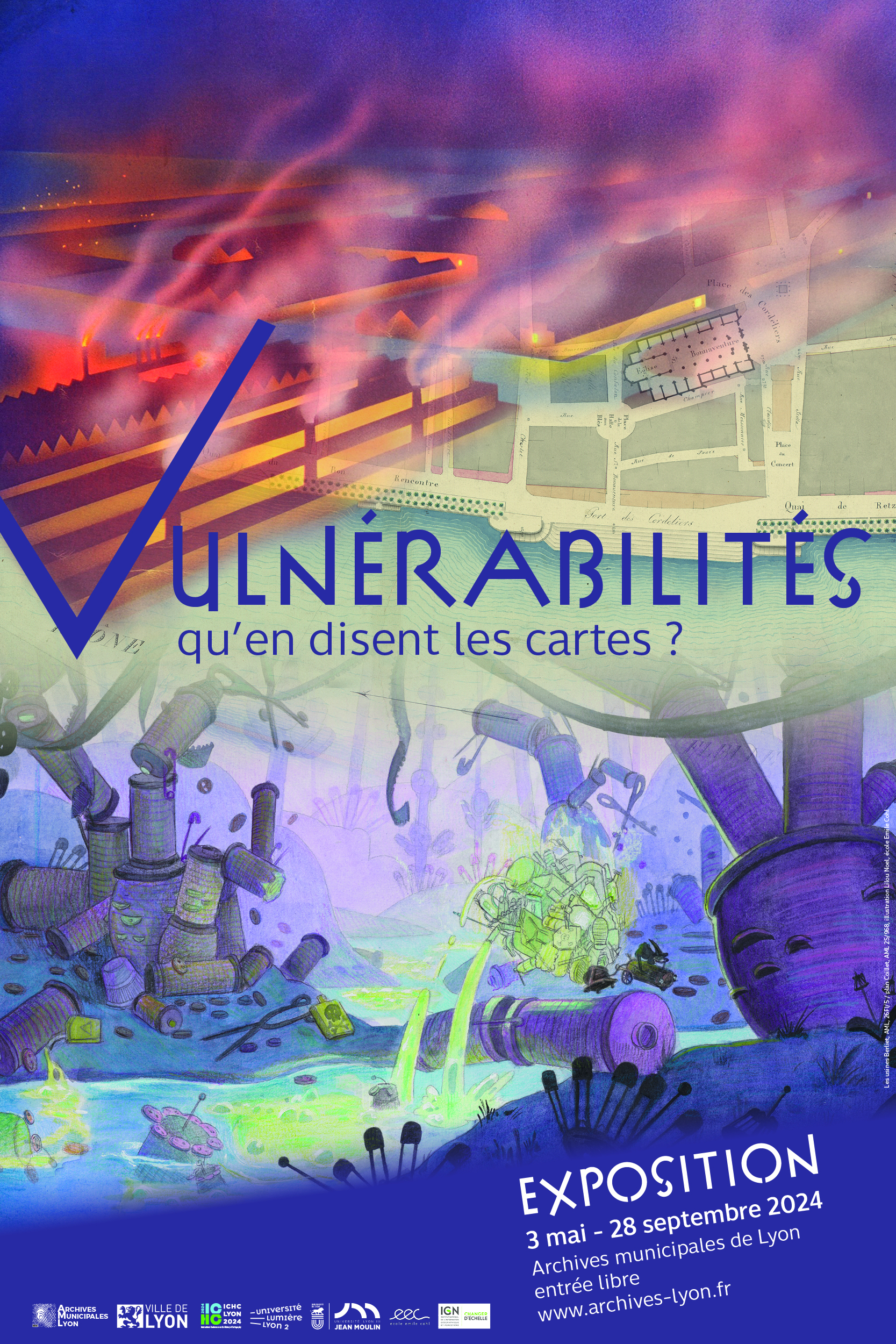
La ville de Lyon est vulnérable à des événements variés, soudains ou au cheminement long et indécelable, jusqu’au moment où ils s’imposent et menacent. La plupart d’entre eux n’ont laissé que des mots, bien insuffisants à nous permettre de comprendre ce qui s’est passé, ni comment les hommes composaient avec. Cette histoire est parfois représentée sur des cartes ou par des images qui nous permettent d’en saisir l’ampleur et les particularités. La carte, de ce point de vue, est venue tardivement, accompagnant une vision de plus en plus nourrie scientifiquement. Cette exposition interroge la ville sous l’angle de ses vulnérabilités, au travers de documents rarement vus et encore moins montrés, alors que la ville d’aujourd’hui regorge de dispositifs instaurant la plus grande sécurité.
4) Sentiers papier - Cartes et images de voyages en France et ailleurs, 19e-21e siècle
Sentiers papier - Cartes et images de voyages en France et ailleurs, 19e-21e siècle (Bibliothèque Interuniversitaire Diderot, 15 mai 2024 - 29 septembre 2024)
Les mobilités, phénomènes complexes, mêlent - entre autres - des dimensions technique, politique et culturelle. Pour les périodes récentes, elles s’accompagnent de la diffusion d’une grande variété de documents imprimés aux fonctions diverses, qu’il s’agisse d’aider le voyageur (guide ou carte touristique), de le faire rêver (fiction, iconographie), ou encore de reproduire le voyage (récit et itinéraire d’exploration). Entre le XIXe et le XXIe siècle, les mobilités individuelles se complexifient et s’intensifient en Europe. En lien avec celles-ci, les cartes et les guides, instruments indissociables du voyage et de sa représentation, connaissent de nombreuses transformations.
5) Cartes pédagogiques : sur les traces de la cartographie à l'Université de LyonCartes pédagogiques : sur les traces de la cartographie à l'Université de Lyon (Bibliothèque de la Manufacture de l'Université Jean Moulin, 1er juin 2024 - 30 septembre 2024)
L’approche cartographique a accompagné les mutations de l’enseignement de la géographie depuis le XIXe siècle. Toujours présente, sa place s’est peu à peu affirmée au sein de l’université de Lyon. C’est par le biais des productions et collections cartographiques des différents géographes et cartographes qui se sont succédé au sein des différentes universités de Lyon que nous vous proposons de suivre 150 ans d’analyses géographiques, parfois locales, parfois lointaines élaborées sur place.
Articles connexes
Exposition « Cartografia, la Corse en cartes 1520-1900 »
Europe : 12 cartes et un projet (exposition virtuelle de la Bibliothèque nationale d'Espagne)
Exposition de Mathieu Pernot L’Atlas en mouvement
Exposition cartographique à Marseille sur la naissance de l’état grec moderne
Le monde en cartes (1400-1600) : une exposition de la Beinecke Library (Yale University)
Environnement et justice dans les paysages anthropisés. Une exposition virtuelle du Leventhal Center
Exposition virtuelle. Figures d’un géographe, Paul Vidal de la Blache (1845-1918)
Le monde en sphères. Une exposition virtuelle de la BnF
Rubrique Cartes et altas historiques
-
18:46
Les pays bénéficiaires de l'aide des Etats-Unis depuis 1945
sur Cartographies numériques
ForeignAssistance.gov est le site portail de l'Administration américaine qui met à disposition du public les données sur l'aide étrangère américaine. Il sert de plateforme centrale pour les données budgétaires et financières produites par les agences gouvernementales américaines qui gèrent les portefeuilles d'aide auprès d'autres pays. A travers l'orientation de ces aides financières, le site permet d'étudier l’évolution des ambitions géopolitiques des États-Unis depuis la fin de la Seconde guerre mondiale.
La carte des tendances fournit un aperçu très intéressant de l’évolution des priorités géopolitiques des États-Unis au fil du temps (choisir une année et cliquer sur le bouton d'animation pour visualiser l'évolution jusqu'à nos jours).
Au début des années 1950, la majorité de l'aide américaine était destinée aux pays européens, afin de les aider à se reconstruire après la Seconde Guerre mondiale. Par exemple, en 1953, les États-Unis ont fourni 4,2 milliards de dollars d’aide étrangère au Royaume-Uni, 4,6 milliards de dollars à l’Italie, 5,3 milliards de dollars à la France et 2,3 milliards de dollars à l’Allemagne.
Au cours des années 1960, l'aide étrangère américaine s'est détournée de l'Europe pour se diriger vers l'Asie du Sud-Est. En 1967, 8,3 milliards de dollars d’aide étrangère ont été fournis au Vietnam, 3,1 milliards de dollars à la Corée et 780 millions de dollars à Taiwan
Depuis la fin des années 1970, Israël est devenu de loin le plus grand bénéficiaire de l'aide américaine. A la faveur de la guerre en Afghanistan (2001-2021), ce pays est devenu temporairement le principal bénéficiaire de l’aide américaine entre 2008 et 2020. Depuis l’invasion de l’Ukraine par la Russie en 2022, l’Ukraine est devenue à son tour le plus grand bénéficiaire de l’aide étrangère américaine.
Les données sont disponibles en téléchargement au format csv ou xlxs. L'ensemble des données représente plus de 3 Go, mais il est possible de télécharger en fonction des types d'aide ainsi que par pays bénéficiaires.
Articles connexes
Les ventes d'armes des Etats-Unis et de la de la Russie (1950-2017)
La carte, objet éminemment politique : les interventions des Etats-Unis et de la Russie dans les élections à l'étranger (1946-2000)
La carte, objet éminemment politique : la montée des tensions entre l'Iran et les Etats-Unis
Des images aériennes déclassifiées prises par des avions-espions U2 dans les années 1950
Comment la Chine finance des méga-projets dans le monde
Mesurer le rayonnement des grandes puissances à travers leurs réseaux diplomatiques
Les dépenses militaires dans le monde à partir des données du SIPRI
Utiliser les cartes du CSIS pour étudier les grandes questions géopolitiques du monde contemporain
Mapping China's Strategic Space : un site d'analyse géopolitique à base de cartes
Un Atlas de géographie historique des États-Unis (1932) entièrement numérisé
.jpg)

Éléments récents
-
11:00
Mappery: Cookie Cutter (literally)
sur Planet OSGeo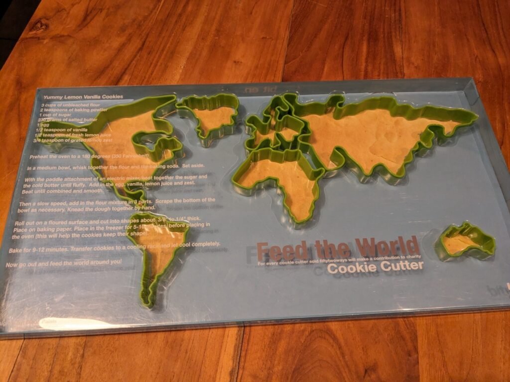
Erik spotted this in a thrift shop.
“Best thrift store find of the year: #MapsintheWild cookie cutter (or: clip irl function). I’ll accept the #mapswithoutnewzealand issue. Wouldn’t be more than a crumb anyway!”
MapsintheWild Cookie Cutter (literally)
-
7:18
? of Rafah’s Buildings Destroyed
sur Google Maps ManiaBloomberg has analysed satellite imagery of the Palestinian city of Rafah and determined that Israel has damaged or destroyed about 32% of the region's buildings.In How the Israel-Hamas War has Reshaped Rafah in Gaza Bloomberg presents a satellite image of the Palestinian city. As you scroll through the article a layer is superimposed on top of this satellite view to show buildings which have
-
Evolutions à venir sur les types d'utilisateurs ArcGIS
sur arcOrama, un blog sur les SIG, ceux d ESRI en particulierLes types d'utilisateurs ArcGIS sont aujourd'hui la manière de disposer d'une identité et de pouvoir accéder à certaines capacités et applications dans votre SIG ArcGIS. Les capacités du système ArcGIS ainsi que vos usages évoluant, Esri travaille à rationaliser l'accès à ces capacités ArcGIS pour chaque utilisateur et annonce de prochaines mises à jour des licences associées à ces types d'utilisateurs.
Les capacités d'ArcGIS sont traditionnellement accessibles via plusieurs produits, applications, extensions et add-ons, tous avec différents niveaux de licence, de tarification et de droits.
À compter de juin 2024, Esri met à jour le modèle de licence des types d'utilisateur vers six types d'utilisateurs basés sur des rôles qui offrent un accès étendu aux capacités, applications et services du système ArcGIS.
Voici quelques détails sur les licences par type d'utilisateur, résumées dans le tableau suivant :2023 et avant 2024 et au-delà Viewer Viewer Accès sécurisé en consultation (lecture seule) à ArcGIS Online ou ArcGIS Enterprise, y compris les Essential Apps et Office Apps Bundle. Affichez en toute sécurité des cartes, des applications et des tableaux de bord, y compris le contenu d'ArcGIS for Microsoft 365. 2023 et avant 2024 et au-delà Editor Contributor Afficher et mettre à jour les entités dans ArcGIS Online ou ArcGIS Enterprise. Le type d'utilisateur Contributor est un nouveau type d'utilisateur qui étend les capacités de l’Editor. Ce type d'utilisateur permet aux utilisateurs de consulter et de mettre à jour des entités dans ArcGIS Online ou ArcGIS Enterprise. Les utilisateurs peuvent désormais interagir avec les données d'ArcGIS for Microsoft 365 et d'ArcGIS GeoBIM. Cela inclut également tout ce qui concerne le Viewer. 2023 et avant 2024 et au-delà Mobile Worker Mobile Worker Afficher et mettre à jour les entités dans ArcGIS Online ou ArcGIS Enterprise, ainsi que dans le bundle des apps mobiles (Field Apps Bundle). Le type d'utilisateur Mobile Worker conserve ses capacités existantes, notamment l'accès aux applications de terrain, et intègre toutes les capacités du type d'utilisateur Contributor.
2023 et avant 2024 et au-delà Creator Creator Afficher, modifier et créer du contenu et des applications dans ArcGIS Online ou ArcGIS Enterprise.
GIS Professional Basic
Inclut tout ce qui concerne le Creator ainsi qu’ArcGIS Pro Basic.Le type d'utilisateur Creator fusionne avec le type d'utilisateur GIS Professional Basic. Il donne désormais accès à ArcGIS Pro Basic et à d'autres applications auparavant vendues séparément, notamment ArcGIS Image for ArcGIS Online1 et ArcGIS Excalibur2. 2023 et avant 2024 et au-delà GIS Professional Standard Professional Inclut tout ce qui concerne le GIS Professional Basic ainsi qu’ArcGIS Pro Standard. Le type d'utilisateur Professional est un nouveau type d'utilisateur qui étend les capacités du type d'utilisateur GIS Professional Standard. Ce type d'utilisateur inclut ArcGIS Pro Standard et l'extension de type d'utilisateur Advanced Editing2. Il inclut tout ce qui concerne le type d'utilisateur Creator. 2023 et avant 2024 et au-delà GIS Professional Advanced
Professional Plus Inclut tout ce qui concerne le GIS Professional Standard ainsi qu’ArcGIS Pro Advanced. Le type d'utilisateur Professional Plus est un nouveau type d'utilisateur qui étend les capacités du GIS Professional Advanced. Il comprend désormais les extensions ArcGIS Pro3 les plus populaires et ArcGIS CityEngine. Il comprend tout ce qui concerne le type d'utilisateur Professional.
1 Disponible avec ArcGIS Online uniquement2 Disponible avec ArcGIS Enterprise uniquement3 Extensions ArcGIS Pro incluses avec le Professional Plus : ArcGIS 3D Analyst, ArcGIS Data Reviewer, ArcGIS Geostatistical Analyst, ArcGIS Image Analyst, ArcGIS LocateXT, ArcGIS Network Analyst, ArcGIS Publisher, ArcGIS Spatial Analyst et ArcGIS Workflow Manager.
?
En savoir plus
Pour en savoir plus sur ces évolutions, vous pouvez consulter la page Web des types d'utilisateurs ArcGIS. Vous pouvez également consulter les matrices détaillées des types d’utilisateurs ArcGIS sur le site de la Géo-Communauté.
Licences auparavant vendues séparément
Avec ces évolutions des types d'utilisateurs, les bundles, applications et extensions de types d'utilisateurs suivants deviendront exclusivement disponibles via les types d'utilisateurs répertoriés ci-dessus :- ArcGIS Pro Basic licence additionnelle
- ArcGIS Pro Standard licence additionnelle
- ArcGIS Pro Advanced licence additionnelle
- Essential Apps Bundle
- Field Apps Bundle
- Office Apps Bundle
- ArcGIS Field Maps
- ArcGIS Workforce
- ArcGIS Survey123
- ArcGIS QuickCapture
- ArcGIS Collector (Windows)
- ArcGIS Mission Manager
- ArcGIS Excalibur
- ArcGIS GeoBIM
- ArcGIS Image for ArcGIS Online proposera l’hébergement d'images avec le type d'utilisateur Creator, tandis que l'analyse d'images nécessitera le type d'utilisateur Professional ou supérieur.
Se préparer à la mise à jour
Pour les organisations ArcGIS Online :
Avec la mise à jour d’ArcGIS Online de juin 2024, votre organisation recevra des mises à jour automatiques des types d'utilisateurs, y compris de nouvelles capacités et applications basées sur vos types d'utilisateurs actuels. Vos types d'utilisateurs existants et vos licences additionnelles pour les produits désormais inclus dans les mises à jour resteront fonctionnels jusqu'à votre prochain renouvellement de souscription annuelle. Cela signifie que vos utilisateurs ne seront pas affectés et pourront continuer à utiliser ArcGIS comme ils le faisaient auparavant.
?Pour les organisations ArcGIS Enterprise :
Les types d'utilisateurs mis à jour pour ArcGIS Enterprise seront disponibles à l'achat et seront reflétés dans les devis de renouvellement à partir de juin 2024. Les types d'utilisateurs mis à jour seront disponibles dans ArcGIS Online avec la mise à jour de juin 2024 et dans ArcGIS Enterprise lors de la mise à niveau vers la version 11.4, dont la disponibilité est prévue en novembre 2024.
Pour les utilisateurs d’ArcGIS Pro :
Étant donné qu'ArcGIS Pro peut être administré via ArcGIS Online et ArcGIS Enterprise, les mises à jour seront reflétées dans leurs versions respectives.
D'autres communications seront faites d'ici juin 2024 pour apporter des éléments complémentaires. En attendant, vous pouvez découvrir ces nouveaux types d’utilisateurs depuis cette page.
-
Les SDKs ArcGIS Maps for Native Apps passent en version 200.4
sur arcOrama, un blog sur les SIG, ceux d ESRI en particulier
Les SDKs ArcGIS Maps for Native Apps sont les SDKs qui permettent de développer des applications natives (desktop ou mobile) implémentant les capacités de cartographie 2D/3D, d'analyse spatiale, de collecte et de saisie de données en connecté/déconnecté, ... en utilisant les environnements de développement .NET, Java, Kotlin, Qt, Swift et bientôt Flutter. Depuis quelques jours, la version 200.4 de ces SDKs ArcGIS Maps for Native Apps est disponible.
Cette version 200.4 propose de nombreuses évolutions comme le support des formulaires intelligents, l'affichage de couches au format OGC 3D Tiles, l'ajout de nouvelles capacités de snapping dans l'éditeur de géométrie, la mise à jour de l'API d'agrégation, ... Cette mise à jour est également l'occasion de rappeler la dépréciation du SDK Java et la sortie prochaine de la bêta du SDK Flutter. Vous retrouverez tous les détails sur l'ensemble des nouveautés de cette version 200.4.


-
11:00
Mappery: Arab Islands in Reflection
sur Planet OSGeo
Stan Carey shared this mirror map.
“Mirrors in the shape of the Aran Islands at Connemara Airport, alongside Tim Robinson’s map for lo-fi comparison (below)”

MapsintheWild Arab Islands in Reflection
-
The American Home Values Map
sur Google Maps ManiaHome Values in America is a dot density map showing the self-reported value of homes across the whole United States.The map shows home values across the United States using data from the U.S. Census Bureau's 2018-2022 American Community Survey (ACS). The ACS is a large-scale survey that gathers information about the American population every year.The colored dots on the map
-
2:00
Paul Ramsey: Cancer 4
sur Planet OSGeoCancer is a mind fuck.
I mean, it’s a body fuck too, obviously, but the early experience for me has been of weird gyrations of mental health and mood with each passing day.
The first thing I did was the first thing everyone does – look up all the different probabilities of five year survival, because that’s what is at the top of the Google search.
With a stage two diagnosis (hard to know if that’s actually what I have, though) Google says I have a 10% chance of dying over the next five years.
That feels like… a lot? A scary amount.
But wait, here’s an fact – my odds of dying just in the ordinary course of affairs over the next five years are about 4.5%.
Does that stop me from being 1000% more terrified, on a daily basis, since receiving my diagnosis? No it does not.
A good deal of that terror, I think, is that cancer promises a patient a long and painful interaction with a medical system that has only destructive rear-guard actions at hand to stop it. Cut things out; kill it with poison; zap it with radiation. These procedures all leave a body worse for wear, and if they don’t work… they bring you back and do some more of them.
My great grandfather died while rolling a ball on the lawn bowling green in his late 80s. Massive stroke, he died doing something he loved and was dead before he hit the ground. Floyd Ramsey hit the mortality jackpot.
Naturally, I would also like to hit that jackpot. Cancer says, “not so fast, you might have a different life experience ahead of you”.
It would be a little too pat to say that getting a diagnosis starts you off on the stages of grief, because that implies some orderly process to the mental evolution. I am not progressing linearly through the stages of grief, so much as visiting them randomly, over and over, in an emotional shuffle mode.
Some days are denial days. Some days are acceptance days. Some days are bargaining days.
I told my councillor last week that “I only feel OK to the extent that I am dissociative”, and that seems to still hold true. I am at my most together when I have fully distracted myself from the diagnosis. I’m not sure if this counts as “taking one day at a time”. Probably not.
Talk to you again soon, on the other side, inshalla.
-
23:32
A recap of the 128th OGC Member Meeting, Delft, The Netherlands
sur Open Geospatial Consortium (OGC)Two records were broken in Delft this March: not only was OGC’s 128th Member Meeting our biggest ever – with over 300 representatives from industry, government, and academia attending in-person (and over 100 virtual) – but the meeting also saw a record number of motions for votes on new Standards, highlighting the very productive activities undertaken by the OGC community in recent months.
Held in Delft, Netherlands from 25-28 March, 2024, OGC’s 128th Member Meeting brought together global standards leaders and geospatial experts looking to learn about the latest happenings at OGC, advance geospatial standards, and see what’s coming next. Hosted by TU Delft and sponsored by Geonovum with support from GeoCat and digiGO, the overarching theme for the meeting was GeoBIM for the Built Environment.
As well as the many Standards and Domain Working Group meetings, the 128th Member Meeting also included a Land Administration Special Session, a Geospatial Reporting Indicators ad hoc, a Data Requirements ad hoc, the OGC Europe Forum, an Observational Data Special Session, two Built Environment sessions subtitled The Future of LandInfra and What Urban Digital Twins Mean to OGC, a public GeoBIM Summit, a Quantum Computing ad hoc, and the usual Monday evening reception & networking session and Wednesday night dinner.
The dinner was held at the historic Museum Prinsenhof Delft, former residence of William of Orange, and – grimly – where he was assassinated. On a lighter note, during the dinner Ecere Corporation, represented by Jérôme Jacovella-St-Louis, received an OGC Community Impact Award for their tireless work in driving OGC Standards forward. Congratulations Ecere and Jérôme!
 Attendees of the Wednesday night dinner at OGC’s 128th Member Meeting.
In tandem with the theme of GeoBIM, two other technology areas stood out during the meetings: Data Spaces, and the transition from OGC Web Services to OGC APIs.
Data SpacesThere has lately been a dramatic increase in the number of discussions on Data Spaces, both in and outside of OGC, as the concept becomes more commonplace in European projects and policy. As per the European Union Data Spaces Support Centre, a Data Space is defined as “an infrastructure that enables data transactions between different data ecosystem parties based on the governance framework of that data space.” In other words, the “space” in a Data Space defines a context for which the data are useful: a container, governance, and access. Given the ubiquitous use of geospatial data, directly and indirectly, an understanding of the Data Space ecosystem may be key to participate in emerging data infrastructures.
OGC Web Services to OGC API transitionThe full set of capabilities offered by the OGC Web Services Standards (e.g., Web Map Service (WMS), Web Feature Service (WFS), etc.) is now reflected in OGC API Standards that have either been published, are approaching final approval vote, or are being actively developed. Over the coming months, OGC will establish a process and resources to aid in the transition to the more modern Standards, while ensuring that the user community recognizes that the legacy web services are still functional and valuable.
 Friso Penninga, CEO of Geonovum, opens the week with an introduction to Geonoum and Delft.
Opening Session
Friso Penninga, CEO of Geonovum, opens the week with an introduction to Geonoum and Delft.
Opening Session
The week opened with a welcome from Friso Penninga, CEO of Geonovum, who outlined not only the work of Geonovum, but also the culture of Delft. Following this, Prof. Jantien Stoter of 3Dgeoinfo, TU Delft highlighted activities at TU Delft in the meeting theme area and previewed Wednesday’s GeoBIM Summit. Pieter van Teeffelen of digiGO then presented a Dutch platform for digital collaboration in the built environment. Finally, Jeroen Ticheler of GeoCat explained challenges in social welfare and the work of the GeoNetwork to address these challenges.
Next, it was time to settle a long-running dispute in OGC: who has the better chocolate, Switzerland or Belgium? After a blind taste-test, the audience voted Belgium as the winner. Is the debate now settled? Only time – and perhaps our taste buds – shall tell.
The chocolate contest was followed by a demonstration of the Netherlands Publieke Dienstverlening Op de Kaart (PDOK) geodata platform, which integrates a number of published and draft OGC API Standards.
Special tribute was then paid to two instrumental figures in OGC’s history who passed away in November 2023: Jeff de la Beaujardiere (OGC Gardels and Lifetime Achievement Awards recipient) and Jeff Burnett (former OGC Chief Financial Officer).
 Prof. Jantien Stoter of 3Dgeoinfo, TU Delft, offered a preview of Wednesday’s GeoBim Summit during the Opening Session.
Today’s Innovation, Tomorrow’s Technology, and Future Directions
Prof. Jantien Stoter of 3Dgeoinfo, TU Delft, offered a preview of Wednesday’s GeoBim Summit during the Opening Session.
Today’s Innovation, Tomorrow’s Technology, and Future Directions
As always, the popular Today’s Innovation, Tomorrow’s Technology, and Future Directions session runs unopposed on the schedule so that all meeting participants can attend. At this Member Meeting, the session was presented by Marie-Françoise Voidrot and Piotr Zaborowski of OGC’s Collaborative Solutions and Innovation Program (COSI). The session focused on several projects that OGC is participating in and are developing capabilities that will be of use to all members. Many of these projects are sponsored by the European Union to advance interoperable science and data management and are supporting OGC resources such as the OGC RAINBOW registry, GeoBIM integration, and learning and developer resources, such as the Location Innovation Academy.
OGC Members can access the presentations and a recording from the session on this page in the OGC Portal. An overview of some of the European projects highlighted during the session, entitled European Innovation, Global Impact, was published on the OGC Blog last year. Piotr Zaborowski, Senior Director, of OGC’s Collaborative Solutions and Innovation Program, presents some of the European Union funded projects in which OGC is involved.
Meeting Special Sessions
Piotr Zaborowski, Senior Director, of OGC’s Collaborative Solutions and Innovation Program, presents some of the European Union funded projects in which OGC is involved.
Meeting Special Sessions
The Land Administration Special Session was dedicated to updating OGC membership on the progress of Land Administration activities amongst members and in ISO/TC 211, where the Land Administration Domain Model (LADM) is managed. A new Land Administration Domain Model Standards Working Group (SWG) is being considered to create Part 6 of LADM: the encoding of Parts 1-5 in one or more formats. OGC Members can access the presentations and a recording here (Session 1) and here (Session 2) in the OGC Portal.
Geospatial Reporting Indicators have been discussed in the OGC Climate Resilience Domain Working Group (DWG) in the context of Land Degradation. However, the means to exchange indicator information reporting the degree of land degradation (or influencing factors) is not standardized in the community. OGC members are therefore proposing a new SWG to develop such standardized reporting indicators, possibly as extended functionality of work in Analysis Ready Data (ARD). OGC Members can access the presentations and a recording on this page in the OGC Portal.
An ad hoc session on Geospatial Data Requirements was held to assess the chartering of a new SWG. The purpose of this proposed SWG is to develop a Standard for describing what geospatial data a project or task needs to collect, store, analyze, and present to achieve the project objectives. OGC Members can access the presentations and a recording on this page in the OGC Portal.
The OGC Europe Forum met on Tuesday with presentations focused on Data Spaces: understanding the European Commission principles of data spaces and how OGC members can engage in the topic. The Forum featured speakers from the International Data Spaces Association (IDSA), ISO/TC211, and the European Commission’s Joint Research Centre (JRC) as well as an open panel discussion. OGC Members can access the presentations and a recording on this page in the OGC Portal.
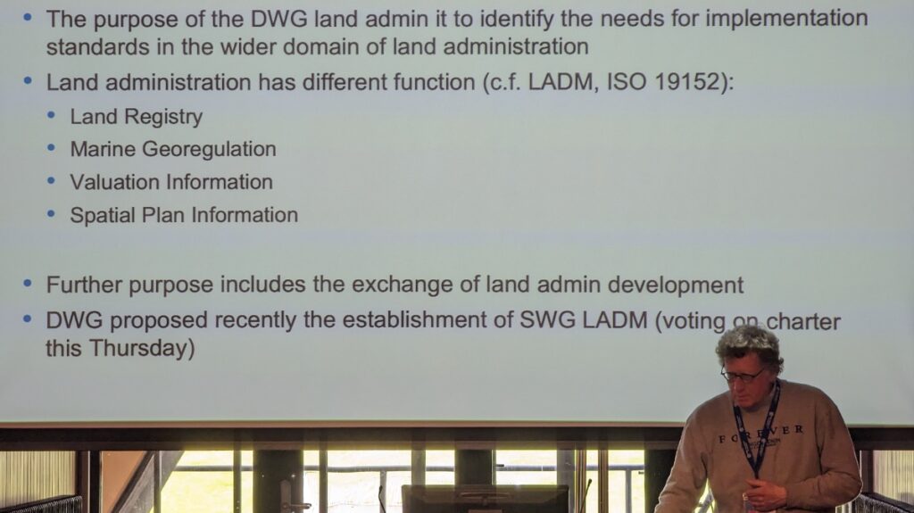 Peter van Oosterom, from TU Delft and the co-chair of the OGC Land Administration DWG, presents during the Land Administration Special Session.
The Observational Data Special Session was organized to identify the various OGC Working Groups that are building Standards or assessing the collection & use of observational data. The session clarified the commonalities between these WGs so they can be considered in future development of observational data Standards. OGC Members can access the presentations and a recording on this page in the OGC Portal.
Two sessions were held to discuss and prioritize the next steps for OGC activities concerning standardization in the Built Environment. The first of these sessions focused on the future development of the LandInfra suite of Standards: whether priority should be made on new encodings, new Parts, or other tasks. OGC Members can access the presentations and a recording on this page in the OGC Portal.
The second Built Environment session considered the topic of what Urban Digital Twins mean to OGC. Presentations on human engagement as sensors and the place for digital twins in data spaces were followed by a preview of the OGC Urban Digital Twins Discussion Paper and a panel of OGC specialists to discuss where Urban Digital Twins are most important in OGC. OGC Members can access the presentations and a recording on this page in the OGC Portal.
The public GeoBIM Summit emphasized the theme of this meeting: there is a great amount of continuity between the geospatial and Building Information Modeling (BIM) communities and their respective technologies and practices. Numerous rapid presentations highlighted activities using OGC and BIM Standards and use-cases for interoperability. OGC Members can access the presentations and a recording on this page in the OGC Portal. Presentations and recordings will soon be made available to the public on the GeoBIM Summit event page.
The Quantum Computing ad hoc session included open discussion from OGC Members working with or researching the application of quantum computing technology on geospatial issues. Future ad hoc meetings are planned to move towards the development of an OGC Quantum Computing Working Group.
Closing PlenaryThe Closing Plenary normally includes two sessions: an open discussion of Important Things suggested by members, followed by motions, votes, and presentations from members to advance the work of the Consortium. However, with the Member Meeting being compressed down to four days (as Friday was a regional holiday) the Important Things discussion was not held. As such, I opened the Closing Plenary with a rapid, 7-minute summary of the entire meeting week, which included Slides and content from a large number of the week’s Working Group sessions, available to OGC Members on this page in the OGC Portal. The Closing Plenary included a record number of motions for votes on new Standards, highlighting the very productive activities of OGC members in recent months.
Thank youOur 128th Member Meeting was our biggest yet. As always, it’s a pleasure to see hundreds of OGC Members get together to discuss, collaborate, and drive technology and standards development forward. Once again, a sincere thank you to our members for investing their time and energy, as well as their dedication to making OGC the world’s leading and most comprehensive community of location experts.
Be sure to join us at Centre Mont-Royal in Montreal, Canada, June 17-21, 2024, for our 129th Member Meeting. Registration is open now on ogcmeet.org. Sponsorship opportunities remain available – contact OGC for more info.
To receive a digest of the latest OGC news in your inbox every two weeks, be sure to subscribe to the OGC Newsletter.
The post A recap of the 128th OGC Member Meeting, Delft, The Netherlands appeared first on Open Geospatial Consortium.
-
11:00
Mappery: Floor Puzzle Map
sur Planet OSGeo
Erik shared this great puzzle map.
“100 years of #RotaryInternational in the Netherlands celebrated with a biking marathon for charity through the country. Today”
MapsintheWild Floor Puzzle Map
-
9:51
Sous les décombres
sur SIGMAG & SIGTV.FR - Un autre regard sur la géomatique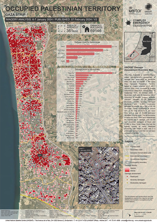 L’institut des Nations Unies pour la formation et la recherche (Unitar) a partagé l’analyse d’Unosat autour des dommages et des destructions de structures sur la bande de Gaza dans le cadre du conflit israélopalestinien. Basé sur de l’imagerie satellite très haute résolution collectée les 6 et 7 janvier, cette analyse compare des données depuis le 1er mai 2023 jusqu’au 26 novembre. Ces images ont aidé à identifier la destruction de plus de 22.000 bâtiments, 14.000 sévèrement endommagés et près de 33.000 endommagés moyennement. Au total, ce sont 69.147 structures touchées, soit environ 30% du patrimoine de la bande de Gaza. Pour une augmentation supérieure à 10.000 depuis l’image du 26 novembre. Le nombre de logements impactés s’élève à 93.800 sur cette zone. Une cartographie recense plus précisément la répartition des dommages par gouvernorat et par municipalité.
+ d'infos :
unitar.org
-
The 2024 Cicadapocalypse
sur Google Maps Mania2024 is set to see the emergence of two large periodical cicada broods. Both Brood XIX (13-year cicada) and Brood XIII (17-year cicada), are expected to emerge together in 2024 for the first time since 1803. This double emergence has been nicknamed a "cicada-geddon" by some.Periodical cicadas are native to eastern North America. They spend most of their lives underground as nymphs, feeding
-
20:38
Estimation du PIB agricole local (AgGDP) à travers le monde
sur Cartographies numériques
Source : Ru, Y., Blankespoor, B., Wood-Sichra, U., Thomas, T. S., You, L., and Kalvelagen, E., Estimating local agricultural gross domestic product (AgGDP) across the world, Earth Syst. Sci. Data, 15, 1357–1387, [https:]] , 2023.Le PIB agricole sur une trame de 10x10km² exprimé en dollar US 2010 (source : RU & al. 2020)
Les statistiques économiques sont fréquemment produites à un niveau infranational. Cependant, ces mesures peuvent manquer de précision pour permettre une analyse efficace des modèles de développement économique local et de l'exposition aux risques naturels. Le produit intérieur brut (PIB) agricole est un indicateur essentiel pour mesurer le secteur primaire, dont dépendent plus de 2,5 milliards de personnes pour leurs moyens de subsistance. Il constitue une source clé de revenus pour l'ensemble des ménages (FAO, 2021). Cet article désagrège les statistiques administratives nationales et infranationales du PIB agricole en un ensemble de données mondiales sur une maille d'environ 10 × 10 km pour l'année 2010 en y ajoutant des données satellites concernant la production végétale, la production animale, la pêche, la chasse et la foresterie. Pour illustrer l'utilisation de ce nouvel ensemble de données, l'article évalue l'exposition des zones ayant connu au moins une sécheresse extrême entre 2000 et 2009 à partir du PIB agricole, qui s'élève à environ 432 milliards USD vers 2010, avec près de 1,2 milliard de personnes vivant dans ces zones.
Cet ensemble de données est susceptible de fournir des informations importantes sur les variations locales de la production agricole et d'aider à identifier des lieux d'intérêt. Avec la fréquence et la gravité croissantes des risques naturels tels que les inondations, les sécheresses et les cyclones, les estimations socioéconomiques au niveau local jouent un rôle de plus en plus important dans la préparation des interventions en cas de catastrophe.
Les données sont disponibles sur le Development Data Hub de la Banque mondiale ( [https:]] ; l'IFPRI et la Banque mondiale, 2022)
Site pour télécharger les données maillées :
[https:]]Liens directs pour télécharger chaque fichier (au format TIFF) selon la grille à 5mn d'arc :
- Valeur de la production végétale mondiale
- Valeur de la production mondiale de la pêche
- Valeur de la production animale
- Valeur de la production forestière mondiale :
- PIB agricole mondial maillé (AgGDP)
Jeu de cartes disponible sur ResearchGate (en licence Creative Commons Attribution 4.0 International) pour comparer avec le PIB agricole local avec le détail des données ayant servi à le produire, à savoir : la production végétale, la production animale, la production de poissons en eau douce et la production de bois.
Pour compléter
Dans les zones urbaines, les chercheurs utilisent les sources d'émission lumineuse pour en inférer l'activité économique (avec des biais possibles dans la façon de mesurer) :
Global 1 km × 1 km gridded revised real gross domestic product and electricity consumption during 1992-2019 based on calibrated nighttime light data [Produit intérieur brut réel révisé et consommation d'électricité mondiale sur une grille de 1 km × 1 km entre 1992 et 2019, sur la base de données d'éclairage nocturne calibrées]
Kummu, M., Taka, M., Guillaume, J. Ha (2020). Gridded global datasets for Gross Domestic Product and Human Development Index over 1990-2015 [Ensembles de données mondiaux quadrillés pour le produit intérieur brut et l'indice de développement humain sur 1990-2015]. Dryade.
Articles connexes
WorldCover (ESA), une couverture terrestre de l'occupation du sol à 10m de résolution
EuroCrops, un ensemble de données harmonisées et en open data sur les parcelles cultivées au sein de l'UE
Cartes et données sur l'occupation des sols en France (à télécharger sur le site Theia)
L'occupation du sol aux Etats-Unis à travers l'Atlas for Green New Deal (McHarg Center)
Un Atlas de la PAC pour une autre politique agricole commune
Publication des résultats du recensement agricole 2020
Données de population par mailles de recensement d'1 km² (Eurostat)
Les évolutions de l'Indice de Développement Humain (IDH) : vers un indicateur infranational ?
- Valeur de la production végétale mondiale
-
16:01
Doit-on se méfier des cartes ethno-linguistiques ?
sur Cartographies numériques
Les cartes ethno-linguistiques ont connu un grand succès aux XIXe et XXe siècles pour délimiter des aires linguistiques et pour identifier des minorités à l'intérieur d'un Etat. Il s'agit souvent de cartes à contenus très politiques. Les cartes ethnographiques d'Emmanuel de Martonne, montrant la répartition des nationalités, ont joué par exemple un rôle important dans le remaniement des frontières nationales de l'Europe centrale au lendemain de la Première Guerre mondiale. L'ouvrage de Catherine Gibson Geographies of Nationhood examine l'essor fulgurant de la cartographie ethnographique au XIXe et au début du XXe siècle en tant que forme de culture visuelle et matérielle qui exprime des visions territorialisées de la nation. Établies le plus souvent à partir de la langue maternelle considérée comme principal critère d'appartenance éthnique lors des recensements, les cartes « ethnographiques » ont tendance à être chargées d’idéologie et de propagande nationaliste.
Pour autant, il peut être intéressant de dresser des cartes ethno-linguistiques pour mesurer des évolutions sur un temps long. Cela suppose de disposer de statistiques ethniques, ce qui fait débat en France. Pour des empires comme l'empire austro-hongrois où les minorités ethniques étaient très nombreuses, les historiens et les géographes disposent de séries statistiques à partir desquelles ils essaient de dresser des cartes. Deux géographes d'origine hongroise Károly Kocsis et Patrik Tátrai ont ainsi pu reconstituer l'évolution ethnique de la région Carpates-Pannonie de 1495 à 2011 :
Károly Kocsis - Patrik Tátrai, Changing Ethnic Patterns of The Carpatho-Panonnian Area, Third, revised and enlarged edition, 2015. [https:]]
Carte ethnique au 1:500 000 de la région Carpates-Pannonie en 2011 (source : Kocsis et Tátrai, 2015)
Cette carte satistique, téléchargeable en haute résolution, est d'une très grande précision. Elle est accompagnée de 8 cartes qui documentent l'évolution de la répartition ethnique de 1495 à 2011. Ces cartes ne sont pas sans poser des questions sur le plan des sources et des choix sémiologiques. Ces problèmes sont abordés dans le fil Twitter-X ci-dessous.Effectivement il faut toujours se méfier des cartes ethno-linguistiques qui essentialisent des réalités souvent plus complexes. On peut noter toutefois dans cet atlas l'intérêt de pouvoir comparer des dates différentes. Méthodo malgré tout à interroger [https:]] pic.twitter.com/obRyoyQYuh
— Sylvain Genevois (@mirbole01) April 15, 2024
Se pose aussi le pb de la distinction Ukrainiens/Rusyns, le nb de personnes s'identifiant comme Ruthènes ayant chuté au cours du XXe
— Sylvain Genevois (@mirbole01) April 15, 2024
Il sont indiqués en orange clair sur la carte par rapport aux Hongrois en orange foncé. Un choix de couleurs discutable [https:]] pic.twitter.com/uCwN1xEEAi
C'est ce genre de cartes qui a conduit à de lourdes erreurs, comme l'invasion de l'Ukraine par la Russie, arguant de la présence d'une population considérée comme ethniquement russe.
— Benoit Vaillot (@BenoitVaillot) April 15, 2024
La question de savoir s’il s'agit d’une langue à part entière, d’un dialecte ou plusieurs dialectes de l’ukrainien, est une querelle qui agite linguistes et nationalistes de diverses obédiences [https:]] .
— Sylvain Genevois (@mirbole01) April 15, 2024
Pour compléterLes Ruthènes sont le cauchemar des cartographes ayant une conception ethnique de l'identité nationale, ils ne savent jamais comment les catégoriser, et effectivement, certains les classent comme Ukrainiens... Même problème avec les Sorabes, les Polonais luthériens, etc.
— Benoit Vaillot (@BenoitVaillot) April 15, 2024
Károly KOCSIS, Patrik TÁTRAI, Contributions to the History of the Hungarian Ethnic Mapping La cartographie ethnique en Hongrie a une longue histoire si on la compare au reste de l'Europe. Cette abondance est due au fait que le bassin des Carpates, c'est-à-dire la Hongrie historique, est depuis les XVIe et XVIIe siècles l'une des régions les plus hétérogènes du continent du point de vue ethnique, linguistique et confessionnel. C’est la raison pour laquelle cette région est en proie à des tensions ethniques depuis la période des Lumières avec l’émergence d'une conscience nationale. Au cours des deux derniers siècles, la coexistence pacifique des peuples, typique du royaume médiéval hongrois, s'est progressivement transformée en une attitude hostile – principalement en raison des mouvements irrédentistes des minorités nationales. L'étude et la cartographie de ce mélange ethnique et de son hétérogénéité est devenue un facteur influençant le sort de millions de personnes. L'ouvrage vise à retracer l'histoire de ces activités de cartographie ethnique en Hongrie qui se sont déroulées avec une intensité variable au cours des siècles en fonction du contexte politique. Dans les « périodes de paix », ce type d'activités cartographiques servaient généralement à l'administration de l'État et à l'information du public, tandis que pendant les guerres mondiales et les négociations de traités de paix, elles visaient à sauvegarder l'intégrité territoriale du royaume hongrois historique ou au moins d'une partie de la zone ethnique hongroise (voir la fameuse "carte rouge" de Pál Teliki représentant les groupes ethniques par différentes couleurs et proportionnellement à leur nombre). En conséquence, un grand nombre de cartes ethniques ont été publiées au cours des périodes 1918-1920 et 1939-1945. Par la suite, dans les pays communistes – pour éviter l’émergence de tout conflit dans le bloc de l’Est – la cartographie ethnique a été interrompue pendant plusieurs décennies. Cependant, depuis 1989, avec la montée des rivalités ethniques, elle a pris un nouvel élan dans cette partie de l'Europe pour servir la recherche fondamentale et fournir des informations fiables à l'opinion publique nationale et internationale.
Daniel ZOLTÁN SEGYEVY, Carte Rouge 100. Teleki Pál vörös térképének hatástörténeti elemzése [Carte Rouge 100. Analyse historique de la carte rouge de Pál Teleki]L'article propose une étude critique de la "carte rouge" de Pál Teleki (1918). Outre une revue de littérature générale sur la cartographie ethnique, il traite de travaux antérieurs et postérieurs à cette carte Il aborde son processus de création, puis son impact politique et culturel dans une perspective internationale. L'article donne aussi des exemples nationaux et internationaux inspirés de cette carte qui a eu d'emblée une portée internationale.
Un ouvrage sur l'empire austro-hongrois agrémenté de cartes à télécharger en open access :
RUMPLER Helmut, SEGER Martin, Soziale Strukturen. Band IX, 2. Teilband: Die Gesellschaft der Habsburgermonarchie im Kartenbild. Verwaltungs-, Sozial-und Infrastrukturen. Nach dem Zensus von 1910. Die Habsburgermonarchie 1848?1918. [Structures sociales. Tome IX, 2ème partie : La société de la monarchie des Habsbourg en cartes. Administration, société et infrastructures d'après le recensement de 1910. La monarchie des Habsbourg 1848?1918]
Articles connexes
Une animation cartographique pour reconstituer les dynamiques de peuplement aux Etats-Unis sur la période 1790-2010
La suppression de la Racial Dot Map et la question sensible de la cartographie des données ethniques aux Etats-Unis
Frontières et groupes ethniques à travers le monde
György Markos et les graphiques par isotypes

-
11:00
Mappery: Peaks Island Cooler
sur Planet OSGeo
Doug shared this “Map of Peaks Island keeping my hands warm and my beer cool.”
MapsintheWild Peaks Island Cooler
-
Escapades à pied ou à vélo vers la destination Compiègne-Pierrefonds
sur Makina CorpusEn avril 2023, le projet Geotrek Compiègne-Pierrefonds a été lancé à l'issu d'un marché gagné pour l'installation de Geotrek-Admin, ">
-
7:30
PostgreSQL sur Smartphone : Importer des données géographiques
sur GeomatickEn attendant l’implant cérébral, le plus petit support mobile pour gérer des données géographiques est le téléphone portable. Mais quelles sont les possibilités de gestion de données spatialisées depuis cet appareil ? Alors que j’étais en déplacement à l’étranger sans mon pc portable, je me retrouvai face à un problème.… Continuer à lire →
L’article PostgreSQL sur Smartphone : Importer des données géographiques est apparu en premier sur GEOMATICK.
-
7:00
[Témoignage client] Émilie Bigorne, géomaticienne EPTB Loire
sur OslandiaÉmilie Bigorne est géomaticienne au sein de l’EPTB Loire, syndicat mixte qui couvre le bassin de la Loire et ses affluents.
L’EPTB Loire emploie environ 70 agents et fédère 50 collectivités adhérentes (Région, Départements et EPCI). L’organisme a en charge plusieurs missions : la gestion des ouvrages de protection contre les inondations, la gestion des digues des collectivités territoriales, la mise en oeuvre de programmes de prévention des inondations et le suivi et la gestion de la ressource en eau.
Administratrice de la base de données PostgreSQL / PostGIS, Émilie Bigorne garantit l’intégrité des données et fournit des outils aux agents dans le cadre de leurs missions.» J’ai travaillé avec Oslandia sur deux projets. En 2019, je me suis fait accompagner avec un audit de la base de donnée mise en place. Oslandia a pu me fournir des recommandations pour l’amélioration de la fluidité, des accès et de la configuration générale. Ils m’ont également donné des conseils dans le cadre du changement de version de PostgreSQL.
En 2023, nous avons collaboré pour mettre en place l’outil « QGIS Deployment Toolbet« . Au vu de l’augmentation des effectifs, je n’arrivais plus à maintenir QGIS sur les postes de travail. La mise en place de cet outil me permet aujourd’hui l’installation automatisée de QGIS ainsi que l’installation de raccourcis personnalisés en fonction du périmètre d’action géographique et des missions de chaque agent. Le paramétrage se fait automatiquement, y compris sur les postes de travail des agents qui ne sont pas présents sur le site d’Orléans.
QGIS Deployment Toolbet simplifie mon quotidien et celui des utilisateurs, c’est un gain de temps et d’énergie. Nous avons par ailleurs une meilleure utilisation de la base de données avec des outils plus maintenables.
Je ne passe plus mon temps à installer QGIS sur les postes des utilisateurs !
La collaboration avec Oslandia s’est vraiment très bien passée. A chaque étape, les personnes en face de moi étaient disponibles. J’ai appris énormément de choses sur QGIS et sa configuration, des petites choses annexes à ce qui était demandé initialement.
Les équipes ont su m’écouter pour répondre à mes besoins et être forces de proposition. Oslandia consacre du temps à la communauté libre, je trouve que c’est hyper intéressant, on sent un vrai intérêt pour le libre. Je suis également dans cet état d’esprit de partage de connaissances ! »
Plus d’informations sur QGIS Deployment Toolbet :
-
Backdrop - the Ultimate Challenge
sur Google Maps ManiaBackdrop Backdrop is a map based game which is somewhat similar to the very popular GeoGuessr game. However in Backdrop instead of Google Maps Street View images you have to identify the locations depicted in famous paintings by some of history's greatest artists.In GeoGuessr you can stroll around in Street View to pick-up clues as to the location that you have been dropped in. In Backdrop if -
Spikkin Scots
sur Google Maps ManiaThe Shetland Dialect map allows you to listen to examples of the Shetland Dialect spoken across the Shetland Isles. The Shetland Isles are the northernmost region of the United Kingdom, Shetland, positioned between Orkney, the Faroe Islands, and Norway. Due to the isolated geography of the Shetland Isles the Shetland dialect (also called Shetlandic or auld Shetland) has continued to
-
2:00
Paul Ramsey: Cancer 3
sur Planet OSGeoA common refrain on my Facebook cancer support groups is that the first months after diagnosis can be among the most stressful. You know the least about the actual extent of your condition, but you simultaneously know for sure that your life is going to change a great deal, starting now.
It is also the first time for grieving.
In the worst case it is grieving actual mortality, the very real threat of the end. But even in a relatively low impact diagnosis like my (current) one, there is grief. It is the grief of lost futures, lost plans, lost self-image.
I am a person who runs and climbs and rows and goes on long walks and travels and teaches and speaks publicly. At least, I was. If all goes according to plan, there will eventually be a new me, who does some or many of those things. Maybe not all of them anymore, there is no predictability or control.

Last Christmas I took my family to Rome over the holidays. “No time like the present!” I said, little knowing how apt that would be. I’m glad for everything I have done with my family. Climbing mountains, scaling cliffs, travelling afar, and even the predictable summer trips to the beach.
Some of these adventures were quite hard, and in the moment I wondered to myself “what the heck were you thinking?” In the end, I regretted none of it, and we all have lifelong memories we share.
Before she was killed by cancer, Amy Ettinger wrote:
I’ve always tried to say yes to the voice that tells me I should go out and do something now, even when that decision seems wildly impractical … Money always comes back, but if you miss out on an experience, the opportunity may never come back.
I am trying to pack as much climbing, and eating out, and walks to the cafe, and evening date nights into my life as I can, before the start of treatment. It’s too late for anything big, but these are little things that bring me joy that may become harder to do, after.

My surgery date is set now, and the procedure will mark an abrupt decline and then the start of a long slow climb back up to whatever “new normal” my body can fashion from my reconfigured plumbing. Some people have great results, some people have terrible ones.
As always, there’s no way to know, the grey area is omnipresent, which is perhaps why I sound so morose.
Talk to you again soon, inshalla.
-
23:28
Sean Gillies: Bear training weeks 1-8
sur Planet OSGeoThe first quarter of my season has been challenging. I've had to deal with injuries and other niggles, and I'm just starting to feel better when I run. Moving forward on fitness while not being able to run very much has been an interesting problem to work on.
As I mentioned in Preason running I started my 8 week block of interval workouts with nagging knee pain. This pain continued for 6 weeks. I dealt with it by alternating outdoor runs with low-impact sessions on an elliptical or stair-stepper machine. I did one outdoor session of hill intervals and one indoor session of stair-stepper intervals every week. By the end of the block, I was doing 36 minutes of hard uphill running, and 4 hours of easier running or stepping in a week. It's not where I want to be. At least I didn't have to skimp on the hard intervals. I'm satisfied with doing as much hard running as my knee allowed, and enjoy feeling more fit.
At the end of last year, I was determined to get some physical therapy and rehabilitate my ankles and feet. I've been visiting a local clinic once a month and have been diligent about doing the recommended exercises. The therapist says that I have good range of motion in my ankles, though there is an imbalance; my right ankle has excellent mobility while the left is only better than average. My bigger problem, in the therapist's view, was that my toes and feet are weak. I needed to build muscle so that I can do toe stands easily and lift my arches. So, I've been going to the gym to build muscle three times a week. I do sets of back squats (5 x 5) for overall strength, and then do sets (3 x 10) of single-leg calf raises on a step with a kettlebell, single-leg squats with toe taps using a barbell and band around my thighs, and single-leg deadlifts with dumbbells. The Three Amigos, as I've been calling these single-leg exercises, have been working for me. My feet and lower legs are stronger and their imbalances are getting ironed out. I feel almost equally good with the deadlifts now, wobbling just one time out of ten, at most, on my left leg. The therapist has me progressing to single-leg jumping now, and I'm feeling better balance with the new exercises, too.
Consistent strength training, conservative running, and changing the way I sit at work seem to have let my knee recover. I'm standing, sitting on a stool, and reclining more when I work, using a conventional office chair less, and at maximum height when I do.
A radiology visit in December revealed that I'm developing a bone spur on my right heel. I wonder if this is yet another symptom of imbalance in my feet and legs, more stress on my right foot caused by favoring my weaker left? I'm getting some consultation on this and meanwhile am icing regularly. Two weeks ago I had to stop running for 3 days to treat aggravation of my right sciatic nerve. It was a good reminder to be more diligent about stretching and foam rolling. Otherwise, I'm doing pretty well. Heart palpitations are behind me. I'm eating and sleeping well, keeping sinus infections at bay, and enjoying longer days and generally nice spring weather.
I'm grateful to be able to continue training and am looking forward to a productive block of tempo running.
-
21:26
Le dessin du géographe n° 101. William Holmes et le Grand Canyon du Colorado
sur Les cafés géographiquesDans « les essentiels » de la Bibliothèque Nationale de France, se trouve un focus sur « L’Ouest, un mythe américain en image », par Jean-Louis Tissier et Jean-François Staszak, qui me permet d’introduire cette page. Commencé avec un portrait photographique de F.V. Hayden (un des 4 chefs d’expédition scientifique dans l’Ouest des Etats-Unis entre 1866 et 1879, avec C. L. King, G. M. Wheeler et J.W. Powell), il se termine par le formidable dessin suivant :
Fig.1 : Panorama du Grand canyon du Colorado depuis le Point Sublime, vers le sud, par William Holmes (1882), lithographie 50,5 x 84 cm (Source : BNF, Société de Géographie)
Cette image est certainement un des croquis panoramiques les plus connus de l’Ouest des États-Unis : le grand canyon du Colorado dessiné depuis le Point Sublime, du sommet du versant nord vers l’ouest. Le dessin original a dû être réalisé à la plume et au lavis d’encre sépia sur papier. Au vu des détails et des tracés de cet extraordinaire empilement de strates sédimentaires subhorizontales, on peut raisonnablement penser que le dessinateur William Holmes (1846-1933), qui fut le principal illustrateur de cette conquête scientifique de l’Ouest des États-Unis, a travaillé d’après une photographie pour produire une lithographie d’une telle précision picturale. Au droit du Point Sublime (2274 m), le Colorado coule à l’altitude de 774 m et c’est donc 1500 m de sédiments qui s’entassent depuis le précambrien dans une histoire géologique complexe.
Fig.2 : Vue aérienne de la partie centrale du Grand canyon du Colorado, à la verticale du Point Sublime, vers le sud, correspondant à la partie dessinée sur la figure 1 (Source : Google Earth)
Jusqu’ici le « dessin du géographe » n’a publié aucun dessin d’un géographe d’origine américaine, et c’est une grave lacune, car l’exploration du double continent a produit au 19e siècle des images de grande qualité, en particulier de la part des géologues et géomorphologues qui se sont intéressés aux États-Unis. Les Montagnes Rocheuses, particulièrement riches en grands sites naturels, ont été parcourues pendant la seconde moitié du 19ème siècle par des scientifiques de renom (Hayden, Davis, Gilbert…) qui ont fait de très nombreuses observations originales et progresser à grands pas la science du relief du sol. Par exemple, la théorie du cycle d’érosion par le géographe William Davis : le premier dessin modélisateur d’un anticlinal de type jurassien soumis à l’érosion pourrait se trouver dans un article de The Geographical Journal publié par ce dernier en 1899 (Vol.14, No 5, p.492).
Fig.3 : Folded Strata, a Great Geological Arch, Colorado, par William Holmes (1874), aquarelle et crayon sur papier (Source : Smithsonian American Art Museum).
Le terme anglais « arch » ne se traduit pas ici par l’ « arche » française, mais par le « mont » anticlinal au sens « relief plissé » du terme. Curieusement, le catalogue en ligne du SAAM n’identifie pas la localisation géographique de ce mont, localisation qui permettrait d’en faire une analyse géomorphologique plus précise en s’aidant de la carte géologique.
Sur la fig.3 on reconnaîtra aisément, dans un relief plissé, un crêt encadrant une hémicombe peut-être à ‘occasion d’une cluse traversant un axe anticlinal. Mais le dessin ne permet pas de voir la topographie du thalweg ; par contre, il semble que l’érosion dégage dans la combe un mont dérivé dans une couche de roche plus dure.
W.H. Holmes, qui a commencé sa carrière de dessinateur scientifique en reproduisant des mollusques pour F.B. Meek, paléontologue de l’Institut Smithonian , a pratiqué ensuite le dessin et la peinture sur le terrain jusqu’à devenir un artiste reconnu, comme le montre l’aquarelle de la figure 3 prise sur le motif. Ce versant de son activité est mis en valeur par le SAAM sur son site internet : [https:]]
Le Grand canyon du Colorado a continué à attirer les scientifiques et les artistes. Parmi les peintres contemporains le dernier en date est peut-être David Hockney. En cherchant de nouveaux moyens perspectifs pour présenter des espaces de très grande taille, il a trouvé dans ce site un bon exemple pour illustrer sa méthode des paysages peints par panneaux multiples avec des points de vue différents. L’exposition « J’aime les Panoramas » réalisée au MUCEM de Marseille par Laurence Madeline et Jean-Roch Bouiller en 2015-2016 en présentait un résultat « flashant » pris du même point de vue que Holmes :

Fig.4 : David Hockney, A closer Grand Canyon, 1988, huile sur toile, 60 panneaux, 8,93 x 2,48m
Collection Louisiana Museum of Modern Art, Humlebaek, Denmark © David Hockney, Photo Richard SchmidtLe peintre anglais évoque à cette occasion une qualité commune au dessinateur et au géographe, l’observation : « Lorsqu’on est sur place, au bord du canyon, on regarde… : on se tient debout et on commence à contempler » (David Hockney, in Martin Gayford Conversations avec David Hockney, 2022, p.139).
Contemplation qui peut être alors à la source de la perception du Sublime, cette sensation nouvelle tirée de l’observation méditée de la nature à la fin du 18ème siècle par les poètes et les peintres, et qui a pu être partagée par les géographes sur le terrain de leurs propres recherches.
Pour aller plus loin : L’Ouest, un mythe américain en images, par Jean-Louis Tissier et Jean-François Staszak [expositions.bnf.fr]
Roland Courtot, avril 2024
-
21:09
Hommage à Michel Sivignon, un grand géographe français
sur Les cafés géographiques A Michel, notre ami
A peine arrivés à Paris au mitan des années quatre-vingt-dix, Michel Sivignon et son épouse Michèle (un seul prénom pour deux) sont invités au Café géo. Nous venons d’ouvrir la saison avec Yves Lacoste, Roger Brunet, Jean-Pierre Raison, Chantal Blanc-Pamard et Hervé Rakoto Ramiarantsoa et… très vite, Michel Sivignon nous parle de la Grèce, pays qu’il connaissait intimement pour y avoir fait sa thèse sur la Thessalie à la charnière des années 1960-1970, des Balkans, de l’Albanie… Dans les archives du Clermontois André Fel, nous retrouvons cette photo prise en Thessalie lors d’un voyage en 1992 : « Michel Sivignon, notre pâtre grec ».
Au Café géo, nous avons été d’emblée séduits par cette voix de basse, profonde. Michel parlait toujours posément, non sans une certaine solennité pour imprimer son récit, avec un geste de main droite qui est souvent celui des enseignants aimant montrer un lieu sur une carte. Michel était un sage qui faisait prendre de la hauteur à tous les débats. Sans avoir d’avis sur tout et renvoyant souvent aux collègues « qui en savent plus que moi », Michel avait toujours un point de vue en surplomb, sans négliger les détails « qui parlent ». Amoureux de la controverse et du débat, Michel semblait avoir élu la Grèce aussi pour son apport démocratique à la civilisation occidentale.
Les Cafés géo ont une dette incommensurable envers lui. Il est le premier universitaire qui a pris la mesure de ce qui s’y passait. Avec Michel, nous avions trouvé un ancêtre : le géographe allemand Friedrich Ratzel (1844-1904) réunissant ses étudiants à Leipzig au café (peut-être là où Bach jouait sa célèbre cantate ?) après les cours pour refaire le monde. Avec Pierre Gentelle notre autre mentor du CNRS, Michel avait aimé qu’on put lui offrir un espace où discuter librement, loin des chapelles et leurs querelles, des idées qui germaient dans les laboratoires de recherche et qu’il fallait tamiser par le débat démocratique. Michel a ouvert son carnet d’adresses à ses collègues, ses étudiants, ses amis, géographes ou non, pour les inviter au Café.
Au Café de Flore (Paris 6ème), Michel Sivignon (à droite) et Daniel Oster (à gauche) lors d’un café géo, le 11 décembre 2021 (photo de Jean-Pierre Némirowsky)
Hors de son travail universitaire, Michel cultivait de nombreuses passions qu’il aimait partager. Celle de l’étymologie et, surtout, du dessin, avec l’Aixois Roland Courtot qui vaut aux Cafés géo une rubrique étonnante, éclairante par son évidence à montrer ce qui se révèle aux géographes par le crayon et la gomme, puis l’aquarelle jusqu’à l’image satellitale : « Le dessin du géographe ». Déjà cent contributions d’amateurs sollicités entre les articles de Michel et Roland (près des deux tiers des articles à eux deux) constituent une mine dont on pense qu’elle fournira un jour le matériau d’une thèse. Des explorations en tous sens : la déesse grecque Eugée, la frontière du rio Grande, l’affichiste R. Broders, le dessin colonial du Maroc…
La deuxième passion partagée avec Michèle, était le symposion, mot grec qui fait référence aux nourritures et aux repas. Michel fut le premier à proposer en 1999 un « repas géo » dans un restaurant grec du XIVe arrondissement. On découvrit avec lui qu’une carte de restaurant vaut parfois carte de géographie. Que chaque mets, que l’ordonnancement des plats, que le boire, que les toasts et les gestes les plus banals et les moins évidents hors de leur culture font géographie. Grâce à cette aventure, un enseignement sur l’alimentation a germé à l’université où des jeunes et moins jeunes étudient pour comprendre quelle alimentation le changement climatique va faire naître. On peut entendre Michel et ses amis, chanter au cours du banquet qui a marqué les dix ans de l’association.
La troisième passion partagée, ce sont les voyages. Ceux qu’il a accompagnés ou, plus nombreux encore, initiés, notamment en Asie centrale avec un mémorable café géo nomade sur les routes même de la Soie. Ceux qu’il a suscités en Charolais d’où était originaire sa famille, en Grèce, dans le Pélion, à Argalasti où il avait pied depuis ses années de thèse. Nombreux sont ses amis, ses étudiants qui firent le pèlerinage au bord de la mer, non loin de Volos, et goûtèrent le spetzofai, la fasolada, le kefalotyri, le tiropsomo, sans oublier le célèbre thé des montagnes (tsai tou vounou). Michel savait partager la saveur d’un lieu qui infusait alors en ceux qui l’écoutaient.
Michel avait tant de talents qu’on ne fera pas injure à ceux qui l’ont connu de vouloir les évoquer tous. Il a donné à tous le modèle d’une vie lumineuse, exigeante, rayonnante jusque dans ses plus infimes attentions aux autres. Après plusieurs décennies à l’université, il s’est consacré pendant vingt-cinq ans au rayonnement des Cafés géo. Un maître de la transmission.
Michel, notre ami, tu seras toujours des nôtres, avec ta curiosité insatiable et ta bienveillance qui nous donnent du courage devant les défis qui nous attendent.
Gilles Fumey, Olivier Milhaud, Daniel Oster, avril 2024

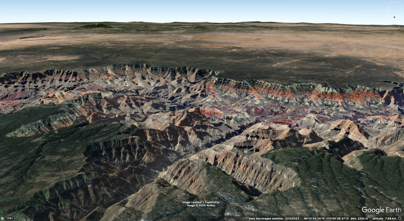

-
13:40
L'IGN lance en 2024 un grand concours de cartographie à partir de la BD Topo
sur Cartographies numériques
L'IGN lance en 2024 un grand concours de cartographie. Emparez-vous de la BD TOPO® pour construire un récit cartographique autour des Continuités et disparités territoriales.
À l’initiative de son nouvel atelier de cartographie thématique, l’IGN lance un concours pour inviter professionnels, étudiants et amateurs à se saisir de la BD TOPO® et à imaginer un récit cartographique, infographique ou artistique autour des Continuités et disparités territoriales.
Les candidats pourront concourir dans la ou les catégories suivantes de leur choix, seuls ou en équipe, à hauteur d’une contribution par catégorie :
- Cartographie statique
- Cartographie interactive
- Datavisualisation
- Artistique
Ouverture des inscriptions : 15 avril au 31 juillet 2024 - Pour en savoir plus
Pour compléter
La BD TOPO® est une description vectorielle 3D (structurée en objets) des éléments du territoire et de ses infrastructures, de précision métrique, exploitable à des échelles allant du 1 : 2 000 au 1 : 50 000. Elle couvre de manière cohérente l’ensemble des entités géographiques et administratives du territoire national. Elle permet la visualisation, le positionnement, la simulation au service de l’analyse et de la gestion opérationnelle du territoire. La description des objets géographiques en 3D permet de représenter de façon réaliste les analyses spatiales utiles aux processus de décision dans le cadre d’études diverses.
Les objets de la BD TOPO® sont regroupés par thèmes guidés par la modélisation INSPIRE :- Administratif (limites et unités administratives) ;
- Bâti (constructions) ;
- Hydrographie (éléments ayant trait à l’eau) ;
- Lieux nommés (lieu ou lieu-dit possédant un toponyme et décrivant un espace naturel ou un lieu habité) ;
- Occupation du sol (végétation, estran, haie) ;
- Services et activités (services publics, stockage et transport des sources d'énergie, lieux et sites industriels) ;
- Transport (infrastructures du réseau routier, ferré et aérien, itinéraires) ;
- Zones réglementées (la plupart des zonages faisant l'objet de réglementations spécifiques).
Articles connexes
Les anciens millésimes de la BD Topo disponibles en téléchargement sur le site de l'IGN
Topomine, une application web pour visualiser des données relatives à la toponymie en France
Lidar HD : vers une nouvelle cartographie 3D du territoire français (IGN)
Depuis le 1er janvier 2021, l'IGN rend ses données libres et gratuites
Vagabondage, un jeu de rôle à partir de cartes et de photographies aériennes de l'IGN
Une carte topologique pour voir le monde autrement
Worldle, le jeu géographique qui cartonne sur Internet
Countryle, un jeu pour acquérir des repères géographiques
-
12:00
Mappery: Can you guess where this fingerpost is?
sur Planet OSGeo
Harel Dan shared this pic with me. Can you guess where it is? Scroll down to find out.

Harel explained “The uniquely American passion for copying other placenames from every corner of the world, led to there being all these places within a few hundred miles of each other in the state of Maine. Someone was clever enough to make a tourist trap out of it.”
MapsintheWild Can you guess where this fingerpost is?
-
10:31
Des lacs pour une protection capitale
sur SIGMAG & SIGTV.FR - Un autre regard sur la géomatiqueEn 1910, la Seine était sortie jusqu'à 8,62 m de son lit. Seine Grands Lacs assure une compétence majeure pour limiter l’impact des inondations sur le bassin versant de la Seine. Depuis 2014, l’EPTB s’appuie sur le SIG.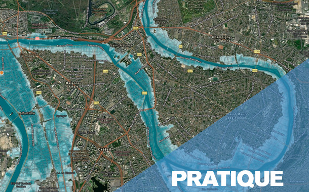 Protéger et prévenir contre les inondations de la Seine et de ses principaux affluents, maintenir un débit minimum et adapter le bassin amont de la Seine face aux changements climatiques sont les trois missions de Seine Grands Lacs. Créé en 1969, l’établissement public territorial de bassin s’intéresse à un territoire couvrant 19 départements et 4 régions. Acteur majeur de l’eau, il gère quatre lacs d’une superficie équivalente à la ville de Paris, capables de stocker 805 millions de m3, et ainsi d’offrir jusqu’à 70 cm de répit à plus de 12 millions d’habitants, dont près de 1 million en zones inondables. SGL porte et coordonne six programmes d’actions de prévention des inondations (PAPI) et veille également sur 67 km de canaux, 40 km de digues et plus de 3.000 hectares de forêts.
Retrouvez la suite de cette enquête dans le magazine SIGMAG N°40
-
10:30
Le territoire est toujours vivant. Une analyse transversale de la littérature sur un concept central de la géographie
sur CybergeoLe concept de territoire fait l’objet d’une très abondante littérature en sciences humaines et sociales, qui alimente des sens et des usages apparemment très différents. Cet article dresse un état de l’art multidisciplinaire qui situe les uns par rapport aux autres les différents courants sur le concept de territoire. Dans le format synthétique qui est le sien, le but n’est pas d’approfondir chacune des discussions théoriques. Le premier objectif est plutôt de structurer, à travers un corpus d’environ 120 références, un panorama de la très abondante littérature francophone, anglophone et hispanophone sur le territoire. Le deuxième objectif est de tenter des rapprochements entre ces arènes de discussions qui échangent peu entre elles, autour de trois problématiques qui pourraient leur être communes. Enfin, en approfondissant la lecture transversale de la littérature et l’effort de synthèse, le troisième objectif est de soumettre à la discussion des caractéristiques fondamentales qui ...
-
10:30
Vers une transition des systèmes agricoles en France métropolitaine ? Une géographie contrastée et en mouvement (2010 et 2020)
sur CybergeoFace aux objectifs de décarbonation de l’agriculture, de préservation de l’environnement et aux enjeux de viabilité économique et de sécurité alimentaire qui en découlent, les politiques européennes (Farm to fork) et françaises encouragent une transition en profondeur des systèmes agri-alimentaires. Dans ce contexte, la transformation des modes de production agricole devient une nécessité. Cet article présente une géographie des exploitations agricoles en transition en France métropolitaine. Il repose sur une typologie des exploitations agricoles combinant mode de production agricole (biologique ou conventionnel) et mode de commercialisation des produits (circuit court ou filière longue) à partir des données des recensements agricoles de 2010 et 2020. L’analyse propose une cartographie à échelle fine (canton INSEE) des trajectoires d’évolution sur la période 2010-2020 des agricultures en transition, ouvrant la voie à discussion sur les facteurs favorables à l’émergence certains type...
-
10:30
Explorer la répartition spatiotemporelle des piqûres de tiques sur les humains en France : la température moyenne comme indicateur du risque acarologique
sur CybergeoParmi les maladies à transmissions vectorielles, les maladies à tiques (dont la Borréliose de Lyme) sont celles dont la fréquence des cas est en constante augmentation. L’Europe et l’Amérique du Nord sont particulièrement concernées dans les régions tempérées. Comme il existe une saisonnalité des piqûres de tiques, plus de signalement en été, moins en hiver, nous nous sommes demandés s’il existait des marqueurs climatiques permettant de connaître le début de la saison du risque acarologique pour en informer le public. Grâce à programme de sciences participatives de l’INRAe, CiTIQUE, 22 000 cas géolocalisés en France de piqûres de tiques sur des humains ont été collectés, entre juillet 2017 et avril 2020. Ces signalements ont été appairés avec les conditions météorologiques (issues des bases Météo-France et Dark Sky) qui régnaient au lieu et à la date de chacune des piqûres signalées. Parmi toutes les variables analysées, la température quotidienne moyenne est le meilleur indicateur....
-
10:30
Bernard Lahire, 2023, Les structures fondamentales des sociétés humaines, Paris, La Découverte, Collection sciences sociales du vivant, 970 p.
sur CybergeoL’ouvrage de Bernard Lahire est d’importance, par son volume, par son érudition qui en fait une véritable "somme" scientifique, et par sa position originale réaffirmant en la substantialisant la liaison entre les sciences sociales et les sciences de la nature. Il faut admirer le courage de l’auteur, qui mobilise un vaste corpus de données pour aller souvent à contre-courant des idées plus fréquemment reçues en sciences sociales, et identifier des éléments de savoirs cumulables pour construire une sociologie faite d’universaux et de lois. Je ne prétends pas faire ici la recension que mérite cet ouvrage, quant à ce qu’il représente en termes d’apport à la science sociologique, d’autres plus qualifiés s’en chargeront, et sa dimension et sa construction rendraient difficile autant qu’injuste une proposition de résumé. Chacune de ses trois grandes parties offre cependant une lecture qui sera du plus grand intérêt pour les géographes. La première partie "Des sciences sociales et des lois"...
-
10:30
Improving the perfomance of commercial mapping on the web : proposals for the web site of the French Forest Authority
sur CybergeoIn 1999 the Internet was used for the first time as a marketing medium by the ONF (France’s National Forest Office) to sell timber from state- and locally-owned forests. Using a search engine, this site enables visitors to locate items corresponding to their requests (species, available volume,...). The only map proposed by the ONF is a document indicating roughly the felling location. It seemed appropriate to suggest the addition of an atlas allowing sellers to increase the visibility of the products on sale and visitors to rationalize their purchases. Is the result more efficient? A questionnaire is provided for Cybergeo readers.
Keywords: geomatics, Internet, wood sale, applied cartography, ONF -
10:30
Le principe de solidarité dans les politiques françaises de l’eau : originalité, fonctionnement et fragilités
sur CybergeoPour répondre à la dégradation de la qualité de l’eau en France, le législateur a créé en 1964 des outils novateurs d’une gestion autonome de l’eau, à savoir les agences et les comités de bassin, délimités selon les bassins hydrographiques. Durant les cinquante années qui ont suivi, les lois françaises puis les directives européennes ont favorisé une solidarité unique en matière de politiques environnementales, fonctionnant à un triple niveau : hydrographique, financier et territorial. Cet article présente l’originalité de cette solidarité et son évolution, en s’appuyant sur l’évolution des règlementations et l’analyse du fonctionnement des agences et des comités de bassin à mesure de l’élargissement de leurs missions. La récente reconnaissance nationale d'une pression quantitative sur la ressource, matérialisée en 2023 par l'adoption de 53 mesures visant une gestion de l'eau résiliente et concertée, recentre les agences et les comités de bassin au cœur de la gouvernance de l'eau. C...
-
10:30
Déforestation au nord du Bénin : un éclairage par des enquêtes communautaires
sur CybergeoCet article part du constat d'une hétérogénéité spatio-temporelle de la déforestation dans le nord du Bénin au cours des quatre dernières décennies. Pour explorer les raisons sous-jacentes de ces disparités spatiales, nous avons mené une enquête approfondie auprès des résidents des territoires où le couvert ligneux a connu des évolutions s’écartant sensiblement de la tendance régionale. En utilisant des méthodes statistiques textuelles, notre analyse de ces entretiens a fourni des perspectives plus approfondies sur les nuances locales spécifiques dans les perceptions de la population concernant les transformations environnementales en cours au sein de leurs territoires. Nos enquêtes ont également mis en évidence une aggravation des inégalités sociales et foncières qui touche l’ensemble de la région. La poursuite de la déforestation au Nord du Bénin ainsi que le sentiment de vulnérabilité économique et sociale exprimé par les populations interrogées trouvent un écho à des situations ...
-
10:30
Georges Courade, 2023, "Comme le fleuve, la vérité se perd dans le désert". Faire de la recherche dans les Afriques en décolonisation, Paris, Les Indes savantes, 151 p.
sur CybergeoDans ce petit livre interrogeant sur un mode personnel les modalités de la recherche en Afrique subsaharienne entre les décennies 1960 et 2010, Georges Courade mène un projet devenu assez commun dans le monde de la géographie, l’égohistoire. Mais c’est un projet exigeant, visant à reconstituer la vérité d’un parcours scientifique, vérité pour soi, par rapport aux enjeux successivement formulés par l’institution de recherche "pour le développement" et en termes d’effets sur les sociétés étudiées. Ce récit de vie vise aussi à retracer une "aventure collective" menée par une "génération 1962-1968" dans le cadre d’une recherche finalisée au sein de l’ORSTOM puis de l’IRD. Mais surtout, il s’agit d’une autofiction, une analyse réflexive menée en fin de carrière sous le truchement du personnage de Basile Costal.
Le récit se déroule en dix chapitres. Les six premiers portent sur les débuts et sur le background du chercheur, encadrés par son "baptême" dans un coin peu connu de l’Afrique, le ...
-
10:30
La compensation écologique permet-elle vraiment de tendre vers l’absence de perte nette de biodiversité ?
sur CybergeoDepuis 2016, le droit français poursuit un objectif de non perte nette de biodiversité en imposant aux projets ayant des incidences sur la biodiversité d’éviter, de réduire, puis de compenser ces incidences. Les mesures compensatoires doivent générer des gains écologiques suffisants, ce qui suppose qu’elles soient réalisées sur des sites en mauvais état écologique. Cet article analyse le contexte écologique dans lequel ont été réalisées 1153 mesures compensatoires, entre 2017 et 2021, sur le territoire hexagonal français. En utilisant des données de la "naturalité potentielle de France métropolitaine", nous comparons d’une part les scores d’intégrité biophysique des sites choisis et d’autre part les scores de qualité écologique incluant un indice de connectivité du paysage autour des sites, par rapport aux scores nationaux. Nos résultats montrent que 64 % de la surface des sites de compensation se situe sur des espaces où le score d’intégrité biophysique est supérieur à la médiane f...
-
10:30
Rémi Rouault, Patrice Caro, 2022, Éducation et fractures scolaires. Questions de géographes à propos de l’école, Lyon, Chronique Sociale, 161 p.
sur CybergeoC’est parce qu’ils ont questionné l’école en géographes que Rémi Rouault et Patrice Caro ont été en mesure de proposer cet ouvrage, précieux et nécessaire, pour analyser la situation socio-spatiale de l’école française. Et c’est parce qu’ils s’appuient sur un matériau riche de données récentes aux échelles nationale, académique et départementale qu’ils restituent la multiplicité des enjeux posés par les questions scolaires et les inégalités du système éducatif.
Contribuant au renouvellement d’une géographie francophone de l’éducation dynamisée, depuis peu, par la publication d’un livre portant sur les espaces et les systèmes éducatifs dans le monde (Giband, Delage, Mary, Nafaa, 2023), l’étude présentée au fil des 161 pages de l’ouvrage sur le cas français, clairement rédigée par Rémi Rouault et Patrice Caro, est structurée en 8 chapitres. Ceux-ci évoquent les lieux, les espaces quotidiens et locaux de l’éducation (chapitres 1 à 3) puis les leviers et les acteurs clés de l’éducation (...
-
9:30
Appropriations de l’espace et répression du mouvement des Gilets jaunes à Caen
sur MappemondeEn mobilisant différentes méthodologies de recherche issues principalement de la géographie sociale et de la sociologie politique, le présent article souhaite esquisser quelques pistes d’analyse et répondre à la question suivante : comment rendre compte par la cartographie des espaces de lutte du mouvement des Gilets jaunes dans l’agglomération caennaise ? En explorant ainsi sa dimension spatiale, nous désirons contribuer aux débats méthodologiques et analytiques qui ont accompagné ce mouvement qui s’est distingué par ses revendications et sa durée, mais aussi par sa géographie.
-
9:30
Les cartes dans l’analyse politique de l’espace : de l’outil à l’objet de recherche
sur MappemondeLa publication de la carte répertoriant les trajets d’utilisateurs de l’application de sport Strava, en 2017, a rendu identifiables des bases militaires dont les membres utilisaient Strava lors de leurs entraînements (Six, 2018). Cet exemple souligne à la fois l’omniprésence de l’outil cartographique dans nos vies et sa dimension stratégique. Aucune carte n’est anodine, quand bien même son objet semble l’être. Nos sociétés sont aujourd’hui confrontées à de nouveaux enjeux, liés à l’abondance des cartes sur Internet, dans les médias, au travail, que celles-ci soient réalisées de manière artisanale ou par le traitement automatisé de données géolocalisées. L’usage de la cartographie, y compris produite en temps réel, s’est généralisé à de nombreux secteurs d’activités, sans que l’ensemble des nouveaux usagers ne soit véritablement formé à la lecture de ce type de représentation, ni à leur remise en question. Dans ce cadre, le rôle du géographe ne se limite pas à la production de cartes...
-
9:30
Les stratégies cartographiques des membres de la plateforme Technopolice.fr
sur MappemondeConséquence de la transformation des cadres institutionnels du contrôle et de la sécurité, le déploiement de la vidéosurveillance dans l’espace public est aujourd’hui contesté par plusieurs collectifs militants qui s’organisent à travers des modes d’action cartographiques. Leurs pratiques entendent dénoncer, en la visibilisant, une nouvelle dimension techno-sécuritaire des rapports de pouvoir qui structurent l’espace. Grâce aux résultats d’une enquête de terrain menée auprès des membres de la plateforme Technopolice, nous montrons que le rôle stratégique de la cartographie collaborative dans leurs actions politiques réside dans ses fonctions agrégatives et multiscalaires. La diffusion de cartes et leur production apparaissent alors comme des moyens complémentaires, analytiques et symboliques, utilisés par les militants pour mieux appréhender et sensibiliser le public au phénomène auquel ils s’opposent.
-
9:30
La végétalisation de Paris vue au travers d’une carte : une capitale verte ?
sur MappemondeCet article s’intéresse à un dispositif cartographique en ligne proposant de visualiser les projets de végétalisation urbaine entrant dans la politique municipale parisienne. Avec une approche de cartographie critique, nous montrons comment la construction de la carte, et en particulier le choix des figurés et la récolte des données, participe à donner à la capitale française une image de ville verte. Le mélange de données institutionnelles et de données contributives composant la carte du site web Végétalisons Paris traduit l’ambiguïté de la politique de végétalisation parisienne, entre participation citoyenne et instrumentalisation politique.
-
9:30
Géopolitique de l’intégration régionale gazière en Europe centrale et orientale : l’impact du Nord Stream 2
sur MappemondeDépendante des importations de gaz russe, l’Union européenne tente de diversifier ses approvisionnements depuis la crise gazière russo-ukrainienne de 2009. En Europe centrale et orientale, cette politique se traduit par un processus d’intégration régionale des réseaux gaziers. Planifié depuis 2013, ce processus n’a pas connu le développement prévu à cause des divisions engendrées par le lancement du projet de gazoduc Nord Stream 2 porté par Gazprom et plusieurs entreprises énergétiques européennes. Ainsi la dimension externe de la politique énergétique des États membres a un impact sur la dimension interne de la politique énergétique européenne.
-
9:30
Les Petites Cartes du web
sur MappemondeLes Petites Cartes du web est un ouvrage de 70 pages de Matthieu Noucher, chargé de recherche au laboratoire Passages (Bordeaux). Il s’adresse à un public universitaire ainsi qu’à toute personne intéressée par la cartographie. Son objet est l’analyse des « petites cartes du web », ces cartes diffusées sur internet et réalisées ou réutilisées par des non-professionnel?les. Elles sont définies de trois manières :
-
historique, comme des cartes en rupture avec les « grands récits » de la discipline ;
-
politique, comme des cartes « mineures », produites hors des sphères étatiques et dominantes ;
-
technique, en référence aux « petites formes du web » d’É. Candel, V. Jeanne-Perrier et E. Souchier (2012), participant à un « renouvellement des formes d’écriture géographique ».
Ce bref ouvrage, préfacé par Gilles Palsky, comprend trois chapitres. Les deux premiers, théoriques, portent l’un sur la « profusion des “petites cartes” » et l’autre sur l’actualisation de la critique de la cartographie. L...
-
-
9:30
L’Amérique latine
sur MappemondeEn choisissant de commencer son ouvrage par la définition du terme « latine », Sébastien Velut donne le ton d’une approche culturelle et géopolitique de cette région centrale et méridionale du continent américain. Grâce à une riche expérience, il présente ce « grand ensemble flou » (p. 11), ce continent imprévu qui s’est forgé depuis cinq siècles par une constante ouverture au Monde. L’ouvrage, destiné à la préparation des concours de l’enseignement, offre une riche analyse géographique, nourrie de travaux récents en géographie et en sciences sociales, soutenue par une bibliographie essentielle en fin de chaque partie. L’exercice est difficile mais le propos est clair, explicite et pédagogique pour documenter l’organisation des territoires de l’Amérique latine. En ouverture de chaque partie et chapitre, l’auteur pose de précieuses définitions et mises en contexte des concepts utilisés pour décrire les processus en œuvre dans les relations entre environnement et sociétés.
En presque 3...
-
9:30
Les cartes de l’action publique. Pouvoirs, territoires, résistances
sur MappemondeLes cartes de l’action publique, ouvrage issu du colloque du même nom qui s’est déroulé en avril 2018 à Paris, se présente comme une recension de cas d’étude provenant de plusieurs disciplines des sciences sociales. Sociologues, politistes et géographes proposent au cours des 14 chapitres de l’ouvrage (scindé en quatre parties) une série d’analyses critiques de cartes dont il est résolument admis, notamment depuis J. B. Harley (1989), qu’elles ne sont pas neutres et dénuées d’intentionnalités. Cette position, assumée dès l’introduction, sert de postulat général pour une exploration de « l’usage politique des cartes, dans l’action publique et dans l’action collective » (p. 12).
Les auteurs de la première partie, intitulée « Représenter et instituer », approchent tout d’abord les cartes de l’action publique par leur capacité à instituer et à administrer des territoires.
Dans un premier chapitre, Antoine Courmont traite des systèmes d’information géographique (SIG) sous l’angle des scien...
-
9:30
Vulnérabilités à l’érosion littorale : cartographie de quatre cas antillais et métropolitains
sur MappemondeL’érosion littorale est un phénomène naturel tangible dont la préoccupation croissante, compte tenu du changement climatique, nous a menées à travailler sur la problématique de la cartographie de certaines composantes du risque d’érosion comprenant l’étude de l’aléa et de la vulnérabilité. Les terrains guadeloupéens (Capesterre-Belle-Eau et Deshaies) et métropolitains (Lacanau et Biarritz) ont été choisis, présentant une grande diversité d’enjeux. À partir d’un assortiment de facteurs, puis de variables associées à ces notions, la spatialisation d’indices à partir de données dédiées permettrait d’aider les décideurs locaux dans leurs choix de priorisation des enjeux et de mener une réflexion plus globale sur la gestion des risques.
-
9:30
La construction d’une exception territoriale : L’éducation à la nature par les classes de mer finistériennes
sur MappemondeLes classes de mer, inventées en 1964 dans le Finistère, restent encore aujourd’hui très implantées localement. Dépassant la seule sphère éducative, ce dispositif est soutenu par des acteurs touristiques et politiques qui ont participé à positionner le territoire comme pionnier puis modèle de référence en la matière à l’échelle nationale. Tout en continuant à répondre aux injonctions institutionnelles, poussant à la construction d’un rapport normalisé à la nature (développement durable, éco-citoyenneté), cette territorialisation du dispositif singularise la nature à laquelle les élèves sont éduqués.
-
GeoGuessr for Art
sur Google Maps ManiaCalling all art sleuths and geography buffs! There's a new game in town that will test your knowledge of both the artistic and the actual world. Buckle up, because Backdrop is here to take you on a virtual journey through the works of the world's most famous artists.Inspired by the wildly popular GeoGuessr, Backdrop throws you into the heart of stunning landscapes and iconic cityscapes, all
-
12:00
Mappery: Compass Coffee
sur Planet OSGeo
Another one from Erik’s US trip
I know that some will complain about the cardinal points not being a map but we have had them before and if you want to go ultra geek you could probably visualise a country outline in a weird projection in the coffee.
MapsintheWild Compass Coffee
-
8:35
Un artefact de visualisation sur la plateforme Ventusky
sur Cartographies numériquesVentusky est une plateforme de visualisation de données météorologiques qui rencontre un grand succès auprès des internautes. Comme Windy, son principal concurrent, l'application permet d'afficher des cartes de vents, de précipitations et de températures pour n'importe quel lieu à la surface de la Terre. Ses cartes de prévision météo sont très utiles notamment pour la navigation maritime.
Suite à une erreur de modèle, Ventusky a affiché des vagues géantes de plus de 20 m de hauteur au large de l'Afrique du Sud le 11 avril 2024. Il n'en a pas fallu plus pour déchaîner l'imagination de certains internautes sur les réseaux sociaux, voyant là la preuve de chute de métorites ou d'impact d'OVNI ! En réalité, l'erreur provient, semble-t-il, de l'énorme quantité de données fournies par les navires et les bouées à travers l'océan, comme en témoigne le site allemand qui sert de fournisseur de données météo pour Ventusky. Des problèmes peuvent survenir dans une base de données aussi volumineuse.
Despite numerous reports of UFOs or Atlanteans launching from the ocean ??, yesterday's image of giant waves near Africa was due to a model error. Fortunately, our provider, the German Meteorological Institute @DWD_presse, has already resolved it, and the forecast is fine. pic.twitter.com/slOU9jtxcJ
— Ventusky (@Ventuskycom) April 12, 2024Ventusky a intégré un autre modèle provenant de Météo-France (une "source respectée") pour prouver que les vagues géantes qui apparaissaient au large de l'Afrique étaient liées à une erreur de leur modèle
— Sylvain Genevois (@mirbole01) April 14, 2024
et non à des théories sur les ovnis ! [https:]]Articles connexes
Comment la cartographie animée et l'infographie donnent à voir le changement climatique
La France est-elle préparée aux dérèglements climatiques à l'horizon 2050 ?
Les villes face au changement climatique et à la croissance démographiqueDonnées météorologiques sur la France disponibles en open data
-
2:00
Paul Ramsey: Cancer 2
sur Planet OSGeoBefore I joined the population of fellow cancer travellers, I had the same simple linear understanding of the “process” that most people do.
You get diagnosed, you get treatment, it works or it doesn’t.
What I didn’t appreciate (and this will vary from cancer to cancer, but my experience is with colorectal) is how little certainty there is, and how wide the grey areas are.
Like, in my previous post, I said I was “diagnosed” with cancer. Which maybe made you think I have it. But that’s not how it works. I had a colonoscopy, and a large polyp was removed, and that polyp was cancerous, and a very small part of it could not be excised. So it’s still in me.
Do I have cancer? Maybe! I have a probability of having live cancer cells in me that is significantly higher than zero. But not as high as one.

How bad is what I have? This is also a game of probabilty. Modern technology can shave off the edges of the distribution, but it can’t quite nail it down.
A computed tomography (CT) scan didn’t show any other tumors in my body, so that means I probably don’t have “stage 4” (modulo the resolution of the scan), which is mostly incurable (though it can be manageable), where the cancer has managed to spread outside the colon.
An MRI didn’t show any swollen lymph nodes, which means I maybe do not have “stage 3”, which requires chemotherapy, because the cancer has partially escaped the colon. But MRI results are better at proving rather than disproving nodal involvement and people report having surgical results that run counter to the MRI all the time.
That leaves me (theoretically) at “stage 2”, looking at a surgical “cure” that involves removing the majority of my rectum and a bunch of lymph nodes. At that point (after the major life-altering surgery!) the excised bits are sent to a pathologist, and the probability tree narrows a little more. Either the pathologist finds cancer in the nodes (MRI was wrong), and I am “upstaged” to stage 3 and sent to chemotherapy, or she doesn’t and I remain a stage 2 and move to a program of monitoring.
In an exciting third possibility, the pathologist finds no cancer in the lymph nodes or the rectum, which means I will have had major life-altering surgery to remove… nothing dangerous. My surgeon says I should find this a happy result (no cancer!) which is probably because he’s seen so many unhappy results, but it’s a major surgery with life-long side effects and I would do almost anything to not have to have it.
Amazingly, despite our modern technology there’s just no way to know for sure if there are still live cancer cells in me short of taking the affected bits out and doing the pathology. Or waiting to see if something grows back, which is to flirt with a much worse prognosis.
Monitoring will be regular blood tests, annual scans and colonoscopies for several years, as the probability of recurrence slowly and asymptotically moves toward (but never quite arrives at) zero. And all those tests and procedures have their own error rates and blind spots.
There are no certainties. All the measuring and cutting and chemicals, and I will still have not driven the cancer entirely out, it will stubbornly remain as a probability, a non-zero ghost haunting me every year of the rest of my hopefully long life.

And of course worth mentioning, I am getting the snack-sized, easy-mode version of this experience! People in stage three or stage four face a probability tree with a lot more “and then you probably die in a few years” branches, and the same continuous reevaluation of that tree, with each new procedure and scan, each new discovery of progression or remission.
Talk to you again soon, inshalla.
-
12:41
La paternité de deux cartes allégoriques du XVIIIe siècle enfin résolue
sur Cartographies numériques
Source : « An intriguing late 18th century mystery of map authorship finally solved. The french pimpernel is at last unveiled » (source : Barron Maps)Le Royaume de France représenté comme un chêne (source : © Barron Maps)
L'histoire est d'autant plus singulière que l'on pourrait croire la paternité des cartes anciennes connue depuis longtemps. Elle est racontée par Debbie Hall dans l'ouvrage Treasures Map Room paru en 2016 et reprise récemment sur le site Barron Maps. Après des recherches approfondies dans les archives et les documents, l'auteur de l'une des cartes les plus remarquables de la Bibliothèque Bodléienne a été identifié, mettant fin à 228 ans d'anonymat. Il s'agit d'une carte de 1796 représentant la France révolutionnaire sous la forme d'un chêne malade, avec en dessous de la carte la liste des départements français. Titrée et légendée en anglais, la carte est à rapprocher d'une autre carte toute aussi allégorique représentant la France sous la forme d'un navire échoué.
Le Royaume de France représenté sous la forme d'un navire (source : Bibliothèque du Congrès)
.jpg)
Ces deux cartes allégoriques brossent le tableau d'une France menacée par « les anarchistes actuels qui ont essayé de fixer leurs infâmes principes ». Publiées à la même date mais diffusées séparément, les deux cartes présentent des similitudes dans leur facture et dans la manière de dérouler le détail des événements révolutionnaires. En réalité en 1796, le royaume de France balayé par la Révolution n'existait plus. Leur auteur ne pouvait être qu'un monarchiste nostalgique de l'Ancien Régime. Il restait à en découvrir l'identité. Les textes qui accompagnent ces cartes fournissent des indices quant à l’identité de l’auteur. Il s'agit d'un aristocrate français, vivant en exil à Londres, d'un homme qui était clairement un confident très proche de la famille royale française. Le texte suggère qu'il a vécu et travaillé dans les cercles les plus intimes de la Cour royale à Versailles pendant de nombreuses années. Après différents recoupements, il s'agit du baron Charles Antoine de Thierry (1755-1824), réfugié à Londres depuis 1794. Il présenta en 1796 à Edimbourg des exemplaires de ces deux cartes au prince Bourbon, comte d'Artois, frère cadet de Louis XVI guillotiné trois ans auparavant. Pour en savoir plus sur le détail de cette découverte, lire l'enquête détaillée décrite sur le site Barron Maps.
Pour compléter
Le site commercial Barron Maps propose une impressionnante série de cartes satiriques et de cartes de propagande. Roderick Barron (@barronmaps) est spécialisé dans le domaine des cartes de propagande et des cartes imaginaires. Il alimente un blog associé au site qui contient des articles de fond. Il y explore notamment le phénomène des cartes « sério-comiques » de la fin du XIXe et du début du XXe siècle (voir cette présentation vidéo en anglais). On y trouve les oeuvres de Fred W. Rose qui s'est rendu célèbre par ses cartes caricaturales de l’époque victorienne (avec des pieuvres).
La Bibliothèque Bodleian de l'Université d'Oxford détient près de deux millions de cartes et environ 20 000 atlas, des documents datant du XIVe au XXIe siècle. A la manière d'un salon de cartes virtuel, le Bodleian Map Room Blog se propose de mettre en avant une partie de ces éléments qui échappent souvent au regard des profanes et qui font l'objet de discussion entre spécialistes. La collection comprend des cartes du monde entier, bien qu'elle soit plus riche en cartes d'origine britannique et de pays ayant un lien historique avec le Royaume-Uni. Près de 2500 cartes sont disponibles directement en ligne.Articles connexes
Derrière chaque carte, une histoire : découvrir les récits de la bibliothèque Bodleian d'Oxford
Cartes et caricatures. Recension de cartes satiriques et de cartes de propagande
Les nouvelles façons de « faire mentir les cartes » à l’ère numérique
La rhétorique derrière les cartes de propagande sur le coronavirus
Cartographie électorale, gerrymandering et fake-news aux Etats-Unis
Étudier l'expansion de la Chine en Asie du Sud-Est à travers des cartes-caricatures
La carte, objet éminemment politique. Carte-caricature et dispositif narratif
Utiliser le lion pour politiser la géographie (blog de la Bibliothèque du Congrès)
Bouger les lignes de la carte. Une exposition du Leventhal Map & Education Center de Boston
La carte, objet éminemment politique

-
11:00
Mappery: The Pieces of London
sur Planet OSGeo
We all love a map jigsaw, well at least Harry Woods and I do. Here’s Harry making a jigsaw map of London that was made from OpenStreetMap.
I guess you could make a jigsaw of your favourite location, could be one for my friends at SplashMaps.

MapsintheWild The Pieces of London
-
The AI Music Map
sur Google Maps ManiaOver the last few days my Twitter feed has been lit up by people sharing the songs that they have created on Udio. For the one or two cave dwellers out there who have only just installed spelunking wi-fi, Udio is an AI-powered music generation tool which allows users to create songs from a text prompt. The tool allows you to create tunes with customized lyrics, vocal styles, and musical
-
21:24
gvSIG Batoví: Participante en concurso Proyectos de Geografía con estudiantes y gvSIG Batoví seleccionado para el programa ICT Training for Colombian Teachers 2024
sur Planet OSGeo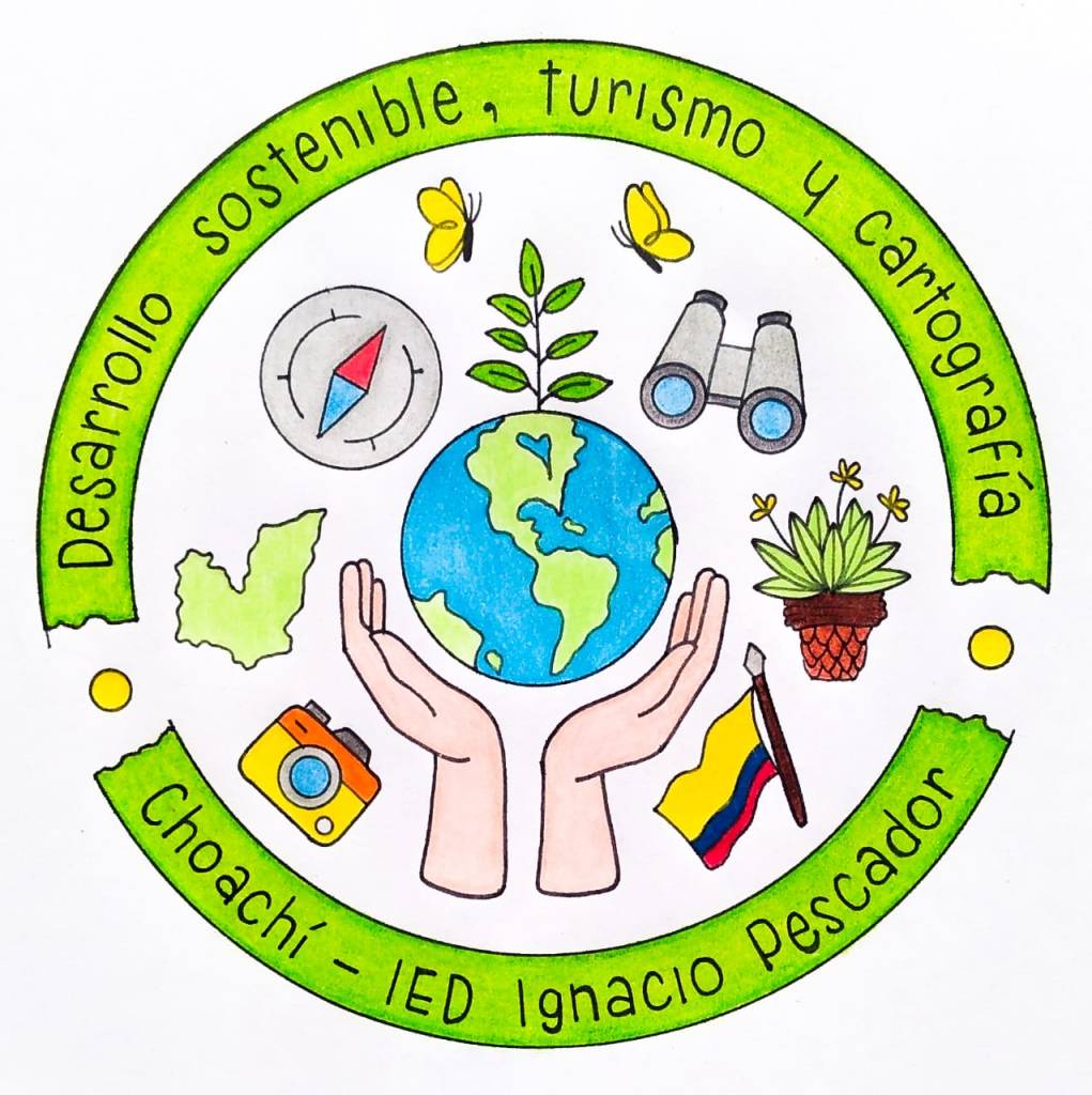 logo del proyecto
Es con gran placer que informamos que el equipo ganador por Colombia de la edición 2023 del concurso Proyectos con Estudiantes y gvSIG Batoví fue seleccionado para el Programa de entrenamiento en el uso pedagógico de las TIC – Convocatoria 2024
Como resultado, el proyecto viaja a Corea del Sur.
Postulación al programa ICT Training for Colombian Teachers 2024: Estrategia desarrollo sostenible, turismo y cartografia en Choachí.Nos llena de orgullo saber que la iniciativa del Curso – Concurso Geoalfabetización mediante la utilización de Tecnologías de la Información Geográfica (que en el año 2023 tuvo por primera vez participantes fuera de Uruguay) permita que un proyecto desarrollado en Colombia (y que ameritó haber sido declarado ganador del concurso) dé a conocer la experiencia aún más internacionalmente.
 el equipo colombiano ganador con los diplomas del concurso Proyectos de Geografía con estudiantes y gvSIG Batoví
Felicitamos a la profesora Astrid Corredor por el logro obtenido. Estos resultados son los que nos convencen cada día de continuar con la iniciativa del curso-concurso para seguir difundiendo el uso de las Tecnologías Libres de Información Geográfica como herramientas de enseñanza y de generación de conocimiento.
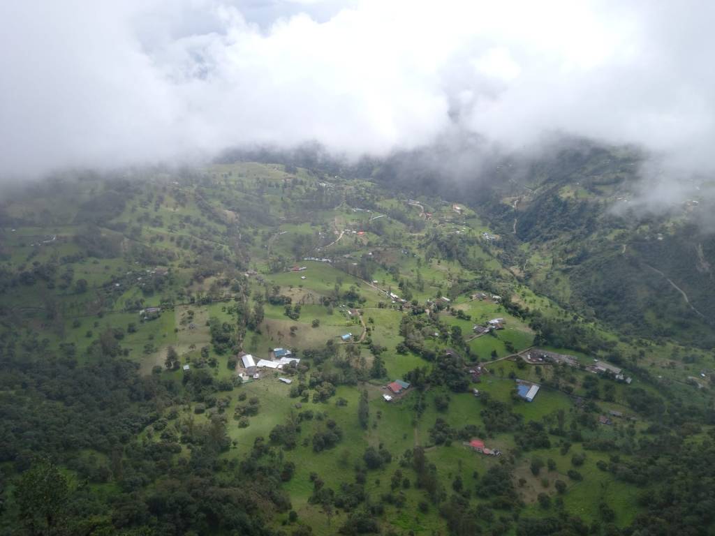 vista del municipio de Choachí desde el páramo

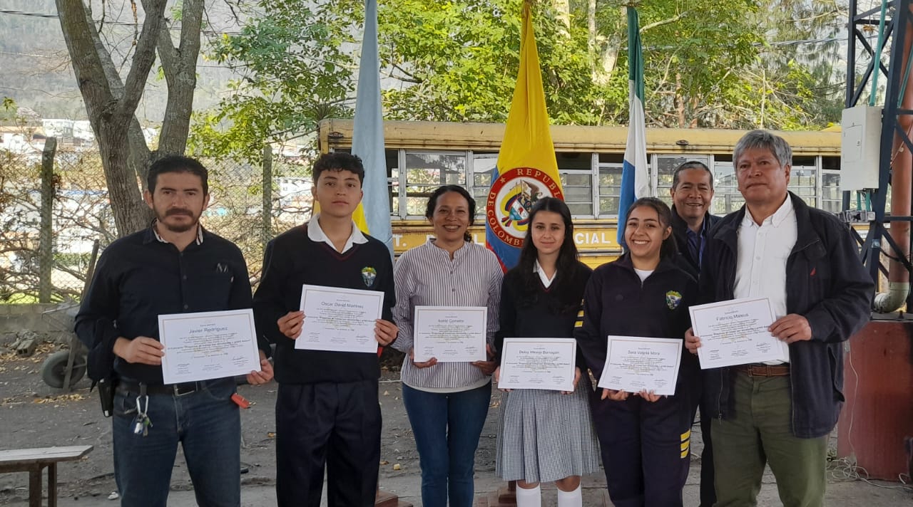
-
14:37
Les nouveautés Giro3D 0.35
sur Oslandia
Giro3D est une bibliothèque Javascript de visualisation de données géospatiales sur le Web. Notamment utilisée par l’application Piero, elle est compatible avec de nombreuses sources de données rasters et vecteurs, ainsi que 3D comme les nuages de points.
La version 0.35 apporte de nombreuses évolutions, et notamment d’importantes améliorations de performance utiles pour les scènes complexes combinant de nombreuses sources de données.
Améliorations de performancesCes améliorations touchent principalement à l’affichage des données rasters (couleur ou élevation) sur l’entité Map:
- Réduction de l’usage mémoire des tuiles de Map
- Réduction de la latence d’affichage des images sur la Map
- Réduction du nombres de requêtes HTTP nécessaires
- Augmentation de la vitesse de traitement des tuiles
 Voir l’exemple interactif
Les entités Map et les nuages de points supportent maintenant le brouillard THREE.js, permettant de donner des effets atmosphériques à vos scènes.
Brouillard dans Giro3D
Le graticule géographique Voir l’exemple dédiéL’entité Map permet désormais d’afficher un graticule géographique entièrement paramétrable sur sa surface:
- réglage du pas en X et en Y
- origine du repère
- couleur
- opacité
- épaisseur des traits
Le graticule avec un pas de 500 mètres.
GeoTIFF YCbCr et masques de transparence Voir l’exemple interactifLes images GeoTIFF peuvent embarquer des masques de transparence. Ils sont désormais supportés dans Giro3D.
Il est maintenant possible d’afficher des images GeoTIFF dans l’espace colorimétrique YCbCr. Cet espace colorimétrique, couplé à la compression JPEG, permet de réduire considérablement la taille des images couleur GeoTIFF (par rapport à des compressions comme LZW ou DEFLATE).
Une image GeoTIFF compressée en JPEG, utilisant l’espace colorimétrique YCbCr et un masque de transparence. La bordure verte indique la limite de l’image, et n’est pas visible par défaut.
-
11:00
Mappery: Great Lakes Drainage Basin Map Umbrella
sur Planet OSGeo
Matt Malone was one happy geographer when he got this umbrella for Christmas.
MapsintheWild Great Lakes Drainage Basin Map Umbrella
-
10:03
Un outil immersif pour explorer les globes de la collection David Rumsey
sur Cartographies numériques
L'application Globes est conçue en collaboration entre l'Université Monash et le David Rumsey Map Center de Stanford. Cet outil immersif permet aux utilisateurs d'explorer des reproductions détaillées de cartes historiques, avec la possibilité de les mettre à l'échelle, de les faire pivoter et de les positionner librement. L'application vise à offrir aux utilisateurs une nouvelle manière d'interagir avec la collection de cartes de David Rumsey .
Le but de ce projet est de créer un outil immersif à la fois pour les passionnés et pour les chercheurs. Il s'appuie sur les travaux antérieurs du groupe de visualisation immersive de l'université Monash, qui étudie l'application de la réalité augmentée et des technologies interactives à la visualisation de cartes. Leurs travaux sur le développement de globes tangibles et la facilitation des interactions gestuelles pour les cartes démontrent le potentiel de ces technologies pour améliorer l'accessibilité aux données géographiques. L'Apple Vision Pro introduit de nouvelles possibilités dans cet espace grâce à son paradigme d'interaction naturel, permettant une navigation plus facile dans les interfaces spatiales, ce qui marque une avancée au-delà des appareils existants.Collaboration between the Rumsey Map Center at Stanford and Monash University’s Embodied Visualisation Group has produced Globes, an App for the new Apple Vision Pro. Blog post by Dilpreet Singh who with Bernie Jenny and Kadek Satriadi developed the App. [https:]] pic.twitter.com/2JeAF7Zbgv
— David Rumsey (@DavidRumseyMaps) April 11, 2024
Pour compléter
Vous avez dit "toucher des yeux ?" Avec la nouvelle génération de globes tangibles permettant une visualisation en réalité augmentée, c'est en train de devenir possible :
« Tangible Globes for Data Visualisation in Augmented Reality ». Kadek Ananta Satriadi, Jim Smiley, Barrett Ens, Maxime Cordeil, Tobias Czauderna, Benjamin Lee, Ying Yang, Tim Dwyer, Bernhard Jenny, CHI Conference on Human Factors in Computing Systems 2022. New Orleans, USA.Source : [https:]]
Articles connexes
De la supériorité du globe sur la carte pour enseigner la géographie. Un vieux débat
L'histoire par les cartes : 18 globes interactifs ajoutés à la collection David Rumsey
Rechercher du texte sur les cartes de la collection David Rumsey
Le monde en sphères. Une exposition virtuelle de la BnF
Simuler des courbes de niveau en réalité augmentée dans un bac à sable
La navigation en réalité augmentée arrive sur Google Maps
Globes virtuels et applicatifs
Cartes et atlas historiques
-
The 2024 Submarine Cable Map
sur Google Maps ManiaEvery year the telecommunications company Telegeography releases a new, updated version of its Submarine Cable map. This map shows all the undersea telecommunication cables which carry data around the world.The 2024 Submarine Cable Map is now available. Subsea cables carry telecommunication signals under the oceans, communicating information between different countries and regions of the
-
8:20
Participez le 4 juin 2024 au Colloque "souveraineté et données géolocalisées : le temps de l'action"
sur Conseil national de l'information géolocaliséeParticipez le 4 juin 2024 au Colloque "souveraineté et données géolocalisées : le temps de l'action"
-
19:01
Pollution lumineuse et trame noire à partir des données de radiance nocturne
sur Cartographies numériques
Le Cerema fournit une cartographie départementale de la radiance nocturne à partir des données du satellite LuoJia. Une visualisation cartographique des données en ligne est proposée sur le portail Cartagene du Cerema.La livraison est sous forme d'un dossier compressé (.zip) par département (région pour l'Ile-de-France), contenant la cartographie raster (.tif), un fichier de style pour l'affichage sur le logiciel QGIS (.qml), un fichier vecteur indiquant les dates et heures d'acquisition (.shp), et les métadonnées (.xml).

Que représentent ces cartes ?
Ces cartes représentent la radiance nocturne vue par le satellite LuoJia 1-01 en 2018, exprimée en nW.cm-2.sr-1, au pas de 130 m. Elles sont livrées par département.
De quand ces cartes sont-elles représentatives ?
Ces cartes sont représentatives de l’année 2018. Elles ont été construites par concaténation de toutes les images disponibles et exploitables du satellite LuoJia, acquises entre juin et octobre 2018. L’ancienneté de ces cartes implique des différences avec la situation actuelle, mais elles restent un excellent outil de pré-diagnostic de la trame noire. L’heure de passage locale du satellite se situe entre 22h30 et minuit. Les heures et jours précis d’acquisition sont disponibles dans les fichiers vecteur (.shp) qui accompagnent la donnée.
Pourquoi certains départements ne sont pas disponibles ?
80 départements sont disponibles. Les départements de la frange Ouest de la France ainsi que les DROMn’ont pas été capturés par le satellite nocturne utilisé (LuoJia 1-01). Il n’existe donc pas d’image disponible sur ces zones. D’autres départements du Nord de la France présentaient de nombreux nuages lors du passage du satellite : la plupart des sources lumineuses sont donc invisibles et les images ne sont pas exploitables. Cependant, certains départements ont été capturés partiellement (ou partiellement sans nuages) ; il est donc possible de produire à la demande les cartographies sur les EPCI ou villes disponibles. Sur certains départements (27, 32, et 61), la surface non disponible étant mineure, la cartographie a été réalisée et livrée, mais certaines zones du territoire ne contiennent pas de données.
Quelles sont les caractéristiques techniques de ces cartes ?
Ces cartes sont livrées au format raster GeoTiff (.tif), par département, avec un volume d’environ 3-5 Mo par fichier. Le système de coordonnées géographique est l’EPSG 2154 (système de coordonnées pour la France, projection Lambert 93). La résolution spatiale vaut 130 m x 130 m. La valeur attribuée aux no-data est 100000. Le reste des caractéristiques techniques des cartes est décrit dans le fichier de métadonnées (.xml) qui les accompagne. Les cartes peuvent être affichées et exploitées avec un logiciel SIG (QGIS ou ArcGIS par exemple).
Quelle est l’unité de ces cartes et que représente-t-elle ?
nW.cm-2.sr-1 : nanowatts par centimètres carrés par stéradians. Elle représente la radiance (également appelée luminance énergétique) qui est la puissance d'un rayonnement émis par un élément de surface, dans une direction donnée, par unité de surface (centimètres carrés) et par unité d'angle solide (stéradians). Ce rayonnement peut être direct (ex : source émettant vers le ciel) ou indirect (ex : lumière réfléchie par la route).
Quel est le style associé à ces cartes ?
Lefichier de style proposé (.qml) se charge automatiquement dans QGIS à l’ouverture de la carte raster. Sinon, il peut être chargé via l’onglet « Propriétés de la couche » > « Symbologie » > « Style » > « Charger le style ». L’échelle proposée est logarithmique afin de visualiser correctement l’éclairage nocturne en zonesombre(rurale) commeéclairée(urbaine). Les plages decouleurssont les suivantes : les valeurs 0 et 100000 (no-data) sont affichées en transparence pour une meilleure visualisation. Un style secondaire avec une échelle logarithmique aux couleurs viridis (du jaune au bleu) est aussi disponible dans la section « Fichiers secondaires » de la page data.gouv.fr. L’utilisateur peut modifier le style de visualisation à sa guise, selon son besoin.
Pourquoi n’y a t’il pas de valeurs proches de 0 ? A qui s’adresse cette donnée ?
Les valeurs situées entre 0 et 2 nW.cm-2.sr-1 ont été seuillées à la valeur 0 afin d’éviter du bruit parfois trompeur et hétérogène dans les zones sombres. Cette cartographie de radiance est à destination des techniciens (SIG) des services publics en charge des sujets de l’éclairage, de la biodiversité et de l’énergie. Les entités publiques les plus à même d’exploiter ces données sont les syndicats d’énergie, les SCOT, les métropoles ou les régions. Les bureaux d’étude ou agences d’urbanismes sont aussi invités à se saisir de ces informations pour la construction d’un état initial d’un SCOT par exemple.
Comment interpréter et exploiter ces cartes ?
La résolution spatiale des cartes (130 m) permet de réaliser des études à l’échelle des quartiers, des communes, et des villes, mais elle n’est pas adaptée à des études plus fines, par exemple à l’échelle des rues ou des bâtiments. On ne peut pas discerner les points lumineux. Une observation depuis le ciel (par satellite ou avion) diffère d’une observation depuis le sol pour différentes raisons : orientation des sources lumineuses, réflexion sur le sol ou sur différents matériaux, recouvrement de la lumière par de la végétation ou des bâtiments, etc. Les radiances observées peuvent varier selon l’angle et l’heure de prise de vue, la météo, l’angle et la phase de la Lune, les résidus d’éclairement solaire en été, etc. Les valeurs absolues de radiance ne doivent donc pas être utilisées pour des comparaisons quantitatives. Par contre, ces cartes fournissent d’excellentes indications qualitatives sur les secteurs les plus émetteurs de lumière, publics et privés.
A quoi peut-elle servir et comment ?
Des exemples d’exploitation réalisés par le Cerema sur la région Provence Alpes Côte d’Azur, la métropole Aix Marseille Provence, et la métropole de Nice Côte d’Azur sont présentés dans le rapport d’étude associé.
Quelle(s) autre(s) source(s) de données peut-on utiliser sur les départements non disponibles ?
Les utilisateurs peuvent se diriger vers les données du satellite VIIRS, qui acquiert une donnée chaque jour mais àplusfaible résolution (500 m) et qui couvre le monde entier. EOSDIS Worldview (nasa.gov) Si les applications souhaitées nécessitent une meilleure résolution, d’autres satellites comme Jilin ou SDGSAT-1 ( [https:]] ) permettent d’obtenir des cartographies plus fines. Les utilisateurs sont invités à contacter le Cerema ou des acteurs privés comme La TeleScop, qui détiennent une expertise de haut niveau sur le sujet.
Y aura-t-il une mise à jour de ces cartes ?
Ces cartes ne seront pas mises à jour car le satellite utilisé (LuoJia 1-01) était un satellite de démonstration qui n’a produit des images qu’en 2018. Cependant, le Cerema étudie la possibilité d’utiliser d’autres données plus récentes pour approfondir le sujet.
Lien ajouté le 15 avril 2024
Articles connexesPollution lumineuse et biodiversité à La Réunion
— Sylvain Genevois (@mirbole01) April 15, 2024
"Cilaos : plus de 150 pétrels retrouvés échoués cette nuit" [https:]]
Les cartes d'émission ou de pollution lumineuse : quelles différences, quels usages ?
Les photos de la Terre prises par Thomas Pesquet lors de ses missions spatiales
Greenpeace dresse une carte mondiale de la pollution au SO? à partir d'images de la NASA
Cartographie de la pollution atmosphérique NO2 à l'échelle mondiale (à partir des images Copernicus Sentinel-5P - ESA) Des cartes pour alerter sur la pollution de l'air autour des écoles à Paris et à Marseille
Une cartographie du niveau de pollution de l'air à Paris

-
11:00
Mappery: As Strong as Worcester Sauce
sur Planet OSGeo
Harry Wood spotted this on the Archway Road in north London. I’m guessing that this is a removal van with some strong people but the connection to Worcester Sauce baffles me
MapsintheWild As Strong as Worcester Sauce
-
Access Control : une bibliothèque PHP pour gérer des droits d'accès
sur Makina CorpusNous avons récemment abouti un projet de gestion métier opérationnel, dont la durée de vie et la maintenance sont planifiées pour de nombreuses années. Dans ce contexte, nous avons expérimenté un passage de celui-ci sur l’architecture hexagonale et la clean architecture.
-
7:00
Étude EDF Indoor – déplacements & guidage en intérieur et réalisation d’un prototype
sur OslandiaEDF a sollicité les équipes d’Oslandia pour la réalisation d’une étude puis une preuve de concept sous forme de logiciel prototype. L’étude comprend un rapport et des préconisations sur la cartographie indoor, l’analyse des déplacements et le guidage à l’intérieur de bâtiments et plus spécifiquement de centrales nucléaires. Le prototype concerne le calcul d’itinéraires.
ContexteLes centrales nucléaires sont des bâtiments complexes comprenant des zones pouvant être temporairement fermées à la circulation et / ou présentant une dangerosité pour le personnel. Les déplacements à l’intérieur de ces bâtiments nécessitent donc des calculs d’itinéraires, réalisés actuellement avant l’intervention. EDF R&D souhaite disposer d’une application mobile pour optimiser les déplacements de ses personnels de façon dynamique, et garantir leur sécurité.
L’étude OslandiaCette étude a permis de définir une architecture globale de la solution ainsi que différentes préconisations et scénarii concernant la technologie utilisée pour développer l’application mobile.
Oslandia a proposé un modèle relationnel de données correspondant au besoin fonctionnel et compatible avec le standard IndoorGML, puis une proposition d’architecture logicielle globale de la solution, des différents flux applicatifs et les considérations de sécurité des données.
Enfin, plusieurs scénarii basés sur des technologies différentes sont envisagés pour le développement de l’application mobile (QFIELD, OSMAND, application spécifique), avec pour chacun les avantages et inconvénients de la solution.
Le prototype : calcul d’itinérairesSuite à l’étude, une demande de réalisation de POC (Proof Of Concept) a été commandée par EDF. Ce prototype concerne le calcul du graphe de déplacement et des itinéraires. Pour le calcul du graphe, les technologies PostgreSQL et PostGIS ont été utilisées. Concernant les calculs d’itinéraires, l’extension pgRouting de PostgreSQL a été mise en œuvre.
Les étapes :- Nettoyage des données (topologie)
- Extraction des sols et des murs par niveau
- Découpage des sols en cellules à l’aide de l’algorithme de Voronoï
- Ajout des ascenseurs, escaliers et crinolines pour la navigation entre les niveaux
- Calcul du graphe de déplacement
- Calcul des itinéraires avec pgRouting
- Fermeture des zones à forte radioactivité
- Navigation entre différents équipements
- Ajout de barrières infranchissables (zone de chantiers,…)
- Possibilité d’utiliser des sols à des altitudes différentes dans un même étage (passerelles, escalier vers une plateforme surélevée).
 Voilà une vidéo de démo du prototype :
Conclusion
Voilà une vidéo de démo du prototype :
Conclusion
Ce travail a permis de valider la faisabilité d’une application mobile permettant d’optimiser les déplacements dans les environnements contraints et dangereux gérés par EDF. Le travail d’Oslandia sur un traitement de la donnée intelligent et des algorithmes adaptés ont levé les verrous sur la faisabilité fonctionnelle de l’optimisation des déplacements pour la sécurité des personnes.
Le travail réalisé avec une modalité étude et le prototype ont montré une forte efficacité et une concrétisation des préconisations.
Le chemin est désormais libre et optimisé pour la réalisation d’une application complète.
-
6:50
DeltaDTM : un modèle numérique de terrain côtier à l'échelle mondiale
sur Cartographies numériques
Les données d'élévation des côtes sont essentielles pour une grande variété d'applications, telles que la gestion côtière, la modélisation des inondations ou encore la planification de l'adaptation au changement. Les zones côtières de basse altitude inférieures ou égales à 10 m par rapport au niveau moyen de la mer (MSL) risquent de connaître des changements rapides en raison de l'élévation du niveau de la mer (SLR) et de l'évolution des conditions météorologiques extrêmes. Les ensembles de données d’altitude actuellement disponibles gratuitement n'étaient pas suffisamment précises pour modéliser ces risques.DeltaDTM fournit un modèle numérique de terrain (MNT) côtier disponible dans le domaine public, avec une résolution spatiale horizontale de 30 m et une erreur absolue moyenne verticale (MAE) de 0,45 m à l'échelle mondiale. DeltaDTM corrige le modèle CopernicusDEM grâce aux données lidar issues des missions ICESat-2 et GEDI. Plus précisément, il corrige le biais d'élévation de CopernicusDEM, applique des filtres pour supprimer les cellules hors terrain et comble les lacunes par interpolation. L'approche par classification produit des résultats plus précis que les méthodes de régression (y compris l'apprentissage automatique) récemment utilisées par d'autres pour corriger les DEM, qui atteignent au mieux un MAE global de 0,72 m. DeltaDTM est susceptible de fournir une ressource précieuse pour la modélisation de l'impact des inondations côtières et pour d'autres applications.
Erreur moyenne globale de DeltaDTM par tuile lors d'une validation croisée par rapport à ICESat-2
sous forme de points (source : Pronk et al., 2024)
Les données sont disponibles en licence Creative Communs 4.0. Elles sont à télécharger par continents sur le site 4TU.ResearchData.Pour en savoir plus : Pronk, M., Hooijer, A., Eilander, D. et al. DeltaDTM : A global coastal digital terrain model. Sci Data 11, 273 (2024). [https:]]
Articles connexes
FABDEM, un nouveau modèle d'élévation dérivé des données Copernicus (GLO-30 DEM)
La NASA publie un nouveau modèle numérique d'élévation (février 2020)
Lidar HD : vers une nouvelle cartographie 3D du territoire français (IGN)
Des images Lidar pour rendre visible l'invisible. L'exemple de l'archéologie
Découvrir les structures cachées du paysage grâce au lidar (Cesbio)
Images 3D, MNT et MNE
-
Mapping Conflicts Around the World
sur Google Maps ManiaIn 2024 the specter of military conflicts haunts the world. Israel is engaged in conflict in Gaza, Russia continues its illegal invasion of Ukraine and the Syrian civil war is now in its thirteenth year. It should be a matter of extreme shame that there are so many organizations who feel the need to publish interactive maps dedicated to tracking the progress of military action around the globe.
-
18:00
Paul Ramsey: Cancer 1
sur Planet OSGeoA little over a month ago, three days after my 53rd birthday, I received a diagnosis of rectal cancer. Happy birthday to me.
Since then, I have been wrestling with how public to be about it. I have a sense that writing is good for me. But it also keeps like milk. I wrote most of this a couple weeks ago and my head space has already evolved.
So writing like this is mostly a work of self-absorption (I’m sure you can forgive me) but hopefully it also helps to raise awareness amongst the cohort of people who might know me or read this.
Colorectal cancer rates are going up, and the expected age of occurance is going down. Please get screened. No matter your age, ask your clinician for a “FIT test”. If you’re over 45, just ask for a colonoscopy, the FIT test isn’t perfect.
I have a pretty good prognosis, mostly because my case was caught by screening, not by experiencing symptoms bad enough to warrant a trip to the doctor. Most of the people who get diagnosed after showing symptoms have it worse than I, and will have a longer, harder road to recovery. Get screened.
Our language of cancer borrows a bit from the language of contagion. I “got” cancer. It’s not quite a neutral description, there’s a hint of agency in there, maybe I did something wrong? This article drives me crazy, the author “went vegan and became a distance runner” after his father died of colorectal cancer.
Sorry friend, cancer is not something you “get”, and it’s not something you can opt out of with clean living. It’s something that happens to you. Take it from this running, cycling, ocean rowing, rock climbing, healthy eater – driving down the marginal probability of cancer (and heart disease (and depression (and more))) with exercise and diet is its own reward, but you are not in control. When cancer wants you, it will come for you.

This is why you should get screened (right?). It’s the one way to proactively protect yourself. The amazing thing about a colonoscopy is, not only can it detect cancer, but it also prevent it, by removing pre-cancerous polyps. It’s possible that screening could have prevented my case, if I had been screened a few years earlier.
I am now a denizen of numerous Facebook fora for fellow travellers along this life path, and one of the posts last week asked “what do you think cancer taught you”? I am a little too early on the path to write an answer myself, but one woman’s answer struck me.
She said it taught her that control is an illusion.
Before, I had plans. I could tell you I was going to go places, and do things, and when I was going to do them, next month, next season, next year. I was in control. Now, I can tell you what I will be doing next week. Perhaps. The rest is in other hands than mine.
Talk to you again soon, inshalla.
-
12:05
Distribution énergétique
sur SIGMAG & SIGTV.FR - Un autre regard sur la géomatique EnRezo, la nouvelle application du Cerema, est une plate-forme cartographique qui aide à identifier les réseaux de chaleur et de froid existants et leur potentiel de développement. Elle est destinée à évaluer les opportunités en matière de nouveaux projets ou d’extension de réseaux et les références de façon préconstruite. L’outil propose des informations sur les besoins en chaleur et en froid des bâtiments, les ressources d’énergies renouvelables disponibles. Des retours d’expériences sont attendus afin de l’améliorer en ajoutant par exemple des indicateurs sur les modes de chauffage et les régimes de température et des analyses thématiques sur le potentiel solaire thermique. Ou encore, la disponibilité de la ressource biomasse ou encore des données sur la précarité énergétique des bâtiments. La mise à jour des données devrait être régulière. L’application va disposer d’une version « expert » pour offrir plus de données et d’analyses.
+ d'infos :
cartagene.cerema.fr
-
11:00
Mappery: The World in a Coffee Shop
sur Planet OSGeo
Irdi spotted this in the STOA coffee shop in Tirana. I’m not sure what the map is showing, but it’s fun
MapsintheWild The World in a Coffee Shop
-
Canada's Hidden Subterranean Rivers
sur Google Maps ManiaCanadian cities, like many cities around the world, have a history of hiding waterways underground. As cities grow rivers can become obstacles to the movement of people, can be seen as wasted real-estate, and historically (when cities had poor sanitation) they often became open sewers. For these reasons cities often culvert and divert rivers underground.In Discover Where Ancient Rivers Flow CBC
-
Revoir les webinaires : découverte de l’outil CANARI-France
sur Makina CorpusL’application CANARI-France est destiné aux acteurs agricoles afin de calculer des indicateurs agro-climatiques à partir de projections climatiques. Découvrer en le replay des 4 webinaires organisés par Solagro et l’ADEME.
-
19:12
Simulateur de vote et résultats aux élections présidentielles aux États-Unis
sur Cartographies numériques
Source : What would it take to turn blue states red ? (G. Elliott Morris, Amina Brown, Aaron Bycoffe)Que faudrait-il pour faire basculer électoralement les États bleus en rouge ou inversement ? Comment les changements dans l'orientation du vote et dans la participation des principaux groupes démographiques pourraient affecter l’élection présidentielle de 2024 aux Etats-Unis ?
Le simulateur Swing-O-Matic montre ce qui pourrait arriver lors des élections de 2024 si le président Joe Biden ou l'ancien président Donald Trump gagnait du terrain auprès de certains groupes démographiques et si le taux de participation changeait. Pour construire ce simulateur, les auteurs ont utilisé les données de l'US Census Bureau et plusieurs sondages pour estimer le taux de participation et les choix de vote aux élections de 2020, répartis à partir de 5 variables clés sur le plan démographique : l'âge, l'éducation, le sexe, le revenu et la race. La carte de départ reflète les préférences électorales et les niveaux de participation de 2020, ajustés aux changements démographiques depuis lors.
L'intérêt de ce simulateur est de pouvoir tester différents scénarios :- Scénario à faible taux de participation et vote élevé du Third-Party parmi les jeunes électeurs
- Scénario où les électeurs non universitaires et non blancs se tournent vers la droite
- Scénario à faible taux de participation des électeurs non universitaires et des électeurs blancs
- Scénario où les électeurs plus âgés et les électeurs blancs se tournent vers la gauche
Pour compléter
Dans le même type de représentation schématique, voici une "carte" spatio-temporelle des élections présidentielles américaines par Etat entre 1788 et 2020 (DataIsBeautiful). Créé par XenBuild à partir des données de la page Wikipedia des élections présidentielles aux Etats-Unis, ce tableau donne une vue synoptique de tous les Etats qui sont proches par le comportement électoral.
The Economist propose de construire un profil type de l'électeur américain en jouant sur différentes variables (âge, sexe, race, religion, niveau d'études, rural/urbain...). Les données sont basées sur les données d'enquête YouGov 2023 réalisées chaque semaine à partir d'un échantillon de 1500 Américains.
Articles connexes
S'initier à la cartographie électorale à travers l'exemple des élections présidentielles de novembre 2020 aux Etats-Unis
L'attaque du Capitole reconstituée en cartes et en vidéos
Cartographie électorale, gerrymandering et fake-news aux Etats-Unis
La suppression de la Racial Dot Map et la question sensible de la cartographie des données ethniques aux Etats-Unis
Le « redlining » : retour sur une pratique cartographique discriminatoire qui a laissé des traces aux Etats-Unis
Analyser les cartes et les données des élections présidentielles d'avril 2022 en France
La carte, objet éminemment politique : exemple des élections européennes
Dis-moi où tu vis, je te dirai ce que tu votes ? (Géographie à la carte, France Culture)

-
Conseils & Astuces ArcGIS Online - N°187
sur arcOrama, un blog sur les SIG, ceux d ESRI en particulierN°187 - Afficher une barre graphique de statistiques de l'ensemble des entités de la couche dans des fenêtres contextuelles avec Arcade
Dans mon article précédent, je vous donnais un exemple d'expression Arcade pour afficher un tableau de statiques et permettre ainsi à l'utilisateur de comparer la valeur de l'entité courante à l'ensemble des valeurs des entités de la couche. La présentation en tableau est simple à comprendre pour un large public mais on peut envisager une représentation plus scientifique et plus graphique en intégrant notamment les informations liées à l'écart type de la série de valeurs de l'ensemble du jeu de données. Dans cet article, je vous propose une expression Arcade qui affiche une barre graphique reprenant la valeur de l'entité courante ainsi que les indicateurs statistiques : min, max, moyenne et écart-type, sur l'ensemble du jeu de données.
Reprenons l'exemple d'une couche d'enseignes de jardinage sur le département de la Manche qui contient des champs avec les chiffres d'affaire 2022 pour chaque magasin. Nous souhaitons pouvoir consulter le chiffre d'affaire de chaque magasin mais également pouvoir le comparer avec le chiffres d'affaire total de l'ensemble des magasins.
Voici comment vous pouvez utiliser Arcade pour afficher les statistiques souhaitées (min, max, moyenne, total, ...), dans la fenêtre contextuelle, en utilisant un tableau.- Après avoir ajouté la couche des jardineries dans la carte, vous afficherez l'interface de définition des fenêtres contextuelles. Vous supprimerez la liste des champs proposée par défaut et vous ajouterez une expression Arcade.
- Vous donnerez tout d'abord un nom à votre expression, par exemple ici : "Comparaison du chiffre d'affaire 2022".
 Vous saisirez ensuite l'expression Arcade suivante :
Expects($feature, "*") // Nom du champ contenant les valeurs var nom_champ = "CA2022" // Récupération de la valeur de l'entités courante var valeur = $feature[nom_champ] // Largeur de la barre graphique var largeur_barre = 400 // Titre du graphique var titre = "Chiffre d'affaire 2022 :" // Unités des valeurs présentées var unite = "€" // Couleur principale de la barre graphique var couleur_barre ="#EBF5FB" // Couleur pour la zone de l'intervalle d'un ecart-type autour de la moyenne var couleur_zone_ecart_type ="#AED6F1" // Calcul des statistiques var valeur_min = Min($layer,nom_champ) var valeur_max = Max($layer,nom_champ) var valeur_moy = Mean($layer,nom_champ) var valeur_std = Stdev($layer,nom_champ) // Calcul des largeurs (en pixels) des différentes zones de la barre graphique var plage = valeur_max - valeur_min var plage_valeur1 = ((valeur-valeur_min)/plage) * largeur_barre var plage_valeur2 = ((valeur_max-valeur)/plage) * largeur_barre var plage_std1 = ((valeur_moy-valeur_std-valeur_min)/plage) * largeur_barre var plage_std2 = ((valeur_max-(valeur_moy+valeur_std))/plage) * largeur_barre var plage_std = largeur_barre-plage_std1-plage_std2 // Construction de la chaîne HTML qui présentera les informations var strHTML = "<span style='font-family: arial;font-size: 10pt;'>" strHTML += Titre strHTML += "</span><br/><br/>" // Premier tableau HTML contenant min, moyenne et max strHTML += "<table style='border-collapse: collapse;width:"+Text(largeur_barre)+"px'>" strHTML += "<tr style='height:10px'><td style='width:"+Text(plage_std1+40) + "px;text-align: left;font-family: arial;font-size: 8pt;'>Min:<br/>" + Text(valeur_min) + " " + Text(unite) + "</td>" strHTML += "<td colspan='2' style='width:"+Text((plage_std)-80) + "px;text-align: center;font-family: arial;font-size: 8pt;'>Moy:<br/>" + Text(valeur_moy,'#')+ " " + Text(unite) + "</td>" strHTML += "<td style='width:"+Text(plage_std2+40) + "px;text-align: right;font-family: arial;font-size: 8pt;'>Max:<br/>" + Text(valeur_max)+ " " + Text(unite) + "</td>" strHTML += "</tr>" strHTML +="</table>" // Second tableau HTML contenant la barre du graphique strHTML += "<table style='border-collapse: collapse;width:"+Text(largeur_barre)+"px'>" strHTML += "<tr style='height:20px'>" strHTML += "<td style='border-left: 1px solid #000;width:"+ Text(plage_std1)+"px;background-color: " + couleur_barre + "'/>" strHTML += "<td style='width:"+Text(plage_std/2) + "px;text-align: center;font-family: arial;font-size: 8pt;background-color: " + couleur_zone_ecart_type + ";" + "border-right: 1px solid #000;'>-σ</td>" strHTML += "<td style='width:"+Text(plage_std/2) + "px;text-align: center;font-family: arial;font-size: 8pt;background-color: " + couleur_zone_ecart_type + "'>" + "+σ</td>" strHTML += "<td style='border-right: 1px solid #000;width:"+Text(plage_std2)+"px;background-color: " + couleur_barre + "'/>" strHTML += "</tr>" strHTML +="</table>" // Troisième tableau HTML pour afficher le curseur de la valeur courante var alignement_fleche_valeur ="center" if(plage_valeur1==0){alignement_fleche_valeur ="left"} if(plage_valeur2==0){alignement_fleche_valeur ="right"} strHTML += "<table style='border-collapse: collapse;width:"+Text(largeur_barre)+"px'>" strHTML += "<tr style='height:10px'>" if(plage_valeur1>0){ strHTML += "<td style='width:"+Text(plage_valeur1-1)+"px'/>" } strHTML += "<td style='width:2px;text-align: " + alignement_fleche_valeur + ";font-family: arial;font-size: 12pt;'><b>❘</b></td>" //↑ if(plage_valeur2>0){ strHTML += "<td style='width:"+Text(plage_valeur2-1)+"px'/>" } strHTML += "</tr>" strHTML +="</table>" // Quatrième tableau pour afficher la valeur courante var alignement_texte_valeur ="center" if(plage_valeur1<50){alignement_texte_valeur ="left"} if(plage_valeur2<50){alignement_texte_valeur ="right"} strHTML += "<table style='border-collapse: collapse;width:"+Text(largeur_barre)+"px'>" strHTML += "<tr style='height:10px'>" if(plage_valeur1>50){ strHTML += "<td style='width:"+Text(plage_valeur1-50)+"px'/>" } strHTML += "<td style='width:100px;text-align: " + alignement_texte_valeur + ";font-family: arial;font-size: 8pt;'><b>" + Text(valeur,'#.##')+ " " + Text(unite) + "</b></td>" if(plage_valeur2>50){ strHTML += "<td style='width:"+Text(plage_valeur2-50)+"px'/>" } strHTML += "</tr>" strHTML +="</table>" // On renvoie la chaîne HTML pour remplir la fenêtre contextuelle return { type : 'text', text : strHTML }- Votre carte affiche désormais un tableau avec l'information sur la valeur du chiffre d'affaire du magasin mais également le chiffre d'affaire minimum, maximum, moyen et total de l'ensemble du jeu de données. Le tableau intègre aussi le nombre total d'entités et la part du chiffre d'affaire par rapport au total. On notera que si la couche possède un ensemble de définition, les statistiques ne seront calculées que sur les entités filtrées.
- Vous pouvez maintenant modifier le nom du champ, le titre, les couleurs, ... et même le code HTML pour personnaliser l'aspect de cette barre graphique de statistiques.
Si vous souhaitez afficher cette barre de statistiques pour plusieurs champs de votre couche, plutôt que de rédiger une expression Arcade unique, je vous recommande d'insérer plusieurs blocs Arcade en dupliquant celui que vous venez de réaliser.
Après avoir modifié le nom du champ, le titre et les couleurs, vous pourrez obtenir ce type de rendu pour votre fenêtre contextuelle :
Bonne route sur ArcGIS Online ! Pour retrouver l'ensemble des Conseils & Astuces ArcGIS Online, cliquez sur ce lien.
- Après avoir ajouté la couche des jardineries dans la carte, vous afficherez l'interface de définition des fenêtres contextuelles. Vous supprimerez la liste des champs proposée par défaut et vous ajouterez une expression Arcade.


-
11:00
Le #30DayChartChallenge, un défi communautaire pour réaliser la meilleure datavisualisation
sur Cartographies numériquesLe #30DayChartChallenge est un défi communautaire qui se déroule chaque année en avril sur le réseau X-Twitter. Chaque jour, une invite apparaît parmi cinq catégories : comparaisons, distributions, relations, séries chronologiques et incertitudes. Tout le monde est invité à contribuer, quelle que soit la source de données ou l'outil utilisé pour créer les visualisations (voir les règles de participation).
La première édition a eu lieu en 2021 avec 1 960 contributions du monde entier. Le défi est inspiré du #30DayMapChallenge lancé par Topi Tjukanov en 2019. Des réalisations les plus classiques aux plus originales, des sujets les plus légers aux plus sérieux, la diversité des productions est remarquable.
Sélection de quelques exemples de l'édition 2024 :
? #30DayChartChallenge #Day6: OECD (Data Day)
— Mireia? (@mireiacamacho75) April 6, 2024
?How countries use their land#rstats #ggplot2 #dataviz pic.twitter.com/OorDuJ3Z0Q
??For #Day9 of #30DayChartChallenge (distribution X major/minor), a #dataviz showing the creation of the yield gap between countries with the lowest and highest wheat yields
— Benjamin Nowak (@BjnNowak) April 9, 2024
?Link to #RStats code: [https:]] pic.twitter.com/gtPu2kdEPn
?? The #30DayChartChallenge is blowing my mind
— Yan Holtz (@R_Graph_Gallery) April 4, 2024
?? So many awesome charts published every day!
A few pictures by @LauraNavarroSol, @wisevis, @BjnNowak and @nrennie35
I will do a selection and include it in [https:]] ! pic.twitter.com/8MhK9jGL5ZPour compléter
- Portfolio de dataviz diverses et variées pour s'entraîner (Boris Mericskay)
- Animation d'un diagramme circulaire : l'évolution des navigateurs web depuis 1994 (Visual Capitalist)
- Tableau de bord croisant tableau, graphique et carte : les vaccinations contre le Covid19 dans le monde (Cartovista)
- Décomposition d'un graphique à secteurs : les 100 premières entreprises mondiales en 2021 (Visual Capitalist)
- Dataviz-inspiration.com présente 181 dataviz qui permettent de découvrir leur grande diversité et de trouver son inspiration (Dataviz-inspiration)
Cinquième édition du défi cartographique #30DayMapChallenge (novembre 2023)
Comment différencier infographie et data visualisation
Utiliser des graphiques animés pour donner à voir des évolutions et des ruptures
Data Viz project, une source d'inspiration pour créer ses propres data visualisations
Les dataviz des journaux vont-elles trop loin dans la manière de représenter le nombre de morts du coronavirus ?
La naissance des data visualisations et de l'imagination moderne
Les cartes et data visualisations de Topi Tjukanov : entre art et cartographie
Country T-SNE, une solution de data visualisation originale pour comparer des pays entre eux
La plateforme de data visualisation Flourish propose d'associer narration et exploration
-
11:00
Mappery: The Luggage That You Just Have to Have
sur Planet OSGeo
Raf spotted this beautiful luggage in a store in Takeshita Street in Tokyo
MapsintheWild The Luggage That You Just Have to Have
-
15 Minute US Cities
sur Google Maps ManiaThe idea of the 15 Minute City is that urban living is much more enjoyable and sustainable when all our essential needs are close by. These essential needs include such things as grocery stores, health care facilities, cultural attractions, transit stops, educational facilities and leisure activities. Individuals living in a 15 Minute neighborhood should be able to access all these essential
-
7:04
OPENGIS.ch: Status of Cloud Optimized Geospatial Formats
sur Planet OSGeo
Cloud-optimized formats are changing how we handle geospatial data, making it easier to access and work with large datasets directly in the cloud. These formats reduce the need to download entire datasets, facilitating quicker and more focused data analysis and visualization. For those interested in the specifics of these advancements, our recent Cloud Optimized Geospatial Formats – Status Report, offers an introduction into the topic, recommendations for usage and an overview of promising formats.
Within this project, we also released a sample of various tiles downloaded from swissSURFACE3D as a single cloud optimized point cloud file and made it accessible also via a potree powered web viewer that demonstrates how one single file can be used for visualization in the web and making accessible for applications like QGIS and QField via the direct access URL .

I would like to thank GeoStandards.ch and SGS to allow us working on this.
We’re keen to hear from you as well. Please share your experiences or additional insights and formats in the comments.
-
11:00
Mappery: The World of Top Gear
sur Planet OSGeo
-
10:30
Le territoire est toujours vivant. Une analyse transversale de la littérature sur un concept central de la géographie
sur CybergeoLe concept de territoire fait l’objet d’une très abondante littérature en sciences humaines et sociales, qui alimente des sens et des usages apparemment très différents. Cet article dresse un état de l’art multidisciplinaire qui situe les uns par rapport aux autres les différents courants sur le concept de territoire. Dans le format synthétique qui est le sien, le but n’est pas d’approfondir chacune des discussions théoriques. Le premier objectif est plutôt de structurer, à travers un corpus d’environ 120 références, un panorama de la très abondante littérature francophone, anglophone et hispanophone sur le territoire. Le deuxième objectif est de tenter des rapprochements entre ces arènes de discussions qui échangent peu entre elles, autour de trois problématiques qui pourraient leur être communes. Enfin, en approfondissant la lecture transversale de la littérature et l’effort de synthèse, le troisième objectif est de soumettre à la discussion des caractéristiques fondamentales qui ...
-
10:30
Vers une transition des systèmes agricoles en France métropolitaine ? Une géographie contrastée et en mouvement (2010 et 2020)
sur CybergeoFace aux objectifs de décarbonation de l’agriculture, de préservation de l’environnement et aux enjeux de viabilité économique et de sécurité alimentaire qui en découlent, les politiques européennes (Farm to fork) et françaises encouragent une transition en profondeur des systèmes agri-alimentaires. Dans ce contexte, la transformation des modes de production agricole devient une nécessité. Cet article présente une géographie des exploitations agricoles en transition en France métropolitaine. Il repose sur une typologie des exploitations agricoles combinant mode de production agricole (biologique ou conventionnel) et mode de commercialisation des produits (circuit court ou filière longue) à partir des données des recensements agricoles de 2010 et 2020. L’analyse propose une cartographie à échelle fine (canton INSEE) des trajectoires d’évolution sur la période 2010-2020 des agricultures en transition, ouvrant la voie à discussion sur les facteurs favorables à l’émergence certains type...
-
10:30
Explorer la répartition spatiotemporelle des piqûres de tiques sur les humains en France : la température moyenne comme indicateur du risque acarologique
sur CybergeoParmi les maladies à transmissions vectorielles, les maladies à tiques (dont la Borréliose de Lyme) sont celles dont la fréquence des cas est en constante augmentation. L’Europe et l’Amérique du Nord sont particulièrement concernées dans les régions tempérées. Comme il existe une saisonnalité des piqûres de tiques, plus de signalement en été, moins en hiver, nous nous sommes demandés s’il existait des marqueurs climatiques permettant de connaître le début de la saison du risque acarologique pour en informer le public. Grâce à programme de sciences participatives de l’INRAe, CiTIQUE, 22 000 cas géolocalisés en France de piqûres de tiques sur des humains ont été collectés, entre juillet 2017 et avril 2020. Ces signalements ont été appairés avec les conditions météorologiques (issues des bases Météo-France et Dark Sky) qui régnaient au lieu et à la date de chacune des piqûres signalées. Parmi toutes les variables analysées, la température quotidienne moyenne est le meilleur indicateur....
-
10:30
Bernard Lahire, 2023, Les structures fondamentales des sociétés humaines, Paris, La Découverte, Collection sciences sociales du vivant, 970 p.
sur CybergeoL’ouvrage de Bernard Lahire est d’importance, par son volume, par son érudition qui en fait une véritable "somme" scientifique, et par sa position originale réaffirmant en la substantialisant la liaison entre les sciences sociales et les sciences de la nature. Il faut admirer le courage de l’auteur, qui mobilise un vaste corpus de données pour aller souvent à contre-courant des idées plus fréquemment reçues en sciences sociales, et identifier des éléments de savoirs cumulables pour construire une sociologie faite d’universaux et de lois. Je ne prétends pas faire ici la recension que mérite cet ouvrage, quant à ce qu’il représente en termes d’apport à la science sociologique, d’autres plus qualifiés s’en chargeront, et sa dimension et sa construction rendraient difficile autant qu’injuste une proposition de résumé. Chacune de ses trois grandes parties offre cependant une lecture qui sera du plus grand intérêt pour les géographes. La première partie "Des sciences sociales et des lois"...
-
10:30
Improving the perfomance of commercial mapping on the web : proposals for the web site of the French Forest Authority
sur CybergeoIn 1999 the Internet was used for the first time as a marketing medium by the ONF (France’s National Forest Office) to sell timber from state- and locally-owned forests. Using a search engine, this site enables visitors to locate items corresponding to their requests (species, available volume,...). The only map proposed by the ONF is a document indicating roughly the felling location. It seemed appropriate to suggest the addition of an atlas allowing sellers to increase the visibility of the products on sale and visitors to rationalize their purchases. Is the result more efficient? A questionnaire is provided for Cybergeo readers.
Keywords: geomatics, Internet, wood sale, applied cartography, ONF -
10:30
Le principe de solidarité dans les politiques françaises de l’eau : originalité, fonctionnement et fragilités
sur CybergeoPour répondre à la dégradation de la qualité de l’eau en France, le législateur a créé en 1964 des outils novateurs d’une gestion autonome de l’eau, à savoir les agences et les comités de bassin, délimités selon les bassins hydrographiques. Durant les cinquante années qui ont suivi, les lois françaises puis les directives européennes ont favorisé une solidarité unique en matière de politiques environnementales, fonctionnant à un triple niveau : hydrographique, financier et territorial. Cet article présente l’originalité de cette solidarité et son évolution, en s’appuyant sur l’évolution des règlementations et l’analyse du fonctionnement des agences et des comités de bassin à mesure de l’élargissement de leurs missions. La récente reconnaissance nationale d'une pression quantitative sur la ressource, matérialisée en 2023 par l'adoption de 53 mesures visant une gestion de l'eau résiliente et concertée, recentre les agences et les comités de bassin au cœur de la gouvernance de l'eau. C...
-
10:30
Déforestation au nord du Bénin : un éclairage par des enquêtes communautaires
sur CybergeoCet article part du constat d'une hétérogénéité spatio-temporelle de la déforestation dans le nord du Bénin au cours des quatre dernières décennies. Pour explorer les raisons sous-jacentes de ces disparités spatiales, nous avons mené une enquête approfondie auprès des résidents des territoires où le couvert ligneux a connu des évolutions s’écartant sensiblement de la tendance régionale. En utilisant des méthodes statistiques textuelles, notre analyse de ces entretiens a fourni des perspectives plus approfondies sur les nuances locales spécifiques dans les perceptions de la population concernant les transformations environnementales en cours au sein de leurs territoires. Nos enquêtes ont également mis en évidence une aggravation des inégalités sociales et foncières qui touche l’ensemble de la région. La poursuite de la déforestation au Nord du Bénin ainsi que le sentiment de vulnérabilité économique et sociale exprimé par les populations interrogées trouvent un écho à des situations ...
-
10:30
Georges Courade, 2023, "Comme le fleuve, la vérité se perd dans le désert". Faire de la recherche dans les Afriques en décolonisation, Paris, Les Indes savantes, 151 p.
sur CybergeoDans ce petit livre interrogeant sur un mode personnel les modalités de la recherche en Afrique subsaharienne entre les décennies 1960 et 2010, Georges Courade mène un projet devenu assez commun dans le monde de la géographie, l’égohistoire. Mais c’est un projet exigeant, visant à reconstituer la vérité d’un parcours scientifique, vérité pour soi, par rapport aux enjeux successivement formulés par l’institution de recherche "pour le développement" et en termes d’effets sur les sociétés étudiées. Ce récit de vie vise aussi à retracer une "aventure collective" menée par une "génération 1962-1968" dans le cadre d’une recherche finalisée au sein de l’ORSTOM puis de l’IRD. Mais surtout, il s’agit d’une autofiction, une analyse réflexive menée en fin de carrière sous le truchement du personnage de Basile Costal.
Le récit se déroule en dix chapitres. Les six premiers portent sur les débuts et sur le background du chercheur, encadrés par son "baptême" dans un coin peu connu de l’Afrique, le ...
-
10:30
La compensation écologique permet-elle vraiment de tendre vers l’absence de perte nette de biodiversité ?
sur CybergeoDepuis 2016, le droit français poursuit un objectif de non perte nette de biodiversité en imposant aux projets ayant des incidences sur la biodiversité d’éviter, de réduire, puis de compenser ces incidences. Les mesures compensatoires doivent générer des gains écologiques suffisants, ce qui suppose qu’elles soient réalisées sur des sites en mauvais état écologique. Cet article analyse le contexte écologique dans lequel ont été réalisées 1153 mesures compensatoires, entre 2017 et 2021, sur le territoire hexagonal français. En utilisant des données de la "naturalité potentielle de France métropolitaine", nous comparons d’une part les scores d’intégrité biophysique des sites choisis et d’autre part les scores de qualité écologique incluant un indice de connectivité du paysage autour des sites, par rapport aux scores nationaux. Nos résultats montrent que 64 % de la surface des sites de compensation se situe sur des espaces où le score d’intégrité biophysique est supérieur à la médiane f...
-
10:30
Rémi Rouault, Patrice Caro, 2022, Éducation et fractures scolaires. Questions de géographes à propos de l’école, Lyon, Chronique Sociale, 161 p.
sur CybergeoC’est parce qu’ils ont questionné l’école en géographes que Rémi Rouault et Patrice Caro ont été en mesure de proposer cet ouvrage, précieux et nécessaire, pour analyser la situation socio-spatiale de l’école française. Et c’est parce qu’ils s’appuient sur un matériau riche de données récentes aux échelles nationale, académique et départementale qu’ils restituent la multiplicité des enjeux posés par les questions scolaires et les inégalités du système éducatif.
Contribuant au renouvellement d’une géographie francophone de l’éducation dynamisée, depuis peu, par la publication d’un livre portant sur les espaces et les systèmes éducatifs dans le monde (Giband, Delage, Mary, Nafaa, 2023), l’étude présentée au fil des 161 pages de l’ouvrage sur le cas français, clairement rédigée par Rémi Rouault et Patrice Caro, est structurée en 8 chapitres. Ceux-ci évoquent les lieux, les espaces quotidiens et locaux de l’éducation (chapitres 1 à 3) puis les leviers et les acteurs clés de l’éducation (...
-
9:45
longwayaround.org.uk: Sorting lines in (Neo)Vim
sur Planet OSGeoThe built-in Vim
:sortcommand supports sorting either all lines in a buffer or a range of lines.For example to sort a range of lines it's possible to visually select those lines then run
:sort.Help docs can be accessed via
:help :sortand can be viewed online via …
-
9:30
Appropriations de l’espace et répression du mouvement des Gilets jaunes à Caen
sur MappemondeEn mobilisant différentes méthodologies de recherche issues principalement de la géographie sociale et de la sociologie politique, le présent article souhaite esquisser quelques pistes d’analyse et répondre à la question suivante : comment rendre compte par la cartographie des espaces de lutte du mouvement des Gilets jaunes dans l’agglomération caennaise ? En explorant ainsi sa dimension spatiale, nous désirons contribuer aux débats méthodologiques et analytiques qui ont accompagné ce mouvement qui s’est distingué par ses revendications et sa durée, mais aussi par sa géographie.
-
9:30
Les cartes dans l’analyse politique de l’espace : de l’outil à l’objet de recherche
sur MappemondeLa publication de la carte répertoriant les trajets d’utilisateurs de l’application de sport Strava, en 2017, a rendu identifiables des bases militaires dont les membres utilisaient Strava lors de leurs entraînements (Six, 2018). Cet exemple souligne à la fois l’omniprésence de l’outil cartographique dans nos vies et sa dimension stratégique. Aucune carte n’est anodine, quand bien même son objet semble l’être. Nos sociétés sont aujourd’hui confrontées à de nouveaux enjeux, liés à l’abondance des cartes sur Internet, dans les médias, au travail, que celles-ci soient réalisées de manière artisanale ou par le traitement automatisé de données géolocalisées. L’usage de la cartographie, y compris produite en temps réel, s’est généralisé à de nombreux secteurs d’activités, sans que l’ensemble des nouveaux usagers ne soit véritablement formé à la lecture de ce type de représentation, ni à leur remise en question. Dans ce cadre, le rôle du géographe ne se limite pas à la production de cartes...
-
9:30
Les stratégies cartographiques des membres de la plateforme Technopolice.fr
sur MappemondeConséquence de la transformation des cadres institutionnels du contrôle et de la sécurité, le déploiement de la vidéosurveillance dans l’espace public est aujourd’hui contesté par plusieurs collectifs militants qui s’organisent à travers des modes d’action cartographiques. Leurs pratiques entendent dénoncer, en la visibilisant, une nouvelle dimension techno-sécuritaire des rapports de pouvoir qui structurent l’espace. Grâce aux résultats d’une enquête de terrain menée auprès des membres de la plateforme Technopolice, nous montrons que le rôle stratégique de la cartographie collaborative dans leurs actions politiques réside dans ses fonctions agrégatives et multiscalaires. La diffusion de cartes et leur production apparaissent alors comme des moyens complémentaires, analytiques et symboliques, utilisés par les militants pour mieux appréhender et sensibiliser le public au phénomène auquel ils s’opposent.
-
9:30
La végétalisation de Paris vue au travers d’une carte : une capitale verte ?
sur MappemondeCet article s’intéresse à un dispositif cartographique en ligne proposant de visualiser les projets de végétalisation urbaine entrant dans la politique municipale parisienne. Avec une approche de cartographie critique, nous montrons comment la construction de la carte, et en particulier le choix des figurés et la récolte des données, participe à donner à la capitale française une image de ville verte. Le mélange de données institutionnelles et de données contributives composant la carte du site web Végétalisons Paris traduit l’ambiguïté de la politique de végétalisation parisienne, entre participation citoyenne et instrumentalisation politique.
-
9:30
Géopolitique de l’intégration régionale gazière en Europe centrale et orientale : l’impact du Nord Stream 2
sur MappemondeDépendante des importations de gaz russe, l’Union européenne tente de diversifier ses approvisionnements depuis la crise gazière russo-ukrainienne de 2009. En Europe centrale et orientale, cette politique se traduit par un processus d’intégration régionale des réseaux gaziers. Planifié depuis 2013, ce processus n’a pas connu le développement prévu à cause des divisions engendrées par le lancement du projet de gazoduc Nord Stream 2 porté par Gazprom et plusieurs entreprises énergétiques européennes. Ainsi la dimension externe de la politique énergétique des États membres a un impact sur la dimension interne de la politique énergétique européenne.
-
9:30
Les Petites Cartes du web
sur MappemondeLes Petites Cartes du web est un ouvrage de 70 pages de Matthieu Noucher, chargé de recherche au laboratoire Passages (Bordeaux). Il s’adresse à un public universitaire ainsi qu’à toute personne intéressée par la cartographie. Son objet est l’analyse des « petites cartes du web », ces cartes diffusées sur internet et réalisées ou réutilisées par des non-professionnel?les. Elles sont définies de trois manières :
-
historique, comme des cartes en rupture avec les « grands récits » de la discipline ;
-
politique, comme des cartes « mineures », produites hors des sphères étatiques et dominantes ;
-
technique, en référence aux « petites formes du web » d’É. Candel, V. Jeanne-Perrier et E. Souchier (2012), participant à un « renouvellement des formes d’écriture géographique ».
Ce bref ouvrage, préfacé par Gilles Palsky, comprend trois chapitres. Les deux premiers, théoriques, portent l’un sur la « profusion des “petites cartes” » et l’autre sur l’actualisation de la critique de la cartographie. L...
-
-
9:30
L’Amérique latine
sur MappemondeEn choisissant de commencer son ouvrage par la définition du terme « latine », Sébastien Velut donne le ton d’une approche culturelle et géopolitique de cette région centrale et méridionale du continent américain. Grâce à une riche expérience, il présente ce « grand ensemble flou » (p. 11), ce continent imprévu qui s’est forgé depuis cinq siècles par une constante ouverture au Monde. L’ouvrage, destiné à la préparation des concours de l’enseignement, offre une riche analyse géographique, nourrie de travaux récents en géographie et en sciences sociales, soutenue par une bibliographie essentielle en fin de chaque partie. L’exercice est difficile mais le propos est clair, explicite et pédagogique pour documenter l’organisation des territoires de l’Amérique latine. En ouverture de chaque partie et chapitre, l’auteur pose de précieuses définitions et mises en contexte des concepts utilisés pour décrire les processus en œuvre dans les relations entre environnement et sociétés.
En presque 3...
-
9:30
Les cartes de l’action publique. Pouvoirs, territoires, résistances
sur MappemondeLes cartes de l’action publique, ouvrage issu du colloque du même nom qui s’est déroulé en avril 2018 à Paris, se présente comme une recension de cas d’étude provenant de plusieurs disciplines des sciences sociales. Sociologues, politistes et géographes proposent au cours des 14 chapitres de l’ouvrage (scindé en quatre parties) une série d’analyses critiques de cartes dont il est résolument admis, notamment depuis J. B. Harley (1989), qu’elles ne sont pas neutres et dénuées d’intentionnalités. Cette position, assumée dès l’introduction, sert de postulat général pour une exploration de « l’usage politique des cartes, dans l’action publique et dans l’action collective » (p. 12).
Les auteurs de la première partie, intitulée « Représenter et instituer », approchent tout d’abord les cartes de l’action publique par leur capacité à instituer et à administrer des territoires.
Dans un premier chapitre, Antoine Courmont traite des systèmes d’information géographique (SIG) sous l’angle des scien...
-
9:30
Vulnérabilités à l’érosion littorale : cartographie de quatre cas antillais et métropolitains
sur MappemondeL’érosion littorale est un phénomène naturel tangible dont la préoccupation croissante, compte tenu du changement climatique, nous a menées à travailler sur la problématique de la cartographie de certaines composantes du risque d’érosion comprenant l’étude de l’aléa et de la vulnérabilité. Les terrains guadeloupéens (Capesterre-Belle-Eau et Deshaies) et métropolitains (Lacanau et Biarritz) ont été choisis, présentant une grande diversité d’enjeux. À partir d’un assortiment de facteurs, puis de variables associées à ces notions, la spatialisation d’indices à partir de données dédiées permettrait d’aider les décideurs locaux dans leurs choix de priorisation des enjeux et de mener une réflexion plus globale sur la gestion des risques.
-
9:30
La construction d’une exception territoriale : L’éducation à la nature par les classes de mer finistériennes
sur MappemondeLes classes de mer, inventées en 1964 dans le Finistère, restent encore aujourd’hui très implantées localement. Dépassant la seule sphère éducative, ce dispositif est soutenu par des acteurs touristiques et politiques qui ont participé à positionner le territoire comme pionnier puis modèle de référence en la matière à l’échelle nationale. Tout en continuant à répondre aux injonctions institutionnelles, poussant à la construction d’un rapport normalisé à la nature (développement durable, éco-citoyenneté), cette territorialisation du dispositif singularise la nature à laquelle les élèves sont éduqués.
-
Conseils & Astuces ArcGIS Online - N°186
sur arcOrama, un blog sur les SIG, ceux d ESRI en particulierN° 186 - Afficher des informations statistiques sur l'ensemble des entités de la couche dans des fenêtres contextuelles avec Arcade
Les fenêtres contextuelles permettent le plus souvent d'afficher les valeurs des attributs de votre entités. Cependant, dans certains cas, il est également pertinent de comparer certaines de ces valeurs aux valeurs des autres entités de la couche. Vous pouvez avoir besoin, par exemple, de comparer le nombre d'élèves d'une école avec le total (ou la moyenne) des autres écoles du département. Autre exemple, vous disposez d'une couche contenant le nombre de pharmacies pour chaque quartier et vous souhaitez comparer ce nombre au nombre total de pharmacie sur votre territoire. Pour calculer et afficher ce type de statistique, il est possible d'utiliser une expression Arcade calculant ces indicateurs (minimum, maximum, moyenne, ...) sur l'ensemble de la couche et de générer la chaîne HTML qui présentera ces statistiques.
Prenons l'exemple d'une couche d'enseignes de jardinage sur le département de la Manche qui contient des champs avec les chiffres d'affaire 2022 pour chaque magasin. Nous souhaitons pouvoir consulter le chiffre d'affaire de chaque magasin mais également pouvoir le comparer avec le chiffres d'affaire total de l'ensemble des magasins.
Voici comment vous pouvez utiliser Arcade pour afficher les statistiques souhaitées (min, max, moyenne, total, ...), dans la fenêtre contextuelle, en utilisant un tableau.- Après avoir ajouté la couche des jardineries dans la carte, vous afficherez l'interface de définition des fenêtres contextuelles. Vous supprimerez la liste des champs proposée par défaut et vous ajouterez une expression Arcade.
- Vous donnerez tout d'abord un nom à votre expression, par exemple ici : "Comparaison du chiffre d'affaire 2022".
- Vous saisirez ensuite l'expression Arcade suivante :
Expects($feature, "*") // Nom du champ à représenter var nom_champ = "CA2022" // Récupération de la valeur de l'entité courante var valeur = $feature[nom_champ] // Paramètre de représentation du tableau var titre = "Chiffre d'affaire 2022" var couleur_fond_titre = "#0B680C" var couleur_texte_titre = "#ffffff" var couleur_fond_valeur = "#9DC59D" var couleur_texte_valeur = "#000000" var unite = "€" var largeur_tableau=250 // Récupération des statistiques sur l'ensemble de la couche var valeur_min = Min($layer,nom_champ) var valeur_max = Max($layer,nom_champ) var valeur_moy = Mean($layer,nom_champ) var valeur_count = Count($layer) var valeur_sum = Sum($layer,nom_champ) // Construction de la chaîne HTML var strHTML = "" strHTML += "<table style='width: "+Text(largeur_tableau) + "px;border-collapse: collapse;font-family: arial;font-size: 10pt;'>" strHTML += "<tr style='border: 1px solid #333;background-color: " + couleur_fond_titre+"'><td colspan='2' style='color: " + couleur_texte_titre+"'><b>"+titre+"</b></td></tr>" strHTML += "<tr style='border: 1px solid #333;background-color: " + couleur_fond_valeur+";color: " + couleur_texte_valeur+"'><td><b>Valeur : </b></td><td><b>" + Text(valeur) + " " + unite + "</b></td></tr>" strHTML += "<tr style='border: 1px solid #333'><td>Minimum : </td><td>" + Text(valeur_min) + " " + unite + "</td></tr>" strHTML += "<tr style='border: 1px solid #333'><td>Maximum : </td><td>" + Text(valeur_max) + " " + unite + "</td></tr>" strHTML += "<tr style='border: 1px solid #333'><td>Nombre d'entités : </td><td>" + Text(valeur_count) + "</td></tr>" strHTML += "<tr style='border: 1px solid #333'><td>Moyenne : </td><td>" + Text(valeur_moy,"#.##") + " " + unite + "</td></tr>" strHTML += "<tr style='border: 1px solid #333'><td>Total : </td><td>" + Text(valeur_sum) + " " + unite + "</td></tr>" strHTML += "<tr style='border: 1px solid #333'><td>Part du total : </td><td>" + Text(100*valeur/valeur_sum,"#.##") + "%</td></tr>" strHTML +="</table>"
type : 'text', text : strHTML }// On renvoie la chaîne HTML pour remplir la fenêtre contextuellereturn { - Votre carte affiche désormais un tableau avec l'information sur la valeur du chiffre d'affaire du magasin mais également le chiffre d'affaire minimum, maximum, moyen et total de l'ensemble du jeu de données. Le tableau intègre aussi le nombre total d'entités et la part du chiffre d'affaire par rapport au total. On notera que si la couche possède un ensemble de définition, les statistiques ne seront calculées que sur les entités filtrées.
- Vous pouvez maintenant modifier le nom du champ, le titre, les couleurs, ... et même le code HTML pour personnaliser l'aspect de ce tableau de statistiques.
Dans certains cas, peut-être aurez-vous besoin de comparer la valeur de votre entité à un nombre restreint d'entités recherchées dans un rayon donné. Imaginez que vous gérez une couche des établissements hoteliers et que vous souhaitez connaitre ce que représente la capacité de chaque hotel par rapport à tous ceux se trouvant dans un rayon de 5 km, l'expression Arcade évoluera alors comme ceci :Expects($feature, "*") // Nom du champ à représenter var nom_champ = "Capacite_Chambres" // Rayon de recherche en kilomètres var rayon_recherche = 5 // Récupération de la valeur de l'entité courante var valeur = $feature[nom_champ] // Paramètre de représentation du tableau var titre = "Capacité hotelière 2021" var couleur_fond_titre = "#521d80" var couleur_texte_titre = "#ffffff" var couleur_fond_valeur = "#bf8deb" var couleur_texte_valeur = "#000000" var unite = "chambres" var largeur_tableau=300 // Calcul de la géométrie de la zone tampon pour réaliser la recherche var zone_tampon = Buffer($feature, rayon_recherche, 'kilometer')
La fenêtre contextuelle de la couche de mes hotels ressemblera alors à ceci :// Sélection des entités qui intersectent la zone tampon var selection = Intersects($layer, zone_tampon) // Récupération des statistiques sur la sélection var valeur_min = Min(selection,nom_champ) var valeur_max = Max(selection,nom_champ) var valeur_moy = Mean(selection,nom_champ) var valeur_count = Count(selection) var valeur_sum = Sum(selection,nom_champ) // Construction de la chaîne HTML var strHTML = "" strHTML += "<table style='width: "+Text(largeur_tableau) + "px;border-collapse: collapse;font-family: arial;font-size: 10pt;'>" strHTML += "<tr style='border: 1px solid #333;background-color: " + couleur_fond_titre+"'><td colspan='2' style='color: " + couleur_texte_titre+"'><b>"+titre+"</b></td></tr>" strHTML += "<tr style='border: 1px solid #333;background-color: " + couleur_fond_valeur+";color: " + couleur_texte_valeur+"'><td><b>Valeur : </b></td><td><b>" + Text(valeur) + " " + unite + "</b></td></tr>" strHTML += "<tr style='border: 1px solid #333'><td>Minimum : </td><td>" + Text(valeur_min) + " " + unite + "</td></tr>" strHTML += "<tr style='border: 1px solid #333'><td>Maximum : </td><td>" + Text(valeur_max) + " " + unite + "</td></tr>" strHTML += "<tr style='border: 1px solid #333'><td>Nombre d'entités dans" + "<br/>un rayon de " +Text(rayon_recherche)+" km. : </td><td>" + Text(valeur_count) + "</td></tr>" strHTML += "<tr style='border: 1px solid #333'><td>Moyenne : </td><td>" + Text(valeur_moy,"#.##") + " " + unite + "</td></tr>" strHTML += "<tr style='border: 1px solid #333'><td>Total : </td><td>" + Text(valeur_sum) + " " + unite + "</td></tr>" strHTML += "<tr style='border: 1px solid #333'><td>Part du total : </td><td>" + Text(100*valeur/valeur_sum,"#.##") + "%</td></tr>" strHTML +="</table>" // On renvoie la chaîne HTML pour remplir la fenêtre contextuelle return { type : 'text', text : strHTML }
Bonne route sur ArcGIS Online ! Pour retrouver l'ensemble des Conseils & Astuces ArcGIS Online, cliquez sur ce lien.
- Après avoir ajouté la couche des jardineries dans la carte, vous afficherez l'interface de définition des fenêtres contextuelles. Vous supprimerez la liste des champs proposée par défaut et vous ajouterez une expression Arcade.


-
Live from the Sundhnúkur Eruption
sur Google Maps ManiaThe Reykjanes peninsula in Iceland has been experiencing a period of heightened volcanic activity since December 2023. This follows an increase in seismic activity that began in late 2019. The most recent eruption started on March 16th in Sundhnúkur near the town of Grindavík.You can view a live webcam of volcanic activity in Sundhnúkur on Live from Iceland. This webcam shows a live