
Vous pouvez lire le billet sur le blog La Minute pour plus d'informations sur les RSS !
Canaux
2686 éléments (0 non lus) dans 55 canaux

-
 Décryptagéo, l'information géographique
-
Cybergeo
-
Revue Internationale de Géomatique (RIG)
-
SIGMAG & SIGTV.FR - Un autre regard sur la géomatique
-
Mappemonde
-
Imagerie Géospatiale
-
Toute l’actualité des Geoservices de l'IGN
-
arcOrama, un blog sur les SIG, ceux d ESRI en particulier
-
arcOpole - Actualités du Programme
-
Géoclip, le générateur d'observatoires cartographiques
-
Blog GEOCONCEPT FR
-
Géoblogs (GeoRezo.net)
-
Conseil national de l'information géolocalisée
-
 Geotribu
-
Les cafés géographiques
-
UrbaLine (le blog d'Aline sur l'urba, la géomatique, et l'habitat)
-
Icem7
-
Séries temporelles (CESBIO)
-
Datafoncier, données pour les territoires (Cerema)
-
Cartes et figures du monde
-
SIGEA: actualités des SIG pour l'enseignement agricole
-
Data and GIS tips
-
Neogeo Technologies
-
ReLucBlog
-
L'Atelier de Cartographie
-
My Geomatic
-
archeomatic (le blog d'un archéologue à l’INRAP)
-
Cartographies numériques
-
Veille cartographie
-
Makina Corpus
-
Oslandia
-
Camptocamp
-
Carnet (neo)cartographique
-
Le blog de Geomatys
-
GEOMATIQUE
-
Geomatick
-
CartONG (actualités)

Séries temporelles (CESBIO)
-
sur Training deep neural networks for Satellite Image Time Series with no labeled data
Publié: 17 April 2024, 4:39pm CEST par Iris Dumeur
The results presented in this blog are based on the published work : I.Dumeur, S.Valero, J.Inglada « Self-supervised spatio-temporal representation learning of Satellite Image Time Series » in IEEE Journal of Selected Topics in Applied Earth Observations and Remote Sensing, doi: 10.1109/JSTARS.2024.3358066.
In this paper, we describe a self-supervised learning method to train a deep neural network to extract meaningful spatio-temporal representation of Satellite Image Time Series (SITS). The code associated to this article is also available.This work is part of the PhD conducted by Iris Dumeur and supervised by Silvia Valero and Jordi Inglada. In the last few years, the CESBIO team has developed machine learning models which exploit Satellite Image Time Series (SITS). For instance, the blog « End-to-end learning for land cover classification using irregular and unaligned satellite image time series » presents a novel classification method based on Stochastic Variational Gaussian Processes.
Context and IntroductionWith the recent launch of numerous Earth observation satellites, such as Sentinel 2, a large amount of remote sensing data is available. For example, the Sentinel 2 mission acquires images with high spatial resolution (10 m), short temporal revisit (5 days), and wide coverage. These data can be exploited under the form of Satellite Image Time Series (SITS), which are 4-dimensional objects with temporal, spectral and spatial dimensions. In addition, SITS provide critical information for Earth monitoring tasks such as land use classification, agricultural management, climate change or disaster monitoring.
In addition, due to SITS specific acquisition conditions, SITS are irregular and have varying temporal sizes. Indeed, as detailed in this blog, the areas located on different orbital paths of the satellite have different acquisition dates and have a different revisit frequencies, causing respectively the unalignment and irregularity of SITS. Finally, Sentinel 2 SITS are affected by different meteorological conditions (clouds, haze, fog, or cloud shadow). Therefore, pixels within a SITS may be corrupted. Although validity masks are provided, incorrectly acquired pixels may be wrongly detected. In short, the development of models adapted to SITS requires to:- Utilize the 4D temporal, spectral, and spatial information
- Deal with SITS irregularity and unalignement
- Ignore wrongly detected cloudy pixels
Moreover, while Deep Learning (DL) approaches have shown great performances in remote sensing tasks, these models are data greedy. In addition, building large labeled datasets is costly. Therefore, the training of DL models on large geographic and temporal scales is constrained by the scarcity of labels. Moreover, self-supervised learning has achieved amazing performance in other domains, such as image processing or natural language processing. Self-supervised learning is a branch of unsupervised learning in which the model is trained on a task generated by the data. In other words, the labels needed to supervise the task are generated thanks to the data. For example, in natural language processing, as illustrated in the following image, one common self-supervised pre-training task consists in training the model to recover masked words.
 Example of a Masked Language Model self-supervised training task (read upward)
Self-supervised learning can be used to pre-train a model on a large unlabeled dataset. Notably, during pre-training, the model learns representations of the input data, which are then used by a decoder to perform the self-supervised task. In a second phase, these latent representations can be used for various supervised tasks, denoted downstream tasks. In this case, as illustrated in the following image, a downstream classifier is trained on top of the latent representations generated by the pre-trained model.
 Description of the link between self-supervised pre-training and supervised downstream task
When the self-supervised pre-training is successful:
- The pre-trained model provides latent representations that are relevant for a various set of downstream tasks
- If the downstream task lacks of labeled data to train a Deep Neural Network (DNN) from scratch, loading a pre-trained model is expected to improve the performance.
Considering all of the above, we propose a new method, named U-BARN (Unet-Bert spAtio-temporal Representation eNcoder).
We present two main contributions:- A new spatio-temporal architecture to exploit the spatial, spectral and temporal dimensions of SITS. This architecture is able to handle irregular and unaligned annual time series.
- A self-supervised pre-training strategy suitable for SITS
Then, the quality of the representations is assessed on two different downstream tasks: crop and land cover segmentation. Due to the specific pre-training strategy, cloud masks are not required for the downstream tasks.
Method U-BARN architecture
As described in the previous image, U-BARN is a spectro-spatio-temporal architecture that is composed of two successive blocks:
- Patch embedding : which is composed of a spatial-spectral encoder (a Unet) that processes independently each image of the SITS. No temporal features are extracted in this block.
- Temporal Transformer : which processes pixel-level time series of pseudo-spectral features. No further spatial features are extracted in this block.
The details of the U-BARN architecture are given in the full paper. We have used a Transformer to process the temporal dimension, as it enables to process irregular and unaligned time series while being highly parallelizable. Lastly, the latent representation provided U-BARN has the same temporal dimension as the input SITS.
Self-supervised pre-training strategyInspired by self-supervised learning techniques developed in natural language processing, we propose to train the model to reconstruct corrupted images from the time series. As shown in the next figure, during pre-training, a decoder is trained to rebuild corrupted inputs from the latent representation. The way images are corrupted is detailed on the full paper.

A reconstruction loss is solely computed on corrupted images. Additionally, to avoid training the model to reconstruct incorrect values, a validity mask is used in the loss. If the pixel has incorrect acquisition conditions, the pixel is not used in the loss. We want to emphasize that the validity mask is only used in the loss reconstruction. Therefore, the validity mask is not needed for the supervised downstream tasks. Lastly, an important pre-training parameter is the masking rate, i.e., the number of corrupted images in the time series. Increasing the number of corrupted image, complicate the pre-training task.
Experimental setup DatasetsThree Sentinel 2 L2A datasets constituted of annual SITS are used:
- A large scale unlabeled dataset to pre-train U-BARN with the previously defined self-supervised learning strategy. This dataset contains data from 2016 to 2019 over 14 S2 tiles in France. The constructed unlabeled dataset is shared on zenodo : 10.5281/zenodo.7891924.
- Two labeled datasets are used to assess the quality of the pre-training. We perform crop (PASTIS) and land cover (MultiSenGE) segmentation.
 Description of the S2 data-sets used for pretext and downstream tasks. The unlabeled data-set for pre-training is composed of two disjoint data-sets: training (tiles in blue) and validation (tiles in red). S2 tiles in the labeled data-sets are shown in green and black respectively for PASTIS and MultiSenGE.
In all three datasets, the Sentinel 2 products are processed to L2A with MAJA. For these data-sets, only the four 10 m and the six 20 m resolution bands of S2 are used.
Experimental setupThe conducted experiments are summarized in the following illustration.
 Illustration of the conducted experiments. The loop means that the SITS encoder weights are updated during the downstream task. The red crossed-out loop indicates that the weights are frozen during the downstream task.
In the downstream tasks, the representations provided by U-BARN are fed to a shallow classifier to perform segmentation. The proposed shallow classifier architecture is able to process input with varying temporal sizes. We consider two possible ways to use the pre-trained U-BARN:
– Frozen U-BARN: U-BARNFR corresponds to the pre-trained U-BARN whose weights are frozen during the downstream tasks. In this configuration, the number of trainable parameters is greatly reduced during the downstream task.
– Fine-tuned U-BARN: U-BARNFT is the pre-trained U-BARN whose weights are the starting points for training the downstream tasks.
To evaluate the quality of the pre-training, we integrate two baselines:
– FC-SC: We feed the shallow classifier (SC) with features from a channel-wise fully connected (FC) layer. Although the FC layer is trained during the downstream task, if the U-BARN representations are meaningful, we expect U-BARNFR to outperform this configuration.
– U-BARNe2e: The fully supervised framework U-BARNe2e, where the model is trained from scratch on the downstream task (end-to-end (e2e)). When enough labelled data are provided, we expect U-BARNe2e to outperform U-BARNFR . The fully-supervised architecture is compared to another well known fully-supervised spectro-spatio-temporal architecture on SITS: U-TAE.
Results Results of the two downstream segmentation tasks
Segmentation tasks performances on PASTIS and MultiSenGE. The F1 score is averaged per class.Model Nber of trainable weights F1 PASTIS F1 MSENGE FC-SC 14547 0.509 0.323 U-BARN-FR 13843 0.618 0.356 U-BARN-FT 1122323 0.816 0.506 U-BARN-e2e 1122323 0.820 0.492 U-TAE 1086969 0.803 0.426
First, as expected, U-BARNFR outperforms FC-SC, showing that the features extracted by U-BARN are meaningful for both segmentation tasks. Second, we observe that in the MultiSenGE land cover segmentation task, the fine-tuned configuration (U-BARNFT) outperforms the fully-supervised one (U-BARNe2e). Nevertheless, when working on the full PASTIS labeled dataset, in contrast to MultiSENGE, we observe no gain from fine-tuning compared to the fully supervised framework on PASTIS. We assume that there may be enough labeled data for PASTIS task, to pre-train the model from scratch. Third, the results show that the newly proposed architecture is consistent with the existing baseline: the performance of the fully supervised U-BARN is slightly higher than that of U-TAE. Labeled data scarcity simulationWe have conducted a second experiment where the number of labeled data is greatly reduced on PASTIS. As expected, with a decrease in the number of labeled data, the models’ performances drop. Nevertheless, the drop in performance is different for the pre-trained architecture U-BARNFT, and the two fully-supervised architectures U-BARNe2eand U-TAE. Indeed, we observe that when the number of labeled data is small, fine-tuning greatly improves the performance. This experiment highlights the benefit of self-supervised pre-training in configuration when labeled data is lacking.
 The F1 and mIoU as a function of the number of training data. NSITS is the number of SITS of PASTIS labelled dataset used to train the various configurations. The lower NSits, the less information provided to train the downstream task. When NSITS equals 150, this is approximately 13% of the labeled dataset.
Supplementary results
The F1 and mIoU as a function of the number of training data. NSITS is the number of SITS of PASTIS labelled dataset used to train the various configurations. The lower NSits, the less information provided to train the downstream task. When NSITS equals 150, this is approximately 13% of the labeled dataset.
Supplementary results
Investigation of the masking rate influence, training and inference time as well as detailed segmentation performances are available in the full paper.
Conclusion and perspectivesWe have proposed a novel method for learning self-supervised representations of SITS. First, the proposed architecture’s performance is consistent with the U-TAE competitive architecture. Moreover, our results show that the pre-training strategy is efficient in extracting meaningful representations for crop as well as land cover segmentation tasks.
Nevertheless, the proposed method suffers from several limitations:
- The proposed architecture only processes annual SITS.
- The proposed architecture is less computationally efficient compared to the U-TAE, and further research should be done to reduce the number of operations in our architecture.
- The temporal dimension of the learned representation is the same as the input time series. In the case of irregularly sampled time series, the classifier in the downstream task must be able to handle this type of data.
Lastly, future work will focus on producing fixed-dimensional representations of irregular and unaligned SITS. Additionally, we intend to use other downstream tasks and integrate other modalities, such as Sentinel 1 SITS.
AcknowledgementsThis work is supported by the DeepChange project under the grant agreement ANR-DeepChange CE23. We would like to thank CNES for the provision of its high performance computing (HPC) infrastructure to run the experiments presented in this paper and the associated help.
-
sur How do we use Remote Sensing data at CESBIO ?
Publié: 3 April 2024, 10:12am CEST par Olivier Hagolle
Several data access centres are being renovated at CNES, ESA, and their first versions often lack some of the features we need. Together with colleagues from CESBIO, we have made a presentation of the way we use remote sensing (RS) data: here is a text version of this presentation.
Of course, there are as many ways of using the data as there are users, but we can find some recurring patterns in all CESBIO users. What about you ? How do you use RS data? Please specify that in the article’s comments. There are certainly other modes of use than ours, just as effective.
What users are we ?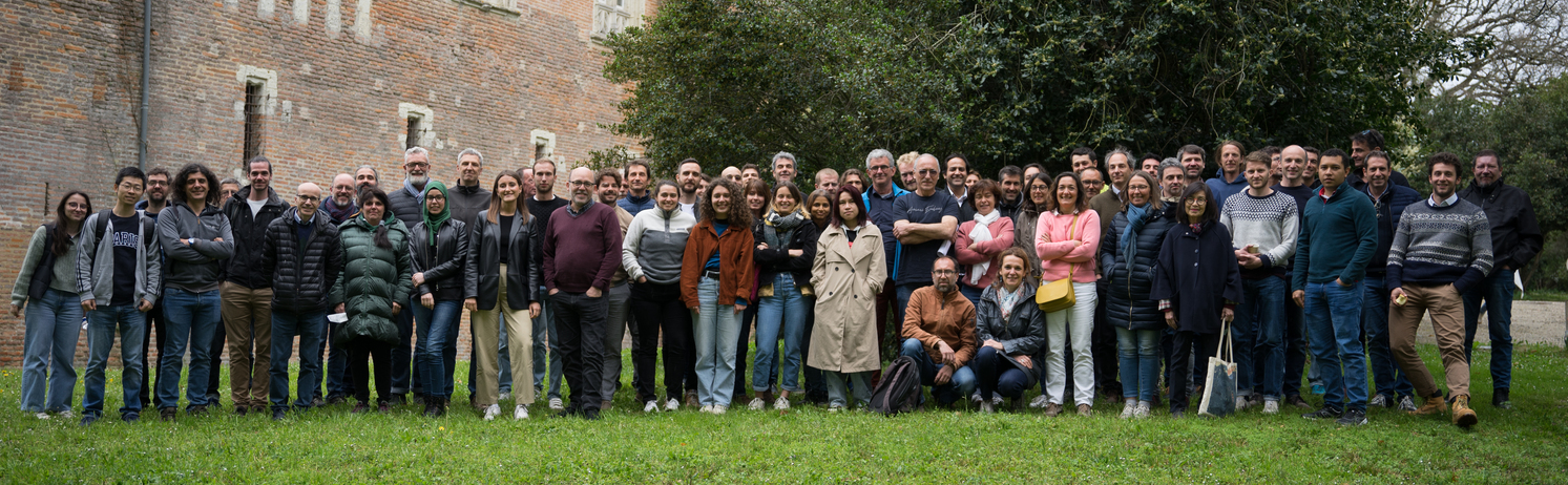 CESBIO RS users in front of the lab
At CESBIO, or among the laboratories we work with, we have different types of users:
- Scientists with high skills in computer science, capable of developing their applications and managing the scaling-up of these processors over large territories
- Non-coding specialist scientists, but able to write scripts, who are interested only in one or more AOIs, possibly over several years and with multiple sensors, who need help with scaling up.
- Scientists who are uncomfortable with coding, or who no longer have the time (did you recognize me?), and who prefer already coded tools.
Finally, in general, we rarely work as on the first illustration of the post, and some of us take pride at never looking at the images (but I know they are lying).
Which data ?At CESBIO, we are observing vegetation using satellites, and we need a high enough resolution to access the agricultural plots, but we are also interested in large territories and their evolution. The Copernicus data fit our needs, in particular Sentinel-1 and -2, and later Trishna, LSTM, ROSE-L or CHIME will be very useful to us. These are global data, with a strong revisit and a good resolution. They volume is huge, and often distributed by granules covering fairly small territories.
Some of us also use lower resolution global observations, such as SMOS, VIIRS, Sentinel-3, Grace, and if in general resolution is lower, the revisit frequency increases, and the volume remains high.
We also need auxiliary data, such as weather data (analysis, forecasts, atmospheric components), field and validation data…
 Land cover maps of France, annually processed at CNES with CESBIO’s support, using a year of Sentinel-2, for THEIA land data center.
How do we use them ?
Land cover maps of France, annually processed at CNES with CESBIO’s support, using a year of Sentinel-2, for THEIA land data center.
How do we use them ?
- The data we use often have a global coverage and frequent revisits. We almost never use a single image, we deal with large regions, and often whole years.
- As researchers, we experiment, modify and improve our processors, which never work at first. We develop our own processing tools, so the data is processed many times until we are satisfied with the results
- We sometimes develop interesting processors (yes, we do), and in this case we need to test their scalability to process slightly larger geographical areas..
- Machine learning methods often require the use of randomly distributed patches in different landscapes. In the learning phase, we do not need to use whole images.
 Deforested surfaces on Guyana plateau(left), and South East Asia, made by processing all Sentinel-1 data acquired since 2017, in the framework TropiSCO project.
Data download
It’s true that the trend is to process data close to the source, on remote servers (the Cloud), but downloading is still often necessary, for example when computing resources close to the data are limited or expensive.
Given the quantities of data we use, it is absolutely impossible to download our data by clicking on each of them. We therefore make very little use of interactive data search interfaces, which are mainly useful for data discovery. Some distribution centers provide APIs (Rest, STAC), suitable for some users, but they require to spend time understanding these tools, coding and maintaining them, as the interfaces change. Providing validated, command-line download tools is therefore very necessary, and often overlooked by data providers. For example, we have provided download tools (Peps_download, Theia_download, Sentinel_download, Landsat_download) for several servers, but we had largely underestimated the burden of documentation, maintenance and answering questions, since these tools have been successful. In our opinion, it’s up to the distribution centers to provide them, not up to the users.
 Patches from the Sen2VENµS dataset which provides pairs of Sentinel-2 and VENµS data acquired almost simultaneously, to train or validate Sentinel-2 super resolution methods.
Automatic learning is often based on small patches randomly selected from the products. To save transfer time, it would therefore be useful for download tools to be able to select the area of interest, dates and spectral bands. For this, storing data in a web-optimized format, such as Cloud Optimized Geotiff (COG), would be very useful.
Some of us need to cross-reference databases, for example to track simultaneous acquisitions between different satellites, often on different servers, taking into account cloud cover or camera angles, for example. An API opening up access to this information when querying the database is therefore very useful, with as few limitations as possible in terms of performance and number of accesses.
On demand processing
In the same way as for downloads, some sites offer on-demand processing. For example, launch an atmospheric correction or a super-resolution tool. Again, if we use them, it won’t be to run them on a single image, but to process large quantities of data. We therefore need to access this processing from the command line or by having a python API accessible on the server where the data is located.
Cloud computing
Processing data on the cloud saves download time, as the output of processing is often smaller than the input (for example, a land cover map produced from a year’s worth of Sentinel-2 data). However, this presents a number of difficulties, and we’d like to see the task made easier.
From one cloud to another, the tools for automating processing, opening virtual machines and launching processes may differ. If the data we need is on different clouds, or if we want to be able to move our processing from one cloud to another, we need to learn the API protocols specific to these clouds, and adapt them from one cloud to another. This is not efficient.
Our work almost always begins with the creation of data cubes, whose dimensions are spatial coordinates, time, spectral bands or any other useful information. The current format of Sentinel-2 data, for example, is a data cube, with a granularity by dates. However, it may be practical to make data cubes larger or smaller than the 100 x 100 km² data tiles. The use of an API that generates these data cubes on the fly, and allows you to apply processing to them, is therefore very interesting. This is the case with the OpenEO library. It’s not the only API of its kind, but it’s well done and has the good taste of being free software.
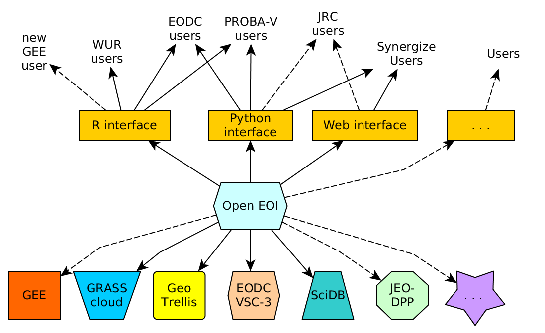 Access to various clouds through the OpenEO APU (from r-spatial blog)
To be able to use data distributed across several cloud servers, OpenEO library needs to be installed on the server side of these clouds. This is how OpenEO came up with the notion of data federation. Datacubes can be generated in parallel on several clouds, with each cloud preparing the part of the datacube for which it owns the data. Participating in this federation therefore also gives visibility to the data available on each cloud.
We kindly urged CNES to install it, and CNES has added it to the GEODES road map and started a « proof of concept » study :).
Help… Help…
Finding information on all these solutions requires a great deal of researches, but should not be the main focus of researchers. What we really need is information, tutorials (but please not video tutorials, which take so much time to find the information you need) and announcements to anticipate changes and improvements. All this is costly and not always included in priorities.
ConclusionsOur colleagues who are developing the Geodes server at CNES seem to have understood our needs, and are preparing a data catalog, data server, a Virtual Research Environment, an information site, python download scripts and are working hard to implement Open EO on our cluster (which requires solving some technical issues apparently). Of course, it takes time, but we should get a lot of improvements compared to PEPS.
The Copernicus dataspace is a bit ahead of us in using all these technologies, but to my knowledge, a good download tool is still missing.


Beta version of Geodes interface and information portal, which will be available in a few weeks.
Thanks !This post is the result of many discussions with my colleagues, with precious inputs provided by Sylvain Ferrant, Julien Michel Emmanuelle Sarrazin and Jordi Inglada at CESBIO.
-
sur L’utilisation des données de télédétection au CESBIO
Publié: 29 March 2024, 2:59pm CET par Olivier Hagolle
Plusieurs centres d’accès aux données sont en train d’être renouvelés au CNES, à l’ESA, et il manque souvent dans les premières versions des caractéristiques dont nous aurions besoin. Avec des collègues du CESBIO, nous avons fait une présentation au CNES de la manière dont nous utilisons les données. Voici une version écrite de cette présentation.
Bien évidemment, il y a autant de manière d’utiliser les données qu’il y a d’utilisateurs, mais nous pouvons cependant trouver quelques motifs récurrents chez tous les utilisateurs du CESBIO.
Et vous, comment utilisez vous vos données ? N’hésitez pas à préciser dans les commentaires de l’article. Il y a certainement d’autres modes d’utilisation que les nôtres, tout aussi efficaces.
Quels utilisateurs ?Les utilisateurs de données du CESBIO devant le laboratoire
Au CESBIO ou chez nos proches collègues, nous avons différents types d’utilisateurs :
- Des scientifiques compétents en informatique, capables de développer leurs applications et de gérer le passage à l’échelle de ces traitements sur de grands territoires
- Des scientifiques non spécialistes de codage, mais capables d’écrire des scripts, qui s’intéressent uniquement à une ou plusieurs AOI, éventuellement sur plusieurs années et avec plusieurs capteurs, qu ont besoin d’aide pour le passage à l’échelle
- Des scientifiques peu à l’aise avec le codage, ou qui n’en ont plus le temps (vous m’avez reconnu ?), et qui préfèrent des outils où l’on utilise des lignes de commandes déjà toute prêtes, voire même où l’on clique.
Finalement, nous travaillons rarement comme le montre l’illustration en entête de cet article, et quelques uns d’entre nous sont fiers d’affirmer ne jamais regarder les images (mais je sais qu’il mentent).
Quelles données ?Au CESBIO, nous observons la végétation par satellite, nous avons donc besoin d’une assez haute résolution pour accéder aux parcelles agricoles, mais nous nous intéressons aussi à de larges territoires, et à leur évolution. Les données Copernicus, et notamment Sentinel-1 et -2, et plus tard Trishna, LSTM, ROSE-L ou CHIME nous seront très utiles. Il s’agit de données globales, avec une forte revisite, une bonne résolution. Elles sont donc très volumineuses, et distribuées par granules couvrant des territoires assez réduits.
Certains d’entre nous utilisent des observations globales, comme SMOS, VIIRS, Sentinel-3, Grace, et si en général leur résolution est inférieure, la fréquence de revisite augmente, et le volume reste élevé.
Nous avons aussi besoin de données auxiliaires, comme des données météo (analyses, prévisions, composants atmosphériques), des données de terrain et de validation…
Cartes d’occupation des sols sur la France, produites annuellement au CNES avec le support du CESBIO, avec une année de données Sentinel-2, pour le compte de THEIA.
Comment utilisons nous ces données ?
- les données que nous utilisons ont souvent une couverture globale et une revisite fréquente. Nous n’utilisons quasiment jamais une seule image, nous traitons de grandes régions, et souvent des années entières.
- nous sommes chercheurs, nous tâtonnons, modifions et améliorons nos traitements qui ne marchent jamais du premier coup. Nous développons nos outils de traitement, et les données sont donc traitées à de nombreuses reprises, jusqu’à ce que nous soyons satisfaits des résultats.
- il nous arrive de mettre au point des chaines de traitement intéressantes (si, si ), et nous avons dans ce cas besoin de tester le passage à l’échelle de ces traitements pour traiter des zones géographiques un peu plus étendues.
- les méthodes d’apprentissage automatique nécessitent souvent l’utilisation de vignettes réparties aléatoirement dans des paysages différents. Dans la phase d’apprentissage, nous n’avons pas besoin d’utiliser des images entières
- les données spatiales sont aussi utilisées à des fins pédagogiques, dans les cours et travaux dirigés de nos collègues enseignants chercheurs, ou à des fins de démonstration, pour mettre en évidence le potentiel d’applications des satellites, par exemple sur ce blog
Cartes de surface déforestées sur le plateau des Guyanes, et en Asie du Sud-Est, réalisées avec le traitement de toutes les données Sentinel-1 depuis 2017, dans le cadre du projet TropiSCO.
Téléchargement des donnéesCertes, la mode est au traitement proche de la donnée, sur des serveurs à distance (le Cloud), mais le téléchargement reste souvent nécessaire, quand par exemple les ressources de calcul à proximité des données sont limitées, ou payantes et onéreuses.
Vues les quantités de données que nous utilisons, il n’est absolument pas envisageable de télécharger les données en cliquant. Nous utilisons donc très peu les interfaces interactives de recherche des données, elles ne nous sont utiles que pour la découverte des données. Certains centres de distribution fournissent des API (Rest, STAC), qui conviennent à certains utilisateurs, mais elles nécessitent de dépenser du temps à comprendre ces interfaces, à les coder et les maintenir, car les interfaces changent. Fournir des outils de téléchargement validés, utilisables en lignes de commandes, est donc très important, et souvent oublié par les fournisseurs de données. Nous avons par exemple fourni des outils de téléchargement (Peps_download, Theia_download, Sentinel_download, Landsat_download), mais nous avions largement sous-estimé la charge de documentation, maintenance et de réponse aux questions, ces outils ayant rencontré du succès. A notre avis, c’est aux centres de diffusion de les fournir, ce n’est pas le rôle des utilisateurs.
Vignettes du jeu de données Sen2VENµS qui associe des données Sentinel-2 et des données VENµS acquises au cours de la même journée, pour entrainer ou valider des méthodes de super-résolution appliquées à Sentinel-2.
Les apprentissages automatiques sont souvent réalisés à partir de vignettes de petite taille sélectionnées aléatoirement dans les produits. pour économiser du temps de transfert, il serait donc utile que les outils de téléchargement permettent de sélectionner la zone d’intérêt, les dates et les bandes spectrales. Pour celà, le stockage des données en un format optimisé pour le web, comme le Cloud Optimised Geotiff (COG), serait bien utile.
Certains d’entre nous ont besoin de croiser des bases de données, par exemple pour repérer des acquisitions simultanées entre différents satellites, souvent sur des serveurs différents, en prenant en compte par exemple la couverture nuageuse ou les angles de prise de vue. Une API ouvrant l’accès à ces informations lors de requêtes à la base de données est donc très utile, avec le moins de limitations possibles en termes de performances et de nombres d’accès.
Traitement à la demandeDe la même manière que pour les téléchargements, certains sites proposent de lancer des traitements à la demande. Par exemple, lancer une correction atmosphérique, ou un outil de super-résolution. La encore, si nous les utilisons, ce ne sera pas pour les faire tourner sur une seule image, mais pour traiter de grandes quantités de données. Nous avons donc besoin d’accéder à ces traitements en ligne de commande ou en lançant des scripts sur le serveur où se trouvent les données.
Calcul proche des données
Traiter les données sur le cloud permet d’économiser le temps de téléchargement, les données en sortie des traitements étant souvent moins volumineuses que celles en entrée (par exemple, une carte d’occupation des sols produite à partir d’une année de données Sentinel-2). Cela présente cependant de nombreuses difficultés, et nous aimerions que l’on nous facilite la tâche.
D’un cloud à l’autre, les outils pour automatiser les traitements, ouvrir des machines virtuelles, lancer des processus peuvent différer. Si les données dont nous avons besoin sont sur des clouds différents, ou si nous souhaitons pouvoir déplacer nos traitements d’un cloud à l’autre, nous avons besoin d’apprendre les protocoles API propres à ces clouds, et de les adapter quand nous en changeons. Ce n’est pas efficace.
Nos travaux commencent presque toujours par la constitution de cubes de données, dont les dimensions sont les coordonnées spatiales, le temps, les bandes spectrales ou des informations diverses. Le format actuel des données Sentinel-2 peut être vu comme un cube de données, avec une granularité par date. Cependant, il peut-être pratique de réaliser des cubes de données plus grands ou plus petits que les tuiles de 110 x 110 km² de données. L’utilisation d’une API qui génère ces cubes de données à la volée, et permet de leur appliquer des traitements est donc très intéressante. C’est le cas de la librairie OpenEO. Ce n’est pas la seule API de ce genre, mais elle est bien faite et a le bon gout d’être un logiciel libre.
Accès à différents clouds au travers de l’API OpenEO (à partir d’un article de blog de r-spatial)
Pour pouvoir utiliser des données réparties sur plusieurs clouds, OpenEO doit être installée côté serveur sur ces clouds. OpenEO utilise donc la notion de fédération de données. La génération des datacubes peut-être réalisée en parallèle sur plusieurs clouds, chaque cloud préparant la partie du datacube dont il possède les données. Pour un centre de distribution de données, participer à cette fédération donne donc aussi de la visibilité qu’il met à disposition.
Nous avons quelque peu insisté auprès du CNES pour que ce soit mis en place, et le CNES a intégré cette demande a sa feuille de route et a lancé une étude du type « preuve de concept »
De l’aide… de l’aide… .
.
Trouver de l’information sur toutes ces solutions demande beaucoup de recherches, mais ne devrait pas être l’objet principal des recherches des chercheurs. Nous avons donc vraiment besoin d’information, d’exemples, d’annonces permettant d’anticiper les changements et améliorations. Tout cela est couteux et n’est pas toujours inclus dans les priorités.
Nos collègues qui préparent le serveur Géodes au CNES semblent avoir bien pris en compte nos besoins, et nous préparent un portail d’accès, un site d’informations et support, des outils de téléchargement et travaillent à l’implémentation d’Open EO. Celà prend du temps bien sûr, mais devrait permettre un réel par rapport aux versions encore en activité comme PEPS.
Version Beta de l’interface et du portail de Geodes, qui seront disponibles dans quelques semaines.
RemerciementsCet article est le résultat de nombreuses discussions au CESBIO, avec des contributions directes de Sylvain Ferrant, Julien Michel, Emmanuelle Sarrazin et Jordi Inglada. Merci à tous !
-
sur Quel est l’angle solaire zénithal maximum dans les produits Sentinel-2 ?
Publié: 28 February 2024, 7:42pm CET par Simon Gascoin
Pour certaines applications il est utile de connaître l’angle solaire au moment de l’acquisition d’un produit Sentinel-2. Par exemple pour notre chaine de détection de la neige LIS nous avons besoin de pré-calculer les ombres créées par le relief à partir d’un MNT. Cela nous permet d’améliorer la détection de la neige dans les zones à l’ombre. Pour savoir si un pixel est à l’ombre, il faut tester si des pixels placés dans la direction du soleil ont une altitude assez élevée pour masquer le soleil. L’algorithme va devoir parcourir un nombre de pixels de plus en plus grands plus le soleil est bas à l’horizon, ce qui peut entrer en conflit avec la fenêtre du MNT chargée en mémoire. Comme notre chaîne tourne en contexte opérationnel nous devons être vigilants vis à vis des cas limites.
                          _____
                        x|     |  ^
                    x    |     |  | Height
               x   __    |     |  |
      ____p_______|  |___|     |__v____________
          <-------------->
              Distance
Extrait de la docstring de la classe hillshade du logiciel rastertools.
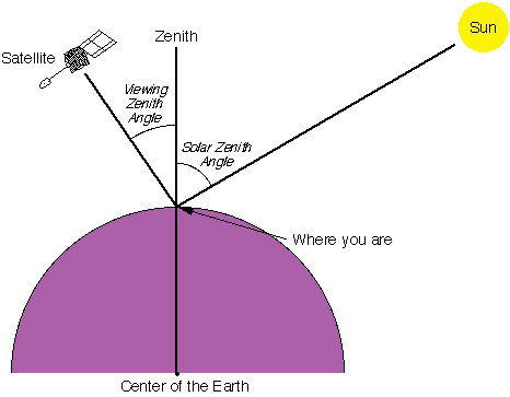
Nous avons ainsi été amenés à nous demander quel est l’angle solaire zénithal maximal possible dans les produits Sentinel-2 ? Je n’ai pas trouvé cette information dans la documentation de la mission Sentinel-2. Les utilisateurs de Sentinel-2 savent sans doute qu’il n’y a pas d’images en hiver dans les régions proches des pôles, car l’angle solaire zénithal est trop élevé à l’heure d’acquisition (~10:30 heure locale) si bien que la lumière est insuffisante pour éclairer la scène.
Heureusement, la valeur de l’angle solaire zénithal est fournie dans les métadonnées de chaque produit (notamment la valeur moyenne dans la tuile). Il est donc possible d’évaluer empiriquement la distribution des angles solaires. Sur la période 01-Jan-2022 au 31-Dec-2022 la valeur maximale dans tous les produits L1 disponibles dans le catalogue de Google Earth Engine est 86,2°, soit une élévation solaire de 3,8° ! Autant dire un soleil déjà très rasant… On voit sur la carte ci-dessous que l’ESA pousse les acquisitions le plus tard possible en Europe du Nord


Bien sûr la majorité des acquisitions est faite lorsque le soleil est plus proche du zénith, comme le montre l’histogramme ci-dessous également calculé à partir de tous les produits L1C de l’année 2022.

Le code suivant permet de générer les résultats ci-dessus dans Earth Engine.
// Earth Engine code
var s2 = ee.ImageCollection("COPERNICUS/S2_HARMONIZED")
  .filterDate('2022-01-01','2022-12-31')//.limit(10000);
var p = 'MEAN_SOLAR_ZENITH_ANGLE';
var szamax = s2.aggregate_max(p);
var get_sza = function(im){
  var sza = im.metadata(p).clip(im.geometry());
  return sza;
};
var s2sza = s2.map(get_sza);
var im_szamax = s2sza.select(p).max();
print('Max SZA of all products',szamax);
print(ui.Chart.feature.histogram(s2, p, null, 1));
Export.image.toDrive(im_szamax, 'SZA', 'GEE', 'SZA', null, null, 10000);
Parc National Børgefjell (Norvège) le 2022-11-18 – Sentinel-2, composition colorée des bandes 8/4/3
Photo en tête : © Steinar Johannesen, Børgefjell National Park (conseil : ne pas visiter leur site web ..)
-
sur SapienSapienS et le CNES nous expliquent l’observation de la terre
Publié: 28 February 2024, 4:26pm CET par Olivier Hagolle
Le CNES a confié à la société SapienSapienS la réalisation de belles vidéos pour le grand public, qui expliquent de manière très didactique, et en moins de 5 minutes, différentes thématiques d’observation de la terre. Trois d’entre-elles font la part belle aux travaux du CESBIO, et je suis très fier d’avoir contribué à la première (mais la créativité vient de SapienSapienS). Thierry Koleck et Stephane Mermoz (Globeo) ont contribué à la seconde, et Philippe Maisongrande (un ancien du CESBIO, maintenant au CNES) a suivi la réalisation de la cinquième. Vous trouverez les liens d’accès ci-dessous (ou sur la chaine Youtube du CNES) :
- L’observation solaire en optique (spectre solaire réfléchi) : « Quand la maison brûle », avec Sentinel-2 et Pleiades (et je ne suis pour rien dans le choix de démarrer avec Jacques Chirac).
- L’observation radar, avec Sentinel1 et TropiSCO: « Quand il fait noir »
- L’altimétrie marine avec SWOT : « Quand la mer monte »
- L’hydrologie continentale avec SWOT (et un peu de SMOS) : « Quand les plantes sèchent et les rivières débordent »
- L’imagerie thermique (TRISHNA) et l’eau dans les plantes (un peu de SMOS, et les cartes OSO) : « Quand les plantes souffrent »
-
sur A sneak peak at the first SWOT hydrology products
Publié: 22 February 2024, 1:54am CET par Simon Gascoin
Pièce jointe: [télécharger]
SWOT, the Surface Water and Ocean Topography mission was successfully launched more than a year ago (Dec 16, 2022). Hydrologists are eagerly awaiting the release of SWOT products, which will allow them to study for the first time the water levels variations of more than a million lakes and rivers around the globe!
A first batch of products from the SWOT mission has been released by NASA and CNES. As explained in the release note, these SWOT products are « at a very early stage, with known limitations ». The hydrology products span only two weeks in April 2023. However, I could not resist to have a look at the data… Hence I downloaded some level 2 hydrology products via the CNES Hydroweb.next portal ( [https:]] ). The datasets are distributed as shapefile and convenient to use. The Level 2 High Rate River Single Pass Vector Product provides river data – including water surface elevation of the river. Here is an example of the surface water elevation of the Oranje river in southern Africa.
 Water surface elevation of the Oranje river on April 07, 2023 from SWOT
It is quite amazing to be able to map a river’s elevation profile from satellite measurements. Such data is key to estimate the river discharge [Durand et al] and therefore should enable us to make considerable progress in our understanding of the terrestrial water cycle. SWOT is expected to measure river surface elevation with an accuracy of approximately 10 cm at 100–200 m along-stream resolution [Langhorst et al.]. Several teams are already working to evaluate the actual accuracy depending on the river morphology.
Similarly, the High Rate Lake Single Pass Vector Product provides the surface elevation of lakes. To begin with, I picked four artificial lakes in northern India near Varanasi (Benares). In this case, the lake polygons match well the water surfaces that can be seen in a Sentinel-2 image acquired four days earlier.
 Selected lakes in northern India. Background image is a Sentinel-2 false color image captured on 2023 April 05. White lines indicate the lake polygons provided in the SWOT lake product of 2023 April 09.
In SWOT products, each lake has an ID. A lake’s attributes including its mean water surface elevation (wse) and uncertainty (wse_u) can be retrieved in a terminal using ogrinfo from a level 2 file:
file="SWOT_L2_HR_LakeSP_(...).zip"
id="4520103033" # lake ID
ogrinfo /vsizip/$file -nomd -al -geom=NO -where "lake_id='${id}'"This is the output from all available preliminary SWOT products at these four Indian reservoirs.
 The top panel corresponds to the largest lake (Pipari dam): the data indicate that the water level dropped by 2 meters between April 21 and April 26 (from 168.5 to 166.5 m). This agrees well with the time series of Sentinel-2 images below, which show a reduction of the surface water area from April 20 to May 05 after a period of constant lake area.
document.createElement('video');
[https:]]
The top panel corresponds to the largest lake (Pipari dam): the data indicate that the water level dropped by 2 meters between April 21 and April 26 (from 168.5 to 166.5 m). This agrees well with the time series of Sentinel-2 images below, which show a reduction of the surface water area from April 20 to May 05 after a period of constant lake area.
document.createElement('video');
[https:]]
I am a bit more familiar with lakes in the French Pyrenees. There are many cases where SWOT lake polygons (red polygons in the map below) are off the actual lake position, both in the « obs » and « prior » products. Be careful if you use SWOT data in mountain regions!
 Some lakes in the north of the map (Bassiès) are correctly geolocated, especially this one (Etang Majeur de Bassiès, 21 hectares):
 Here, we see a quick increase of the water level after April 21, which is consistent with the snowmelt that happened over the same period as shown below from Sentinel-2 imagery.
[https:]]
Here, we see a quick increase of the water level after April 21, which is consistent with the snowmelt that happened over the same period as shown below from Sentinel-2 imagery.
[https:]]
Below is another example in western France near Pressac, where there are many small lakes and ponds. From the SWOT product, I selected 23 lakes with areas ranging from 3 to 19 hectares, all well located.

 All lakes follow the same decreasing trend. This may reflect the evolution of the regional water table but a 2 meters drop in two weeks only? Its seems really big for natural lakes.
In conclusion, it is really exciting to have access to some SWOT products – even preliminary. Hydrology products are easy to obtain and to work with. This first release has indeed some limitations in lake geolocation but NASA and CNES engineers are probably working hard to improve the data. I look forward to the next release!
__
All lakes follow the same decreasing trend. This may reflect the evolution of the regional water table but a 2 meters drop in two weeks only? Its seems really big for natural lakes.
In conclusion, it is really exciting to have access to some SWOT products – even preliminary. Hydrology products are easy to obtain and to work with. This first release has indeed some limitations in lake geolocation but NASA and CNES engineers are probably working hard to improve the data. I look forward to the next release!
__
Top picture: Oranje river by yakovlev.alexey, CC BY-SA 2.0 [https:]] , via Wikimedia Commons
-
sur Le ballet des icebergs autour de l’Antarctique
Publié: 6 February 2024, 11:22pm CET par Simon Gascoin
Pièce jointe: [télécharger]
Les icebergs de taille significative* sont répertoriés et nommés par l’agence américaine U.S. National Ice Center. Moyennant un peu de web scraping, j’ai récupéré tous les fichiers qui donnent la position hebdomadaire de ces icebergs depuis novembre 2014. Les librairies pandas et matplotlib ont fait le reste (code) ! Voyez comment les icebergs sont d’abord entrainés autour du continent Antarctique d’est en ouest avant d’être embarqués au large par le courant circumpolaire dans le sens inverse.
[https:]]Parmi les icebergs notables, on voit notamment A23A, actuellement le plus gros iceberg au monde (4000 km2), qui prend le large depuis la mer de Weddell, 37 ans après s’être détaché de la plate-forme de glace de Filchner [2].
 Animation : A23A (Série d’images Sentinel-3)
On voit aussi B22A s’en aller après quelques années à l’ombre de son géniteur, l’immense glacier Thwaites (je vous en parlais ici).
[https:]]Animation : B22A (Série d’images Sentinel-1)
Enfin, le plus gros de tous est A68, qui a sérieusement amputé la barrière de glace Larsen C lorsqu’il s’est décroché en 2017 (voir aussi ici)…
[https:]]Notes
[1] 20 milles marins carrés soit environ 70 km2 ( [https:]] )
[2] Altendorf, D. ; Gascoin, S. 37 ans plus tard, l’iceberg A23a remet les voiles. La Météorologie, 124, 2-3, 2024. 10.37053/lameteorologie-2024-0002
-
sur Iota2 can also do regression
Publié: 29 January 2024, 5:09pm CET par fauvelm
Iota2 is constantly evolving, as you can check at the gitlab repository. Bugs fix, documentation updates and dependency version upgrade are done regularly. Also, new features are introduced such as the support of Landsat 8 & 9 images, including thermal images, or for what concerns us in this post, the support of regression models.
In machine learning, regression algorithms are supervised methods1 used to estimate a continuous variable from some observations (see more here: [https:]] ). In remote sensing, regression is used to recover biophysical or agronomic variables from satellite images. For instance, it is used in SNAP ( [https:]] ) to estimate LAI from Sentinel-2 surface reflectance.
At the beginning, iota2 was designed to perform classification (estimation of categorical values) whose framework shares a lot with regression but has also some significant differences. To cite the main ones: the loss function as well as how the data are split differ between classification and regression. Some other differences may exist depending on the algorithm. Fortunately, since the end of 2023, iota2 is also able to perform regression with satellite image time series.
In this post, we are going to illustrate the workflow of the regression builder on a simple case: estimate the red band value of one Sentinel-2 date having observed other Sentinel-2 dates. Full information can be found in the online documentation: [https:]] .
1. Iota2 configuration 1.1. Data setTo illustrate iota2 capability, we set-up the following data set: One year of Sentinel2 data over the tile T31TCJ, starting on the 2018-02-10 until the 2018-12-10, from which we try to infer the red band of 2018-12-17. Yes, it is not a real problem but since Sentinel2 data are free and open-source, we can put online this toy data to let you reproduce the simulation: [https:]] .
The area in pixel size is 909*807, see figure below. We have randomly extracted pixel values from the red band for training and validation and put everything in a shapefile.

Figure 1: Area of interest (background image © OpenStreetMap contributors)
1.2. Configuration fileAs usual with iota2, the configuration file contains all the necessary information and it is very similar to what is required for classification (see [https:]] for a more detailed discussion on the configuration file). We use the following one
chain:
{
    s2_path: "<<path_dir>>/src/sensor_data"
    output_path: "<<path_dir>>/Iota2Outputs/"
    remove_output_path: True
    list_tile: "T31TCJ"
    ground_truth: "<<path_dir>>/src/vector_data/ref_small.shp"
    data_field: "code"
    spatial_resolution: 10
    proj: "EPSG:2154"
    first_step: "init"
    last_step: "validation"
}

arg_train:
{
    runs: 1
    ratio : 0.75
    sample_selection:
    {
        "sampler": "periodic",
        "strategy": "all",
    }
}
scikit_models_parameters:
{
    model_type:"RandomForestRegressor"
    keyword_arguments:
    {
        n_estimators : 200
        n_jobs : -1
    }
}
python_data_managing:
{
    number_of_chunks: 10
}
builders:
{
    builders_class_name: ["i2_regression"]
}
sentinel_2:
{
    temporal_resolution:10
}
1.3. Results146,579 pixels were used to train the random forest with 200 trees, and 48,860 pixels were used as test samples to compute the prediction accuracy. Iota2 returns the following accuracy results for the test set (we normalize the data to have reflectance and not digital number):
max error mean absolute error mean squared error median absolute error r2 score 0.200 0.005 6.383e-5 0.003 0.894 Well, the results are good
Given one year of data, it is possible to infer most of the pixel values 7 days later. Congrats iota2 !If we look at the map, we can see that most of the errors are made over areas with light clouds. It would have been the case also for areas with rapid changes since we have done nothing particular to deal with changes in the regression set-up. Figures below show the true red band, the estimated one and the prediction error, computed as the normalized absolute error.

Figure 2: True Sentinel-2 red band.

Figure 3: Predicted Sentinel-2 red band.

Figure 4: Prediction error in percentage; \(\frac{|true-pred|}{true}\).
2. DiscussionIota2 offers many more possibilties, as for the classification framework: multi-run, data augmentation or spatial stratification for instance. The online documentation ( [https:]] ) provides all the relevant information: please check it if needed.
In this short post, we have used random forest, but other methods are available, in particular deep learning based methods. For now, it is possible to regress only one parameter at time. A possible extension would be to regress several variables simultaneously.
This new feature has been used to map moving date of permanent grasslands at the national scale for year 2022. This work is in progress, but you can see current results on zenodo (draft map: [https:]] ). Iota2 has simplified greatly the production of such large scale map.
3. AcknowledgementIota2 development team is composed of Arthur Vincent and Benjamin Tardy, from CS Group. Hugo Trentesaux spent 10 months (October 2021 – July 2022) in the team and started the development of the regression. Then, Hélène Touchais continued the IT developments since November 2022 and has concluded this work at the end of 2023.
Developments are coordinated by Jordi Inglada, CNES & CESBIO-lab. Promotion and training are ensured by Mathieu Fauvel, INRAe & CESBIO-lab and Vincent Thierion, INRAe & CESBIO-lab.
The development was funded by several projects: CNES-PARCELLE, CNES-SWOT Aval, ANR-MAESTRIA and ANR-3IA-ANITI with the support of CESBIO-lab and Theia Data Center. Iota2 has a steering committee which is described here.
We thank the Theia Data Center for making the Sentinel-2 time series available and ready to use.
Footnotes:Need some ground truth.
-
sur End-to-end learning for land cover classification using irregular and unaligned satellite image time series
Publié: 19 January 2024, 10:08am CET par Valentine Bellet
The results presented here are based on published work : V. Bellet, M. Fauvel, J. Inglada and J. Michel, « End-to-end Learning For Land Cover Classification Using Irregular And Unaligned SITS By Combining Attention-Based Interpolation With Sparse Variational Gaussian Processes, » in IEEE Journal of Selected Topics in Applied Earth Observations and Remote Sensing, doi: 10.1109/JSTARS.2023.3343921.
This work is part of the PhD of Valentine Bellet supervised by Mathieu Fauvel and Jordi Inglada. Since 2016, the CESBIO team works on the improvement of the algorithms and the tools (the iota2 processing chain) for the CES OSO land cover map. If you want to learn more about this land cover map, you can refer to the different articles on this blog: validation, contextual classification. Also, a very good article explained how iota2 is now able to perform classification with deep neural networks.
Context and introductionSatellite image time-series (SITS) covering large continental surfaces with a short revisit cycle, such as those provided by Sentinel-2, bring the opportunity of large scale mapping. For example, land use or land cover (LULC) maps provide information about the physical and functional characteristics of the Earth’s surface for a particular period of time. To produce these LULC maps from massive SITS, automatic methods are mandatory. In the last years, Machine Learning (ML) and then Deep Learning (DL) methods have shown outstanding results in terms of performance accuracy.
Currently, most conventional ML and DL classifiers work with a representation of the data as a vector of fixed length. Each pixel is described by a vector of constant size where components represent the same type of information, i.e. the value of a given band on a given date and in the same order. However, in general, SITS are not acquired as regular time series of fixed size. Firstly, not all pixels are acquired on the same dates. In large areas, there are different revisit cycles because of satellite orbits (2 or 3 days difference between 2 adjacent swaths). For example, in our case in the South of France using Sentinel-2 data, five orbits cover the study area, as illustrated in Figure 1.
 Figure 1: The study area is located in the south of metropolitan France and is composed of 27 Sentinel-2 tiles (each blue square corresponds to one tile). Five different orbits cover the study area.
Secondly, not all the acquisitions in a swath contain the same dates. As such, the time series are irregularly sampled in the temporal domain: observations are not equally spaced in time due to the presence of clouds or cloud shadows. Indeed, if clouds are present in an image, the reflectance corresponds to the one of the clouds and not to the one of the land cover. Therefore, dates for which the image consists essentially of clouds (i.e. images containing more than 90% of clouds are not processed to the level 2A at THEIA) are removed. Figure 2 represents the temporal grids for three tiles (T30TXQ, T31TCH, T31TFL) and shows the misalingment phenomenon.
 Figure 2: Temporal grids for three different tiles: T31TFL, T31TCH, T30TXQ.
Finally, locally, different meteorological conditions, such as clouds, haze, mist or cloud shadow can cause technical artifacts for one pixel at a given date. This information is considered as corrupted and the pixel is declared as invalid. Therefore, the information at this date can be removed for this pixel leading to irregular temporal sampling. Therefore, the sampling of very close pixels may also be different. Figure 3 represents the NDVI profile for three pixels from these same tiles (T30TXQ, T31TCH, T31TFL). Both valid dates and cloudy / shadow dates are represented in this figure. A valid date corresponds to an acquired observation where no cloud or cloud shadow is detected by the level 2A processor. The pixel from the tile T31TFL has long periods without valid dates. The pixel from the tile T31TCH is the least impacted by the cloudy / shadow dates.
 Figure 3: NDVI time series for three pixels from different tiles: T30TXQ, T31TCH, T31TFL. Filled dots correspond to valid observations, transparent dots correspond to observations flagged as clouds or cloud shadows in level 2A masks. Pixels were selected randomly, and the NDVI has been renormalised between -1 and 1, as it is a common practice in machine learning methods. The last example corresponds to a water pixel.
To cope with the clouds, cloud shadows and different temporal sampling betweem the tiles, the data can be linearly resampled onto a common set of virtual dates with an interval of ten days, for a total of 37 dates, as it is currently done in iota2. The first date corresponds to the day 1 of the year and the last day corresponds to the day 361 of the year. Figure 4 represents the linear interpolation for the three pixels described previously.
 Figure 4: The black circled markers correspond to the linear interpolation of the valid dates with an interval of 10 days for a total of 37 dates.
However, linear interpolation is performed independently of the classification task, i.e., the final task. Li et al. [Li and Marlin, 2016] showed that an independent interpolation method directly followed by a classification method performed worse in terms of classification accuracy than methods trained end-to-end. Therefore, in the following, we propose to learn a representation optimized for the classification task.
Data set and experimental set upThe study area covers approximately 200 000 km2 in the south of metropolitan France and it is composed of 27 Sentinel-2 tiles, as displayed in Figure 1. All available acquisitions of level 2A between January and December 2018 were used (the preprocessing of the data is described more in detail in the paper) . Combining the five orbits, 303 unique acquisition dates are available.
Pixels were randomly sampled from polygons over the full study area to create three spatially disjoint data subsets: training, validation and test, as illustrated in Figure 5. The polygons are disjoint between the three data sets. The three data sets are class-balanced: 4 000 pixels per class in the training data set, 1 000 pixels per class in the validation data set and 10 000 pixels per class in the test data set. Therefore, we have 92 000 pixels for the training data set, 23 000 pixels for the validation data test and 230 000 pixels for the test data set.
 Figure 5: Example of polygon selection. Red, green and blue polygons correspond to training, validation and testing polygons, respectively.
The reference data used in this work is composed of the 23 land cover classes from the OSO land cover map. The nomenclature and the color-code of the classes is given in Figure 6.
 Figure 6: OSO nomenclature.
Method
Figure 6: OSO nomenclature.
Method
We propose to use end-to-end learning by combining a spatially informed interpolator called Extended multi Time Attention Networks (EmTAN) (first block) with a Stochastic Variational Gaussian Processes (SVGP) classifier, (second block), as illustrated in Figure 7. The model made of the EmTAN combined with the SVGP classifier is called EmTAN-SVGP.
Figure 7 represents the workflow for the classification of one irregular and unaligned pixel time series X* of size D × T through its learned latent representation Z of size D’ × R, with D the number of spectral features, T the total number of observations (in our case 303 unique acquisition dates), D’ the number of latent spectral (we take the liberty of using the term « spectral » as a misnomer, as it does not concern the temporal dimension) features and R the number of latent dates.
The EmTAN is a spatially informed interpolator as the spatial coordinates are integrated in the processing by means of spatial positional encoding. Besides, a spectro-temporal feature reduction is performed. Indeed, by taking R < T , the EmTAN allows to perform feature reduction in the temporal domain. Moreover, with D’ < D, a spectral reduction is performed. The spectro-temporal reduction allows to reduce the complexity of the SVGP classifier. The EmTAN is optimized by maximizing the classification accuracy, not the reconstruction error as it is conventionally done with standard interpolation methods. A more detailed description of the EmTAN and of the SVGP classifiers are provided in our articles: 10.1109/JSTARS.2023.3343921 and 10.1109/TGRS.2023.3234527.
 Figure 7: EmTAN-SVGP, end-to-end learning for the classification of one irregular and unaligned pixel time series X* and its associated representation Z. The parameters, ?1 and ?2, of the EmTAN and the SVGP, respectively, are optimized using the loss L.
Competitive methods
Figure 7: EmTAN-SVGP, end-to-end learning for the classification of one irregular and unaligned pixel time series X* and its associated representation Z. The parameters, ?1 and ?2, of the EmTAN and the SVGP, respectively, are optimized using the loss L.
Competitive methods
Four different classification methods are defined as competitive methods:
1. Gapfilled-SVGP: A SVGP classifier feeds with time series linearly interpolated every 10 days, as illustrated in Figure 8.
 Figure 8: Gapfilled-SVGP, classification of one pixel series X produced by linear interpolation. The parameters ?1 of the SVGP are optimized using the loss L.
2. EmTAN-MLP: A Multi-layer Perceptron (MLP) classifier combined with the EmTAN, as illustrated in Figure 9.
 Figure 9: EmTAN-MLP, end-to-end learning for the classification of one irregular and unaligned pixel time series X* and its associated representation Z. The parameters, ?1 and ?2, of the EmTAN and the MLP, respectively, are optimized using the loss L.
3. EmTAN-LTAE: A Light Temporal Attention Encoder (LTAE) classifier combined with EmTAN, as illustrated in Figure 10.
 Figure 10: EmTAN-LTAE, end-to-end learning for the classification of one irregular and unaligned pixel time series X* and its associated representation Z. The parameters, ?1 and ?2, of the EmTAN and the LTAE, respectively, are optimized using the loss L.
4. raw-LTAE: A LTAE classifier without EmTAN. Unlike SVGP or MLP classifiers, the LTAE classifier uses attention mechanisms. It may be redundant to use attention mechanisms both in the EmTAN and in the LTAE classifier. However, the LTAE classifier was not defined to deal with the irregular and unaligned time series pixels. Thus, we provide the mask m as an additional feature, as illustrated in Figure 11.
 Figure 11: raw-LTAE, classification of one pixel series X* with the LTAE classifier. The parameters ?1 of the LTAE are optimized using the loss L. The mask m is provided as an additional feature.
A more detailed description of these methods are provided in our article (10.1109/JSTARS.2023.3343921).
Results Quantitative resultsFigure 12 represents the overall accuracy (OA) for the five methods (Gapfilled-SVGP, EmTAN-SVGP, EmTAN-MLP, EmTAN-LTAE, raw-LTAE). For information, from previous works, we found that Gapfilled-SVGP is above the baseline, the Gapfilled-RF (Random Forest with linearly interpolated data every 10 days) from CES OSO [https:] Therefore, these results are not represented in Figure 12.
The learned latent representation Z obtained by the EmTAN contains more meaningful information for the classification task for the SVGP classifier compared to the linearly interpolated data. Besides, the SVGP model took greater advantage of the interpolator than the MLP or the LTAE models. Indeed, the OA of the EmTAN-SVGP model is seven points above the EmTAN-MLP model and around four points above the EmTAN-LTAE model. Besides, the EmTAN-SVGP model is the model with the smallest dispersion. On the other hand, the EmTAN-SVGP model is in average two points below the raw-LTAE model. However, to compute the inference on a specific area (e.g. on a specific Sentinel-2 tile), the raw-LTAE requires the whole set of observed dates used during the training step (e.g. observed dates from all tiles) . This is not the case for our proposed model which is able to process pixels with a set of observed dates (e.g. the corresponding dates for one Sentinel-2 tile). See our article (10.1109/JSTARS.2023.3343921) for more details.
 Figure 12: Boxplots of the OA for each studied model (computed over 9 runs).
Qualitative results
Figure 12: Boxplots of the OA for each studied model (computed over 9 runs).
Qualitative results
Figure 13 represents the land cover maps obtained for four methods (EmTAN-SVGP, EmTAN-MLP, EmTAN-LTAE, raw-LTAE) on a agricultural area around Toulouse. In the forest areas, it appears that the raw-LTAE model does not correctly predict the BLF class. In contrast, the predictions are homogeneous for the models using the EmTAN : EmTAN-SVGP, EmTAN-MLP and EmTAN-LTAE. For the mTANe-MLP and mTANe-LTAE models, the majority of the crops are surrounded by the class VIN whereas it would appear to be hedges instead. Finally, the results obtained for the EmTAN-SVGP, EmTAN-MLP and EmTAN-LTAE models showed that the main structures of the map are clearly represented (i.e. crop field borders). Therefore, these models provide the spatial information in the EmTAN without spatial over-smoothing.
 Figure 13: Comparison of land cover maps obtained with each model on an agricultural area around Toulouse (tile T31TCJ). Topography information (30-meter STRM, contours are in meters) and Sentinel-2 image (RGB) (acquisition date: 5/05/18) of the specific zone are provided. Some clouds are visible in the Sentinel-2 image. The studied area is relatively flat (min: 180m, max:260m). There are different types of landscape: towns, crop fields, a lake, forests, etc. The OSO nomenclature is represented in Figure 6.
Reconstruction
Figure 13: Comparison of land cover maps obtained with each model on an agricultural area around Toulouse (tile T31TCJ). Topography information (30-meter STRM, contours are in meters) and Sentinel-2 image (RGB) (acquisition date: 5/05/18) of the specific zone are provided. Some clouds are visible in the Sentinel-2 image. The studied area is relatively flat (min: 180m, max:260m). There are different types of landscape: towns, crop fields, a lake, forests, etc. The OSO nomenclature is represented in Figure 6.
Reconstruction
Figure 14 represents the comparison of three NDVI time series profiles from one pixel labeled as corn: the raw data, the linearly interpolated data and the learned latent representation obtained by the EmTAN. The latent representation Z clearly does not minimize the reconstruction error of the original time series. For instance, the second minimum of the NDVI observed around the day of the year 280 is not reconstructed. Yet, this is the representation that conducts to minimize the classification loss function of the SVGP. Besides, latent dates do not necessarily correspond to real dates, so time distortion can occur. The aim is to align the data in order to maximize classification performance.
 Figure 14: NDVI time series profiles for a pixel labeled as corn. The blue points correspond to the raw data X* (before the EmTAN) (observations flagged as clouds or cloud shadows have been removed). The red points correspond to the values obtained with a linear interpolation (10 days interval). The green points correspond to the latent representation Z obtained with the EmTAN.
Conclusion and perspectives
Figure 14: NDVI time series profiles for a pixel labeled as corn. The blue points correspond to the raw data X* (before the EmTAN) (observations flagged as clouds or cloud shadows have been removed). The red points correspond to the values obtained with a linear interpolation (10 days interval). The green points correspond to the latent representation Z obtained with the EmTAN.
Conclusion and perspectives
In this work, we have developed an end-to-end model that combines a time and space informed kernel interpolator (EmTAN) with the SVGP classifier. We were able to process irregular and unaligned SITS without any temporal re-sampling preprocessing. This method outperformed the simple SVGP classifier with linearly preprocessed interpolated data. Therefore, from previous works, it also outperformed the CES OSO based approach (RF classifier with linearly preprocessed interpolated data and spatial stratification) in our study area. A perspective could be to apply the model over all metropolitan France, as it is done for OSO and to compare with the CES OSO based approach.
Another perspective could be to use pluriannual time series instead of a one-year time series (i.e. multitemporal data fusion). The EmTAN could learn periodic patterns over the years. Besides, another perspective could be to combine multi-modal time series. Adding a radar sensor (i.e. Sentinel-1) or other type of optical sensors (i.e. Landsat 8 with its thermal bands) could improve the representation for the classification task. The ability of the EmTAN to process unaligned time series would make the fusion of multi-sensor data straightforward.
AcknowledgementsOur warmest thanks go to Benjamin Tardy, from CS Group – France, for his support and help during the generation of the different data sets and the production of land cover classification maps with the iota2 software. We would also like to thank CNES for the provision of its high performance computing (HPC) infrastructure to run the experiments presented in this paper and the associated help.
This work was supported by the Natural Intelligence Toulouse Institute (ANITI) from Université Fédérale Toulouse Midi-Pyrénées under grant agreement ANITI ANR-19-PI3A-0004 (this PhD is co-founded by CS-Group and by Centre National d’Études Spatiales (CNES)).
-
sur THEIA : a tricky transition period caused production delays, but the production resumes
Publié: 21 December 2023, 4:52pm CET par Olivier Hagolle
Update the 8th of January, 2024 : A new change in the interface from the Copernicus Dataspace on January the 2nd, implemented without prior notice, has caused a new interruption of our downloads, and the real time processing at THEIA, at a moment when no one was available to change things on the our side :(. The teams are now working to resume downloads.
As the screenshot above shows, the end of 2023 was a tricky time for THEIA’s MUSCATE production center.
- ESA changed its main data distribution center, and the transition brought us a few surprises. The colleagues at CNES who download data to PEPS had to make last-minute changes. This caused a few weeks’ delay (from November 10 to December 4).
- The data made available on this server don’t stay there for long, and some were deleted before they could be retrieved from CNES. We therefore had to retrieve the missing data from other servers. This activity is still on going, and we have still have a few missing data.
- At the same time, our production system had to be migrated to the new CNES HPC system, and with these kinds of migrations, there are always surprises. Everything had been validated on the test datasets, but the transition to mass production triggered major delays. This problem was solved in a few days, and production can now restart just before the vacations. We’ll soon be able to remove the red message from our site !
A big thank you at the technical teams at CNES (including contractors) who maintain the PEPS and THEIA centers, et qui gave us the very nice Christmas present. I would like to thank especially Marie France Larif, for all her work and dedication, as she is leaving the center for a new position within CNES !

The outlook is bright for next year, with the commissioning of our new Hesperides production center, and the new data access center GeoDataHub (the name is going to change). Their official openings are scheduled for mid-2024, but test versions already exist. And by the way, MAJA now only requires 6 minutes to detect clouds and correct atmospheric effects on a Sentinel-2 product! We should therefore be able to significantly increase the areas we cover.
-
sur THEIA : une délicate période de transition : retards de production bientôt résolus
Publié: 20 December 2023, 6:56pm CET par Olivier Hagolle
Mise à jour du 8 janvier 2024 : un nouveau changement sans préavis dans le format des métadonnées distribuées par le DataSpace Copernicus, effectué aux alentours de la Noël, a causé un plantage des téléchargements à une période où il n’y avait personne pour maintenir les logiciels de téléchargements
 . Les équipes techniques essaient de suivre et de faire les modifications nécessaires pour reprendre les traitements.
Comme le montre la copie d’écran ci-dessus, la fin de 2023 fut une période délicate pour le centre production MUSCATE de THEIA .
- l’ESA a changé son principal centre de distribution de données, et la transition nous a réservé quelques surprises, et les collègues du CNES qui rapatrient les données sur PEPS ont du faire des changements de dernière minute qui ont occasionné quelques semaines de retard (du 10 Novembre au 4 décembre)
- les données mises à disposition sur ce serveur n’y restent pas longtemps, certaines ont été supprimées avant d’avoir pu être récupérées au CNES. Il a donc fallu aller récupérer les données manquantes sur d’autres serveurs.
- dans le même temps, notre système de production a du migrer sur le nouveau système HPC du CNES, et là aussi, il y a toujours des surprises. Tout avait été validé sur les jeux de données de tests, mais le passage à la production de masse a déclenché de grosses lenteurs. Ce problème a été résolu en quelques jours, et la production peut donc redémarrer juste avant les congés. Nous allons donc bientôt pouvoir supprimer le message en rouge sur notre site.
Un gros merci aux équipes techniques du CNES qui exploitent les serveurs PEPS et THEIA, et qui nous offrent ce beau cadeau de Noël, et notamment, pour l’ensemble de son œuvre et son professionnalisme hors pair, un grand merci à Marie-France Larif qui nous quitte pour un autre poste !
Les perspectives sont belles pour l’année prochaine, avec la mise en service de notre nouveau centre de production Hesperides, et du nouveau centre d’accès aux données, le GeoDataHub (le nom va changer). Leurs ouvertures officielles sont prévues pour mi 2024, mais des versions de test existent déjà, et MAJA n’y demande plus que 6 minutes pour détecter les nuages et corriger les effets atmosphériques sur un produit Sentinel-2! ). Nous devrions donc pouvoir largement augmenter les zones traitées. -
sur Une nouvelle méthode opérationnelle pour surveiller le dépérissement des chênes en région Centre-Val de Loire
Publié: 22 November 2023, 3:51pm CET par Florian Mouret
Les résultats présentés ici sont issus des travaux publiés dans l’article: F. Mouret, D. Morin, H. Martin, M. Planells and C. Vincent-Barbaroux, « Toward an Operational Monitoring of Oak Dieback With Multispectral Satellite Time Series: A Case Study in Centre-Val De Loire Region of France, » in IEEE Journal of Selected Topics in Applied Earth Observations and Remote Sensing, doi: https://doi.org/10.1109/jstars.2023.3332420
Contexte et introductionLe dépérissement forestier se caractérise par une diminution de la vitalité des arbres (déficit foliaire, perte de ramifications et de branches), pouvant aller jusqu’à leur mort. Il est causé par une combinaison de facteurs (sol, climat, ravageur, …) pouvant se succéder et/ou se combiner, provoquant une perte de santé dans des peuplements entiers.
Le changement climatique, un facteur aggravantLe changement climatique a un impact direct sur les forêts. Les principaux facteurs en cause sont l’augmentation des températures et des phénomènes météorologiques extrêmes ainsi qu’une modification des précipitations. Les arbres, plus vulnérables, sont donc plus sensibles aux attaques de ravageurs et aux parasites, eux même favorisés par l’augmentation des températures.
 Figure 1: Taux d’arbres morts sur pied par essence (période 2015-2019). Source : IGN ( [https:]] )
Étude de cas : le dépérissement des chênes en Centre-Val de Loire
Figure 1: Taux d’arbres morts sur pied par essence (période 2015-2019). Source : IGN ( [https:]] )
Étude de cas : le dépérissement des chênes en Centre-Val de Loire
Le chêne sessile et pédonculé, des espèces emblématiques des forêts françaises et particulièrement présentes en région Centre-Val de Loire, sont touchés par une augmentation massive des dépérissements. Cette augmentation fait suite aux sécheresses successives de ces dernières années (en particulier 2018/2019/2020) et devrait continuer dans les décennies à venir. Concernant la vitesse des dépérissements, celui du chêne est un processus lent et diffus contrairement à d’autres espèces (par exemple, les attaques de scolytes sur épicéa), ce qui rend son suivi particulièrement délicat.
Mise en place d’un système de suivi opérationnel basée sur la chaîne de traitement iota2Dans ce contexte, un état des lieux est nécessaire afin d’adapter au mieux les réponses à apporter par la filière forestière. Dans le cadre du projet RECONFORT de l’ARD SYCOMORE, programme de recherche financé par la région Centre-Val de Loire, un système de suivi opérationnel du dépérissement du chêne a donc été mis au point par l’Université d’Orléans et le CESBIO. Ce suivi est réalisé à l’aide d’images satellites Sentinel-2, qui présentent des avantages évident pour ce type d’applications : grande revisite temporelle et résolution spatiale adaptée à des détections fines. La chaîne de traitement se base sur iota2, développée au CESBIO pour la cartographie large échelle à l’aide de séries temporelles d’images satellite. L’utilisation de iota2 permet d’avoir une chaîne de production facilement transférable et/ou utilisable par différents utilisateurs (voir par exemple notre package de production de cartes de dépérissement). Dans le cadre de notre étude, la chaîne iota2 a été adaptée à nos besoins. En particulier, l’étape d’apprentissage du modèle est effectuée en dehors de la chaîne afin de pouvoir utiliser des exemples d’apprentissage provenant de plusieurs années différentes (voir la Section Méthode).
Zone d’étude et données d’apprentissageNotre zone d’étude correspond à la région Centre-Val de Loire et ses environs (voir Figure 2). Les données d’apprentissages sont des placettes (20 arbres) labellisées entre les année 2017 et 2022 à l’aide du protocole DEPERIS, utilisé par le Département de la santé des forêts (DSF) en France. En prenant en compte le taux de mortalité de branches et le manque de ramification, ce protocole associe à un arbre une note allant de A (sain) à F (mort). Une note de D correspond à un arbre dépérissant et traduit une perte de plus de 50% de son houppier. Une placette est considérée dépérissante lorsque plus de 20% des arbres sont dépérissants (c’est la convention adoptée par les forestiers en France). En pratique, nous avons séparé les placettes en 3 catégories en fonction du pourcentage d’arbres dépérissants : saines (moins de 20%), dépérissantes (entre 20 et 50%) et très dépérissantes (+50%). Au total, plus de 2700 placettes de référence ont été utilisées, la moitié ayant été labellisées en 2020 lors d’une enquête nationale menée par le DSF.
 Figure 2 : La région d’étude est délimitée par la zone grise. La frontière de la région Centre-Val de Loire et de ses départements est en blanc. Enfin, les points de couleur localisent les données de référence, chaque couleur représentant une année de notation. L’arrière-plan utilise des images S2 sans nuage (Mouret et al., 2023).
Méthode
Figure 2 : La région d’étude est délimitée par la zone grise. La frontière de la région Centre-Val de Loire et de ses départements est en blanc. Enfin, les points de couleur localisent les données de référence, chaque couleur représentant une année de notation. L’arrière-plan utilise des images S2 sans nuage (Mouret et al., 2023).
Méthode
La chaîne de traitement élaborée pour l’apprentissage d’un modèle de détection du dépérissement sur le chêne est détaillée Figure 3. Une des particularités de notre approche est l’élaboration d’une base d’apprentissage multi-annuel, permettant d’obtenir un modèle de prédiction utilisable sur plusieurs années différentes. Cette approche multi-annuelle est motivée par la volonté de 1) mettre à profit la disponibilité de références terrain acquises sur plusieurs années et 2) continuer les prédictions dans les années à venir sans avoir besoin de recalibrer le modèle appris.
Dans un premier temps, nous avons étudié différents indices spectraux calculés à partir d’images Sentinel-2 afin de repérer ceux qui étaient les mieux adaptés au suivi du dépérissement du chêne. Deux indices différents et complémentaires ont été choisis : un lié au contenu en chlorophylle et l’autre lié au contenu en eau de la végétation analysée. En passant à la production des cartes, nous nous sommes aperçus que les prédictions du modèle appris sur nos données brutes avaient tendance à osciller entre prédictions optimistes (carte avec une majorité de pixels sains) et pessimistes (carte avec plus de pixels dépérissants). Ces oscillations sont causées par des variations phénologiques et un déséquilibre de nos données d’apprentissage: par exemple, les prédictions pour l’année 2020 ayant une grande proportion de données d’apprentissage saines sont plus optimistes que l’année 2021 qui a une proportion de données d’apprentissage dépérissantes plus importante. Pour améliorer la stabilité de notre modèle de prédiction (et ses performances), nous avons augmenté nos données d’apprentissage en utilisant une technique simple et intuitive qui peut se résumer avec les deux règles suivantes : Règle 1: une placette saine l’année Y était très probablement saine les années Y-1 et Y-2, Règle 2 : une placette dépérissante l’année Y va très probablement continuer à dépérir l’année Y+1 et Y+2. En pratique (voir détails dans l’article complet), le modèle de classification utilisé est Random Forest et les données d’entrées sont des séries temporelles sur deux années consécutives des deux indices de végétation issus d’image Sentinel-2 décrit plus haut. Une étape d’équilibrage du jeu d’apprentissage est également effectuée grâce à l’algorithme SMOTE, qui permet de générer des exemples synthétiques dans les classes minoritaires.
 Figure 3 : chaîne de traitement proposée (Mouret et al., 2023)
Résultats
Figure 3 : chaîne de traitement proposée (Mouret et al., 2023)
Résultats
Nos résultats de validation montrent qu’il est possible de détecter avec précision le dépérissement du chêne (overall accuracy = 80 % et balanced accuracy = 79 %). Une validation croisée spatiale a également été effectuée avec un tampon de 10 km pour évaluer les performances du modèle sur des régions qui n’ont jamais été rencontrées pendant l’entraînement (quelque soit les années). Dans ce cas là, une légère diminution des performances a été observée ( ? 5 %). La Figure 4 montre la carte produite pour l’année 2022. Elle met en avant l’hétérogénéité de l’état sanitaire au sein de la région : la Sologne au centre de l’image est par exemple très dépérissante alors que le nord-ouest est peu affecté. N’ayant pas à notre disposition de masque chêne de grande qualité, nous avons décidé d’utiliser le masque feuillus OSO (des études préliminaires nous ont d’ailleurs montré que les cartes produites sont assez pertinentes sur les feuillus en général). En utilisant le masque de chêne « BD forêt V2 (IGN) » , le pourcentage de pixels dépérissants est passé de 15% en 2019 à 25% en 2022 (ces résultats sont à prendre avec précaution et sont probablement pessimistes, puisque le masque est ancien et que nous ne disposons pas d’un masque pour les coupes rases).. Des parcelles homogènes (en rouge) sont visibles et correspondent en général à des coupes. Les Figures 5 et 6 nous permettent d’apprécier plus en détail la finesse spatiale de l’analyse et l’évolution temporelle des dépérissements dans des zones situées dans les forêts domaniales d’Orléans et de Tronçais. En particulier, nous pouvons constater l’évolution parfois très rapide et étendue des dépérissements d’une année à l’autre.
 Figure 4 : Cartographie de l’état sanitaire des peuplements feuillus pour l’année 2022. En cyan, orange et en rouge les pixels sains, dépérissants et fortement dépérissants. Le masque de la carte d’occupation du sol OSO 2021 pour les peuplements feuillus a été utilisé.
 Figure 5: Évolution du dépérissement prédit entre 2017 et 2022 sur une partie de la forêt d’Orléans (nord-ouest). Des parcelles homogènes (en rouge) sont visibles et correspondent en général à des coupes.
 Figure 6: Évolution du dépérissement prédit entre 2017 et 2022 sur une partie de la forêt de Tronçais. Des parcelles homogènes (en rouge) sont visibles et correspondent en général à des coupes.
Conclusions et perspectives
Figure 6: Évolution du dépérissement prédit entre 2017 et 2022 sur une partie de la forêt de Tronçais. Des parcelles homogènes (en rouge) sont visibles et correspondent en général à des coupes.
Conclusions et perspectives
Ces travaux mettent en avant l’intérêt de l’imagerie Sentinel-2 pour le suivi systématique de la santé des forêts. Compte tenu du caractère diffus du phénomène observé, l’utilisation de méthode supervisée (ici Random Forest) s’est avérée nécessaire. Une particularité de notre approche est l’élaboration d’un modèle multi-annuel assez stable pour être utilisé plusieurs années successives. De nombreuses perspectives et pistes d’amélioration sont possibles. En particulier, il serait intéressant d’automatiser l’étape d’augmentation de données afin de remplacer les règles (rigides) appliquées actuellement. Un passage à l’échelle nationale pourrait être envisageable compte tenu de la relative robustesse du modèle pour la prédiction sur plusieurs années et sur des zones en dehors de la région d’apprentissage. Passer à un modèle feuillus et non spécifique au chêne pourrait également permettre de fournir un produit plus généraliste. Enfin, l’ajout d’images Sentinel-1 est une autre piste de recherche intéressante afin d’évaluer si la complémentarité entre les deux satellites est pertinente pour notre cas d’usage.
RemerciementsNous remercions chaleureusement l’équipe iota2 du CESBIO (A. Vincent, H. Touchais, M. Fauvel, J. Inglada, etc.) et le CNES. Nous remercions également les divers participants du projet RECONFORT (liste non exhaustive) : ONF (J. Mollard, A. Jolly, M. Boulogne), CNPF (M. Chartier, J. Rosa), Unisylva (E. Cacot, M. Bastien), DSF (T. Belouard, FX. Saintonge, S. Laubray), INRAe (JB. Féret, S. Perret) et l’EI de Purpan (V. Cheret et JP. Denux). Ce travail a bénéficié d’une aide au titre du programme Ambition Recherche et Développement (ARD) SYCOMORE financé par la région Centre-Val de Loire.
-
sur A new operational method for monitoring oak dieback in the Centre-Val de Loire region
Publié: 22 November 2023, 3:42pm CET par Florian Mouret
 =>
=> 
The results presented here are based on work published in the journal paper: F. Mouret, D. Morin, H. Martin, M. Planells and C. Vincent-Barbaroux, « Toward an Operational Monitoring of Oak Dieback With Multispectral Satellite Time Series: A Case Study in Centre-Val De Loire Region of France, » in IEEE Journal of Selected Topics in Applied Earth Observations and Remote Sensing, doi: https://doi.org/10.1109/jstars.2023.3332420
IntroductionForest dieback is characterized by a reduction in tree vitality (defoliation, loss of branches and twigs), which may lead to death. It is caused by a combination of factors (soil, climate, pests, etc.) that can occur in sequence and/or in combination, leading to a loss of health in entire stands.
Climate change, an aggravating factorClimate change has a direct impact on forests. The main factors are rising temperatures, extreme weather events and changes in rainfall patterns. Trees become more fragile and therefore more susceptible to pests and parasites, which are themselves favored by rising temperatures.
Figure 1: Rate of standing dead trees by species (2015-2019 period) Source: IGN ( [https:]]
Case study: Oak dieback in the Centre-Val de Loire region
Sessile and pedunculate oaks, emblematic species of French forests and particularly present in the Centre-Val de Loire region, are affected by a massive increase in dieback. This increase follows the successive droughts of recent years (in particular 2018/2019/2020) and will continue in the coming decades. Unlike dieback in other species (e.g. bark beetle attacks on spruce), oak dieback is a slow and diffuse process that is particularly difficult to monitor.
Implementation of an operational monitoring system based on the iota2 processing chainIn this context, timely mapping of forest health is needed to best tailor the responses of the forest sector. Within the RECONFORT project of ARD SYCOMORE, a research program financed by the Centre-Val de Loire region, an operational monitoring system for oak decline has been developed by the University of Orléans and CESBIO. This monitoring system uses Sentinel-2 satellite imagery, which offers obvious advantages for such an application: high temporal revisit and spatial resolution suitable for precise detection. The processing chain is based on iota2, developed at CESBIO for large-scale mapping with satellite image time series. The use of iota2 means that the production chain is easily transferable and usable by different users (see, for example, our package for the production of dieback maps). In the context of our study, the iota2 chain was adapted to our needs. In particular, the model learning step is performed outside the chain, so that learning examples from several different years can be used (see Methods section).
Study area and reference dataOur study area corresponds to the Centre-Val de Loire region and its surroundings (see Figure 2). The training data are plots (20 trees) labeled between 2017 and 2022 according to the DEPERIS protocol used by the Département de la Santé des Forêts (DSF, Department of Forest Health) in France. Taking into account branch mortality and lack of ramification, this protocol assigns to each tree a grade ranging from A (healthy) to F (dead). A grade of D corresponds to a declining tree with a loss of more than 50% of its crown. A plot is considered to be affected by dieback if more than 20% of the trees are declining (this is the convention used by foresters in France). In practice, we divided the plots into 3 categories according to the percentage of declining trees: healthy (less than 20%), declining (between 20 and 50%) and very declining (+50%). In total, more than 2,700 reference plots were used, half of which were labeled in 2020 during a national survey conducted by the DSF.
Figure 2 : The study region is delimited by the grey area. The boundaries of the Centre-Val de Loire region and its departments are shown in white. Finally, the colored dots locate the reference data, each color representing a year of rating. The background uses cloud-free S2 images (Mouret et al., 2023).
Method
The processing chain developed for oak dieback detection is detailed in Figure 3. A contribution of our approach is the development of a multi-year learning set, which makes it possible to obtain a prediction model that can be used to predict dieback over several years. The main motivations for this multi-year approach were 1) to take advantage of the availability of plot references acquired over several years, and 2) to continue predicting in future years without the need to recalibrate the prediction model.
As a first step, we studied different spectral indices extracted from Sentinel-2 images to identify those most suitable for monitoring oak dieback. Two complementary indices were selected: one related to chlorophyll content and the other to water content of the vegetation. As for the map production, we found that the predictions of the model learned from our raw data tended to oscillate between optimistic predictions (map with a majority of healthy pixels) and pessimistic ones (map with more dieback detected). These oscillations are caused by phenological variations and an imbalance in our training data. For example, predictions for the year 2020, which has a high proportion of healthy training data, are more optimistic than those for the year 2021, which has a higher proportion of declining training data. To improve the stability of our classifier (and its performance), we expanded our training data using a simple and intuitive procedure that can be summarized by the following two rules. Rule 1: a plot that was healthy in year Y was most likely healthy in years Y-1 and Y-2. Rule 2: a plot that was declining in year Y will most likely continue to decline in years Y+1 and Y+2. In practice (see details in the full article), the classification model used is a Random Forest and the input data are time series over two consecutive years of the two vegetation indices derived from the Sentinel-2 image described above. The training set is also balanced using the SMOTE algorithm, which generates synthetic examples in the minority classes.
Figure 3 : proposed processing chain (Mouret et al., 2023)
Results
Our validation results show that it is possible to accurately detect oak dieback (average overall accuracy = 80% and average balanced accuracy = 79%). A spatial cross-validation was also conducted with a buffer of 10km to evaluate the performance of the model on regions that were never encountered during training across all years, resulting in a slight decrease in accuracy ( ? 5%). Figure 4 shows the map produced for the year 2022. It highlights the heterogeneous state of forest health within the region: the Sologne region in the center of the image, for example, is in severe decline, while the northwest is less affected. As we did not have a high quality oak mask, we decided to use the OSO deciduous mask (preliminary studies have shown that the maps produced are quite relevant for deciduous trees in general). Looking at the oak mask « BD forêt V2 (IGN)« , the percentage of pixels in decline has increased from 15% in 2019 to 25% in 2022 (these results should be taken with caution and are probably pessimistic since the mask is old and we do not have a proper mask for clear cuts). Homogeneous plots (in red) are visible and generally correspond to clear-cuts. Figures 5 and 6 allow us to appreciate in more detail the spatial resolution of the analysis and the temporal evolution of the dieback in areas located in the state forests of Orléans and Tronçais. In particular, we can see how quickly and extensively dieback can change from one year to the next.
Figure 4 : Mapping of deciduous stand dieback for the year 2022. Healthy, declining, and very declining pixels are shown in cyan, orange, and red. The OSO 2021 deciduous tree mask was used.
Figure 5: Trends in predicted dieback between 2017 and 2022 on part of the Orléans forest (north-west). Homogeneous plots (in red) are visible and generally correspond to clear-cuts
Figure 6: Trends in predicted dieback between 2017 and 2022 in part of the Tronçais forest. Some homogeneous plots (in red) are visible and generally correspond to clear-cuts.
Conclusions and perspectives
This work highlights the value of Sentinel-2 imagery for systematic forest health monitoring. Given the diffuse nature of the observed phenomenon, the use of a supervised method (here Random Forest) proved necessary. A particular feature of our approach is the development of a multi-year model that is stable enough to be used for several consecutive years. There are still many opportunities for improvement. In particular, it would be interesting to automate the data expansion stage to replace the (rigid) rules currently used. Mapping at national scale is another perspective, given the relative robustness of the model for prediction over several years and over areas outside the learning region. Switching to a deciduous model, not specific to oak, could also provide a more general production. Finally, the addition of Sentinel-1 imagery could be done to investigate whether the complementarity of the two satellites is relevant to our use case.
AcknowledgementsOur warmest thanks go to the iota2 team at CESBIO (A. Vincent, H. Touchais, M. Fauvel, J. Inglada, etc.) and to CNES. We would also like to thank the various participants in the RECONFORT project (non-exhaustive list): ONF (J. Mollard, A. Jolly, M. Boulogne), CNPF (M. Chartier, J. Rosa), Unisylva (E. Cacot, M. Bastien), DSF (T. Belouard, FX. Saintonge, S. Laubray), INRAe (JB. Féret, S. Perret) and EI de Purpan (V. Cheret and JP. Denux). This work was supported by the Ambition Recherche et Développement (ARD) SYCOMORE program funded by the Centre-Val de Loire region.
-
sur Glacier changes in the Lingtren–Khumbutse catchment using Pléiades
Publié: 13 November 2023, 1:29am CET par Simon Gascoin
The iconic Khumbu Glacier in Nepal is fed by several tributaries, such as this branch in the Lingtren–Khumbutse catchment.
 Glacier area from the Randolph glacier inventory 6.0
Recently a new Pléiades triplet covering the Khumbu region was added into the DINAMIS repository (acquisition date 22 Oct 2023). There is another triplet in the same area acquired on 11 Mar 2016 hence we can compute a sequence of two high resolution 3D models that are 7.5 years apart. Welcome to the fourth dimension!


The Lingtren-Khumbutse branch of the Khumbu glacier is less spectacular than the main branch because it is almost entirely covered by granitic debris [1]. However it flows like any glacier as shown by this animation of the shaded relief.
[https:]]I computed the horizontal displacement from theses shaded DEM images using imGraft [2]. The displacement field looks consistent in the debris covered area, but it is very noisy and heterogeneous on the main branch. The algorithm did not work better with the ortho-images due to the changes in snow cover, illumination, etc.
 Horizontal displacement from Mar 2016 to Oct 2023
From both 3D models we can also examine the surface elevation changes in the past 7.5 years.
 Elevation changes from Mar 2016 to Oct 2023
Pléiades data show that in the Lingtren–Khumbutse catchment, the horizontal velocities range between 5 to 10 meters per year, which is consistent with the data from the global ice velocity atlas computed over 2017-2018 by Millan et al. [3]. The elevation changes of about 1 meter per year are also consistent with the global assessment of glacier thickness changes by Hugonnet et al. over 2015-2019 [4]. The thinning rates in this part of the glacier are less important than those that can be observed in the main part because the debris insulates the ice from the warming atmosphere.
 Glacier velocity (2017-2018) and elevation changes (2015-2019) from Theia [maps.theia-land.fr]
 I generated the digital elevation models from each Pléiades triplet in my web browser using the DSM-OPT online service, a very convenient tool to avoid downloading tens of gigabytes of raw imagery on my laptop. There remain some artifacts in the southern face of Lingtren slopes due to data gaps in the DEMs. Steep slopes are always challenging to resolve using satellite photogrammetry. Yet, the DEMs are fairly complete thanks to the tri-stereoscopic acquisition geometry and the good performance of the processing software (MicMac).
DINAMIS services and data are accessible to French public entities and non-profit organizations. Foreign scientists may download DINAMIS products free of charge under specific terms and conditions. See [https:]]
References
[1] Higuchi, K., Watanabe, O., Fushimi, H., Takenaka, S., Nagoshi, A., Williams, R. S., & Ferrigno, J. G. (n.d.). GLACIERS OF NEPAL—Glacier Distribution in the Nepal Himalaya with Comparisons to the Karakoram Range. [https:]
[2] Aslak Grinsted (2023). ImGRAFT [https:] GitHub. Retrieved November 12, 2023.
[3] Millan, R., Mouginot, J., Rabatel, A., & Morlighem, M. (2022). Ice velocity and thickness of the world’s glaciers. Nature Geoscience, 15(2), Article 2. [https:]]
[4] Hugonnet, R., McNabb, R., Berthier, E., Menounos, B., Nuth, C., Girod, L., Farinotti, D., Huss, M., Dussaillant, I., Brun, F., & Kääb, A. (2021). Accelerated global glacier mass loss in the early twenty-first century. Nature, 592(7856), Article 7856. [https:]]
Top picture by Tom Simcock, CC BY-SA 3.0, [https:]]
-
sur Les avantages et inconvénients du traitement systématique et du traitement à la demande
Publié: 13 October 2023, 6:55pm CEST par Olivier Hagolle
À mesure que la résolution de nos missions satellitaires s’améliore, le volume de données des produits de sortie augmente, et la part des coûts de calcul et de stockage de ces produits augmente également.
Supposons que vous prépariez une nouvelle mission satellite, par exemple une mission de type Sentinel, dans l’espoir d’une utilisation potentielle par des utilisateurs opérationnels ou privés, ainsi que par des scientifiques, bien entendu. Ces applications pourraient être, par exemple, l’estimation des rendements, de la biomasse, de l’évapotranspiration, la détection des maladies des cultures, de la déforestation ou la surveillance de la fonte des neiges… Ces applications pourraient être réalisées à l’échelle d’un continent, d’un pays ou d’une région.
Cette mission va acquérir des données au niveau mondial, et produire chaque jour au moins un téraoctet (TB) de produits (L1C) qui sont ensuite transformés en L2A, L2B, L3A… Supposons que la mission totalise une douzaine de péta-octets (PB) pendant la durée de vie de 7 ans du satellite, et qu’il faut un millier de cœurs de calcul pour traiter les données à l’échelle globale, en temps réel.
Au début d’une mission, lors de la définition du segment terrestre, la question suivante se pose généralement : lequel des choix suivants devrions-nous sélectionner ?
- une production globale, en temps quasi réel, avec des données stockées indéfiniment, retraitées lorsqu’une nouvelle version plus performante est disponible,
- ou une production à la demande ?
A mon avis, la production doit être globale et systématique. Voici pourquoi.
Couts de traitement : le matériel Couts d’un traitement globalJe ne suis pas un spécialiste, mais j’ai des collègues qui le sont, et qui ont trouvé les coûts d’un centre de calcul de la taille nécessaire pour traiter les données d’une mission de type Sentinelle avec un seul satellite. Ces coûts comprennent la maintenance, l’énergie…
Storage Processing Per year 100 k€/PB/Year 100 k€/1000 cores/year Total/7years (3000 cores/12 PB) 4.2 M€ 2.1 M€ Si nous avons besoin de 12 Po à la fin de la durée de vie de 7 ans, il n’y a presque rien à stocker au début. Par conséquent, le stockage de toutes les données nécessite en moyenne 6 Po pendant 7 ans, soit 4,2 millions d’euros. Après la fin de vie du satellite, les données sont toujours utiles et le stockage devrait également se poursuivre, avec un coût total de 12 Po. Cependant, les données pourraient être stockées sur des bandes, avec un accès plus long, mais un coût beaucoup plus faible, et nous pouvons encore espérer que les coûts de stockage et l’empreinte carbone continuent à diminuer avec le temps.
Pour une production globale de données de résolution moyenne avec revisite, la capacité de traitement nécessaire est d’au moins 1000 cœurs selon des études faites au CNES. Bien sûr, cela dépend de la mission et des méthodes utilisées. Il est également nécessaire de permettre le retraitement (car qui fait un traitement parfait en une seule fois ?), et un retraitement doit fonctionner au moins 3 fois plus vite que le traitement en temps réel. Même avec de telles performances, le retraitement en fin de vie prend deux ans ! Par conséquent, au moins 3000 cœurs sont nécessaires, pour un total de 2,1 millions d’euros pour sept ans. Une partie de ces cœurs ne sont peut-être pas utilisés en permanence.
Avec 12 péta octets et environ 3000 cœurs, on devrait avoir un coût total (incluant la maintenance, l’énergie…) en matériel de l’ordre de 7 M€. C’est moins de 5 % du coût d’une mission de type Sentinel à un satellite, mais c’est quand même beaucoup.
Coût du traitement à la demandeIl est beaucoup plus difficile d’évaluer le coût d’une production à la demande, car il dépend du nombre d’utilisateurs qui y auront recours. Par conséquent, la solution choisie devra faire l’objet d’un suivi et d’une adaptabilité, et probablement d’un surdimensionnement. Bien sûr, il y a une forte réduction des coûts de stockage, puisque seul un stockage temporaire est nécessaire. En cas de succès, si chaque site est traité plusieurs fois pour différents utilisateurs, le coût de traitement peut être supérieur à celui de la production systématique, mais on gagne toujours sur le stockage/
Cependant, si les données produites à la demande ne sont pas conservées dans le système de stockage du projet, les utilisateurs seront tentés de stocker les produits à la demande fabriqués pour eux dans leurs locaux.
Si nous essayons de donner des chiffres, une capacité de moins de 10 % de la production globale et systématique est nécessaire pour le stockage, et de 20 à 50 % pour le traitement.
Empreinte carboneOutre le coût, le bilan carbone d’une solution à la demande est également bien meilleur. La majeure partie du carbone, en particulier en France où l’électricité est à faible teneur en carbone, provient de la fabrication du matériel. Il est donc probablement proportionnel au coût d’investissement.
Cependant, les experts en calcul disent que le nœud CPU a son meilleur rendement lorsqu’il est utilisé au moins 80% du temps. Par conséquent, le rendement des nœuds utilisés pour la production à la demande, avec des variations aléatoires des demandes de production, serait inférieur à celui d’une production globale bien programmée.
Bien entendu, il est essentiel d’optimiser les volumes de calcul et de stockage, quelle que soit la solution retenue.
Avantages et inconvénients de chaque solutionAu delà des couts, chaque solution a ses avantages et inconvénients. Voici ceux auquel j’ai pensé (avec l’aide de quelques collègues).
Production systématique Avantages- Les données sont disponibles partout et sans délai.
- Les utilisateurs peuvent utiliser ces données de manière efficace grâce à des solutions dites « cloud ».
- Les données peuvent être redistribuées par d’autres centres de traitement, même si la duplication est à éviter.
- Il est possible de créer des produits en aval sur de grandes surfaces de manière efficace, avec un traitement en temps réel si nécessaire.
- La comparaison avec des données plus anciennes est facile. Les scientifiques aiment observer les tendances, ce qui peut s’avérer difficile s’il faut demander un retraitement préalable sur une grande surface.
- Les données sont toujours disponibles sur les serveurs de la mission, les utilisateurs n’ont pas besoin de sauvegarder les données sur leurs propres disques, dupliquant ainsi les archives.
- Certaines des régions produites peuvent ne jamais être téléchargées, la capacité de traitement et de stockage peut être utilisée alors qu’elle n’est pas nécessaire. Cependant, cet inconvénient disparaît dès qu’il y a une production globale de certaines variables
- Lorsqu’une nouvelle version des processeurs est disponible, il faut beaucoup de temps pour retraiter et mettre à jour les données.
- Le coût est plus élevé (même s’il s’agit de montants faibles par rapport au coût total de la mission)
- Les émissions de CO2 sont plus importantes (même s’il s’agit de petites quantités par rapport au budget carbone total de la mission). En outre, les données des missions de type Sentinelle sont utilisées pour tenter de surveiller et de réduire les émissions de carbone.
- Seuls les produits nécessaires sont traités
- Le traitement peut toujours être effectué avec la dernière version
- Le retraitement global n’est pas nécessaire
- Les coûts sont réduits (même s’il s’agit de petits montants par rapport au coût total de la mission)
- Les émissions de carbone (même s’il s’agit de petites quantités par rapport à l’empreinte totale de la mission)
- Le traitement prend du temps, d’autant plus si certaines méthodes utilisées pour traiter les données exigent de les traiter dans l’ordre chronologique (comme MAJA). Dans ce cas, une série temporelle ne peut pas être traitée en parallèle.
- Les données n’étant pas conservées sur les serveurs du projet, le traitement en mode « cloud » n’est pas optimisé. Les données peuvent être effacées avant que l’utilisateur qui les a demandées n’ait terminé son travail. Par conséquent, l’utilisateur doit télécharger les données.
- La télémesure satellitaire se présente généralement sous la forme de longs segments: le traitement d’une zone d’intérêt, même petite, nécessite l’accès à un grand volume de données. Cet inconvénient est exacerbé pour les missions à large champ, dans lesquelles une zone d’intérêt est vue à partir de différentes orbites.
- Il est difficile d’estimer la capacité et la puissance informatique nécessaires pour répondre à la demande. Par conséquent, il faut étudier la demande des utilisateurs et la solution doit être rapidement adaptable, voire surdimensionnée.
- Si la mission est un succès, il se peut que certaines régions ou certains pays doivent être traités plusieurs fois, ce qui réduit le gain du traitement à la demande.
- Le traitement à la demande empêche tout traitement à l’échelle mondiale, voire continentale. Même l’échelle d’un pays peut être problématique.
- Le traitement en temps quasi réel n’est pas possible
- Les utilisateurs peuvent être découragés par la latence du traitement et décider d’abandonner la mission ou d’en préférer une autre, même si ce n’est pas le meilleur choix pour leur application. Ceci est particulièrement important pour les nouvelles missions, où la complexité de l’accès peut empêcher de découvrir facilement l’intérêt de la mission.
- La mission n’aura donc pas l’utilité qu’elle aurait eu si les données avaient été traitées systématiquement.
Le principal avantage de la production à la demande est son coût réduit. Toutefois, ce coût reste faible par rapport au coût global de la mission. Le budget carbone joue également en faveur de la production à la demande, mais il s’agit probablement d’un montant peu élevé par rapport à l’empreinte totale de la mission. Il est donc probablement préférable d’utiliser pleinement le satellite. C’est encore plus vrai si le satellite est utilisé pour surveiller l’environnement et aider à prendre des décisions pour réduire notre empreinte carbone. Quoi qu’il en soit, les processeurs et le stockage doivent bien sûr être optimisés.
A l’opposé, la longue liste des inconvénients du traitement à la demande est éloquente. Il en résulterait clairement une mission beaucoup moins utile.
Bien entendu, il existe des solutions hybrides dans lesquelles certaines régions/pays/continents sont traités systématiquement et d’autres à la demande. Cela modifie les proportions des avantages et des inconvénients de chaque solution, mais peut introduire des difficultés en cas de changement de version entre chaque type de traitement.
Pour conclure, à mon avis, le traitement à la demande des données d’une mission de type Sentinel n’est intéressant que si l’on prévoit que cette mission n’aura pas de succès auprès des utilisateurs. Mais dans ce cas, avons-nous vraiment besoin de cette mission ?
-
sur Should we produce on demand, or globally ?
Publié: 4 October 2023, 12:16pm CEST par Olivier Hagolle
=>
As the resolution of our satellite missions improve, the data volume of output products increases, and the share of the computing and storage costs of its products increases too.
Let’s assume we are preparing a new satellite mission, for instance a Sentinel-like mission, with the hope of potential use by operational or private users, as well as scientists, of course. These applications could be for instance: estimating yields, biomass, evapotranspiration, detecting crop diseases, deforestation or monitoring snow melt… These applications could be performed at continental, country or region scales.
This mission will acquire data globally, and produce each day at least a tera byte (TB) of products (L1C) which are then transformed into L2A, L2B, L3A… At the end of the satellite life, let’s assume the mission totals a dozen of peta bytes (PB) during the satellite lifetime, and requires 1000 cores to produce the data in near real time.
In the early stages of a mission, when the ground segment is being defined, the following question usually arises: which of the following choices should we select ?
- a global production, in near real time, with data stored indefinitely, reprocessed when a new better version is available,
- or a production on-demand, where the needed products are only generated when someone asks for them ?
In my opinion, the production should be global and systematic. Here’s why.
Processing costs: hardware Cost of global processingI am not a specialist, but I have colleagues who are, and who found the costs of a computer center of the size that would be necessary to process the data of a Sentinel-like mission with only one satellite. These costs include maintenance, power…
Storage Processing Per year 100 k€/PB/Year 100 k€/1000 cores/year Total/7years (3000 cores/12 PB) 4.2 M€ 2.1 M€ If we need up to 12 PB at the end of the 7 years life, it is almost zero at the beginning. Therefore, storing all the data requires an average of 6 PB during 7 years, or 4.2 M€. After the satellite end of life, data are still useful. As a result, storage should also go on, with the full cost of 12 PB. However, the data could be stored on tapes, with a longer access, but a much lower cost, and we can still hope storage costs and carbon footprint continue to decrease with time.
For a global production of medium resolution data with revisit, the need of processing capacity is at least 1000 cores. Of course it depends on the mission and methods used. It is also necessary to allow reprocessing (because who does a perfect processing at once ?), and a reprocessing needs to run at least 3 times faster than the real time processing. Even with such performances, the final reprocessing at the end of life takes two years ! As a result, at least 3000 cores are necessary, for a total of 2.1 M€ for seven years.
With 12 peta bytes and something like 3000 cores, we should have a total cost (including maintenance, energy…) in hardware around 7 M€. This is less than 5% of the cost of a one satellite Sentinel-like mission, but still a lot.
Cost of on-demand processingSizing the cost for an on-demand production is much more difficult, as it depends on how many users will ask for it. As a result, the selected solution will need monitoring and adaptability, and probably some over-sizing. Of course, there is a large cost reduction in storage, as only temporary storage is needed. In case of success, if each site is processed several times for different users, the processing cost might be greater than that of the systematic production.
Moreover, if data produced on-demand are not kept on the project storage, users will be attempted to store the on-demand products produced for them on their premises.
If we try to provide numbers, a capacity of less than 10% of the global and systematic production is necessary for the storage, and 20% to 50% for the processing.
Carbon budgetOutside the cost, the carbon budget of an on-demand solution is also much better. Most of the carbon, especially in France where electricity is low-carbon, comes from the hardware manufacturing. It is therefore probably proportional to the investment cost.
However, computation experts say that the CPU node has its best yield when it is used at least 80% of the time. As a result, the yield of nodes used for on-demand production, with random variations of production demands, would be lower than that of a well scheduled global production.
Of course it is essential to try to optimise the computing and storage volumes whatever the selected solution is.
Processing costs: the software and exploitationProcessing software is expensive too: you need a data base, a scheduler, processing chains, monitoring and control software. But whether it is for on demand or systematic global production does not change the cost much. On demand production is maybe a little more complex, as it means support for users, development of interfaces, documentations. But a global production in near real time requires complex monitoring solutions
Of course, hybrid solutions exist, processing one part of the globe systematically, and offering the remaining parts on demand. Regarding softwares, it is probably a bit more expensive as it requires implementing both solutions.
Pros and cons of each solutionBesides the costs, described above, each solution has its pros and cons :
Systematic production Advantages- Data are available everywhere without delay. Users may use these data efficiently with cloud solutions.
- Data can be harvested by other processing centers
- It is possible to create downstream products on large surfaces efficiently, with near real time processing if necessary.
- Comparison with older data is easy. Scientists like to observe trends, which can be difficult if you need to ask for a reprocessing before that.
- Data are always available on the mission servers, users do not need to save the data on their own disks, duplicating the archive
- Some of the regions produced might never be downloaded, processing capacity and storage can be used while not necessary. However, this drawback disappears as soon as there is a global production of some variable
- When a new version of processors is available, it takes a long time to reprocess and update the versions
- Larger cost (even if those are small amounts compared to the total cost of the mission)
- Larger carbon emissions (even if those are small amounts compared to the total carbon budget of the mission). Moreover, Sentinel-like mission data are used to try to monitor and reduce carbon emissions.
- Only the needed products are processed
- The processing can always be done with the last version
- Global reprocessing is not necessary
- Reduced cost (even if those are small amounts compared to the total cost of the mission)
- Reduced carbon emissions (even if those are small amounts compared to the total carbon budget of the mission)
- Processing takes time, all the more if some methods used to process data require to process them in chronological order (such as MAJA). In that case, a time series can’t be processed in parallel
- As data are not stored permanently on the project servers, processing on the « cloud » is not optimised. The data might be erased before the user who asked for them has finished his work. As a result, the user needs to download the data.
- Satellite telemetry usually comes in long chunks: processing even a small area of interest (AOI) requires accessing a large volume of data. This drawback is exacerbated for missions with a wide field of view, in which an AOI is seen from different orbits.
- It is hard to estimate the capacity and the computer power necessary to answer the demand. As a result, it requires studies of user demand, and the solution should be quickly adaptable, and maybe over-sized
- If the mission is a success, some regions or countries might have to be processed several times, reducing the gain of on-demand processing.
- On-demand processing prevents any global processing, or even continental scale processing. Even country scale might be problematic.
- Near real time processing is not possible
- Users might be deterred by the processing latency and decide to give up on the mission, or prefer another one, even if it is not the best choice for their application. This is especially important for new missions, where complexity in access might prevent the easy discovery of the interest of the data.
- The mission will not have the impact it might have had with systematic processing
The main advantage of on-demand production is its reduced cost. However, this cost remains small compared to overall mission cost. The carbon budget plays in favor of the on-demand too, but it is probably a small amount compared to the satellite budget. As a result, making full use of the satellite is probably better. And this is even truer if the satellite is used to monitor the environment and help taking decisions to reduce our carbon footprint. Anyway, processors and storage should be optimised of course.
On the other hand, the long list of drawbacks of on-demand processing speaks for itself. It would clearly result in a much less useful mission.
Of course there are hybrid solutions where some regions/countries/continents are processed systematically, and others on-demand. It only changes the proportions of pros and cons of each solution, and may introduce difficulties in case of change of versions between each type of processing.
To conclude, in my opinion, on-demand processing is only interesting if we plan that that mission will not be a success among users. But in that case, do we really need that mission ?
-
sur How does revisit affect data fusion methods (between S2 and a potential VHR constellation)
Publié: 28 September 2023, 10:30am CEST par Olivier Hagolle
In a previous post, we showed that spatio-temporal fusion methods would enable to obtain hybrid data with the revisit of the S2-NG mission (3 to 5 days), and the resolution of the Sentinel-HR mission (2 m), with an uncertainty better than the atmospheric correction errors (better than 0.01 in reflectance). In this section, we tested how this uncertainty evolves if we change the revisit of the Sentinel-HR constellation. The analysis was done by Julien Michel and Ekaterina Kalinicheva at CESBIO, and was partially funded by ESA in the framework of S2-NG preparation, by CNES, and by the EVOLAND (Horizon Europe) project.
Data SetsAs explained in the previous post, the work is based on VENµS and Sentinel-2 time series, with VENµS simulating the VHR mission, and S2 the S2-NG mission. To keep a factor 2.5 between the resolution of S2-NG and VENµS, we had to degrade S2 resolution to 12.5 m, as VENµS has a resolution of 5 m. VENµS images can be acquired with a 2 day revisit, but the acquisitions from this microsatellite have not always been fully reliable: there have been periods when the satellite was devoted to another mission, a few temporary breakdowns, and also recurrent downlink issues. As a result, it is not straightforward to simulate a regular time series with 10, 20, 30 and 60 days revisit for instance.
The study has been applied to 5 VENµS time series on different sites displayed in the table below, and an image of each region is provided.
VENµS site name Country description ARM USA Intensive agriculture ESGISB France Forests, small urban fabric ES-IC3XG SPAIN Forest Herbaceous vegetation FR-LAM France Agriculture, some woods MAD-AMBO Madagascar Arid, Shrubs  Example of cloud free images from the five sites used in the study
The following graph provides a representation of the dates for the ARM site :
 For the ARM time series, the blue dots correspond to the dates of VENµS with less than 50% of clouds, while the red dots are the S2 dates. The green dates correspond to acquisitions on the same day.
In order to simulate the desired VHR series revisit, the following process is applied.
- all the dates with more than 50% cloud coverage are discarded
- S2 and VENµS acquisitions on the same day are searched to be used as a validation data set. In order to have an independent evaluation, same day acquisitions are therefore removed from the HR series and kept apart to serve as reference images in the evaluation process.
The remaining HR dates are processed as follows:
- A grid of dates with target revisit, starting at the first available HR date, is defined
- For each position in the grid, the closest HR date is selected. If this date was acquired less than N days apart from the grid date, the date is kept, otherwise it is discarded. We used N=¼ of the Target HR revisit.
Target revisit with less than 50 % of clouds Number of dates Mean revisit Minimum revisit Maximum revisit Rough value of revisit of a real satellite mision allowing the target revisit 10 20 16.4 6 32 8 20 14 23 16 38 12 30 11 30 24 36 15 40 8 39.7 34 46 20 50 7 50 48 53 25 60 6 60 56 64 30 Because of the gaps in VENµS acquisitions and because we removed the simultaneous images to get reference results, we could not simulate a real and regular revisit over long period of times. As explained above we worked with ‘target HR revisits with less than 50% of cloud cover. The mean revisit is the most interesting column, as it takes into account the missing dates, the reference dates, and the cloud coverage. For the high values, we have a mean revisit close to the target one, but for the low values, the mean revisit is higher.
Knowing that on average, 70 % of pixels are cloudy on the earth, we estimate that half of the acquisitions in a regular revisit provide images with less than 50% of clouds. We acknowledge that this should be checked. With this rule of thumb, we decided to test 3 configurations that correspond to 20, 40 and 60 days revisit with 50% cloud free, and therefore should correspond respectively to more or less to 12, 20 and 30 days revisit of a VHR constellation. We would have liked to test longer periods, but the number of dates used would be really reduced and the results could be statistically insignificant.
MethodsTo the 5 methods presented in the previous section, we removed the single image super resolution CARN, as it is not sensitive to the revisit (the VHR data are only used to train the network). Two new methods were added, named “Data Mining Sharpener”, and “Data fusion”.
- DMS : Data Mining Sharpener[1], has been widely use to improve the resolution of TIR images. It makes a regression between HR and LR data, and requires to make a new learning at each image. It needs a new learning for each image.
- DF (Data fusion), uses the Extended Super-Resolution Convolutional Neural Network[2], based on the architecture of Single Image Super resolution network named SCRNN. It has a simple architecture with 3 convolution layers, uses N HR images as input, and needs a new training for each image.
The zoom method does not need VHR data, and the gap-filling does not use S2-NG data. The four other methods (StarFM, DMS, DF and DDI ) used 2 dates before and 2 dates after the reference date. For a target revisit of 30 days (60 days with less than 50% of clouds), the VHR acquisition span over 180 days (three intervals of about 60 days), or half a year !
ResultsThe graphs below show that the DDI method has better performances than the other methods, that the Gap filling (or linear interpolation against time), which does not use the more frequent S2-NG images, can sometimes have very good performances when the VHR images are frequent, or when the landscape does not change much. However, of course, when changes occur, the performances are degraded, and an increased degradation is observed with the revisit. The three data fusion methods (DMS, DF, DDI) seem to behave almost equally, with DDI marginally better. We only show the red band here, but the results for the other VHR bands are similar.
 RMSE error of fused images, for 20 days revisit with less than 50% of clouds, expressed as reflectances, for 5 sites and 74 validation dates, for the red band, a factor 2.5 in resolution between S2-NG and VHR, for the different methods, zoom, Gap filling (GF), StarFM (*FM), Data Mining Sharpener (DMS), Data Fusion (DF) and Data Driven Interpolation (DDI). For each method, a modeled histogram of errors per date is provided. The values are provided for all pixels, and for two strata of image gradients, the 25% lowest gradients (rather uniform environment), and the 25% highest gradients (pixels with a contrasted environment)
 Same as above, but for 60 days revisit with less than 50% of clouds, or about 30 days revisit without accounting for clouds
Another experiment was done simulating the S2-NG images from VENµS ones, before applying the fusion methods to the simulated images (next figure). This avoids all the differences between S2 and VENµS regarding spectral bands, viewing directions, registration errors and noise… The figure below shows that the performance of (DMS, DF and DDI) are much better, and that DDI gives the best results. It is also interesting to know that most of the residual errors in the figures above are due to differences between VENµS and S2 and not to the data fusion. However, we think that the performances obtained using VHR data simulated by VENµS and LR simulated from S2 correspond better to the real performances, than similar results with both VHR and LR simulated from VENµS. The degradation of performances due to using two different sensors is maybe a little exagerated because of the the larger viewing angles of VENµS, while the VHR constellation should be observing at NADIR.
 Same as above, but for 20 days revisit with less than 50% of clouds, or about 10 days revisit without accounting for clouds, and with simulated S2-NG images instead of real ones.
The following figure compares the DDI method performances as a function of the revisit (with less than 50% cloud cover). Contrarily to the Gap filling, the degradation with time exists but is very low, showing that 30 days revisit (or 60 days with less than 50 of clouds) could be acceptable.
 Comparison of results obtained from the DDI method with a mean revisit of 20, 40 and 60 days, with images with less that 50% of clouds. This should correspond to a mission with a revisit of, 10, 20 and 30 days regardless of cloud cover.
ConclusionAs a conclusion, it appears that the fusion methods are quite robust to the degradation of the VHR revisit. The high resolution feature seem to be quite stable with time, and that the evolutions only concern a small fraction of the pixels. With such results, a revisit of 30 days could seem acceptable. However, such a diagnostic should be tempered by the fact that even if they don’t happen frequently, quick changes of VHR details are an important part of what is searched in such missions. Fusion methods may provide unreliable results when for instance a catastrophic event occurs which is not observed by the VHR imagery because of an infrequent revisit.
[1] Feng Gao, William P. Kustas, and Martha C. Anderson. A data mining approach for sharpening thermal satellite imagery over land. Remote Sensing, 4(11):3287–3319, 2012.
[2] Zhenfeng Shao, Jiajun Cai, Peng Fu, Leiqiu Hu, and Tao Liu. Deep learning-based fusion of landsat-8 and sentinel-2 images for a harmonized surface reflectance product. Remote Sensing of Environment, 235(nil):111425, 2019.
-
sur Test of spatio-temporal fusion of Sentinel-2 New Generation data with a potential VHR mission
Publié: 28 September 2023, 10:14am CEST par Olivier Hagolle
Three years ago, we started the phase-0 study of a mission named Sentinel-HR : S-HR would be a satellite mission to complement Sentinel-2 new generation (S2-NG) with
- better resolution images (2 m),
- a lower revisit (around 20 days),
- 4 spectral bands (Blue, green, red and near-infrared),
- and the capacity to make stereoscopic observations
In that study, one of our assumptions was that a lower revisit frequency than that of Sentinel-2 was sufficient. This seems possible because, in most cases, the high frequency features of the images (the details) do not change as quickly as the low frequency features (the colors).
During that study, Julien Michel spent quite some time in verifying this assumption. To do so, he studied if it is possible to fuse the time series from S2-NG and from S-HR in order to get hybrid time series with the high resolution of S-HR (2 m), and the high revisit of S2 (5 days) or S2-NG (3 days). These results have already been shown in our report one year ago, but we are not fully sure everyone reads reports with 150 pages.
In this first article, we show the methodology, validation data set and first results, and in a second post, we study the influence of the revisit frequency. A second post studies the influence of the revisit.
Data sets
Different techniques allow to merge time series of S2NG and VHR data, to get at the same time the frequent revisit of S2NG, and the very high resolution of the S-HR, with a good accuracy. Our study compared different methods, using Sentinel-2 and VENµS images to simulate S-HR and S2NG data. As VENµS images are acquired every second day, for each time series, one image every 20 days was used for the data fusion, and the other ones to validate the fused data.
The following series gives an example of the data set we used (which has been published [4]). We have such data on 110 sites, observed by VENµS for two years.
 Series of images obtained from Sentinel-2 (top row) and VENµS (bottom row). For each column, S2 and VENµS data were acquired one day apart or even on the same day. The first S2 image is shown in black as it was fully cloudy. As VENµS resolution is 5 m, the S2 data have been downgraded to 12.5 m, in order to keep the 2.5 resolution factor we will have between S2 NG and S-HR. In this data set, the first and last S-HR images are separated by 20 days. The real Sentinel-HR data would not provide the data in between. The S-HR images acquired in between are therefore used to validate the data fusion.
Data fusion methods
Series of images obtained from Sentinel-2 (top row) and VENµS (bottom row). For each column, S2 and VENµS data were acquired one day apart or even on the same day. The first S2 image is shown in black as it was fully cloudy. As VENµS resolution is 5 m, the S2 data have been downgraded to 12.5 m, in order to keep the 2.5 resolution factor we will have between S2 NG and S-HR. In this data set, the first and last S-HR images are separated by 20 days. The real Sentinel-HR data would not provide the data in between. The S-HR images acquired in between are therefore used to validate the data fusion.
Data fusion methods
For sake of conciseness we do not detail the methods here, as they are fully described in the report. We studied five methods :
Two trivial methods for reference:
- GF : Gap filling the VHR data, without using any information from the S2 or S2NG sensors. It is just a temporal interpolation, performed pixel wise
- Zoom : Zooming the S2NG or S2 using resampling techniques. In that case S-HR data are not used.
Three more methods where tested:
- STARFM [3] or *FM is a classical multi-linear approach to data fusion, that uses information from both missions
- CARN [2] is an efficient single image super-resolution method, that only uses the S-HR data as reference data for the machine learning, while the inference of super-resolution images is obtained with the S2 (NG) data.
- DDI is a guided interpolation approach. Neural networks are trained to learn how to interpolate the S2(NG) data at S2(NG) resolution, and then, the same neural network is used to interpolate the VHR data at full resolution. The DDI method was tested with two different normalizations. DDI, developed at CESBIO ash not been published yet, but should be published soon.
The results displayed in next figure show that differences lower than 0.01 with the reference data set have been reached in the red, green and blue bands with the DDI methods. It has been tested for uniform pixels, where temporal variations are preponderant, and with the 25% of pixels that include the highest gradients, for which the spatial features are more important. The results are not as accurate for the near infra-red bands because of larger differences in the spectral response functions between VENµS and Sentinel-2. Standard deviations of 0.01 are close to the performances of atmospheric correction on Sentinel-2 images. It may therefore be considered as a really good result.
 Comparison of data fusion methods for 4 bands, obtained on a data set of Sentinel-2 images degraded to 25 m GSD, and VENµS images at 5m, representing the VHR images with a low revisit of 20 days. The factor between resolution is the same as in Sentinel2 vs VHR mission. GF is gap filling, or temporal interpolation, using only VENµS images, ZOOM is a spatial interpolation using only S2 images, STARFM is a classical but old multilinear data fusion method, CARN is a single image super resolution method based on deep learning, using S2 and VENµS for training but only S2 for inference, and DDI is a modern data fusion method. The results show that an accuracy on reflectance of 0.01 can be reached even for the pixels with sharp variations. Gap Filling provides good results for the rmse, but terrible results for the temporal criteria.
The next figure shows, for just one case, the differences observed in the fused data depending on the methods. The final report includes much more results.
 The first row shows the predicted HR images, with first, the reference imaged by VENµS, and then the prediction obtained from the S2 image (bottom image in the first column). In that case, we simulated the data fusion between S2 and S-HR, with a factor 5 in resolution. The gray images show the differences between the predicted image and the reference, for 4 methods, gap filling, CARN, STARFM and DDI.
It is interesting to note that the gap filling methods predicts the contours very well, but the linear interpolation in time is not able to capture the complex evolution of landscape colors, while the other methods manage to provide the low frequency evolution, but do not obtain the contours as well as the gap filling. However, the DDI methods does quite a good job for both criteria, as shown by the statistics above. These results show that our assumption of the possibility of a lower revisit for the Sentinel-HR is correct. Of course, in terms of cost, a constellation with a revisit of 20 days is probably 4 times cheaper than the same constellation with 5 days revisit. In a second post we studied if we could further reduce the revisit.
[1] Julien Michel, Olivier Hagolle, Jean-Marc Delvit, Martin Thierry, Lebegue Laurent, et al.. Sentinel-HR Phase 0 Report. CNES – Centre national d’études spatiales; CESBIO. 2022. [https:]]
[2] Li, Yawei, Agustrsson, Eirikur, Gu, Shuhang, et al. Carn: Convolutional anchored regression network for fast and accurate single image super-resolution. In : Proceedings of the European Conference on Computer Vision (ECCV) Workshops. 2018. p. 0-0.
[3]Hilker, T., Wulder, M. A., Coops, N. C., Seitz, N., White, J. C., Gao, F., … & Stenhouse, G. (2009). Generation of dense time series synthetic Landsat data through data blending with MODIS using a spatial and temporal adaptive reflectance fusion model. Remote Sensing of Environment, 113(9), 1988-1999.
[4] Michel, J., Vinasco-Salinas, J., Inglada, J., & Hagolle, O. (2022). SEN2VENµS, a dataset for the training of Sentinel-2 super-resolution algorithms. Data, 7(7), 96.
-
sur Iota2 ne fait pas que de la classification, elle fait aussi des indicateurs environnementaux !
Publié: 13 September 2023, 11:51am CEST par fauvelm
Contexte scientifiqueLe projet SOCCROP, qui a été financé par l’association Planet A, avait pour objectif de développer un indicateur pour quantifier les échanges annuels de CO2 entre les parcelles cultivées et l’atmosphère. Mesurer les flux permet d’accéder à l’évolution des stocks de carbone des sols agricoles. Cet indicateur peut être utile dans différents contextes :
- pour les inventaires nationaux d’émissions de gaz à effet de serre (GES),
- en tant qu’indicateur de l’effet des pratiques sur les bilans de C pour la Politique Agricole Commune (PAC)
- pour quantifier l’évolution des stocks de C pour les marchés du C en agriculture.
Cet indicateur ayant été au préalable testé sur de petites zones en Europe, un des objectifs du projet SOCCROP était de tester la possibilité de l’appliquer sur de vastes territoires et dans des contextes pédoclimatiques plus contrastés (i.e. sur plusieurs continents).
Cet indicateur est calculé en utilisant la chaîne de traitement iota2 à partir des images Sentinel-2 de niveaux 2A afin d’estimer la fixation nette du CO2 trimestrielle sur un an. L’indicateur du projet SOCCROP est basé sur une méthodologie très similaire à celle de l’indicateur “Carbon Tier 1” (CT1) développé dans le cadre du projet H2020 NIVA. Le CT1 NIVA avait été développé en se basant sur la relation empirique décrite par Ceschia et al. (2010) reliant le flux net annuel de CO2 (NEP, pour Net Ecosystem Production) aux nombres de jours où la végétation est photosynthétiquement active (NDAV pour “Number of days of active végétation”) (Figure 1).
 Figure 1: Flux net annuel de CO2 en fonction des jours où la végétation est active
Cette relation s’appuie sur une quarantaine d’années de mesures de flux net de CO2 obtenues par la méthode d’Eddy covariance des fluctuations turbulentes, cumulées sur une quinzaine de sites en Europe (couvrant une large gamme de pédoclimats et types de culture). Cette relation est applicable aux principales grandes cultures en Europe. L’indicateur NIVA CT1 utilise donc cette relation relativement simple pour estimer le flux net de CO2 à partir de l’observation du nombre de jours où la végétation est active (NDAV) :
NEP = a · NDAV + b (1)
où les paramètres a et b ont été calibrés sur des mesures de flux du réseau ICOS réalisées en Europe selon
 et
et  avec des erreurs respectives de
  et
et  . Une expression analytique de l’incertitude peut être dérivée pour cet indicateur. Elle combine l’incertitude intrinsèque du modèle de régression (contenue dans l’incertitude des paramètres) avec l’incertitude sur la mesure du NDAV. Elle s’écrit :
A ce stade, l’idée naturelle est d’utiliser la télédétection pour estimer le NDAV. Cela repose toutefois sur l’hypothèse forte que la végétation verte observée par satellite est toujours active d’un point de vue photosynthèse. A partir d’images optiques, on produit un indice de végétation comme le NDVI. Dans le cadre du CT1 NIVA, nous avons fait l’hypothèse que le NDAV est bien approximé en comptant le nombre de jours où le NDVI est supérieur ou égal à 0.3 qui est une valeur typique caractérisant un sol nu.
Cependant, dans le cadre du projet SOCRROP, plusieurs améliorations ont été suggérées pour améliorer la précision de l’indicateur. En particulier la prise en compte de variables climatiques comme la température de l’air et le rayonnement global. En effet, en fonction des conditions climatiques, la végétation et le sol n’ont pas le même niveau d’activité.
Ainsi, une analyse précise des données expérimentales du réseau de stations de flux Européennes labellisées par ICOS montre que le modèle initial (1) peut être modifié sous la forme suivante :
 (2)
(2)où
 est le nombre de jours vert,
  est le nombre de jours durant lesquels la respiration du sol est potentiellement plus active car il fait chaud, et c et d sont des paramètres de régression. Dans ce contexte, est défini comme le nombre de jours où NDVI >0.3. est définie comme le nombre de jours tel que NDVI <0.3 et tel que le rayonnement global est supérieur à un certain seuil
  . La calibration de ce modèle sur les données flux du réseau ICOS permet d’obtenir que
  ,
,  et
et  . Comme pour l’indicateur originel, l’expression analytique de l’incertitude peut être dérivée comme :
 (3)
(3)Dans le cadre du projet SOCCROP, c’est l’indicateur (2) avec son incertitude (3) qui sont considérés. Cependant, pour des raisons d’analyse, l’information du nombre de jours de vert peut se révéler intéressante. Ainsi, il a aussi été décidé de conserver le nombre de jours de vert par trimestre.
Enjeux du projetL’enjeu essentiel de ce projet pour l’équipe CS GROUP était de démontrer le passage à l’échelle du code développé par l’INRAe sur un environnement cloud en optimisant les temps de calcul et les coûts associés. Pour démontrer ce passage à l’échelle, 180 tuiles Sentinel-2 ont été produites avec cette chaîne. Ces tuiles couvrent, sur une année agricole entière, 4 pays européens (Belgique, Espagne, Italie et Pays-Bas) ainsi que qu’un ensemble de zones éco-climatiques variées en Australie, au Brésil, aux États-Unis (plus précisément en Géorgie au cœur de la Corn Belt) et au Sénégal.


Figure 2 : Répartition des tuiles
Ce démonstrateur a été déployé sur l’infrastructure d’AWS, sur leur centre de calcul de Frankfurt pour bénéficier d’un accès optimisé aux données Sentinel-2 et de leur service d’orchestration de traitement serverless et managé Fargate. Pour ce faire, les chaînes de traitements MAJA et iota2 ont été instanciées et configurées pour produire rapidement les cartes d’indices voulues en optimisant les coûts. L’objectif final de cette démonstration étant d’anticiper et d’estimer le coût d’une production annuelle de l’indice SOCCROP sur l’ensemble des surfaces continentales.
Aspects techniques de la chaîne de traitement SOCCROPLa chaîne de traitement SOCCROP, mise en œuvre par CS Group, est constituée de 2 blocks de traitements, illustrée dans la figure 2, permettant la récupération des données Sentinel-2 et la production de l’indice.
 Figure 3 : Schéma des différents blocs de la chaîne de traitement SOCCROP
Pour les données Sentinel-2 L2A non disponibles sur le site THEIA, la chaîne MAJA est utilisée pour produire des réflectances de surface (niveau 2A) à partir des images Sentinel-2 de niveau 1C. La chaîne MAJA a été choisie car elle permet la détection précise des nuages et de leurs ombres ainsi que la correction des effets atmosphériques sur des séries temporelles d’images. La précision des masques de nuages obtenus par MAJA offre une meilleure précision à l’indicateur SOCCROP qui est très sensible aux altérations du signal (nuage, saturation, ombre). Cette précision est nécessaire car elle évite les propagations d’erreurs lors d’étapes comme le sur échantillonnage temporel.
De plus, MAJA, dans ses dernières versions, offre la possibilité de ne produire qu’une partie des sorties (réflectances de surface ou masques) ce qui permet d’optimiser les temps de production et de réduire les volumes de donnés à stocker sur une année. En effet, seules les bandes rouges et proche-infrarouges et 3 masques (les masques de nuage, de saturation et de bord) sont nécessaires pour le calcul de l’indice SOCCROP par « iota2 ».
Le second pipeline encapsule la chaîne iota2 qui calcule l’indice de carbone à partir des bandes rouges et proche-infrarouges des produits L2A. La boite à outils iota2 dispose de nombreuses fonctions permettant entre autres de calculer des cartes d’indices spectraux. La chaîne gère de manière automatique les données d’entrées, la configuration de la méthode d’interpolation temporelle et de correction des nuages. Elle offre également la possibilité d’exploiter des données tierces, comme les informations d’ensoleillement et de température disponible dans les données ERA5. De même, pour alléger les coûts de stockage et de calcul, iota2 a été modifié pour ne prendre en compte que les bandes et les masques nécessaires. Grâce à ces améliorations, l’espace stocké des images a pu être réduit de moitié et le temps de production des cartes diminué significativement. Le traitement par tuile natif de iota2 et les traitements hautement parallélisés offert par l’OrfeoToolBox [https:] bibliothèque de traitement d’images sur laquelle les deux chaînes de traitement sont basées, ainsi que les capacités de distribution de traitements du service Fargate d’AWS ont permis de réaliser la production annuelle sur les 180 tuiles en un peu moins d’une semaine (hors temps de récupération des produits L2A depuis Theia).
Au final, les cartes trimestrielles d’indice carbone SOCCROP sont produites sous la forme d’une image multi–bandes :
- Bande 1 : Nombre de jour de vert pour le premier trimestre
- Bande 2 : Nombre de jour de vert pour le deuxième trimestre
- Bande 3 : Nombre de jour de vert pour le troisième trimestre
- Bande 4 : Nombre de jour de vert pour le quatrième trimestre
- Bande 5 : Indicateur de flux net annuel de CO2 (gC/m²) (Equation 3)
- Bande 6 : Incertitude de l’indicateur (Equation 4)


Figure 3 : Cartographie du flux net annuel de CO2 pour l’année 2019 en tC de CO2/ha à l’échelle pixel Sentinel 2 (10m) (Gauche). Cartographie du flux net annuel de CO2 pour l’année 2020 (Droite). Les trois lettres indiquées pour chaque culture correspondent aux codes de cultures du RPG : MIS pour maïs grain, BTH pour blé tendre d’hiver, CZH pour colza d’hiver, SOG pour sorgho, PPH pour prairie permanente, LUZ pour luzerne, SOJ pour soja, MLO pour mélange d’oléagineux, TRN pour tournesol…voir [https:]Le tableau 1 présente les temps moyens de traitement pour chaque étape du pipeline. Le temps requis pour le traitement par MAJA est relativement long dans la mesure où une année entière de données Sentinel-2 est traitée d’un trait. Un découpage de la période temporelle pourrait être réalisé pour distribuer ces calculs, mais cela peut avoir un impact sur la qualité des produits. Les cartes de carbone sont produites en environ 7h par iota2. Ici la majorité du temps est dépensée dans l’interpolation temporelle de la série annuelle.
Temps de traitements des données L1C (peps)
Temps de traitement des données L2A (théia)
Traitement par MAJA : 72h
Téléchargement L2A : 7h
Traitement iota2 : 7h
Traitement iota2 : 7h
Temps de traitement d’une tuile L1C : 79h
Temps de traitement d’une tuile L2A : 14h
Tableau 1 : Coût d’exploitation d’une tuile pour une année de données Sentinel-2, dans le cadre SOCCROP
Conclusion et perspectivesLa collaboration entre l’équipe CS GROUP et l’INRAE a permis de démontrer la possibilité d’un passage à l’échelle du code développé par l’INRAe sur un environnement cloud en optimisant les temps de calcul et les coûts associés. Cet outil nous a permis d’estimer les flux nets annuel de CO2 des principales grandes cultures sur une bonne partie de l’Europe de l’Ouest et sur plusieurs autres zones test dans le monde grâce à l’utilisation des données Sentinel-2 et de la chaine iota2. L’indicateur a montré une bonne cohérence avec les pratiques connues sur le terrain comme la mise en œuvre de cultures intermédiaires (ex. en Bretagne ou en Géorgie).
C’est donc une approche assez opérationnelle permettant d’estimer un indicateur lié au bilan C des grandes cultures dans une optique de versement de primes environnementales (éco-schèmes) pour la PAC ou dans un contexte d’inventaires nationaux d’émissions de GES. Cependant cette approche ne permet pas de prendre en compte l’effet de l’ensemble des pratiques sur les bilans C des parcelles. Pour ce faire, il faudrait intégrer au calcul de l’indicateur des données relatives aux récoltes et aux amendements organiques (ce qui correspond à la méthode TIER 2 du projet NIVA). C’est cette méthode qui serait à privilégier dans le cadre d’un financement des agriculteurs en fonction de la quantité de carbone qu’ils stockent. Pour y parvenir, les agriculteurs et les autorités devraient s’accorder pour que les données de pratiques soient accessibles à l’échelle de la parcelle.
L’approche a toutefois montré ses limites dans les zones à fort ennuagement comme en Belgique ou au Brésil. Pour une production opérationnelle à l’échelle globale, il serait donc nécessaire d’utiliser des données satellitales radar (ex. Sentinel-1) en complément des données optiques Sentinel-2. L’utilisation des donnes Sentinel-1 pour interpoler de manière opérationnelle les trous dans les séries temporelles de NDVI issues de Sentinel-2 est explorée par plusieurs unités de recherches. Ce n’est donc probablement qu’une question de temps avant que l’approche mise en œuvre dans le cadre de SOCCROP puisse être appliquées de manière opérationnelle à l’échelle globale en s’appuyant sur l’utilisation combinée des données Sentinel 1 et 2.
ContributeursPour le CESBIO-INRAe: Ludovic Arnaud, Mathieu Fauvel et Eric Ceschia
Pour CS-Group: Alice Lorillou, Mickael Savinaud et Benjamin Tardy
-
sur [MUSCATE & THEIA] Production of Sentinel-2 L2A is late
Publié: 5 September 2023, 6:19pm CEST par Olivier Hagolle
Update on 25 september 2023 : we have no backlog left in Europe, and the system is catching up on the other regions of the world
Update on 9 september 2023 : 25 days processed in a week over France ! We are catching up a bit
CNES has bought and built a new HPC cluster, named T-Rex, that will soon replace the former one, HAL. T-Rex will drastically improve our processing capacity ! T-Rex started its operations this summer, but the transition is complex, as T-Rex reuses the most powerful nodes of HAL, needs a synchronisation of all the data sets (the data volumes to copy are huge), and of course, has a different OS version and a new scheduler. We have anticipated the changes in our systems, using a simulated environment to test our softwares, but, you know, simulations are not the reality.
As a result, the production of MUSCATE (THEIA) is still running on HAL, but some of the best processors of HAL have been migrated to T-REX, reducing our production capacity. moreover, we have been asked to stop producing on week-ends, to allow a faster copy of the data from HAL to T-Rex.
As a result, yet, we have not been able to catch-up the production that we had halted for a few weeks when the new version of CAMS was put in production, and for some sites, for instance, in France, we are late by one month. Please be assured that the teams are doing their best to catch it up.
-
sur HR TIR DA IRL (High Resolution Thermal Infra-Red Directional Anisotropy In Real Life)
Publié: 1 September 2023, 12:06pm CEST par Julien Michel
Dans le cadre de la préparation de la mission Trishna, une question importante concerne la nécessité de corriger les effets directionnels dans les images, ainsi que la méthode à appliquer. Certains d’entre vous sont sans doute familiers de l’effet dit de « hotspot » dans le domaine réflectif, qui a été bien illustré sur notre blog. Dans le domaine de l’Infra-Rouge Thermique, les effets directionnels ne sont pas provoqués par une réflexion directe de la lumière du soleil, mais plutôt par un changement de proportion entre des éléments à l’ombre – donc plus froids – et des éléments au soleil – donc plus chauds – au sein du pixel. Un autre effet, connu sous le nom de gap fraction, est également relié au changement de proportion entre la fraction visible de sol nu et celle de végétation, qui ont des émissivités ou des températures bien différentes. Ces proportions changent continuellement avec les angles de vue du satellite, et quand ces angles sont parfaitement alignés avec les angles solaires, les éléments à l’ombre deviennent invisibles dans le pixel, ce qui cause une température observée plus élevée. Étant donné le champ de vue de +/-34° prévu pour Trishna, ce phénomène se produira régulièrement en fonction de la saison et de la localisation sur le globe.
Il est important de noter que la température de surface (LST pour Land Surface Temperature) n’est pas stable dans le temps comme peut l’être la réflectance de surface (SR pour Surface Réflectance). En effet les facteurs d’évolution principaux de la température de surface sont la météo et le cycle quotidien du soleil. C’est pourquoi, si les effets directionnels dans le domaine Infra-Rouge sont bien modélisés dans des codes de transfert radiatif comme SCOPE ou DART, et parfois observés lors des campagnes terrains instrumentés, ils sont plutôt difficile à observer dans les données satellites réelles, en particulier dans la gamme des Hautes Résolutions (en dessous de 100 mètres). Au CESBIO, nous sommes parti à la chasse (ou plus exactement à la pêche) dans le grand lac des données publiques de télédétection, et – coup de bol – nous avons eu une touche. Vous pouvez trouver notre récit complet ici (ou dans le preprint sur HAL):
Julien Michel, Olivier Hagolle, Simon J. Hook, Jean-Louis Roujean, Philippe Gamet, Quantifying Thermal Infra-Red directional anisotropy using Master and Landsat-8 simultaneous acquisitions, Remote Sensing of Environment, Volume 297, 2023, 113765, ISSN 0034-4257, [https:]] .
En cherchant des acquisitions quasi-simultanées entre Landsat-8 et le capteur aéroporté avec un grand champ de vue MASTER de la NASA (avec l’aide précieuse du JPL), nous avons pu observer la LST quasiment au même moment (à moins de 15 minutes d’intervalle), acquise sous deux angles de vue différents pour 9 scènes en Californie, dont 3 sont proches des conditions de hotspot, comme montré dans la figure ci-dessous (tracks (2), (8) et (12)) :
 Différence de température entre MASTER et Landsat-8, en fonction des angles de visée azimut et zénith de MASTER. La couleur rouge (resp. bleue) signifie que MASTER est plus chaud (resp. plus froid) que Landsat-8. La position du soleil est marquée par une étoile orange.
Nous avons observé des différences de LST jusqu’à 4.7K à l’intérieur du champ de vue prévu pur Trishna. En utilisant ces données pour estimer les paramètres de modèles de correction issus de la littérature, nous avons pu ramener cette erreur sous la barre des 2K dans tout les cas, même si nos expériences n’ont pas permis d’identifier le modèle le plus performant. La figure ci-dessous montre à quel point les différents modèles collent aux effets directionnels observés, quand leurs paramètres sont estimés à partir de toutes les observations.
 Estimation aux moindres-carrés des paramètres de cinq modèles directionnels à partir des différences de température observées. L’axe vertical représente le pourcentage de variation de la température entre Landsat (considéré comme Nadir) et MASTER. Dans cette figure, les paramètres conjointement sur l’ensemble des données. Les lignes verticales en pointillés bleus représentent le champ de vue de Trishna.
Un autre constat intéressant concerne la sensibilité des effets directionnels à l’occupation du sol et au stades de croissance de la végétation. En théorie, les paramètres des modèles devraient dépendre de ces facteurs. En effet, le mélange entre parties à l’ombre et au soleil, ainsi qu’entre végétation et sol nu, devrait changer de manière plus importante pour les couverts végétaux intermédiaires. Cependant, nous avons essayé de corréler les différences de températures observées entre MASTER et Landsat-8 avec une combinaison des cartes d’occupation du sol fournies par Copernicus (Copernicus Global Land Service Maps) et du NDVI fourni par Landsat-8. Nous n’avons pas observé de changement significatif des tendances entre les différentes classes et stades végétatifs, comme le montre la figure ci-dessous. Ceci ne veut pas dire que l’occupation du sol et le stade de croissance de la végétation n’est pas important pour la correction des effets directionnels, mais plutôt que les sources de données disponibles pour ces variables sont sans doute trop imprécises pour être utilisées de cette manière.
 Moyenne ± écart-type des différences de température entre MASTER et Landsat-8, en fonction de l’angle de visée zénithal de MASTER, pour les classes principales ( >15% ) de chaque site.
Même s’il reste beaucoup à faire pour intégrer la correction des effets directionnels dans les segments sols à venir, cette étude montre que sur un ensemble limité d’observations réelles (en Californie), les modèles paramétriques de la littérature avec un paramétrage statique peuvent être utilisés pour diminuer l’impact de ces effets. Cette étude plaide également pour des campagnes aériennes plus importantes dédiées à ce sujet (hors de la Californie), avec des survols simultanées de Landsat-8, afin de pouvoir qualifié et calibrer ces modèles avec un panel plus large de paysages et de conditions d’observations.
-
sur HR TIR DA IRL (High Resolution Thermal Infra-Red Directional Anisotropy In Real Life)
Publié: 1 September 2023, 12:04pm CEST par Julien Michel
=>
In the frame of the preparation of the Trishna mission, one important question is : do we have to correct for directional effects, and how should we do it ? Some of you may be familiar with the so-called hotspot effect in the reflective domain, which is well illustrated on our blog. Well in Thermal Infra-Red domain, directional effects are not caused by direct reflection of the sun light, but rather by the change of proportion between shaded, cooler elements and sunlit, hotter elements within the pixel. Another effect, called gap fraction, also relates to a change in proportion between vegetation and ground seen in the pixel, since they have very different emissivities. Those proportions continuously change with the satellite viewing angles, and when the viewing angles of the satellite perfectly align with the sun angles, the shaded elements become invisible in the pixel, resulting in a higher observed temperature. Given the wide field of +/-34° of Trishna sensor, this will be occuring quite often depending on the season and the location.
It is noteworthy that the Land Surface Temperature (LST) is not as stable in time as Land Surface Reflectance (SR), since temperature is mainly driven by meteorological forcing and daily sun cycle. Therefore, if directional effects in TIR domain are well modeled by radiative transfer codes such as SCOPE or DART, and sometimes captured by instrumented field studies, they are quite hard to observe in real satellite data, especially in the High Resolution range (below 100 meter). At CESBIO, we went on a hunt (well actually, more a fishing party) in the wide lake of publicily available remote sensing data, and – luckily – we got a catch. You can read the full story here (or the preprint on HAL):
Julien Michel, Olivier Hagolle, Simon J. Hook, Jean-Louis Roujean, Philippe Gamet, Quantifying Thermal Infra-Red directional anisotropy using Master and Landsat-8 simultaneous acquisitions, Remote Sensing of Environment, Volume 297, 2023, 113765, ISSN 0034-4257, [https:]
By leveraging the MASTER airborne wide field of view sensor from NASA (with the kind support from JPL) and Landsat-8 near simultaneous acquisitions, we were able to observe the LST almost simultaneoulsy (less than 15 minutes appart) acquired under different viewing angles, for 9 scenes in California, 3 of which are close to hotspot conditions, as can be seen in the figure below (tracks (2), (8) and (12)).
Differences in temperature between MASTER and Landsat-8, depending on MASTER azimuth and zenith viewing angles. Red (resp. blue) mean MASTER is hotter (resp. cooler) than Landsat-8. The sun position marked by an orange star.
We observed a LST difference of up to 4.7K within the future viewing angle of Trishna. By fitting parametric models from the litterature, we were able to reduce this error below 2K in all cases, though our experiments did not allow to determine which model should be preferabily used. The figure below shows how well the different models fitted the directional effects, when fitted on all tracks at once.
Least-Square fitting of five TIR directional models on SBT differences. Vertical axis represent the percentage of variation of SBT between Landsat-8 (considered as Nadir) and MASTER. In this figure, each model is jointly fitted on all tracks.Blue dashed vertical lines indicate Trishna field of view.
Another interesting outcome of this study is the sensitivity to land cover and vegetation growing stage. In theory, model parameters should be driven by those factors. Indeed, the mix between shadow/sunlit and vegetation/bare soil should change more dramatically with intermediate vegetation covers. However, when we tried to relate the difference between MASTER and Landsat-8 observed temperature to a combination between a landcover class from Copernicus (Global Land Service maps) and NDVI stratas from Landsat-8 for the growing stage, we did not observe significant trends: all classes behave alike, as shown in the figure below. From this experiment we should not conclude that land-cover and vegetation growth stage is not important for directional effects mitigation, but rather that current available sources of land-cover are probably too coarse and imprecise to be used for the correction of directional effects.
Mean ± standard-deviation of unbiased SBT difference with repect to MASTER signed view zenith angle for the major land-cover classes (> 15%) of each track.
While there is still a lot to do to get operational directional effects corrections in up-coming ground segments, this study shows that on a limited set of real life scenes (from California), parametric models from the litterature with a fixed set of parameter can be used to mitigate the impact of those effects. It also advocates for larger dedicated airborne campaigns (outside of California) with simulatenous flight with Landsat-8, so as to qualify and calibrate those models on a wider range of landscape and conditions.
-
sur Global map of irrigated areas
Publié: 1 August 2023, 4:24pm CEST par Simon Gascoin
It’s not easy to find a good cartographic representation of the global irrigated land, therefore I made my own map using data from Meier et al. (2018).
The raw resolution of the above product is 30 arcsec, i.e. 1 pixel covers about 1 km by 1 km at equator. Here, I aim to represent the entire world in a single picture of say 1000 pixels wide, which means that 1 pixel would span about 40 km of land at the equator. Therefore I need to aggregate the original data to a lower resolution. Many people don’t realize that cartographic software like QGIS or ArcGIS will do this resampling under the hood with a default anti-aliasing method that may not work well with the data to represent, as shown below:

I like to aggregate data with hexagon grids because « hexagons are the most circular-shaped polygon that can tessellate to form an evenly spaced grid « . Thanks to the MMQGIS plugin it’s easy to generate a shapefile of continuous hexagons covering the Meier et al. layer. Here I worked in the Equal Earth projection because it retains the relative size of areas. Hence I first resampled the Meier et al. layer to Equal Earth at 800 m resolution using the nearest neighbor method. Then, I used the zonal statistics tool in QGIS to compute the « count » of irrigated pixels in every hexagon. Finally I computed the percentage of irrigated area by hexagon using the $area function in the field calculator available from the attribute table menu (percent irrigated = 100*800*800* « _count » / $area).


Using the same method we can aggregate the data by country.

Countries with the highest percentage of irrigated land:
- Bangladesh (38%)
- India (28%)
- Pakistan (22%)
Countries with the largest irrigated area:
- India (876’000 km²)
- China (746’000 km²)
- USA (287’000 km²)
Reference: Meier, J., Zabel, F., and Mauser, W.: A global approach to estimate irrigated areas – a comparison between different data and statistics, Hydrol. Earth Syst. Sci., 22, 1119–1133, [https:] 2018.
-
sur An update on the use of CAMS 48r1
Publié: 20 July 2023, 4:42pm CEST par Jérôme Colin
As announced in a previous post, the aerosol definition of the new 48r1 release of the CAMS auxiliary data has changed as compared to the former 47r1. At that time, we recommended to disable the use of CAMS data with MAJA before we adapt the code. Meanwhile, we have also tested the actual impact on the performance of the current version of MAJA, and found that reflectances estimates based on 48r1 are significantly closer to those with 47r1 than without using CAMS. Here are some more information.
To properly use the CAMS auxiliary data, MAJA relies on Look-up tables (LUT) computed with a radiative transfer model (RTM) to adequately account for aerosols optical properties, ie. their size distribution, their refractive index, and for the hydrophilic ones their growth factor along the relative humidity. With the latest CAMS release 48r1, the definition of Organic Matter species changed slightly, with a new Secondary Organic aerosol, and with new optical properties for Dust. To adapt and to test MAJA for such new definitions takes some time, but in the meantime one may ask : “What if I keep using my version of MAJA with the latest 48r1 CAMS data ?”. The short answer is “it’s pretty much as good”, but let’s have a look a little closer.
Using a CAMS 47r1 compliant version of MAJA (4.x) with 48r1 CAMS means :
- To keep downloading the Atmospheric Optical Depth (AOD) of the 7 previous species, without the new Secondary Organic Aerosol variables ;
- To keep using the 7-species LUT definitions.
From a technical point of view, it works seamlessly, since the IDs of the CAMS variables did not changed. Therefore, we performed a few runs of MAJA (version 4.6 here) using the 48r1 test data for the month of April 2023 on the tiles of La Crau (31TFJ), Gobabeb (33KWP) and Milan (32TNR), with each 12 L1C products. The same products were then computed with the 47r1 CAMS products, and without any CAMS data.
The following comparisons were performed on the surface reflectances of valid pixels (cloud-free, shadow-free, snow-free) between :
- 47r1-based reflectances against 48r1-based ones ;
- 47r1-based reflectances against “no CAMS data”-based ones.
The Figure below synthesises the obtained Root Mean Square Errors (RMSE) for Sentinel-2 bands 2, 3, 4 and 8, stacked for all valid pixels of all the L2A products of all sites.

What stands out of this Figure is that the surface reflectances obtained using the 48r1 CAMS data are significantly closer to the ones using the 47r1 CAMS data than those resulting from deactivating the CAMS option, whatever the band under consideration.
How can it be so ?
- The overall occurrence of Organic Matter in the aerosol mix may limit the impact of a change of its definition (in terms of optical properties and sub-species partitioning) ;
- The new optical properties of Dust are actually very close from the ones we used until now.
While the first point is an hypothesis than needs further investigation, the second is clearly documented. At the time of the implementation of the use of CAMS in MAJA, our former colleague B. Rouquié demonstrated that the use of the refractive index values for Dust from Woodward [1] lead to better estimates of the AOD than the values used by CAMS. The comparison was published in [2] and summarized in the following table:

Therefore, the MAJA Look-up Tables for Dust were computed using the Woodward refractive index. And the new Dust refractive index used in the CAMS 48r1 (1.53-0.0057 at 500nm) [3] is actually very close from the one we used in MAJA until now.
If we compare the AOD at 550nm computed by MAJA with the values measured at the ROSAS station of Gobabeb [4], we obtain the following :
MAJA configuration
RMSE on AOD no CAMS 0.021 47r1 CAMS 0.054 48r1 CAMS 0.014 Table 1 : Root Mean Square Errors (RMSE) of the estimates of the Atmospheric Optical Depth (AOD) at 550nm using the in-situ ROSAS station of Gobabeb (Namibia) operated by the CNES [4]. The corresponding reference measurements of the La Crau ROSAS station are not yet available at the time of writing.
It’s worth keeping in mind that these later RMSEs on AOD are computed from only 11 values (the AOD value of the MAJA L2A product is taken at the location of the ROSAS station in each of the 11 cloud-free products). But it still tends to confirm that the existing Look-up Table for Dust is well suited to the latest CAMS products.
To conclude :
- The presented results are based on a short period of time where the CAMS 47r1 and 48r1 product overlap, and for a limited number of locations. We will further refine the analysis once we accumulate in-situ AERONET and ROSAS data and increase the number of locations ;
- MAJA will anyway be adapted to the new aerosols definitions in a future release expected by the end of September ;
- This first analysis suggest than it’s worth using the 48r1 CAMS auxiliary data rather than deactivating the CAMS option with the current version of MAJA. Therefore, we reconsider our former recommendation to deactivate the use of CAMS ;
References :
[1] Woodward, S. Modeling the atmospheric life cycle and radiative impact of mineral dust in the Hadley Centre climate model. J. Geophys. Res. 2001, 106, 18155–18166.
[2] B. Rouquié, O. Hagolle, F.-M. Bréon, O. Boucher, C. Desjardins, and S. Rémy, ‘Using Copernicus Atmosphere Monitoring Service Products to Constrain the Aerosol Type in the Atmospheric Correction Processor MAJA’, Remote Sensing, vol. 9, no. 12, p. 1230, Dec. 2017, doi: 10.3390/rs9121230.
[3] IFS Documentation CY48R1 – Part VIII: Atmospheric Composition, ECMWF, DOI: [https:]]
[4] S. Marcq et al., ‘New Radcalnet Site at Gobabeb, Namibia: Installation of the Instrumentation and First Satellite Calibration Results’, in IGARSS 2018 – 2018 IEEE International Geoscience and Remote Sensing Symposium, Jul. 2018, pp. 6444–6447. doi: 10.1109/IGARSS.2018.8517716.
-
sur Hesperides, the data garden
Publié: 5 July 2023, 6:14pm CEST par Olivier Hagolle
=>
Since a few years, my colleagues from THEIA project and from the data campus at CNES, started designing a new processing and distribution center, named Hysope-II. This centre was initially set up for products related to hydrology. It includes a processing center, a catalog, and a distribution center (hydroweb.next). It was developed in the framework of the SWOT mission downstream project, and aims to provide users with all the data that can help analyse hydrology data.
But the tools developed on this occasion quickly proved their worth, and little by little we became convinced that they were perfectly suited to the setting up of the new CNES production center for THEIA. Indeed, it is necessary to replace the current MUSCATE, whose technologies and processing capabilities are no longer state-of-the-art, despite the million products already published.
Rather than calling it MUSCATE-NG, my colleagues have poetically voted to name it « Hesperides », after the mythical garden where Hercules, tasked with picking well-guarded golden apples, distinguished himself by his cunning. The golden apples of the garden will be our beautiful continental surface remote sensing data, and we’ll do our utmost to make it as easy as possible for you to access them. It’s up to CNES to do the work of Hercules, not up to data users.
Hesperides description Zone de production de validation en cours dans Hysope-II
Hespérides will consist of three workshops, based on developments from Hysope-II:
- Hymotep will be the production workshop, based on a processing orchestrator developed for the SWOT mission: Chronos.
- Hygor will be the database manager
- Hydra will oversee the entire system
These workshops already exist, as for Hysope-II, they are already producing France in near real time, with the following processors: MAJA (Sentinel-2 surface reflectances), LIS (snow cover) and Surfwater (water surfaces).Their adaptation to Hesperides therefore mainly consists of configuring them for the specific features of THEIA production.
Hesperides does not provide a data access center, as the distribution and access will be handled by hydroweb.next and the GeoDataHub, which are also being developed.
While it used to take months to integrate a new chain into MUSCATE, it has now been demonstrated that it only takes a few weeks to configure Hymotep to put a new chain into production. This should make it possible to finally put into production some of the chains that have been prepared for years in THEIA’s CES.
Finally, the Hesperides garden will be hosted in fertile ground, with the new CNES TREX computing centre and its datalake, which should increase the computing power dedicated to THEIA at CNES by almost tenfold. Hesperides is scheduled to start mass production in the second quarter of 2024.
What should we process ? Nicolas Gasnier counted the number of tiles (Tuiles in French) of Sentinel-2 grid per continent. Hespérides could produce up to 10 000 tiles.
As new possibilities open up, two questions will quickly arise:
- which areas of the world are we going to cover?
- with which processors?
To determine this, two processes will take place in parallel :
- consolidating the assessment of our processing capacities, and determining the priorities of the CNES, which is funding this infra-structure
- gathering the needs of THEIA users (French public remote sensing community). THEIA will be issuing a call for projects at the end of the summer. You will be able to put forward your areas of interest and ask for processing lines to be put into production. So you can already start thinking about your requests to be submitted after the holidays.
We already know that the processors will be able to rely on Sentinel-2 L2A data produced with MAJA, and on the Sentinel-1 data, ortho-rectified on Sentinel-2 tile grid with S1-Tiling processor.
Of course, despite their sharp increase, resources will remain limited, and we probably won’t be able to meet all requests. That said, before calling on Hercules and Atlas, don’t hesitate to submit your ideas and requirements.
-
sur Hespérides, le jardin des données
Publié: 5 July 2023, 11:40am CEST par Olivier Hagolle
Depuis quelques années, mes collègues du projet THEIA et du Campus de la Donnée au CNES, ont entrepris la conception d’un nouveau centre de traitement et de distribution des données liées à l’hydrologie, appelé Hysope-II. Ce centre était initialement destiné à produire et distribuer les données spatiales utiles à l’hydrologie. Il inclut un centre de traitement, un catalogue et un centre de distribution (hydroweb.next). Ce système a été mis en place à l’occasion du développement de la mission SWOT, et permet aux utilisateurs d’accéder à toutes les données permettant d’interpréter les données hydrologiques. Ces travaux ont été financés par le programme SWOT Aval.
Mais les outils développés à cette occasion ont rapidement démontré leur efficacité, et petit à petit, nous nous sommes convaincus qu’ils étaient parfaitement adaptés à la mise en place du nouveau centre de production du CNES pour THEIA. Il est en effet nécessaire de remplacer l’actuel MUSCATE, dont les technologies et capacités de traitement ne sont plus à la pointe du progrès, malgré le million de produits déjà publiés.
Plutôt que de l’appeler MUSCATE-NG, mes collègues, par un vote plein de poésie, ont décidé de l’appeler Hespérides, un jardin mythique où Hercules, chargé d’y cueillir des pommes d’or bien gardées, s’est illustré par sa ruse. Les pommes d’or du jardin seront nos belles données de télédétection des surfaces continentales, et nous ferons tout notre possible pour vous en simplifier l’accès. C’est au CNES de faire le travail d’Hercules, pas aux utilisateurs de données.
Description d’HespéridesZone de production de validation en cours dans Hysope-II
Hespérides sera composé de trois ateliers, issus des développements d’Hysope-II :
- Hymotep sera l’atelier de production, basé sur un orchestrateur de traitements développé pour la mission SWOT : Chronos.
- Hygor sera le gestionnaire de base de données
- Hydra supervisera tout le système
Ces ateliers existent déjà, puisque dans Hysope-II, ils sont déjà en production pour traiter la France au fil de l’eau, avec les chaines MAJA (réflectances de surface Sentinel-2), LIS (couverture neigeuse) et Surfwater (surface en eau). Leur adaptation à Hespérides consiste donc principalement à les configurer pour les spécificités de la production de THEIA.
Hespérides ne fournit pas d’atelier d’accès aux données, car ce rôle sera dévolu à hydroweb.next et au GeoDataHub, également en préparation.
Alors que l’intégration d’une nouvelle chaine dans MUSCATE prenait des mois, la démonstration a été faite qu’il suffit de quelques semaines pour configurer le système pour mettre en production une nouvelle chaine. Ceci devrait permettre de mettre enfin en production certaines des chaines préparées depuis des années dans les CES de THEIA.
Enfin, le jardin des Hespérides s’appuiera sur un terreau fertile, avec le nouveau centre de calcul du CNES TREX et son datalake, qui devraient quasiment décupler la puissance de calcul dédiée à THEIA au CNES. Il est prévu qu’Hesperides commence à produire en masse au deuxième trimestre 2024.
Que traiter ?Nicolas Gasnier a compté les tuiles de la grille Sentinel-2 par continent. Hespérides pourrait produire entre 5000 et 10 000 tuiles.
Alors que de nouvelles possibilités s’ouvrent à nous, deux questions vont donc se poser rapidement :
- quelles zones du monde allons nous traiter ?
- avec quelles chaines ?
Pour déterminer cela, deux processus vont avoir lieu en parallèle,
- la consolidation de l’évaluation de nos capacités de traitement, et la détermination des priorités du CNES, qui finance cette infra-structure
- le recueil des besoins des utilisateurs de THEIA. Pour ce recueil des besoins, un appel à projets va être diffusé à la fin de l’été par THEIA. Vous pourrez y proposer vos zones d’intérêt, et demander la mise en production de chaines de traitement. Vous pouvez donc dores et déjà réfléchir à vos demandes à soumettre après les vacances.
Il est déjà clair que les produits pourront se baser sur les données Sentinel-2 produites avec MAJA, ainsi que les données Sentinel-1, ortho-rectifiées et projetées sur la grille Sentinel-2 avec l’outil S1-Tiling.
Bien évidemment, malgré leur forte augmentation, les ressources resteront limitées, et nous ne pourrons probablement pas accéder à toutes les demandes. Ceci dit, avant d’en appeler à Hercules et Atlas, n’hésitez pas à soumettre vos idées et besoins.
-
sur Protégé : Should we remove the constraint of constant viewing angles on Sentinel-2 NG ?
Publié: 30 June 2023, 5:11pm CEST par Olivier Hagolle
Cette publication est protégée par un mot de passe. Pour la voir, veuillez saisir votre mot de passe ci-dessous :
Mot de passe :
-
sur MAJA and the new CAMS aerosols 48r1
Publié: 22 June 2023, 10:48am CEST par Jérôme Colin
The Copernicus Atmospheric Monitoring Service (CAMS) is about to release a new version of its aerosol products on 27 June 2023, referred as 48r1. Their evolution has a direct impact on MAJA, and requires us to adapt the processor. MAJA will not be ready to support 48r1 before the next MAJA release scheduled for September 2023. Therefore, users are advised not to use the ‘–cams’ option to process Sentinel-2 products after 27 June until the next release. The number and type of aerosols described by CAMS has evolved over time, along with the versions of MAJA, starting with five species before 10 July 2019, and then seven species until the next CAMS release scheduled for 27 June 2023. To properly account for the aerosols, MAJA relies on per-aerosol Look-Up Table (LUT) calculated with a radiative transfer model. Each aerosol is described by its optical properties, ie. its refractive index, its size distribution, its growth factor for those whose size varies with the relative humidity of the atmosphere. The upcoming 48r1 release of the CAMS products includes several changes :- Biogenic and anthropogenic Secondary Organic Aerosols (SOA) are two new aerosols previously included in Organic Matter. They are both hydrophilic, which means that their size varies with humidity ;
- The size distributions of Organic Matter and Dust species change with this new version.
- Prepare the new Look-up Tables and extend the GIPP (the parameter files) to the new aerosols specifications ;
- Adapt the processor so that MAJA picks the right LUT according to the L1C product date ;
- Adapt the cams_download tool to collect the adequate AOD and mixing ratios.
- to ensure that the quality of the L2A products obtained using the 48r1 aerosols fit MAJA’s specifications, by validating AOD and spectral reflectances with our in-situ ROSAS network ;
- to assess the differences of the L2A produced with both 47r1 and 48r1 ;
- to ensure that the next release of MAJA is fully backward-compatible with 47r1 and handles the processing of a time series mixing CAMS versions properly.
-
sur Reappearance of the Dnieper river after the destruction of Kakhovka dam
Publié: 19 June 2023, 5:14pm CEST par Simon Gascoin
The Kakhovka Reservoir was created in 1956. As the level of the reservoir drops at a staggering rate of two meters per day, it is now possible to see the ancient river reappear in satellite images.
I have georeferenced a 1943 German military map published by Defense Express in their article « 1943 Maps Show What Ukraine’s Kakhovka Reservoir Will Look Like When the Waters Settle Down » to verify if the Dnieper returns to its original state before the dam was constructed.
 German General Staff map issued in 1943 and Sentinel-2 image acquired on 18 June 2023
 18 June 2023 vs 1943
The former river is also visible near the Zaporizhzhia Nuclear Power Plant. According to the French Institute for Radiation Protection and Nuclear Safety the dikes of the cooling pond can withstand a Dnieper level of 10 m in the vicinity of the power plant. The level reached 11.8 m on June 9. It should be already well below 10 m by now but the cooling pond remains full.
Almost two weeks after the destruction of the dam this is how Lake Kakhovka looks… (June 18) pic.twitter.com/KQRvshMZEf
— Simon Gascoin (@sgascoin) June 19, 2023
The lake water level can be monitored by satellite altimetry in Theia’s HydroWeb website. However, the data are no longer updated due to the lack of water to reflect the signal emitted by the altimeter.

Update on June 21, with a new Sentinel-2 image acquired on June 20:
The magnitude of the hydrological disruption caused by the destruction of the #KakhovkaDam is mind-blowing. 2000 square kilometers (800 sq miles) restored to pre-1956 condition in two weeks. @CopernicusLand pic.twitter.com/wUWvwDAloH
— Simon Gascoin (@sgascoin) June 21, 2023
Top picture by Katerina Polyanska – Own work, CC BY-SA 3.0, [https:]
-
sur Suivi du réservoir de Kakhovka par satellite
Publié: 11 June 2023, 7:35pm CEST par Simon Gascoin
La rupture du barrage de Kakhovka au sud de l’Ukraine a eu lieu tôt le matin du 6 juin 2023.
L’évolution de la hauteur d’eau du lac mesurée par altimétrie satellite est disponible sur Hydroweb. On peut constater que le niveau du lac est passé de 13,80 m le 8 juin à 08:18 à 11,86 m le 9 juin à 08:28, soit une baisse proche de deux mètres en 24h. La surface du lac Kakhovka dans la base OpenStreetMap est 2055 km2 (*). Donc en négligeant les apports en amont du réservoir et l’évaporation, on peut estimer le débit sortant en m3/s : 2055 km2 × 2 m / jour = 2055’000’000 × 2 / (24 × 3600) = 48’000 m3/s. A titre de comparaison, ce débit est similaire à celui du fleuve Congo, ou bien cent fois celui de la Seine.
Hauteur d’eau du réservoir de Kakhovka. Les données proviennent de trois satellites : Sentinel-6A (track number: 42), Sentinel-3A (track number: 197, 311, 584, 698) et Sentinel-3B (track number: 311,425,698).
La vidange du lac se voit aussi par imagerie optique. La bande infrarouge du capteur OLCI du satellite Sentinel-3 permet de bien distinguer la surface inondée en aval du barrage autour de Kherson [voir dans le EO Browser].
 Images Sentinel-3 du 5 juin et 7 juin 2023
Ces images ont une résolution assez faible (300 m/pixel) donc on ne peut pas vraiment zoomer davantage sur Kherson. Pour cela il faut chercher des images Sentinel-2 à 20 m de résolution. Malheureusement, la fréquence de revisite de Sentinel-2 est plus faible et les inondations autour de Kherson sont cachées par des nuages dans l’image Sentinel-2 du 8 juin. En revanche, les images radar du satellite Sentinel-1 ne sont pas obstruées par les nuages et révèlent les zones inondées (baisse de la rétrodiffusion = teintes plus sombres) [EO Browser] :
 Images Sentinel-1 la de rétrodiffusion en polarisation VV du 28 mai et 9 juin
Les images Landsat montrent aussi l’ampleur des inondations. La montée des eaux dans le fleuve Dniepr a même causé la remontée du niveau de l’eau dans son affluent l’Inhoulets !
 Images Landsat du 01 et 09 juin 2023 (composition colorée avec la bande infrarouge)
Sentinel-2 nous permet tout de même de voir le retrait du lac en amont du barrage. Vers Marianske, le trait de côté a reculé de plusieurs centaines de mètres en trois jours.
 Images Sentinel-2 du 5 juin et 8 juin 2023
Toutes ces images et données sont publiques et peuvent être diffusées librement.
(*) On peut récupérer le polygone du lac via le plugin QuickOSM par exemple en recherchant la clé wikidata donnée sur openstreetmap.

et calculer sa surface via le menu vecteur > ajouter les attributs de géométrie (attention à bien sélectionner « Ellipsoïdale » ou bien d’utiliser un système de projection adapté au calcul des aires).
 Pour s’assurer que le polygone est correct on peut l’exporter en GeoJSON ou KML et le superposer à une image satellite (ici Sentinel-3 09/06/2023) dans le EO Broswer.

Pour en savoir plus sur Hydroweb : Cretaux J-F., Arsen A., Calmant S., et al., 2011. SOLS: A lake database to monitor in the Near Real Time water level and storage variations from remote sensing data, Advances in space Research, 47, 1497-1507 [https:]]
Photo du barrage de Kakhovka par Lalala0405 (Avril 2013) CC BY-SA 3.0, [https:]]


