Planet GeoRezo
Agrégateur de flux RSS - Actualités et contenus géomatiques
Polygon Map Effects
The Fallout - Vault-Tec Map

gvSIG Team: Cuando el software libre es la opción conservadora
En muchas ocasiones, hablar de software libre o de código abierto en proyectos públicos se asocia a innovación. Y aunque es cierto que el acceso al conocimiento permite innovar de forma más eficiente en muchos ámbitos, también suele interpretarse como una apuesta por soluciones alternativas o incluso de riesgo.
Si nunca lo fue, hoy todavía menos: esa lectura ya no encaja con la realidad.
Cada vez más, el verdadero riesgo no está en el software libre. Está en la dependencia.
...Fallout - Would You Survive a Nuclear War?
OSGeo Announcements: [OSGeo-Announce] Happy Birthday OSGeo! Celebrating 20 years of Free and Open Source Software for Geospatial
2026-02-04 | Celebrate 20 years of OSGeo with us
In February 2026, the Open Source Geospatial Foundation (OSGeo) will celebrate its 20th anniversary. What began as a small group of individuals and projects with a shared vision for free and open-source software for geospatial applications (FOSS4G) has evolved into a global organisation with projects, local chapters, conferences and communities spanning all continents.
While looking back over the last 20 years is important, it is even more important to consider what OSGeo represents today and how the foundation continues to evolve.
...
QGIS Blog: Documentation and Infrastructure Report 2025
It’s our pleasure to share our first Documentation and Infrastructure Report with highlights ranging across documentation, web infrastructure, and community-facing work. While this blog post provides a brief summary and team introduction, you can find the full report here.
...GeoSolutions: FREE Webinar: GeoNode 5.0 Release
You must be logged into the site to view this content.

GIScussions: Dead Reckoning – if Gemini was my employee, I’d fire him/her/them
Click on the image above to view Dead Reckoning
This could be a long post because this was an ambitious project that was full of challenges and there are a few learnings, but first a bit of context.
A friend turned me on to the Grateful Dead in 1969, one listen to Live Dead and I was hooked. I still think the transition from Dark Star to St. Stephen is one of the most sublime bits of music ever. When the Dead came to England in 1972 I managed to get to most of their London gigs and made the journey to Bickershaw for the longest performance I have ever seen, I think it ran out at nearly 5 hours!
...
gvSIG Team: INSPIRE and SDIs in the era of AI and digital twins
We are living in a time when almost every territorial project is presented alongside concepts such as artificial intelligence, digital twins or advanced analytics. The message is appealing: prediction, automation, intelligent decision-making.
But there is a less visible and far more decisive reality:
these systems only work properly when data is well structured.
AI applied to territorial management does not just require large volumes of information. It requires data that is coherent, comparable and maintainable over time. This is where standards come into play.
...Introducing GeoCards – A Wiki Labeled Map
gvSIG Team: Cómo descomprimir y ejecutar una versión portable de gvSIG Desktop
Desde la versión 2.7, gvSIG Desktop se ofrece directamente para descargar como distribución portable, con lo que no se instala nada en el equipo del usuario, simplemente es un fichero ZIP que se descomprime y ya se puede ejecutar. Esta versión se podría tener incluso en una tarjeta SD en el ordenador portátil, o llevarla en un pen-drive y ejecutarla en otros equipos, siempre que tengan el mismo sistema operativo, lo que mantendrá la configuración que teníamos en ella.
Un detalle a tener en cuenta al descomprimir los ficheros .ZIP es que no se debe hacer en rutas con espacios, acentos o eñes ni en rutas largas.
Sobre las rutas largas, un problema que suele haber en la distribución de Windows es que si se descomprime con el descompresor del sistema, se generan dos carpetas con el mismo nombre, por lo que genera una ruta más larga. En este vídeo te mostramos las posibles soluciones:
...Sean Gillies: Quad Rock training week three
Week three had some good workouts and social running.
12 hours, 9 minutes all training
23.9 miles running
3,268 ft D+ running
Yoga on Monday, as usual. Hill sprints Tuesday on a moderately steep dirt ramp at Pineridge Open Space. Elliptical spin and sets of back squats on Thursday. A long easy bike ride Friday.
Saturday, yesterday, I went for a long run in the snow at Horsetooth Mountain with friends. I kept it super easy until the last mile and a half, when I jumped onto a train of younger, faster runners who were coming down from a different route.
...Sean Gillies: Quad Rock training weeks one and two
The first two weeks of my Quad Rock training program went by quickly. My running mileage is still low, as I'm emphasizing power and speed, with generous recovery, and biking, treadmill, or elliptical chuggingfor easy aerobic base building. The quality of my running workouts has been good, in a way that doesn't show up in these numbers.
In week one, I did hill sprint sessions on Tuesday and Thursday on a block of Wallenberg Drive with a 3-4% incline. Running up at nearly maximum effort took about 25 seconds. This was not an aerobic workout in any way. I was focused solely on power and turnover.
11 hours, 7 minutes all training
26.4 miles running
1,545 ft D+ running
...

geomatico: La tierra no es plana. Pero tampoco es redonda.
Los mapas en papel son planos, las pantallas en las que vemos Google Maps también lo son. Y nadie duda de su admirable exactitud. En cambio, nos dicen que la tierra es redonda… sospechoso, ¿no? ¡Hemos vivido en una mentira toda la vida! Ellos nos engañan.
¿Pero quiénes son ellos?
Los mapas, naturalmente.
Porque resulta que la Tierra no es plana, pero tampoco es perfectamente redonda, y comprender cómo describimos su forma es el primer paso para entender la cartografía moderna, la navegación o el funcionamiento del GPS.
La Tierra es una realidad única, pero existen distintos modelos para representarla: desde su superficie real, hasta los mapas planos que utilizamos a diario.
...Drive Anywhere on Earth
American Food Deserts
gvSIG Team: INSPIRE y las IDE en la era de la IA y los gemelos digitales
Vivimos un momento en el que casi cualquier proyecto territorial se presenta asociado a conceptos como inteligencia artificial, gemelos digitales o analítica avanzada. El mensaje es atractivo: predicción, automatización, toma de decisiones inteligente.
Pero hay una realidad menos visible y mucho más determinante:
estos sistemas solo funcionan bien si los datos están bien estructurados.
La IA aplicada al territorio no necesita únicamente grandes volúmenes de información. Necesita datos coherentes, comparables y mantenibles en el tiempo. Y ahí es donde entran en juego los estándares.
...
gvSIG Team: Land Laws and the Role of Municipal SDIs
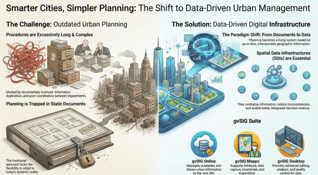
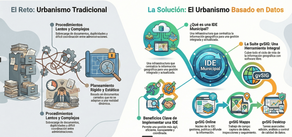
In many countries and regions, public administrations are revising their urban planning and land-use legislation with a shared goal: to simplify procedures, reduce administrative burdens, and adapt territorial management to an increasingly complex and dynamic reality.
The Valencian Community (Spain) is a recent example of this process, with the promotion of a new Land Law based on a widely shared diagnosis: excessively long procedures, documentary overload, duplication of information, and difficulties in coordinating data across departments and administrations. A situation that, to a greater or lesser extent, is repeated in many other territories.
...You can fit 21 Vaticans in San Francisco
gvSIG Team: Leyes del Suelo y el papel de las IDE municipales
En muchos países y regiones, las administraciones públicas están revisando su legislación urbanística y territorial con un objetivo común: simplificar procedimientos, reducir cargas administrativas y adaptar la gestión del territorio a una realidad cada vez más compleja y dinámica.
La Comunitat Valenciana es un ejemplo reciente de este proceso, con el impulso de una nueva Ley del Suelo que parte de un diagnóstico ampliamente compartido: procedimientos excesivamente largos, sobrecarga documental, duplicidades y dificultades para coordinar información entre departamentos y administraciones. Un escenario que, en mayor o menor medida, se repite en muchos otros territorios.
...Mergin Maps: [Blog] Plugin and API update brings simultaneous syncs
Meet Language Explorer: Google’s New Open-Source Linguistic Atlas
The World's Oldest Globe

geomatico: Tejiendo redes
Ya desde los inicios de la red de autónomos que fue el germen de Geomático, teníamos la costumbre de hacer, todos los años, al menos una reunión presencial de todo el equipo. Para quienes trabajáis en empresas cien por cien en remoto, sabéis lo importante que es juntarse y convivir con otros humanos.
En Geomático, además, al ser una cooperativa, aprovechamos la ocasión para realizar lo que legalmente es nuestra Asamblea Ordinaria. En nuestro caso, utilizamos este evento tanto para la toma de decisiones que requieren el debate de todas las personas socias como para lo que comúnmente llamamos “frikear” un poco.
Durante todo este tiempo, cuando se acercaban estas fechas, elegíamos dónde queríamos vernos y nos poníamos a buscar alojamiento. Hace cuatro años decidimos que nos reuniríamos en Segovia y, durante la búsqueda, dimos con Duermevela.
...
gvSIG Team: Technological sovereignty: when dependency is no longer an option
For years, at gvSIG we have insisted on a concept that was often dismissed as ideological, romantic, or even naïve: technological sovereignty.
Today, in a context marked by geopolitical tensions, supply chain disruptions, and structural dependence on external technologies, this concept has moved beyond academic debate to become a strategic necessity.
Europe imports around 80% of its digital infrastructure and technologies. This is not only an economic issue: it is a political, operational, and democratic vulnerability. We depend on decisions taken outside our legal frameworks, our interests, and, in many cases, our values.
...The Giant Pixel Art Map of New York

gvSIG Team: Soberanía tecnológica: cuando la dependencia deja de ser una opción
Durante años, en gvSIG hemos insistido en un concepto que muchas veces se despachaba como ideológico, romántico o incluso ingenuo: la soberanía tecnológica.
Hoy, en pleno contexto de tensiones geopolíticas, disrupciones en las cadenas de suministro y dependencia estructural de tecnologías externas, ese concepto ha dejado de ser un debate académico para convertirse en una necesidad estratégica.
Europa importa alrededor del 80 % de su infraestructura y tecnología digital. Esto no es solo una cuestión económica: es una vulnerabilidad política, operativa y democrática. Dependemos de decisiones tomadas fuera de nuestro marco legal, de nuestros intereses y, en muchos casos, de nuestros valores.
...TorchGeo: v0.8.1
This is a bugfix and maintenance release. While there are no new features or API changes, this release includes important bug fixes, documentation improvements, and minor enhancements across datasets, models, and testing.
Note
TorchGeo's documentation has been updated to use the PyData Sphinx Theme, bringing a modern look and feel along with improved navigation and accessibility. The new theme aligns TorchGeo with other scientific Python projects like NumPy, pandas, and xarray, providing a familiar experience for users across the ecosystem.
...Subways Built by Slime Mold
Where is Trump Still Popular?
Mergin Maps: [Blog] How to Import Geotagged Photos into QGIS for Fieldwork Mapping

OPENGIS.ch: QGIS User Conference 2026: welcoming the community to Laax 🏔️
We’re genuinely excited to co-organise the upcoming QGIS User Conference together with QGIS User Group Switzerland, and to do so in Laax, right here in the Swiss Alps.
Laax is home to OPENGIS.ch and the place where QField was born. It is a setting that has shaped how we work, how we collaborate, and how we think about building open-source tools that are meant to be used in the real world.
Bringing the global QGIS community together in such a place feels just right. People and ideas come together around open source, with space to exchange, reflect, and collaborate, in an environment that mirrors values that are deeply rooted in our DNA and our close connection to nature.
...How Big is Big?

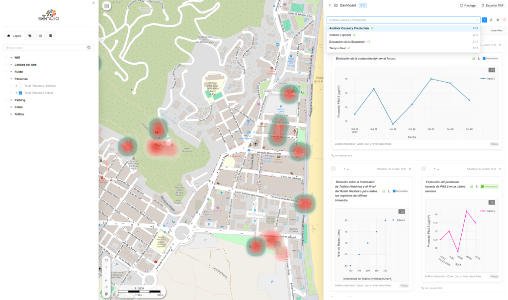
gvSIG Team: Descubre el nuevo frontend de gvSIG Online en pocos minutos
El nuevo frontend de gvSIG Online da un paso adelante en usabilidad, claridad y experiencia de usuario.
En este breve vídeo te mostramos, de forma rápida y directa, las principales herramientas y elementos de la interfaz: navegación por el geoportal, gestión de capas, herramientas habituales de consulta, edición, marcadores, etc… y una organización del interfaz pensada para trabajar de forma más ágil y eficiente con información geoespacial.
Ver el vídeo:
Una buena oportunidad para conocer, en solo unos minutos, cómo evoluciona gvSIG Online y qué aporta su nuevo frontend al trabajo diario con mapas y datos territoriales. Y esto solo son las herramientas principales…
Drunk Map
Mappery: The Earth is flat
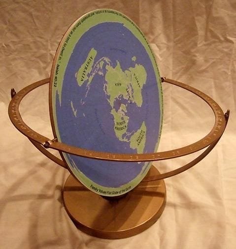
Should I keep this for April Fool’s Day? Nah, a good laugh is always welcome whenever it comes! Thanks Brilliant Maps for sharing.
GeoTools Team
GeoServer Team: GeoServer 2.28.2 Release
GeoServer 2.28.2 release is now available with downloads (bin, war, windows), along with docs and extensions.
This is a stable release of GeoServer recommended for production use. GeoServer 2.28.2 is made in conjunction with GeoTools 34.2, and GeoWebCache 1.28.2.
Thanks to Gabriel Roldan for making this release.
Release notesImprovement:
...GeoSolutions: GeoNode 5 is out!
You must be logged into the site to view this content.

Mapping U.S. Military Interventions
Camptocamp: Météo France Hackathon
GeoCat: MapScaping Podcast: Free software and expensive threats
GeoCat: GeoCat featured on the MapScaping Podcast
Mappery: Cross-stitch
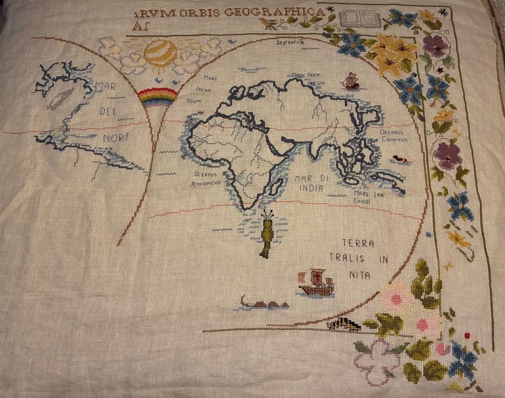
Sallie “bumbling about town 🐝🍉” on BlueSky shared this cross-stitch project in progress.
Make a Map Poster

Sean Gillies: Running in 2026: the plan
I've made my long range plan for 2026. It's different from my plans from 2023-2025, which were about recovering from injuries and trying to finish a 100 mile race. I succeeded in the former, but not in the latter.
In 2026 I am trying to be more intentional about training for speed. I'm going to do some workouts that develop power and neuromuscular adaptations, without any concern for building aerobic capacity during those workouts. I'm going to do more strides during longer runs and sign up for some shorter 5-10K races. I'm going to remind myself that running briefly, but regularly, at 100 percent can translate to running faster at 80-85 percent during a longer run.
...
Mappery: Multimap Teapot
We all enjoy a nice cup of tea with family or friends over Christmas, Walter Schwartz spotted this mappy teapot on his travels.
“This little teapot, short and stout, was in the Two English Ladies Tea Shoppe, a booth at the San Francisco Dickens Fair. It says “Cardew’s London Maps” on the bottom and may have originally been for sale in 1992. Although it is in the collection of the shop owner, they removed from it display case and let me photograph it because I explained it was for the internationally renowned mappery.org website.”
My guess is that this was made for Multimap, a London based mapping business at the time of the first dotcom boom (late 90’s early 2000’s), as a corporate gift. Maybe one of my friends who worked there will be able to confirm.
The Bovine Brands Browser

Mappery: Covent Garden Map Seller
In the Christmas market at Covent Garden, London, I spotted this map seller. Unfortunately there was no time to peruse and purchase.

Mappery: Sicily on a Plate
Reinder spotted this plate decorated with a map of Sicily at the Waterlooplein in Amsterdam, the daily flea market.
Did You Win the Global Lottery?
gvSIG Team: The SDI as a silent infrastructure
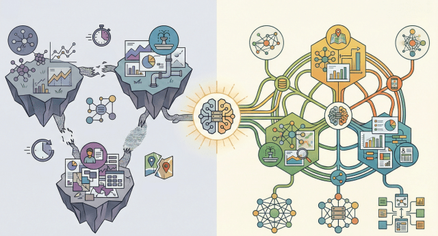
A Spatial Data Infrastructure (SDI) works like the nervous system of the digital territory. It is not always visible, but it connects data, people, and decisions. When everything works properly, it goes unnoticed. When it does not exist, problems become chronic.
Outdated layers, unresponsive services, duplicated or inconsistent data… the outcome is well known: wasted time, poor coordination between departments, and decisions made with incomplete information— not to mention the public service role that SDIs play in terms of communication and transparency with citizens.
...
gvSIG Team: La IDE como infraestructura silenciosa
Una Infraestructura de Datos Espaciales (IDE) funciona como el sistema nervioso del territorio digital. No siempre se ve, pero conecta datos, personas y decisiones. Mientras todo funciona, pasa desapercibida. Cuando no existe, los problemas son crónicos.
Capas desactualizadas, servicios que no responden, datos duplicados o incongruentes… El resultado es conocido: más tiempo perdido, menor coordinación entre áreas y decisiones tomadas con información incompleta… por no hablar del servicio público que aportan las IDE en cuanto a comunicación y transparencia con los ciudadanos.
...
GIScussions: Elite Football in Europe – don’t rely on AI to compile data
Click on the image above to view the map
Anyone who knows me knows that two of my top passions are maps and football, more specifically The Arsenal. Fans are always debating the historic achievements of their clubs, in some cases going back 40 years or more to find success (name-check = Ken Field), so I thought I would use a map canvas as a backdrop to an interactive dashboard to explore the connections between finances and success.
...
gvSIG Team: The gvSIG Suite as a partner for better municipal management
In the day-to-day management of a city council, information is key. But it is not just about having data—it is about knowing how to organize it, keep it up to date, and turn it into useful knowledge for decision-making. This is where the geographic dimension plays a fundamental role: infrastructures, administrative procedures, public services, environment, urban planning, or heritage… almost everything happens in a specific place within the territory.
The gvSIG Suite provides a comprehensive response to this challenge by combining three tools that cover the entire lifecycle of municipal geographic information: gvSIG Online, gvSIG Mapps, and gvSIG Desktop.
...Oslandia: (Fr) QSoccer : QGIS, football, what else ?
Sorry, this entry is only available in French.

Mappery: Foxy Map
Alex shared this pic, with apologies for the quality. I’m left wondering “What! Why?”
![OSGeo Announcements: [OSGeo-Announce] OSGeo Board Election 2025 results](https://www.osgeo.org/wp-content/uploads/cropped-osgeo-emblem-rgb-1-32x32.png)
OSGeo Announcements: [OSGeo-Announce] OSGeo Board Election 2025 results
There were five open seats for the 2025 board in this cycle of the Board of Directors election. The Chief Returning Officers reported that 285 out of 468 Charter members cast their votes for the Board of Directors (60% participation). … Continued
Est. reading time: 2 minutes
The Open Source Geospatial Foundation is pleased to announce the
results of its Board of Directors elections 2025.
There were five open seats for the 2025 board in this cycle of the
Board of Directors election. The Chief Returning Officers reported
that 285 out of 468 Charter members cast their votes for the Board of
Directors (60% participation). More information on the election
results is available on the dedicated OSGeo wiki page[1].
The Last Train Map

gvSIG Team: La Suite gvSIG como aliada para una mejor gestión municipal
En la gestión diaria de un ayuntamiento, la información es clave. Pero no solo importa tener datos, sino saber organizarlos, mantenerlos actualizados y convertirlos en conocimiento útil para la toma de decisiones. Y ahí es donde la dimensión geográfica juega un papel fundamental: infraestructuras, expedientes, servicios públicos, medio ambiente, urbanismo o patrimonio… casi todo ocurre en un lugar concreto del territorio.
La Suite gvSIG ofrece una respuesta integral a este reto, combinando tres herramientas que cubren todo el ciclo de vida de la información geográfica municipal: gvSIG Online, gvSIG Mapps y gvSIG Desktop.
...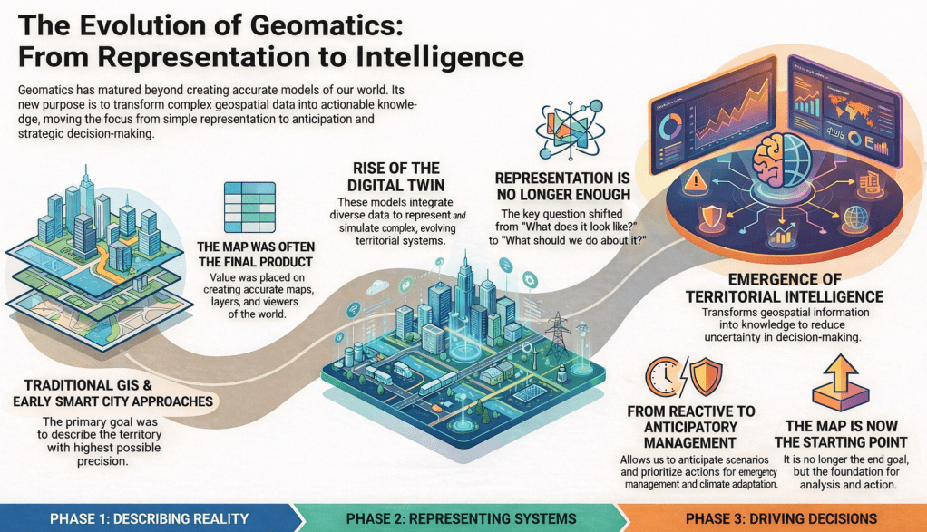
gvSIG Team: From Digital Twins to Territorial Intelligence: A natural evolution of geomatics
For years, in the field of geomatics, we have worked to describe territory with the highest possible level of accuracy. First came traditional GIS, then the Smart Cities narrative, and more recently the consolidation of the digital twin concept. Each of these terms has served a very specific purpose: helping us explain complex projects and highlight the value of geospatial technology in increasingly broad contexts.
The digital twin has represented an important step forward. It has allowed us to talk about models that integrate heterogeneous data, evolve over time, and represent complex territorial systems in an understandable way. However, as these projects mature, a shared feeling begins to emerge: representing reality well is no longer enough.
...
Mappery: Worldwide Produce
Another mappy truck, this time spotted by Ken Field somewhere in the US.
The World on Fire
Sean Gillies: Rasterio 1.5.0
Version 1.5.0 of your favorite Python library for reading and writing classic GIS raster data is on PyPI now. Since Jan 5, in fact.
Among other new features, this version adds support for 16-bit floating point raster data, and HTTP cache control. Please See the release notes for a full list of bug fixes, new features, and other changes.
Once again, major credit goes to Alan Snow for managing this release. Thanks, Alan!
GeoSolutions: GeoSolutions at GeoWeek Feb 16-18 (Booth #1245): Building Urban Digital Twins with Open Source Technologies
You must be logged into the site to view this content.
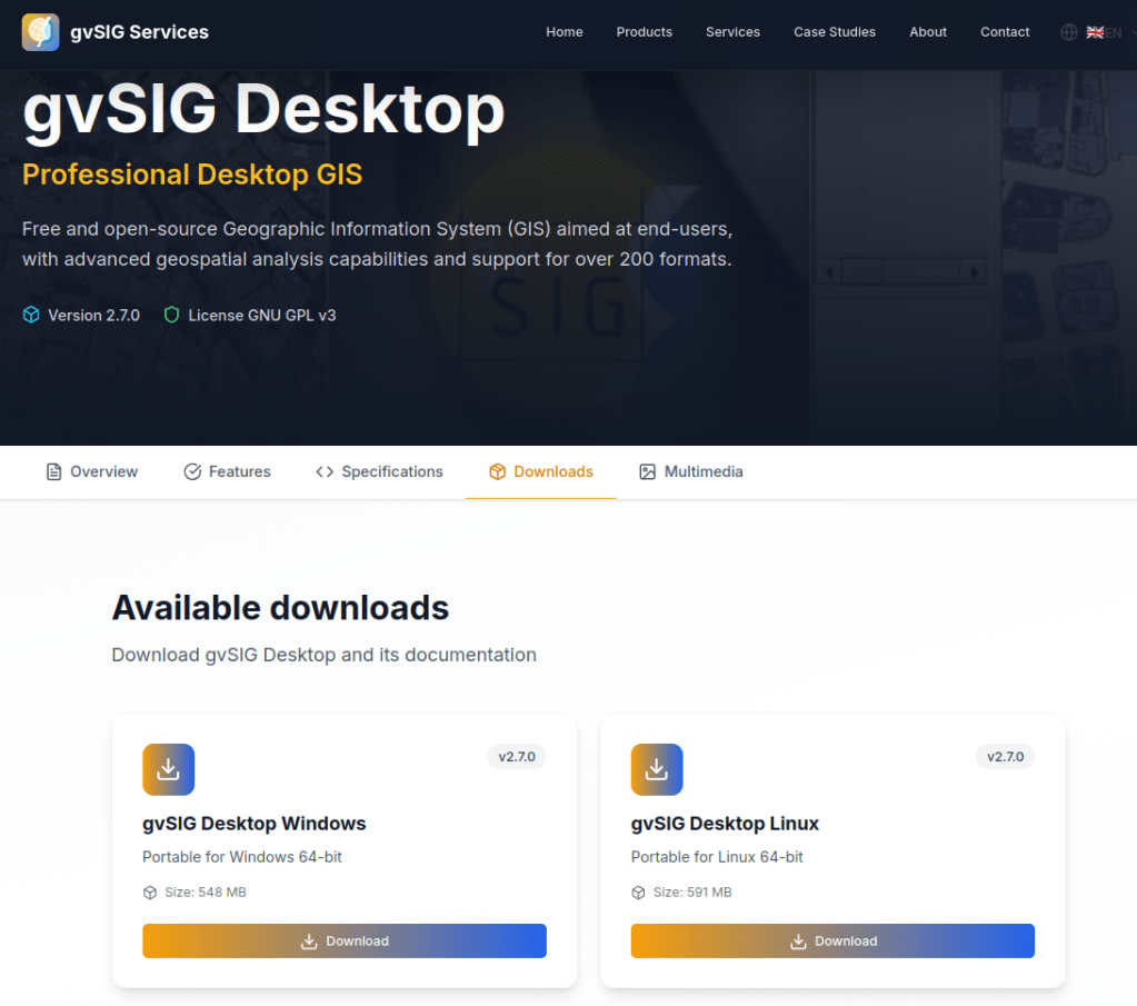
gvSIG Team: New gvSIG Desktop 2.7 version now available
With gvSIG Desktop 2.7, we continue moving forward along the path started in previous versions—a path clearly focused on integration with gvSIG Online and on the evolution of gvSIG Desktop as an advanced GIS editor, fully integrated into modern Spatial Data Infrastructure (SDI) architectures.
In this context, gvSIG Desktop consolidates its role as the desktop tool for editing, analysis, and quality control of geospatial information, naturally complementing gvSIG Online as a platform for data publication, management, and dissemination. This combination is designed to support real-world workflows in public administrations, corporate projects, and collaborative environments.
...
GIScussions: Geomob Events – it’s all in the data, geojson is VERY unforgiving
Click on image above to view the Geomob Events map
Last Friday I recorded a podcast with Ed Freyfogle about my vibe coding exploits. In the podcast Ed challenged me to make a map of Geomob events, so on Sunday afternoon I sat down to see what I could do.
...
gvSIG Team: Nueva versión de gvSIG Desktop 2.7 ya disponible
Con la versión gvSIG Desktop 2.7 continuamos avanzando en el camino iniciado en versiones anteriores, un camino claramente orientado a la integración con gvSIG Online y a la evolución de gvSIG Desktop como un editor SIG avanzado, plenamente integrado en arquitecturas IDE modernas.
En este contexto, gvSIG Desktop se consolida como la herramienta de escritorio para la edición, análisis y control de calidad de la información geoespacial, complementando de forma natural a gvSIG Online como plataforma de publicación, gestión y difusión de datos. Una combinación pensada para responder a flujos de trabajo reales en administraciones públicas, proyectos corporativos y entornos colaborativos.
...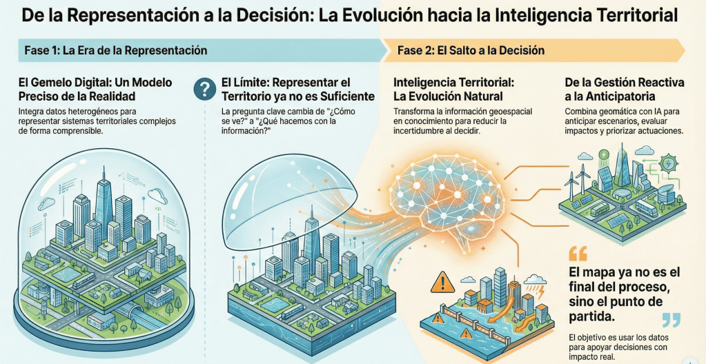
gvSIG Team: Del gemelo digital a la inteligencia territorial: Una evolución natural de la geomática
Durante años, en el ámbito de la geomática hemos trabajado para describir el territorio con la mayor precisión posible. Primero fueron los SIG tradicionales, después el discurso de las Smart Cities y, más recientemente, la consolidación del concepto de gemelo digital. Cada uno de estos términos ha cumplido una función muy concreta: ayudarnos a explicar proyectos complejos y a poner en valor la tecnología geoespacial en contextos cada vez más amplios.
...
Mappery: John Speed in Pieces
Rollo spotted this jigsaw of John Speeds county maps in a charity shop. For reasons that I can’t understand he didn’t buy it.
War Atlas: Mapping 3,500 Years of Conflict
Kartoza: Building Energy Planning Capacity in Nigeria: Reflections on EMP-N 2025
Mapping ICE Activity

Mappery: A Mappy Carpet in The Hague
Reinder spotted this in the in the public library in The Hague ” on the floor there is a map – not surprisingly – of the city of The Hague, the Netherlands. Been here many times, but never saw this before. “

Sean Gillies: Station Identification
Hello, my name is Sean Gillies, and this is my blog. I write about running, cooking and eating, gardening, travel, family, programming, Python, API design, geography, geographic data formats and protocols, open source, and internet standards. Mostly running and local geography. Fort Collins, Colorado, is my home. I work at TileDB, which sells a multimodal data platform for genomics and precision medicine. I appreciate emailed comments on my posts. You can find my address in the "about" page linked at the top of this page. Happy New Year!
Snow-covered cones, craters, and lava flows of Craters of the Moon National Monument in Idaho, viewed from an airliner traveling between Denver and Seattle on February 21, 2025.

Mappery: The Melbourne Map Scarves
Melinda Clarke, the creator of the Melbourne Map has branched out with a range of beautiful silk scarves with some very stylish map designs including, of course, The Melbourne Map. n this pic my pal Denise McKenzie is wearing Melbourne at the GeoBusiness conference.
Here’s Melinda with her vintage New York scarf
And here she is with the Melbourne map
You can order the scarves from her site at https://www.themelbournemap.com.au/collections/scarves, a beautiful gift for a map lover.

Free and Open Source GIS Ramblings: Notebooks in QGIS
Finally it’s here: Jupyter notebooks inside QGIS. I don’t know about you but I’ve been hoping for someone to get around to doing this for quite a while.
Qiusheng Wu published the first version of the Notebook plugin on 26 Dec 2025. Late Christmas present?!
For the setup, there’s a handy tutorial by Hans van der Kwast and, additionally, Qiusheng published an intro video:
Development is going fast (version 0.3.0 at the time of writing) so there will be new features when you install / update the plugin compared to both the tutorial and the video.
...
GIScussions: Mass Shootings and Gun Policy in the United States – it’s all in the prompt
Click on image above to view the map
Do the levels of deaths from mass shootings in the US correlate with the gun policies of individual states? I thought this might be an interesting topic to explore in my journey of mapping with AI, you can draw a conclusion from the screenshot above or wait until you get to the end of this post for my thoughts. Mapping wise – I also wanted to explore building a fairly complex map with a detailed prompt to see how close I could get in one go.
...
Mappery: At 39,000 feet
This is not the opening screen of some Esri software, it’s the in-flight mapping system on Ken’s last flight to the UK
Where are the Most Expensive Houses?

GIScussions: Is this vibe coding?
I started out trying to make web maps with WebMapperGPT and then Google Gemini to scratch an itch after my pal Ken Field said he was going to make a map a day in 2026. I thought I would give it a try and as some of the previous posts in this thread have shown I have been able to make some reasonable web maps with quite nice design and interaction (IMHO). But it isn’t easy and it’s certainly not a miracle coding solution.
My coding expertise is non existent – I do not know anything about JavaScript, I can edit but not create html pages and CSS with guidance and I have used mark-down a few times. My cartographic skills are quite limited and are a combination of self taught (not good) and correction by ridicule (Ken Field), I can use QGIS but am only a basic level user. Bottom line I couldn’t build one of the maps that I have built without assistance from AI.
...12 Million Bike Rides on One Map
![OSGeo Announcements: [OSGeo-Announce] Nyall Dawson receives the 2025 Sol Katz Award](https://www.osgeo.org/wp-content/uploads/cropped-osgeo-emblem-rgb-1-32x32.png)
OSGeo Announcements: [OSGeo-Announce] Nyall Dawson receives the 2025 Sol Katz Award
Nyall Dawson has been working on FOSS4G projects since 2013, having contributed to numerous projects such as QGIS, GDAL, and PROJ. He is best known as a key, longstanding core contributor to QGIS, with over 24000 commits (and growing). Nyall …...
Est. reading time: 2 minutes
We are honoured to announce that Nyall[1] is the recipient of the 2025
Sol Katz Award (the 21st year of the award) at the recent FOSS4G event
in Auckland, New Zealand.
Nyall Dawson has been working on FOSS4G projects since 2013, having
contributed to numerous projects such as QGIS, GDAL, and PROJ.

Mappery: Central Mediterranean and Near East
Marc Tobias spotted this old school map in Ed Frefogles home. It’s pretty nig!
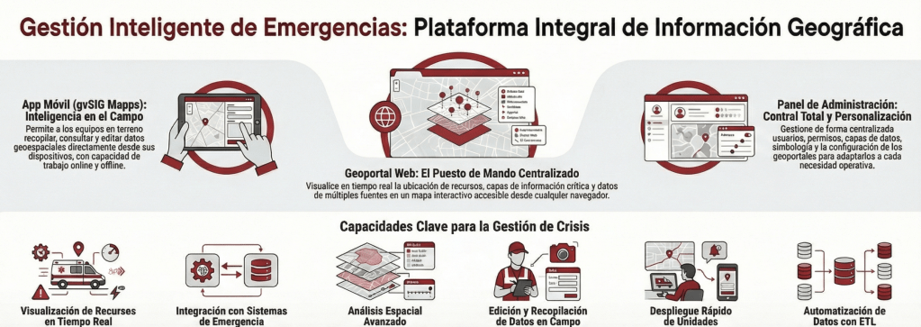
gvSIG Team: Innovación en la gestión de emergencias: Potenciando la toma de decisiones con la Suite gvSIG
En entornos donde cada segundo cuenta, la capacidad de gestionar, visualizar y analizar información geográfica de forma precisa es un factor determinante para el éxito operativo. Desde la Suite gvSIG, estamos impulsando una solución integral diseñada para modernizar las Infraestructuras de Datos Espaciales (IDE) y optimizar los procesos de respuesta ante emergencias y asistencia ciudadana.
Un ecosistema de trabajo completoNuestra propuesta tecnológica se basa en la integración de tres pilares fundamentales que cubren todo el ciclo de vida del dato espacial:
...Mergin Maps: [Case Study] Open source geological mapping with British Geological Survey
A Map of Personal Memories

Mappery: World of Communication
“World of communication’, in Rome, in the National Gallery of Modern and Contemporary Art. It dates from 1972 and is made by Jiří Kolář. ” I htink the collage on the globe is made with postage stamps.
QGIS Blog: QGIS User Conference 2026 in LAAX
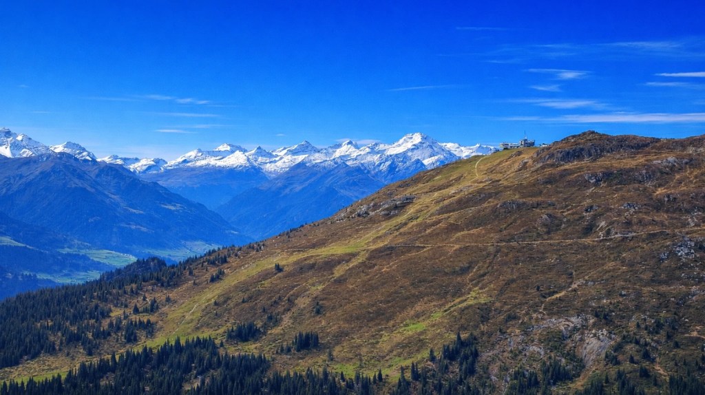
We are happy to announce that the QGIS User Conference 2026 will take place on 5–6 October 2026 in Laax, in the heart of the Swiss Alps. Visit the conference website to find out all details.
The conference will be hosted at Crap Sogn Gion, at 2,222 metres above sea level, offering a unique setting with panoramic mountain views and direct access to the surrounding alpine landscape. Despite its mountain location, Laax is well connected by public transport and provides a wide range of accommodation options in the valley.
As Chair of the QGIS Project and of the QGIS User Conference 2026, I’m very much looking forward to welcoming the community in my hometown and place of birth of QField.
...
Mappery: Little Mappy Suitcases
Reinder spotted these mappy suitcases in a hotel window in Rome. He was so taken with them that he didn’t mention the nice looking globe, while his wife apparently was more impressed by the towels folded as swans. Go figure!
If only those cases were a bit bigger and had wheels.
A New Year’s Flight Around Planet Earth
gvSIG Team: GeoLIBERO se convierte en Red Emérita CYTED
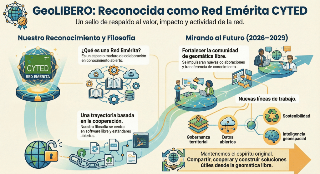
La red GeoLIBERO ha sido reconocida oficialmente como Red Emérita por el Programa CYTED. Este reconocimiento fue aprobado por la Asamblea General celebrada en noviembre de 2025 en Asunción (Paraguay) y supone, sobre todo, un respaldo al trabajo colectivo que venimos desarrollando desde hace años en torno a la geomática libre en Iberoamérica.
Además, he sido nombrado coordinador de la Red Emérita GeoLIBERO para el periodo 2026–2029, una responsabilidad que desde la Asociación gvSIG asumimos con orgullo y con muchas ganas de seguir impulsando esta comunidad.
...
OPENGIS.ch: QField at FOSS4G 2025 Auckland
Throughout the week, in workshops, presentations, and project showcases, a consistent theme emerged: QField is not just “the mobile companion to QGIS,” it is production infrastructure for complete field-to-cloud-to-desktop workflows.
It was incredible to see how present QField was throughout FOSS4G 2025 in Auckland. With around 20 presentations and workshops featuring QField, the conference showcased a wide range of real-world, production-grade use cases across many sectors.
What stood out was not just the number of talks, but how consistently QField was presented as a trusted, operational tool rather than an experiment.
...
Mappery: Mosaic Map of Rome
Reinder spotted this mosaic map of the Old City of Rome, “Saw this in the lobby of the Santa Chiara hotel in Rome. The size of the map is let’s say 50 x 70 cm, it is made of little stones of approximately 4 x 4 mm. No artist is mentioned — but he or she deserves our respect. Ciao!”
The United States on Mars

GIScussions: Unequal London v2 – Lessons Learnt
Click the image to go the Unequal London Map (v2)
I was quite pleased with the first version of the Unequal London Map, but by the time I had crawled over the finish line I realised that there were several choices that I had made which were less than ideal, particularly with regard to the data I selected. I thought it should be quite easy to build another version with more/different data and remedy some of the other issues. I decided to start with Gemini to avoid the usage limits with WebMapperGPT.
The first stage was to identify the data that I could use to give a better view of inequality in London. I started with this prompt:
...
Mappery: Balloon View of the Thames
Remember Santa’s Delivery Route from Xmas Eve? Ken sent me this modern version of that map which he spotted in the lobby of the Great Northern Hotel next to Kings Cross. Note that this time the map is north up.
Estimating Population with OpenStreetMap
Propulsé par FreshRSS | 301 articles dans cette sélection

