Planet GeoRezo
Agrégateur de flux RSS - Actualités et contenus géomatiques

GIScussions: Alcohol Consumption & Production – you’d think the data would be easy?
I thought it might be interesting to look at alcohol consumption and production around the world. I expected the data to be pretty easy to find an process – how wrong can you be!
Consumption figures came from the World Health Organization via Our World in Data, which publishes recorded per capita alcohol consumption broken down by beverage type — beer, wine and spirits — for most countries in the world, with data running up to 2020. The WHO figures measure litres of pure alcohol, so Claude converted these to litres of finished drink using standard ABV assumptions (beer 5%, wine 12%, spirits 40%). The total consumption layer uses pure alcohol to allow a fair comparison across drink types.
...GRASS GIS: GRASS 8.5.0 released
OSGeo Announcements: [OSGeo-Announce] GDAL 3.13.0 "Iowa City" is released
https://www.osgeo.org/foundation-news/gdal-3-13-0-iowa-city-is-released/
Hi,
On behalf of the GDAL/OGR development team and community, I am pleased to announce the release of GDAL/OGR 3.13.0 “Iowa City”.
GDAL/OGR is a C++ geospatial data access library for raster and vector file formats, databases and web services. It includes bindings for several languages, and a variety of command line tools.
The 3.13.0 release is a new feature release with the following highlights:
...When London Was on the Equator
Keyboard Free Maps
OSGeo.nl: Foss4G-NL 2026 Call for Presentations
Een FOSS4G‑evenement draait om makers én gebruikers van open source GIS‑toepassingen. Het is de plek waar we laten zien wat er mogelijk is met vrije software, waar we elkaar inspireren en waar nieuwe ideeën ontstaan.
Ben je maker van een tool, plugin, workflow of dataset? Dan is dit hét podium om te laten zien wat er allemaal kan: van slimme scripts tot verrassende visualisaties.
Lutra consulting: QGIS 3D for digital twins: crowdfunding results
iCarto Blog: Key Milestone in Eswatini: SIRH Enters Final Phase with Billing Module Implementation
The path toward efficient and modern water management is not traveled through technology alone, but through close technical and human collaboration. Recently, part of the iCarto team traveled to Eswatini to work hand-in-hand with the Joint River Basin Authorities (JRBA), achieving two fundamental milestones for the project’s sustainability.
Main achievements: Billing and Real-World DataThis field visit was decisive in consolidating the system’s operability. Thanks to the joint effort, we succeeded in fulfilling the two main planned objectives:
...Map Cam Selfie
GeoCat: GeoCat Find 2026.0
Mapping the Jet Stream
Sean Gillies: Quad Rock training week 16
Week 16 is over. It's six days to Quad Rock.
10 hours, 11 minutes all training
18 miles running
2,385 ft D+ running
I did a small set of hard running intervals, some steady running, and one last hilly run on the Quad Rock course with a friend on Friday. We pushed the pace on the upper half of the first climb, going up Towers Trail, and I was just a few seconds off my personal bests on those segments. 10/10 effort on Saturday won't be sustainable, but it was fun and a useful check on my fitness before the race. I'll completely recover from that by the end of the week, no problem.
...![OSGeo Announcements: [OSGeo-Announce] TorchGeo and IBM TerraTorch Join Forces](https://www.osgeo.org/wp-content/uploads/terratorch-terrakit-scaled.png)
OSGeo Announcements: [OSGeo-Announce] TorchGeo and IBM TerraTorch Join Forces
https://www.osgeo.org/foundation-news/torchgeo-organization-ibm-research/
The TorchGeo Organization and IBM Research are joining forces!
The TerraTorch and TerraKit libraries have joined the TorchGeo Organization! https://github.com/torchgeo is now home to 3 of the most influential and widely used open-source GeoAI libraries:
...The World is Your Canvas
Sean Gillies: Kyle Kingsbury's bullshit about bullshit machines
You've probably seen links to "The Future of Everything is Lies, I Guess" already. I've just finished the last installment. This is an excellent series of posts with many references. If we meet to talk about the industry, I'm almost certainly going to ask if you've read it.
This is bullshit about bullshit machines, and I mean it. It is neither balanced nor complete: others have covered ecological and intellectual property issues better than I could, and there is no shortage of boosterism online. Instead, I am trying to fill in the negative spaces in the discourse. “AI” is also a fractal territory; there are many places where I flatten complex stories in service of pithy polemic. I am not trying to make nuanced, accurate predictions, but to trace the potential risks and benefits at play.
...Marble Madness
The Interstellar Travel Planner
Tracking & Mapping Private Cars in Real-Time
geomatico: Los mapas que se ignoran
El espacio no es contexto, es estructura.
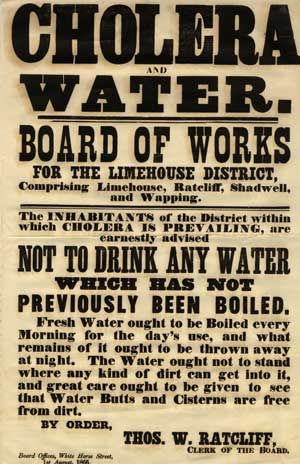
Los Sistemas de Información Geográfica (GIS) parecen hoy inseparables de disciplinas como urbanismo, planificación territorial o gestión ambiental. Sin embargo, su presencia en la enseñanza académica es sorprendentemente desigual: omnipresente en geografía, marginal en arquitectura, casi inexistente en sociología, economía o ciencias políticas. Lo paradójico es que el concepto fundacional del GIS no nació de la informática ni de la ingeniería, sino de algo mucho más antiguo y urgente: un epidemiólogo británico tratando de detener una epidemia.
Un plano que cambió la forma de entender la ciudadEn 1854, Londres sufría un grave brote de cólera. La teoría dominante era clara y científicamente respaldada: la enfermedad se transmitía por el aire —los llamados «miasmas». Pero John Snow, médico con una observación incómoda, sospechaba que la teoría estaba radicalmente equivocada.
...Every Solar Eclipse This Century
SourcePole: Multi-User Editing in QGIS Cloud
QGIS Cloud makes it possible to edit geospatial data collaboratively directly from the web browser. This is especially useful when several users need to update the same dataset without installing or configuring a local QGIS project.

GIScussions: Brain Freeze – What to map next?
I am struggling to come up with an idea for what to map next. A bit of a brain freeze. Have you got an idea? Leave a suggestion in the comments.
Historical GeoGuesssr
GRASS GIS: GRASS Community Meeting 2026 Announcement

Sean Gillies: Quad Rock training week 15
Week 15 was my peak week before Quad Rock on May 9. I didn't run a lot, but it was all high quality running.
14 hours, 23 minutes all training
24.8 miles running
6,020 feet D+ running
Tuesday I hiked and ran up and down Green Mountain in Boulder, my first time on that mountain. I went up the steeper east side and down the more runnable west side. The trail is ridiculously steep: in the first mile I gained 1,300 feet of elevation. There's a ladder at one point, that's how steep it is. The second mile has a short runnable section and averages only 19%. I went steadily to the top and ran the downhills of Ranger and Gregory Canyon as fast as I could while sight-reading. Green Mountain is fun, easy to access, and loved almost to death by Boulderites. The Amphitheater and Saddle Rock trails are in sad shape.
...GeoSolutions: GeoSolutions Exhibiting and Presenting at GEOINT 2026 Symposium
You must be logged into the site to view this content.
Is Your Home Too Close to a Road?
QGIS España: Madrid acogerá la QGISCamp España 2026
Hace unos días lanzamos una encuesta para decidir si se celebraba y en caso afirmativo, cómo y dónde celebrar la próxima QGISesCamp 2026. Queríamos escuchar a la comunidad, contrastar opciones y tomar la decisión con criterio compartido. Y eso es exactamente lo que ha pasado.
Tras analizar los resultados, desde la Junta de la Asociación QGIS España hemos decidido que finalmente la QGISCamp España 2026 se celebrará en Madrid.
No ha sido una decisión automática. Ambas propuestas han estado muy igualadas, con argumentos diversos, pero entendemos que la propuesta ganadora, Madrid, ha destacado por su accesibilidad, su capacidad de acogida y las facilidades logísticas para organizar un encuentro cómodo, presencial y centrado en lo que de verdad importa: compartir conocimiento, experiencias y ganas de seguir construyendo comunidad en torno a QGIS.
...The World is Your Canvas
Sean Gillies: Laid off
Welp, I'm joining the ranks of the unemployed tech workers again.
As before, I'm in a good situation. I don't depend on my former employer for health insurance. I've got some severance and savings, my family is in good health, we have a roof over our heads, and I have good connections. I don't feel afraid.
But maybe I should? The job market is worse than last time this happened to me. I've seen experienced and talented people go for weeks and months without offers, and read some harrowing stories about what under-employment looks like for older tech workers these days.
After a little detour into the biomedical field, I'm looking to get back into helping to solve important geospatial problems. If you've got them, please let me know.
Creating a Global Disco
Sean Gillies: Station identification
Hello, my name is Sean Gillies, and this is my blog. I write about running, cooking and eating, gardening, travel, family, programming, Python, API design, geography, geographic data formats and protocols, open source, and internet standards. Fort Collins, Colorado, is my home.
Email me with questions or comments on any of my posts: sean.gillies@gmail.com.
Update: I'm currently looking for work in the geospatial field, remote or in Colorado. Please check out my CV.
Mergin Maps: [Blog] From wishlist to app: Feature filtering is live
QGIS Blog: Plugin Repository Security Enhancements
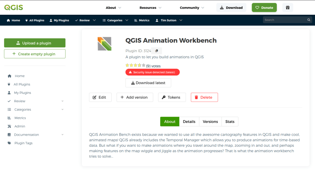
We want to share some updates we have made on the QGIS Plugin Repository. In January 2026 we shared QEP 409. The proposal seeks to improve the general working practices with QGIS plugins, adding some optional and some mandatory checks to every plugin that gets published in the QGIS plugin repo. This builds on initial work (see PR) we did to run ‘soft’ checks on every plugin when they are published.
We also ‘back ran’ the new security checks on every existing plugin in the plugin repository (latest versions only) and assigned them a security badge without blocking or removing any plugin from being published.
...Data as Art
gvSIG Team: Novedades gvSIG Desktop 2.7: Calculadora de coordenadas
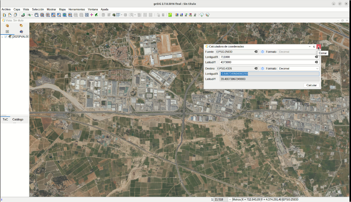
La versión 2.7 de gvSIG Desktop incluye una nueva herramienta que permite convertir coordenadas entre distintos sistemas de referencia, que facilita por ejemplo el poder buscar coordenadas de puntos que se tienen en un sistema diferente al de la vista desde la propia aplicación, y no tener que acudir a herramientas externas. En el caso de coordenadas geográficas se puede seleccionar formato decimal, o grados, minutos y segundos.
Esta herramienta complementa al capturador de coordenadas, herramienta que ya existía en versiones anteriores de gvSIG Desktop, y con la que se podía obtener las coordenadas de un punto sobre la vista en el sistema de referencia elegido, aunque la vista estuviese en un sistema diferente. Esta herramienta permitía además guardar dichos puntos, para ser utilizados en algunos geoprocesos.
En el siguiente vídeo se muestra el funcionamiento de ambas herramientas:
GeoCat: GeoServer 3.0-RC is here
GeoSolutions: GeoServer 3.0-RC is here
You must be logged into the site to view this content.
Where Europe Is Emptying

Fernando Quadro: Curso WebGIS com PostGIS, GeoServer 3 e GeoNode 5
Se você já trabalha com dados geoespaciais, provavelmente domina análise. Mas deixa eu te provocar:
Você sabe transformar isso em uma solução acessível na web?
Porque existe uma diferença enorme entre:
Gerar mapas
E entregar uma plataforma que outras pessoas realmente usam
E é exatamente aí que entra o WebGIS.
Hoje, quem se destaca não é só quem analisa dados… É quem consegue:
Centralizar informações
Publicar serviços padronizados (OGC)
Criar aplicações acessíveis via navegador
Controlar acesso e usuários
Escalar o uso dos dados
Em outras palavras: sair do desktop e ir para internet.
Agora vem o ponto que trava muita gente:
“Pra fazer isso eu preciso programar?”
Não.
Com as ferramentas certas, você consegue construir um WebGIS completo usando:
...Address to Impress
GeoServer Team: GeoServer 3.0-RC, a crowdfunded success story
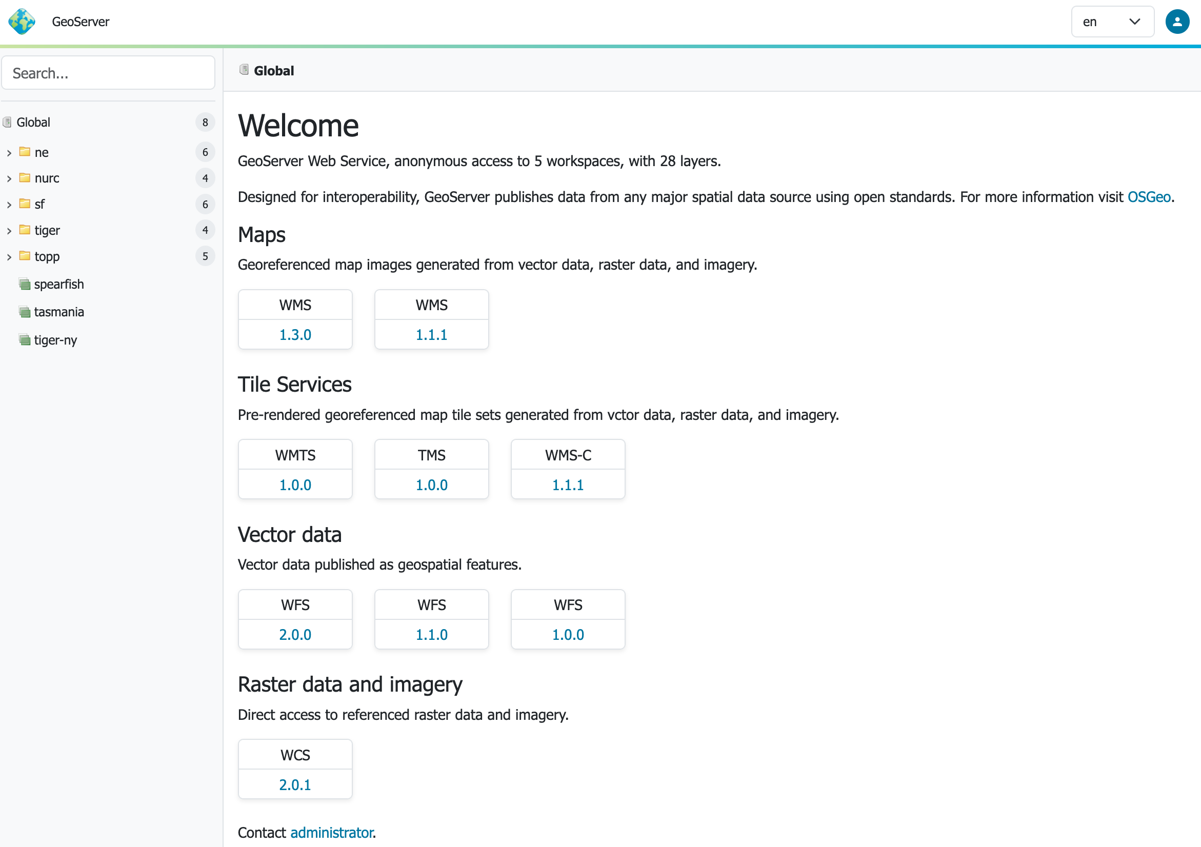
GeoServer 3.0-RC is now available, and with it we can celebrate something bigger than a release candidate.
This milestone is the concrete outcome of a successful community crowdfunding campaign.
When we launched the GeoServer 3 crowdfunding initiative in September 2024, the goal was ambitious. GeoServer needed more than incremental maintenance. It needed a full platform modernization, including a new generation user experience, a stronger security foundation, a modern Java stack, improved raster processing, and the engineering effort required to carry those changes across the broader GeoServer ecosystem.
That work is now visible in GeoServer 3.0-RC.
...The First Systematic Survey Meets Modern DEM

Sean Gillies: Quad Rock training week 14
I needed my training to begin to peak in week 14. Quad Rock is in 20 days (at this writing), and I won't get much adaptation to workout loading in the last 13 days. Weeks 14 and 15 would be my last opportunities to get faster and stronger before the race. Fortunately, a return to good health and favorable weather helped make this my best week yet.
13 hours, 8 minutes all training
42.7 miles running
8,550 feet D+ running and treadmill
The first block of my training was dedicated to power and pure speed, The second to intense aerobic efforts. This last block is about going up and down technical mountain trails at my race pace or a bit faster. In practice, I push pretty hard for half of each climb, run the downhills as fast as I can, and otherwise keep it easy, but not slow.
...
GeoServer Team: GeoServer 3.0-RC Release
GeoServer 3.0-RC is now available, with downloads for ( bin, war ), along with docs and extensions. We are working with OSGeo for the windows installer download, and will update this post when it is available. Windows users are asked to test out the bin download while we wait. Release available as docker image docker.osgeo.org/geoserver:3.0-RC .
...
Narcélio de Sá: FOSS4G 2026: O Geoprocessamento Brasileiro em Hiroshima
É oficial! É com muita alegria e entusiasmo que confirmo minha participação no FOSS4G 2026 em Hiroshima! 🇯🇵
Para quem não está familiarizado, o FOSS4G é o maior evento do mundo dedicado ao software livre geoespacial. Organizado pela OSGeo, é o lugar onde desenvolvedores, usuários e entusiastas se reúnem para moldar o futuro das geotecnologias.
Gratidão à ComunidadeAntes de falar das apresentações, quero expressar meu profundo agradecimento à comissão organizadora. Sabemos que realizar um evento desta magnitude exige uma dedicação quase sobre-humana. O o trabalho de vocês é fundamental para fortalecer o ecossistema global de software livre geoespacial. Obrigado por tornarem isso possível!
...Sean Gillies: Quad Rock training week 13
Week 13 started out pretty strong. I returned to my favorite Monday evening yoga class, did a fun run with strides at Pineridge on Tuesday, and then a hard running interval workout on Towers Trail in Horsetooth Open Space on Wednesday. Thursday I had cold symptoms again and shifted to dog walking and bike riding for the rest of the week. The running numbers for the week are nothing much.
11 hours, 35 minutes all training
14.6 miles running
2,041 feet D+ running
By Saturday afternoon I felt much better, which gave me hope for a solid week 14.
Google Night View
Drop a Message in a Bottle

OPENGIS.ch: QGIS Sustainability Initiative – Annual Report
At OPENGIS.ch, we believe that the long-term health of the QGIS ecosystem depends on more than just adding new features. Critical work like bugfixing, code reviews, codebase maintenance, and quality assurance often goes unnoticed, yet it is essential to delivering the stable, reliable software that thousands of organisations depend on every day. That is why we launched the QGIS Sustainability Initiative (#sustainQGIS). For every support contract of more than 10 days, we donate development time to the initiative. In addition, all unused hours at the end of the year of each contract are also donated. This ensures that buying an OPENGIS.ch support contract directly helps enable the long-term, sustainable development of the QGIS and QField ecosystem.
...
OPENGIS.ch: QGIS Sustainability Initiative – Annual Report
At OPENGIS.ch, we believe that the long-term health of the QGIS ecosystem depends on more than just adding new features. Critical work like bugfixing, code reviews, codebase maintenance, and quality assurance often goes unnoticed, yet it is essential to delivering the stable, reliable software that thousands of organisations depend on every day. That is why we launched the QGIS Sustainability Initiative (#sustainQGIS). For every support contract of more than 10 days, we donate development time to the initiative. In addition, all unused hours at the end of the year of each contract are also donated. This ensures that buying an OPENGIS.ch support contract directly helps enable the long-term, sustainable development of the QGIS and QField ecosystem.
...what1tune - Musical Addresses
The Ebb and Flow of a City in Motion
QGIS España: ¿QGIS Camp España 2026? ¿Madrid o Granada?
Desde la Asociación QGIS España queremos compartir con la comunidad una reflexión abierta y, sobre todo, lanzar una consulta clave para la toma de decisiones de este año.
Como ya sabéis, en 2026 no se celebrarán las Jornadas de SIG Libre de Girona, un evento que durante años ha sido el principal punto de encuentro de la comunidad SIG Libre y que, además, servía de marco para la celebración de la QGIS Camp España, donde personas asociadas y usuarias de QGIS nos reuníamos para compartir experiencias, debatir sobre la herramienta y sobre el propio rumbo de la Asociación.
Creemos que la comunidad no debería quedarse sin su encuentro anual, y por ello desde la Asociación estamos valorando la posibilidad de celebrar la QGIS Camp España en 2026, manteniendo el espíritu participativo que siempre ha caracterizado a este espacio.
...![OSGeo Announcements: [OSGeo-Announce] PROJ 9.8.1 is released](https://www.osgeo.org/wp-content/uploads/cropped-osgeo-emblem-rgb-1-32x32.png)
OSGeo Announcements: [OSGeo-Announce] PROJ 9.8.1 is released
Warning It was discovered after the PROJ 9.8.0 release that several EPSG updates introduced after EPSG v12.033 – notably the introduction of national realizations of ETRS89 (ETRS89-XXX […] where XXX is the 3-letter ISO country code) – caused backward...
Est. reading time: 2 minutes
It’s my pleasure to announce the release of PROJ 9.8.1!
The release includes a few updates, bug fixes and a major regression fix for ETRS89-related coordinates operations.
See the release notes below.
Download the archives here:
...
OPENGIS.ch: Sustainability initiative: what is it and why we do it?
At OPENGIS.ch, we create open-source software.
We are contributors, maintainers, and in the case of QField, the team that builds it.
That comes with a responsibility we take seriously: giving back.
“Give back” is not a slogan. It is our first core value, and the very reason the sustainability initiative exists.
Open-source is a garden. If you eat from it, water it, and keep seeding.
...Scrabble Map
PostGIS Development: PostGIS Patch Releases
The PostGIS development team is pleased to provide bug fix and security releases for PostGIS 3.2 - 3.6.

QGIS Blog: We’re Hiring! QGIS Administrative Assistant Wanted
QGIS.org is pleased to announce that we will be using some of the funding that is donated to us by our users and sustaining members to fund a dedicated administrative role for the project.
Principle duties:
...How Livable is Your Street?
This Map Finds Cities Everyone Can Fly To
Lutra consulting: Lutra Consulting at FOSSGIS 2026: The Göttingen Wrap-up
Legible Rude Places Map
Camptocamp: PMTiles: vector tiles supporting firefighters
Oslandia: (Fr) [Témoignage client] Julien Girard Claudon, DSI LPO AuRA
Sorry, this entry is only available in French.
11 Million Colored Buildings
GeoSolutions: GeoSolutions USA Sponsoring FedGeoDay 2026 – “Building Ecosystems for Supporting Federal Data Stewardship”
You must be logged into the site to view this content.
Jackie Ng: New plans and stuff
So after finally getting MapGuide Open Source 4.0 out the door, I took a self-imposed hiatus from all things mapping/GIS related for several months, permanently moved from Windows to Linux as my daily driver OS just in time before the end of Windows 10 support, and also to mentally recharge and savor the relief of having this major burden (of releasing MGOS 4.0) being finally lifted off of my back.
I now return with a renewed vigor and some rough roadmaps for things going forward in MapGuide and my other various projects. Part of that renewed vigor is due to the advent of ...
...The Ancestry Dot Map of America

Nick Bearman: Generative AI Tools for Mapping
David Bann and Liam Wright have put together a great guide to Generative AI Tools for Quantitative Research on the NCRM resources site. This is a great overview of what Generative AI is, how it works and all of the potential different models available, both commercial and open source, as well as how to run some models locally rather than relying on the cloud.
They are also very focused on the practical elements of how to actually use the tools in your work, discussing the different approaches as well as highlighting the importance of making sure you do not share sensitive data with cloud services.
They also have a great selection of videos for setting up both cloud based and local LLMs for working with Stata and R scripts in a number of tools including VS Code:
...The World in Motion

Sean Gillies: Quad Rock training week 12
In week 12, I started to get things back on track after being sick. I ran five days, biked one day, and took Saturday off to take my family to a Nuggets game in Denver.
12 hours, 9 minutes all training
34.8 miles running
5,800 ft D+ running (and treadmill)
My energy level was low to mid until Friday, when I rallied for a good interval workout on a 12% incline treadmill indoors and a sauna session after. My fitness didn't advance much in week ten, but I didn't lose a step. According to the machine, I went "up" beyond any of the Quad Rock climbs, and at a pace that I'd love to hit on race day.
...
GIScussions: Critical Minerals – The Global Supply Chain
Listening to the news about the impact of the current war and the closure of the Strait of Hormuz, I was prompted to think about critical minerals that could also have massive disruptive impact in geopolitical turmoil.
I asked Claude “Can you build a dataset of the most critical minerals, where they are mined (mine sites or countries), shares of world production, price changes over 5-10 years, main usages so that we can build a map of these commodities. Build it in a way that we can extend if we find more data” and it found me some data using these sources:
...The Politics of Street View
200,000 Rivers Run Through It

Ecodiv.earth: OmniCloudMask for cloud detection
Cloud masking is one of those steps you cannot really avoid when working with satellite data. Yet, it is often more cumbersome than it needs to be: different sensors come with different workflows, tools, and preprocessing requirements.
That is why I like OmniCloudMask. It is a Python library for cloud and cloud shadow detection in high to moderate resolution satellite imagery. Instead of relying on sensor-specific approaches, it uses a single model that generalizes across platforms.
According to the documentation, it supports resolutions from 10 m to 50 m and works with imagery from Sentinel-2, Landsat, PlanetScope, Maxar, and other sensors with Red, Green, and NIR bands. In practice, however, it also performs well on higher-resolution data, such as the 1.2 m Pléiades NEO imagery used in this example.
...ASCII Mapping of Live Data
Sean Gillies: Quad Rock training week 11
I had big plans for week eleven and then came down with a cold. My Wednesday workout's mediocre feeling was the first indication. The rest of the week I shifted into recovery rides and easy runs.
10 hours, 23 minutes all training
19.2 miles running
2,306 ft D+ running
It wasn't a terrible week, to be clear. I didn't fall apart physically, or anything like that. My concern is that it was the first week where I didn't progress very much in my Quad Rock training season.

GIScussions: Find Cheap Fuel Near Me – APIs and cron jobs
Having knocked up a simple fuel finder based on a csv download from the government site at the beginning of the week I thought “How difficult could it be to make something more functional and elegant and connect to the government fuel finder API?” Answer – the “more functional and elegant” not too difficult – about 3 hours of vibe coding, Connecting to the API and refreshing regularly – pretty damn hard even with Claude helping me.
For comparison here is the first version using a downloaded file
The map pins are simple, the pop-up has limited info and worst of all there are all those miscoded petrol stations in the North Sea.
...Real-Time Mapping of the Moon Mission
Mini London 3D
OSGeo Announcements: [OSGeo-Announce] OSGeo Ambassador Programme: Call for Participation
https://www.osgeo.org/foundation-news/osgeo-ambassador-programme-call-for-participation/
In line with its commitment to increase the impact of the organization, OSGeo is excited to announce its new Ambassador Programme.
What is an OSGeo Ambassador?
Someone who helps OSGeo to grow its financial resources through fundraising. These are some fundraising activities that we would love for an ambassador to explore:
• Engage with Organizations such as the European Commission (EC), or the United Nations (UN), to seek grants and other opportunities.
• Liaison with commercial companies and acquire new sponsors.
We acknowledge that it may not be easy for everyone o approach many of these organizations. An ideal candidate would be someone who already has a strong professional network that they can leverage.
...Volker Mische: Atmospheric data portals reply
This is a reply to David Gasquez’ blog post Atmospheric Data Portals. As there’s so much in it and much of it overlaps with future plans, I thought it makes sense to write a proper public reply instead of following up in a private conversation.
First of all, read his blog post and follow the many links, there is so much to discover.
One re-occurring thing in the documents linked from the “issues on the earlier stages of the Open Data pipeline” section is that for most portals a static site should be sufficient. I fully agree with that. When it’s done properly, an automated rebuild of some parts when new data is added should work well. These days even powerful client-sided search is possible.
...Moon Shots and Space Rot
Volker Mische: FOSSGIS 2026
This is a short write-up on the FOSSGIS 2026 conference. It’s a German speaking conference on free and open source geographic information systems and OpenStreetMap. So maybe a blog post in English spreads the word even wider.
While being the biggest edition ever (1000 registrations on-site, 300 online) it was well run and organized as every year. It didn’t even feel larger than usual. The CCC video team streamed live and published the cut videos the same day in outstanding quality as always.
I split this post into two sections, one about interesting talks for the geo world in general and then follow up discussions on my Matadisco talk and ATProto in general.
...Sentient Street View

GIScussions: Petrol Prices in the North Sea
This morning there was a lot of amused banter amongst my geo-pals about the UK Government’s Fuel Finder API based on an article in The Times (possible paywall) on the problems with the data. You can download the data or access the api from the gov.uk site.
...
GIScussions: National Symbols – from zero to hero in an hour
I was thinking about what map to make next and I thought about flags, national symbols like birds or animals.
I started out with a very simple prompt to see what Claude would come up with:
I want to make an interactive map of national symbols: Flags, Trees, Flowers, Animal, Symbols,Anything else you can suggest?
It chundered away for a few minutes and came up with this monster
Yes it is truly awful! You can click on the map above to see it in action, it sort of works but the map part is rubbish (but probably represents Claude’s limited sense of world geography) and the linked data is pretty flaky as well. When I challenged Claude it explained that it was using “training data” I guess that means “any old crap that I could scrape.
...The World is a Piano!
The Notable People Map Game
OSGeo Announcements: [OSGeo-Announce] Thank you Angelos, outgoing OSGeo President
https://www.osgeo.org/foundation-news/thank-you-angelos-outgoing-osgeo-president/
After years of service, Angelos Tzotsos is stepping down as President of OSGeo and will continue to serve on the Board of Directors for the remainder of his term. We want to take this opportunity to thank him for his leadership on behalf of the community.
Angelos joined the OSGeo Board in 2016 and has served as President since 2019. Over that period, he has been a consistent and active contributor. Not only in his governance role, but also as a developer and project leader across several key OSGeo projects.
He has been a regular presence at code sprints, FOSS4G events and other international conferences, actively representing and advocating for OSGeo and open geospatial software.
Angelos is a true leader by example as demonstrated during his time as the President of OSGeo.
...The IRL Streaming Map

KAN T&IT Blog: GeoNode 5: un nuevo comienzo para las Infraestructuras de Datos Espaciales
El pasado webinar organizado por KAN Territory & IT reunió a la comunidad geoespacial de habla hispana para presentar las principales novedades de GeoNode 5 y explorar cómo evoluciona el ecosistema hacia arquitecturas modernas basadas en la nube.
En este artículo, resumimos los principales conceptos y avances compartidos durante el encuentro.
GeoNode es una plataforma open source diseñada para la gestión, publicación y análisis de datos geoespaciales, ampliamente utilizada para construir Infraestructuras de Datos Espaciales (IDE) y sistemas SIG.
¿Qué es GeoNode y por qué sigue siendo clave?Permite a organizaciones:
...
Stefano Costa: Qual è la colonna sonora di un gasometro?
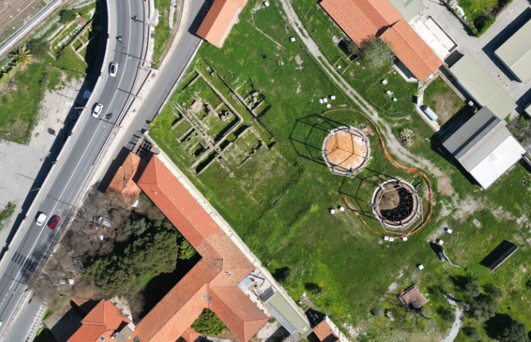
Non è facile cominciare a raccontare questa storia, quindi comincio da dove mi viene in mente. Avete presente un gasometro? Avete mai visto un gasometro dal vivo o in foto, in video, in televisione? Fino ad alcuni anni fa per me era una parola un po’ strana eppure è diventato uno dei luoghi con cui ho a che fare più spesso nella mia vita quotidiana. A Ventimiglia, dentro un’area archeologica romana abbastanza famosa e importante, ci sono due gasometri. Alcuni anni fa ho iniziato a occuparmi di questi due gasometri e di tutto quello che ci sta intorno che si chiama Officina del Gas è un impianto abbastanza grande, di 12.000 m² che dal 1906 al 1993 ha funzionato per dare il gas alla città.
Prima di iniziare a lavorare veramente alla realizzazione del progetto, con alcune persone molto preparate ho iniziato a studiare la storia di questo luogo e a farmi raccontare dalle persone che ci vivono accanto che cosa rappresenta per loro.
...The Oceans of Mars and this Dammed Earth
Sean Gillies: Quad Rock training weeks seven, eight, nine, and ten
I'm squishing four weeks worth of recap into this one post.
First, the numbers.
40 hours, 32 minutes all training
99 miles running
15,600 ft D+ running (and treadmill)
I'm less concerned with miles than I used to be, but I'm still writing these numbers down for continuity's sake.
I'm running four days a week and riding or other cross-training 2-3 days. Two of my runs are easy, but not slow. One has some high intensity intervals or hill sprints. The other is a 2-3 hour run with 45-60 minutes of tempo pace in the middle. My top speed hasn't increased in the past four weeks, but my easy pace has improved a lot. With five more weeks of training ahead before I begin to taper off, I'm looking forward to getting even faster at zones 2 and 3.
...SourcePole: FOSSGIS 2026 Göttingen
Sourcepole hat an der FOSSGIS 2026 in Göttingen verschiedene Themen mit Vorträgen abgedeckt:
- Datenkataloge mit STAC und OGC API Records
- Volltextsuche in Echtzeitdaten mit pg_search
- Kollaboratives GIS mit Jupyter Notebooks und JupyterGIS
- QGIS Web Client (QWC) – Neues aus dem Projekt
Mergin Maps: [Blog] Support tip - using conditions to improve your Mergin Maps survey
Propulsé par FreshRSS | 290 articles dans cette sélection

