Vous pouvez lire le billet sur le blog La Minute pour plus d'informations sur les RSS !
Canaux
7207 éléments (2941 non lus) dans 50 canaux
 Dans la presse
(2756 non lus)
Dans la presse
(2756 non lus)
-
 Cybergeo
(2691 non lus)
Cybergeo
(2691 non lus) -
Mappemonde
(60 non lus)
-
Dans les algorithmes
(5 non lus)
Du côté des éditeurs
(28 non lus)
-
Toute l’actualité des Geoservices de l'IGN
(17 non lus)
-
arcOpole - Actualités du Programme
-
arcOrama
(11 non lus)
-
Neogeo
Toile géomatique francophone
(110 non lus)
-
Géoblogs (GeoRezo.net) (5 non lus)
-
UrbaLine (le blog d'Aline sur l'urba, la géomatique, et l'habitat)
-
Séries temporelles (CESBIO)
(2 non lus)
-
Datafoncier, données pour les territoires (Cerema)
-
Cartes et figures du monde
-
SIGEA: actualités des SIG pour l'enseignement agricole
-
Data and GIS tips
-
ReLucBlog
-
L'Atelier de Cartographie
-
My Geomatic
-
archeomatic (le blog d'un archéologue à l’INRAP)
-
Cartographies numériques
-
Carnet (neo)cartographique
-
GEOMATIQUE
-
Évènements – Afigéo
(12 non lus)
-
Afigéo
(12 non lus)
-
Geotribu
(50 non lus)
-
Conseil national de l'information géolocalisée
(9 non lus)
-
Icem7
-
Makina Corpus (1 non lus)
-
Oslandia
(1 non lus)
-
CartONG
(2 non lus)
-
GEOMATICK
(6 non lus)
-
Geomatys
(3 non lus)
-
Les Cafés Géo
(1 non lus)
-
L'Agenda du Libre
(3 non lus)
-
Conseil national de l'information géolocalisée - Actualités
(3 non lus)
Géomatique anglophone
(35 non lus)
-
All Points Blog
-
Directions Media - Podcasts
-
Navx
-
James Fee GIS Blog
-
Maps Mania
(19 non lus)
-
Open Geospatial Consortium (OGC)
-
Planet OSGeo
(16 non lus)
Géomatique anglophone
-
 12:17
12:17 gvSIG Team: Integración del Gestor de Expedientes de SEDIPUALBA con gvSIG Online
sur Planet OSGeoHace un tiempo atrás, hablamos del nuevo plugin ETL (Extract, Transform and Load) integrado en la plataforma de gvSIG Online,que permite realizar cualquier integración, transformación, edición… geoespacial de datos.
Hoy queremos compartir una integración que se ha estado desarrollando recienteemente y que mejora significativamente la gestión administrativa y geográfica en las entidades locales: la conexión entre el gestor de expedientes SEGEX de SEDIPUALBA y la plataforma gvSIG Online.
El resultado es una potente funcionalidad que permite, por ejemplo, identificar todos los expedientes asociados a una parcela o localizar en el mapa los elementos vinculados a un expediente concreto. Todo ello sin necesidad de duplicar información ni modificar los sistemas de origen.
En el siguiente vídeo mostramos cómo se realiza la conexión entre ambas plataformas y los beneficios que aporta.
Esta iniciativa refuerza el compromiso de la Asociación gvSIG con el desarrollo de soluciones abiertas, interoperables y orientadas a mejorar la eficiencia en la administración pública.
-
10:42
gvSIG Team: Curso-Concurso gvSIG Batoví: Lanzamiento de un proyecto que trasciende fronteras
sur Planet OSGeo
En el Ministerio de Transporte y Obras Públicas (MTOP) de Uruguay se realizó el lanzamiento oficial de la 8ª edición del curso-concurso gvSIG Batoví, una iniciativa que desde sus comienzos ha convocado a cientos de estudiantes y docentes de todo el país, además de participantes de Colombia, México, Cuba y Madrid.
El proyecto invita a presentar propuestas geográficas que aborden problemáticas locales desde una perspectiva territorial, en sintonía con los Objetivos de Desarrollo Sostenible (ODS) promovidos por la Organización de las Naciones Unidas (ONU). “Es un proyecto que se ha transformado en una política de Estado que ha atravesado los distintos períodos de gobierno y es nuestra aspiración que siga creciendo y fortaleciéndose durante este período”, expresó el director nacional de Topografía, Arq. Felipe de los Santos.
Desde 2011, la dirección nacional de Topografía promueve este tipo de experiencias formativas mediante un convenio con Ceibal y la Asociación gvSIG. A partir de 2017, el curso-concurso ha ofrecido oportunidades de crecimiento tanto a estudiantes como a docentes, generando impactos positivos en las comunidades participantes.
Durante el acto de lanzamiento, la subsecretaria de Transporte, Claudia Peris, destacó el potencial transformador de este proyecto y valoró su alcance. Por su parte, Felipe De los Santos, expresó que este evento representa un gran desafío y un enorme orgullo para su cartera, por dos razones fundamentales. Primero, porque “forma parte de las primeras acciones” orientadas a “fomentar el trabajo colaborativo dentro y fuera del Ministerio. Queremos consolidar espacios de sinergia entre quienes diseñamos y ejecutamos políticas públicas en todo el territorio nacional”. Segundo, porque este proyecto ha sabido sostenerse en el tiempo, “ha atravesado los distintos períodos de gobierno”, consolidándose como una verdadera “política de Estado”.
De los Santos también subrayó que la iniciativa “ha trascendido fronteras”, con participación de estudiantes y docentes de Colombia, México y Cuba, así como de referentes de universidades latinoamericanas y europeas como la Universidad Politécnica de Madrid, la Universitat Oberta de Catalunya y la Universidad Central Marta Abreu de las Villas.
Los proyectos desarrollados en el marco del concurso han abordado temáticas clave como la conservación ambiental, el mejoramiento del espacio urbano y barrial, la participación ciudadana y los derechos colectivos, contribuyendo desde una mirada integradora a la construcción de ciudad y territorio.
Las inscripciones y bases del curso-concurso estarán disponibles a partir de mayo en el sitio web institucional del MTOP. Esta convocatoria está dirigida a estudiantes y docentes de nivel medio de Educación Secundaria y de UTU.
En la actividad también estuvo presente la directora general de Secretaría, Yenny Merlo; el director nacional de Vialidad, Federico Magnone; el jefe del departamento de Geomática, Sergio Acosta y Lara; el sub gerente de Desarrollo Profesional Docente, Nicolás Ambrosi; la inspectora nacional de Geografía y Geología, Prof. Magister Mónica Canaveris.
-
21:48
gvSIG Batoví: Curso-Concurso gvSIG Batoví: Lanzamiento de un proyecto que trasciende fronteras
sur Planet OSGeo Click en la imagen para abrir el enlace
-
13:00
Mappery: California Metalwork
sur Planet OSGeo
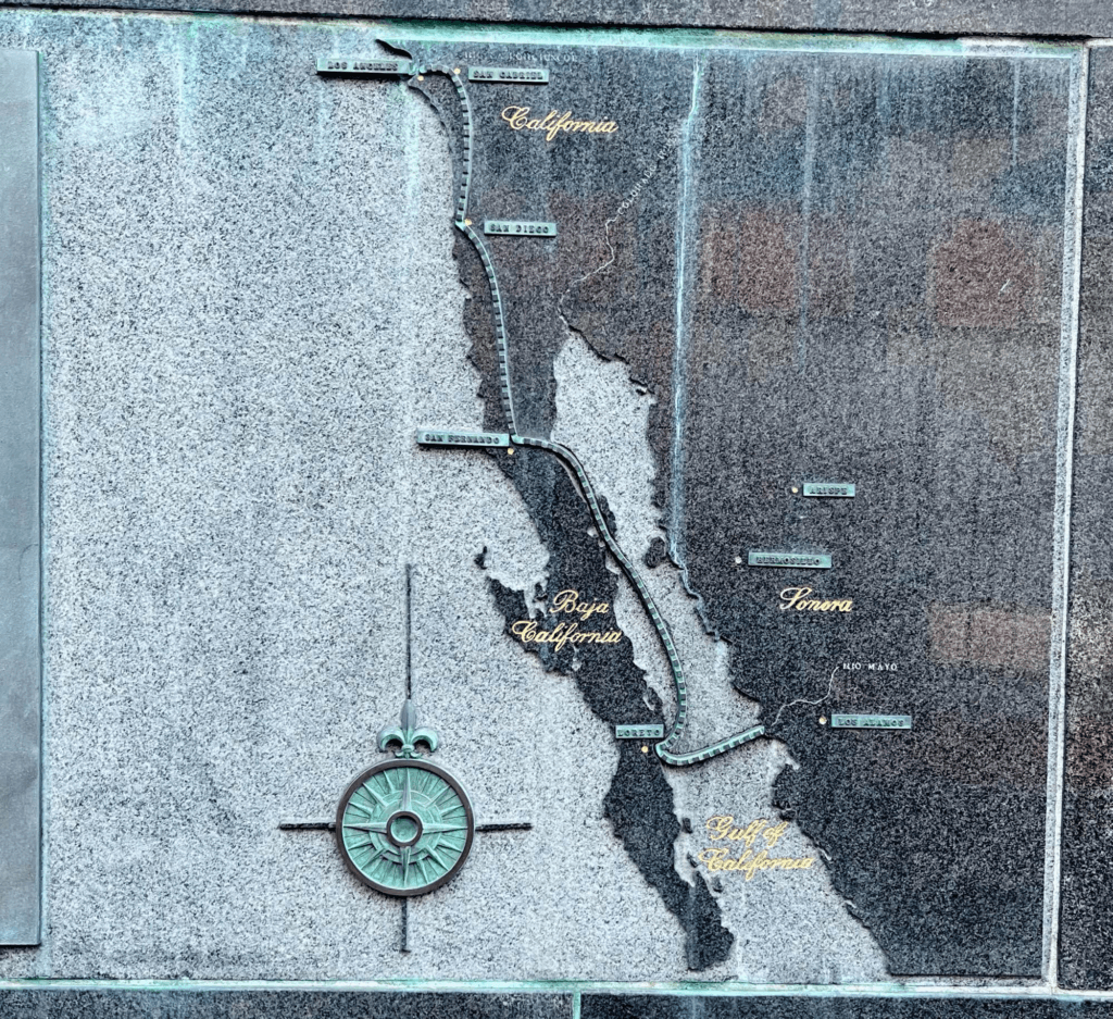
A beautiful simple map spotted by Wanmei L in downtown LA
-
0:52
Sean Gillies: Bear training week 9 recap
sur Planet OSGeoI have enjoyed a rest week. I exercised every day, but nothing intense or long, with double easy workouts on Thursday. I did a short bit of tempo pace running on Thursday, 8-8.5 effort out of ten. It felt great.
16.3 miles running
7 hours, 16 minutes all training
981 ft D+ running
Next week I'll be diving into tempo runs for real as I get into my second eight-week training block.

A pale brown concrete bike path rises in curves toward snow-covered Rocky Mountain foothills under broken low clouds.
-
13:00
Mappery: Museo de Arte Precolombino
sur Planet OSGeo

Robert Simmon shared these from the Museo de Arte Precolombino in Santiago, Chile. I love the way the map wraps around the corner of the gallery.
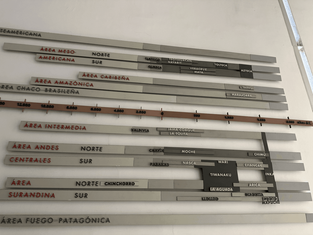
Timeline of pre-Colombian cultures mounted on the wall of the Museo de Arte Precolombino. The oldest cultures are dated to 14,000 BC.
-
21:13
GIScussions: Defying Gravity
sur Planet OSGeo
Another year, another set of opaque accounts from What3Words. Why do I say opaque? Because despite quite a few years of reading company accounts I feel that I must be missing something when I read through these accounts.
The headline info is clear:
- Turnover doubled to £2.15m
- Losses reduced from £16.5m last year to £10.6m
- Net assets of £15.6m (slightly down on last year)
- Investment received in the year £7.9m
- Employees reduced by 36 to 92
The cumulative position is eye watering, since its formation w3w has accumulated £146m of losses and taken on £160m of investment,
The directors consider w3w to be a “going concern” and it looks as if it can sustain another year or so of losses with a bit of shareholder support but unless major revenues start to materialise then at some stage a major cost reduction program will be needed or ..?
I don’t understand how this works, the company continues to lose sums that are many times it’s revenue and yet investors continue to support the business presumably because they have insight into the future upside that will come from a massive upturn in revenues or a golden clad purchaser who will confer unicorn status on the company.
maybe.maybe.maybeMaybe I am an old fashioned entrepreneur who fussed too much about costs and revenues.
Maybe this all works out brilliantly and the company is on the verge of becoming an outstanding success, as the directors say in acknowledging risk “The group has created a new addressing format, with the aim of becoming a universal standard for location referencing. A key aspect of this is acquiring and retaining a high volume of newly engaged consumers, creating wide-scale network effects and consumer behaviour change to ultimately deliver commercial contracts.”
On the other hand, maybe we will look back on this saga in a couple of years and wonder how we could possibly have believed that it would ever make money. Well I won’t be doing that!
-
13:00
Mappery: Where do I go from here?
sur Planet OSGeo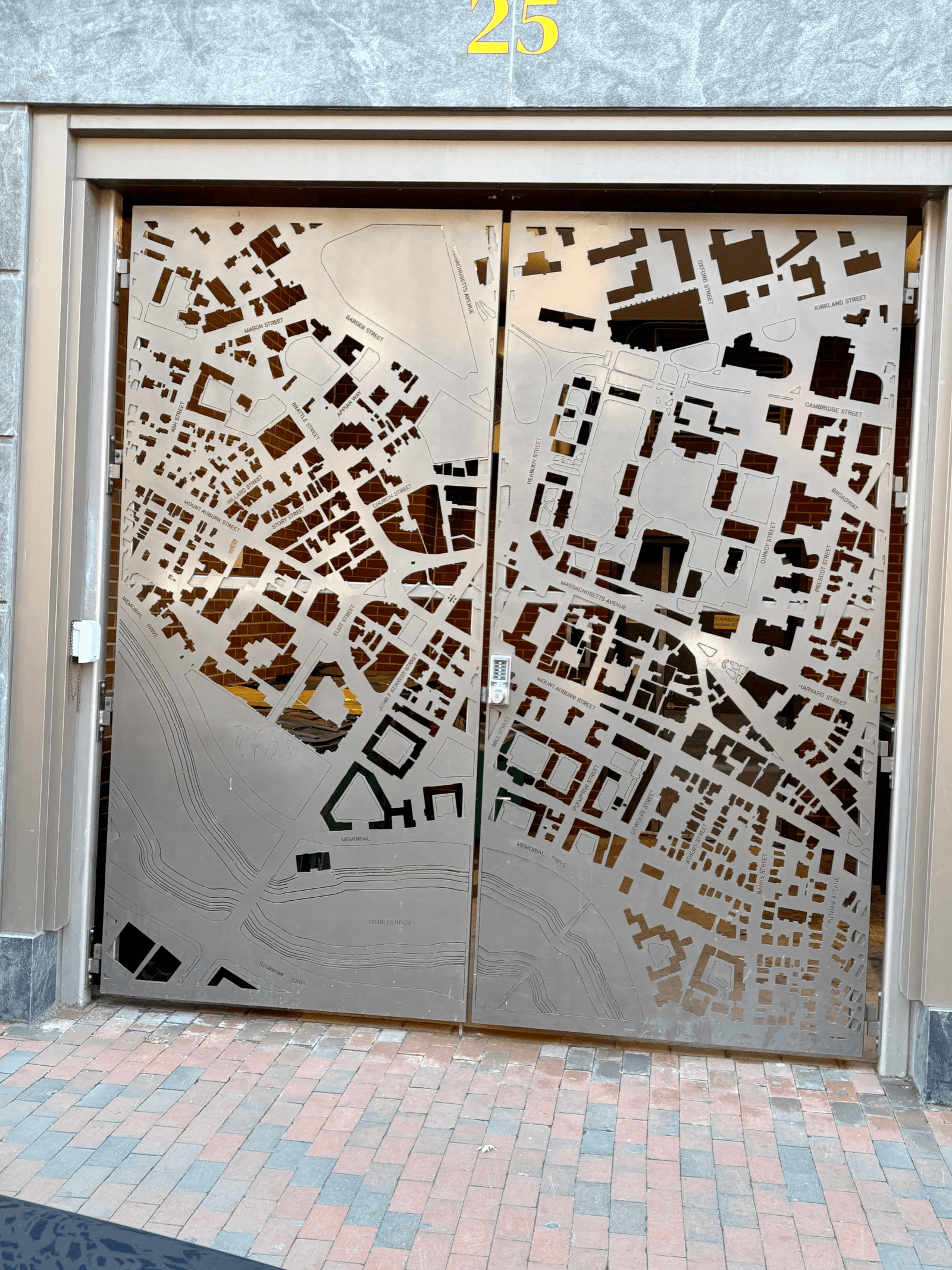

Doug spotted this map design on the exit of an office building in Cambridge, Massachusetts
-
13:00
Mappery: Europe is a Big Place
sur Planet OSGeo

Joe Davis spotted this massive map display in Lyon
-
13:00
Mappery: Santa Catalina Island Map Tat
sur Planet OSGeo

Who can resist a bit of map tat? Certainly not Wanmei L.

-
11:17
QGIS Blog: ? Changes Ahead: QGIS Is Moving to Qt6 and Launching QGIS 4.0!
sur Planet OSGeoWe’re happy to share some major updates coming to the QGIS platform over the next few months. These changes are part of a long-planned technical migration that will bring new possibilities and ensure QGIS stays modern, fast, and future-ready.
 QGIS Is Migrating to Qt6
Qt6 is the latest version of the cross-platform application framework that QGIS is built upon. Moving to Qt6 allows us to:
- Future-proof the QGIS codebase.
- Take advantage of modern libraries with significant performance and security improvements.
- Simplify long-term maintenance and development.
While most of the migration is complete, a few final tasks remain, especially around Continuous Integration (the automated processes that run on each change to the QGIS code base to help reduce bugs), layout rendering, and PDF output. The core team is actively working on these and making significant progress.
 Enter QGIS 4.0
To mark this significant backend shift, we’ve decided to align the Qt6 migration with a new major release: QGIS 4.0, which will arrive after QGIS 3.44, in October 2025.
Here’s what you need to know:
- QGIS 4.0 will be Qt6-only
- It will not be an LTR (see release strategy below for details)
- To ease the transition, it will retain deprecated APIs, so plugin developers will only need minimal work to ensure compatibility with Qt6 and prepare for future QGIS versions.
This strategy allows us to modernise QGIS without forcing a major rewrite of existing plugins. Some adjustments will be needed to ensure QGIS 4.0 compatibility.
Note on Features: While QGIS 4.0 marks a major version jump, it’s essential to understand that this release will include only a few new user-facing features. The primary focus is on the transition to Qt6, which involves significant changes under the hood.
In the QGIS project, a major version number doesn’t necessarily mean a flood of new features—it signals a break in the API. This ensures that developers are aware of potential compatibility updates needed for their plugins or integrations, even if the visible functionality remains largely unchanged. Why This Matters
This isn’t just about upgrading for the sake of it — it’s about keeping QGIS secure, modern, and maintainable.
- Qt 5.15 enters Extended Support (EOS) in May 2025, with continued security updates available only under commercial terms
- Staying on Qt5 would limit our ability to access upstream fixes and improvements
- Qt6 is already a proven platform — projects like QField and Mergin Maps have been using it successfully in production for quite some time
- Migrating to Qt6 ensures QGIS stays aligned with a supported, modern framework
 Release Strategy
To ensure a smooth transition for users and developers, we’re taking a phased approach:
- QGIS 3.40 LTR will be extended by 4 months, until May 2026, giving plugin developers and organisations extra time to adapt
- QGIS 4.0, scheduled for October 2025, will be a regular release
- QGIS 4.2, scheduled for February 2026, will follow as the next official LTR
This gradual rollout ensures users who depend on stable environments can continue with 3.40 LTR, while early adopters and plugin developers move forward with Qt6 in 4.0.
 What About Plugins?
We’re making it easier than ever for plugin developers to prepare:
- The QGIS Plugin Repository will begin accepting 4.x-compatible plugins
- The plugin site will inform users if a plugin is Qt6-compatible
- A comprehensive migration guide is in the works to support developers during the transition
If you maintain a plugin, now’s the perfect time to start testing and preparing for Qt6 compatibility!
 See:
See: Try Qt6 Today
The migration to Qt6 isn’t just theoretical — it’s already happening and ready for testing:
- Windows: Qt6 builds of all release branches and master are available now via the OSGeo4W installer
- Linux (Debian): Qt6 support is almost there — packaging work is underway to support both Qt5 and Qt6 side by side
- macOS: Qt6 packages will start building as soon as QGIS 3.44.0 is released and the QGIS 4.0 development cycle begins
Start exploring Qt6 builds today and help us shape the future of QGIS.
 Get Involved
We’ll share more updates in the coming weeks. In the meantime:
- Try the Qt6 builds
- Test your plugins for compatibility
- Stay tuned on qgis.org and community channels
A massive thank you to all contributors, developers, testers, and organisations supporting this transition.
QGIS 4.0 is shaping to be a big leap forward, and we can’t wait to share it with you!
Edited on 24.04.25
- Removed leftover texts
- Added a note on new features in QGIS 4.0 -
3:00
Nick Bearman: The Open Science Retreat, Batenberg, Switzerland: collaboation, connection and snow!
sur Planet OSGeoFor four days in April I was lucky enough to be able to attend the Open Science Retreat, in Batenberg, Switzerland. The Open Science Retreat (OSR) is a chance for anyone interested in and passionate about Open Science to get together, brain storm ideas and spend time working on projects related to this. It is run by the Digital Research Academy, with a focus on discussion and networking as well as getting some interesting outputs. “A week full of scientific discussions and reflections, getting work done, making new friends and resetting.” I have already written another blog post about travelling there by train.
The event works on an unconference format, with topic groups submitted a week or so before the event. We then had a chance to hear from the proposers about each of the topics, and talk with other people interested in the topic. This means there’s a bit of evolution of the topics, with the topics revised based on who is attending and what they want to do. Written down, this does sound sightly random, but it does work in practice. Within about 30 min of discussions, we had formed then 6 topic groups that would run throughout the remainder of the Retreat.
Alongside the topic groups, which ran for 3 mornings, there were a variety of short sessions (30min - 1hr) and workshops (2hr) as well as a focus on well being and recovery from what often is a busy academic schedule. In the spectacular setting of Batenburg, Switzerland, I made the most of the location and spent a reasonable amount of time outside. There was an organised walk around the Swiss mountains, and trips out to see local sights. We also had optional social events in the evening, with opportunities for silent disco, board games and networking.
Playing Fluxx
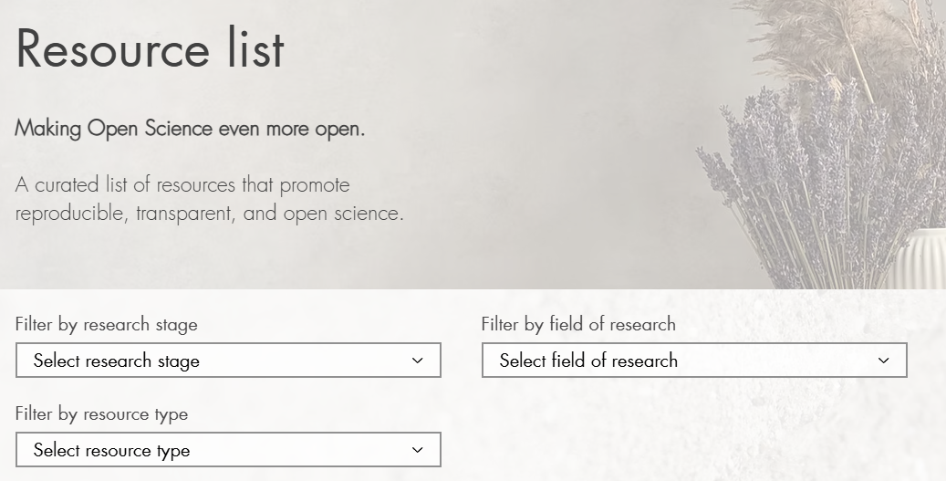
I opted to take part in the ‘Even More Open’ group, which was a combination of topics focused about discover-ability and usability of Open Science tools including Quick and Easy Wins for Open Science and discussion around the use of AI. Our group was larger than typical for these groups (9 people) so after some initial discussions we split into one more theoretical group and one more practical group. I was working with more-practical group on a new tool to help discover existing Open Science tools, on the principle that while there are many many tools out there, it can be hard to find the right tool for the job. This tool is currently hosted on AdvancdSci Research Solutions and allows you to select tools for specific points in the research life cycle, subject area, level of complexity and a number of other options:
As a part of the OSR, the aim was to make outputs available at the end of the week, in an open form (of course!). We have shared our output on Research Equals, a new platform for me, but a way of sharing outputs with a DOI. For us, this included a summary report with links to our tool and other outputs and slide from the wrap up sessions: DOI: 10.53962/znvv-1p7c
There is so much potential with open science it is sometimes hard to pin down exactly what to do or how to do it. A number of groups addressed this is a number of different ways, including discussions about how to reward participation in Open Science, dealing with burnout and roles as an activist and a short session on calendar management. Check out all the available outputs on Research Equals.
This was not my typical GIS conference, and it was great to meet with a different group outside GIS! I did get a chance to help a group make a map. The Open Science activists were keen to create a map of activists which they could update and edit without relying on third parties (organisations or people). I adapted The Fellowship of the Traveling #GISChat Book which is a Leaflet map based in a website with a bit of R coding to geocode locations and convert the CSV data into GeoJSON. It is currently a work in progress but it was an exciting project to be involved in.
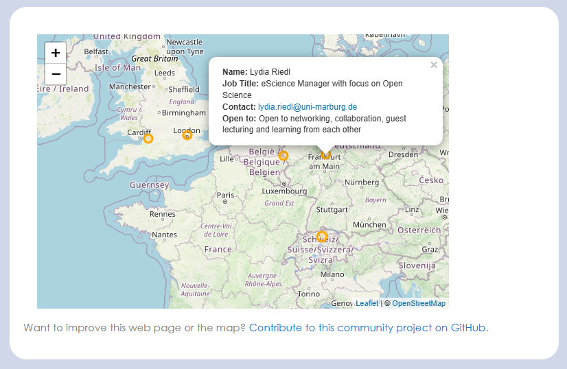
I am a bit fan of making GIS more accessible to anyone who wants to do mapping* and the map I developed for the activist group could easily be adapted for other users. I hope to finish off the automation elements (I need to work out GitHub actions) and potentially package it up as an easy to use tool for anyone else doing mapping.
*I was reminded about the variation in terminology that we have with different groups. The activist group wanted a geographic map of people, but this was not understood by everyone - often the term ‘map’ or ‘mapping’ is used in a non-spatial sense looking at relationships between different members or a group or elements - e.g. how people relate to each other. The group knew what they wanted and I understood them correctly, but not everyone who saw their message did!
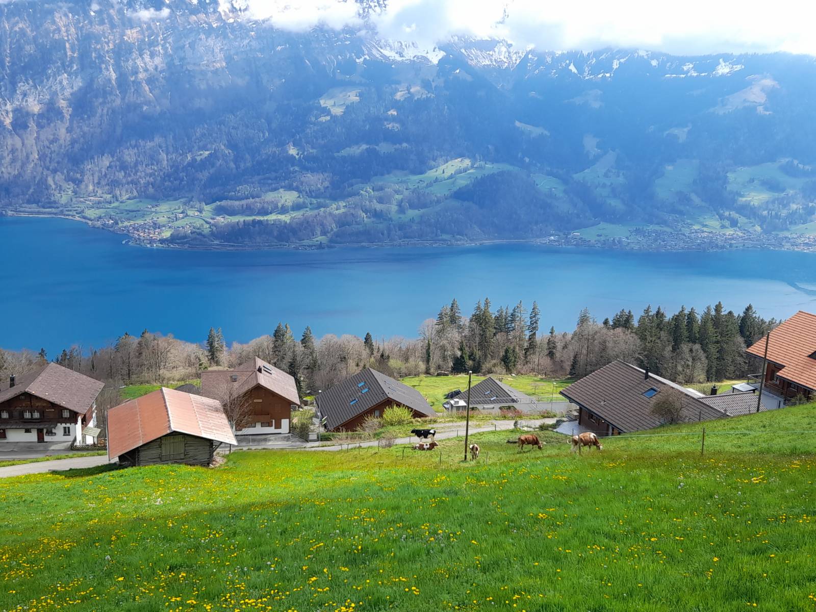
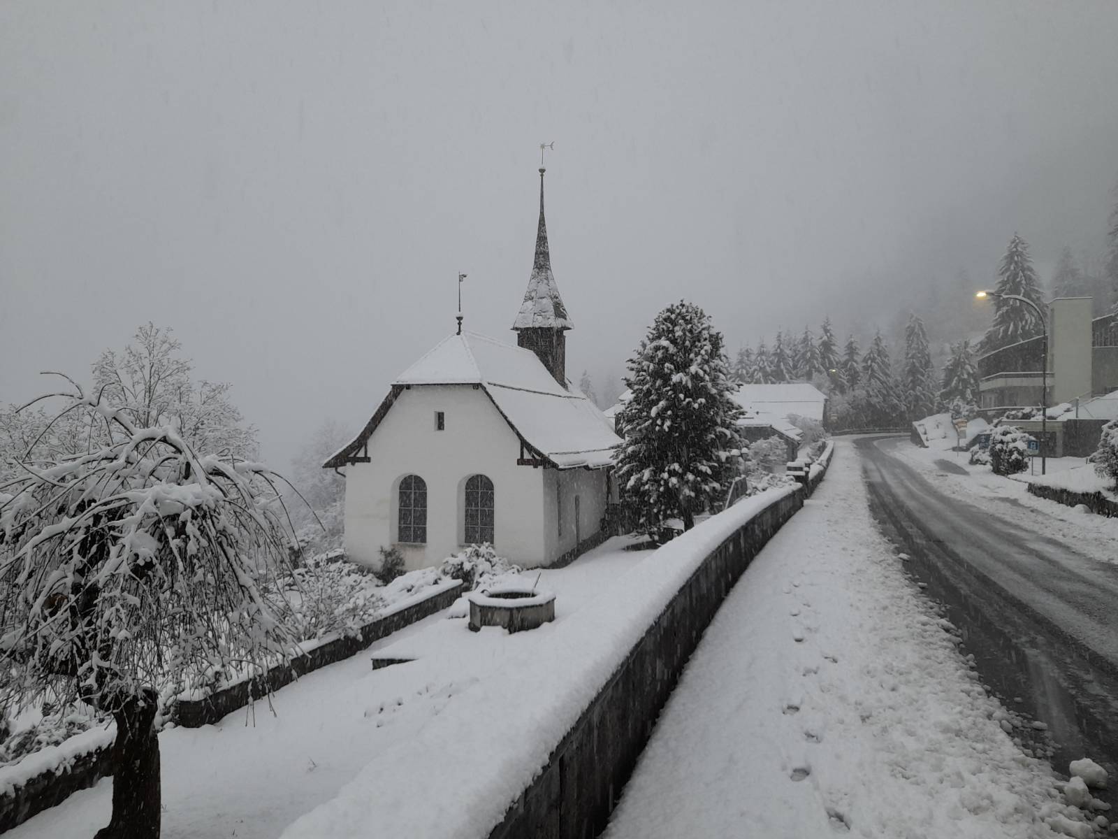
Finally, I discovered how varied the weather in Switzerland at about 1200m elevation can be - while most of the trip was sunny, on the final morning I woke up to this:
It was a great event, and I would recommend it to anyone who in interested in discussing or doing Open Science. The next retreat is planned to be in the UK, so please do come along! Join the DRA mailing list to learn about upcoming DRA events!
-
15:50
Mappery: Scrambled Maps in the Wild
sur Planet OSGeo

A little bit of fun for you. We have teamed up with our friends at TripGeo who make a whole load of fun map and travel related games including my favourite Scrambled Maps (Warning – you may get hooked) to create a new puzzle for you Scrambled Maps in the Wild. We have started with 7 puzzles and plan to add more if people like them and want more, so do let us know what you think
-
13:55
gvSIG Team: Geoportal y Semana Santa: Planificación y seguridad con información geográfica actualizada
sur Planet OSGeoLa Semana Santa no solo es una de las celebraciones más emblemáticas del calendario, sino también un gran reto organizativo para los municipios. En este contexto, la colaboración entre el Ayuntamiento de Albacete, la Policía Local y la Junta de Cofradías ha permitido desarrollar itinerarios seguros para los desfiles procesionales, utilizando como herramienta clave la Infraestructura de Datos Espaciales, basada en tecnología gvSIG Online.
Gracias a esta plataforma, que ofrece información geográfica completa y constantemente actualizada, se ha podido planificar con antelación los servicios de emergencia, diseñar recorridos accesibles y seguros, y coordinar los distintos servicios municipales involucrados en la gestión de estos eventos multitudinarios.
Se ha publicado la información de las distintas procesiones de Semana Santa en el Geoportal de la Policía Local, accesible desde la web del Ayuntamiento y de la IDE de Albacete. La plataforma de gestión de información geográfica de Albacete no solo facilita el acceso a mapas, catálogos y servicios de visualización, sino que se ha convertido en una herramienta indispensable para el diseño de proyectos y la planificación urbana. Según ha destacado Francisco Navarro, teniente de alcalde y concejal de Movilidad, “el Geoportal es un servicio esencial y fundamental que permite conocer la ciudad centímetro a centímetro y nos ayuda en la planificación urbana”.
La Unidad de Cartografía, Topografía y Geomática del Ayuntamiento ha sido la encargada de elaborar y mantener la cartografía y la información espacial que alimenta esta plataforma. La información se organiza y visualiza en distintos visores temáticos, como el Visualizador de la Policía Local, desde donde se gestiona todo lo relativo a los recorridos procesionales de Semana Santa. Tras la creación de la estructura en la geodatabase por parte del equipo de Topografía, es la Policía Local quien se encarga de mantener actualizados los recorridos, fechas y detalles.

Además, la IDE de Albacete ofrece a los ciudadanos otras funcionalidades destacadas como el Visor de Urbanismo (Plan General de Ordenación Urbana), el Visor Cartográfico (con cartografía histórica y límites administrativos), el Visor del Cementerio (para localizar sepulturas) o el Visor Feria, que permite gestionar la ocupación de espacios durante grandes eventos.
Esta experiencia demuestra una vez más el valor de las plataformas basadas en tecnología gvSIG Online para la gestión municipal, la mejora de la eficiencia de los servicios públicos y la implicación de diferentes actores en la toma de decisiones a través de la geoinformación.
La prensa dice:
-
13:00
Mappery: Welcome to Bendigo
sur Planet OSGeo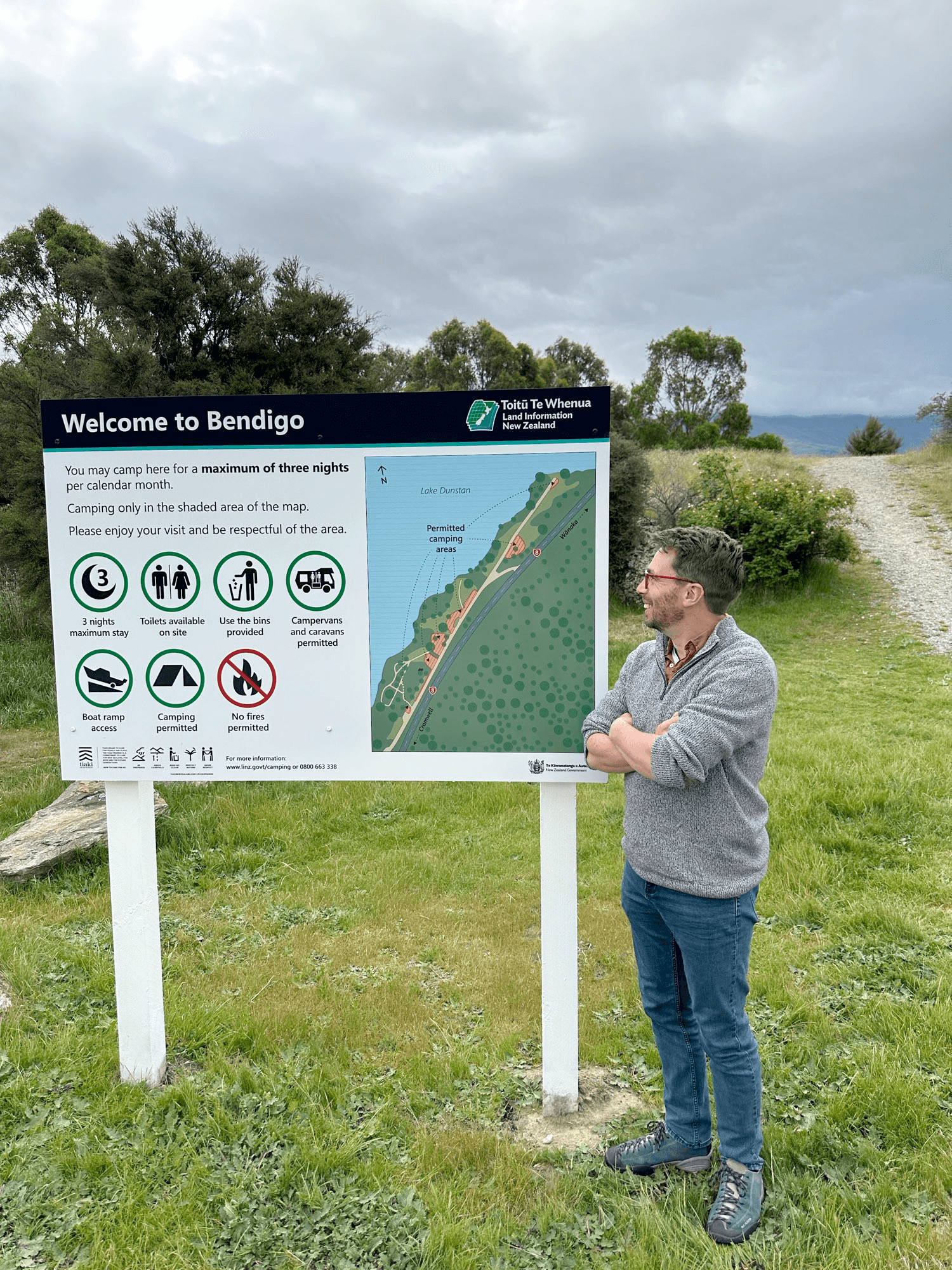
Andrew Tyrrell could have said “Here is one I made before” (readers of a certain age will get the cultural reference) but he was a bit more loquacious and said “Driving to #Queenstown to run my first half marathon tomorrow, and stopped off along Lake Cromwell to admire one of my #MapsInTheWild. I made this in my day job, and there’s one for each of the freedom camping sites managed by Toit? Te Whenua.”
Nice one, Andrew!
-
19:30
Tim Waters: Whoots updates: Some changes, and add new PHP version
sur Planet OSGeoWhoots is a simple tile server proxy for WMS servers. WMS > TMS. So if you have an application that only works with ZYX Google-style tiles and all you have is a WMS server, you can use it to re-route the request.

It was created way back in 2010! Here’s the post announcing it: WhooTS a small wms to tile proxy – WMS in Potlatch
There’s been few recent changes.
- Some validations to the code was added to make it a bit more secure.
- image/png and image/jpeg will now work. Defaults to png. Optionally pass in ?format=image/jpeg for jpeg
- You don’t need to have a map= param in the URL for it to work now.
- Puma server configs added
- new php port of the code
- The server at whoots.mapwarper.net was moved to a shared host and is now running the php version
The code is at [https:]]
-
13:00
Mappery: Spectacular Highland Hall
sur Planet OSGeo

Jeff Allen shared htis. No idea what or where the building is but this is spectacular.
A little bit of image search and I discovered that this is Highland Hall on the University of Toronto Scarborough Campus, still spectacular.
-
4:00
Kartoza: Streamlining Geospatial Data for GeoPackage Upload
sur Planet OSGeoMy GeoPackage exceeded the 5MB limit due to excess vertices, unused attributes, and residual data. By simplifying geometries and optimizing the database, I reduced it from 9.7MB to 1.6MB. -
18:50
gvSIG Team: Leyenda por mapa de calor en gvSIG Online
sur Planet OSGeoEn la última versión de gvSIG Online se ha incorporado un nuevo tipo de simbología: la leyenda por mapa de calor. Dicha leyenda permite representar, tanto la densidad de puntos como con valores ponderados, mediante un gradiente continuo de colores.

En el caso de densidad de puntos podemos ver en qué zonas hay más puntos, y puede ser muy útil para ver dónde hay más farolas en un municipio, dónde ha habido más accidentes… En ese caso todos los puntos tienen el mismo valor.
Si se utiliza un campo para ponderar, un caso podría ser el de estaciones de tomas de datos, por ejemplo de temperatura, polución…, y donde el campo a ponderar sería el de dichos valores.
En ambos tipos de leyenda se dispone de dos tipos de gradientes: uno donde se indica el color inicial y color final, y en el que se calcula el gradiente entre esos dos colores, y otro en el que se pueden indicar gradiente de varios colores y el porcentaje de aplicación de cada uno.
Los otros parámetros que se deben configurar son el radio (en píxeles), que calcularíamos en función de la separación de los puntos que estemos representando, y los píxeles por celda.
Aparte, si la capa está configurada con parámetro temporal y aplicamos dicha leyenda, podríamos visualizar cómo cambian los gradientes en el tiempo. Por ejemplo si representamos una capa de delitos, podríamos ver si las zonas con más delitos han ido cambiando según el tiempo,
En el siguiente vídeo podéis ver su funcionamiento:
-
13:00
Mappery: A Reader’s Guide to Western Massachusetts Bookshops
sur Planet OSGeo
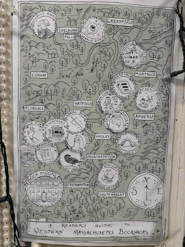
Doug G spotted this, very useful if you are in Western Massachusetts
-
0:02
Sean Gillies: Bear training week 8 recap
sur Planet OSGeoI brought running back in week eight. I ran five times, and four days in a row for the first time since early June, 2024. The numbers:
31.9 miles running
12 hours, 12 minutes all training
5,171 ft D+ running
Tuesday I did hard running and hiking intervals on Towers road, 5.5 km of 10% grade. 30 minutes at 9/10 effort, my biggest single workout of the season. I'm only a minute slower on the climb than early season runs in 2020 and 2021. That's very encouraging.
Today I went back to the hills for an easy long run. It felt easy until mile eight, where I boarded the struggle bus for the last two and a half miles. Still, I enjoyed the entire run, saw lots of hikers, and the season's first wildflowers: sand lily, clematis, pasqueflower, and springbeauty.
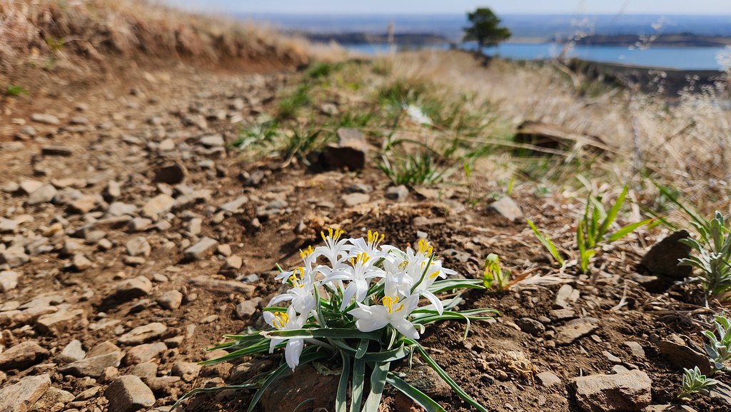
Close up of white Sand lily blossoms with a dirt trail and high plains in the background. Lower Timber trail, Lory State Park, Colorado.
Conditions are very dry in our foothills. The creeks in Well Gulch and below Arthur's Rock often have running water into May, but have none now. It's not a good sign.
-
13:00
Mappery: Lacrima Olea
sur Planet OSGeo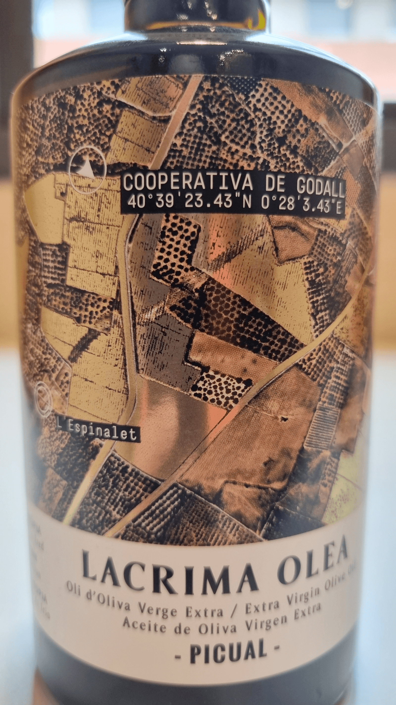

Raf has been on a run of great maps in the wild recently. This one is a detailed aerial image on the label of Lacrima Olea, “The plots where the olives come from, in gold on top of the orthophotomap, is the label of Lacrima Olea, the Picual variety extra virgin olive oil home grown and cold pressed produced by Cooperativa de Godall, Catalunya”
-
13:00
Mappery: Gordon the Globe
sur Planet OSGeo

Javier Jimenez Shaw spotted this giant ad at Alexanderplatz station, Berlin. We last saw Gordon on the London Underground, now he is in Berlin – he gets around!
-
13:00
Mappery: Vintage Geo Fabric
sur Planet OSGeo

Raf spotted this fabric sold by the meter at El Barato shop in Reus, with a vintage map pattern
-
13:00
Mappery: Theatrical Maps
sur Planet OSGeo

Michael Stuyts shared pamphlet with us from a play being performed in Antwerp
-
3:59
Sean Gillies: Bear training week 7 recap
sur Planet OSGeoPoor weather last week complicated my training plans. I ran more than I did in week six, but not much more. I did some indoor intervals, a tempo run, the usual yoga and pool HIIT, my favorite bike loop of Southwest Fort Collins, and a great trail run in the hills of Lory State Park on Saturday. All together, here are the numbers:
24 miles running
9 hours, 32 minutes all training
2,313 ft D+ running
My body is holding up well, so I'll be doing even more running in week eight. Spoiler alert: I've already had one solid running workout, the hardest of my season so far.

A sandy trail along a partially snow-covered ridge approaches a stand of pine trees under a blue sky. Lory State Park, Colorado.
-
19:28
Sean Gillies: The Poulletier sandwich
sur Planet OSGeoI'm not the first person to make a sandwich with fried eggs and pastrami, but I think I may have come up with a name for it that could stick. Served hot with melted cheddar cheese on slices of grilled sourdough bread, I call it the "Poulletier" after François Poulletier de la Salle, the discoverer of cholesterol.

A grilled sandwich, cut in two, on a green plate.
Hash browns would be good in this. As would a thick smear of pesto sauce, suggested by a person in a reply to my Mastodon post. I'll try one or both of these additions next time.
-
13:00
Mappery: Another Mappy Chair
sur Planet OSGeo

Kevin Carey sent this “A glorious mappy chair at Oldmeldrum House Hotel, Aberdeenshire”
-
18:50
GeoCat: GeoServer 3 Crowdfunding: Last Call!
sur Planet OSGeoThe GeoServer 3 crowdfunding campaign is now entering its final phase. After months of effort and strong engagement from the geospatial community, we are approaching our collective goal. The campaign ... -
17:00
GeoSolutions: GeoServer 3 Crowdfunding – Last Call!
sur Planet OSGeoYou must be logged into the site to view this content.
-
13:00
Mappery: Priorat
sur Planet OSGeo

Another one from Raf, he must have been. traveling a bit. This one is a hand drawn map on a blackboard inside El Refugi, a small eats & drinks place in Arbolí, Catalunya
-
4:00
GeoServer Team: GeoServer 3 Crowdfunding – Last Call!
sur Planet OSGeoThe GeoServer 3 crowdfunding campaign is now entering its final phase. After months of effort and strong engagement from the geospatial community, we are approaching our collective goal. The campaign has reached over 90% of its target, with only €40,000 remaining. Several organizations are currently engaged in discussions, and we remain confident that we will successfully complete the campaign.
? We will officially close the campaign on Monday, April 21, 2025.
This is the final window of opportunity for organizations that wish to contribute and ensure GeoServer’s continued innovation and reliability.
Why this upgrade is critical
GeoServer 3 is more than just a version number—it is a significant technical shift that will modernize the platform’s foundations and secure its future. This includes:
- Migration to Spring 6 and JDK 17: Required to maintain compatibility with modern Java ecosystems, ensure long-term support, and adopt secure, future-proof components.
- End of support for Spring 5: From January 2025, no more security updates will be provided, making the upgrade essential for compliance and operational security.
- OAuth2 support and improved security architecture: Crucial for enterprise-grade authentication and integration with modern infrastructure.
- Switch from JAI to ImageN: A much-needed replacement for image processing, improving speed, maintainability, and compatibility.
- Alignment with current deployment environments: Including Tomcat 10 and Jakarta EE, ensuring compatibility with containerized and cloud-native environments.
You can learn more about the technical transition already underway in this behind-the-scenes update.
What happens if we exceed the goal?If the total contributions exceed the financial target, the additional workforce funded through this campaign will be redirected to tasks identified and prioritized by the GeoServer Project Steering Committee (PSC). This ensures the extra support directly benefits the project’s long-term roadmap and the broader user community.
Acknowledgements and next stepsWe extend our sincere thanks to all who have supported this campaign so far—through funding, code contributions, testing, and outreach. The effort has already mobilized an international team of core contributors who are ready to move forward.
We now invite all remaining stakeholders to join before the deadline. If your organization uses GeoServer and values its open, sustainable evolution, this is your moment to act.
? To pledge or contact the coordination team, please visit:
[https:]]Let’s complete this journey—together.
The following organisations have pledged their support:


Individual donations: Abhijit Gujar, Laurent Bourgès, Stefan Overkamp.
-
19:05
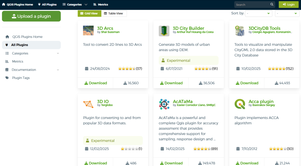
QGIS Blog: Plugin Update – February to March, 2025
sur Planet OSGeoIn the last couple of months a total of 57 new plugins were published in the QGIS plugin repository.
HighlightsIn early February a new web portal for QGIS plugins was launched, in line with the main website overhaul, intending on improving the user experience and with new functionalities as well as detailed information on over two thousand plugins. Congratulations on all involved, and enjoy everyone!
 Overview
Here follows the quick overview in reverse chronological order. If any of the names or short descriptions catches your attention, you can find the direct link to the plugin page in the table below:
Space trace Draws a spacecraft’s ground trace over the Earth’s surface. SpaceMouse3Dconnexion Plugin Direct HID support for 3DConnexion SpaceMouse in QGIS 3D views. ?HMÚ/CHMI – Meteorological Data Processing Weather measurements and spatial interpolation. UHI Urban Heat Island. FPT Plot Allocation Plot allocation for forest inventory. Cornelis Help produce ‘cartographic’ tessellations of the plan, and try to imitate M.C. Escher. Fun Reprojector Reproject vector layers by selecting anthropomorphized characters as coordinate systems. Enjoy transforming your layers with a fun and intuitive graphical interface! AzimuthTool A powerful QGIS plugin for generating vector line layers from azimuths or quadrant bearings and distances, starting from a user-defined point. GSM Cover Builder GSM Cover Builder allows you to quickly generate coverage plans based on localities and a defined coverage radius. Matti A plugin to estimate soybean maturity. SplashTool Result Loader Load and symbolize results from a SplashTool output directory. aGrae | Mapeo Integral | Analíticas de Mapeo aGrae Mapeo Integral, permite gestionar la informacion de cultivos asociados a la explotacion. aGrae | Mapeo Integral | Mapeo de Procesos aGrae Mapeo Integral, permite gestionar la informacion de cultivos asociados a la explotacion. Change GPKG Path QGIS Plugin to change all GPKG datasources inside a GPKG project. Layer Group Locator Plugin Registers a locator filter that searches for layer groups by name (case insensitive) and jumps to the group in the layer legend. Warszawa GIS Wtyczka zapewniaj?ca ?atwy dost?p do danych przestrzennych m.st. Warszawy. QGIS Track Changes This plugin helps track changes in vector layer data, including:
– Feature modifications
– Geometry updates
– Attribute changes
It ensures data integrity by logging changes efficiently within QGIS.Promptly This plugin provides an interface to send prompts to various LLM providers (Ollama, OpenAI, OpenRouter, Anthropic, and custom endpoints) and execute the generated Python code in QGIS. Features include: Support for multiple LLM providers, Database schema integration for SQL queries, Layer metadata reference for QGIS operations, Code execution with error handling and fixing, Cross-platform compatibility. FloodRiskSwatPlus QGIS plugin to assess flood risk impacts in economic terms for SWAT+ scenarios. QTempo Plugin for accessing data from the TEMPO-Online statistical database of the National Institute of Statistics of Romania. NeighborHighlighter ????????????????????? Geom From Attribute This plugin allows users to create geometry using attributes from table. PackageInstallerQgis Package installer for QGIS plugins. AutoSave Automatically saves the QGIS project and editable layers at a user-defined interval. Stratigraphic Thickness Estimates the stratigraphic thickness based on a trigonometric calculation with topographic correction using a DEM. Pan Europeo Processing gdal calc wrapper for multi utility attribute functions raster calculator. grd2stream Streamline generation from gridded data. Add BIM Data Dictionary Semantics Use the buildingSMART Data Dictionary (bSDD) API or similar APIs to classify features and add attributes. PlacesSearch Fetch places data from Google Maps API and save to Shapefile. Crop Site Suitability Analysis Equal weighted overlay analysis for crop site suitability mapping. MOVE – MobilityDB QGIS Plugin to display MobilityDB query results. LayoutSelector Load and manage QPT layout templates in QGIS. Social Tenure Domain Model A pro-poor land information tool that offers a complimentary land administration system that is pro-poor, gender-sensitive, affordable and sustainable for the promotion of secure land and property rights for all. QGIS Pip Manager A QGIS plugin to manage Python packages within the QGIS environment, simplifying the installation, uninstallation, and searching of packages without command-line interaction. VectorSelector Select a one or multiple fields in a vector file filter columns and create a widget. Sig Caceres WMS Gestión del SIG de Cáceres. Menú de carga de capas WMS. Buscador Sig Caceres Buscador SIG de Cáceres. Permite realizar búsquedas por:
Barrios, calles, caminos, carreteras, toponimia,…Minimum Bounding Box Create layer with extents (minx,miny, maxx, maxy) and extents geometry. Manning’s Roughness Generator Plugin to generate high resolution 2D Manning’s roughness coefficients raster from land cover data. IdentifProj This QGIS plugin is an easy way to guess which map projection has been used for a location. The plugin has 3 use cases :
– type projected coordinates and get all thez possible points all over the world
– click on a location on the map and find all the possible projected coordinates
– draw a bbox and find all the projected bboxes
IMPORTANT: at the first start, the plugin will build its CRS database from Qgis CRS list. It can last au couple of minutes but it will only happen one time. This plugin has been initially developed during a third year engineering project at ENSG ( [https:]] )QMapCompare A QGIS plugin that enables you to compare maps smoothly. Italy Inspire Cadastre Downloader QGIS plugin for downloading cadastral data of cadastrals parcels and cadastral zoning in Italy. EconoMe Load information from QGIS into your EconoMe project and vice versa. Download the calculated damage and risk results from EconoMe to visualize them in your QGIS project.
IMPORTANT: You need to have an EconoMe User Account in order to use the plugin!MeasureCalculator QGIS plugin for calculates area, perimeter, and length for selected features with automatic reprojection for accuracy. iNaturalist Extractor Extract data from iNaturalist database from an extent. 3D IO Plugin for converting to and from popular 3D data formats. Add Legend Labels to Layer Attributes Plugin to extract legend labels from the current layer style and assigns them as attribute values to the corresponding features. Georondonia Tools for the georeferencing of rural properties in Settlement Projects or Land Projects, based on the updated Technical Manual for Georeferencing of Rural Properties from the National Institute of Colonization and Agrarian Reform (INCRA), and for the Rural Environmental Registry (CAR). Temporal Resample This plugin uses as input a user vector layer that has a temporal field and resamples it to a new time spacing provided by the user. tomofast_x_q Supports Tomofast-x geophysical inversion code geol_qmaps The geol_qmaps plugin facilitates legacy field data import, fieldwork preparation and post-fieldwork processing using the geol_qmaps QGIS mapping template developed by the WAXI Team. LibreGeoLens Experiment with MLLMs to analyze remote sensing imagery. Equalyzer – Split Polygons into Equal Areas or Parts Splits polygons into equal areas or equal parts easily EBVCubeVisualizer Visualize biodiversity-related netCDF data within QGIS. Gender Enabling Environments Spatial Tool (GEEST) Gender Enabling Environments Spatial Tool. Topaze Add to QGIS capability to compute topographical survey with data fom field recorder. GDI This plugin is designed to facilitate seamless discovery and access to data available on the GDI platform by leveraging its integrated APIs: the Data Explorer, Authorization Server, and OGC Resource Server. -
13:00
Mappery: Petrofuture at the Georgetown Steam Plant
sur Planet OSGeo

Conspiracy of Casrtographers shared this mock-up image of seven Petrofuture maps on display in the boiler room of the Georgetown Steam Plant. For more on Petrofuture have a look at [https:]]
-
11:29
Oslandia: (Fr) [Replay] Webinaire – La collaboration autour de QGIS
sur Planet OSGeoSorry, this entry is only available in French.
-
4:00
GeoServer Team: Mastering WFS Transactions in GeoServer
sur Planet OSGeoGeoSpatial Techno is a startup focused on geospatial information that is providing e-learning courses to enhance the knowledge of geospatial information users, students, and other startups. The main approach of this startup is providing quality, valid specialized training in the field of geospatial information.
( YouTube | LinkedIn | Facebook | X )
Mastering WFS Transactions in GeoServer: A Comprehensive GuideIn this session, we’ll explore WFS transactions available in GeoServer. If you want to access the complete tutorial, click on the link.
Introduction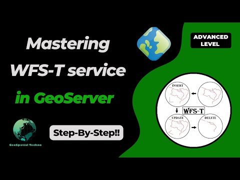
The Web Feature Service (WFS) transactions in GeoServer, enable users the ability to manipulate geographic data for serving and editing geospatial information over the web. This feature allows for direct editing of spatial features within a dataset through a web browser or application, without needing to download and edit the data locally.
WFS transactions in GeoServer allow users to dynamically edit spatial data by sending XML requests to insert, update, or delete features. This real-time editing is crucial for applications like online maps and collaborative planning systems. It improves efficiency, data accuracy, and supports real-time collaboration.
Note. This video was recorded on GeoServer 2.22.4, which is not the most up-to-date version. Currently, versions 2.25.x and 2.26.x are supported. To ensure you have the latest release, please visit this link and avoid using older versions of GeoServer.
Note. In all examples in this blog post, we utilize the
WFS Insert Featuretopp:tasmania_roadslayer.The Insert Feature operation, when used with GeoServer’s WFS transaction feature, allows users to append new features to an existing dataset. This ensures the new feature is securely added to the layer, preventing data duplication and errors.
Note. Backup your data and configuration before making any changes to avoid potential data loss or unexpected behavior.
Here is an example of how to use the WFS insert feature in GeoServer:
- Navigate to the Demos page, then click on the Demo requests link.
- From the Request drop-down list, select WFS_transactionInsert.xml.
-
Enter the new coordinates and road’s type as follows:
<wfs:Insert> <topp:tasmania_roads> <topp:the_geom> <gml:MultiLineString srsName="http://www.opengis.net/gml/srs/epsg.xml#4326"> <gml:lineStringMember> <gml:LineString> <gml:coordinates decimal="." cs="," ts=" "> 145.2,-42.5 145.2,-43.3 145.8,-43.3 </gml:coordinates> </gml:LineString> </gml:lineStringMember> </gml:MultiLineString> </topp:the_geom> <topp:TYPE>street</topp:TYPE> </topp:tasmania_roads> </wfs:Insert> - Remember that using the WFS transaction in GeoServer requires appropriate permissions and access rights to ensure that only authorized users can modify the data. Enter the username and password to be authorized, and then press the Submit button.
- GeoServer processes the transaction request. If successful, it adds the new feature to the road layer; if unsuccessful, a relevant error information is displayed and no changes are made to the data.
- Navigate to the Layer Preview section and open up the OpenLayers preview for the
tasmania_roadslayer. Your map should now look like this:
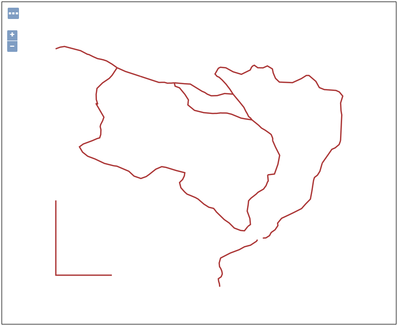
You have successfully used the insert feature with WFS transaction in GeoServer to add a new street to your dataset.
WFS Update FeatureThe Update feature of the WFS transaction in GeoServer enables users to modify existing features within a geospatial dataset. By submitting a request that specifies both the feature type and the desired changes to attributes and geometry, users can efficiently update specific attributes while altering the shape, location, and size of various features.
Here are the steps to perform an update feature with WFS transaction in GeoServer:
-
Select WFS_transactionUpdateGeom.xml from the Request drop-down list, then edit the codes as follows:
<wfs:Update typeName="topp:tasmania_roads"> <wfs:Property> <wfs:Name>the_geom</wfs:Name> <wfs:Value> <gml:MultiLineString srsName="http://www.opengis.net/gml/srs/epsg.xml#4326"> <gml:lineStringMember> <gml:LineString> <gml:coordinates>145.55,-42.7 145.04,-43.04 145.8,-43.4</gml:coordinates> </gml:LineString> </gml:lineStringMember> </gml:MultiLineString> </wfs:Value> </wfs:Property> <ogc:Filter> <ogc:FeatureId fid="tasmania_roads.15"/> </ogc:Filter> </wfs:Update> - Enter the username and password to be authorized, and then press the Submit button.
- After the GeoServer has processed the transaction request, go back to the Layer Preview section and open up the OpenLayers preview for the
tasmania_roadslayer. Your map should now look like this:
WFS Delete Feature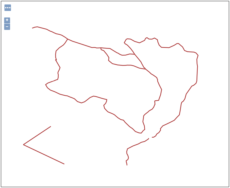
This operation allows users to selectively remove specific features from a dataset by providing their unique identifiers. The process of deleting features can be seamlessly executed through the WFS transaction capabilities in GeoServer.
This functionality gives users more control over their geospatial database, helping them manage and manipulate data efficiently. As an example, let’s remove the features whose type attribute is equal to
road. To do this, follow the steps displayed on the screen:-
Select WFS_transactionDelete.xml from the Request drop-down list, then edit the codes as follows:
<wfs:Delete typeName="topp:tasmania_roads"> <ogc:Filter> <ogc:PropertyIsEqualTo> <ogc:PropertyName>topp:TYPE</ogc:PropertyName> <ogc:Literal>road</ogc:Literal> </ogc:PropertyIsEqualTo> </ogc:Filter> </wfs:Delete> - Enter the username and password to be authorized, and then press the Submit button.
- After the GeoServer has processed the transaction request, preview for the
tasmania_roadslayer. As you can see, the features of typeRoadhave been deleted.
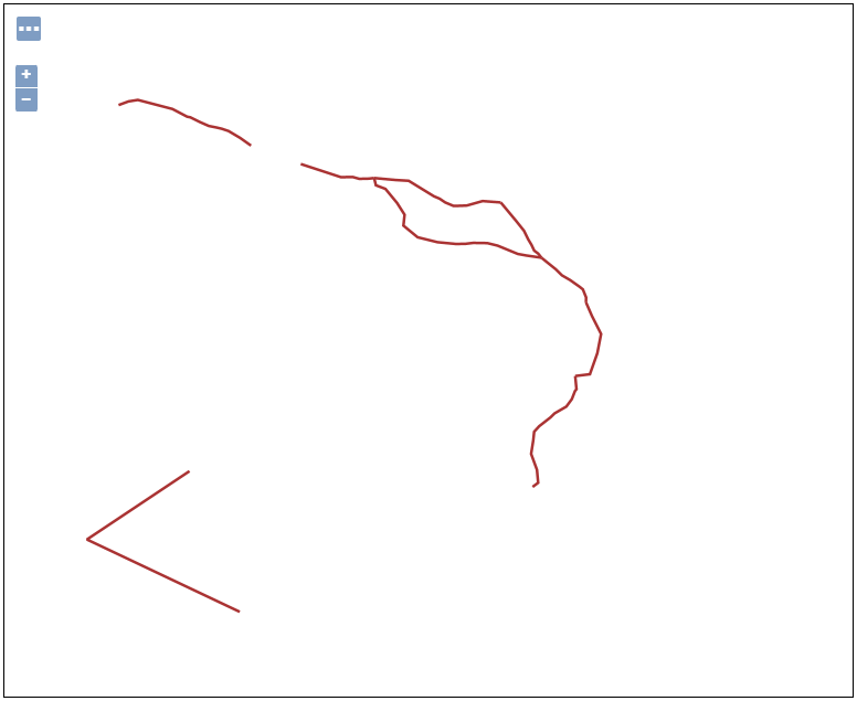
Remember that you can define filter conditions to remove the specific features using the WFS Delete transaction. This can include feature IDs, attributes, spatial extent or other criteria.
-
Again, select WFS_transactionDelete.xml from the Request drop-down list, then edit the codes as follows:
<wfs:Delete typeName="topp:tasmania_roads"> <ogc:Filter> <ogc:FeatureId fid="tasmania_roads.15"/> </ogc:Filter> </wfs:Delete> - Enter the username and password to be authorized, and then press the Submit button.
- After the GeoServer has processed the transaction request, open the OpenLayers preview for the
tasmania_roadslayer from the Layer Preview section. As you can see, thefid 15has been deleted.
In this session, we took a brief journey to explore WFS Transaction to insert update and remove features in GeoServer. If you want to access the complete tutorial, click on the link.
-
13:00
Mappery: Manhattan
sur Planet OSGeoPièce jointe: [télécharger]

My mum sent me this picture for my birthday—her first Map in the Wild.
-
4:33
Sean Gillies: Bug Club at Hi-Dive, April 1
sur Planet OSGeoTuesday, April 1, Ruthie and I, and a couple of friends, drove to Denver to see The Bug Club at the Hi-Dive on South Broadway. The Bug Club have become one of my favorites over the past two years, since I first heard them on a WFMU show. I can't remember if it was Joe Belock's or Todd-o-Phonic Todd's. I was extremely excited to see them, and to see them with Ruthie. We're going to Denver to see music less frequently as we get older, so this was a special occasion. The Breeders at The Ogden in 2018 was our last show in Denver, if I recall correctly.
The Hi-Dive is a small club with a modest stage and no seating, only an open floor in front of the stage. I don't think there is any backstage, either. Bands enter and leave the stage using steps at the front of the stage. It's unabashedly no-frills and I liked it.
Ducks Limited were nominally the main act. I've listened to them a little and they're good, if not exactly my cup of tea. The opening act was Denver's own Mainland Break. Like Ducks Ltd., they play a jangly 80's pop, but also channel the Replacements on stage. I enjoyed their short set.
The effect of putting The Bug Club between these bands was a bit like giving the Minutemen a long set in the middle of an REM show in 1983. They tore through 20 songs in a little over an hour with humor and grace but otherwise no break. Every song from The Intricate Inner Workings of The System, minus Actual Pain and Cold Hard Love (which I love), a new single, and from earlier albums: Marriage, Cheap Linen, Short and Round, It's Art, and Little Coy Space Boy. There were songs I didn't recognize, including one with dueling spiels between Sam and Tilly, that especially reminded me of the Minutemen, what with their physically imposing and proficient producer Tom Rees driving the drumbeat, Sam's buzzed head, and it being D. Boon's birthday. Uncanny!

The Bug Club setting up at Denver's Hi-Dive club.
I'm looking forward to my next chance to see The Bug Club. They really did put on a satisfying show.
-
23:46
TorchGeo: v0.7.0
sur Planet OSGeoTorchGeo 0.7.0 Release NotesTorchGeo 0.7 adds 26 new pre-trained model weights, 33 new datasets, and more powerful trainers, encompassing 7 months of hard work by 20 contributors from around the world.
Highlights of this releaseNote
The following model and dataset descriptions were generated by an imperfect human, not by an LLM. If there are any inaccuracies or anything else you would like to highlight, feel free to reach out to @adamjstewart.
Growing collection of foundation models
TorchGeo has a growing collection of Earth observation foundation models, including 94 weights from 13 papers:
- GASSL (@kayush95 et al., 2020): Uses spatially aligned images over time to construct temporal positive pairs and a novel geo-location pretext task. Great if you are working with high-resolution RGB data such as Planet or Maxar.
- SeCo (@oscmansan et al., 2021): Introduces the idea of seasonal contrast, using spatially aligned images over time to force the model to learn features invariant to seasonal augmentations, invariant to synthetic augmentations, and invariant to both.
- SSL4EO-S12 (@wangyi111 et al., 2022): A spiritual successor to SeCo, with models for Sentinel-1/2 data pretrained using MoCo, DINO, and MAE (new).
- Satlas (@favyen2 et al., 2022): A collection of Swin V2 models pretrained on a staggering amount of Sentinel-2 and NAIP data, with support for single-image and multiple-image time series. Sentinel-1 and Landsat models were later released as well.
- Scale-MAE (@cjrd et al., 2022): The first foundation model to explicitly support RGB images with a wide range of spatial resolutions.
- SSL4EO-L (@adamjstewart et al., 2023): The first foundation models pretrained on Landsat imagery, including Landsat 4–5 (TM), Landsat 7 (ETM+), and Landsat 8–9 (OLI/TIRS).
- DeCUR (@wangyi111 et al., 2023): Uses a novel multi-modal SSL strategy to promote learning a common representation while also preserving unique sensor-specific information.
- FG-MAE (@wangyi111 et al., 2023): (new) A feature-guided MAE model, pretrained to reconstruct features from histograms of gradients (HOG) and normalized difference indices (NDVI, NDWI, NDBI).
- CROMA (@antofuller et al., 2023): (new) Combines contrastive learning and reconstruction loss to learn rich representations of MSI and SAR data.
- DOFA (@xiong-zhitong et al., 2024): Introduced the idea of dynamically generating the patch embedding layer of a shared multimodal encoder, allowing a single model weight to support SAR, RGB, MSI, and HSI data. Great for working with multimodal data fusion, flexible channel combinations, or new satellites which don't yet have pretrained models.
- SoftCon (@wangyi111 et al., 2024): (new) Combines a novel multi-label soft contrastive learning with land cover semantics and cross-domain continual pretraining, allowing the model to integrate knowledge from existing computer vision foundation models like DINO (ResNet) and DINOv2 (ViTs). Great if you need efficient small models for SAR/MSI.
- Panopticon (@LeWaldm et al., 2025): (new, model architecture pictured above) Extends DINOv2 with cross attention over channels, additional metadata in the patch embeddings, and spectrally-continual pretraining. Great if you want the same features as DOFA but with even better performance, especially on SAR and HSI data, and on “non-standard” sensors.
- Copernicus-FM (@wangyi111 et al., 2025): (new) Combines the spectral hypernetwork introduced in DOFA with a new language hypernetwork and additional metadata. Great if you want to combine image data with non-spectral data, such as DEMs, LU/LC, and AQ data, and supports variable image dimensions thanks to FlexiViT.

TorchGeo now boasts a whopping 126 built-in data loaders. Shoutout to the following folks who have worked tirelessly to make these datasets more accessible for the ML/EO community: @adamjstewart @nilsleh @isaaccorley @calebrob6 @ashnair1 @wangyi111 @GeorgeHuber @yichiac @iejMac etc. See the above figure for a breakdown of how many datasets each of these people have packaged.
In order to build the above foundation models, TorchGeo includes an increasing number of large pretraining datasets:
- BigEarthNet (@gencersumbul et al., 2019): Including BEN v1 and v2 (new), consisting of 590K Sentinel-2 patches with a multi-label classification task.
- Million-AID (@IenLong et al., 2020): 1M RGB aerial images from Google Earth Engine, including both multi-label and mutli-class classification tasks.
- SeCo (@oscmansan et al., 2021): 1M images and 70B pixels from Sentinel-2 imagery, with a novel Gaussian sampling technique around urban centers with greater data diversity.
- SSL4EO-S12 (@wangyi111 et al., 2022): 3M images and 140B pixels from Sentinel-1 GRD, Sentinel-2 TOA, and Sentinel-2 SR. Extends the SeCo sampling strategy to avoid overlapping images. (new) Now with automatic download support and additional metadata.
- SatlasPretrain (@favyen2 et al., 2022): (new) Over 10M images and 17T pixels from Landsat, NAIP, and Sentinel-1/2 imagery. Also includes 302M supervised labels for 127 categories and 7 label types.
- HySpecNet-11k (@m.fuchs et al., 2023): (new) 11k hyperspectral images from the EnMAP satellite.
- SSL4EO-L (@adamjstewart et al., 2023): 5M images and 348B pixels from Landsat 4–5 (TM), Landsat 7 (ETM+), and Landsat 8–9 (OLI/TIRS). Extends the SSL4EO-S12 sampling strategy to avoid nodata pixels, and includes both TOA and SR imagery, composing the largest ever Landsat dataset. (new) Now with additional metadata.
- SkyScript (@wangzhecheng et al., 2023): (new) 5.2M images from NAIP, orthophotos, Planet SkySat, Sentinel-2, and Landsat 8–9, with corresponding text descriptions for VLM training.
- MMEarth (@vishalned et al., 2024): (new) 6M image patches and 120B pixels from over 1.2M locations, including Sentinel-1/2, Aster DEM, and ERA5 data. Includes both image-level and pixel-level classification labels.
- Copernicus-Pretrain (@wangyi111 et al., 2025): (new, pictured below) 19M image patches and 920B pixels from Sentinel-1/2/3/5P and Copernicus GLO-30 DEM data. Extends SSL4EO-S12 for the entire Copernicus family of satellites.

We are also expanding our collection of benchmark suites to evaluate these new foundation models on a variety of downstream tasks:
- SpaceNet (@avanetten et al., 2018): A challenge with 8 (and growing) datasets for instance segmentation tasks in building segmentation and road network mapping, with > 11M building footprints and ~20K km of road labels.
- Copernicus-Bench (@wangyi111 et al., 2025): (new) A collection of 15 downstream tasks for classification, pixel-wise regression, semantic segmentation, and change detection. Includes Level-1 preprocessing (e.g., cloud detection), Level-2 base applications (e.g., land cover classification), and Level-3 specialized applications (e.g., air quality estimation). Covers Sentinel-1/2/3/5P sensors, and includes the first curated benchmark datasets for Sentinel-3/5P.

TorchGeo now includes 10 trainers that make it easy to train models for a wide variety of tasks:
- Classification: including binary (new), multi-class, and multi-label classification
- Regression: including image-level and pixel-level regression
- Semantic segmentation: including binary (new), multi-class, and multi-label (new) semantic segmentation
- Instance segmentation: (new, example predictions pictured above) for RGB, SAR, MSI, and HSI data
- Object detection: now with (new) support for SAR, MSI, and HSI data
- BYOL: Bootstrap Your Own Latent SSL method
- MoCo: Momentum Contrast, including v1, v2, and v3
- SimCLR: Simple framework for Contrastive Learning of visual Representations, including v1 and v2
- I/O Bench: For benchmarking TorchGeo I/O performance
In particular, instance segmentation was @ariannasole23's course project, so you have her to thank for that. Additionally, trainers now properly denormalize images before plotting, resulting in correct "true color" plots in tensorboard.
Backwards-incompatible changesTorchGeo has graduated from alpha to beta development status (#2578). As a result, major backwards-incompatible changes will coincide with a 1 minor release deprecation before complete removal whenever possible from now on.
MultiLabelClassificationTaskis deprecated, useClassificationTask(task='multilabel', num_labels=...)instead (#2219)torchgeo.transforms.AugmentationSequentialis deprecated, usekornia.augmentation.AugmentationSequentialinstead (#1978, #2147, #2396)torchgeo.datamodules.utils.AugPipewas removed (#1978)- Many objection detection datasets and tasks changed sample keys to match Kornia (#1978, #2513)
- Channel dimension was squeezed out of many masks for compatibility with torchmetrics (#2147)
dofa_huge_patch16_224was renamed todofa_huge_patch14_224(#2627)SENTINEL1_ALL_*weights are deprecated, useSENTINEL1_GRD_*instead (#2677)ignoreparameter was moved to a class attribute inBaseTask(#2317)- Removed
IDTReeS.plot_las, use matplotlib instead (#2428)
- PyVista (#2428)
- Python: drop support for Python 3.10 (#2559)
- Python: add Python 3.13 tests (#2547)
- Fiona: v1.8.22+ is now required (#2559)
- H5py: v3.8+ is now required (#2559)
- Kornia: v0.7.4+ is now required (#2147)
- Lightning: v2.5.0 is not compatible (#2489)
- Matplotlib: v3.6+ is now required (#2559)
- Numpy: v1.23.2+ is now required (#2559)
- OpenCV: v4.5.5+ is now required (#2559)
- Pandas: v1.5+ is now required (#2559)
- Pillow: v9.2+ is now required (#2559)
- Pyproj: v3.4+ is now required (#2559)
- Rasterio: v1.3.3+ is now required, v1.4.0–1.4.2 is not compatible (#2442, #2559)
- Ruff: v0.9+ is now required (#2423, #2512)
- Scikit-image: v0.20+ is now required (#2559)
- Scipy: v1.9.2+ is now required (#2559)
- SMP: v0.3.3+ is now required (#2513)
- Shapely: v1.8.5+ is now required (#2559)
- Timm: v0.9.2+ is now required (#2513)
- Torch: v2+ is now required (#2559)
- Torchmetrics: v1.2+ is now required (#2513)
- Torchvision: v0.15.1+ is now required (#2559)
- CaFFe (#2350)
- FTW (#2368)
- HySpecNet-11k (#2410)
- LandCover.ai 100 (#2262)
- MMFlood (#2450)
- ReforesTree (#2642, #2655)
- SpaceNet 6 (#2367)
- Substation (#2352)
- TreeSatAI (#2402)
- Fix support for large mini-batches in datamodules previously using RandomNCrop (#2682)
- I/O Bench: fix automatic downloads (#2577)
- Annual NLCD (#2387)
- BigEarthNet v2 (#2531, #2545, #2662)
- BRIGHT (#2520, #2568, #2617)
- CaFFe (#2350)
- Copernicus-Bench (#2604, #2605, #2606, #2607)
- Copernicus-Pretrain (#2686)
- DIOR (#2572)
- DL4GAM Alps (#2508)
- DOTA (#2551)
- EnMAP (#2543)
- EverWatch (#2583, #2679)
- FTW (#2296, #2699)
- GlobalBuildingMap (#2473)
- HySpecNet-11k (#2410, #2569)
- LandCover.ai 100 (#2262)
- MDAS (#2429, #2534)
- MMEarth (#2202)
- MMFlood (#2450)
- SatlasPretrain (#2248)
- SODA-A (#2575)
- Substation (#2352)
- TreeSatAI (#2402)
- Many objection detection datasets changed sample keys to match Kornia (#1978, #2513)
- BioMassters: rehost on HF (#2676)
- Digital Typhoon: fix MD5 checksum (#2587)
- ETCI 2021: fix file list when 'vv' in directory name (#2532)
- EuroCrops: fix handling of Nones in labels (#2499)
- IDTReeS: removed support for plotting lidar point cloud (#2428)
- Landsat 7: fix default bands (#2542)
- ReforesTree: skip images with missing mappings (#2668)
- ReforesTree: fix image and mask dtype (#2642)
- SSL4EO-L: add additional metadata (#2535)
- SSL4EO-S12: add additional metadata (#2533)
- SSL4EO-S12: add automatic download support (#2616)
- VHR-10: fix plotting (#2603)
- ZueriCrop: rehost on HF (#2522)
- GeoDataset: all datasets now support non-square pixel resolutions (#2601, #2701)
- RasterDataset: assert valid bands (#2555)
- Copernicus-FM (#2646)
- CROMA (#2370, #2652)
- FG-MAE (#2673)
- Panopticon (#2692)
- SoftCon (#2677)
- SSL4EO-S12 MAE (#2673)
- Timm models now support
features_only=True(#2659, #2687) - DOFA: save hyperparameters as class attributes (#2346)
- DOFA: fix inconsistent patch size in huge model (#2627)
- Instance segmentation (#2513)
- All trainers now denormalize images before plotting, resulting in correct "true color" plots in tensorboard (#2560)
- Classification: add support for binary, multiclass, and multilabel classification (#2219)
- Classification:
MultiLabelClassificationTaskis now deprecated (#2219) - Object Detection: add support for non-RGB imagery (SAR, MSI, HSI) (#2602)
- Semantic Segmentation: add support for binary, multiclass, and multilabel semantic segmentation (#2219, #2690)
- Fix
load_from_checkpointto load a pretrained model (#2317) - Ignore
ignorewhen saving hyperparameters (#2317)
- AugmentationSequential is now deprecated (#2396)
- SpaceNet is now properly documented as a benchmark suite
- Fix license for RESISC45 and VHR-10
- SatlasPretrain: fix table hyperlink
- Update list of related libraries (#2691)
- Add GeoAI to related libraries list (#2675)
- Add geobench to related libraries list (#2665)
- Add OTBTF to related libraries list (#2666)
- Fix file-specific test coverage (#2540)
- Customization: fix broken hyperlink (#2549)
- Trainers: document where checkpoints are saved (#2658)
- Trainers: document how to get the best model (#2658)
- Various typo fixes (#2566)
- Faster model testing (#2687)
- Codecov: move configuration file to subdirectory (#2361)
- Do not cancel in-progress jobs on main branch (#2638)
- Ignore prettier reformat in git blame (#2299)
This release is thanks to the following contributors:
@adamjstewart
@ando-shah
@ariannasole23
@ashnair1
@burakekim
@calebrob6
@DarthReca
@dcodrut
@giswqs
@isaaccorley
@japanj
@lccol
@LeWaldm
@lns-lns
@mdchuc
@nilsleh
@remicres
@rijuld
@sfalkena
@wangyi111 -
14:00
Mappery: Another map of Argentina on a cow hide
sur Planet OSGeo

We had a map like this a while ago but Raf wanted to share the one that he has in his home and I thought – why not?
-
13:00
Mappery: Map Origami
sur Planet OSGeo

Javier Jimenez Shaw spotted this display in an opticians window in Berlin
-
4:00
GeoServer Team: GeoServer 2.27.0 Release
sur Planet OSGeoGeoServer 2.27.0 release is now available with downloads (bin, war, windows), along with docs and extensions.
This is a stable release of GeoServer recommended for production use. GeoServer 2.27.0 is made in conjunction with GeoTools 33.0, GeoWebCache 1.27.0, and ImageIO-EXT 1.4.15.
This release graduates the OGC API Features module to extension status, ensures all OGC services pass CITE compliance tests, and adds performance improvements to the catalog loader that significantly reduces startup times for large deployments. The release also includes Smart Data Loader override rules. This release addresses several security vulnerabilities, and enforces browser Content Security Policy for increased security.
Thanks to extensive community testing through our user forum, we’re confident in recommending this release for production use. Check update notes for specific instructions.
Thanks to Gabriel Roldan (Camptocamp) and Jody Garnett (GeoCat) for making this release and to all contributors who helped with this release cycle.
Community TestingThis release cycle featured an extensive community testing effort, with our new discourse communication channels playing a central role in pre-release validation.
Testers helped identify and resolve several important issues:
- Performance Improvements: Daniel Calliess verified faster startup times and validated the GeoFence plugin functionality.
- Security Enhancements: Georg and Roar Brænden provided detailed feedback on the new Content Security Policy (CSP) implementation, helping refine the upgrade instructions.
- Catalog Robustness: Andrea tested the new parallel catalog loader across various data directory configurations, identifying and helping resolve concurrency edge cases.
- Documentation: Emanuele Tajariol collaborated with Daniel to update GeoFence plugin documentation.
- Standards Implementation: Landry Breuil validated the OGC API Features extension on behalf of the geOrchestra community.
The GeoServer team is grateful to all community members who participated in this testing effort. Their feedback was instrumental in addressing issues before release and ensuring a smooth upgrade experience for users.
Special thanks to Andrea, Jody, Peter, and Gabriel for their diligent work reviewing feedback and addressing issues throughout the preflight testing period.
Security ConsiderationsThis release addresses several security vulnerabilities, and is a recommended upgrade for production systems.
See project security policy for more information on how security vulnerabilities are managed.
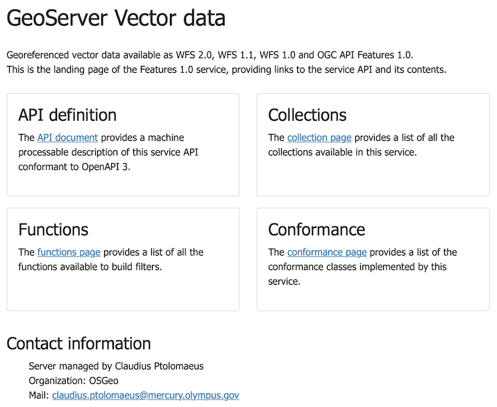
OGC API FeaturesService ExtensionThe OGC API Features module has officially graduated from community status to become a supported GeoServer extension. This implementation of the modern, web-friendly OGC API - Features standard provides a RESTful API alternative to traditional WFS services.
Key capabilities include:
- Feature collection discovery and access
- Spatial and attribute filtering using CQL2
- Multiple output formats (GeoJSON, HTML, etc.)
- Service-level operations across multiple collections
This service operates alongside the existing WFS services:
-
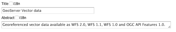
Update the WFS Settings title and description appropriately.
-
This information is used for the service landing page:
-
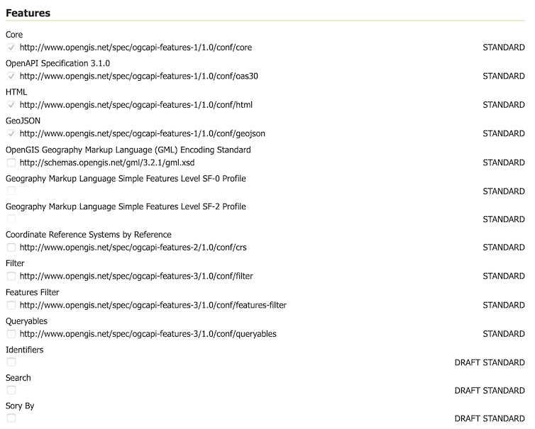
GeoServer has not previously included draft or work-in-progress development - preferring to make such functionality available as community modules for developers to collaborate. However OGC API - Features specification is defined in a modular fashion, and accommodates the idea of both draft and community standards.
To configure enable/disable “conformances” for Features, CQL2, and ECQL.
-
For more information on OGC API support in GeoServer:
- OGC API Service Configuration (User Manual)
- Configuration of OGC API - Features module (User Manual)
This graduation is the result of a collaborative code sprint with developers from Camptocamp, GeoSolutions, and GeoCat joining forces. As part of this effort, the module now passes OGC CITE compliance tests, ensuring proper interoperability with other OGC-compliant systems.
Special thanks to the French “Commissariat général au développement durable du Ministère chargé de l’Ecologie” for sponsoring this work as part of the Collectif Interopérabilité et mise en Commun de Composants Logiciels pour les plateformes de données (CICCLO) project.
For more information, and the extension user docs.
- GSIP-230 OGC API Features Extension
- GEOS-11627 OGCAPI FeatureService Extension
A significant effort has been made to ensure GeoServer passes the OGC Conformance and Interoperability Test and Evaluation (CITE) compliance tests across all supported services. This work improves the quality and interoperability of GeoServer with other OGC-compliant systems.
Restoring CITE Compliance has been a project goal for a number of years, and an ongoing sponsorship goal for the GeoServer project. Many thanks to prior sponsors of this activity including Gaia3D, and OSGeo:UK.
We are pleased to share that GeoServer now passes all the OGC CITE compliance tests available for the services it supports. Passing OGC CITE tests involved fixing numerous issues related to exception handling, version negotiation, and service behavior.
Special thanks to Andrea Aime for leveraging, extending, and improving the OGC CITE conformance testing infrastructure that was developed during the OGC API Features work, and methodically applying it to ensure all GeoServer services now pass their respective compliance tests.
While official certification from the OGC is still pending at the time of writing, the process is underway and we anticipate formal recognition of GeoServer in the coming days.
Thanks to Peter Smythe (AfriGIS) and Angelos Tzotsos for working with Open Source Geospatial Foundation to provide access to the CITE Certification process. Once certification is granted, we will update this post and home page with a “live logo” to reflect our official status.
- GEOS-11729 Pass WCS 1.0 certification OGC CITE tests
- GEOS-11730 Pass WCS 1.1 certification OGC CITE tests
- GEOS-11780 Pass WCS 2.0 certification OGC CITE tests
- GEOS-11731 Pass WFS 1.0 certification OGC CITE tests
- GEOS-11732 Pass WFS 1.1 certification OGC CITE tests
- GEOS-11733 Pass WFS 2.0 certification OGC CITE tests
- GEOS-11734 Pass WMS 1.1 certification OGC CITE tests
- GEOS-11735 Pass WMS 1.3 certification OGC CITE tests
- GEOS-11779 Pass WMTS 1.0 certification OGC CITE tests
- GEOS-11736 Pass OGC API Features 1.0 certification OGC CITE tests
- GEOS-11752 Pass GeoTIFF 1.1 certification OGC CITE tests
- GEOS-11753 Pass GPKG 1.2 certification OGC CITE tests
The use of Content Security Policy (CSP) headers is an additional safety precaution introduced by your browser to mitigate cross-site scripting and clickjacking attacks.
GeoServer 2.27.0 pages now include a Content Security Policy, limiting expected browser interactions to increase security.
-
Before updating double check your
PROXY_BASE_URLsetting is correct.This is a common mistake blocked by the new CSP policy.
-
It is expected that the web administration console functions correctly, along with extensions and community modules.
With these improved CSP safety measures GeoServer may now detect vulnerabilities in your environment that were previously undetected.
If you run into any problems, troubleshooting instructions are available in the user manual.
-
Additional tools are available for administrators seeking greater control.

Thanks to Steve Ikeoka for his dedication to this activity.
- GSIP 227 Content-Security-Policy Headers
- GEOS-11346 Add a configurable Content-Security-Policy header
- GEOS-11698 Update GeoServer User Interface Troubleshooting Guidance
- GEOS-11585 Patch Spectrum to work with Wicket’s CSP
- GEOS-11586 Patch CodeMirror to work with Wicket’s CSP
- GEOS-11669 Patch jscolor to work with Wicket’s CSP
GeoServer 2.27.0 includes significant performance improvements for server startup with the promotion of the “datadir catalog loader” from a community module to the GeoServer core. This enhanced loader dramatically improves startup times for deployments with large data directories through parallel processing.
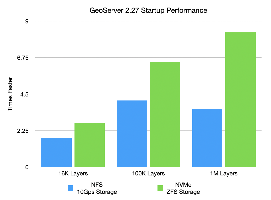
The performance gains are substantial, as shown by these benchmark results:
NFS/10Gbps Storage:
- 16K layers: reduced from 5.8s to 3.3s (1.8× faster)
- 100K layers: reduced from 1.9min to 28.3s (4.1× faster)
- 1M layers: reduced from 21.3min to 5.9min (3.6× faster)
NVMe Gen5/ZFS Storage:
- 16K layers: reduced from 3.5s to 1.3s (2.7× faster)
- 100K layers: reduced from 21.2s to 3.2s (6.5× faster)
- 1M layers: reduced from 3.4min to 24.6s (8.3× faster)
The new loader uses work-stealing thread pools for catalog processing while ensuring thread safety. This enhancement is particularly valuable for large enterprise deployments where startup time has been a bottleneck.
The loader is enabled by default but can be disabled or tuned if needed as explained in the data directory documentation.
- GSIP-231 Promote data_dir catalog loader to core
- GEOS-11284 Promote community module “datadir catalog loader” to core
A file system sandbox is used to limit access for GeoServer Administrators and Workspace Administrators to specified file folders.
-
A system sandbox is established using
GEOSERVER_FILESYSTEM_SANDBOXapplication property, and applies to the entire application, limiting GeoServer administrators to the<sandbox>folder, and individual workspace administrators into isolated<sandbox>/<workspace>folders. -
A regular sandbox can be configured from the Security > Data screen, and is used to limit individual workspace administrators into
<sandbox>/<workspace>folders to avoid accessing each other’s files.
Thanks to Andrea (GeoSolutions) for this important improvement at the bequest of Munich RE.
MapML EnhancementThe MapML extension continues to receive significant updates.
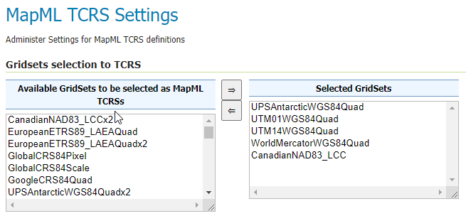
Tiled Coordinate Reference Systems can now be managed with a new MapML TCRS Settings page, available in the Admin Console Settings section:
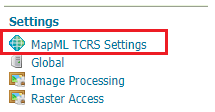
The MapML TCRS Settings page provides a selector containing available GridSets. The administrator can select GridSets from the left list that will be converted to TiledCRSs.
Check out the documentation for more insights.
These changes provide better integration and more powerful capabilities for creating web maps with MapML.
- GEOS-11561 Client-Delegating MapML Proxy
- GEOS-11577 Rename MapML <layer-> to <map-layer>, rename viewer bundle to mapml.js
- GEOS-11605 MapML Support custom TCRS projections from existing GridSets
- GEOS-11666 Update MapML viewer to latest release 0.16.0
The Smart Data Loader has been improved with override rules, making it more flexible for data management scenarios:
The Smart Data Loader plugin automates the creation of XSD schemas and App-Schema mapping files, significantly simplifying the configuration of complex feature data in GeoServer.
With the new override rules capability, you can now customize how database tables are mapped to feature types without modifying the database schema, providing greater control and flexibility when working with complex or legacy data structures.
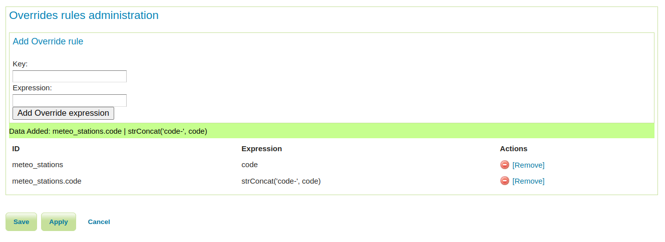
For more details on using Smart Override Rules, see the official documentation.
- GEOS-11741 Enhancing Smart Data Loader with Override Rules
- GEOS-11691 Smart data loader accepts bigint and bigserial but not int8 postgresql type alias
The GeoFence extension has received several significant improvements:
These improvements make GeoFence more flexible and powerful for implementing fine-grained security policies.
- GEOS-11702 GeoFence: major libs update
- GEOS-11704 GeoFence: filter rule list by IP address
- GEOS-11705 GeoFence: make rules valid within a date range
- GEOS-11526 GeoFence: slow GeoServer response when there are many roles and layergroups
Several performance improvements have been implemented in this release:
- GEOS-11580 Improve embedded GWC meta-tiling performance
- GEOS-11766 Speed up CRS and store factory lookups during catalog loading
- GEOS-11722 Coverage view reader partially ignores multithreaded loading
- GEOS-11739 Excessive memory usage for WMS KML output format
- GEOS-11760 Fix a potential OOM in the KML transformation
Several improvements have been made to the Web Processing Service implementations:
- GEOS-11564 WPS calls to internal WFS will handle requests with version=2.0.0
- GEOS-11783 Longitudinal profile process now allows for input chaining
- GEOS-11784 The longitudinal profile process limits the number of points it can extract
- GEOS-11785 The longitudinal profile process now respects cancellation
- GEOS-11786 General performance improvements for the longitudinal profile process
- GEOS-11468 Coverage REST API URL Checks
- GEOS-11562 Default Gzip filter setting in web.xml does not compress application/javascript
- GEOS-11578 WMTS Multidim extension, allow usage of a sidecar in a separate store
- GEOS-11603 KML download mode now shows layer titles
- GEOS-11612 Add system property support for Proxy base URL -> use headers activation
- GEOS-11613 Increase control-flow logging admin visibility in logs
- GEOS-11624 Split Geopackage extension into separate modules to reduce dependencies
- GEOS-11625 Add “Challenge Anonymous Sessions” Option to AuthKey Filter
- GEOS-11645 Control FreeMarker template access
- GEOS-11654 Fix multiline strings that are missing a space between the lines
- GEOS-11677 Hide version info on GWC home page
GeoServer 2.27.0 includes updates to many core libraries:
- GEOS-11770 Update to jai-ext 1.1.31
- GEOS-11771 Update to Imageio-EXT 1.4.15
- GEOS-11590 Upgrade log4j to 2.24.1 and slf4j to 2.0.16
- GEOS-11608 Update Bouncy Castle Crypto package from bcprov-jdk15on:1.69 to bcprov-jdk18on:1.79
- GEOS-11609 Bump XStream from 1.4.20 to 1.4.21
- GEOS-11685 Bump jetty.version from 9.4.56.v20240826 to 9.4.57.v20241219
- GEOS-11631 Update MySQL driver to 9.1.0
- GEOS-11743 Upgrade Oracle JDBC driver (ojdbc) from 8 to 11
- GEOS-11754 Update to mapfish-print-v2 2.3.3
- GEOS-11763 Update jai-ext to latest version (1.1.30)
Many bugs have been fixed in this release, including:
- GEOS-4533, GEOS-7967 Fixed WPS demo builder chaining issues
- GEOS-11494 WFS GetFeature request with a propertyname parameter fails when layer attributes are customized
- GEOS-11524 CSW: default queryables mapping not generated
- GEOS-11540 OGC API queryables features call not working in JSON
- GEOS-11607 KML WMS GetMap is performing a heavy database load query
- GEOS-11620 Smart Data Loader plugin produces a Mapping file data source definition and tries to establish a connection pool, but fails
- GEOS-11636 Store panels won’t always show feedback in target panels
- GEOS-11649 Welcome page per-layer is not respecting global service enablement
- GEOS-11658 Time editor dumps stack trace in UI if the start or end time values are intervals
- GEOS-11664 Update REST security paths
- GEOS-11667 Make WMTS work in strict cite compliance mode
- GEOS-11668 WMTS home page capabilities link uses 1.1.1 as the version, and the wrong version negotiation approach
- GEOS-11684 GDAL no longer included in Docker image
- GEOS-11762 Feature Templates by feature type can not be listed via GeoServer Rest API
- GEOS-11792 Default Service Capabilities shown on initial start with no workspaces
- GEOS-11796 Deadlocks During GeoServer Startup When Loading Style Group Layer Groups
Community modules are shared as source code to encourage collaboration. If a topic being explored is of interest to you, please contact the module developer to offer assistance.
Community module development:
- GEOS-11651 Support env parametrization on OIDC filter
- GEOS-11781 Community cleanup fall 2024
- Removed abandoned community modules:
- GEOS-11641 Remove the abandoned community module webservice-test
- GEOS-11642 Remove the gwc-distributed community module
For the complete list of changes, see 2.27.0 release notes.
About GeoServer 2.27 SeriesAdditional information on GeoServer 2.27 series:
- GeoServer 2.27 User Manual
- GeoServer 2025 Roadmap
- Content-Security-Policy Headers
- OGCAPI Features Extension
- File system access isolation
- Promote data dir catalog loader to core
Release notes: (2.27.0)
-
4:00
FOSSGIS e.V. News: FOSSGIS 2025 in Münster mit Sonnenschein und Feuerwerk
sur Planet OSGeoDie FOSSGIS-Konferenz 2025 hat vom 26.-29. März 2025 erfolgreich in Münster stattgefunden. Die vielen positiven Rückmeldungen der Teilnehmenden bestätigen die Bedeutung der Veranstaltung als führende Konferenz für Freie und Open Source Software für Geoinformationssysteme sowie für die Themen Open Data und OpenStreetMap im D-A-CH-Raum.
Der FOSSGIS e.V und die OpenStreetMap Community veranstalteten die Konferenz in Kooperation mit dem Institut für Geoinformatik der Universität Münster. Das Schloss Münster als, imposante Kulisse für die FOSSGIS 2025 bekam ein großes Zelt auf den Schlossplatz, um die große Anzahl der Teilnehmenden brandschutzgerecht zu meistern. Dort war ein Großteil der Firmenausstellung sowie die Pausenversorgung und die Posterausstellung verortet.

FOSSGIS Konferenz 2025 Schloss MünsterÜber 1.000 Interessierte verfolgten die Veranstaltung, dabei waren 750 vor Ort und über 350 Online dabei. Die Veranstaltung war schon Ende Januar ausverkauft.
Programm
FOSSGIS Konferenz 2025 GruppenfotoDas vielfältige und hochwertige Programm der drei Konferenztage deckte viele Themen ab und es gab viele Fragen aus dem Publikum sowie anregende Diskussionen.
Die Konferenz startete mit einer Zeitreise durch das Vereinsleben anlässlich dem 25-jährigen Bestehen des Vereins. Moderiert von Dominik Helle präsentierten sich aktive Vereinsmitglieder mit Ihren Aktivitäten und Ideen in einem kurzweiligen Format mit vielen Infos und Fotos im Beitrag “25. Jahre FOSSGIS e.V. - eine Zeitreise durch das Vereinsleben”.Insgesamt wurden 87 Vorträge und 30 Lightning Talks sowie 6 Demosessions angeboten. Die meisten Vorträge wurden aufgezeichnet, die Aufzeichnungen sind im Programm verlinkt. Die 20 Workshops, bei denen Themen praxisnah zum mitmachen vermittelt wurden, sind über 200 mal gebucht worden. OSGeolive kam in vielen Workshops zum Einsatz. In 5 Expert:innenfragestunden wurden im direkten Gespräch Fragen aus und mit dem Publikum beantwortet und diskutiert. Die 14 stattgefundenen Anwender:innentreffen zeigen, dass die FOSSGIS-Konferenz erfolgreich zur Vernetzung der Community beiträgt.
Die Posteraussstellung kam gut an, auf 19 Postern wurden Arbeiten & Projekte vorgestellt. Von einzelnen Posterbeträgen gibt es Videoaufzeichnungen.
Die Dialogrunde “25 Jahre FOSSGIS e.V. - was haben wir geschafft und wo wollen wir hin” wurde durch die Arbeitsgruppe “Öffentliche Ausschreibungen mit FOSS” des FOSSGIS e.V. organisiert und von Niklas Alt moderiert. Die Idee über einen Blick in den Rückspiegel, wo kommt der Verein her, verbunden mit dem Blick in die Zukunft, ergab eine spannende Diskussionsrunde.

FOSSGIS Konferenz 2025 Paneldiskussion mit Andreas Hocevar, Pirmin Kalberer, Klaus Greve, Stefan Sander, Bernhard E. Reiter, moderiert von Niklas AltWer wissen möchte, was die Koordinierungsstelle des FOSSGIS e.V. macht, erfährt im Beitrag “Ein Blick in die Koordinierungsstelle des FOSSGIS e.V.” von Katja Haferkorn und Jochen Topf einige Einblicke.
Ein bemerkenswerter Vortrag war der Beitrag “GIS-Schulprojekte in Zusammenarbeit mit kommunalen Gebietskörperschaften”. Die Schüler:innen, ihr Lehrer sowie der Schulleiter hatten die vielleicht weiteste Anreise aus dem deutschsprachigen Raum zur Konferenz auf sich genommen. In Ihrem Vortrag stellten sie ihr Projekt der Zusammenarbeit zwischen Schule und Kommunen vor. Umgesetzt wurde das Projekt mit PostgreSQL und QGiS im Rahmen des jährlichen Vermessungspraktikums eines technischen Gymnsiums in Südtirol. Dieses schöne Beispiel für den Einsatz von FOSSGIS in Schule und Ausbildung will andere Schulen ermutigen, diesem Beispiel zu folgen. Insbesondere das Feedback der Schüler:innen zu ihrem Praxisprojekt zeigt eindringlich den Mehrwert und empfiehlt es zur unbedingten Nachahmung.
Zum Ausklang der ersten drei Konferenztage lud der FOSSGIS e.V. zum Sektempfang ein.
RahmenprogrammDas großartige Rahmenprogramm wurde gut angenommen. Es gab Exkursionen durch Münster, am Dienstag in Form eines geographischen Stadtrundgangs, am Freitag stand die Kartensammlung des Landesarchives NRW auf dem Plan und am Samstagnachmittag begaben sich die Teilnehmenden auf einen archäologisch, historischen Stadtrundgang.
Das Treffen der GeoChicas am Dienstag vor der Konferenz war ein großer Erfolg. Über 20 Frauen waren dabei und kamen schnell ins Gespräch. Auch der inoffizielle Start zeigte wieder, dass viele schon am Vortrag der Konferenz die vernetzung und das Gespräch suchen.
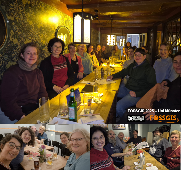
FOSSGIS Konferenz 2025 Treffen GeoChicas und inoffizeller Start am Vortrag der KonferenzDie Abendveranstaltung mit mehr als 500 Teilnehmenden in der Mensa am Aasee war ein kulinarischer und geselliger Höhepunkt der Konferenz.
Zum Auftakt des OSM Samstag gab es am Freitag ein Treffen im Hier und Jetzt am Ufer des Aasees. Von hier konnte das Feuerwerk am Send wunderbar betrachtet werden.
Samstag OSM-Samstag
FOSSGIS Konferenz 2025 AbschlussfeuerwerkDer OSM-Samstag, mittlerweile gut gepflegte Tradition, fand als Unconference statt. Circa 50-60 Teilnehmende verteilten sich in den Räumen und diskutierten die eingebrachten Themen. Die Themen und auch die Ergebnisse sind im Wiki dokumentiert.
Mittags fand eine partielle Sonnenfinsternis statt. Mit unterschliedlichen Werkzeugen wurde das Phänomen beobachtet.
Community SprintSeit langem fand mal wieder ein Community Sprint nach der FOSSGIS statt, welcher sehr gut angenommen wurde. Fragen wie “Was ist ein Issue”, “Was ist ein Pull requst” wurden geklärt, Python Plugins entwickelt und am deegree-Projekt und anderen Aufgaben gearbeitet.
Dank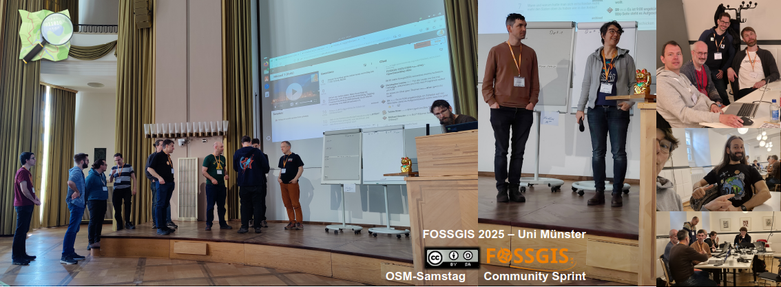
OSM-Samstag und Community Sprint 2025Vielen Dank an Christian Knoth vom Institut für Geoinformatik (IFGI) für den unermüdlichen Einsatz im Vorfeld. Danke an die Universität Münster dafür, dass wir unsere Konferenz im Schloss veranstalten durtfen. Danke an die Stadt Münster für die Unterstützung mit dem Willkommensticket zur ÖPNV-Nutzung. Herzlichen Dank an die Sponsoren der Konferenz.
Helfer:innenIn diesem Jahr konnten wir uns über 74 Helfer:innen freuen, die mit Spaß und Elan alle Herausforderungen gemeistert haben.
FOSSGIS 2026 Göttingen
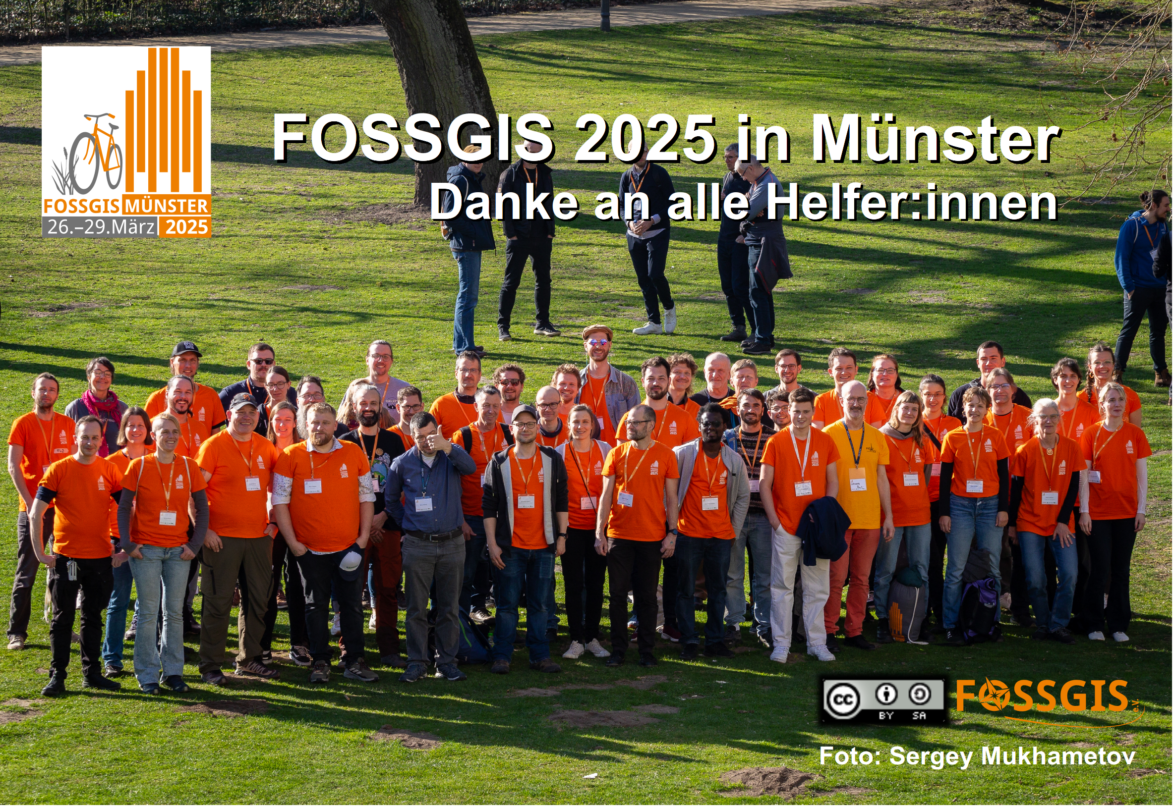
FOSSGIS 2025 - Helfer:innenNun heißt es wieder, nach der Konferenz ist vor der Konferenz. Der Veranstaltungsort für 2026 wurde im Abschluss bekannt gegeben. Zum ersten Mal planen wir eine FOSSGIS in Göttingen und freuen uns schon sehr darauf. Wer sich gerne in die Planung einbringen möchte ist herzlich willkommen und meldet sich beim Orgateam.
Der Verein wächstWir konnten uns während der Konferenz über viele Vereinseintritte freuen. So sind 44 Formulare beim Verein gelandet. Es wird eine Verlosung geben, bei der ein Konferenzticket für das nächste Jahr als Gewinn lockt.
Was kommt als nächstes?Die anstehenden Veranstaltungen:
- FOSSGIS-OSM-Communitytreffen 2025: https://www.fossgis.de/wiki/Hauptseite
- FOSS4G Europe 2025 Mostar: [https:]]
- FrOSCon: [https:]]
- Maker Faire: [https:]]
- Jubiläumsevent FOSSGIS e.V.
- SotM 2026 Manila: [https:]]
- FOSS4G 2025 Auckland Neuseeland: [https:]]
- FOSSGIS-Konferenz 2026 - 25.-28.3.2026 Göttingen [https:]]
- Alle OSGeo-Events: [https:]]
Und natürlich freut sich auch der FOSSGIS e.V. über Euer Engagement. Ihr seid herzlich eingeladen, euch zu einer Arbeitsgrupe dazu zu gesellen.
Es war eine tolle Konferenz. Herzlichen Dank an alle Beteiligten.
-
14:00
Mappery: Helsinki’s Global Church
sur Planet OSGeo

Jilles van Gurp shared this pic from his visit to Helsinki
-
20:21
GeoSolutions: GeoSolutions USA Sponsoring FedGeoDay 2025
sur Planet OSGeoYou must be logged into the site to view this content.
-
14:00
Mappery: Monhegan, not deceased
sur Planet OSGeo
David Fox shared this odd object “The dates seem a bit off, as I can confirm the island is still here and does seem a bit older.”
I checked and Monhegan Island remains off the coast of Maine.
-
9:53
Marco Bernasocchi: FOSSGIS 2025 – What a Week!
sur Planet OSGeoAs long time sponsors of FOSSGIS, we stepped up the game this year and became Platinum Sponsors for FOSSGIS 2025. We are proud to be part of a thriving open-source GIS community and to contribute to such a great conference. Here’s a recap of everything we were involved in:
 Talks & Presentations
 QField: New Strategy and Application Potential
Berit and Marco presented how QField, with over 1 million downloads and 350,000 active users, is now recognized as Digital Public Good aligned with the UN Sustainable Development Goals. Marco also shared the vision and mission behind QField’s development — highlighting our commitment to empowering field teams across the globe with open, user-friendly tools for data collection.
Real-world stories illustrated how QField helps bridge data gaps to support informed, sustainable decision-making. View talk
 QField in Practice: Fieldwork Made Easy
Berit and Michael led an interactive workshop demonstrating how to develop a QField project from scratch. The goal was for each participant to create and sync their own field study project using QFieldCloud, focused on collecting data on flowering plants in the picturesque “Schlussgarten.” View session When Web Meets Desktop
Matthias demonstrated how Django can be used to build consumable geodata layers via OGC API – Features endpoints. His talk covered how to use Python and Django ORM to elegantly define data models and business logic, offering an alternative to complex database logic. View talk
fossgis25-poster-extending-qfcDownload Extending QFieldCloud – Ideas and Practical Examples
Michael showed how QFieldCloud can be extended with Django apps, sharing practical implementations such as automated project generation and integration of remote sensing workflows. View talk QField Plugins – Examples and Possibilities
In a lightning talk, Michael introduced useful QField plugins, explained how to install and use them, and explored how they can enhance your mobile GIS workflows. View talk Hands-on qgis-js: Building Interactive QGIS-Based Web Maps
In this practical workshop, Michael guided participants through using qgis-js, an exciting new project that brings QGIS functionality directly into the browser. View session QGIS AMA Expert Session
Matthias and Marco hosted a live Q&A session where attendees could ask everything about QGIS development, best practices, organisation and real-world applications. At the Booth
Our QField booth was buzzing with activity all week – from plugin demos and project showcases to deep dives into QFieldCloud and field mapping workflows. We had great conversations, received valuable feedback, and met many enthusiastic users.

 Supporting Open Source
We were proud to be Platinum Sponsors of FOSSGIS 2025. Supporting open-source events like this is essential for fostering innovation, collaboration, and community-driven growth in the GIS world.

 Looking Ahead
Thank you to the organisers, speakers, and everyone who joined us in Münster. We left the event full of ideas, motivation, and appreciation for this community – and we’re already looking forward to the next FOSSGIS!

#QField #QFieldCloud #FOSSGIS2025 #OpenSourceGIS #QGIS #SupportOpenSource
-
17:08
WhereGroup: WebAssembly: Revolutioniere WebGIS mit unbegrenztem Potenzial
sur Planet OSGeoMartin Alzueta zeigt, welche Möglichkeiten WebAssembly (WASM) bietet, um GIS-Anwendungen performanter, skalierbarer und flexibler zu gestalten. -
14:45
Mappery: Exploring our maps in the wild
sur Planet OSGeoPièce jointe: [télécharger]

There are now nearly 3,000 Maps in the Wild on Mappery. If you are new to the site that may be a little overwhelming to find your way around our back catalogue (the editors speak English not American btw), but htere is a great way to browse our collection using a map of course! Who knew that a map was a great way to organise a massive collection of data? Go on, enjoy a few maps in the wild on our Mapping Maps in the Wild page, there’s enough there to keep you occupied for a few hours/days/weeks!
This Map in the Wild appeared a year or so ago, it still makes me smile and I wonder whether it is a real tatoo disaster or an April Fool’s joke
-
14:00
Mappery: When a geographer flies ?
sur Planet OSGeoPièce jointe: [télécharger]

Originally posted by Matthew Malone, saying, “As a geographer, how I told my son the ground would look during his first flight.”
-
13:00
Mappery: South Amerfrica
sur Planet OSGeo

Matt Malone spotted this, he said “Babe…wake up, the new South Amerfrica globe just dropped!”
I though this could be a fun game on April Fools Day, sometimes known as Trump This Day. Loads of possibilities open up – Amerada, Ameriland, Ameranama, Amerikraine, Russikraine and so on. Post your global mix ups in the comments.
-
13:00
Mappery: At Queens Museum
sur Planet OSGeo
Tom MacWright posted a pic of this massive panorama at Queens Museum, NY.
“The Panorama of the City of New York is an urban model of New York City that is a centerpiece of the Queens Museum. It was originally created for the 1964 New York World’s Fair.” Wikipedia
-
1:18
Sean Gillies: Bear training week 6 recap
sur Planet OSGeoA productive week six is done!
22.8 miles running
11 hours, 39 minutes all training
2,277 ft D+
That's not a lot of running, but it's the most I've done in a week since last July. I did two hill workouts outside on a 10% grade stretch of single track above Pineridge open space, Tuesday and Thursday. Today, Sunday, I did an easy long run from my house to the same dirt climb, and went up to the bench one time. My left Achilles, which has been nagging me, feels better. Weather permitting, I'll run 3-4 days next week, and increase my mileage to 25-26.
-
14:00
Mappery: A box of wine
sur Planet OSGeo

Raf shared this – cardboard cube containing 3 litres of Dolmens wine from wine making region Empordà in Catalunya by Celler Cooperatiu d’Espolla.
The title to this post is a little homage to “Box of Rain” by Phil Lesh of the Grateful Dead who passed a few months ago (a bit off track I know, but hey!)
-
23:38
Free and Open Source GIS Ramblings: The quest for a fair TimeGPT benchmark
sur Planet OSGeoAt the end of yesterday’s TimeGPT for mobility post, we concluded that TimeGPT’s trainingset probably included a copy of the popular BikeNYC timeseries dataset and that, therefore, we were not looking at a fair comparison.
Naturally, it’s hard to find mobility timeseries datasets online that can be publicized but haven’t been widely disseminated and therefore may have slipped past the scrapers of foundation models builders.
So I scoured the Austrian open government data portal and came up with a bike-share dataset from Vienna.
DatasetSharedMobility.ai dataset published by Philipp Naderer-Puiu, covering 2019-05-05 to 2019-12-31.
Here are eight of the 120 stations in the dataset. I’ve resampled the number of available bicycles to the maximum hourly value and made a cutoff mid August (before a larger data collection cap and the less busy autumn and winter seasons):
 Models
To benchmark TimeGPT, I computed different baseline predictions. I used statsforecast’s HistoricAverage, SeasonalNaive, and AutoARIMA models and computed predictions for horizons of 1 hour, 12 hours, and 24 hours.
Here are examples of the 12-hour predictions:

We can see how Historic Average is pretty much a straight line of the average past value. A little more sophisticated, SeasonalNaive assumes that the future will be a repeat of the past (i.e. the previous day), which results in the shifted curve we can see in the above examples. Finally, there’s AutoARIMA which seems to do a better job than the first two models but also takes much longer to compute.
For comparison, here’s TimeGPT with 12 hours horizon:

You can find the full code in [https:]]
ResultsIn the following table, you’ll find the best model highlighted in bold. Unsurprisingly, this best model is for the 1 hour horizon. The best models for 12 and 24 hours are marked in italics.
Model Horizon RMSE HistoricAverage 1 7.0229 HistoricAverage 12 7.0195 HistoricAverage 24 7.0426 SeasonalNaive 1 7.8703 SeasonalNaive 12 7.7317 SeasonalNaive 24 7.8703 AutoARIMA 1 2.2639 AutoARIMA 12 5.1505 AutoARIMA 24 6.3881 TimeGPT 1 2.3193 TimeGPT 12 4.8383 TimeGPT 24 5.6671 
AutoARIMA and TimeGPT are pretty closely tied. Interestingly, the SeasonalNaive model performs even worse than the very simple HistoricAverage, which is an indication of the irregular nature of the observed phenomenon (probably caused by irregular restocking of stations, depending on the system operator’s decisions).
Conclusion & next stepsOverall, TimeGPT struggles much more with the longer horizons than in the previous BikeNYC experiment. The error more than doubled between the 1 hour and 12 hours prediction. TimeGPT’s prediction quality barely out-competes AutoARIMA’s for 12 and 24 hours.
I’m tempted to test AutoARIMA for the BikeNYC dataset to further complete this picture.
Of course, the SharedMobility.ai dataset has been online for a while, so I cannot be completely sure that we now have a fair comparison. For that, we would need a completely new / previously unpublished dataset.
-
12:00
Mappery: Ticket to Ride
sur Planet OSGeo

Barry shared this, he said “Ticket to Ride UK+Ireland game map. With enough resources you can even run a transatlantic boat service…”
-
1:00
Ecodiv.earth: Fix references in space-time dataset after renaming a mapset
sur Planet OSGeoThe problemGRASS GIS offers powerful tools for working with temporal data. You can create space-time raster or vector datasets, and register these in a temporal database that’s automatically managed by GRASS. A key feature of this temporal framework is that the temporal database is mapset-specific. So, space-time datasets and registered time series maps in a mapset are stored in a temporal database inside the same mapset.
The way GRASS handles spatial data is intuitive and powerful. Yet, I ran into a problem after I renamed a mapset. As it turns out, the mapset name is integral part of how temporal data sets and data layers are registered in the temporal database. And changing the mapset name doesn’t automatically update those references. So renaming the mapset rendered my space-time datasets inaccessible. As far as I could tell, there’s no built-in mechanism in GRASS to resolve this.
A possible solutionBy default, GRASS stores the temporal database as a SQLite3 file located in the
Cautiontgisfolder inside the mapset. This means that, in principle, you could manually open that database and replace all references to the old mapset name with the new mapset name.It is generally not advisable to make any manual changes to a GRASS database. Only do this when you are really sure what you are doing, and always make a backup first.
Still, I decided to give it a go. Rather than modifying the SQLite database directly, I opted for a safer approach. I dumped the contents of the database to a text file, made the changes there, and then restored the database from the modified dump.
First step, obviously, is to make a backup of the SQLite file. Next, I exported the entire SQLite database using the
.dumpcommand. This creates a text-based SQL script of the database.> cd path_to_the_temporal_db/sqlite.db > cp path_to_the_temporal_db/sqlite.db backup-location/sqlite_backup.db > sqlite3 sqlite.db > .output temp_dump.sqlite > .dump > .exitI then opened the
temp_dump.sqlfile in a text editor and used a simple search-and-replace to update all occurrences of the old mapset name to the new one. Finally, I recreate the SQLite database using the.restorefunction with the updatedtemp_dump.sqlfile as input.> cd path_to_the_temporal_db/sqlite.db > sqlite sqlite.db > .read temp_dump.sqlite > .exitThe result, all the space-time data sets are available again from within GRASS :-).
Wrapping it upTo make this repeatable (and reduce the chance of messing up manual steps), I wrapped the process in a simple Python script. The script backs up the database, dumps its contents, performs the replacement, and restores the modified version. You can optionally specify a backup location, but if you don’t, it will create the backup in the same folder.
import sqlite3
import subprocess
import os
import shutil


def replace_string_in_qlite(input_db, old_string, new_string, backup_name=None):
    # Step 1: Define backup path
    if not backup_name:
        backup_name = input_db + ".backup"

    # Step 2: Create backup
    if os.path.exists(backup_name):
        raise FileExistsError(
            f"Backup file '{backup_name}' already exists. Aborting to prevent overwrite."
        )

    shutil.move(input_db, backup_name)
    print(f"Original database backed up to: {backup_name}")

    # Step 3: Dump the SQL from backup DB
    dump_file = "temp_dump.sql"
    with open(dump_file, "w", encoding="utf-8") as f:
        subprocess.run(["sqlite3", backup_name, ".dump"], stdout=f)

    # Step 4: Read, modify, and write the dump
    with open(dump_file, "r", encoding="utf-8") as f:
        sql_content = f.read()

    modified_sql = sql_content.replace(old_string, new_string)

    with open(dump_file, "w", encoding="utf-8") as f:
        f.write(modified_sql)

    # Step 5: Restore the modified dump to the original filename
    with open(dump_file, "r", encoding="utf-8") as f:
        conn = sqlite3.connect(input_db)
        cursor = conn.cursor()
        cursor.executescript(f.read())
        conn.commit()
        conn.close()

    os.remove(dump_file)
    print(
        f"Replaced '{old_string}' with '{new_string}' and saved new DB as: {input_db}"
    )
As an example, suppose I have a GRASS database with a project called
Climate, and inside it, a mapset namedBioclim. After renaming the mapset tobioclim_variables, the space-time datasets become inaccessible. Running the script solves that:db2replace = "/home/paulo/GRASSdb/Climate/tgis/sqlite.db" db2backup = "/home/paulo/Desktop/sqlite_backup.db" replace_string_in_qlite(db2replace, "Bioclim", "bioclim_variables")Crisis averted, and, as a bonus, this little exercise has given me a little bit better understanding of how GRASS handles spatial and temporal data under the hood.
That said, as mentioned earlier, directly modifying the GRASS database is generally discouraged. So, as a disclaimer, this post is mostly a note to my future self. You’re welcome to use it, but do so at your own risk! And, if you know a better way, or if I overlooked a standard way to deal with this in GRASS, please let me know.
-
0:59
Free and Open Source GIS Ramblings: TimeGPT for mobility: Can foundation models outperform classic machine learning models for mobility predictions?
sur Planet OSGeotldr; Maybe. Preliminary results certainly are impressive.
IntroductionCrowd and flow predictions have been very popular topics in mobility data science. Traditional forecasting methods rely on classic machine learning models like ARIMA, later followed by deep learning approaches such as ST-ResNet.
More recently, foundation models for timeseries forecasting, such as TimeGPT, Chronos, and LagLlama have been introduced. A key advantage of these models is their ability to generate zero-shot predictions — meaning that they can be applied directly to new tasks without requiring retraining for each scenario.
In this post, I want to compare TimeGPT’s performance against traditional approaches for predicting city-wide crowd flows.
Experiment setupThe experiment builds on the paper “Deep Spatio-Temporal Residual Networks for Citywide Crowd Flows Prediction” by Zhang et al. (2017). The original repo referenced on the homepage does not exist anymore. Therefore, I forked: [https:]] as a starting point.
The goals of this experiment are to:
- Get an impression how TimeGPT predicts mobility timeseries.
- Compare TimeGPT to classic machine learning (ML) and deep learning (DL) models.
- Understand how different forecasting horizons impact predictive accuracy.
The paper presents results for two datasets (TaxiBJ and BikeNYC). The following experiment only covers BikeNYC.
You can find the full notebook at [https:]]
First attemptIn the first version, I applied TimeGPT’s historical forecast function to generate flow predictions. However, there was an issue: the built-in historic forecast function ignores the horizon parameter, thus making it impossible to control the horizon and make a fair comparison.
RefinementsIn the second version, I therefore added backtesting with customizable forecast horizon to evaluate TimeGPT’s forecasts over multiple time windows.
To reproduce the original experiments as truthfully as possible, both inflows and outflows were included in the experiments.
I ran TimeGPT for different forecasting horizons: 1 hour, 12 hours, and 24 hours. (In the original paper (Zhang et al. 2017), only one-step-ahead (1 hour) forecasting is performed but it is interesting to explore the effects of the additional challenge resulting from longer forecast horizons.) Here’s an example of the 24-hour forecast:

The predictions pick up on the overall daily patterns but the peaks are certainly hit-and-miss.
For comparison, here are some results for the easier 1-hour forecast:

Not bad. Let’s run the numbers! (And by that I mean: let’s measure the error.)
ResultsThe original paper provides results (RMSE, i.e. smaller is better) for multiple traditional ML models and DL models. Addition our experiments to these results, we get:
Model RMSE ARIMA 10.56 SARIMA 10.07 VAR 9.92 DeepST-C 8.39 DeepST-CP 7.64 DeepST-CPT 7.56 DeepST-CPTM 7.43 ST-ResNet 6.33 TimeGPT (horizon=1) 5.70 TimeGPT (horizon=12) 7.62 TimeGPT (horizon=24) 8.93  Key takeaways
- TimeGPT with a 1 hour horizon outperforms all ML and DL models.
- For longer horizons, TimeGPT’s accuracy declines but remains competitive with DL approaches.
- TimeGPT’s pre-trained nature made means that we can immediately make predictions without any prior training.
These preliminary results suggest that timeseries foundation models, such as TimeGPT, are a promising tool. However, a key limitation of the presented experiment remains: since BikeNYC data has been public for a long time, it is well possible that TimeGPT has seen this dataset during its training. This raises questions about how well it generalizes to truly unseen datasets. To address this, the logical next step would be to test TimeGPT and other foundation models on an entirely new dataset to better evaluate its robustness.
We also know that DL model performance can be improved by providing more training data. It is therefore reasonable to assume that specialized DL models will outperform foundation models once they are trained with enough data. But in the absence of large-enough training datasets, foundation models can be an option.
In recent literature, we also find more specific foundation models for spatiotemporal prediction, such as UrbanGPT [https:]] , UniST [https:]] , and UrbanDiT [https:]] . However, as far as I can tell, none of them have published the model weights.
If you want to join forces, e.g. add more datasets or test other timeseries foundation models, don’t hesitate to reach out.
-
12:00
Mappery: Calling from Rathlin Island
sur Planet OSGeo
Manny Ownoh shared this pic of a telephone street cabinet covered in a stylised map of Rathlin Island, Co Antrim.
-
12:00
Mappery: Lanildut
sur Planet OSGeoPièce jointe: [télécharger]

Greg shared this cute little map from Lanildut in Brittany
-
12:00
Mappery: Terraseca
sur Planet OSGeo

It never ceases to make me smile at how many bottles of wine or beeer end up here as maps in the wild. This ones comes via our friend Raf in Barcelona.
“Terra Seca is a red wine from Terra del Priorat cellar, made with garnatxa negra and carinyena, in a bottle dressed with contour lines”

-
10:42
Oslandia: (Fr) Rencontres QGIS-fr – Avignon du 10 au 12 juin 2025
sur Planet OSGeoSorry, this entry is only available in French.
-
5:02
Sean Gillies: Bear training week 5 recap
sur Planet OSGeoMy week 5 was a light one. I did some indoor workouts early in the week, some telemark skiing on Friday, and then short and easy trail runs Saturday and Sunday. Saturday's was my first run above 8000 ft elevation this season, on some very nice trails outside Nederland, Colorado. Here are the numbers, not including my skiing, which I didn't record.
8.5 miles running
5 hours, 6 minutes all training
761 ft D+ running

A sign next to a gravel trail through pine trees
-
19:17
OSGeo Announcements: [OSGeo-Announce] OTB version 9.1.1 is out !
sur Planet OSGeoOn behalf of the OTB team
Ready to use binary packages are available on the package page of the website:
1 post - 1 participant
-
12:00
Mappery: Car Park
sur Planet OSGeo
A minimalist map sent by Dean, who forgot to locate where “You are here” is!
-
12:00
Mappery: My Lamp is unique
sur Planet OSGeoPièce jointe: [télécharger]

M. LeCartographe sent us this very unique Lamp.
-
12:00
Mappery: Nairobi International Airport
sur Planet OSGeo

Another African Map in the Wild from Ragnvald. This time, it was the Simba Lounge at the Nairobi International Airport.
-
4:46
Sean Gillies: Bear training week 3 recap
sur Planet OSGeoI just noticed that the original URL slug for last week's recap blog post was "beer-training-weeks-1-2-recap.html". "Beer" instead of "bear". I'm fixing that now. I'd be down for a beer mile, but not a beer 100 miler.
In week 3, I got two interval workouts in, but developed a knot in my left calf and some Achilles tenderness. I ran twice, and did long bike rides instead of long runs. They were quality rides, though, and so I still got a good mix of intensity and long easy effort.
11.3 miles running
11 hours, 50 minutes all training
476 ft D+ running
The highlight of my week was a long Sunday ride on the Poudre River Trail east of Fort Collins, stopping by a taco truck and tap room, and ending up at Hoedown Hill, which might be Colorado's easternmost ski hill. It's a bar and restaurant on top of a 200-foot tall butte, with a north-facing slope beneath.
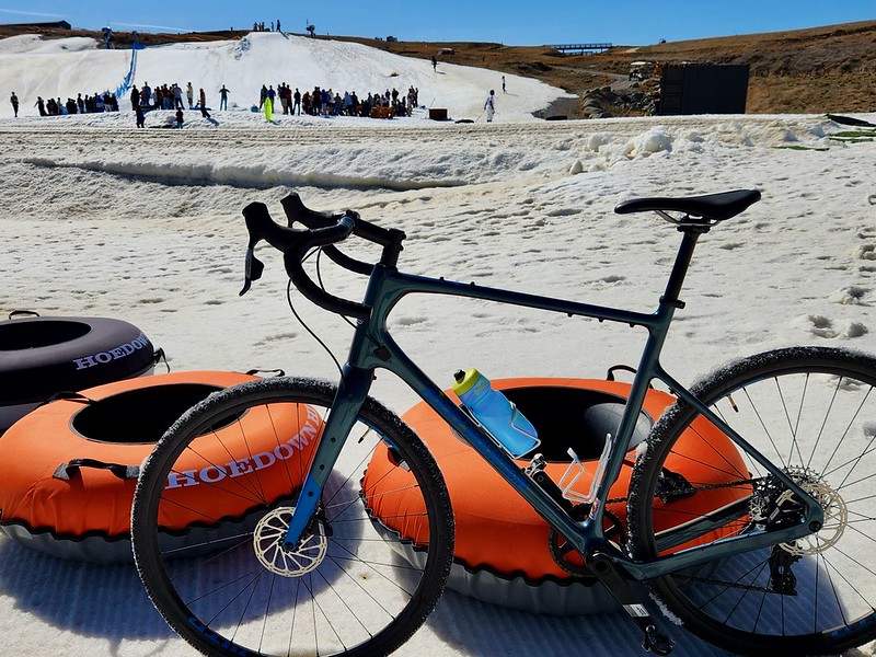
A blue bike parked in soft snow next to orange inner tubes at the bottom of a small ski hill.
-
12:39
Free and Open Source GIS Ramblings: Analyzing GTFS Realtime Data for Public Transport Insights
sur Planet OSGeoIn today’s post, we (that is, Gaspard Merten from Universite Libre de Bruxelles and yours truly) are going to dive deep into how to analyze public transport data, using both schedule and real time information. This collaboration has been made possible by the EMERALDS project.
Previously, I already shared news about GTFS algorithms for Trajectools that add GTFS preprocessing tools (incl. Route, segment, and stop layer extraction) to the QGIS Processing toolbox.
Today, we’ll discuss the aspect of handling realtime GTFS data and how we approach analytics that combine both data sources.
About Realtime GTFSMany of us have come to rely on real-time public transport updates in apps like Google Maps. These apps are powered by standardized data formats that ensure different systems can communicate. Google first introduced GTFS in 2005, a format designed to organize transit schedules, stop locations, and other static transit information. Then, in 2011, they introduced GTFS Realtime (GTFS-RT), which added the capability to include live updates on vehicle positions, delays, speeds, and much more.
However, as the name suggests, GTFS Realtime is all about live data. This means that while GTFS-RT APIs are useful for providing real-time insights, they don’t hold historical data for analytics. Moreover, most transit agencies don’t keep past GTFS-RT records, and even fewer make them available to the public. This can be a significant challenge for anyone looking to analyze past trends and extract valuable insights from the data. For this reason, we had to implement our own solution to efficiently archive GTFS-RT files while making sure the files could be queried easily.
There are two main challenges in the implementation of such a solution:
- Data Volume: While individual GTFS-RT files are relatively small—typically ranging from 50KB to 500KB depending on the public transport network size—the challenge lies in ingestion frequency. With an average file size of 100KB and updates every 5 seconds, a full day’s worth of data quickly scales up to 1.728GB.
- Data Usability: GTFS-RT is a deeply nested format based on Protobuf, making direct conversion into a more accessible structure like a DataFrame difficult. Efficiently unnesting the data without losing critical details would significantly improve usability and streamline analysis.
Storing and analyzing real-time transit data efficiently isn’t just about saving space—it’s about making the data easy to work with. Luckily, modern data formats have come a long way, allowing us to store massive amounts of data while keeping retrieval and analytics processing fast. One of the best tools for the job is Apache Parquet, a columnar storage format originally designed for Hadoop but now widely adopted in data science. With built-in support in libraries like Polars and Pandas, it’s become a go-to choice for handling large datasets efficiently. Moreover, Parquet can be converted to GeoParquet for smoother integration with GIS such as GeoPandas.
What makes Parquet particularly well-suited for GTFS Realtime data is the way it compresses columnar data. It leverages multiple compression algorithms and encodings, significantly reducing file sizes while keeping access speeds high. However, to get the most out of Parquet’s compression, we need to be smart about how we structure our data. Simply converting each GTFS-RT file into its own Parquet file might give us around 60% compression, which is decent. But if we group all GTFS-RT records for an entire hour into a single file, we can push that number up to 95%. The reason? A lot of transit data—like trip IDs and stop locations—doesn’t change much within an hour, while other values, such as coordinates, often share common elements. By organizing data in larger batches, we allow Parquet’s compression algorithms to work their magic, drastically reducing storage needs. And with a smaller disk footprint, retrieval is faster, making the entire analytics pipeline more efficient.
One more challenge to tackle is the structure of the data itself. GTFS-RT files tend to be highly nested, which isn’t an issue for Parquet but can be problematic for most data science tools. While Parquet technically supports nested structures, many analytical frameworks don’t handle them well. To fix this, we apply a lightweight preprocessing step to “unnest” the data. In the original GTFS-RT format, the vehicle position feed is deeply nested, making it difficult to work with. But once unnesting is applied, the structure becomes flat, with clear column names derived from the original hierarchy. This makes it easy to convert the data into a table format, ensuring smooth integration with tools commonly used by data scientists.

 The GTFS-RT Pipelines
With this in mind, let’s walk through the two pipelines we built to store and retrieve GTFS-RT data efficiently.
The entire system relies on two key pipelines that work together. The first pipeline fetches GTFS-RT data from an API every five seconds, processes it, and stores it in an S3 bucket. The second pipeline runs hourly, gathering all the individual files from the past hour, merging them into a single Parquet file, and saving it back to the bucket in a structured format. We will now take a look at each pipeline in more detail.
Pipeline 1: Fetching and Storing DataThe first step in the process is retrieving GTFS-RT data. This is done via an API, which returns files in the Protocol Buffer (ProtoBuf) format. Fortunately, Google provides libraries (such as gtfs-realtime-bindings) that make it easy to parse ProtoBuf and convert it into a more accessible format like JSON.
Once we have the data in JSON format, we need to split it based on entity type. GTFS-RT files contain different types of data, such as TripUpdate, which provides updated arrival times for stops, and VehiclePosition, which tracks real-time locations and speeds. Not all GTFS-RT feeds contain every entity type, but TripUpdate and VehiclePosition are the most commonly used. The full list of entity types can be found in the GTFS Realtime documentation.
We separate entity types because they have different schemas, making it difficult to store them in a single Parquet file. Keeping each entity type separate not only improves organization but also enhances compression efficiency. Once split, we apply the same unnesting process as described earlier, ensuring the data is structured in a way that’s easy to analyze. After that, we convert the data into a data frame and store it as a Parquet file in memory before uploading it to an S3 bucket. The files follow a structured naming convention like this:
{feed_type}/YYYY-MM-DD/hour/individual_{date-isoformat}.parquet
This format makes it easy to navigate the storage bucket manually while also ensuring seamless integration with the second pipeline.
Pipeline 2: Merging and Optimizing StorageThe second pipeline’s job is to take all the small Parquet files generated by Pipeline 1 and merge them into a single, optimized file per hour. To do this, it scans the storage bucket for the earliest unprocessed “hour folder” and begins processing from there. This design ensures that if the pipeline is temporarily interrupted, it can easily resume without skipping any data.
Once it identifies the files to merge, the pipeline loads them, assigns a proper timestamp to each record, and concatenates them into a single Parquet table. The final file is then uploaded to the S3 bucket using the following naming convention:
{feed_type}/YYYY-MM-DD/hour/HH.parquet
If any files fail to merge, they are renamed with the prefix unmerged_{date-isoformat}.parquet for manual inspection. After successfully storing the merged file, the pipeline deletes the individual files to keep storage clean and avoid unnecessary clutter.
One critical advantage of converting GTFS-RT data into Parquet early in the process is that it prevents memory overload. If we had to merge raw GTFS-RT files instead of pre-converted Parquet files, we would likely run into memory constraints, especially on standard servers with limited RAM. This makes Parquet not just a storage solution but an enabler of efficient large-scale processing.
Ready for AnalyticsIn this section, we will explore how to use the GTFS-RT data for public transport analytics. Specifically, we want to compute delays, that is, the difference between the scheduled travel time and the real travel time.
The previously created Parquet files can be loaded into QGIS as tables without geometries. To turn them into point layers, we use the “Create points layer from table” algorithm from the Processing “Vector creation” toolbox. And once we convert the unixtimes to datetimes (using the datetime_from_epoch function), we have a point layer that is ready for use in Trajectools.

Let’s have a look at one bus route. Bus 3 is one of the busiest routes in Riga. We apply a filter to the point layer which reveals the location of the route.
 Computing segment travel times
Computing travel times on public transport segments, i.e. between two scheduled stops, comes with a couple of challenges:
- The GTFS-RT location updates are provided in a rather sparse fashion with irregular reporting intervals. It is not clear that we “see” every stop that happens.
- We cannot rely solely on stop detection since, sometimes, a vehicle will not come to a halt at scheduled stop locations (if nobody wants to get off or on)
- The stop ID, representing the next stop the vehicle will visit, is not always exact. Updates are often delayed and happen some time after passing the stop.
Here’s an example visualization of the stop ID information of a single trip of bus 3, overlaid on top of the GTFS route and stops (in red):

To compute the desired delays, we decided to compare GTFS-RT travel times based on stop ID info with the scheduled travel times. To get the GTFS-RT travel times, we use Trajectools and create trajectories by splitting at stop ID change using the Split by value change algorithm:
 Computing delays
The final step is to compute travel time differences between schedule and real time. For this, we implemented a SQL join that matches GTFS-RT trajectories with the corresponding entry in the GTFS schedule using route information and temporal information:

The temporal information is important since the schedule accounts for different travel times during peak hours and off peak:
This information is extracted from the GTFS schedule using the Trajectools Extract segments algorithm, if we chose the “Add scheduled speeds” option:

This will add the time windows, speeds, and runtimes per segment to the resulting segment layer:

Joining the GTFS-RT trajectories with the scheduled segment information, we compute delays for every segment and trip. For example, here are the resulting delays for trip ‘AUTO3-18-1-240501-ab-2230’:

Red lines mark segments where time is lost compared to the schedule, while blue lines indicate that the vehicle traversed the segment faster than the schedule suggested.
What’s nextWhen interpreting the results, it is important to acknowledge the effects caused by the timing of the next stop ID updates in the real-time GTFS feed. Sometimes, these updates come very late and thus introduce distortions where one segment’s travel time gets too long and the other too short.
We will continue refining the analytics and related libraries, including the QGIS Trajectools plugin, to facilitate analytics of GTFS-RT & GTFS.
After successful testing of this analytics approach in Riga, we aim to transfer it to other cities. But for this to work, public transport companies need ways to efficiently store their data and, ideally, to release them openly to allow for analysis.
The pipelines we described, help keep storage needs low, which allows us to drastically reduce costs (for a year we would only have a few gigabytes, which is inexpensive to store in S3 storage). Let us know if you would be interested in an online platform on which one could register a GTFS-RT feed & GTFS, which would then automatically start being archived (in exchange, the provider would only need to accept sharing the archives as open data, at no cost for them).
-
12:00
Mappery: Priscilla Tour
sur Planet OSGeo

Ken sent me this. I can see why it is a map in the wild but I didn’t know what it was meant to be saying. A bit of searching suggests that it is related to The Adventures of Priscilla, Queen of the Desert:
“A 1994 Australian roadcomedy film written and directed by Stephan Elliott. The plot follows two drag queens, played by Hugo Weaving and Guy Pearce, and a transgender woman, played by Terence Stamp, as they journey across the Australian Outback from Sydney to Alice Springs in a tour bus that they have named “Priscilla”, along the way encountering various groups and individuals.”
UTS might be University of Technology, Sydney – feel free to correct me.
-
2:00
Paul Ramsey: BC IT Outsourcing 2023/24
sur Planet OSGeoOK, it has been a while since the last time I published this data, but I have a valid excuse.
The most striking feature of the 2024 chart is the zero’ing out of IBM’s piece of the pie. Big Blue, which once billed the government $107M in a year, has been reduced to a billing rate of less than $5M per year over the last two years.
Everything else feels more or less the same. After seven years of NDP government, the overall trajectory of outsourcing growth has beeen flattened, but in no way reversed. It is a smaller proportion of overall spend, but the substantial change wrought by the Campbell Liberal government starting around 2005 has been durable – BC IT has a huge outsourced component still.
The initial surge in smaller local companies after 2017 stalled out by 2021 and had been flat since.
The most consistent grower is now CGI, which entered the Victoria market around 2005 and has grown to $60M/year in billings with consistent year-over-year increases.
-
12:00
Mappery: How to order food in Hokaido
sur Planet OSGeo

The simple answer is to find a resaurant that has menus in English as well as Japanese, it’s useful to also know that you are in the right place!
Another one from Ken
-
2:00
Paul Ramsey: Cancer 13
sur Planet OSGeoBack to entry 1
I recently “celebrated” my “cancerversary”, the one-year mark since my GI doctor phoned me up and said the fateful words – “you have cancer”.
At that moment, my universe shrunk down immensely. All the external stuff, job, professional relationships, volunteerism, just kind of fell away, I had no mental space for it. It was just me and my immediate family and the many, many unknowns.
My experience since then has included two major physical insults. The “curative” surgery that removed most of my rectum, and the associated c.difficle infection that brutally wrecked my GI tract.
The insults really knocked me back. Moving around the house involved effort. Meals would lead to stomach pain and long sessions on the toilet. Runs were replaced with walks and then shorter walks. A trip to the cafe became my gold standard for “getting out”.

Now, I am immensely “better” than I was this summer. But I am still a very long way from the physical condition I was before (which was excellent). My body just doesn’t work as well anymore. This may slowly resolve over more months, or it may be permanent. As it stands, I feel like I’ve been instantly aged 10-15 years. I went into this process in my early 50s and came out in my late 60s.
A result of feeling weak and out of control is that I have a lot less confidence than I used to. This manifests in not wanting to leave the house as much, or engage with novel situations. I never know when I am going to have a “bad day” and feel sick or uncomfortable for 24 hours. Travel feels fraught. Staying close to home, feels safer.
I am a turtle, startled and afraid, drawn up into its shell.
To try and break out of this pattern, I have scheduled two trips this spring, one personal and one professional. They are both east coast, so there’s a 5 hour flight involved and then all the usual transfers and so on. And then just “living” in a different place. As they get closer, I get more scared. I shouldn’t. The worst case scenario is just “pooping a lot in a hotel room”, but I think the verification of worse-case scenarios is the scary part – maybe I am not someone who travels anymore.
Most of my other pre-surgery worst-case scenarios have not come to pass. I am still able to climb. I have started running again. I can lift weights again. I have done some middling bike rides. I have rowed on the ocean. I have started some building projects around the house.

But travel is (like going out for dinner) fraught with being away from the home base, and full of questionable activities (like eating for pleasure, or taking a walk not knowing where the next public restroom is). Hopefully these trips will go well, and I will be able to poke my head a little further out of my shell.
The next station on my cancer journey will be the first monitoring procedures. Colonoscopy and then a CT scan. The odds of anything growing back are low, but I still keep my fingers crossed, since they are not zero.
Keep f’ing going. See you soon, inshala.

-
12:00
Mappery: Niseko Taproom
sur Planet OSGeo

Ken visited Japan recently for a bit R&R, he couldn’t resist sending us this map-centric menu from a local bar.
-
13:53
Markus Neteler: GRASS GIS 8.4.1 released
sur Planet OSGeoThe GRASS GIS 8.4.1 release provides more than 80 improvements and fixes with respect to the release 8.4.0. Enjoy!
The post GRASS GIS 8.4.1 released appeared first on Markus Neteler Consulting.
-
12:00
Mappery: Is this a map?
sur Planet OSGeo

Elizabeth saw this in the foyer of a building in SW1.
The blurb says:
“Angela Detanico & Rafael Lain – A Different Place, 2022
This wall painting is based on a method of cartographic writing that correlates a letter of the alphabet with each of the earth’s 24 time zones. That system of navigation, still in use today, was developed in 1802 by American astronomer Nathaniel Bowditch, who is considered the father of maritime navigation. Angela Detanico and Rafael Lain used the lexicon to encode text into a world map, spelling out the phrase “A Different Place.” By melding language with the map, the artists address two of the basic structures- geography and language that govern our daily lives.
Linguists, semiologists and graphic designers by training, the artists invite viewers to play a decrypting game that unlocks multiple levels understanding. Their rearranged map could represent immigration patterns or the phenomenon of globalisation, but it also serves as a vehicle to reflect on the connection between signs and meaning.” -
2:00
Kartoza: Introducing the new QGIS Plugins Website and QGIS Hub
sur Planet OSGeoWe are excited to announce the release of the newly updated QGIS Plugins Website and the launch of the QGIS Hub Website! These updates bring a fresh new look that aligns with the QGIS branding overhaul, along with significant improvements in user experience.
Revamped QGIS Plugins Website
QGIS Plugins Homepage
The QGIS Plugins website has undergone a major redesign to enhance usability and provide a seamless experience for users. With a modernised interface and improved navigation, users can now find and manage plugins more efficiently. Some of the key updates include:
- A fresh UI that matches the latest QGIS branding.
- Enhanced browsing experience with better categorisation of plugins.
- Detailed plugin pages showcasing ratings, download counts, and descriptions more clearly.
- Improved search and filtering options to find the right plugin quickly.
- A more intuitive submission process for plugin developers.
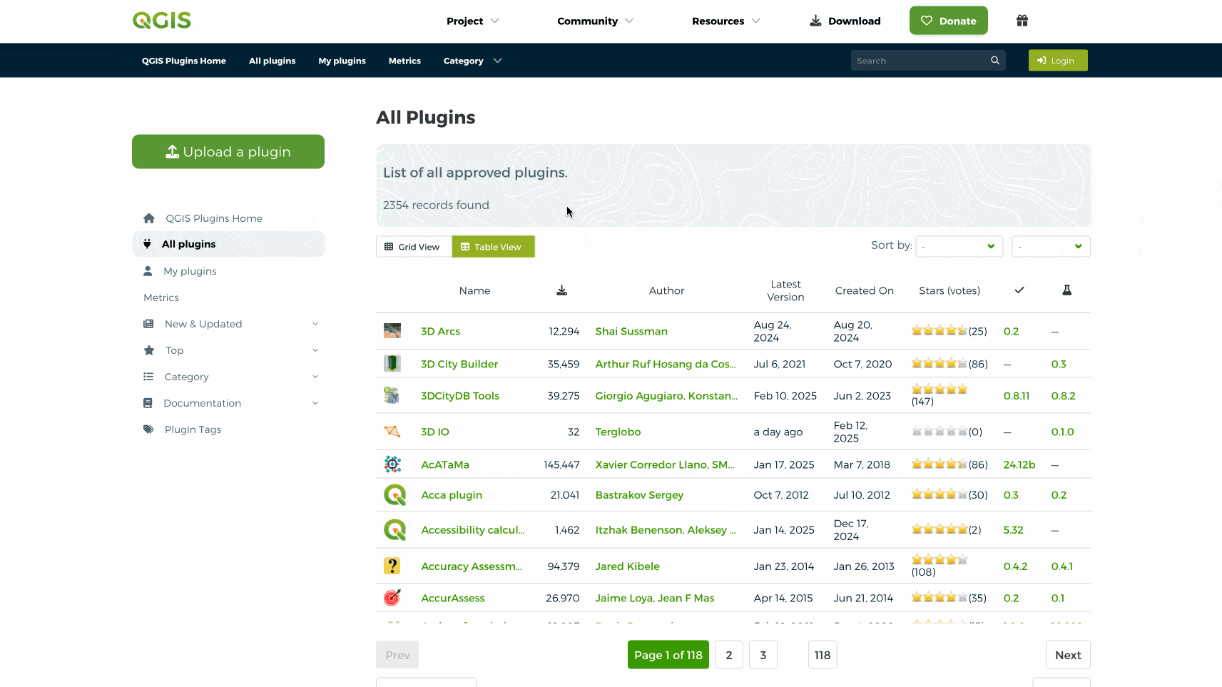
Plugins List with Grid View and a Table View
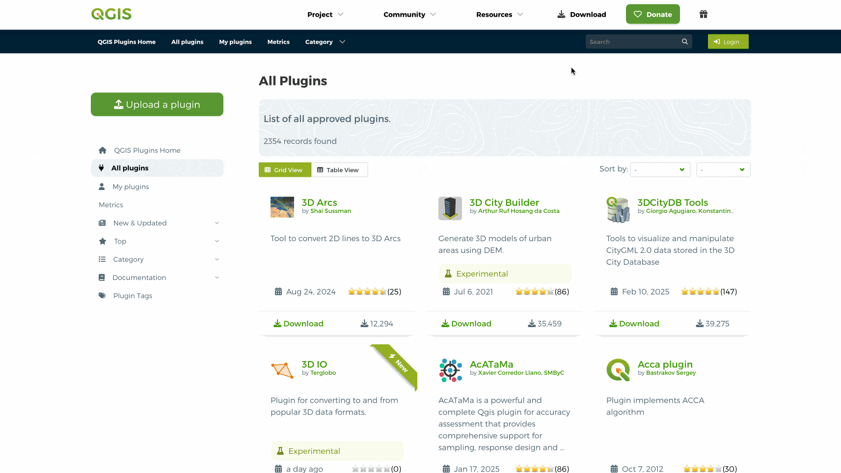
Plugins search and details page
Introducing QGIS Hub
QGIS Hub Homepage
In addition to the plugin update, we are thrilled to introduce the QGIS Hub, now available at https://hub.qgis.org. This new platform serves as a dedicated space for sharing QGIS resources such as styles, 3D models, geopackages projects files, QGIS Layer Definition (QLR) files, and much more. By separating this section into its own website, we have made it easier for users to discover and access valuable resources.
Key features of the QGIS Hub include:
- A visually appealing homepage with featured resources.
- A well-organised list view for browsing available assets.
- Detailed resource pages with previews and descriptions.
- Advanced search functionality to quickly locate specific resources.
- A seamless submission process for users who wish to contribute their resources.
Resources list and details page
Thank you to the QGIS CommunityQGIS is developed by a team of dedicated volunteers, companies and organisations. The QGIS project relies on sponsorships and donations for much of their funding. Without the contributions of the QGIS sustaining members and donors and all volunteers, these continued improvements would not be possible. At Kartoza we are fortunate to employ both a QGIS Document Writer and QGIS Developer as fulltime staff members, an achievement made possible through the donations from QGIS community. Thank you to Tim Sutton (member of QGIS Steering Committee) for donating his time and helping make these updates possible.
Experience the New Platforms Today!We invite you to explore the new QGIS Plugin website and the QGIS Hub today. These updates are designed to enhance your workflow and make it easier to extend and enrich your QGIS experience. We look forward to your feedback and continued support as we work to improve the QGIS ecosystem!
-
21:36
QGIS Blog: QGIS.ORG Annual General Meeting 2024 – Minutes Now Available
sur Planet OSGeoWe are pleased to announce that the minutes from the QGIS.ORG Annual General Meeting (AGM) 2024 are now available for public review.
Since the establishment of QGIS.ORG as a formal legal entity in 2016, we have held virtual AGMs to ensure transparent governance. These meetings allow QGIS Voting Members to approve the annual budget, review financial reports, elect new project members, and make other key decisions affecting the future of the project.
Key Highlights from the 2024 AGMThe AGM took place virtually from November 20 to December 1, 2024, with discussions held via mailing lists and voting conducted through online forms.
Election Results- Board Members:
- Chair: Marco Bernasocchi
- Vice-Chair: Anita Graser
- Treasurer: Andreas Neumann
- Project Steering Committee (PSC) Members:
- Alessandro Pasotti
- Jürgen Fischer
- Régis Haubourg
 Annual Financial Report 2023 – Approved unanimously.
- Annual Report 2023 – Approved unanimously.
- Financial Auditors for 2024
- Andreas Voigt
- Andreas Vonlaufen
The complete minutes of the QGIS.ORG AGM 2024 can be accessed here:

Thank you to all QGIS Voting Members who participated in the AGM. Your contributions help shape the future of QGIS!
- Board Members:
-
12:00
Mappery: Terra Computer
sur Planet OSGeo

Marc-Tobias sent me this.
“Seen randomly at a German hospital. Apparently a German computer brand
[https:]] . Looking closely it really is a world map, not a fantasy maps. They
smoothed the edges it became also unrecognizable. -
1:00
Ecodiv.earth: Raster layer properties in QGIS
sur Planet OSGeoWhen working with raster data in QGIS, manually entering raster resolution and extent repeatedly across various processing steps can become tedious. Often, functions require these inputs explicitly, which can become cumbersome when consistent parameters are essential across multiple tasks. A solution is to use model builder to create a new function that includes as input parameters the raster extent and resolution as input parameters. Still, as an user, I often would prefer to simply use a reference layer as input, similar to what the Align rasters function offers.
As it turns out, the Raster Layer Properties function makes exactly that possible. It is not new, but it might have gone unnoticed by some users, as it did for me in any case. The function automatically extracts useful properties, including the extent, size in pixels and dimensions of pixels (in map units), number of bands, and NoData value, from a choosen reference layer. You can then feed these outputs directly into subsequent processing algorithms, ensuring consistency across your entire model.
 Figure 1: An example of a model in QGIS model designer that uses the
 Raster layer propertiesfunction to get the extent and pixel size from an user-defined reference layer and uses this as input in theRasterizefunction.To illustrate this, built a simple distance-to-features model (Figure 1). The model takes a vector layer and converts it to a raster layer with a fixed value of 1 for all features. Subsequently, it computes a raster proximity map with the distance from each pixel to the center of the nearest pixel with value 1 (in other words, to the nearest feature).
Using this option saves time and reduces potential errors when having to do this manually. It is just a small adjustment, but it can streamline your workflows, especially if you’re regularly dealing with multiple rasters that need to align precisely. If you haven’t used this function before, it’s worth exploring—it’s an efficient way to maintain consistency across your raster workflows and makes your models cleaner and easier to manage.
In case you want to try out, you can download the model here: distance_to_features.model3.
-
12:00
Mappery: The Discovery
sur Planet OSGeo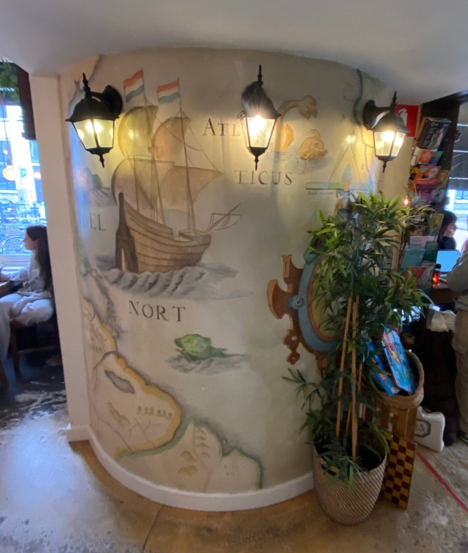

Reinder spotted this in a Utrecht restaurant “… in restaurant ‘De ontdekking’ [The discovery]”
Quite something!
-
19:56
GeoSolutions: FREE Webinar: Supporting Mobility and Infrastructure Decisions in Flanders with MapStore
sur Planet OSGeoYou must be logged into the site to view this content.
-
12:00
Mappery: Westport, Mass. t-shirt
sur Planet OSGeo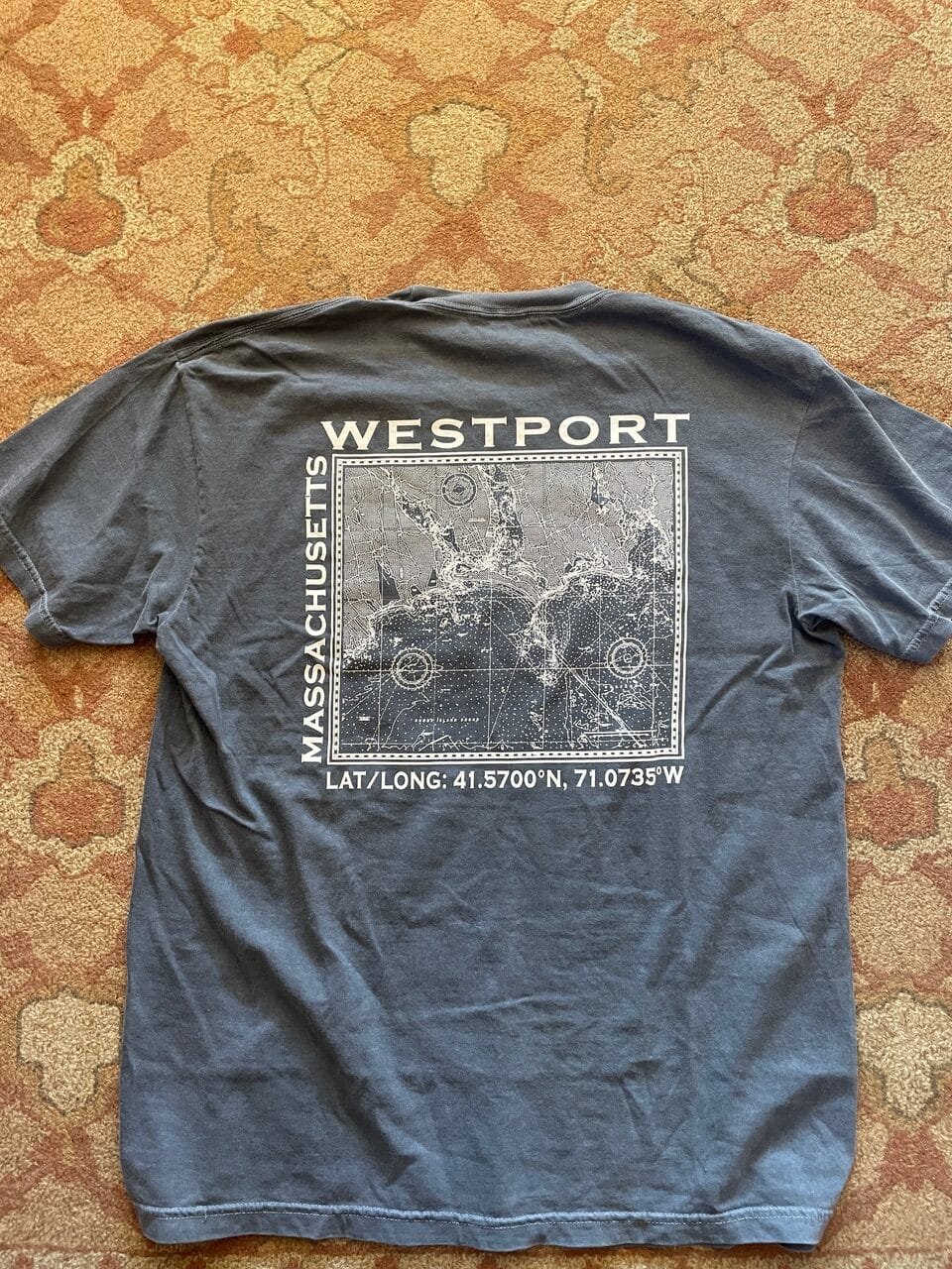

Florence shared this pic of a cracking t-shirt
-
7:45
OPENGIS.ch: QField 3.5 “Fangorn”: Background tracking a reality!
sur Planet OSGeoPièce jointe: [télécharger]
Let’s not bury the lead here: the long-awaited capability to track position while QField is in the background or the device is locked has arrived in this brand-new version of QField. This feels like a magical moment, so we settled for a fantastical forest for our release name.
Main highlights
As highlighted above, QField 3.5 has unlocked background position tracking on the Android platform. This allows users to keep track of their positions even as they put QField in the background to conduct other tasks on their devices. It also means that tracking has become far more battery efficient, as users can lock/suspend their phones and tablets for long periods while QField continues to collect and track positions. On top of it all, this will work out of the book with internal GNSS as well as external high-precision GNSS devices.
This is a long-requested functionality for QField, and we couldn’t be prouder to deliver it to our hundreds of thousands of Android users. Big thanks to Groupements forestiers Québec, Biotope, and Terrex Seismic, who jointly sponsored the development.
Moving on to the next major feature added to this new version. Users can now easily import folders from WebDAV services and subsequently upload and download content to that remote folder within QField itself. This functionality eases friction on Android and iOS platforms where storage access is heavily regulated. This implementation highlights our commitment to providing QField users with the freedom they need to build their workflows; thanks to Prona Romandie, AgaricIG, and Oslandia for commissioning this work.
It’s important to note that the WebDAV functionality does not provide data synchronization. The download and upload operations will overwrite datasets stored locally or remotely. For users in need of synchronization and smooth project distribution, QFieldCloud is the way to go. With this new version of QField, downloading large datasets from QFieldCloud has become much more reliable, especially on devices with low memory.
Last but not least, QField has gained support for project-configured grid decoration. When activated, a grid is overlayed on top of the map canvas, which will dynamically render while panning and zooming around. The grid is configured and activated while setting up projects within QGIS itself.

Pro tip: this functionality can replace heavy grid datasets when covering a large dataset, something to consider when trying to optimize projects’ storage size. Big thanks to Oester Messtechnik GmbH for supporting the implementation of this fourth decoration following the arrival of title, copyright, and image decorations in earlier releases.
Other improvements in this release include “forward” angle snapping to digitize perfectly angled polygons, pinch gesture-driven feature rotation, and a new print template which unlocks printing of map canvas to PDF even when their projects have no layouts defined.
 Plugin-specific improvements
One of the main additions to QField’s plugin framework is the capability to integrate custom results into the search bar. Thanks to Kanton Basel-Landschaft for supporting the development, users can enjoy OpenStreetMap Nominatim search result integration by installing this plugin (instructions available on the repository). This integration also opens up many new possibilities, such as enabling plugins to send prompts to AI, just like this plugin does.Other noteworthy improvements include shipping Quick3D QML modules, which allow authors to develop 3D overlays, a new API to customize QField’s colour appearance and a new mechanism for plugins to add a configuration button within the plugin manager.

Users and plugin authors can expect an exciting year ahead as the QField plugin framework continues to grow with new functionalities and improvements. Watch this space! -
17:12
GRASS GIS: GRASS Developer Summit 2025
sur Planet OSGeoJoin Us for the GRASS Developer Summit 2025 at NC State! ? Dates: Monday, May 19 – Saturday, May 24, 2025 ? Location: North Carolina State University, Raleigh, NC, USA The GRASS team is excited to announce the GRASS Developer Summit 2025, the main community meeting of the year! This 6-day event will bring together contributors, developers, power users, and geospatial enthusiasts to collaborate, code, document, and shape the future of GRASS. -
12:00
Mappery: Lufthansa in Munster
sur Planet OSGeo

Marc-Tobias sent me this pic of a travel agent’s window in Munster
-
2:44
Sean Gillies: Bear training weeks 1–2 recap
sur Planet OSGeoIt's time for the first training recap of my 2025 season. I'm training every day, but only running 2-3 days a week because I'm cautious about stressing my Achilles tendon too much. When I do the numbers, I'll report running distance and elevation gain, and the time for all training, including cycling, weight lifting, elliptical or stationary bike, and yoga.
Week 1:
11.3 miles running
5 hours, 40 minutes all training
1,112 ft D+ running
The first week of my 32-week season was a little light. The highlight was running at Cougar Mountain Regional Park in Issaquah, Washington with my sister-in-law. Even in winter, it's green, with moss and ferns everywhere.
Week 2 was complicated by back pain. Instead of skipping workouts, I did a lot of chugging indoors. Going easy on my back early in the week let me recover and get out for a solid long run today at Bobcat Ridge, my longest run in seven months. In all, this was one of my biggest weeks since April, 2024.
17.8 miles running
10 hours, 18 minutes all training
3,199 ft D+ running
As a side project, I'm doing some physical therapy on my left hip flexor muscles, which are much weaker than those on my right side. I do seated single-leg raises, supine marching with a resistance band, and Joe Uhan's skaters. I'm making slow progress.


-
25 Years of SRTM
sur James Fee GIS BlogI noticed earlier last week that I just missed the 25th anniversary of the mission of the Shuttle Radar Topography Mission aboard STS-99. I’m not sure there has been a more important elevation data product that has been released to the public than SRTM.

Given the uncertainty of funding for government programs in the new Trump administration, I’m not sure we’ll see another public 3D dataset in my time. Sure, there are private companies who collect much more detailed elevation data than SRTM, but none are as freely available as SRTM is (hopefully not was).

-
12:00
Mappery: European Languages
sur Planet OSGeo

Berl said “We saw these two at the top of Monte Igueldo in Donostia (San Sebastian) in the Basque region of Spain. Apparently Basque bears no relationship to any other language.”

-
11:42
GRASS GIS: GRASS 8.4.1 released
sur Planet OSGeoWhat’s new in a nutshell The GRASS 8.4.1 release contains more than 80 changes compared to version 8.4.0. This new minor release includes important fixes and improvements to the GRASS tools, libraries and the graphical user interface (GUI), making it more stable and robust for your daily work. Most importantly, since the 8.4.0 release: location is now project: The Python API, command line, and graphical user interface are using project instead of location for the main component of the data hierarchy while maintaining backward compatibility. -
18:27
Free and Open Source GIS Ramblings: Trajectools is moving to Codeberg
sur Planet OSGeoThe Trajectools repository is migrating from GitHub to Codeberg. The new home for Trajectools is:

The GitHub repo remains as a writable mirror, for now, but the issue tracking is only active on Codeberg.
Why the move?I am working on moving my projects to European infrastructure that better aligns with my values. Codeberg is a nonprofit and libre-friendly platform based in Germany. This will ensure that the projects are hosted on infrastructure that prioritizes user privacy and open-source ideals.
What does this mean for users?- No impact on functionality – Trajectools remains the same great tool for trajectory analysis, available through the recently update QGIS Plugin Repo.
- Development continues – I’ll continue actively maintaining and improving the project. (If you want to file feature requests, please note that the issue tracker on the GitHub mirror has been deactivated and issues should be filed on Codeberg instead.)
 What does this mean for contributors?
If you’re contributing to Trajectools, simply update your remotes to the new repository. The GitHub repo continues to accept PRs and the changes are synched between GitHub and Codeberg, but I’d encourage all contributors to use Codeberg.
How to update your local repositoryIf you’ve already cloned the GitHub repository, you can update your remote URL with the following commands:
cd trajectools
git remote set-url --add --push origin [https:] git pull origin main
Interested in testing Codeberg for your projects?Here are the instructions I followed to perform the migration and to set up the mirroring: [https:]]
Thanks for your support, and see you on Codeberg!
-
12:00
Mappery: Olive Oil Soap from Cyprus
sur Planet OSGeo

Elizabeth found this in her hotel room
-
17:50
Le blog de Geomatys: Les enjeux de l’IA en défense : optimiser la prise de décision et le renseignement stratégique
sur Planet OSGeoDécouvrez comment l'IA révolutionne la défense avec Examind C2 : analyse prédictive, interopérabilité et prise de décision en temps réel.
The post Les enjeux de l’IA en défense : optimiser la prise de décision et le renseignement stratégique first appeared on Geomatys.
-
12:00
Mappery: Crafting maps
sur Planet OSGeo


Our friend Giuseppe is trying to print a map on a tee shirt. He is not yet satisfied with the result, but can you guess the location?
-
21:27
KAN T&IT Blog: UP42 y Kan Territory se unen para simplificar el acceso a datos de observación terrestre
sur Planet OSGeoMuchos artículos hablan sobre cómo desbloquear el potencial completo de los datos de observación terrestre, y especialistas en geoespacial trabajan arduamente en todo el mundo para mejorar su accesibilidad e integración. Hoy queremos contarte sobre uno de estos avances. El plugin de Kan Territory para QGIS, un software SIG de código abierto muy popular, te permite descubrir y adquirir datos archivados del catálogo de UP42 sin salir de QGIS.
Primero, repasemos el catálogo de UP42 y luego exploremos cómo el plugin de Kan Territory puede beneficiarte.
El catálogo de UP42: un breve repasoEl catálogo de UP42 simplifica la búsqueda y adquisición de datos de observación terrestre (EO, por sus siglas en inglés), ofreciendo acceso a un extenso archivo de los principales proveedores del mundo. Incluye una variedad diversa de datos ópticos, SAR y de elevación de proveedores como Airbus, Planet, 21AT, Vexcel, ISI, BlackSky, Capella Space, Hexagon e Intermap. Este catálogo abarca desde imágenes con resolución ultraalta de 5.5 cm y tomas estéreo, hasta niveles de procesamiento flexibles.
El catálogo estandariza las ofertas de los proveedores y armoniza los distintos tipos de datos, lo que reduce el trabajo manual del usuario. Además, cuenta con herramientas avanzadas para clasificar, filtrar y visualizar datos, como vistas previas de múltiples escenas para compararlas fácilmente.
Funciones como verificaciones de disponibilidad en tiempo real y datos de muestra gratuitos te ayudan a encontrar fácilmente los datos adecuados para tus proyectos. También podés añadir etiquetas para categorizar tus datos, haciendo que tus proyectos sean más eficientes.
Kan Territory y su plugin para QGISKan Territory & IT (a quien llamaremos simplemente Kan en este artículo) se especializa en aplicar geo-inteligencia para desarrollar soluciones de IA de código abierto, gobernanza de datos, inteligencia territorial e imágenes satelitales. Su plugin para QGIS, Kan Imagery Catalog (KICa), te permite conectar QGIS con el catálogo de UP42 al instante. De esta forma, podés buscar, ordenar y analizar imágenes de los principales proveedores del mundo, todo desde un único punto de acceso y sin salir de QGIS.
¿Por qué usar el plugin?- Flujos de trabajo optimizados: Explorá el catálogo de UP42 dentro de QGIS, filtrá según tus criterios, visualizá imágenes, hacé pedidos e integrá los datos en tus proyectos de QGIS para análisis posteriores, sin descargas y cargas manuales ni la necesidad de usar varias plataformas.
- Análisis simplificado: Visualizá y analizá imágenes compradas, superponé imágenes con otros conjuntos de datos y capas de mapas, realizá análisis espaciales o generá visualizaciones de alta calidad.
- Estandarización de datos: KICa y UP42 utilizan el estándar STAC para ofrecer datos en un formato estandarizado, lo que facilita la consulta, visualización e integración posterior de datos geoespaciales.
Primero, necesitás instalar el plugin Kan Imagery Catalog. Para hacerlo:
- Abrí QGIS y dirigite a Complementos -> Administrar e instalar complementos en el menú superior.
- Escribí «KAN Imagery Catalog» y hacé clic en Instalar complemento.
Para acceder al plugin, andá a Complementos o simplemente hacé clic en el ícono de KAN Imagery Catalog en el menú. El panel del plugin aparecerá en el lateral de la interfaz de QGIS. Luego, conectate a UP42. Andá a Configuración (el ícono de engranaje en la esquina superior derecha del plugin) e iniciá sesión con tus credenciales habituales de UP42. ¡Listo!
Ahora, podés definir tu área de interés (AOI) importando una existente a QGIS o dibujándola manualmente en el mapa. Indicá la cobertura de nubes deseada, el rango de fechas y seleccioná los proveedores de tu interés haciendo clic en Selección de catálogo (en nuestro ejemplo, elegimos Pléiades, Pléiades Neo y Pléiades Neo HD15). Los datos disponibles que coincidan con tu AOI y requisitos se mostrarán.
Las escenas disponibles aparecerán como huellas en el mapa de QGIS. En la parte inferior izquierda, podés ordenar los resultados por fecha, encontrar toda la información que necesitás sobre cada imagen, previsualizar miniaturas o dirigirte a la plataforma de UP42 para adquirir los datos.
Con este plugin, la industria geoespacial ahora cuenta con una nueva forma de acceder a UP42 a través de una de sus herramientas más populares.
-
12:00
Mappery: The Barbary
sur Planet OSGeo

I had lunch at The Barbary in Covent Garden with a pal. I couldn’t resist a couple of pics of these lovely place mats.

-
12:00
Mappery: Geographical clock
sur Planet OSGeo


I came across this beautiful globe while visiting the Fitzwilliam Museum in Cambridge (UK).
-
12:00
Mappery: Shop, Eat and Drink at Battersea Power Station
sur Planet OSGeo

Elizabeth speed this massive map at Battersea, lots of places to spend your money
-
12:00
Mappery: Old Commercial Airline Ad
sur Planet OSGeoPièce jointe: [télécharger]

Another Old commercial Airline Ad shared by M. Le Cartographe