
Vous pouvez lire le billet sur le blog La Minute pour plus d'informations sur les RSS !
Canaux
7207 éléments (2941 non lus) dans 50 canaux
 Dans la presse
(2756 non lus)
Dans la presse
(2756 non lus)
-
 Cybergeo
(2691 non lus)
Cybergeo
(2691 non lus) -
Mappemonde
(60 non lus)
-
Dans les algorithmes
(5 non lus)
Du côté des éditeurs
(28 non lus)
-
Toute l’actualité des Geoservices de l'IGN
(17 non lus)
-
arcOpole - Actualités du Programme
-
arcOrama
(11 non lus)
-
Neogeo
Toile géomatique francophone
(110 non lus)
-
Géoblogs (GeoRezo.net) (5 non lus)
-
UrbaLine (le blog d'Aline sur l'urba, la géomatique, et l'habitat)
-
Séries temporelles (CESBIO)
(2 non lus)
-
Datafoncier, données pour les territoires (Cerema)
-
Cartes et figures du monde
-
SIGEA: actualités des SIG pour l'enseignement agricole
-
Data and GIS tips
-
ReLucBlog
-
L'Atelier de Cartographie
-
My Geomatic
-
archeomatic (le blog d'un archéologue à l’INRAP)
-
Cartographies numériques
-
Carnet (neo)cartographique
-
GEOMATIQUE
-
Évènements – Afigéo
(12 non lus)
-
Afigéo
(12 non lus)
-
Geotribu
(50 non lus)
-
Conseil national de l'information géolocalisée
(9 non lus)
-
Icem7
-
Makina Corpus (1 non lus)
-
Oslandia
(1 non lus)
-
CartONG
(2 non lus)
-
GEOMATICK
(6 non lus)
-
Geomatys
(3 non lus)
-
Les Cafés Géo
(1 non lus)
-
L'Agenda du Libre
(3 non lus)
-
Conseil national de l'information géolocalisée - Actualités
(3 non lus)
Géomatique anglophone
(35 non lus)
-
All Points Blog
-
Directions Media - Podcasts
-
Navx
-
James Fee GIS Blog
-
Maps Mania
(19 non lus)
-
Open Geospatial Consortium (OGC)
-
Planet OSGeo
(16 non lus)
Géomatique anglophone
-
sur GeoSolutions: GeoSolutions USA at National States Geographic Information Council (NSGIC) 25-28 SEP
Publié: 18 September 2023, 5:51pm CEST
You must be logged into the site to view this content.
-
sur Free and Open Source GIS Ramblings: Data engineering for Mobility Data Science (with Python and DVC)
Publié: 16 September 2023, 7:28pm CEST
This summer, I had the honor to — once again — speak at the OpenGeoHub Summer School. This time, I wanted to challenge the students and myself by not just doing MovingPandas but by introducing both MovingPandas and DVC for Mobility Data Science.
I’ve previously written about DVC and how it may be used to track geoprocessing workflows with QGIS & DVC. In my summer school session, we go into details on how to use DVC to keep track of MovingPandas movement data analytics workflow.
Here is the recording of the session live stream and you can find the materials at [https:]]
-
sur Marco Bernasocchi: OPENGIS.ch and Oslandia: A Strategic Partnership to Advance QField and QFieldCloud
Publié: 15 September 2023, 9:00am CEST

We are extremely happy to announce that we have partnered strategically with Oslandia to push the leading #fieldwork app #QField even further.
In the world of fieldwork, accuracy and efficiency are paramount. As GIS specialists, we understand the importance of reliable tools that streamline data collection and analysis processes. That’s why we are thrilled to join forces with Oslandia, a company that shares our passion for open-source development and innovation.
Embracing Open Source DevelopmentAt OPENGIS.ch, we have always been committed to the principles of true open-source development. We firmly believe collaboration and shared knowledge drive progress in the GIS community. With Oslandia, we have found a partner who shares our values and cares as much as we do about the QGIS ecosystem.
QGIS, the world’s most popular open-source geographic information system software, has already significantly impacted the GIS industry, providing users with versatile mapping tools and capabilities and is the base upon which QField is built. As main contributors to #QGIS, both OPENGIS.ch and Oslandia are dedicated to driving its growth and ensuring its availability to all.
Advancing QField and QFieldCloud Together
QField, with almost 1 million downloads, is the leading app for fieldwork tasks. It empowers professionals in various sectors, such as environmental research, agriculture, urban planning, and disaster management, to efficiently collect data and conduct analyses in the field. With our strategic partnership with Oslandia, we are committed to pushing the boundaries of QField even further.
Our joint efforts will ensure that QField will keep setting trends in the industry, surpassing the evolving needs of GIS specialists and empowering them to excel in their fieldwork tasks.
A Synergy of ExpertiseThe collaboration between OPENGIS.ch and Oslandia represents a true synergy of expertise. Our combined capabilities will enable us to tackle complex challenges quickly and deliver cutting-edge solutions that address the unique requirements for seamless #fielwork.
ConclusionAt OPENGIS.ch, we are excited about the opportunities our partnership with Oslandia brings. Together, we will continue championing open-source development, empowering GIS specialists in each sector to perform their fieldwork tasks more effectively and efficiently.
With QField as our flagship app, we are confident that this strategic collaboration will result in even greater advancements, benefiting our target audience of surveying professionals, fieldwork experts, and GIS specialists, as well as casual users who need a user-friendly solution for their projects.
Join us in celebrating this exciting new chapter as we embark on a shared journey towards innovation and excellence in fieldwork applications.

-
sur Oslandia: Strategic partnership agreement between Oslandia and OpenGIS.ch on QField
Publié: 14 September 2023, 9:30pm CEST
Who are we? For those unfamiliar with Oslandia, OpenGIS.ch, or even QGIS, let’s refresh your memory:
 Oslandia is a French company specializing in open-source Geographic Information Systems (GIS). Since our establishment in 2009, we have been providing consulting, development, and training services in GIS, with reknown expertise. Oslandia is a dedicated open-source player and the largest contributor to the QGIS solution in France.
 As for OPENGIS.ch, they are a Swiss company specializing in the development of open-source GIS software. Founded in 2011, OPENGIS.ch is the largest Swiss contributor to QGIS. OPENGIS.ch is the creator of QField, the most widely used open-source mobile GIS solution for geomatics professionals.
OPENGIS.ch also offers QFieldCloud as a SaaS or on-premise solution for collaborative field project management.
 Some may still be unfamiliar with #QGIS ?
It is a free and open-source Geographic Information System that allows creating, editing, visualizing, analyzing, and publicating geospatial data. QGIS is a cross-platform software that can be used on desktops, servers, as a web application, or as a development library.
QGIS is open-source software developed by multiple contributors worldwide. It is an official project of the OpenSource Geospatial Foundation (OSGeo) and is supported by the QGIS.org association. See [https:]]
A Partnership? Today, we are delighted to announce our strategic partnership aimed at strengthening and promoting QField, the mobile application companion of QGIS Desktop.
 This partnership between Oslandia and OPENGIS.ch is a significant step for QField and open-source mobile GIS solutions. It will consolidate the platform, providing users worldwide with simplified access to effective tools for collecting, managing, and analyzing geospatial data in the field.
 QField, developed by OPENGIS.ch, is an advanced open-source mobile application that enables GIS professionals to work efficiently in the field, using interactive maps, collecting real-time data, and managing complex geospatial projects on Android, iOS, or Windows mobile devices.
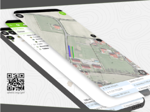
 QField is cross-platform, based on the QGIS engine, facilitating seamless project sharing between desktop, mobile, and web applications.
Reactions QFieldCloud ( [https:]] ), the collaborative web platform for QField project management, will also benefit from this partnership and will be enhanced to complement the range of tools within the QGIS platform.
 At Oslandia, we are thrilled to collaborate with OPENGIS.ch on QGIS technologies. Oslandia shares with OPENGIS.ch a common vision of open-source software development: a strong involvement in development communities, work in respect with the ecosystem, an highly skilled expertise, and a commitment to industrial-quality, robust, and sustainable software development.
 With this partnership, we aim to offer our clients the highest expertise across all software components of the QGIS platform, from data capture to dissemination.
 On the OpenGIS.ch side, Marco Bernasocchi adds:
Commitment to open sourceThe partnership with Oslandia represents a crucial step in our mission to provide leading mobile GIS tools with a genuine OpenSource credo. The complementarity of our skills will accelerate the development of QField and QFieldCloud and meet the growing needs of our users.
Ready for field mapping ? Both companies are committed to continue supporting and improving QField and QFieldCloud as open-source projects, ensuring universal access to this high-quality mobile GIS solution without vendor dependencies.
 And now, are you ready for the field?
So, download QField ( [https:]] ), create projects in QGIS, and share them on QFieldCloud!
 If you need training, support, maintenance, deployment, or specific feature development on these platforms, don’t hesitate to contact us. You will have access to the best experts available: infos+mobile@oslandia.com.
-
sur Making The Data Count, Not Just Counting The Data
Publié: 14 September 2023, 6:05pm CEST par Simon Chester
After three years of collaborative development, the release of the first iteration of the IGIF-(M)SDI Maturity Roadmap is a milestone moment in exploiting geospatial data for the inclusive socio-economic development of nations. This Maturity Roadmap – involving the UK Hydrographic Office (UKHO) as lead sponsor, as well as the Open Geospatial Consortium (OGC), the World Bank Group, and the US National Oceanic and Atmospheric Administration (NOAA) – complements existing resources by providing a quantitative toolkit for nations, ministries, departments, agencies, regions, municipalities, and even individual cities or ports, to benchmark their geospatial development against the United Nations’ Integrated Geospatial Information Framework (IGIF) principles. This independent initiative aligns with, and supports, the mission, vision, and goals of the UN-GGIM initiative (Global Geospatial Information Management), who developed the IGIF core principles for all geospatial data considerations.
(Marine) Spatial Data InfrastructureIGIF provides a vision for developing and strengthening geospatial information management, to assist countries in bridging the geospatial digital divide, secure socio-economic prosperity, and leave no community behind. Marine Spatial Data Infrastructure ((M)SDI) is the International Hydrographic Organization (IHO)’s concept for a future ecosystem of marine data services that can enable the IGIF vision to become a reality. Empowered by OGC standards, the interoperable (M)SDI data services can “make it real through technology.” Bringing these elements together in a straightforward and accessible document, the intent of the Maturity Roadmap is to provide a quantitative “quick start” or “stepping stone” for nations beginning an IGIF-aligned (M)SDI implementation.
With its terrestrial heritage, the World Bank SDI Diagnostic Toolkit is augmented with IHO and OGC contributions to maximise its benefits to the marine community, while remaining aligned with the IGIF principles and, therefore, the UN Sustainable Development Goals (SDGs). As a guiding simplification, the involvement of the World Bank is crucial in providing answers for questions around financing (including business cases), alongside the ‘why’ (UN), ‘what’ (IHO), and ‘how’ (OGC). This aspect of measuring socio-economic return is commonly a key hurdle that prevents real-world progress beyond concepts and ideas. The modular IHO and OGC additions ensure interoperability with the World Bank IGIF methodology, which can lead to the financing of approved (M)SDI development projects. Even as an independent tool, undertaking an (M)SDI assessment provides a clear reference point aligned with international best practice. Without such a starting point, progress towards any (M)SDI end-state will be difficult to govern and manage.
Fully interoperable across all geospatial domainsAs part of the OGC’s Federated Marine SDI (FMSDI) initiative, the Maturity Roadmap seeks to promote the inclusive development of an IGIF-Aligned (M)SDI as the marine and maritime community’s contribution to an all-domain National Spatial Data Infrastructure (NSDI) across air, land, sea, space, and cyberspace. Although initially adapted for marine considerations, the Maturity Roadmap is fully interoperable across all geospatial domains and scalable from the national level to regions, municipalities, cities, ports, and government departments or agencies.
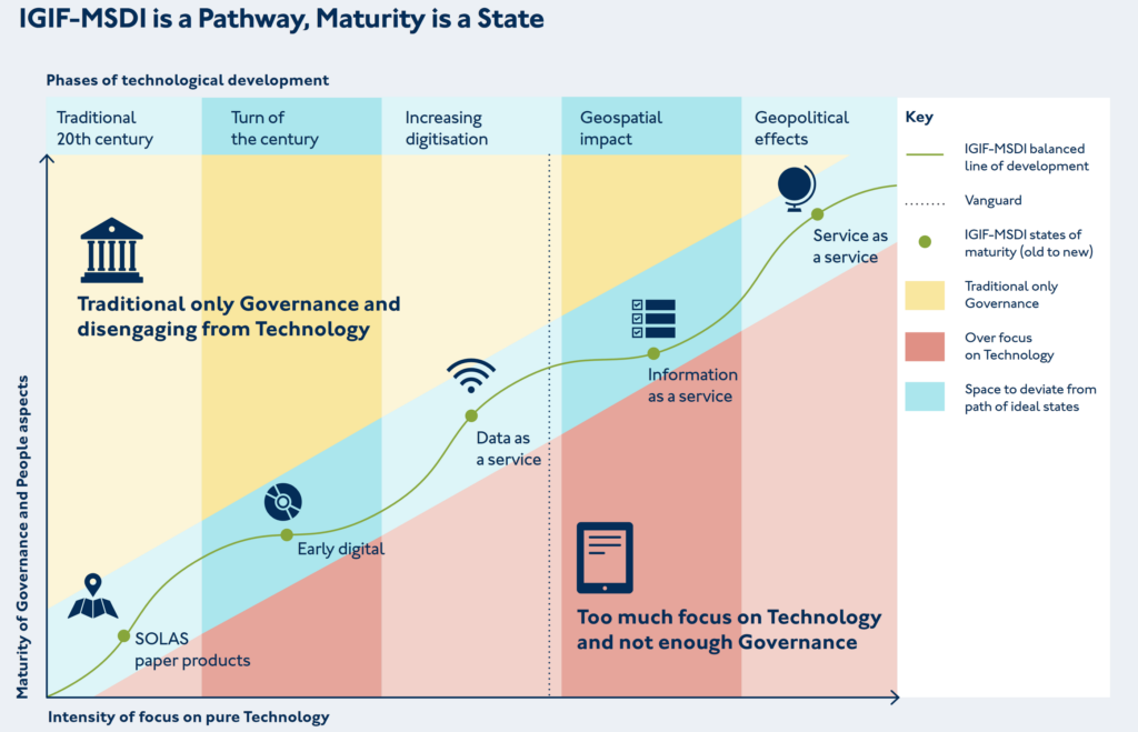
Within the Maturity Roadmap, the concept of an IGIF-(M)SDI Balanced Pathway of Development seeks to promote inclusive geospatial development via two key messages: ‘driving technology, not being driven by technology’ and ‘making the data count, not just counting the data.’
These twin ideas promote the effective governance of technology & standards to meet sovereign national requirements, however expansive or constrained, over the acquisition and possession of the latest technological solutions independent of cost-benefit considerations. OGC contributes to this by providing best practice around the implementation of standards, alongside an active cross-sector global forum to share applied knowledge, cooperate on emerging technologies, and collaborate on standards development. The engagement of the OGC membership at all levels of socio-economic development is vital for realising the cost benefits stemming from the common implementation of technologies across different countries, regions, sectors, and communities, regardless of economic spend.
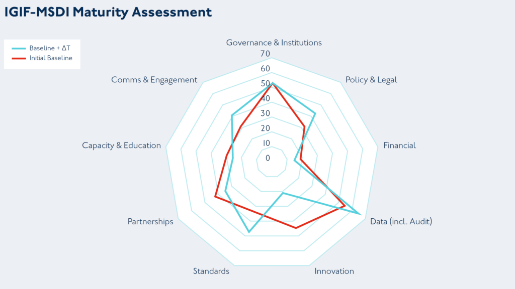
The benefits of benchmarking IGIF-MSDI maturityWhen objectively and independently applied, the benchmarking provided by the IGIF-(M)SDI Maturity Roadmap offers a useful planning and comparison baseline for countries undertaking a public geospatial development programme. The example here is a radar chart output across nine assessment categories corresponding to the IGIF Nine Pathways, for an initial baseline – and a subsequent baseline two years later. The underlying data is from real-world assessments taken under World Bank and partner oversight, which was openly published by the Agency for Land Relations and Cadastre of the Republic of Moldova. Such benchmarking exercises can be executed across different scales (from whole nations to cities or ports) and across different domains (from space to cyberspace), sometimes yielding deep insights into potential opportunities around discovered disparities.
Also included with the Maturity Roadmap is a practically orientated appendix that covers best practice for multi-agency governance, where, during a national geospatial development programme, multiple agencies or departments may have to work closely to operationally deliver joint geospatial outcomes. This may be useful in situations where long-standing traditions and conventions could have created a culture that is not conducive to the tight-knit cooperation needed to develop complex IGIF-(M)SDI solutions. Such solutions require the pooling of expertise, resources, and capabilities that one or even two agencies can not provide alone.
Positive approach to improve ineffective practices is essential to joint IGIF-(M)SDI successOne crucial characteristic for joint IGIF-(M)SDI success is a healthy scepticism and a drive to improve ineffective practices, especially when they have become entrenched as tradition, convention, or “how things have always been done.” I like to counter such perceptions, particularly amongst those that genuinely want to evolve, with the view that “if you always do what you’ve always done, you’ll always get what you’ve always gotten.” Long-term existing practices may have been fine because they met some requirement in a particular environment and once satisfied a need effectively. However, maintaining those same practices now, when society’s expectations and technology have moved forward, can lead to stagnation.
Departments and agencies should foster a keen interest in human behaviour around the use (and misuse) of data or information. Traditional or conventional “hard governance” centres around the assumption that people only make the wrong decisions because they have the wrong information or not enough of it. This traditional view of data governance then coalesces into hard compliance measures and management surveillance, which includes formal audits, regular in-depth reporting, restrictive checklists, and a focus on top-down, non-negotiable command & control. This approach was suited to traditional mass manufacturing of standardised products, but is insufficient by itself for modern data services that are digital-first by design and characterised by near real-time changes.
Soft governance works with the grain of human behaviour to achieve better results by enablement and empowerment, rather than by command and control alone. Principles take precedent over prescription, thus allowing an organisation to leverage the deep insights and frontline experiences of their entire workforce. Shortcut thinking, lack of active engagement and wrong assumptions are some of the key targets for a soft governance approach, which still requires the ultimate backstop of hard governance – but meaningfully targeted and monitored using a risk-based approach. Combining the two approaches can yield outsized and transformative results, which is essential for joint IGIF-(M)SDI success that leaves no community behind.
The IGIF-(M)SDI Maturity Roadmap and related resources are available for free on OGC’s IGIF-(M)SDI Maturity Roadmap webpage.
To best inform future revisions, iterations, and the optimization of the Roadmap, feedback and applied experiences from the geospatial community are sought via OGC Member Meetings, Forums, or directly.
The IGIF-(M)SDI Maturity Roadmap is an independent initiative not endorsed by or officially connected to, but in alignment and support of, the mission, vision, and goals of the United Nations Initiative on Global Geospatial Information Management (UN-GGIM).

Dr. Gerald J Wong is the Data Governance Lead at the United Kingdom Hydrographic Office (UKHO), which is a world-leading centre for hydrography and an executive agency of the Ministry of Defence (MoD). Dr Wong is the Lead Author of the IGIF-(M)SDI Maturity Roadmap, being a specialist in synergising traditional rules-based hard governance with modern and empowering soft governance, which works with the grain of human behaviour to achieve better outcomes.
As an OGC Strategic Member and a sponsor of OGC’s FMSDI initiative, the United Kingdom Hydrographic Office (UKHO) is the UK’s agency for providing hydrographic and marine geospatial data to mariners and maritime organisations across the world. The UKHO is responsible for operational support to the Royal Navy and other defence customers. Supplying defence and the commercial shipping industry, the organisation helps ensure Safety of Life at Sea (SOLAS), protect the marine environment, and support the efficiency of global trade.
Together with other national hydrographic offices and the International Hydrographic Organization (IHO), the UKHO works to develop and raise global standards of hydrography, cartography, and navigation. The UKHO also produces a commercial portfolio of ADMIRALTY Maritime Data Solutions, providing SOLAS-compliant charts, publications, and digital services for ships trading internationally.
The post Making The Data Count, Not Just Counting The Data appeared first on Open Geospatial Consortium.
-
sur geomatico: HOT-OSM para el seísmo de Marruecos
Publié: 14 September 2023, 1:18pm CEST
Geomatico dedica un día al mes a colaborar en aquellos proyectos que más nos llaman la atención tecnológica o socialmente. Es lo que llamamos el día del imasdé (I+D), que empieza con todos los trabajadores votando a qué dedicaremos las siguientes horas de trabajo.
 Votaciones poco tecnológicas para decidir el día del I+D
Como no podía ser de otra manera, esta jornada del 13 de septiembre la dedicamos al precioso proyecto HOT-OSM (Humanitarian OpenStreetMap Team) que había hecho un llamamiento urgente para ayudar a mapear las zonas afectadas por el dramático terremoto del sur de Marruecos.
Primero hicimos una pequeña introducción a OpenStreetMap (OSM) para profanos para aquella parte del equipo que no tenía experiencia anterior con el proyecto. Vimos los diferentes editores, iD, JOSM y estudiamos un poco las primitivas geométricas que caracterizan el proyecto y por supuesto las Map Features. Ya en HOT, decidimos en que proyecto íbamos a colaborar y nos pusimos a ello.
 Seleccionando zona de trabajo en HOT-OSM
Había que que cartografiar los edificios dentro de las rejillas que seleccionábamos. En el mismo proyecto de HOT, se explicaba claramente como realizar la tarea a partir de JOSM. Así, mediante el plugin de crear edificios, pudimos aportar nuestro granito de arena a la zona.
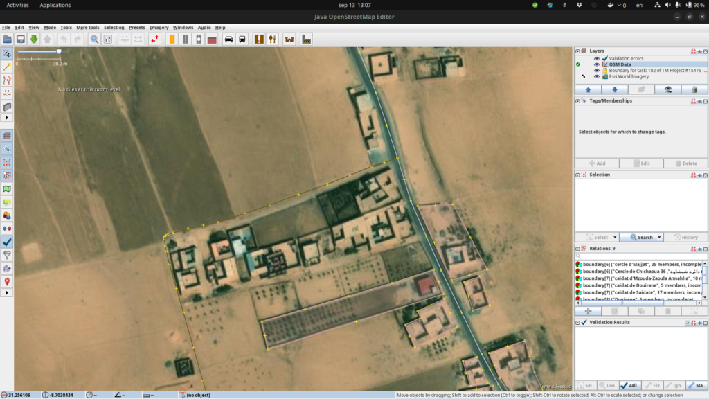 Puede ser complejo definir distinguir exactamente los contornos de los edificios en Marruecos
Fue muy gratificante, tanto por la tarea, como por la dinámica del trabajo, el compartir una jornada completa con las compañeras realizando un trabajo “sencillo“ en el que a la vez podíamos estar comentando otros aspectos de nuestro día a día. ¡Viva el día del imasdé y HOT-OSM!
 Micho, Marta y Alex trabajando en HOT-OSM pero posando disimuladamente para la foto
-
sur Registrations Open for OGC’s October 2023 Open Standards Code Sprint
Publié: 12 September 2023, 5:00pm CEST par Simon Chester
The Open Geospatial Consortium (OGC) invites software developers to the October 2023 Open Standards Code Sprint. The hybrid event will be held on Oct. 30 to Nov. 1, with the face-to-face element held at the Geovation Hub in London. A pre-event webinar will be held on October 12th. Participation is free and open to the public. Registration is available on the OGC Open Standards Code Sprint website. Travel support funding is available.
The Code Sprint is sponsored at the Gold Level by OGC Strategic Member Ordnance Survey (OS), and at the Silver Level by OGC Member the European Union Satellite Centre (SatCen). Additional support comes from OGC Strategic Member the US National Geospatial Intelligence Agency (NGA) and OGC Principal Member the UK Defence Science and Technology Laboratory (Dstl). Additional sponsorship opportunities remain available for organizations to support the geospatial development community while promoting their products or services. Visit the Event Sponsorship page for more information.
The code sprint will be a collaborative and inclusive event to support the development of Open Standards and supporting applications. All OGC Standards are in scope for this code sprint.
OGC code sprints experiment with emerging ideas in the context of geospatial standards, help improve interoperability of existing standards by experimenting with new extensions or profiles, and are used for building proofs-of-concept to support standards development activities and enhancement of software products.
Non-coding activities such as testing, working on documentation, or reporting issues are also welcome during the code sprint. The Code Sprint also provides the opportunity, via its mentor stream, to onboard developers new to OGC Standards.
A one-hour pre-event webinar will take place on October 12 at 14:00 BST (UTC+1). The webinar will outline the scope of work for the code sprint and provide other useful information for participants. Any participants interested in Imagery formats will be invited to stay on after the webinar for a technical overview of the formats in focus for the code sprint. As with the virtual portion of the sprint, the pre-event webinar will take place on OGC’s Discord server.
The Code Sprint will prototype and advance implementations of multiple approved and candidate OGC Standards, for example:
…and more.
In the context of OGC Standards, the Code Sprint will also experiment with the ability to access or provide imagery conforming to NGA’s emerging GEOINT Imagery Media for ISR (GIMI) Profile through implementations of OGC API Standards. The GIMI Profile is based on the ISO/IEC 23008-12 High Efficiently Image File Format (HEIF) and the ISO/IEC 14496-12 ISO Base Media File Format (ISOBMFF) standards. This part of the Code Sprint will also prototype creation of GIMI files from still imagery encoded in JPEG 2000 (with GMLJP2), and motion imagery encoded in H.264 and H.265 formats.
Some Travel Support Funding is available for selected participants. Anyone interested in receiving travel support funding should indicate their interest on the registration form. Requests for funding will need to be received before October 2. They will be notified within 2 weeks of their application whether their application for travel support is approved or not.
The code sprint begins at 09:00 UTC on October 30 with an onboarding session, and ends at 17:00 UTC on November 1. To learn more about future and previous OGC code sprints, visit the OGC Developer Events Wiki or join OGC’s Discord server.
Registration for in-person participation closes at 17:00 UTC on October 25. Registration for remote participation will remain open throughout the code sprint. Registration and further information is available on The Code Sprint website.
The post Registrations Open for OGC’s October 2023 Open Standards Code Sprint appeared first on Open Geospatial Consortium.
-
sur BostonGIS: Why People care about PostGIS and Postgres and FOSS4GNA
Publié: 10 September 2023, 7:22am CEST
Paul Ramsey and I recently had a Fireside chat with Path to Cituscon. Checkout the Podcast Why People care about PostGIS and Postgres. There were a surprising number of funny moments and very insightful stuff.
It was a great fireside chat but without the fireplace. We covered the birth and progression of PostGIS for the past 20 years and the trajectory with PostgreSQL. We also learned of Paul's plans to revolutionize PostGIS which was new to me. We covered many other side-line topics, like QGIS whose birth was inspired by PostGIS. We covered pgRouting and mobilitydb which are two other PostgreSQL extension projects that extend PostGIS.
We also managed to fall into the Large Language Model conversation of which Paul and I are on different sides of the fence on.
Continue reading "Why People care about PostGIS and Postgres and FOSS4GNA" -
sur Camptocamp: The QGIS Hub Plugin
Publié: 8 September 2023, 4:00am CEST
Pièce jointe: [télécharger]
Your direct access to the shared resources of the QGIS community. -
sur GRASS GIS: NSF Grant Awarded to Enhance GRASS GIS Ecosystem
Publié: 6 September 2023, 12:12pm CEST
We, a team of researchers from four U.S. universities, are excited to announce a significant new project to support and expand the global GRASS GIS community. We have been awarded a prestigious grant (award 2303651) from the U.S. National Science Foundation (NSF) to bolster and broaden the software ecosystem of GRASS GIS for a world that increasingly relies on location-based information. The two main goals of the project are: 1) to facilitate the adoption of GRASS GIS as a key geoprocessing engine by a growing number of researchers and geospatial practitioners in academia, governments, and industry; and 2) to expand and diversify the developer community, especially through supporting next-generation scientists to gain expertise to maintain and innovate GRASS software. -
sur GeoSolutions: GeoSolutions to Sponsor FOSS4G North America – 23-25 OCT – Baltimore, MD
Publié: 5 September 2023, 8:19pm CEST
You must be logged into the site to view this content.
-
sur Marco Bernasocchi: Analyzing and visualizing large-scale fire events using QGIS processing with ST-DBSCAN
Publié: 5 September 2023, 12:04pm CEST
A while back, one of our ninjas added a new algorithm in QGIS’ processing toolbox named ST-DBSCAN Clustering, short for spatio temporal density-based spatial clustering of applications with noise. The algorithm regroups features falling within a user-defined maximum distance and time duration values.
This post will walk you through one practical use for the algorithm: large-scale fire event analysis and visualization through remote-sensed fire detection. More specifically, we will be looking into one of the larger fire events which occurred in Canada’s Quebec province in June 2023.
 Fetching and preparing FIRMS data
NASA’s Fire Information for Resource Management System (FIRMS) offers a fantastic worldwide archive of all fire detected through three spaceborne sources: MODIS C6.1 with a resolution of roughly 1 kilometer as well as VIIRS S-NPP and VIIRS NOAA-20 with a resolution of 375 meters. Each detected fire is represented by a point that sits at the center of the source’s resolution grid.
Each source will cover the whole world several times per day. Since detection is impacted by atmospheric conditions, a given pass by one source might not be able to register an ongoing fire event. It’s therefore advisable to rely on more than one source.
To look into our fire event, we have chosen the two fire detection sources with higher resolution – VIIRS S-NPP and VIIRS NOAA-20 – covering the whole month of June 2023. The datasets were downloaded from FIRMS’ archive download page.
After downloading the two separate datasets, we combined them into one merged geopackage dataset using QGIS processing toolbox’s Merge Vector Layers algorithm. The merged dataset will be used to conduct the clustering analysis.

In addition, we will use QGIS’s field calculator to create a new Date & Time field named ACQ_DATE_TIME using the following expression:
to_datetime("ACQ_DATE" || "ACQ_TIME", 'yyyy-MM-ddhhmm')This will allow us to calculate precise time differences between two dates.
 Modeling and running the analysis
The large-scale fire event analysis requires running two distinct algorithms:
- a spatiotemporal clustering of points to regroup fires into a series of events confined in space and time; and
- an aggregation of the points within the identified clusters to provide additional information such as the beginning and end date of regrouped events.
This can be achieved through QGIS’ modeler to sequentially execute the ST-DBSCAN Clustering algorithm as well as the Aggregate algorithm against the output of the first algorithm.

The above-pictured model outputs two datasets. The first dataset contains single-part points of detected fires with attributes from the original VIIRS products as well as a pair of new attributes: the CLUSTER_ID provides a unique cluster identifier for each point, and the CLUSTER_SIZE represents the sum of points forming each unique cluster. The second dataset contains multi-part points clusters representing fire events with four attributes: CLUSTER_ID and CLUSTER_SIZE which were discussed above as well as DATE_START and DATE_END to identify the beginning and end time of a fire event.
In our specific example, we will run the model using the merged dataset we created above as the “fire points layer” and select ACQ_DATE_TIME as the “date field”. The outputs will be saved as separate layers within a geopackage file.
Note that the maximum distance (0.025 degrees) and duration (72 hours) settings to form clusters have been set in the model itself. This can be tweaked by editing the model.
Visualizing a specific fire event progression on a mapOnce the model has provided its outputs, we are ready to start visualizing a fire event on a map. In this practical example, we will focus on detected fires around latitude 53.0960 and longitude -75.3395.
Using the multi-part points dataset, we can identify two clustered events (CLUSTER_ID 109 and 1285) within the month of June 2023. To help map canvas refresh responsiveness, we can filter both of our output layers to only show features with those two cluster identifiers using the following SQL syntax: CLUSTER_ID IN (109, 1285).
To show the progression of the fire event over time, we can use a data-defined property to graduate the marker fill of the single-part points dataset along a color ramp. To do so, open the layer’s styling panel, select the simple marker symbol layer, click on the data-defined property button next to the fill color and pick the Assistant menu item.
In the assistant panel, set the source expression to the following:
day(age(to_date('2023-07-01'),”ACQ_DATE_TIME”)). This will give us the number of days between a given point and an arbitrary reference date (2023-07-01 here). Set the values range from 0 to 30 and pick a color ramp of your choice.
When applying this style, the resulting map will provide a visual representation of the spread of the fire event over time.
 Having identified a fire event via clustering easily allows for identification of the “starting point” of a fire by searching for the earliest fire detected amongst the thousands of points. This crucial bit of analysis can help better understand the cause of the fire, and alongside the color grading of neighboring points, its directionality as it expanded over time.
Analyzing a fire event through histogram
Having identified a fire event via clustering easily allows for identification of the “starting point” of a fire by searching for the earliest fire detected amongst the thousands of points. This crucial bit of analysis can help better understand the cause of the fire, and alongside the color grading of neighboring points, its directionality as it expanded over time.
Analyzing a fire event through histogram
Through QGIS’ DataPlotly plugin, it is possible to create an histogram of fire events. After installing the plugin, we can open the DataPlotly panel and configure our histogram.
Set the plot type to histogram and pick the model’s single-part points dataset as the layer to gather data from. Make sure that the layer has been filtered to only show a single fire event. Then, set the X field to the following layer attribute: “ACQ_DATE”.
You can then hit the Create Plot button, go grab a coffee, and enjoy the resulting histogram which will appear after a minute or so.
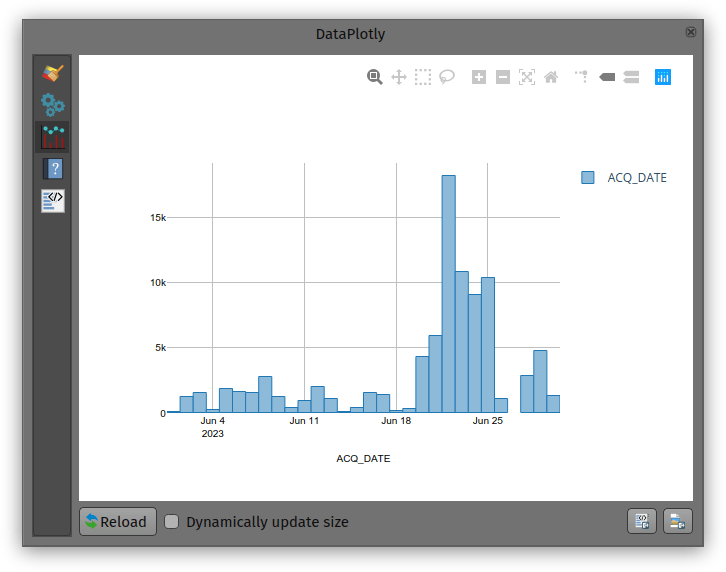
While not perfect, an histogram can quickly provide a good sense of a fire event’s “peak” over a period of time.
-
sur QGIS Blog: Plugin Update August 2023
Publié: 3 September 2023, 3:08pm CEST
In August 13 new plugins that have been published in the QGIS plugin repository.
Here’s the quick overview in reverse chronological order. If any of the names or short descriptions piques your interest, you can find the direct link to the plugin page in the table below the screenshot.

Cesium ion Browse and add datasets from Cesium ion Land Use Analyzer A plugin for Land Use spatial analysis tools GNAVS GNSS Navigate and Save Soar – the new atlas Import or export maps via the Soar platform FotovolCAT Spatial analysis automation for solar power station sitting in Catalonia QGISSPARQL-Layer2Triple Layer2Triple osm2topomap A plugin intended to intermediate the process of using OSM data for official (authoritative) Topographc Maps, or rather, databases Plugin Exporter A QGIS plugin for exporting plugins GetBaseLine GetBaseLine Fast Field Filler The plugin was created to quickly fill in the fields in the attribute table. Radiation ToolBox Plugin Plugin for loading data from Safecast and other radiation monitoring devices LocationIQ Geocoding and Maps LocationIQ integration to add geocoding and map tiles to QGIS Proxy Handler Adds prefix proxy addresses to connections -
sur From GIS to Remote Sensing: Road to the Semi-Automatic Classification Plugin v.8: Landsat and Sentinel-2 images download and preprocessing, classification
Publié: 2 September 2023, 1:10pm CEST
This is the second post describing the main new features of the new version 8 (codename "Infinity") of the Semi-Automatic Classification Plugin (SCP) for QGIS, which will be released in October 2023.The new version is based on Remotior Sensus, a new Python processing framework.
The tool "Download products" has been updated to download Landsat and Sentinel-2 images from different services. In particular, through the service NASA Earthdata (registration required at [https:]] ) it will be possible to download the Harmonized Landsat and Sentinel-2 which are surface reflectance data product (generated with Landsat 8, Landsat 9, and Sentinel-2 data) with observations every two to three days at 30m spatial resolution (for more information read here). This is therefore a great source for frequent and homogeneous monitoring.Moreover, Copernicus Sentinel-2 images will be searched through the Copernicus Data Space Ecosystem API, while the images are downloaded through the Google Cloud service that provides the free dataset as part of the Google Public Cloud Data program.Other download services that were available in SCP 7 (e.g. Sentinel-1, ASTER images) will be available with future updates.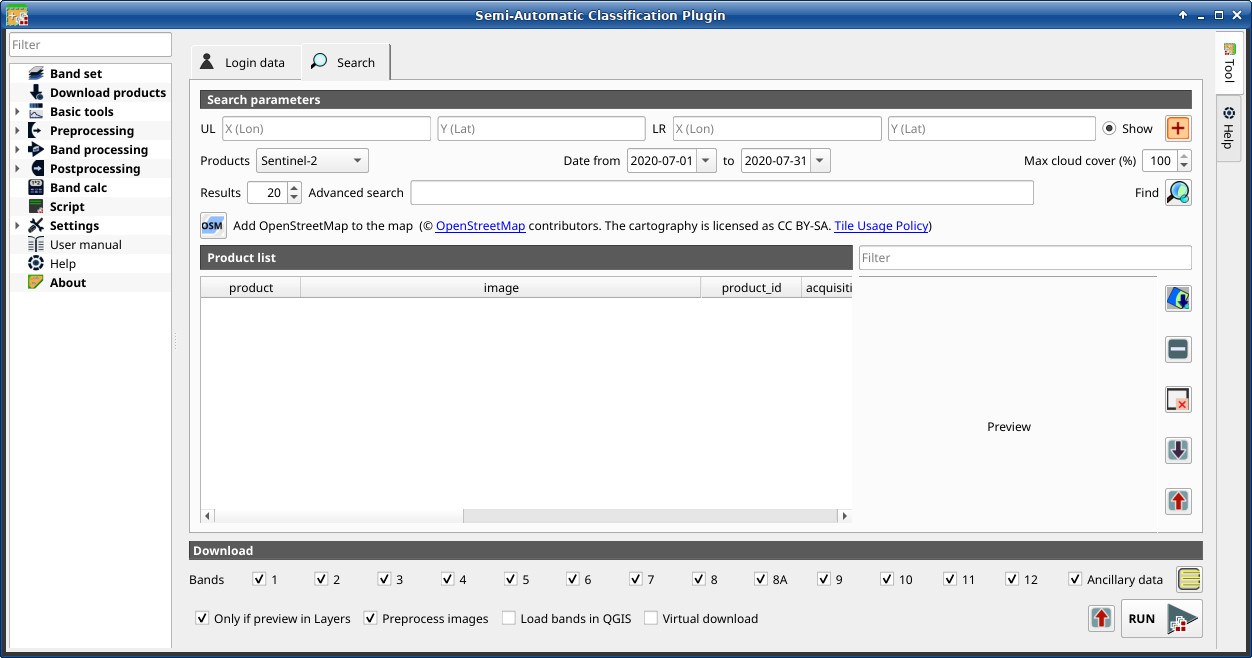
Read more » -
sur GeoSolutions: Partnership with Ecoplan (Bosnia & Herzegovina)
Publié: 1 September 2023, 7:45pm CEST
You must be logged into the site to view this content.
-
sur Free and Open Source GIS Ramblings: Comparing geographic data analysis in R and Python
Publié: 1 September 2023, 12:14pm CEST
Today, I want to point out a blog post over at
written together with my fellow “Geocomputation with Python” co-authors Robin Lovelace, Michael Dorman, and Jakub Nowosad.
In this blog post, we talk about our experience teaching R and Python for geocomputation. The context of this blog post is the OpenGeoHub Summer School 2023 which has courses on R, Python and Julia. The focus of the blog post is on geographic vector data, meaning points, lines, polygons (and their ‘multi’ variants) and the attributes associated with them. We plan to cover raster data in a future post.
-
sur GeoTools Team: GeoTools 28.5 Released
Publié: 31 August 2023, 2:07pm CEST
The GeoTools team are pleased to announce the release of the latest stable version of GeoTools 28.5 geotools-28.5-bin.zip geotools-28.5-doc.zip geotools-28.5-userguide.zip geotools-28.5-project.zip This release is also available from the OSGeo Maven Repository and is made in conjunction with -
sur GeoTools Team: GeoTools 28.5 Released
Publié: 31 August 2023, 2:01pm CEST
The GeoTools team are pleased to announce the release of the latest stable version of GeoTools 28.5 geotools-28.5-bin.zip geotools-28.5-doc.zip geotools-28.5-userguide.zip geotools-28.5-project.zipThis release is also available from the OSGeo Maven Repository and is made in conjunction with GeoServer 2.22.5. We are grateful to Peter Smythe (AfriGIS) for carrying out the -
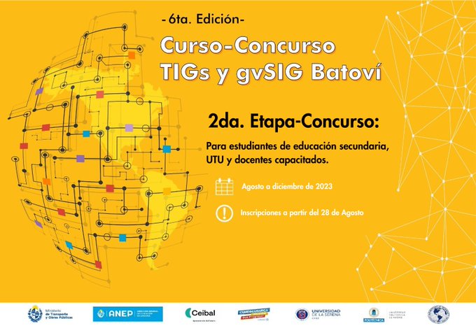
sur gvSIG Batoví: edición 2023 del concurso: Proyectos de Geografía con estudiantes y gvSIG Batoví
Publié: 30 August 2023, 10:32pm CEST

Habiendo finalizado con éxito la etapa de capacitación de la iniciativa Geoalfabetización mediante la utilización de Tecnologías de la Información Geográfica, lanzamos la convocatoria a participar de la edición 2023 del concurso: Proyectos de Geografía con estudiantes y gvSIG Batoví. Pueden acceder aquí a la convocatoria y bases.
Todos los años tenemos alguna novedad y este año no es la excepción:
- tenemos el apoyo del Instituto Panamericano de Geografía e Historia (la iniciativa fue seleccionada por el Programa de Asistencia Técnica 2023, Proyecto PAT No. GEOG-04/2023 Geoalfabetización mediante la utilización de Tecnologías de la Información Geográfica)
- este año participa también la Dirección General de Educación Técnico Profesional (UTU)
- la certificación se obtiene participando del curso y del concurso
- contamos con la colaboración de la Universidad Politécnica de Madrid en la organización de la iniciativa
Agradecemos el apoyo de todas las instituciones que hacen posible la realización de esta propuesta.
-
sur GeoServer Team: GeoServer 2.22.5 Release
Publié: 30 August 2023, 4:00am CEST
GeoServer 2.22.5 release is now available with downloads ( bin, war, windows) , along with docs and extensions.
This is a maintenance release of GeoServer providing existing installations with minor updates and bug fixes. GeoServer 2.22.5 is made in conjunction with GeoTools 28.5, and GeoWebCache 1.22.5.
Thanks to Peter Smythe (AfriGIS) for making this release.
2023-09-05 update: GeoServer 2.22.5 has been recompiled and uploaded to SourceForge. The initial upload was accidentally compiled with Java 11 and would not function in a Java 8 environment.
Thanks to Jody Garnett (GeoCat) for this update, and Steve Ikeoka for testing in a Java 8 environment.
Java 8 End-of-lifeThis GeoServer 2.22.5 maintenance release is final scheduled release of GeoServer 2.22.x series, and thus the last providing Java 8 support.
All future releases will require a minimum of Java 11.
Security ConsiderationsThis release addresses security vulnerabilities and is considered an essential upgrade for production systems.
This blog post will be updated in due course with CVE numbers following our coordinated vulnerability disclosure policy.
See project security policy for more information on how security vulnerabilities are managed.
Release notesImprovement:
- GEOS-10856 geoserver monitor plugin - scaling troubles
- GEOS-11048 Improve URL checking
- GEOS-11081 Add option to disable GetFeatureInfo transforming raster layers
- GEOS-11099 ElasticSearch DataStore Documentation Update for RESPONSE_BUFFER_LIMIT
- GEOS-11100 Add opacity parameter to the layer definitions in WPS-Download download maps
Bug:
- GEOS-10874 Log4J: Windows binary zip release file with log4j-1.2.14.jar
- GEOS-10875 Disk Quota JDBC password shown in plaintext
- GEOS-10901 GetCapabilities lists the same style multiple times when used as both a default and alternate style
- GEOS-10903 WMS filtering with Filter 2.0 fails
- GEOS-10932 csw-iso: should only add ‘xsi:nil = false’ attribute
- GEOS-11025 projection parameter takes no effect on MongoDB Schemaless features WFS requests
- GEOS-11035 Enabling OSEO from Workspace Edit Page Results in an NPE
- GEOS-11054 NullPointerException creating layer with REST, along with attribute list
- GEOS-11055 Multiple layers against the same ES document type conflict with each other
- GEOS-11069 Layer configuration page doesn’t work for broken SQL views
Task:
- GEOS-11062 Upgrade [httpclient] from 4.5.13 to 4.5.14
- GEOS-11063 Upgrade [httpcore] from 4.4.10 to 4.4.16
- GEOS-11067 Upgrade wiremock to 2.35.0
- GEOS-11092 acme-ldap.jar is compiled with Java 8
For the complete list see 2.22.5 release notes.
About GeoServer 2.22 SeriesAdditional information on GeoServer 2.22 series:
- GeoServer 2.22 User Manual
- Update Instructions
- Metadata extension
- CSW ISO Metadata extension
- State of GeoServer (FOSS4G Presentation)
- GeoServer Beginner Workshop (FOSS4G Workshop)
- Welcome page (User Guide)
Release notes: ( 2.22.5 | 2.22.4 | 2.22.3 | 2.22.2 | 2.22.1 | 2.22.0 | 2.22-RC | 2.22-M0 )
-
sur gvSIG Team: Curso-Concurso TIGs y gvSIG Batoví. 6ª edición
Publié: 29 August 2023, 10:56am CEST

Nos hacemos eco del lanzamiento de la 6ª edición del Curso-Concurso TIGs y gvSIG Batoví. Este año viene con una importante novedad, Colombia se suma a esta iniciativa uruguaya.
Y se ha comunicado que más de cien docentes de Uruguay y Colombia ya se inscribieron al curso TIGs y gvSIG Batoví… ¡enhorabuena!
-
sur Sean Gillies: Bear training week ~5 recap
Publié: 28 August 2023, 5:54am CEST
The third week of my season's big training block was my biggest yet from the climbing perspective. My runs averaged 220 feet of elevation gain (D+) per mile, which is what the Bear 100 course will demand of me in 5 weeks. Here are last week's numbers.
20 hours, 37 minutes
76.2 miles
16,775 feet D+
Extrapolating that to 100 miles, naively, predicts a 28 hour finish. That would be amazing! There's no way I'm going to finish in 28 hours. I think I'll be able to keep up this week's average pace for 60 miles and then will slow down dramatically after that. We'll see!
Next week I'm giving myself a break from long hilly runs. I'll do daily runs of not much more than an hour, yoga, some strength and conditioning. And I'll be working on my race day planning: gear, drop bags, fueling, etc.
-
sur GRASS GIS: New Docker images for GRASS GIS
Publié: 27 August 2023, 12:42pm CEST
Moving GRASS GIS Docker Images to the OSGeo Repository In the field of open source software development and deployment, the accessibility and maintenance of resources is of paramount importance. To this end, there has been a major change in the repository structure for the GRASS GIS Docker images. In the past years, these Docker images have been maintained and hosted under the mundialis organisation’s repository. The company mundialis has played a crucial role in providing and maintaining these images, ensuring their availability and stability for the wider GIS community. -
sur From GIS to Remote Sensing: Road to the Semi-Automatic Classification Plugin v.8: Band sets, Band calc and Scripts
Publié: 26 August 2023, 2:10am CEST
As already announced, the new version 8 (codename "Infinity") of the Semi-Automatic Classification Plugin (SCP) for QGIS will be released in October 2023.This post describes a few main new features of the SCP, which is still under development, based on a completely new Python processing framework that is Remotior Sensus.
The Main interface will include all the tools, as in SCP version 7. The Band set tab will allow to manage more than one Band set; the interface has been restyled with a table on the left to manage the list of Band sets, and the larger table on the right to display the bands of the active band set.
Read more » -
sur KAN T&IT Blog: XVII Jornadas IDERA: Nuestra Experiencia
Publié: 25 August 2023, 9:56pm CEST
Cada año, desde 2007, la Infraestructura de Datos Espaciales de la República Argentina (IDERA) extiende su invitación a los apasionados de la información geoespacial a unirse a las Jornadas IDERA. Este evento anual se ha convertido en una tradición, y en 2023, se llevó a cabo en la hermosa ciudad de Santa Rosa, provincia de La Pampa, Argentina. Es un hecho que IDERA se enorgullece de propiciar un espacio donde los expertos pueden compartir y celebrar los avances en el campo de la información geoespacial.
El equipo de Kan participó de este evento, que tuvo como objetivo central impulsar la publicación de datos, productos y servicios geoespaciales de manera eficiente y oportuna, con la finalidad de respaldar la toma de decisiones basadas en evidencias. Las XVII Jornadas IDERA fueron el punto culminante de este esfuerzo, transformándose en el evento geoespacial del año en Argentina. Fue un momento invaluable para intercambiar ideas y debatir sobre los avances y desafíos relacionados con la publicación y utilización de información geoespacial abierta, interoperable y accesible para el desarrollo del país.
Bajo el lema “La comunidad de IDERA hacia un marco integrado de información geoespacial”, las XVII Jornadas IDERA proporcionaron un espacio de reflexión sobre las propuestas globales emergentes destinadas a desarrollar, integrar y fortalecer la gestión de información geoespacial. Este enfoque permitirá mejorar las Infraestructuras de Datos Espaciales en los diferentes niveles jurisdiccionales de Argentina.

La agenda de las XVII Jornadas IDERA estuvo repleta de eventos emocionantes y presentaciones interesantes. Los talleres y ponencias que realizamos desde Kan fueron los siguientes:
Presentación institucional de KAN en el espacio de networking
Taller “Potenciá el uso de tus datos geo con Geonode 4”
Presentación de casos de éxito en el grupo de provincias
Taller “Recolección de datos en campo con Kobo” Ponencia “
Desarrollo de un Sistema de Monitoreo y Manejo Integral de Humedales a partir de Información Satelital”
Además aprovechamos para compartir y asistir a otras charlas y muestras de nuestros colegas. Muchísimas gracias IDERA por esta oportunidad única para conectarnos con otros expertos, dejarnos aprender de sus experiencias y contribuir al avance de la comunidad de información geoespacial en Argentina. ¡Nos vemos el próximo año!


-
sur OGC forms new GeoParquet Standards Working Group
Publié: 24 August 2023, 5:00pm CEST par Simon Chester
The Open Geospatial Consortium (OGC) is excited to announce the formation of the OGC GeoParquet Standards Working Group (SWG). The new SWG will work to advance the GeoParquet encoding format for adoption as an OGC Encoding Standard for cloud-native vector data.
GeoParquet adds geospatial types to Apache Parquet, described by Apache as “an open source, column-oriented data file format designed for efficient data storage and retrieval. It provides efficient data compression and encoding schemes with enhanced performance to handle complex data in bulk.” For an introduction to the GeoParquet format, see this blog post.
GeoParquet started over 3 years ago as a community effort by different Open Source Projects and organizations that have committed to its implementation and support.
OGC is advancing a number of Standards to enable cloud-native geospatial ecosystems. GeoParquet fits in the group of data encoding Standards that are highly performant for large, cloud-based data stores, such as Cloud Optimized GeoTIFF for tiled rasters and Zarr for datacubes. GeoParquet will, in time, enable vector datasets to be as readily accessible from the cloud as the other formats already well-used in the community.
The GeoParquet SWG will take the initial efforts incubated in OGC’s GeoParquet GitHub repository as a draft specification from which a candidate Standard will be developed. As with many other recent OGC Standards, the repository will remain open to contributions from outside OGC and documentation will evolve in concert with prototype implementations.
GeoParquet will be another encoding of the OGC Simple Features Standard, and as such will handle all Simple Feature geometries. While other OGC Standards also encode Simple Features, GeoParquet is intended to be optimized for native use in cloud environments. It is expected that GeoParquet will be tested as an encoding to be accessed by the OGC API family of Standards. The new SWG expects to have a candidate Standard ready for review and approval within one year.
The OGC GeoParquet Standards Working Group Charter is publicly available via the OGC Portal.
OGC Members can join the GeoParquet Standards Working Group via the OGC Portal. Non-OGC members are welcomed to contribute via OGC’s GeoParquet GitHub repository or by joining the OGC GeoParquet SWG Mailing List. Non-OGC members who would like to know more about full participation in the SWG are encouraged to contact the OGC Standards Program.
The post OGC forms new GeoParquet Standards Working Group appeared first on Open Geospatial Consortium.
-
sur Stefano Costa: Gli atti del workshop Archeofoss 2022 sono stati pubblicati
Publié: 23 August 2023, 2:38pm CEST
Gli atti del workshop Archeofoss 2022 sono stati pubblicati in open access su Archeologia e Calcolatori. Li trovate qui [www.archcalc.cnr.it] come numero 34.1 della rivista.
Ho curato insieme a Julian Bogdani l’edizione di questo volume ed è quindi motivo di soddisfazione, anche per i tempi rapidi con cui siamo arrivati alla pubblicazione grazie al lavoro collettivo degli autori e autrici, di chi ha fatto il referaggio, della redazione e della casa editrice.
Rimane una mancanza in questo volume rispetto alla ricchezza dei due giorni di incontro, delle sette sessioni tematiche, delle discussioni guidate da chi ha moderato le sessioni, ibride eppure vivacissime. La mancanza in parte è fisiologica ma in parte deriva da un certo numero di autrici e autori che non hanno presentato il proprio contributo per la pubblicazione. Ad esempio, nella sessione sui dati stratigrafici che ho moderato con Emanuel Demetrescu erano stati presentati 7 interventi ma solo 2 sono confluiti come paper nel volume.
Nei prossimi anni dovremo fare di più per fare in modo che gli atti raccolgano ancora più fedelmente il convegno.
Ci ritroveremo con la comunità Archeofoss a Torino nel mese di dicembre 2023.
-
sur QGIS Blog: QGIS server 3.28 is officially OGC compliant
Publié: 22 August 2023, 2:05pm CEST
QGIS Server provides numerous services like WMS, WFS, WCS, WMTS and OGC API for Features. These last years, a lot of efforts were made to offer a robust implementation of the WMS 1.3.0 specification.
We are pleased to announce that QGIS Server LTR 3.28 is now certified against WMS 1.3.0.

This formal OGC certification process is performed once a year, specifically for the Long Term Release versions. But, as every change in QGIS source code is now tested against the formal OGC test suites (using OGC TeamEngine) to avoid any kind of regressions, you can always check any revision of the code against OGC failures in our Github continuous integration results.
All this has been possible thanks to the QGIS’s sustaining members and contributors.
-
sur OGC, UKHO, and partners release the IGIF-(M)SDI Maturity Roadmap
Publié: 21 August 2023, 5:00pm CEST par Simon Chester
The Open Geospatial Consortium (OGC) is pleased to host and release the first iteration of the IGIF-(M)SDI Maturity Roadmap and supporting materials for community consideration and engagement across not only the marine domain, but any geospatial domain connected to the oceans.
Developed as part of OGC’s ongoing Federated Marine Spatial Data Infrastructure (FMSDI) Initiative, the Integrated Geospatial Information Framework – (Marine) Spatial Data Infrastructure (IGIF-(M)SDI) Maturity Roadmap is a quick-start guide for nations and marine organizations that seeks to advance and simplify efforts in Marine SDI and ensure their alignment with the UN-IGIF principles.
“The IGIF-MSDI maturity roadmap is an important step that supports a holistic understanding of data-exchange and -processing environments,” commented OGC Chief Technology Innovation Officer, Ingo Simonis, Ph.D. “The Roadmap enhances and complements the usual technological focus of SDIs with the equally important criteria outlined in the IGIF Principles. With the Roadmap, OGC continues its engagement and research in support of powerful, sustainable, interoperable geospatial ecosystems at all levels, including technology & standards, policies, communities, education, and capacity building efforts.”
One of the key messages of the document is that an (M)SDI is a continual journey and not an “end state” of expensive technological solutions. The document asserts that nations are sovereign in what manner of (M)SDI they genuinely need for their national requirements, and not governed by an externally imposed or presumed level of technological sophistication.
“Working collaboratively with partners at the World Bank, NOAA, OGC, IHO, and private industry, The UK Hydrographic Office (UKHO) believes that the IGIF-(M)SDI Maturity Roadmap will help many Governments begin their IGIF-aligned digital transformation journeys – whether that be within the Marine or Terrestrial domains,” commented Dr. Gerald J Wong, Data Governance Lead, UKHO.
“As an accessible “Quick Start” or “Stepping Stone” toolkit, the core of the IGIF-(M)SDI Maturity Roadmap is formed by the World Bank SDI Diagnostic Toolkit where, with contributions from IHO and OGC, its Terrestrial heritage was augmented to maximize its benefits to the Marine community. The IGIF-(M)SDI Maturity Roadmap is aligned with the UN-IGIF principles and is fully interoperable with Terrestrial interests.”
When properly executed, the resulting MSDI Diagnostic Toolkit provides a quantitative assessment for nations or marine agencies to baseline their MSDI maturity, as aligned to the UN-IGIF principles. The modular IHO and OGC additions ensure interoperability with the World Bank IGIF methodology, which can lead to the financing of approved MSDI development projects. Even as an independent tool, undertaking an MSDI assessment provides a clear reference point that’s aligned with international Best Practice. Without such a starting point, progress towards any MSDI end state will be difficult to govern and manage.
“As the provider of ADMIRALTY navigation products and services worldwide, the UKHO supports nations in unlocking the many and varied benefits of their marine space,” commented James Carey, Deputy Chief Data Officer at the UKHO “We are a strategic member of the Open Geospatial Consortium and proudly lend our expertise to the development of Marine Spatial Data Infrastructure (MSDI), as an enabler of security, prosperity, and environmental stewardship. By fusing marine data with spatial insights it is possible to forge a path to a more interconnected world where oceans inspire growth and communities prosper.”
The IGIF-(M)SDI Maturity Roadmap and related resources are available for free on OGC’s IGIF-(M)SDI Maturity Roadmap webpage.
To best inform future revisions, iterations, and the optimization of the Roadmap, feedback and applied experiences from the geospatial community are sought via OGC Member Meetings, Forums, or directly.
The IGIF-(M)SDI Maturity Roadmap is an independent initiative not endorsed by or officially connected to, but in alignment and support of, the mission, vision, and goals of the United Nations Initiative on Global Geospatial Information Management (UN-GGIM).
The post OGC, UKHO, and partners release the IGIF-(M)SDI Maturity Roadmap appeared first on Open Geospatial Consortium.
-
sur Sean Gillies: Bear training week ~6 recap
Publié: 20 August 2023, 10:14pm CEST
For fun I'm using the bitwise complement operator
~in the title of this post. Race week is week ~0. On Monday, it was 6 weeks to race week. I'm starting to feel fit, close to my 2020-2021 form.The numbers for the week:
16 hours, 54 minutes
71 miles
12,165 feet D+
I've run six days in a row and my shortest run was today's: an hour and 20 minutes. I went out for five hours in Rocky Mountain National Park on Wednesday, two hours in Lory State Park on Friday, and five and a half hours at Horsetooth Open Space on Saturday.

Soaking hot and tired feet in the Big Thompson River below Fern Lake in RMNP.

Below the Westridge Wall in Lory S.P.

Alone on Arthur's Rock, looking NE across the reservoir and plains.

Towers trail tailgating
A bear was active around Towers Trail yesterday, but successfully avoided me. According to some bikers, it crossed the trail behind my back near the top during my first lap. If I'd turned when I heard them shouting, I might have seen it. I know there are bears up there, but have never seen one while I've been on the trail. It's a good time to be filling up on chokecherries, that's for sure.
Next week I'm going to increase my training volume a little more. Instead of two 5.5 hour runs, I'll aim for 3 x 4 hours.
-
sur Free and Open Source GIS Ramblings: I’ve archived my Tweets: Goodbye Twitter, Hello Mastodon
Publié: 20 August 2023, 6:38pm CEST
Today, Jeff Sikes @box464@firefish.social, alerted me to the fact that “Twitter has removed all media attachments from 2014 and prior” (source: [https:]] ). So far, it seems unclear whether this was intentional or a system failure (source: [https:]] ).
Since I’ve been on Twitter since 2011, this means that some media files are now lost. While the loss of a few low-res images is probably not a major loss for humanity, I would prefer to have some control over when and how content I created vanishes. So, to avoid losing more content, I have followed Jeff’s recommendation to create a proper archival page:
It is based on an export I pulled in October 2022 when I started to use Mastodon as my primary social media account. Unfortunately, this export did not include media files.
To follow me in the future, find me on:
Btw, a recent study published on Nature News shows that Mastodon is the top-ranking Twitter replacement for scientists.
To find other interesting people on Mastodon, there are many useful tools and lists, including, for example:
-
sur European Innovation, Global Impact
Publié: 17 August 2023, 12:49pm CEST par Simon Chester
From Europe to the World, OGC’s Collaborative Solutions and Innovation (COSI) Program is proud of its ongoing contributions to European research topics related to geospatial data. The research topics are driven by projects co-funded by the European Commission (EC) and cover many different domains and fields of application, including data spaces, climate, digital building permits, agriculture, digital twins for the oceans, knowledge generation, and beyond. While these topics are high on the European research agenda, the challenges – as well as their solutions – have global application.
These EC-funded projects are organised as small or large consortiums where different organisations cover different aspects of the projects’ objectives. As one such organisation, OGC is proud to play its part in the European Digital Strategy that is helping to ensure a secure and sustainable life for citizens of Europe and beyond.
OGC’s COSI Program conducts and organises its research around a central theme of “Full Spectrum Interoperability and Agile Reference Architecture.” Full Spectrum Interoperability refers to capturing the many different facets of interoperability that exist between systems. Agile Reference Architecture explores how software architectures can be developed and operated in a cost-efficient, agile, and sustainable manner that also maximises interoperability between systems. This research theme is therefore complementary to the European Digital Strategy.
Much of OGC’s current European work was showcased at the OGC European Innovation Days at Data Week Leipzig 2023. This blog post serves to provide an overview of that work and more for those who couldn’t attend – and who don’t want to have to wait for the next OGC European Innovation Days showcase, to be held July 2024 at FOSS4G Europe in Tartu, Estonia.
Data Spaces
Strong progress is being made towards Common European Data Spaces with the projects All Data for Green Deal (AD4GD) and Urban Data Space for Green Deal (USAGE). In both of these projects, OGC is contributing to the development of interoperable, federated systems that support information dissemination and knowledge generation. Such systems will use OGC Standards to enable interoperability at several technical and administrative levels and optimise the value chain that transforms raw data into decision-ready information.
AD4GD’s mission is to co-create and shape the European Green Deal Data Space as an open hub for FAIR (Findable, Accessible, Interoperable, and Reusable) data and standards-based services that support the key priorities of pollution, biodiversity, and climate change. The focus is on interoperability concepts that will bridge the semantic and technology gaps that are currently preventing stakeholders and application domains from accessing multi-disciplinary and multi-scale data. These gaps are also impeding the full exploitation of processing services and processing platforms at different levels, including Cloud, HPC and edge computing. AD4GD recently published this blog post summarising its second plenary meeting, which was co-located with Data Week Leipzig 2023.
The Horizon Europe USAGE project aims to provide solutions and mechanisms for making city-level environmental and climate data FAIR – and thus available to everyone. Leveraging standards for data and service interoperability, such solutions combine innovative governance mechanisms, consolidated arrangements, AI-based tools, and data analytics to streamline the sharing, access, and use of authoritative and crowdsourced city-level Earth Observation (EO) and Internet of Things (IoT) data.
In both of these projects, OGC Standards will play a fundamental part in enabling the resulting FAIR solutions. The main research challenge is developing Building Blocks for common data problems. These Building Blocks bring together data models, examples, code snippets, and schemas, and undergo continuous testing to make them easily accessible and usable by developers, modellers, and users. The goal is to identify and describe common patterns that exist across communities. This will lead to enhanced interoperability within and between data spaces.
Interested in learning more about Data Spaces? OGC will host a session on European common data spaces at the 2023 INSPIRE Conference this November.
Climate
OGC’s current crop of climate-related projects seek to support FAIR climate services and streamline the value chain that transforms raw data into decision-ready information.
Specifically, as part of the Climate Intelligence (CLINT) project, OGC is developing blueprints for transforming scientific algorithms into climate application packages that can be deployed, regardless of their backend, in the Copernicus Climate Change Service (C3S) Climate Data Store (CDS). More widely, the CLINT project seeks to develop Machine Learning (ML) techniques and algorithms that climate scientists can use to process the large climate datasets required for predicting and identifying the causes of extreme events such as heatwaves, warm nights, droughts, and tropical cyclones.
Focusing on the health impacts of climate change, the CLIMOS (Climate Monitoring and Decision Support Framework for Sand Fly-borne Diseases Detection and Mitigation with COst-benefit and Climate-policy MeasureS) project aims to mitigate the emergence, transmission, and spread of pathogens by sand flies. The project is establishing an Early Warning System and decision support tools for more accurate climate and health models. It will also provide predictions of infection risk and spread, as well as adaptation options. OGC is addressing the interoperability challenges faced when combining health, environmental, Earth observation, and climate model data.
Digital Building Permits
OGC is bringing its geospatial expertise to the digitalisation of building permits across two projects: ACCORD and CHEK. Albeit with a different focus, both projects aim to transform what is currently a largely manual process into a semi-automated one that allows building applications to be submitted in digital form.
In support of sustainability and resource conservation, the ACCORD (Automated Compliance Checks for Construction, Renovation, or Demolition works) has a strong focus on regulations analysis and the use of ontologies and linked data to automate the compliance checks. ACCORD will develop a semantic framework for European digital building permit processes, regulations, data, and tools. This framework will drive the formalisation of rules and the integration of existing compliance tools as Standards-based microservices, for example using OGC APIs. The solutions and tools being developed by ACCORD will provide consistency, interoperability, and reliability with national regulatory frameworks, processes, and standards.
The CHEK (Change toolkit for digital building permit) project is looking at the entire workflow for the digitalisation of building permits and is facilitating the introduction of digital building permit procedures for municipalities by developing flexible, adaptable solutions that take into account all the rules and conditions of the procedure. As with ACCORD, CHEK is using a Standards-based microservices approach to its architecture. CHEK will also develop training for municipalities, which will be made available through the Location Innovation Academy (see below).
As part of CHEK, OGC is investigating how needs-based data models can be derived dynamically as profiles of common conceptual models. The goal is to leave behind the basic problems of standardised data models. Due to their ambition to comprehensively represent a domain, they tend to be over-specified. On the other hand, to adapt to the needs of different use cases, they allow too much flexibility in implementation and modelling details. OGC is currently focused mostly on the transformation of administrative data using ontologies generated from CityGML and CityJSON.
Agriculture
The DEMETER project, which is now coming to an end, has helped to digitally transform Europe’s agri-food sector. DEMTER adopted advanced IoT technologies, data science, and smart farming to ensure the long-term viability and sustainability of the agriculture sector. One of the key results is the production of an Agriculture Information Model (AIM). The AIM is a data model and ontology for agriculture applications that ensures semantic interoperability between data and components involved in agri-food applications. To further enhance the AIM, OGC has now formed the Agriculture Information Model Standards Working Group (AIM SWG). The OGC AIM will provide a common language for agriculture applications to harmonise and improve data and metadata exchange by defining the required data elements, including concepts, properties, and relationships relevant to agriculture applications, as well as their associated semantics/meaning for information exchange.
Oceans and the Blue Economy
The Iliad Digital Twins of the Ocean project is developing a federated, multidimensional representation of the maritime and oceanic ecosystem. As with many of these projects, OGC Standards will be used to enhance the value chain as data sourced from smart IoT, satellite Earth Observations, and Citizen Science is transformed into decision-ready information and knowledge. As such, it fits perfectly into the OGC focus theme of “marine spaces.”
Iliad is developing several Digital Twin pilots in a number of key areas, including: wind energy; renewable energy from the ocean (currents, waves & floating solar); fisheries & aquaculture; marine traffic & harbour safety; pollution; met ocean data (hind, now & forecasts); biodiversity assessments & monitoring; and insurance for marine & maritime activities.
OGC is involved in defining the standards-based Data Transfer Object (DTO) data management APIs built on the OGC APIs framework, as well as ensuring semantic interoperability between the APIs, Citizen Science, and thematic domains. Finally, we are leading standardisation and best practice tasks to enable the solution to fit within the ecosystem of the Digital Twin of the Earth.
Location Innovation Academy
The recently launched Location Innovation Academy is a free online training program based on the knowledge and ideas generated by the GeoE3 project. The free online academy empowers users to improve the accessibility, interoperability, and integration of their geospatial data and services. The academy is currently targeted towards national mapping agencies, meteorological institutions, and other organisations producing or using geospatial data from different countries. The Academy aims to help overcome the interoperability gaps that still exist between European countries.
The growing online training package currently includes three different courses for developing skills in: Data Management; Service Management; and Data and Service Integration.
The Location Innovation Academy also serves as the experimentation platform for a future OGC Academy that will help learners access and exploit the enormous amounts of knowledge generated by OGC. The Location Innovation Academy is hosted by OGC at academy.ogc.org. In support of the academy, OGC is also a Pact For Skills Member.
The Academy continues to be the main component of the DIS4SME project. DIS4SME aims to provide SMEs with high quality specialised training courses on data interoperability across different areas, including location data.
By Europe, for the WorldAs a participant in projects funded by the European Commission, OGC’s COSI Program – with its complementary research theme of “Full Spectrum Interoperability and Agile Reference Architecture” – is proud to develop valuable solutions that support the European Digital Strategy and help ensure a secure and sustainable life for not only the citizens of Europe, but the entire world.
The next OGC European Innovation Days showcase will be held July 2024 at FOSS4G Europe in Tartu, Estonia.
OGC is also hosting a session on European common data spaces at the 2023 INSPIRE Conference this November.
To stay up to date on all things OGC, including European projects, funding opportunities, Standards development, events, and more, subscribe to the OGC Newsletter.
The post European Innovation, Global Impact appeared first on Open Geospatial Consortium.
-
sur QGIS Blog: Plugin Update June & July 2023
Publié: 16 August 2023, 10:27pm CEST
In this summer plugin update, we explore 51 new plugins that have been published in the QGIS plugin repository.
Here’s the quick overview in reverse chronological order. If any of the names or short descriptions piques your interest, you can find the direct link to the plugin page in the table below the screenshot.


JAPATI The QGIS plugin is used by agencies in the West Java provincial government to upload data and create map services on the geoserver in order to publish data internally and publicly BD TOPO® Extractor This tool allows you to extract specific data from IGN’s BD TOPO®. The extraction is based on either an extent drawned by the user on the map canvas or a layer’s extent. Opacity Set Sets opacity 0.5, 0.75 or 1 for selected raster layer. USM toolset (Urban Sprawl Metric toolset) The USM Toolset was developed to facilitate the calculation of Weighted Urban Proliferation (WUP) and all components of urban sprawl for landscapes that include built-up areas (e.g., dispersion (DIS), land uptake per person (LUP). DAI DAI (Daily Aerial Image) France Commune Cadastre Search for a cadastral parcel with the French cadastre API Two distances intersection Get the intersection of two distances (2D cartesian) IDG Plugin providing easy access to data from different SDI SPAN SPAN is a flexible and easy to use open-source plugin based on the QGIS software for rooftop mounted PV potential estimation capable of estimating every roof surface’s PV potential. CSV Batch Import Batch import of CSV vector layers Imagine Sustainability sustainability assessment tool based on geographic MCDA algorithms. Especially suitable for Natura 2000 sites, based on pyrepo-mcda package( [https:]] ) QGIS Hub Plugin A QGIS plugin to fetch resources from the QGIS Hub VFK Plugin Data ?eského katastru nemovitostí (VFK)<br><br>Czech cadastre data (VFK) LinearReferencing Tools for linear referenced data CIGeoE Circumvent Polygon Changes the line to circumvent a polygon between the intersection points UA XML importer ???????? ????????? ???????, ????????, ????? ?? ?????????????? ??? ? ???????????? ????????? ????? XML eagris QGIS eAGRI plugin Geojson Filling Allows to fill imported geojson layers with pre-defined field values Save All File saving script that saves qgis project file and all vector and raster layers into user-specified folder. Automatically detects file type and saves as that file type (supports SHP, GPKG, KML, CSV, and TIF). All styles and formatting are saved with each layer (except for KML), ensuring that they are opened up with the proper style the next time the project is opened. Temporary layers are made permanent automatically. Fast Density Analysis A fast kernel density visualization plugin for geospatial analytics StreetSmart This plugin manages the Street Smart imagery FilePath Copies the path of layer pandapower QGis Plugin Plugin to work with pandapower or pandapipes networks Eqip Qgis Pip Management Infra-O plugin Plugin for Finnish municipal asset management. Add to Felt Create a collaborative Felt (felt.com) map from QGIS Lahar Flow Map Tools This plugin is for opening and processing results from LaharFlow Station Offset This plugin computes the station and offset of points along polylines and exports those values to csv for other applications Jilin1Tiles Jilin1Tiles SiweiEarth This plugin is used to load the daily new map provided by Siwei Earth. QdrawEVT Easily draw and select entities in the drawing footprint. Installation of the plugin “Memory layer saver” highly recommended. See Read_me.txt file in the Help folder of the plugin. Dessiner et selectionner facilement les entités dans l’emprise du dessin. Installation du plugin “Memory layer saver” fortement recommandé. Voir fichier Lisez_moi dans le dossier Hepl du plugin. Merci ! Fuzzy Logic Toolbox This plugin implements the fuzzy inference system feature_space A plugin to plot feature space and export areas as raster or vector Panorama Viewer Plugin for QGIS to view 360-degrees panoramic photos Map Segmenter Uses machine learning to segment a map into ares of interest. ALKIS Plugin Das Plugin verfügt über zwei Werkzeugkästen und insgesamt vier einfache Werkzeuge. Im Werkzeugkasten “Gebäude” finden Sie drei nützliche Werkzeuge, um ALKIS-Gebäudedaten aufzubereiten. Sie können Dachüberstände erstellen, Gebäude auf der Erdoberfläche extrahieren und redundante Gebäudeteile eliminieren. Im Werkzeugkasten “Nutzung” steht Ihnen ein weiteres Werkzeug zur Verfügung, mit dem Sie die Objektarten in den Objektartengruppen Vegetation, Siedlung, Verkehr und Gewässer zuordnen können. Das Plugin erfordert als Datengrundlage ALKIS-Daten im vereinfachten Format, die in NRW, Deutschland, frei verfügbar sind. Dieses Plugin wurde zu Demonstrationszwecken entwickelt. Das Ziel besteht darin, in einer Videoreihe die Entwicklung eines Plugins ohne die Anwendung von Python vorzustellen. Die Tutorials dazu findet ihr in der folgenden Playlist: [https:]] isobenefit Isobenefit Urbanism plugin for QGIS. UA_MBD_TOOLS Tools for Qpositional assessment the positional quality of geographic data Terraform Implementation of popular topographic correction algorithms and various methods of their evaluation. PathoGAME The goal is to find the location of the contamination as soon as possible. Azure Maps Creator Provides access to Azure Maps Creator services CIGeoE Identify Dangles Identifies dangles in a viewport Delete Duplicate Fields Delete duplicate or redundant fields from a vector file LocationFinder Allow QGIS to use LocationFinder (interactive geocoding) COA TPW Polygonizer This plugin can be used to create polygons that track the shape of a line network, including the proper handling of intersections with common nodes of the line segments. XPlan-Umring Create XPlanGML from polygon(s) Tweet my river AI Tweet classifier for river layers 3DCityDB Tools Tools to visualize and manipulate CityGML data stored in the 3D City Database GroundTruther A toolset for Seafloor Caracterization Faunalia Toolkit Cartographic and spatial awesome analysis tool and much much more! -
sur PostGIS Development: PostGIS 3.4.0
Publié: 15 August 2023, 4:00am CEST
The PostGIS Team is pleased to release PostGIS 3.4.0! This version works with versions PostgreSQL 12-16, GEOS 3.6 or higher, and Proj 6.1+. To take advantage of all features, GEOS 3.12+ is needed. To take advantage of all SFCGAL features, SFCGAL 1.4.1+ is needed.
3.4.0This release is a major release, it includes bug fixes since PostGIS 3.3.4 and new features.
-
sur GRASS GIS: Report of the GRASS GIS Community Meeting in Prague
Publié: 13 August 2023, 3:12pm CEST
Community Meeting to celebrate the GRASS GIS 40th birthday!! The GRASS GIS Community Meeting was held in the Czech Republic from June 2 to 6 at the Faculty of Civil Engineering of the Czech Technical University in Prague. The meeting was a milestone event to celebrate the 40th birthday of GRASS GIS and brought together users, supporters, contributors, power users and developers to celebrate, collaborate and chart the future of GRASS GIS. -
sur Jackie Ng: MapGuide Maestro 6.0m12 nuget packages now available on nuget.org
Publié: 12 August 2023, 2:47pm CEST
nuget.org support finally provided a resolution on my account issue and I was able to regenerate my publishing keys.
As a result, the 6.0m12 release (6.0.0-pre500) nuget packages are now finally available on nuget.org
We now return to your regularly scheduled programming ... -
sur Stefano Costa: I servizi da tè e caffè di Laveno al Museu Nacional Feroviario del Portogallo
Publié: 12 August 2023, 11:45am CEST
Ho scritto un articolo sul nuovo forum per gli appassionati di ceramica italiana. Treni e tazzine da caffè, una accoppiata particolare!
-
sur GeoSolutions: GeoNode 4.1.1 is out
Publié: 10 August 2023, 6:43pm CEST
You must be logged into the site to view this content.
-
sur OGC API – Environmental Data Retrieval v1.1 Adopted as Official Standard
Publié: 8 August 2023, 5:00pm CEST par Simon Chester
The Open Geospatial Consortium (OGC) is excited to announce that version 1.1 of the OGC API – Environmental Data Retrieval (EDR) Standard has been approved by the OGC Membership for adoption as an official Standard.
The Standard is part of the OGC API family of Standards that each help advance OGC’s Mission to make the world’s location information FAIR: Findable, Accessible, Interoperable, and Reusable.
The OGC API – EDR Standard makes it easy to access a wide range of data through a uniform, well-defined, simple Web interface that provides users with purely the data they require while shielding them from the complexities of the underlying data storage technologies.
A major use case for an EDR API is to retrieve small subsets from large collections of environmental data, such as weather forecasts, though many other types of data can be accessed. The important aspect is that the data can be unambiguously specified by spatio-temporal coordinates.
The Standard describes a series of requirements for developing an EDR API, including lightweight query interfaces that allow users to request spatio-temporal data at a specific Position, within a Radius, within a Cube, within an Area, along a Trajectory, or through a Corridor.
Version 1.1 of the Standard offers a number of backwards-compatible enhancements. One major enhancement is support for the HTTP POST method. This enhancement will make it possible to handle requests with large payloads, such as complex filter constraints. Another enhancement is greater flexibility in selecting a default Coordinate Reference System (CRS) to be used when a client application has not indicated a preferred CRS. This enhancement will make it easier to serve data that is referenced to national or regional coordinate reference systems.
The other major enhancement is support for additional custom or categorical dimensions to use in queries in addition to the usual (x,y,z,t) continuous spatio-temporal dimensions. An example use case would be to request data for a specific wavelength or select from a specific waveband. A common meteorological use case would be to query data from a specific forecast from an ensemble of simultaneous forecasts.
The OGC API – EDR Standard supports a full range of use cases: from retrieving time-series observations to sub-setting multi-dimensional data cubes along user-supplied sampling geometries. Such sampling geometries are provided by a client through query patterns that use a set of common parameters. These query patterns provide useful building blocks to allow the composition of APIs that satisfy a wide range of geospatial data use cases. By defining a small set of query patterns, the OGC API – EDR Standard helps to simplify the design of systems, as they can be performance tuned for the supported queries – thus making it easier to build robust and scalable infrastructure.
To help users implement the OGC API – EDR Standard, an OpenAPI definition document and schema definition files have been published, alongside the Standard, on the OGC API – EDR page.
To learn more about how the family of OGC API Standards work together to provide modular “building blocks for location” that address both simple and the most complex use-cases, visit ogcapi.org.
OGC Members interested in staying up to date on further progress of this standard, or contributing to its future development, are encouraged to join the OGC API – EDR Standards Working Group via the OGC Portal. Non-OGC members who would like to know more about participating in this SWG are encouraged to contact the OGC Standards Program.
As with any OGC Standard, the OGC API – Environmental Data Retrieval 1.1 Standard is free to download and implement. Interested parties can view and download the Standard from the OGC API – EDR page.
The post OGC API – Environmental Data Retrieval v1.1 Adopted as Official Standard appeared first on Open Geospatial Consortium.
-
sur OGC Welcomes Dr. Simon Cox as next Visiting Fellow
Publié: 7 August 2023, 5:00pm CEST par Simon Chester
The Open Geospatial Consortium (OGC) is excited to Welcome Dr. Simon Cox as our next Visiting Fellow. Simon will use his expertise and experience to help the organization take the new “OGC Rainbow” interoperability environment to the next level.
With its OGC Rainbow, OGC is building the most advanced interoperability framework in the geospatial domain. OGC Rainbow connects taxonomies, profiles, Standards, schemas, metadata, and other elements and enables reliable knowledge generation and decision making, all in a machine- and human-friendly environment.
Dr. Simon Cox will help OGC to further develop the conceptual model behind OGC Rainbow and review all of the underlying assumptions and use cases. Simon will also play a critical role in communicating and coordinating OGC Rainbow with other standards organizations.
“I am excited that Simon will join our work to enhance the level of interoperability seen in the geospatial domain,” said OGC Chief Technology Innovation Officer, Dr. Ingo Simonis. “Simon has excellent expertise in data modeling and extracting modeling patterns and mechanisms. I am confident that Simon will help us take the work around our ‘OGC Rainbow’ interoperability environment to the next level.”
Dr. Simon Cox worked for many years for the leading Australian science and technology organization, CSIRO. Simon has been involved in OGC activities since the year 2000, and received an OGC Gardel’s Award in 2006. Recently, Simon made substantial contributions to the joint OGC/W3C efforts on spatial data on the web.
Simon was the primary driving force behind the creation of the initial resources upon which OGC Rainbow has been built and led the establishment of the OGC Naming Authority – the group that governs OGC’s registries and Standards schemas. After retiring from CSIRO earlier this year, he has maintained an involvement in vocabulary management and publication, and in cross-domain metadata through CODATA and DDI.
“I’m looking forward to renewing my engagement with OGC,” said Simon. “I’ll bring perspectives from recent engagements in environmental and social sciences where adaptation of OGC and W3C standards to specific applications, and presentation of that to a variety of audiences, remains a challenge.”
OGC’s Visiting Fellow program was established to support OGC’s integrated standards and innovation strategy, which falls under the leadership of OGC’s Chief Standards Officer, Scott Simmons, and Chief Technology and Innovation Officer, Dr. Ingo Simonis. The program welcomes highly accomplished, seasoned experts from around the world to augment OGC’s leadership team with external targeted expertise and support the strategic objectives of the Consortium for durations of 3-9 months.
If you are interested in the OGC Visiting Fellow program and wish to be considered, please contact OGC using the form at ogc.org/contact.
The post OGC Welcomes Dr. Simon Cox as next Visiting Fellow appeared first on Open Geospatial Consortium.
-
sur Jackie Ng: Where's the new Maestro API nuget packages?
Publié: 7 August 2023, 3:34am CEST
There were a few things I left out of the previous announcement that I'll use this post to address.
Firstly, the 6.0m12 release of MapGuide Maestro formally drops all Fusion editor support for integration with Google Maps tiles and services. We no longer support Google Maps integration in Fusion and the editor in previous releases gave the false impression that this is still possible. That is no longer the case with this release.
Secondly, the more important thing (and the subject of this post) is that if you are using the Maestro API and consume this through nuget packages from nuget.org you may be wondering why there are no new versions?
The answer to that one is simply: My nuget package publishing keys have expired and something in the nuget.org website or something with my nuget.org account is preventing me from regenerating these keys or to generate a fresh set. As a result, I currently cannot upload any new nuget packages to nuget.org
But do not fret, because there is an alternative solution.
As part of the MapGuide Maestro release on GitHub, the nuget .nupkg files are also included

From here, you can set up a local directory-based nuget package source, drop the .nupkg files into it and the this version of the package is available to install in your Visual Studio solution.
If/when I get a resolution on this publishing key matter, I will upload the .nupkg files for this release and make another announcement. Until then, this local package source is a suitable workaround.
-
sur Narcélio de Sá: A Importância das Conferências do State of the Map para o OpenStreetMap
Publié: 6 August 2023, 9:46pm CEST
Se você teve a sorte de participar de uma conferência do State of the Map (SotM), já sabe que elas oferecem alguns dos melhores conhecimentos, habilidades e treinamentos em SIG (Sistemas de Informações Geográficas) e geoespaciais disponíveis. Isso é além de ser um evento de networking fantástico, com muito tempo social divertido e envolvente. Se você é novo na comunidade do OpenStreetMap e ainda não participou de um SotM, ou faz parte de uma empresa pensando em patrocinar um SotM, juntamente com o envio de uma equipe para participar, este post é para você.
 Image credit: Parker Michels-Boyce Photography. Please tag @OpenStreetMapUS in social media posts when using these photos.
O que é um State of the Map – SotM?
Image credit: Parker Michels-Boyce Photography. Please tag @OpenStreetMapUS in social media posts when using these photos.
O que é um State of the Map – SotM?
Os membros da comunidade do OpenStreetMap (OSM) organizam encontros anuais do State of the Map como uma forma de construir comunidade, compartilhar ferramentas e pesquisas, e estabelecer contatos entre si com o objetivo comum de melhorar o mapa. Esses encontros têm diversos tamanhos e são organizados local, regional e globalmente, mas o objetivo é sempre o mesmo: se reunir para discutir pesquisas sobre a criação de mapas, ferramentas, iniciativas e outros tópicos da comunidade. Os SotMs locais e regionais são organizados por comunidades locais, e o SotM global é organizado pela Fundação OSM.
As conferências do Estado do Mapa estabelecem pontes entre os mapeadores do OSM e ativistas comunitários, desenvolvedores de código aberto, pesquisadores de universidades e instituições acadêmicas, designers, cartógrafos, bem como profissionais de tecnologia de empresas privadas e instituições públicas.
Quais Tipos de Tópicos são Discutidos?A variedade de tópicos é tão diversa quanto a comunidade. As apresentações variam desde “palestras relâmpago” de 5 minutos até apresentações de 15-20 minutos e workshops de 75 minutos. Eles abordam temas como desenvolvimento de plataformas e ferramentas, análise de dados, mapeamento humanitário e muitos outros. Os apresentadores estão afiliados a comunidades locais, Youthmappers, HOTOSM, maplibre, FOSS4G, academia, outras organizações sem fins lucrativos e empresas pequenas e grandes.
A conferência global SotM de 2022 em Firenze, Itália, fornece um bom exemplo da variedade de informações e habilidades representadas em um SotM. Aqui estão apenas alguns títulos de sessões: “OSM Carto as Vector tiles; Innovating on Derivative OpenStreetMap Datasets”, Mapping a Small Town”, “maplibre-rs: Cross-platform Map Rendering using Rust”, “Ten Years iD Editor—The Road Ahead”, “Women Leadership in Mapping Riverside Communities in the Amazon Forest Using OSM.”
Esses exemplos mal arranham a superfície. Aqui está o programa completo e as gravações das apresentações. Há também uma exposição de pôsteres – sim, até as paredes do SotM de 2022 eram educacionais! E há um resumo dos procedimentos acadêmicos.

Portanto, como você pode ver, um SotM oferece inspiração e conhecimento para qualquer pessoa interessada no futuro da tecnologia geoespacial, OpenStreetMap e software e dados livres e de código aberto.
Participe do State of the Map Curitiba 2023
Faça Parte do State of the Map Brasil 2023: Conectando-se ao Futuro do Mapeamento Geoespacial!
Prepare-se para uma experiência extraordinária! Estamos animados em anunciar o aguardado “State of the Map Brasil 2023?. De 2 a 4 de outubro de 2023, você terá a oportunidade de se envolver nesse evento imperdível, sediado na renomada Universidade Federal do Paraná, na charmosa cidade de Curitiba. E tem mais: este evento incrível acontecerá em um formato híbrido, permitindo que você participe tanto pessoalmente quanto virtualmente. Ah, e não se esqueça de marcar em sua agenda a pré-conferência, no dia 30 de setembro (sábado), para um mergulho profundo em conhecimento e networking.
Se você é um aficionado por mapeamento, um pesquisador curioso ou um usuário ávido por dados geoespaciais, esta é a sua oportunidade de brilhar! Estamos convocando você a compartilhar suas experiências, ideias inovadoras e trabalhos científicos através da nossa chamada para resumos de experiências acadêmicas e práticas. Mal podemos esperar para ver as gemas de conhecimento que você tem a oferecer.
O SOTM Curitiba 2023 é uma chance única para compartilhar sua expertise, conectar-se com colegas entusiastas e explorar as tendências mais recentes no mundo do mapeamento geoespacial. Junte-se a nós nessa emocionante jornada e contribua para construir um futuro mais mapeado e interconectado.
Para obter mais detalhes e informações sobre o evento, visite o site oficial aqui.
Não perca essa oportunidade singular. Estamos ansiosos para receber sua contribuição e encontrá-lo(a) pessoalmente no SOTM Curitiba 2023!
Fonte:
Why State of the Map Conferences Are So Important to OSM
The post A Importância das Conferências do State of the Map para o OpenStreetMap appeared first on Narcélio de Sá.
-
sur GRASS GIS: GRASS GIS 7.8.8 released
Publié: 6 August 2023, 3:38pm CEST
What’s new in a nutshell The GRASS GIS 7.8.8 release provides more than 80 improvements and fixes compared to the 7.8.7 release. This release is expected to be the last 7.8 release. Development continues with GRASS GIS 8.x. The overview of features in the 7.8 release series is available at new features in GRASS GIS 7.8. See also our detailed announcement with the full list of changes and bugs fixed at [https:] -
sur Sean Gillies: Never Summer training weekend recap
Publié: 5 August 2023, 6:15am CEST
Thursday, July 27, I drove west on CO-14 up the long Poudre River canyon and over Cameron Pass to Gould, the base for the Never Summer 60K and 100K races, for three days of camping and running in the mountains. Friday I would run the 60K race, Saturday I would go out for a few hours in the morning, and Sunday I would run a few more hours before driving home. Back-to-back-to-back easy long runs at high elevation to help me get in shape for the Bear 100 in September.
I had completely fair weather for the drive and for setting up my tent. I tossed a drop bag with spare shoes and socks in the truck bound for the Bockman aid station, caught up with other runners who I haven't seen in a while, cooked some quinoa for dinner, and tucked myself in.

Nokhu crags from Cameron Pass on CO-14
Thunderstorms passed over Gould almost all night long. I slept fitfully, and struggled to get my act together before the 5:30 a.m. start. I tied my shoes in the last 30 seconds before race director Nick Clark let us go. Not being a morning person, getting to the start on time is always a challenge for me.
After two miles of rolling along the margin of the valley floor, the course climbs steeply up Seven Utes Mountain. I stopped feeling groggy and started feeling the effort. I hiked the whole thing, comfortable at the back of the pack, and in a little over an hour, I was on top of the first alpine summit.
Runners heading down from the summit of Seven Utes Mountain, mile 6
My plan for the day was to go at an average pace of 20 minutes per mile. At the Bear 100, this would equate to a 33 hour finish, comfortably within the 36 hour cut off. I got to the Michigan Ditch aid station (11 miles) ahead of schedule and reached the Diamond Peak aid station (19 miles) 45 minutes ahead of schedule. The segment between them climbs 1000 feet, then becomes a highly runnable downhill. I ate solid food at the aid station, filled some pockets with cookies, and took 3 soft bottles of VFuel (race sponsor) solution to get me through the Diamond Peak climb and the ridge connection to Montgomery Pass.
Sweltering conditions made the first part of the Diamond Peak climb tough. A steady breeze above treeline helped make the slow, steep slog up the ridge more comfortable. The last unforgettable mile of the climb has a vertical gain of 1370 feet.

The ridge between North Diamond Peak and Montgomery Pass, mile 21
I took it easy on top, taking lots of pictures with my phone, and texting them to my family. News from the course always makes my mom happy. I reached the Montgomery Pass aid station a little less than three hours after leaving the Diamond Peak aid station.
I've been recovering from a back injury, perhaps from my crash at Kettle Moraine, and by the time I reached Montgomery Pass it had seized up. I wasn't able to do any consistent downhill running after this point. Still, seven hours of pain free running and hiking felt like major progress. I hope I'll be close to 100 percent by the Bear. I hiked down to Bockman aid station, did not change shoes and socks, grabbed more drinks and cookies, and hiked and jogged intermittently to the finish. I was just seven minutes over my goal.
Fort Collins runners Clint Anders and Jenna Bensko won the men's and women's divisions. Full results are here on OpenSplitTime.
Saturday morning I woke early to the sounds of the 100K race starting, dozed for another two hours, then drove 45 minutes to the Bockman aid station. It was dormant at 9. It is the 100K race's 50 mile mark and the first runner wouldn't be arriving before 2 p.m. From Bockman, I hiked the course in reverse to the Ruby Jewel aid station, then went forward on the course to the pass overlooking Kelly Lake, roughly mile 35. The lead runner and eventual winner, Zachary Russell, caught up to me just before the top. I stuck around to see the next ten runners come over, then headed back to Ruby Jewel. Saturday was warm, and the closer I got to Ruby Jewel, the more suffering I saw on faces. I heard later that 50 runners dropped out there at mile 31.

Pass above Kelly Lake, mile 35
I returned to Bockman, hung out there chatting with the aid station crew for a bit, then went for a swim in North Michigan Reservoir, a place where I've camped with my family, and which is full of water again after being drained for maintenance of the dam in 2021. After cooling and washing off, I returned to my camp at the race finish to change and get ready to work at the kitchen. From 6 p.m. until midnight I washed dishes and served food to runners. The kitchen group was a lot of fun and was lead by an actual chef who does the same duty at Hardrock 100 and a few other serious races. People are super grateful for a hot meal after a long day on the trail or at an aid station, and there isn't anywhere to eat in Gould. I would do this again.
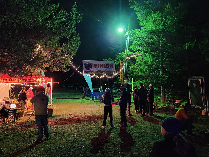
100K finish line
I slept very little Saturday night. Runners trickled in until 6 a.m., and Brad Bishop (volunteer coordinator and finish line announcer among many roles) read every name and number over the PA system. On the bright side, I did hear names I knew, and was glad for them. My friend Ivan became the 100K race's first 70 year old finisher at 3:50 a.m.
After breaking camp and packing my car, I said good-bye to people, and drove homewards, stopping at the American Lakes trailhead for one more trip to that beautiful alpine basin. This time I went all the way to Thunder Pass for the view into Rocky Mountain National Park.

American Lakes basin from Thunder Pass
Over the weekend, I spent 20 hours on trails, covered 100 kilometers distance, and climbed over 4,000 meters. A successful mountain training camp, for sure. I got signs that my back is healing, did some volunteering, hung out with my favorite runners, and met some fun folks for the first time. I don't know if I'll run this next year, but I'll be back to be a part of it.
-
sur PostGIS Development: PostGIS 3.4.0rc1
Publié: 5 August 2023, 4:00am CEST
The PostGIS Team is pleased to release PostGIS 3.4.0rc1! Best Served with PostgreSQL 16 Beta2 and GEOS 3.12.0.
This version requires PostgreSQL 12 or higher, GEOS 3.6 or higher, and Proj 6.1+. To take advantage of all features, GEOS 3.12+ is needed. To take advantage of all SFCGAL features, SFCGAL 1.4.1+ is needed.
3.4.0rc1This release is a release candidate of a major release, it includes bug fixes since PostGIS 3.3.4 and new features.
-
sur Sean Gillies: Laid off
Publié: 4 August 2023, 8:35pm CEST
My position evaporated on Monday, one of many layoffs at my job. This is a first for me. If you've got advice, I'm all ears. If you're a former coworker and looking for help finding a new job, hit me up. I'm good at reviewing resumes and enjoy telling hiring managers good things about good people.
I'm fortunate to be in a good position right now. My family is healthy, we are insured through Ruth's position at CSU, and have some savings. This is not the case for everyone who gets laid off, I know.
Am I going to let this derail my attempt to finish a 100 miler in September? No way. Looking for work will take time, and I'm picking up more family duties, but it looks like I'll also have more free time to spend on the trail this summer.
-
sur Jackie Ng: Announcing: MapGuide Maestro 6.0m12
Publié: 2 August 2023, 12:41am CEST
Next stop on the tour: A new release of MapGuide Maestro
This release includes the following notable changes.
Improved MapGuide Open Source 4.0 authoring supportThis release improves the MapGuide Open Source 4.0 authoring experience with support for the new label justification setting for basic stylization labels.

This setting is part of the new v4.0.0 Layer Definition XML schema, whose .xsd file is now also included with this release (so XML validation against this schema will work)
Fusion editor enhancements for mapguide-react-layout featuresThis release includes several enhancements to the Fusion Flexible Layout editor to support various features that can be taken advantage of when loaded into a mapguide-react-layout viewer. These new enhancements are accessible from the layout settings panel and require the latest release of mapguide-react-layout to leverage these new features.

The Manage Custom Projections button opens up a new dialog that lets you manage and pre-register custom proj4 definitions for your application. By pre-registering these definitions in the Flexible Layout document itself, you can avoid needing to perform a epsg.io lookup for any projections found in the viewer init process that is not EPSG:4326 or EPSG:3857
 The Manage Settings button opens up a different dialog that lets you managed the app settings in the Flexible Layout document. These are arbitrary key/value pairs that your mapguide-react-layout viewer will be initialized with and your viewer code can read such settings at runtime to control and drive whatever custom functionality you may have.
Other Changes- Improved layer editor UI responsiveness when layer points to a feature source with a really large schema
- Increased schema walk/describe timeout to handle really large schemas
- Fix: Connection error dialog buttons are no longer cut off
- Fix: Transactional package drag-and-drop loading works again
- Fix: Broken rest addin due to missing RestSharp dependency
- Fix: Fill/line pattern dropdowns in layer editor are working again
- Fix: MgTileSeeder will now accept bounding boxes outside the [-90, -180, 90, 180] lat/long domain by clamping any outside coordinates to be within this domain.
Download -
sur OSGeo.nl: Nieuw bestuur Stichting OSGeo.nl
Publié: 1 August 2023, 11:47pm CEST
Stichting OSGeo.nl heeft sinds juli 2023 een nieuw bestuur! Dit nieuwe bestuur kijkt onwijs uit om samen met jullie vol enthousiasme en plezier te zorgen dat we samen mensen nog meer bekend maken met het gebruik en de ontwikkeling van open source software voor geo-informatie. Als je benieuwd bent wat er allemaal besproken werd bij het debuut van dit nieuwe bestuur dan is de nota van deze laatste bestuursvergadering is te lezen op de wiki via: [https:] -
sur GeoSolutions: Free Webinar: GeoNode 4.1.0 release
Publié: 1 August 2023, 5:23pm CEST
You must be logged into the site to view this content.


-
sur A Message from Prashant Shukle on Behalf of the OGC Board of Directors
Publié: 31 July 2023, 6:46pm CEST par OGC Admin
The OGC Board of Directors of the Open Geospatial Consortium congratulate Dr. Nadine Alameh on her selection as the inaugural Executive Director of the Taylor Geospatial Institute.
As her final week with the Open Geospatial Consortium draws to a close, we know that we have greatly benefitted from her transformational leadership over the last 5 years and are committed to the ongoing process of modernization within the OGC.
OGC Members and Staff work on very comprehensive and high-impact activities in the areas of Defense and Intelligence, Climate and Disasters, Health, Smart Cities and Digital Twins, the Metaverse, and advanced technology domains including Space and Earth Observation or Cloud Native Geospatial.
As the board searches for a new Chief Executive Officer, the Board and Staff are committed to ensuring that our focus will be sharp, and our momentum will not slow. We will continue to develop geospatial standards and solve interoperability issues; and serve as the leading geospatial consortium by bringing individuals and organizations together from around the world to collaborate, innovate, and develop solutions to some of the world’s toughest data and technology issues.
The Board of the OGC has started to develop a transparent, objective, merit-based process for the next Chief Executive Officer of the Open Geospatial Consortium. Please check ogc.org for any updates.
I look forward to seeing you at our in-person meetings, webinars, standard working groups, domain working groups, and at various high-level fora and research & innovation initiatives.
Should you have any questions, please send your enquiries here.
Prashant Shukle, Board Chair
On behalf of the
Open Geospatial Consortium
The post A Message from Prashant Shukle on Behalf of the OGC Board of Directors appeared first on Open Geospatial Consortium.
-
sur Developers invited to the 2023 OGC API – Processes Virtual Code Sprint
Publié: 31 July 2023, 5:00pm CEST par Simon Chester
The Open Geospatial Consortium (OGC) invites developers to the 2023 OGC API – Processes Virtual Code Sprint to be held September 18-20, 2023, on Gitter. Registration for the code sprint is free and open to the public.

The Sprint will focus on refining the next version of the OGC API – Processes Standard and associated extensions.
The OGC API – Processes Standard supports the wrapping of computational tasks into executable processes that can be offered by a server through a Web API and be invoked by a client application. Typically, these processes combine raster, vector, coverage, and/or point cloud data with well-defined algorithms to produce new information.
Examples of computational processes that can be supported by implementations of OGC API – Processes include vector data analysis, imagery analysis, and various types of Artificial Intelligence (AI) enhanced analysis.
An OGC Sprint is a collaborative and inclusive event driven by innovative and rapid programming with minimal process and organization constraints to support the development of new applications and candidate standards.
During the virtual code sprint, there will be an opportunity for joint discussion with all participants on the goals and objectives of the event, as well as the final briefing of findings and opinions of the participants. However, the majority of the time will be spent in collaboration between participants in active coding. The virtual code sprint will run from 9:00am to 5:30pm US Eastern Time each day.
To learn more about how the family of OGC API Standards work together to provide modular “building blocks for location” that address both simple and the most complex use-cases, visit ogcapi.org.
Registration for the 2023 OGC API – Processes Virtual Code Sprint is here. The Sprint will take place in the ogc-developer/Sprints Gitter room from 9:00am to 5:30pm (US Eastern) each day from September 18-20, 2023.
To learn more about future and previous OGC code sprints, visit the OGC Code Sprints webpage or join the OGC-Events Discord Server.
The post Developers invited to the 2023 OGC API – Processes Virtual Code Sprint appeared first on Open Geospatial Consortium.
-
sur PostGIS Development: PostGIS 3.4.0beta2
Publié: 29 July 2023, 4:00am CEST
The PostGIS Team is pleased to release PostGIS 3.4.0beta2! Best Served with PostgreSQL 16 Beta2 and GEOS 3.12.0.
This version requires PostgreSQL 12 or higher, GEOS 3.6 or higher, and Proj 6.1+. To take advantage of all features, GEOS 3.12+ is needed. To take advantage of all SFCGAL features, SFCGAL 1.4.1+ is needed.
3.4.0beta2This release is a beta of a major release, it includes bug fixes since PostGIS 3.3.4 and new features.
-
sur OGC adopts CityGML 3.0 Part 2: GML Encoding as an official OGC Standard
Publié: 28 July 2023, 5:00pm CEST par Simon Chester
The Open Geospatial Consortium (OGC) is excited to announce that the OGC Membership have approved the OGC City Geography Markup Language (CityGML) Part 2: GML Encoding Standard for adoption as an official OGC Standard.
The CityGML 3.0 GML Encoding Standard presents the GML encoding of the concepts defined by the CityGML 3.0 Part 1: Conceptual Model (CM) Standard, which was approved as an OGC Standard in 2021. The GML encoding is compliant to OGC GML versions 3.2 and 3.3 (thus also ISO 19136). This encoding can be used to store and exchange 3D city models in the GML format as data sets or via web services.
Since its first publication by OGC in 2008, CityGML has been an open standard used for the storage and exchange of virtual 3D city models. CityGML allows the integration of urban geodata for use across a variety of applications, including urban and landscape planning; Urban Digital Twins for Smart Cities; the Metaverse; Building Information Modeling (BIM); mobile telecommunication; disaster management; 3D cadastre; tourism; vehicle & pedestrian navigation; autonomous driving and driving assistance; facility management; and energy, traffic, and environmental simulations.
CityGML defines a “City” in a broad fashion to comprise not just built structures, but also the land surface, vegetation, water bodies, city furniture, and more. Despite its name, CityGML is useful for large areas and small regions, not just cities, and can represent real-world terrain and 3D objects at different Levels Of Detail (LOD) simultaneously. CityGML enables the consistent representation of 3D urban objects across different Geographic Information Systems and users.
CityGML 3.0 is an evolution of the previous versions 1.0 and 2.0 of CityGML that further enables the cost-effective sustainable maintenance of 3D city models. While previous versions standardized a GML exchange format, CityGML 3.0 standardizes the underlying information model and can thus be implemented in a variety of technologies beyond GML. As a result, governments and companies can increase the Return On Investment (ROI) of their 3D city models by being able to put the same models into play across different technology platforms and application fields.
This Part 2 of the Standard defines how the concepts developed in Part 1 are realized using XML and GML technologies. The CityGML 3.0 GML encoding represents a full mapping of the Conceptual Model. The encoding is derived fully automatically from the UML model following the UML-to-GML encoding rules as defined by ISO 19136.
A collection of example data sets for the CityGML 3.0 GML Encoding is available from the OGC CityGML-3.0 Encodings Public GitHub Repository.
OGC Members interested in staying up to date on the progress of this standard, or contributing to its future development, are encouraged to join the CityGML Standards Working Group (SWG) via the OGC Portal. Non-OGC members who would like to know more about participating in this SWG are encouraged to contact the OGC Standards Program.
As with any OGC Standard, the open CityGML Part 2: GML Encoding Standard is free to download and implement. Interested parties can learn more about, view, and download the Standard from OGC’s CityGML Standard Page.
The post OGC adopts CityGML 3.0 Part 2: GML Encoding as an official OGC Standard appeared first on Open Geospatial Consortium.
-
sur PostGIS Development: PostGIS 3.3.4 Patch Release
Publié: 28 July 2023, 4:00am CEST
The PostGIS development team is pleased to announce bug fix release 3.3.4, mostly focused on Topology fixes.
-
sur Stefano Costa: Sono vegetariano da due anni
Publié: 27 July 2023, 11:07pm CEST
In questi giorni di fine luglio, due anni fa, ho deciso di smettere di mangiare carne e pesce e animali. Per un po’ di tempo, mi sono detto, ci provo. E sono passati due anni. Perché?
Non è stata una decisione improvvisa e penso che siano anni che mi porto dietro l’idea di non nutrirmi più di altri animali, ma l’ho sempre considerata molto difficile da attuare, molto faticosa da spiegare. E invece è stato piuttosto semplice.
Sono arrivato a questa decisione da due strade, il rispetto per gli animali e la convinzione che non esista un futuro per l’umanità carnivora.
Il rispetto per gli animali mi porta a rimanere inquieto sul consumo di prodotti di origine animale, in particolare latticini e uova, poiché la loro produzione su larga scala richiede necessariamente quegli allevamenti intensivi disumani da cui provengono gli animali destinati alla macellazione. Ho quindi grande rispetto per chi pratica una alimentazione vegana e non capisco perché la prima domanda che mi viene rivolta quando dico di essere vegetariano è se io non sia mica vegano, nemmeno fosse una malattia infettiva. Ho ridotto il consumo di latticini, soprattutto lo yogurt che ho sostituito con prodotti alternativi che sono in prevalenza a base di soia. La coltivazione di soia non distrugge le foreste amazzoniche, per inciso.
Le considerazioni planetarie sono le stesse che vengono ripetute da anni nell’ambito del discorso sulla crisi climatica globale. L’allevamento consuma una quantità di suolo enormemente superiore alla superficie richiesta per coltivare le piante in grado di fornire lo stesso apporto nutritivo. L’allevamento produce gas serra. Non cedo ai finti fondamentalismi eco-fascisti e credo che le popolazioni che praticano allevamento tradizionale debbano poter continuare a praticarlo. La stessa cosa non può essere detta per l’allevamento industriale tipico dei paesi occidentali. Queste sono convinzioni personali, che vorrei trovassero sponda in ambito politico.
Sono un archeologo, conosco abbastanza bene la storia della cultura materiale dell’umanità e credo che i cambiamenti culturali che continuamente avvengono siano ben più significativi di qualunque “tradizione” a cui si vuole rimanere aggrappati. La lista delle pratiche oggi ritenute incivili e inconcepibili che “abbiamo sempre fatto” è lunghissima, quindi non c’è nessun ostacolo concettuale ad aggiungerci anche il consumo di carne.
Ora sono un po’ più tranquillo quando mi siedo a tavola.
-
sur QGIS Blog: QGIS Contributor meeting at BIDS ‘23 Vienna
Publié: 26 July 2023, 7:18pm CEST
We are happy to announce that OSGeo kindly extended an invitation to have a QGIS contributor meeting joining the OSGeo Community Sprint 2023 during the Big Data from Space 2023 conference in Vienna.
The 26th QGIS Contributor Meeting will be held from Monday, November 6th to Thursday, 11th.
- Where: Austria Center Vienna [https:]]
- When: Mon 2023-??11-06 09:00 -?? Thu 2023-11-09 12:00
For more details and to sign up, please visit the corresponding OSGeo announcement page.
About QGIS contributor meetings
QGIS Contributors Meetings are volunteer-driven events where contributors to the QGIS project from around the world get together in a common space – usually a university campus. During these events, contributors to the QGIS project take the opportunity to plan their work, hold face-to-face discussions and present new improvements to the QGIS project that they have been working on. Everybody attending the event donates their time to the project for the days of the event. As a project that is built primarily through online collaboration, these meetings provide a crucial ingredient to the future development of the QGIS project. The event is planned largely as an ‘unconference’ with minimal structured programme planning. We do this to allow attendees the freedom to meet dynamically with those they encounter at the event. Those sessions that are planned are advertised on the event web page, and we try to enable remote participation through video conferencing software. Although our hosts are not funded and donate the working space to us, we show our appreciation by making one of our software release’s splash screens in honour of that host, which is a great way to gain exposure of your institution and country to the hundreds of thousands of users that make use of QGIS.
About OSGeo
The Open Source Geospatial Foundation (OSGeo) has a long tradition of organizing code sprints for developers of Free and Open Source GIS software.
Since 2009, the Open Source Geospatial Foundation (OSGeo) has been organizing a yearly Code Sprint of the “C Tribe” OSGeo projects, which has evolved into a full OSGeo Community Sprint and all “Tribes” are included/welcome. Leading developers of projects like GDAL, PostGIS,
MapServer, GeoServer, GRASS, QGIS, PDAL, pygeoapi and many more get together to discuss new ideas, hack, decide, tackle large geospatial problems and have fun.The OSGeo Community Sprint is open to all who wish to participate in one or more projects. There is always plenty to do – it’s not all about programming. Translation, documentation, feedback, discussions, testing – all this is also important for projects so everyone is cordially invited to attend the code sprint!
About BiDS
BiDS brings together key actors from industry, academia, EU entities and government to reveal user needs, exchange ideas and showcase the latest technical solutions and applications touching all aspects of space and big data technologies, providing a unique opportunity to discuss and present the most recent innovations and challenges encountered in the context of big data from space. The 2023 edition of BiDS will focus not only on technologies enabling insight and foresight inferable from big data from space. Together, we want to emphasize how breakthrough space data-driven technologies impact society’s grand challenges, such as climate change and the green transition.
The event, organized by the European Space Agency (ESA) together with the European Union Satellite Center (SatCen) and the Joint Research Center (JRC), will take place at the Austria center Vienna, and counts on the support of the partners FFG, Austria in Space and the Federal Ministry Republic of Austria.
-
sur Volker Mische: FOSS4G 2023
Publié: 22 July 2023, 11:50pm CEST
Finally, after missing one virtual and one in person global FOSS4G I had again the chance to attend a global in-person FOSS4G conference. Thanks Protocol Labs for sending me. This year it was in Prizren, Kosovo. I’m a bit late with that post, but that’s due to doing some hiking in Albania right after the conference.
The organization and venueWow. It’s been my favourite venue of all FOSS4Gs I’ve been to so far. The exhibition hall was a great place to hang out, combined with the excellent idea of a 24h bar. I’m not sure if it was used at all times, but definitely for more than 20h a day. Outside, there was plenty of space and tables to hang out, and very close by another set of tables that formed the “work area”. Which was another great place to hang out, with enough power sockets and shade for the hot days.
The main stage was an open air stage with enough seating for everyone. It was converted for the gala dinner to a stage with an excellent live band and the usual big round tables.
For me, the best part was that even the accommodation was on-site. The barracks of the former military basis, which now serve as student dorms, were our home for a week. Pretty spartan, but at a conference I don’t really spend much time in my room, I mostly need just some place to sleep.
Having everything, the talks, exhibition, social events and accommodations on-site makes it easy to maximize the time for socializing, which for me is the number one reason to attend a conference.
Everything was well organized, and it was great to see so many volunteers around.
The talksI haven’t really selected the talks I went to. I rather joined others where they were going, or listened to recommendations. Often, I just stayed in the rest of the slot to see what else is there. My favourite talks were:
- Smart Maps for the UN and All - keeping web maps open: For me, it was the first time I saw someone speaking at a FOSS4G about using IPFS that wasn’t me. It’s great to see that it gains traction for the offline use case, where it just makes a lot of sense. UN Smart Maps is part of the UN OpenGIS initiative, it features a wide range of things, even an AI chatbot called TRIDENT that transforms the text into Overpass API calls. Try TRIDENT it out yourself, when you open the developer console, you can see the resulting Overpass API calls.
- Offline web map server “UNVT Portable”: This talk got into more detail about using Raspberry Pis to have map data stored in IPFS for offline use. It’s very similar to what I envision, the only difference is that I’d also like to keep the storage in the browser. But I surely see a future, where those efforts are combined, to have a small easy server you can deploy, with in browser copies of subsets of the data to be able to work completely offline in the field. The original UNVT Portable repository doesn’t use IPFS, but Smart Maps Bazaar does, which seems to be its successor.
- B6, Diagonal’s open source geospatial analysis engine: A presentation of the B6 tool for geospatial analysis for urban planning. It has a beautiful interface. I really like the idea of doing things directly on the map in a notebook-style way, where you perform certain steps after each other.
- Elephant in the room: A talk about how many resources to computations take? Do we always need it? It’s very hard, often impossible, to find out how environmentally friendly some cloud services are. One of the conclusions was that cheaper providers likely use less power, hence are harming the environment less. I would like if there would be better ways (e.g. it misses things like economies of scale of large providers), but I agree that this might be the best metric we currently have. And I also hope there will be more economic pressure to save resources.
- There was a closing keynote from Kyoung-Soo Eom, who was talking about his long journey in open source GIS, but also his history with Kosovo, where he was also on a mission in 1999. Quite inspiring.
My talk about Collaborative mapping without internet connectivity was about a browser based offline-first prototype that uses IPFS to enable replication to other peers. The project is called Colleemap and is dual-licensed under the MIT and Apache 2.0 license. Although I tried the demo bazillion times before my talk, it sadly didn’t work during my talk. Though, trying it later with various people, I was able to get 4 peers connected once. I even saw it working on a Windows machine. So it really works cross-platform.
For the future I hope to work closer with the people from the UN OpenGIS initiative, it would be great to combine it with their Raspberry Pi based prototype.
Things I’ve learntThe Sentinel-2 satellite imagery is available from multiple sources, directly from Copernicus Open Access Hub or through cloud providers like AWS, Azure of Google Cloud. From the cloud providers you only get the level-2 data. They might use the original level-2 data or do their own atmospheric correction based on the level-1 data. Or even re-encode the data. So it’s hard to tell which kind of data you actually get.
As far as I know (please let me know if I’m wrong), there isn’t any mirror of the full level-1c data. You can only get it through the Copernicus Open Access Hub and there the older images are stored in the long term archive on tape, where it can take up to 24h for the data to be available for download (if it works).
Ideally, there would be a mirror of the full level-1c data (where the ESA would provide checksums of their files) and a level-2 version, where the exact process is openly published, so that you can verify how it was created. The problem is the storage cost. The current level-2 data is about 25 PiB, which leads to storage costs of over $500k USD a month if you would store it on AWS S3 Standard at the current pricing (I used the $0.021 per GB).
Final thoughtsIt was great to meet Gresa and Valmir from the local organizing committee before the FOSS4G in March at the OSGeo German language chapter conference FOSSGIS in Berlin. That made it easy for me to connect to the event right from the start. If there’s one thing future FOSS4Gs should adapt, it’s the cheap on-site (or close by) accommodation. I think that shared bathrooms is also much smoother to have, if you know that everyone in the accommodation is from the conference. We had something similar with the BaseCamp in Bonn during the FOSS4G 2016 and the international code spring in 2018 during the FOSSGIS conference, where the whole place was rented for the time of the events.
Though, of course, I also missed some of my longtime FOSS4G friends I hadn’t seen in a long time. I hope you’re all doing well and will meet again soon.
-
sur KAN T&IT Blog: Jornadas FOSS4G 2023 Kosovo
Publié: 21 July 2023, 11:00pm CEST
Querida comunidad, como saben, en junio estuvimos participando en las jornadas del FOSS4G 2023 en Kosovo. Allí presentamos nuestro conocimiento y experiencia en diferentes temas relacionados con las geosoluciones y el software de código abierto. Aquí está el temario que expusimos y que ahora compartimos con ustedes en nuestro blog.
Workshops
Automatización de Geoprocesamiento con QGIS y GRASS utilizando Airflow
Github – Repositorio del Workshop
El taller tuvo como objetivo implementar en Docker un conjunto de contenedores que permitan la operación de DAGs (flujos ETL) para la automatización de procesos. Se trabajaron los siguientes puntos:
Implementación de Airflow modificado para geoprocesamiento con QGIS y GRASS.
Configuración del entorno de desarrollo.
Montaje de ejemplo de flujo de datos de DAGs para cada caso.
Generación automática de errores y seguimiento de alertas.Implementación de un visor desarrollado con MapLibre y React en conjunto a GeoNode como Servidor de vector tiles
Github – Repositorio del Workshop
El taller abordó los pasos necesarios para personalizar GeoNode como un servidor Vector Tiles. Trabajamos los siguientes puntos:
Revisión del flujo de datos desde la producción hasta la publicación.
Despliegue de GeoNode en Docker Compose.
Adaptación de GeoNode como servidor Vector Tiles.
Armado de visor Maplibre.
Despliegue del visor utilizando Docker Compose.
Configuración de capas a mostrar.
Conexión visor MapLibre con GeoNode.


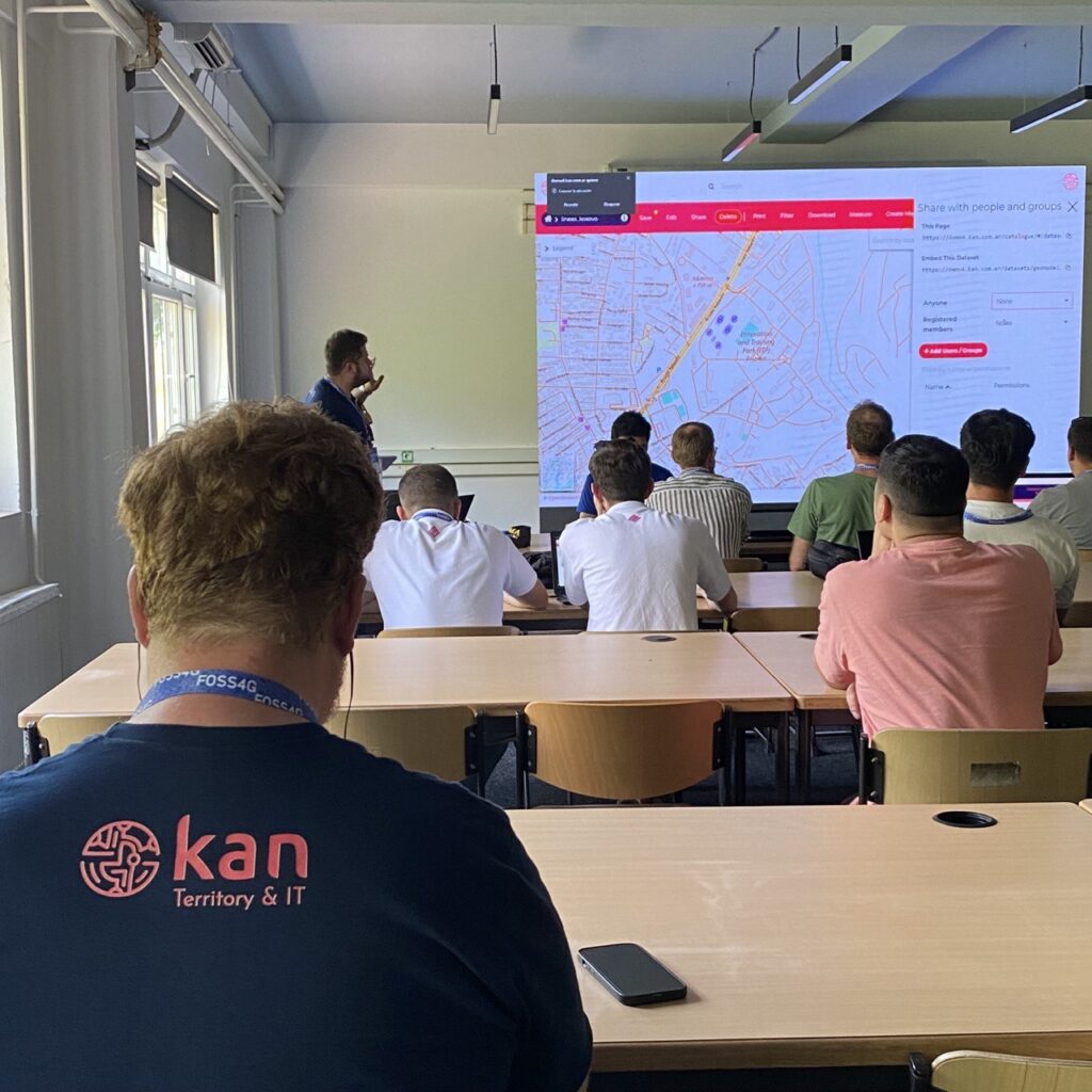
CharlasImplementación de Geoportales Estadísticos en América Latina y el Caribe
A partir de la implementación del Marco Geoespacial y Estadístico Global (GSGF) propuesto por la ONU e implementado en América Latina y el Caribe por la Comisión Económica para América Latina y el Caribe (CEPAL), se desarrollaron un conjunto de componentes tecnológicos específicos, tales como geoportal, gestor estadístico y API con posibilidad de consumir información de diferentes aplicaciones. Al mismo tiempo, se implementaron componentes ya existentes en la comunidad como Kobo Toolbox, GeoNode, Airflow, MapLibre, Nominatim y Metabase para la integración de la información desde la recolección en el territorio hasta la publicación de los datos. El proyecto se realizó inicialmente con un grupo de países: Argentina, Paraguay, Honduras, Guatemala, República Dominicana, Costa Rica y Ecuador.
[Caso de uso] Implementación Digital Twin City en MapLibre con la integración de diferentes fuentes de información
Caso de uso para la implementación de una plataforma que soporte datos que contribuyan a la publicación y gestión de Gemelos Digitales, basada en el uso de MapLibre como visor web y al mismo tiempo consumiendo información de diferentes fuentes geoespaciales, incluyendo Mesh, Raster, DEM y fuentes de datos casi en tiempo real como OneBusWay u OpenTripPlanner basadas en formatos GTFS, para la comparación y análisis de la información.
[Caso de uso] Automatización de Kobo Toolbox con GeoNode para la gestión de riesgos
A partir de la implementación de un conjunto de formularios en Kobo Toolbox se creó un flujo de información para la Comisión de Manejo de Incendios de la República Argentina para poder integrar desde campo los reportes de incendios (on line/off line) de manera sencilla y sus diferentes etapas de evolución. La automatización de la ingesta a un GeoNode como gestor de datos geoespaciales permite la integración con datos de previsión meteorológica, información casi en tiempo real, incidencias de incendios, detección de puntos calientes e índices predictivos de incendios.
La automatización e integración se realiza con la herramienta Airflow, que garantiza el seguimiento de los flujos de información, simplificando el proceso durante las incidencias.
Gobernanza de datos con OpenMetadata Integrando servicios OGC – CSW
La plataforma OpenMetadata facilita la creación, integración y administración de metadatos proporcionando una estructura unificada para describir y clasificar los datos, permitiendo gestionar su acceso y su publicación. Lo que compartimos aquí es la adaptación de una de las fuentes de datos a servicios OGC – CSW para que diferentes sistemas y aplicaciones puedan consumir los metadatos catalogados de forma transparente, facilitando la gestión y aprovechamiento de la información geoespacial.
Esperamos que les haya resultado útil toda esta información. No duden en consultarnos y dejarnos sus comentarios ¡queremos leerlos! Muchas gracias por su apoyo.
-
sur GeoServer Team: GeoServer 2.23.2 Release
Publié: 21 July 2023, 4:00am CEST
GeoServer 2.23.2 release is now available with downloads ( bin, war, windows) , along with docs and extensions.
This is a stable release of GeoServer recommended production use. GeoServer is made in conjunction with GeoTools 29.2, and GeoWebCache 1.23.1.
Thanks to Ian Turton for making this release.
New Security > URL Checks pageThis release adds a new Check URL facility under the Security menu. This allows administrators to manage OGC Service use of external resources.
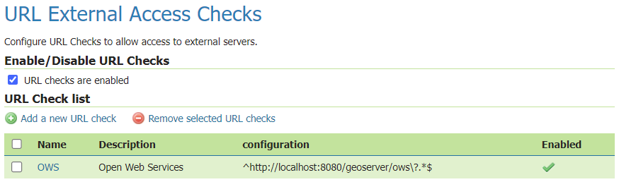
For information and examples on how to use the URL Check page, visit user guide documentation.
Release notesNew Feature:
- GEOS-10949 Control remote resources accessed by GeoServer
- GEOS-10992 Make GWC UI for disk quota expose HSQLDB, remove H2, automatically update existing installations
Improvement:
- GEOS-10973 DWITHIN delegation to mongoDB
- GEOS-11048 Improve URL checking
Bug:
- GEOS-10874 Log4J: Windows binary zip release file with log4j-1.2.14.jar
- GEOS-10875 Disk Quota JDBC password shown in plaintext
- GEOS-10901 GetCapabilities lists the same style multiple times when used as both a default and alternate style
- GEOS-10903 WMS filtering with Filter 2.0 fails
- GEOS-10906 Authentication not sent if connection pooling activated
- GEOS-10932 csw-iso: should only add ‘xsi:nil = false’ attribute
- GEOS-10936 YSLD and OGC API modules are incompatible
- GEOS-10964 Support virtual services for OSEO/STAC
- GEOS-10980 CSS extension lacks ASM JARs as of 2.23.0, stops rendering layer when style references a file
- GEOS-10981 Slow CSW GetRecords requests with JDBC Configuration
- GEOS-10982 Wicket bug when trying to add new Vector Attribute (build 2.23 on Tomcat/Windows)
- GEOS-10993 Disabled resources can cause incorrect CSW GetRecords response
- GEOS-10994 OOM due to too many dimensions when range requested
- GEOS-10997 GetCapabilities broken when using Data Security Layer groups
- GEOS-10998 LayerGroupContainmentCache is being rebuilt on each ApplicationEvent
- GEOS-11015 geopackage wfs output builds up tmp files over time
- GEOS-11024 metadata: add datetime field type to feature catalog
- GEOS-11025 projection parameter takes no effect on MongoDB Schemaless features WFS requests
- GEOS-11026 ClassNotFoundException: org.h2.driver on shutdown
- GEOS-11033 WCS DescribeCoverage ReferencedEnvelope with null crs
- GEOS-11035 Enabling OSEO from Workspace Edit Page Results in an NPE
- GEOS-11036 The OAuth2/OIDC security filters do not work as expected anymore after the spring-security-core depencency update to 5.7.8
- GEOS-11046 Styles using the custom mark
shape://dotdon’t draw any fill - GEOS-11054 NullPointerException creating layer with REST, along with attribute list
- GEOS-11055 Multiple layers against the same ES document type conflict with each other
- GEOS-11060 charts and mssql extension zips are missing the extension
- GEOS-11069 Layer configuration page doesn’t work for broken SQL views
Task:
- GEOS-10987 Bump xalan:xalan and xalan:serializer from 2.7.2 to 2.7.3
- GEOS-10988 Update spring.version from 5.3.26 to 5.3.27 and spring-integration.version from 5.5.17 to 5.5.18
- GEOS-11008 Update sqlite-jdbc from 3.34.0 to 3.41.2.2
- GEOS-11010 Upgrade guava from 30.1 to 32.0.0
- GEOS-11011 Upgrade postgresql from 42.4.3 to 42.6.0
- GEOS-11012 Upgrade commons-collections4 from 4.2 to 4.4
- GEOS-11018 Upgrade commons-lang3 from 3.8.1 to 3.12.0
- GEOS-11020 Add test scope to mockito-core dependency
- GEOS-11062 Upgrade [httpclient] from 4.5.13 to 4.5.14
- GEOS-11063 Upgrade [httpcore] from 4.4.10 to 4.4.16
- GEOS-11067 Upgrade wiremock to 2.35.0
For the complete list see 2.23.2 release notes.
About GeoServer 2.23 SeriesAdditional information on GeoServer 2.23 series:
-
sur GeoTools Team: GeoTools 29.2 Released
Publié: 20 July 2023, 2:48pm CEST
The GeoTools team are pleased to announce the release of the latest stable version of GeoTools 29.2 geotools-29.2-bin.zip geotools-29.2-doc.zip geotools-29.2-userguide.zip geotools-29.2-project.zip This release is also available from the OSGeo Maven Repository and is made in conjunction with GeoServer -
sur Jackie Ng: Announcing: mapguide-react-layout 0.14.9
Publié: 19 July 2023, 2:50pm CEST
Our journey needed to make a temporary detour, with another release of mapguide-react-layout.
This release has the following notable changes
Legend layer and group customization supportThis release provides a new viewer init option to allow layer and group elements of the Legend component to be augmented with additional HTML content. For example, we can use this to add a download link for specific layers (how to actually implement the download link is an exercise left to you the reader)
See this comment for an example of how to customize the layer and group elements.Reduced excessive re-renderingIn the process of implementing the above feature, we discovered that some components (the Legend component in particular) did a lot of pointless re-rendering which contributes to sluggishness in viewer performance.
For this release, great efforts were made to ensure that component re-rendering is the result of legitimate changes to component state and not from pointless re-rendering from bogus shallow state "changes"
Removed IE-specific polyfills and workaroundsInternet Explorer ceased to be a supported browser by Microsoft for some time now. This release formally removes our various IE-specific workarounds and polyfills that were only there to support this ancient browser.
Other changes- The urlPropsIgnore setting is now considered when the viewer updates the URL state
- The viewer bundle patches OpenLayers to log a console warning and abort rendering when attempting to render a map overlay image with a width/height/scale/dpi of 0
- Fixed an issue where no map images are rendered if the browser zoom is below 100%
Download -
sur Ian Turton's Blog: How much fun was FOSS4g 2023?
Publié: 18 July 2023, 4:00am CEST
Review of FOSS4G 2023 IntroductionFOSS4G 2023 was held in Prizren, Kosovo and there were 800+ attendees from 120+ countries. This was a great attendance despite Kosovo not being the easiest place to get to, especially if you were me. I had booked flights to and from Belgrade, Serbia because they were a relatively good times for me (I am missing being only 1 hour from a London airport). It looked like an easy 4 hour drive from the airport to Prizren. Then about a fortnight before the conference Kosovo closed it border to Serbian registered cars! A subsequent check all showed that most of the hire companies wouldn’t let you drive one of their cars over a border (and apparently despite the Serbian Government’s claims they considered Kosovo a separate country). So I fell back on the 9 hour overnight bus trip, which wasn’t as bad as it could have been but did mean I started the conference already somewhat sleep deprived.
Sort of Historical Side NoteWhen I was at school learning Geography all of this area was called Yugoslavia and it was behind an “iron curtain” so we knew little about it and cared even less (it was not on the exam). In history it was covered by the break up of the Ottoman Empire and the meddling of Bismarck as an “honest broker” at the 1878 Congress of Berlin (as I recall he rigged the Balkans in such a way as to start World War I, but history O-Level was a long time ago). So you can already see that there is a long a complex history and geography in the region. It became more complex in the 1990s when Yugoslavia broke up in a series of bloody conflicts, which I remember from the evening news. Kosovo only really came to my attention in 2008 when I was walking through New York with James Macgill and his kids and we saw a large group of cars flying large red flags with double headed eagles on them (and the one thing I retained from my history lessons is the ability to spot a double headed eagle at 200 metres). These were Kosovans celebrating the declaration of independence being proclaimed.

So squabbling about car number plates was pretty peaceful really. Fortunately, for us most of KFOR (the UN/Nato peace keeping force) had gone home, except for some in the Northern predominately Serb areas where they were out keeping the piece over disputed elections for city mayors. This meant we could use their old base as a conference venue, which was great except for the lack of lifts.
Cool talksThis is a list of talks I found particularly interesting or fun and that stuck in my mind long enough to remember for this post. There were lots of great talks that I either failed to see because the room was too full or was too hot for my brain to have taken in the details, so I’m looking forward to the videos coming out so I can refresh my memory later.
- Neiene Boeijen Let’s put it on the map!
- Interesting discussion on why graphic designers shouldn’t make maps and geographers shouldn’t design user interfaces
- Benjamin Trigona-Harany Aircraft trajectory analysis using
PostGIS
- Explains how PostGIS handles trajectories which are really just a
LinestringwithMZvalues on the points whereMincreases along the line - We can create a foreign table based on a foreign “server” that converts to a REST API call in the background this allows real time mapping filtered by the bounds of the map and any other filters the API can handle.
- Explains how PostGIS handles trajectories which are really just a
- Jody Garnett and Andrea Aime GeoServer used in fun and interesting
ways & State of
GeoServer
- As usual Andrea and Jody were presenting way too many talks including this useful review of what GeoServer is capable of in production and a review of new features in GeoServer for this year.
- Iván Sánchez Ortega Gleo
- I was going to say this is a new WebGL mapping library, but apparently Iván has been going on about this
for 8+ years now. Any way there is lots of object orientated style javascript code in there so you can
extend your semi-transparent markers with bouncing. I don’t think it’s quite cool enough for me to start
learning JavaScript or WebGL but the demo with 10,000 randomly coloured bouncing map markers is fun in a
<blink>sort of way.
- I was going to say this is a new WebGL mapping library, but apparently Iván has been going on about this
for 8+ years now. Any way there is lots of object orientated style javascript code in there so you can
extend your semi-transparent markers with bouncing. I don’t think it’s quite cool enough for me to start
learning JavaScript or WebGL but the demo with 10,000 randomly coloured bouncing map markers is fun in a
- Sanghee Shin Let’s defense my country using FOSS4G!
- Discussed how South Korea is modernising its military mapping with GeoServer, PostGIS, Cesium and OpenLayers, which makes me feel better about knowing North Korea is using GeoServer and PostGIS too.
- Andrea Aime Processing and publishing Maritime AIS data with GeoServer and Databricks in
Azure
- Andrea standing in for Nuno discussed how to handle 1.5 Billion records in GeoServer. Looking at the AIS ship location data over 7 years at second intervals (I think) and how you could get GeoServer to display the relevant data in a fast way.
- Logan Williams Investigating war crimes, animal trafficking, and more with open source geospatial
data
- Logan is a Bellingcat reporter who uses open source tools to look at open source data to help confirm stories. For example he described how they looked at tracking a GRAD missile launcher from Russia to Ukraine before Malaysian Airliner was shoot down. This included spotting scuffs on the road and distinctive power lines in posted dash camera footage of the convoy.
- What ever you do don’t play GeoGuesser against these guys as they are going to be very good.
- Neiene Boeijen Let’s put it on the map!
-
sur PostGIS Development: PostGIS 3.4.0beta1
Publié: 14 July 2023, 4:00am CEST
The PostGIS Team is pleased to release PostGIS 3.4.0beta1! Best Served with PostgreSQL 16 Beta2 and GEOS 3.12.0.
This version requires PostgreSQL 12 or higher, GEOS 3.6 or higher, and Proj 6.1+. To take advantage of all features, GEOS 3.12+ is needed. To take advantage of all SFCGAL features, SFCGAL 1.4.1+ is needed.
3.4.0beta1This release is a beta of a major release, it includes bug fixes since PostGIS 3.3.3 and new features.
-
sur GeoTools Team: Construction Ahead: Refactoring org.opengis to org.geotools.api
Publié: 11 July 2023, 10:51pm CEST
In the next release of GeoTools 30.0 there are some breaking API changes to look forward to:org.opengis package is renamed to org.geotools.api packageThis release will include update instructions, and a migration script, to fix your code.This is a breaking change, the formal change control proposal is here.Why is this changingThe GeoAPI Implementation Specification is a Java standard (Interfaces -
sur gvSIG Team: Geoportal del Instituto Nacional de Estadística de Uruguay
Publié: 11 July 2023, 9:29am CEST

El INE de Uruguay también está utilizando gvSIG Online para publicar una serie de información estadística. La capacidad para interpretar la información estadística aumenta significativamente cuando lo hacemos de un modo espacial.
En el Geoportal del INE podemos acceder, por ejemplo, a información como la evolución histórica de la población por departamentos desde 1963 hasta 2011, año del último censo. Por cierto, este año se inicia la actualización del censo… para lo que también tendrá una especial importancia el proyecto realizado con la Suite gvSIG para disponer de un Sistema Único de Direcciones.
Mediante el geoportal disponible podemos consultar el censo de población, el de hogares y el de viviendas por departamentos, secciones, segmentos, zonas o localidades. Ver la representación cartográfica de indicadores de actividad inmobiliaria, como las altas de compraventas por tipo de propiedad por departamento o precios de alquiler en Montevideo. También hay accesible información como la tasa de actividad, empleo y desempleo, así como capas complementarias con información de unidades geoestadísticas, infraestructuras y servicios.
Enlace: Geoportal INE
-
sur gvSIG Team: Optimizando el trabajo con datos en gvSIG Desktop: Tutorial para pasar de shapefile a base de datos H2Spatial.
Publié: 10 July 2023, 9:37am CEST

Si queréis optimizar vuestro trabajo a la hora de trabajar con información geográfica… no os perdáis este vídeo, sobretodo si manejáis capas de información grandes, con cientos de miles o millones de registros, lo que siempre da problemas de velocidad a la hora de hacer zooms, desplazamientos, etc.
Lo que os vamos a mostrar es cómo cambia de manera exponencial la velocidad de trabajo de tener nuestros datos en un formato como el shapefile a hacerlo con una base de datos espacial. H2 es una base de datos ligera, muy fácil de usar y que en nuestro caso va directamente incluida en gvSIG Desktop, por lo que no requiere ninguna instalación. Se basa en ficheros, por lo que distribuir una base de datos de H2 es tan sencillo como compartir un determinado fichero.
En el ejemplo que se muestra en el vídeo vamos a trabajar con una capa del denominado SIGPAC (una especie de Catastro agrícola) de la provincia de Valencia y que contiene aproximadamente 2 millones de registros.
Hemos decidido no cortar el vídeo para que veáis que lo único que demora es el paso inicial de exportar el shapefile a la base de datos, por lo que podéis ver hasta el minuto 2:20 y luego pasar al minuto 17, donde ya tenemos la misma información en ambos formatos y se realiza la comparativa en sí. Vuestros problemas para manejar volúmenes de datos grandes, sin requerir instalar nada adicional a vuestro SIG de escritorio… ya se han resuelto.
-
sur Paul Ramsey: MapScaping Podcast: Pg_EventServ
Publié: 8 July 2023, 4:00am CEST
Last month I got to record a couple podcast episodes with the MapScaping Podcast’s Daniel O’Donohue. One of them was on the benefits and many pitfalls of putting rasters into a relational database, and the other was about real-time events and pushing data change information out to web clients!
TL;DR: geospatial data tends to be more “visible” to end user clients, so communicating change to multiple clients in real time can be useful for “common operating” situations.
I also recorded a presentation about pg_eventserv for PostGIS Day 2022.
-
sur gvSIG Team: Working with Enumerations in gvSIG Online (and gvSIG Mapps)
Publié: 7 July 2023, 9:21am CEST

Among the many tools available to gvSIG Online users, there are those related to enumerations. These types of functionalities are extremely useful for data maintenance, as they allow us to define the possible values for a field. They become even more useful when using gvSIG Mapps integrated with gvSIG Online, as when capturing or updating information using the mobile application, these fields will display dropdown menus for easily selecting the corresponding value for each recorded element.
Enumeration lists can be added, modified, or deleted from the administration area of gvSIG Online. We can create a list from scratch or instruct gvSIG Online to automatically generate it based on the unique values available in that field. Interesting, right?
Once an enumeration is created, we can also assign it to other fields in other layers. Even more interesting, isn’t it?
When editing a published layer in a project, these fields will display a dropdown menu with the elements that make up the list, and one of them can be selected to assign it as an attribute of a map element, if it is of type “enumeration,” or multiple elements if it is of type “multiple enumeration.”
And, as we mentioned earlier, in gvSIG Mapps, we would automatically have our dropdown menus ready to facilitate data collection in the field.


-
sur OGC Compliance Certification Available for v1.0 of the OGC API – Processes Standard
Publié: 6 July 2023, 5:00pm CEST par Simon Chester
The Open Geospatial Consortium (OGC) is excited to announce that the Executable Test Suite (ETS) for version 1.0 of the OGC API – Processes – Part 1: Core Standard has been approved by the OGC Membership. Products that implement the Standard and pass the tests in the ETS can now be certified as OGC Compliant.
The OGC API – Processes Standard supports the wrapping of computational tasks into executable processes that can be offered by a server through a Web API and be invoked by a client application. Typically, these processes combine raster, vector, coverage, and/or point cloud data with well-defined algorithms to produce new information. Examples of computational processes that can be supported by implementations of this Standard include vector data analysis, imagery analysis, and various types of Artificial Intelligence (AI) enhanced analysis. To learn more about how the family of OGC API Standards work together to provide modular “building blocks for location” that address both simple and the most complex use-cases, visit ogcapi.org.
Implementers are invited to validate their products using the new test suite, which is available on the OGC validator tool. Testing involves submitting the endpoint of an OGC API – Processes implementation to be assessed. The validator tool sends the appropriate requests to the endpoint of the implementation and then evaluates the responses. These tests typically take only 5-10 minutes to complete. Once a product has passed the tests, the implementer can submit an application to OGC for use of the OGC Compliant trademark on their product.
To support developers with implementation of the standard, GeoLabs ZOO-Project 2.0 and Ecere GNOSIS Map Server 1.0 have been designated as reference implementations of the standard after the software products successfully passed the compliance tests.
The OGC Compliance Program offers a certification process that ensures organizations’ solutions are compliant with OGC Standards. It is a universal credential that allows agencies, industry, and academia to better integrate their solutions. OGC compliance provides confidence that a product will seamlessly integrate with other compliant solutions regardless of the vendor that created them.
More information about the OGC compliance process is available at ogc.org/compliance. Implementers of version 1.0 of the OGC API – Processes – Part 1: Core Standard – or other OGC Standards – are welcomed to validate their products using the OGC validator tool.
The post OGC Compliance Certification Available for v1.0 of the OGC API – Processes Standard appeared first on Open Geospatial Consortium.
-
sur gvSIG Team: Trabajar con enumeraciones en gvSIG Online (y gvSIG Mapps)
Publié: 6 July 2023, 9:55am CEST
Entre las muchas herramientas que los usuarios de gvSIG Online tienen disponibles se encuentran las relacionadas con enumeraciones. Este tipo de funcionalidades son extremadamente útiles para el mantenimiento de los datos, ya que nos permiten definir los valores posibles de un campo. Doblemente útil si utilizamos gvSIG Mapps integrado con gvSIG Online, ya que a la hora de capturar o actualizar información con la aplicación móvil, en esos campos se nos mostrarán desplegables para elegir fácilmente el valor que corresponde a cada elemento relevado.
Los listados de enumeraciones se pueden añadir, modificar o eliminar desde el área de administración de gvSIG Online. Podemos crear un listado desde cero o bien decirle a gvSIG Online que lo genere automáticamente a partir de los valores únicos disponibles en ese campo. ¿Interesante, verdad?.
Una vez creada una enumeración también podemos asignársela a otros campos de otras capas. ¿Más interesante aún, no?
Cuando se inicie la edición de una capa publicada en un proyecto, en estos campos se desplegarán el listado con los elementos que conforman el listado y se podrá seleccionar uno de ellos para asignarlo como atributo de un elemento del mapa,si es del tipo «enumeración», o varios si es de tipo «enumeración múltiple».
Y, como ya hemos comentado, en gvSIG Mapps tendríamos automáticamente nuestros desplegables listos para facilitar la toma de datos en campo. -
sur Geomatic Blog: Retiring geomaticblog.net
Publié: 6 July 2023, 4:00am CEST

Vicente, Pedro-Juan, and me started this blog in 2006. Back then blogs were the best way to create content and share knowledge. It was the times of RSS, Google Reader, social bookmarking through
del.icio.us, and pictures onFlickr. Very different from these days of micro-blogging, quick videos, influencers moving from one platform to another chasing their viewers' attention and money, newsletters under paywalls, etc.We stayed for a few months in a self-hosted Drupal CMS but maintaining it was a pain, so we moved to a managed Wordpress where we lived most of the time. Wordpress offered an excellent balance to get us writing without much hassle, keeping our domain, and very infrequent ads. Finally, last year I migrated the content to Hugo, a static generator, to save some costs, but the decline in writing started in 2018, so it is OK to close this project formally.
I will keep the blog code and content on a GitHub repository at [https:]] where we have posts in Markdown since 2007, and everything is hopefully for ever available in the web archive at [https:]] . I will probably copy my posts to my website.
Needless to say that we are forever grateful to those that encouraged us to write here. I had a lot of fun maintaining the website and writing content for everyone else. We are easy to find on the Internet, so please contact us anytime!
Have fun!
-
sur gvSIG Team: Curso – Concurso Geoalfabetización mediante la utilización de Tecnologías de la Información Geográfica
Publié: 5 July 2023, 8:19pm CEST
Compartimos información sobre la nueva edición del Curso-Concurso de gvSIG Batoví
¡Vamos por el sexto año!
El Curso – Concurso Geoalfabetización mediante la utilización de TIGs se desarrollará entre el 5 de julio y el 8 de diciembre. Este año la iniciativa fue seleccionada por el Programa de Asistencia Técnica 2023 del Instituto Panamericano de Geografía e Historia, que prevé extender la experiencia desarrollada en Uruguay a otros países de la región: Chile y Colombia.
La iniciativa consta de 2 partes: primero: un curso denominado Tecnologías de la Información Geográfica y gvSIG Batoví dirigido a docentes de enseñanza media de Geografía y áreas relacionadas con el conocimiento geográfico, ambiental y social. La capacitación se desarrollará del 31 de julio al 18 de agosto en modalidad b-learning (plataforma + taller por videoconferencia).
Se entregará una certificación avalada por las instituciones organizadoras del curso, en la cual se reconocerá la participación satisfactoria de los cursillistas en la capacitación brindada (30 horas) y en…
View original post 223 more words


-
sur A recap of the 126th OGC Member Meeting, Huntsville, AL, USA
Publié: 5 July 2023, 6:39pm CEST par Simon Chester
From June 5-9, almost 200 geospatial innovators, influencers, and leaders from across the globe attended OGC’s 126th Member Meeting – with 100 more attending virtually. Hosted by GEOHuntsville at the beautiful Huntsville Botanical Garden in Alabama, USA, meeting attendees spent the week discussing the latest geospatial innovations and hearing how geospatial is transforming organizations and industries across the globe.
The meeting was additionally sponsored by Hexagon, OpenSensorHub (Botts Innovative Research and GeoRobotix), Ethar, Womble Bond Dickinson, and Compass-HSV.
The week saw the usual abundance of Standards Working Group (SWG) and Domain Working Group (DWG) meetings, networking & social events (including a fantastic Sunday pre-meeting gathering at the Signals Museum, hosted by Ethar), two award presentations – a Lifetime Achievement Award as well as the new Community Impact Award – and several special sessions, including a Space Standards ad hoc, an Open Science Summit, a Portrayal Workshop, a Connected Systems track, a Defense and Intelligence Track, and a Climate Workshop.
The full agenda for the 126th OGC Member Meeting is available here. Read on for an overview of the best bits, below.
 OGC CEO, Dr. Nadine Alameh (L), OGC CSO, Scott Simmons (M), and Stan Tillman from meeting sponsor, Hexagon.
Opening Session
OGC CEO, Dr. Nadine Alameh (L), OGC CSO, Scott Simmons (M), and Stan Tillman from meeting sponsor, Hexagon.
Opening Session
Opening the meetings on Monday morning was David Lucas, the Executive Director of host GEOHuntsville, who welcomed attendees and provided event context. This was followed by a welcome from the City of Huntsville Mayor, Tommy Battle.
Next, we heard from Stan Tillman, of meeting sponsor Hexagon, who provided information on the company with specific information regarding Hexagon Digital Reality capabilities. Dr. Chris Tucker, representing additional meeting sponsors OpenSensorHub participants Botts Innovative Research and GeoRobotix, then highlighted the upcoming session on Tuesday for Connected Systems.
OGC CEO Dr. Nadine Alameh then provided a CEO Welcome and described the value of recent organizational changes in OGC. Prashant Shukle, Chair of the OGC Board of Directors then gave a greeting from the Board and highlighted a commitment by the Board to more actively participate in OGC activities.
 OGC CEO, Dr. Nadine Alameh (L), with Patty Mims, Director of Global National Government, Esri
Nadine’s regular fireside chat followed, this time with Patty Mims, Director of Global National Government, Esri. As has become the trend for these chats, they discussed the motivation for joining the geospatial industry as well as provided advice for others to join and succeed in the community.
Trevor Taylor, Senior Director, Member Success and Development of OGC, welcomed new members and refreshed attendees on the new OGC membership model that’s now in place for new members.
I, Scott Simmons, Chief Standards Officer of OGC, then wrapped up the session by providing some logistics information for the week and describing the process to be followed in the coming weeks-to-months to roll out of the new Technical Committee Policies and Procedures. I also described the new tools in place for submitting presentation requests and special sessions for meetings.
Special SessionsThe Space Standards ad hoc continued the discussion from the 125th Member Meeting concerning where OGC should work in Space Standards, which identified a number of topical areas for Standardization as well as existing Standards covering some portions of those areas. Participants at this session identified areas of focus and proposed a new Domain Working Group (DWG) that will begin the chartering process in the coming weeks. OGC Members can access the presentations and a recording on this page in the OGC Portal.
The Open Science Summit focused on a proposal for a new OGC Pilot project for an Open Science Persistent Demonstrator. NASA, Google, and the European Space Agency (ESA) each presented information on their own platforms. The Summit then followed with an open discussion on which other platforms might exist and what should be included. OGC Members can access the presentations and a recording on this page in the OGC Portal.
 Marge Cole, Director, Collaborative Solutions and Innovation Programs, OGC, speaking at the Open Science Summit
The Portrayal Workshop: OGC has been modernizing its Standards for the portrayal of geospatial data. Numerous other communities have dependencies on the OGC Standards portfolio and need to understand the applicability of these newer Standards and how they replace the functionality of legacy Standards. The Portrayal Workshop was organized jointly with the International Cartographic Association (ICA) and was run to develop an OGC Technical Paper for “Standards supporting cartographic best practices.” OGC Members can access the presentations and a recording on this page in the OGC Portal.
The Connected Systems track: OGC has chartered new working groups to update and create a RESTful implementation of sensor-related Standards. The Autonomy, Sensors, Things, Robots, and Observations (ASTRO) Domain Working Group (DWG) investigates requirements and standardization targets and the Connected Systems Standards Working Group (SWG) is building the new Standards. These groups held a full-afternoon track to describe the intent of the Connected Systems API, the relationship of the work to other OGC APIs and the Sensor Web Enablement (SWE) Standards, and to demonstrate how the new Standards work in practice. OGC Members can access the presentations and a recording on this page in the OGC Portal, as well as the Demonstration here.
The Defense and Intelligence Track: The Defense and Intelligence DWG takes a broad look at the use of Standards in defense/intelligence operations as well as the requirements for interoperability that can be solved, in part, by Standards. The DWG held a full-afternoon track to explore the fundamental concepts and thus bring participants to a baseline of understanding. The session also explored where OGC members could contribute to new Standards in imagery & motion imagery as well as Space. OGC Members can access the presentations and a recording on this page in the OGC Portal.
The Climate Workshop: OGC’s Climate Resilience DWG organized a Climate Workshop for Friday where the DWG defined the nature of its mission for resilience as the “ability of a system to compensate for impacts.” The session highlighted numerous initiatives underway in OGC and other organizations, framing them in terms of opportunities for impact. The workshop also expressed a proposed timeline for the next OGC Climate Resilience Pilot. OGC Members can access the presentations and a recording on this page in the OGC Portal.
Today’s Innovation/Tomorrow’s Technology and Future DirectionsThe popular Today’s Innovation/Tomorrow’s Technology and Future Directions session focused on ongoing OGC research and deployment of the nascent OGC Rainbow (borne from the OGC Definitions Server), which represents the state-of-the-art in enabling semantic interoperability.
OGC Rainbow is a web-accessible source of information about things (“Concepts”) that the OGC defines or that communities ask the OGC to host on their behalf. OGC Rainbow comprises several registries linked to common access for both human- and machine-readable representation of the data.
The OGC Definitions Server has long provided Coordinate Reference System (CRS) definitions, terminology definitions used in OGC Standards, and code lists for various domains of interest. As the capability of the OGC Rainbow increases, OGC will be registering requirements from Standards, representation of the OGC Building Blocks, and linkages to other authoritative registries. OGC Rainbow will improve consistency in the geospatial standards community and allow for expedited development of new capabilities.
Dr. Ingo Simonis and Dr. Rob Atkinson of the OGC COSI Program explained the capabilities and use cases of the OGC Rainbow and moderated open discussion amongst participants regarding the use of OGC Rainbow. OGC Members can access the presentations and a recording on this page in the OGC Portal. Stay tuned to the OGC Blog for more on the OGC Rainbow soon.
Dinner & AwardsThe always wonderful Executive Dinner was held on Wednesday night at the U.S. Space & Rocket Center – Davidson Center for Space Exploration, where attendees had the unforgettable experience of dining under an actual Saturn V rocket – one of only three in the world!
 Attendees of the Executive Dinner had the unforgettable experience of dining under an actual Saturn V Rocket
At the dinner, two awards were presented: Dr. Jeff de La Beaujardiere received the OGC Lifetime Achievement Award; and Natural Resources Canada received the inaugural OGC Community Impact Award.
Dr. Jeff de La Beaujardiere was selected for the Lifetime Achievement award due to his long standing leadership, commitment, and support for the advancement and uptake of standards used for the dissemination of Earth Science information. In the OGC community, Jeff is best known as the Editor of the OGC Web Map Service (WMS) Specification: a joint OGC/ISO Standard that now supports access to millions of datasets worldwide. OGC WMS was the first in the OGC Web Services suite of Standards and is the most downloaded Standard from OGC. But most importantly, the OGC WMS Standard truly revolutionized how geospatial data is shared and accessed over the web. Jeff was also a major contributor to other OGC Standards, including the OGC Web Services Architecture, the OGC Web Map Context, OGC Web Terrain Service, and OGC Web Services Common.
The new OGC Community Impact award highlights the importance of collaboration, volunteering time and energy, advancing technologies and standards, raising awareness, and helping solve critical issues across the geospatial community. Natural Resources Canada exemplifies all of these qualities through their championing of innovation and standards. They consistently go above and beyond as both an OGC Member, and as a member of the wider geospatial community.
My well-deserved congratulations go out to both recipients!
 Ryan Ahola (R) accepts the inaugural OGC Community Impact Award, on behalf of Natural Resources Canada, from OGC CEO Dr. Nadine Alameh (L)
Important Things and the Closing Plenary
Ryan Ahola (R) accepts the inaugural OGC Community Impact Award, on behalf of Natural Resources Canada, from OGC CEO Dr. Nadine Alameh (L)
Important Things and the Closing Plenary
Wrapping up the week, I opened the Important Things session with a rapid, 15-minute summary of the entire meeting week that included slides and content from a large number of Working Group sessions. OGC Members can access the presentations and a recording on this page in the OGC Portal.
The Important Things session then featured a discussion on how much OGC SWGs should accommodate developer interests and existing applications vs. optimizing their Standards work to meet the Standard requirements. OGC Members then discussed the issue and provided numerous examples of the conflict in current work. OGC Members can read the notes from the session in the Etherpad “Important-Things-2023-06”.
The Closing Plenary, though mostly focused on presentations and voting, also saw several presentations. Carsten Rönsdorf of Ordnance Survey provided a summary of the effectiveness of the model-driven standard authoring that was used for CityGML 3.0 and is now underway with MUDDI. Ali Al’Awaji highlighted the success of recent cooperation between his organization, the General Authority for Survey and Geospatial Information (GASGI) and OGC. The remainder of the session advanced a number of Standards, SWGs, and documents toward vote or publication.
Thank you to our communityThe GEOHuntsville Member Meeting was not only one of our most attended, but also one of our most memorable – with the beautiful grounds and the unforgettable Saturn V Rocket. As always it was a pleasure seeing our Members interacting, collaborating, and driving technology and standards development forward. It’s the vibrancy and enthusiasm of our community that makes OGC truly special – and my job so enjoyable. So I thank you all, once again, for your time & energy and your dedication to making OGC the world’s leading and most comprehensive community of location experts.
Be sure to join us for the 127th Member Meeting, happening September 25-29, 2023, at the Lifelong Learning Institute, Singapore. Registration and further info can be found at ogcmeet.org.
Sponsorship opportunities are also available: download this brochure or contact OGC for more info.Be sure to subscribe to the OGC Update Newsletter to stay up to date on all things OGC, including future OGC Member Meetings, funding opportunities, and how to contribute to our open Standards.

The post A recap of the 126th OGC Member Meeting, Huntsville, AL, USA appeared first on Open Geospatial Consortium.


-
sur gvSIG Team: Geoportal del Instituto Nacional de Vitivinicultura del Uruguay
Publié: 5 July 2023, 9:48am CEST
Otro de los Geoportales que utilizan el gvSIG Online implantado para la Infraestructura de Datos Espaciales del Uruguay es el creado por el INAVI, el Instituto Nacional de Vitivinicultura.
El Geoportal permite cruzar la información del INAVI con otras cartografías del país mantenidas por otras entidades, como la hidrografía (IDEuy), las redes de transporte (MTOP), el Catastro (DNC), etc.
En cuanto a los datos compartidos por el INAVI podemos encontrar capas como puntos de control, cuadros de cultivos, inventario de suelos bajo viña, superficie de vid implantada por departamento…
Sin más, compartimos el enlace por si queréis explorar este Geoportal: [https:]]
Por cierto, en la temática de vitivinicultura estamos desarrollando un proyecto de gran relevancia y complejidad para la Generalitat Valenciana, pero eso os lo contaremos otro día.
-
sur GeoCat: FOSS4G 2023
Publié: 4 July 2023, 2:36pm CEST
Wow what an adventure, Jody Garnett here returning from visiting FOSS4G conference and the GeoCat offices.
FOSS4G for the PeopleThe Free and Open Source Software for Geospatial conference was very much a community affair this year. FOSS4G 2023 was a chance to meet and speak with peers from the GeoNetwork and GeoServer projects and connect with companies and the B2B activity.
Indeed GeoCat attended with a booth, and a few things to hand out, and conversation. Our booth was near the speakers, so we would sneak over and turn down the music so we could talk. And we talked a lot – so many nice people! With all the talking I do not beleive I opened my laptop to show off our products once the entire week.
It was a pleasure seeing Jeroen and Florent comfortable on the massive stage providing an 1:250k scale overview of GeoNetwork activities.
I had a good workshop on GeoServer with Ian Turton to start, and some entertaining presentations with Andrea over the course of the week. The GeoServer Feature Frenzy and GeoServer used in fun and interesting ways were real highlights with great audience response.
Photos by Jody Garnett and FOSS4G CC-by-A
Presentations:
- State of GeoNetwork
- GeoNetwork Orientation
- GeoServer Feature Frenzy 2023
- State of GeoServer 2.23
- GeoServer Orientation
- GeoServer used in fun and interesting ways
- Getting Started with GeoServer (Workshop)
This year I only had one outreach presentation, on the topic of OSGeo values, with Tom.
With the conference hosted by OSGeo and the FLOSSK regional open source group it appeared attendees were already comfortable with open source as a concept. However OSGeo values go a bit further than just a license – looking at a project’s sustainability and other risk factors also.
Presentation:
GeoCat BennekomIt is always a pleasure to visit the GeoCat office, and customers, in the Netherlands. Everyone was full of ideas and opportunities, and pushing hard on GeoCat Bridge for ArcGIS.
The office garden is amazing, exploring outside of the village showed a landscape surprisingly dry from a regional drought.
 Coming soon
The next activity GeoCat is attending is the Bolsena Code Sprint. Please consider yourself invited!
There are number of regional foss4g events coming up and we look forward to more opportunities for advocacy and meeting new customers.
The post FOSS4G 2023 appeared first on GeoCat B.V..
-
sur gvSIG Team: Inventario turístico georreferenciado del Pla de Mallorca adaptado a la Normativa (UNE 178503)
Publié: 4 July 2023, 9:57am CEST

Como parte de uno de los proyectos que estamos abordando con la Suite gvSIG, la IDE turística de la Mancomunidad del Pla de Mallorca, hemos realizado un inventario turístico en el que se ha partido de datos existentes y se ha realizado labor de toma de datos en campo (con gvSIG Mapps). La novedad de dicho inventario es que es pionero en la adopción de la Norma UNE 178503 para representar las distintas capas de datos georrefenciados.
La UNE 178503:2022 “Semántica aplicada a destinos turísticos inteligentes”, define una semántica base que permite representar la información relevante en la que se conforma el destino turístico (destino turístico, recursos turísticos dentro del destino, experiencias de viaje), asegurando la interoperabilidad de sus plataformas turísticas y de la ciudad y el territorio entre sí y con desarrollos de terceros.
Esta adopción de la Norma ha conllevado un trabajo previo de análisis de datos existentes y de la propia Norma permitiendo, entre otras cosas, identificar posibles términos que no están incluidos en la norma UNE 178503:2022 o campos que no aplican a las características de la Mancomunidad. De este modo se ha conseguido una adopción y adaptación a la realidad particular del destino del Pla de Mallorca que ha acabado reflejado en el modelo de datos de la Infraestructura de Datos Espaciales.
Por tanto, este proyecto ha conllevado llevar la interoperabilidad de datos geográficos turísticos un paso más allá, tanto en servicios de acceso (WMS, WMTS. WFS) como en semántica y modelo de datos.
En breve os contaremos más sobre el proyecto y compartiremos la IDE/Geoportal resultante, donde podréis consultar el inventario. Todo ello desarrollado con gvSIG Online para la publicación de datos, gvSIG Mapps para la toma de datos y gvSIG Desktop para el tratamiento de datos.
-
sur SourcePole: FOSS4G 2023 Prizren
Publié: 4 July 2023, 4:00am CEST
FOSS4G is the annual global event of free and open source geographic technologies and open geospatial data hosted by OSGeo. In 2023 it took place in Prizren, Kosovo.
-
sur GeoServer Team: GeoServer at FOSS4G 2023
Publié: 4 July 2023, 4:00am CEST
The GeoServer team was pleased to attend FOSS4G 2023 last week (26 June - 2 July 2023) in Prizren, Kosovo!
FOSS4G 2023 was put on this year by the Open Source Geospatial Foundation (OSGeo) and the regional Free Libre Open Source Software Kosova (FLOSSK) organization. The local organizing committee worked very hard to make everyone feel welcome and well cared for. Thank you for hosting everyone, we had a great time.
GeoServer content:
- State of GeoServer 2.23
- GeoServer Feature Frenzy 2023
- GeoServer used in fun and interesting ways
- GeoServer Orientation
- Getting Started with GeoServer (Workshop)
GeoServer community content:
- FOSS4G 2023 (GeoCat Blog)
- GeoSolutions presence at FOSS4G 2023 in Prizren (Kosovo) (GeoSolutions Blog)
- Many additional presentations featured GeoServer and showcased its capabilities.
When videos are provided of the event we will update this post with links.
FOSS4G Code sprint
Prizren (Kosovo)We also had our first scheduled codesprint on refactoring org.opengis package. The foss4g sprint was a fact-finding mission to establish the scope of work and confirm time frame and budget.
- The activity was successful in that we were able to change from org.opengis to org.geotools.api and write a script to update GeoWebCache and GeoServer projects.
- GeoServer has some difficulties as gs-printing and gs-geofence-server include the work of external projects which will require assistance.
The work is scheduled for the Bolsena Codesprint 2023 ahead of the GeoServer 2.24.0 release cycle.
For more information see OpenGIS Harmonization at OSGeo. If you are in a position to provide sponsorship, or in-kind participation, this activity could use your support.
-
sur gvSIG Team: Acceso a datos protegidos de Catastro con gvSIG Online
Publié: 3 July 2023, 10:25am CEST
Uno de los desarrollos que se ha realizado para la Infraestructura de Datos Espaciales del Ayuntamiento de Albacete es el relativo a la consulta de datos protegidos de Catastro. Una herramienta innovadora y que gvSIG Online añade a las cada vez más numerosas utilidades que tiene disponibles.
Por supuesto, si hablamos de datos protegidos, a esta funcionalidad solo tendrá acceso el personal del Ayuntamiento que disponga de los permisos correspondientes.
La utilidad y ventaja de esta funcionalidad es fácilmente entendible. Desde cualquier geoportal (de uso interno, claro) que tenga habilitada esta herramienta, una persona con permisos de acceso podrá consultar cualquier parcela – urbana o rústica – y acceder no solo a los datos públicos que proporciona la Sede Electrónica del Catastro sino también a los datos protegidos. Este tipo de consultas son necesarias y habituales en determinados procesos de gestión municipal, especialmente en algunos departamentos como Patrimonio.
Otro motivo más para apostar por gvSIG Online. Y van…
-
sur From GIS to Remote Sensing: Semi-Automatic Classification Plugin v.8 Release Date
Publié: 3 July 2023, 3:15am CEST
I am glad to announce that the new version of the Semi-Automatic Classification Plugin (SCP) for QGIS will be released in October 2023.
This new version will improve the capabilities of SCP, based on a completely new Python processing framework that is Remotior Sensus, developed for image classification, machine learning and GIS spatial analyses.
For any comment or question, join the Facebook group or GitHub discussions about the Semi-Automatic Classification Plugin.
-
sur gvSIG Team: Geoportal de especies exóticas invasoras en Uruguay con gvSIG Online
Publié: 30 June 2023, 10:10am CEST
Los que nos vais siguiendo ya tendréis claro que los geoportales realizados con gvSIG Online tienden a infinito. Cada día surgen nuevos geoportales de las numerosas y crecientes organizaciones que lo tienen implementado. Una de las IDE (Infraestructuras de Datos Espaciales) de referencia donde se utiliza gvSIG Online es la de Uruguay. Aunque inicialmente se pensó para utilizarse para un único geoportal, el propio de la IDE que recopila la información básica del país, poco a poco se han ido generando más y más geoportales – unos públicos, otros muchos privados – para gestionar y divulgar información geográfica de todo tipo (catastral, estadística, sanitaria,… ).
Hoy os compartimos uno de los geoportales públicos, en este caso de temática medioambiental, y que permite consultar la distribución de las especies exóticas invasoras en Uruguay. El geoportal cuenta con las principales herramientas ya disponibles en la IDE, algunas de interés para evaluar la distribución de estas especies como es el cálculo de perfiles longitudinales.
Podéis acceder al geoportal aquí: Geoportal
-
sur Marco Bernasocchi: QField background tracking
Publié: 29 June 2023, 1:54pm CEST
Years ago, the QField community and its users showed their love for their favourite field app by supporting a successful crowdfunding to improve camera handling.
Since then, OPENGIS.ch has continued to lead the development of QField with the regular support of sponsors. We couldn’t be prouder of the progress we have made, with plenty of new features added in every major release. This includes major improvements to positioning including location tracking, integration of external GNSS receivers through not only Bluetooth but TCP/UDP and serial port connections, accuracy indicator and constraints, and most recently sensors reading to list a few.
We are now calling for the community to help further better QField and unlock an important milestone: background location tracking service.
Pledge now Main goal: background location tracking on Android – 25’000€
Currently, QField requires users to keep their devices’ screen on and have the app in the foreground to keep track of the device’s positioning location. On mobile devices, this can drain batteries faster than many would want to, in environments where charging options are limited.
This crowdfunding aims at removing this constraint and allow QField – via a background service – to constantly keep tracking location even while the device is suspended (i.e., when the screen is turned off / locked).
To achieve this, a significant amount of work is required as the positioning framework on Android will need to be relocated to a dedicated background service. Recent work we’ve done adding a background service to synchronize captured image attachments in QFieldCloud projects armed us with the assurances that we can achieve our goal while giving us an appreciation of the large amount of work needed.
Some of the benefitsRunning out of battery is the nightmare of most field surveyors. By moving location tracking to a background service, users will be able to improve their battery life considerably and keep focusing on their tasks even if it involves switching to a different app.
Furthermore, while OPENGIS.ch ninjas remain busy squashing reported QField crashes all year long, there will always be unexpected scenarios leading to abrupt app shutdowns, such as third-party apps, systems running out of battery, etc. To address this, the background service framework will also act as a safeguard to avoid location data loss when QField unexpectedly shuts down and offer users means to recover that data upon re-opening QField.
Stretch goal 1: background navigation audio feedback 5’000€The second stretch goal builds onto QField’s nice fly-to-point navigation system. If the QField community meets this threshold, a new background navigation audio feedback informing users in the field of their proximity to their target will be implemented.
The audio feedback will use text-to-speech technology to state the distance to target in meters for a given time or distance interval.
Stretch goal 2: iOS 15’000€The main goal will cover the Android implementation only. Due to being a very low level work we will have to replicate the work for each platform we support. If we reach stretch goal 2 we will also implement this for iOS.
Pledge now:In case you do not see the embedded form you can open it directly here.
Thanks for supporting our crowdfunding and keep an eye on our blog for updates on the status.
-
sur gvSIG Team: Geoportal y APP para gestión y consulta del Plan de Infraestructuras Turísticas de Canarias con la Suite gvSIG
Publié: 29 June 2023, 9:50am CEST
El Gobierno de Canarias tenía la necesidad de poder gestionar a nivel interno el Plan de Infraestructuras Turísticas de Canarias (PITCAN) y, de cara a los ciudadanos, dotarles de una app para consulta.
El PITCAN es un plan impulsado por la Dirección General de Infraestructuras Turísticas del Gobierno de Canarias. Se trata de una base de datos abierta, dinámica y flexible de infraestructuras turísticas, a modo de relación de actuaciones priorizadas.
Para dar solución a estas necesidades se ha implementado gvSIG Online, como plataforma para gestionar todas la información georreferenciada relativa al PITCAN y que, por ejemplo, incluye funcionalidades para generar informes automáticos en distintos formatos. Por otro lado, se ha desarrollado una app integrada con gvSIG Online y basada en gvSIG Mapps con herramientas orientadas a facilitar las consultas a los ciudadanos y visitantes interesados en el Plan de Infraestructuras Turísticas de Canarias.
Por si queréis echarle un vistazo, la app la tenéis disponible tanto para iOS como para Android.
Google Play: [https:]]
App Store: [https:]]
-
sur gvSIG Team: Planes locales de quemas (PLQ) con gvSIG Online
Publié: 28 June 2023, 10:00am CEST

El Plan Local de Quemas (PLQ) es una normativa reguladora fundamental en la gestión del uso cultural del fuego que se aplica en la Comunidad Valenciana, existiendo normativas similares en otras comunidades autónomas.
Los PLQ están orientados, principalmente, a minimizar los riesgos de incendios forestales. Regulan actividades tradicionales que requieren el uso del fuego como la quema de restos de poda, quema de matorrales, quema de márgenes de cultivo, uso del ahumador en actividades apícolas, etc.
Estos Planes Locales de Quemas tienen una clara componente territorial, estableciendo zonas de riesgos que establecen las limitaciones para realizar quemas en las distintas parcelas de un municipio.
Cada vez son más los municipios que implantan gvSIG Online como su solución para gestionar toda la información territorial. Con gvSIG Online es extremadamente sencillo generar un geoportal con el Plan Local de Quemas.
Os traemos 3 ejemplos de 3 municipios que tienen un geoportal público con el PLQ:
-
sur gvSIG Team: Curso-taller: Preparación de modelos de datos y fichas de búsqueda en gvSIG
Publié: 27 June 2023, 10:21am CEST

Hoy traemos la grabación de un curso-taller al que todos los que trabajáis con datos con dimensión geográfica deberíais echarle un vistazo (y dos, y tres… ). gvSIG Desktop dispone en sus últimas versiones de un conjunto de herramientas muy potentes para trabajar con modelos de datos. Lo dicho, no os lo perdáis…
-
sur QGIS Blog: QGIS Grant Programme 2023 Results
Publié: 26 June 2023, 10:32pm CEST
We are extremely pleased to announce the 4 winning proposals for our 2023 QGIS.ORG grant programme:
- QEP#266 QGIS Bug Tracker cleanup
- QEP#271 Porting to C++ and harmonization of Processing algorithms
- QEP#267 Add vertical CRS handling to QGIS
- QEP#268 Improve test result handling on QGIS CI
Funding for the programme was sourced by you, our project donors and sponsors! Note: For more context surrounding our grant programme, please see: QGIS Grants #8: Call for Grant Proposals 2023.
The QGIS.ORG Grant Programme aims to support work from our community that would typically not be funded by client/contractor agreements. This means that we did not accept proposals for the development of new features. Instead proposals focus on infrastructure improvements and polishing of existing features.
Voting to select the successful projects was carried out by our QGIS Voting Members. Each voting member was allowed to select up to 6 proposals. The full list of votes are available here (on the first sheet). The following sheets contain the calculations used to determine the winner (for full transparency). The table below summarizes the voting tallies for the proposals:

A couple of extra notes about the voting process:
- Voting was carried out based on the technical merits of the proposals and the competency of the applicants to execute on these proposals.
- No restrictions were in place in terms of how many proposals could be submitted per person / organization, or how many proposals could be awarded to each proposing person / organization.
- Voting was ‘blind’ (voters could not see the existing votes that had been placed).
We received 35 votes from 20 community representatives and 15 user group representatives.
On behalf of the QGIS.ORG project, I would like to thank everyone who submitted proposals for this call!
-
sur gvSIG Team: Geocoder of gvSIG Online. Versatility and power in address searches.
Publié: 26 June 2023, 10:20am CEST

The geocoding plugin of gvSIG Online is a powerful and versatile tool that allows us to search for places and locate them on the map. At the user level, its operation is extremely simple. Once the search string is entered, a list of possible candidates is displayed. At the administration level, the most interesting feature is that we can configure and add as many providers/geocoders as we need.
Of course, the plugin offers functionality for both forward geocoding (locating a place based on a search string) and reverse geocoding (finding the address by marking a position on the map).
From the administration panel, in the list of search providers, you can assign a category (to group the results of that provider under a separator) and assign an icon that will mark each of the suggested locations. Then, depending on the characteristics of each provider, different parameters may be required for them to function. Examples of providers include Nominatim from OpenStreetMap, Google Maps, custom layers such as points of interest or street data, etc.
The plugin has very interesting options, such as configuring and establishing the priority order in which the results obtained from each of the providers used in the searches will be displayed.
And, of course, it is possible to configure custom providers for each territory, as we have done in various projects. Examples include Cartociudad in Spain or the Geocoder of the IDE in Uruguay.
-
sur gvSIG Team: Geocoder de gvSIG Online. Versatilidad y potencia en las búsquedas de direcciones.
Publié: 26 June 2023, 10:14am CEST
El plugin de geocodificación (geocoder) de gvSIG Online es una herramienta potente y versátil que nos permite buscar lugares y ubicarlos en el mapa. A nivel de usuario su funcionamiento es extremadamente simple, una vez introducida la cadena de búsqueda nos aparece un listado con los posibles candidatos. A nivel de administración, lo más interesante, es que podemos configurarlo y agregar tantos proveedores/geocodificadores como necesitemos.
Por supuesto el plugin dispone de funcionalidad tanto de geocodificación directa (la localización de una ubicación mediante una cadena de búsqueda) como geocodificación inversa (averiguar la dirección marcando una posición en el mapa).
Desde la parte de administración, en la lista de proveedores de búsqueda se les puede indicar una categoría (para englobar los resultados de ese proveedor bajo un separador) y se les puede asignar un icono que marcará cada una de las sugerencias propuestas . Luego, según las características de cada uno, se requerirán unos parámetros u otros para que puedan funcionar. Ejemplos de proveedores: Nominatim de OpenStreetMap, Google Maps, capas propias de – por ejemplo – puntos de interés o callejero, etc.
El plugin tiene opciones muy interesantes, como configurar y establecer el orden de prioridad en el que se mostrarán los resultados obtenidos de cada uno de los proveedores utilizados en las búsquedas.
Y, por supuesto, se pueden configurar proveedores propios de cada territorio, como así hemos realizado en diversos proyectos. Ejemplos: Cartociudad en España o el Geocoder de la IDE de Uruguay.
-
sur GRASS GIS: GRASS GIS 8.3.0 released
Publié: 24 June 2023, 7:42pm CEST
What’s new in a nutshell The GRASS GIS 8.3.0 release provides more than 360 changes compared to the 8.2 branch. This new minor release brings in many fixes and improvements in GRASS GIS modules and the graphical user interface (GUI) which now has the single window layout by default. Some of the most relevant changes include: support for parallelization in three raster modules, new options added to several temporal modules, and substantial clean-up of g.


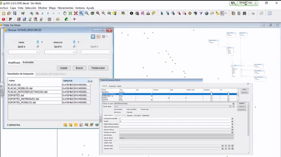
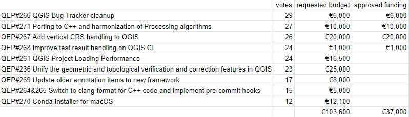


-
sur The 2023 OGC Tiling Interfaces Code Sprint – How it went!
Publié: 23 June 2023, 5:08pm CEST par Simon Chester
On June 12-14, 2023, OGC held its 2023 Tiling Interfaces Code Sprint at OGC Strategic Member NGA’s Moonshot Labs in St. Louis, Missouri. The code sprint focused on a select set of Application Programming Interface (API), database, and encoding standards related to map tiles. An API is a standard set of documented functions that expose the capabilities supported or data offered by an application, or service to other applications.
OGC code sprints are collaborative and inclusive events that support the development and refinement of open standards by providing software developers the time and space to focus on projects that implement the standards.
By experimenting with emerging ideas in the context of geospatial standards, OGC code sprints help improve interoperability of existing standards by experimenting with new extensions or profiles, and building or enhancing software products to implement the standards.
In addition, the sprints’ mentor streams provide developers with a helping hand when learning how to use the standards and projects so that they can build a working understanding of them that will last beyond the duration of the sprint.
The mentor stream at the Tiling Interfaces Code Sprint included three entry-level tutorials that used practical use-cases to introduce participants to the standards. One tutorial focused on how to serve vector tiles using the OGC API – Tiles standard, while another focused on compliance testing, and the third provided an overview of a web-based product that implements several OGC standards.
The 2023 OGC Tiling Interfaces Code Sprint focused on the following Standards and specifications:
- OGC API – Tiles: An approved Standard that specifies building blocks for creating Web APIs that support the retrieval of geospatial information as tiles.
- OGC API – Maps: A candidate Standard that specifies building blocks for serving spatially referenced and dynamically rendered electronic maps and charts.
- Changesets API: A prototype specification based on outcomes from OGC Testbed-15 that provides the foundation for a ‘Transactional Tiles API Extension’ for OGC API – Tiles.
- Vector Tiles Extension to GeoPackage: A prototype extension of the OGC GeoPackage Standard to support the use of vector tiles.
- Variable Width Tile Matrix: A grid suited for the whole globe that keeps the data in a geographic Coordinate Reference System.
- Web Map Tile Service (WMTS): The popular OGC Standard that specifies a web service that can serve map tiles of spatially referenced data using tiled images with predefined content, extent, and resolution. The OGC WMTS Standard is the base standard for the WMTS profiles of the US National System for GEOINT (NSG) and the Defense Geospatial Information Working Group (DGIWG).
At its peak, the code sprint had 50 concurrent active users participating remotely across multiple channels on the code sprint’s online platform. In-person participation saw a dozen participants from NGA, OGC, US Army Geospatial Center, UK Defence Science & Technology Laboratory (Dstl), Universitat Autònoma de Barcelona (CREAF), Pixalytics Ltd., Compass, FlightSafety International, and University of Maryland.
Screenshots of a selection of applications deployed for the code sprint are shown below.
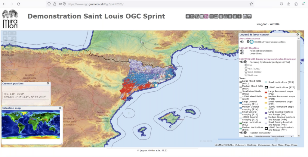 Figure 1 (click to enlarge)
Figure 1 is a screenshot of the MiraMon browser accessing multiple OGC-compliant services and APIs deployed by CREAF and other participants.
 Figure 2 (click to enlarge)
Figure 2 is a screenshot of TEAM Engine, the open source software used by the OGC Validator, presenting test results for a specific implementation of OGC API – Tiles.
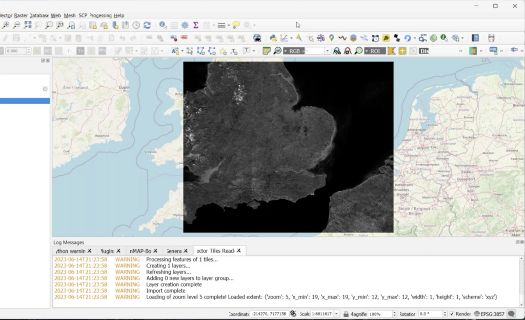 Figure 3 (click to enlarge)
Figure 3 is a screenshot of the open source QGIS Desktop GIS with GDAL embedded to enable import and display of map tiles and vector tiles.
 Figure 4 (click to enlarge)
Figure 4 is a Map Tiles viewer by Tech Maven Geospatial.
 Figure 5 (click to enlarge)
Figure 5 is a screenshot of the pygeoapi application enabled to support OGC API – Tiles.
 Figure 6 (click to enlarge)
During the code sprint, personnel from the US Army Geospatial Center (AGC) presented the Releasable Basemap Tiles (RBT) product which has been in development at AGC (Figure 6). The presentation enabled participants to identify an approach for how QGIS and GDAL could support workflows that involve the downloading of vector tiles and map tiles from an OGC API and the storage of the tiles in a GeoPackage.
 Figure 7 (click to enlarge)
Contains OS data © Crown copyright and database right 2023.Figure 7 shows a map created by KORTxyz from the vector tiles distribution of the Ordnance Survey Zoomstack product and accessed through an OGC API – Tiles interface.
What did we learn?The following are some of the lessons learned during the code sprint, and recorded by participants on the final day of the code sprint.
There is a need for further developer guidance documents for implementing OGC API – Tiles, particularly with regard to the placement on tileset resources. Such guidance should include clarification on the handling of relation types such as ‘conformance’ that can be represented as simple string literals and also as URLs.
There is a need to make sure there exists a well-documented user journey for people that want to use OGC API – Tiles through QGIS. For example, documentation to take a beginner from their first line of code to a more advanced stage.
Although some work has been done on vector tiles within OGC, more work is needed to advance the specification towards becoming an OGC Standard. Some of the work that could be carried out includes, for example, development of a Best Practice document. RBT could provide a foundation for such a Best Practice.
For future code sprints, it may be necessary to introduce participants to the basics of the specifications that are in focus for the code sprint ahead of the event. Further, it would be helpful to participants such as students to have specific instructions to help participants prepare for the code sprint.
Conclusions and RecommendationsThe code sprint met all of its objectives and achieved its goal of supporting the implementation of open geospatial standards within the developer community. Furthermore, the code sprint provided an environment for development and testing of prototype implementations of open standards and a starting point for developers to learn about the draft and approved standards, as well as their implementations.
The participants identified the following recommendations at the conclusion of the code sprint:
- A future code sprint that includes the OGC CDB Standard should examine how vector tiles could be embedded in such a data store.
- AGC is interested in how the World Mercator coordinate reference system (reference EPSG:3395) could support vector tiles in a GeoPackage. The question for future experimentation is whether this could be specified so that it can be implemented by any developer.
- The application of OGC API – Tiles in partitioning and indexing content from an implementation of the OGC SensorThings API standard and the OGC API – Connected Systems candidate standard could be explored in a future code sprint.
- An initiative to develop content for the OGC e-learning resource and the OGC Compliance Program could help improve interoperability between implementations of OGC Standards.
- Although OGC API – Tiles is an approved standard, there is some work to do around addressing interoperability issues in the different implementations (see for instance this Issue on the OSGeo gdal GitHub.
To learn more about – and participate in – future OGC Code Sprints, visit the OGC Code Sprints webpage or sign up to the OGC Events Newsletter.
The post The 2023 OGC Tiling Interfaces Code Sprint – How it went! appeared first on Open Geospatial Consortium.


-
sur OTB Team: OTB release 8.1.2
Publié: 23 June 2023, 4:55pm CEST
Dear OTB community, We are happy to announce that OTB version 8.1.2 has been released! Ready to use binary packages are available on the package page of the website: You can also use the official docker image It is also possible to checkout the branch with git: git clone [https:] OTB -b release-8.1 The documentation […] -
sur gvSIG Team: Inventario de empresas y vertidos en áreas industriales con gvSIG Online
Publié: 23 June 2023, 9:57am CEST

Para el Ayuntamiento de Náquera se ha desarrollado un conjunto de herramientas, integradas con gvSIG Online con el objetivo de llevar a cabo la creación y gestión del inventario georreferenciado de las empresas ubicadas en las áreas industriales del municipio.
La herramienta web sirve para la captación de información de empresas (sector de actividad, volumen de negocio, número de empleados, características de los residuos, tomas de agua, salidas de emergencias…) situadas en los polígonos industriales y para su integración en un visor de mapas de gvSIG Online con la geolocalización de dichas empresas.
Parte de la información es introducida por las propias empresas mediante diversas herramientas desarrolladas con este objetivo. Por otro lado, el sistema dispone de opciones de validación de la información para los técnicos municipales. Además, la solución desarrollada también posee funcionalidad para gestionar el registro de empresas, de forma que puedan acceder al sistema y modificar sus datos.
Después de la introducción de los datos y validación por parte del Ayuntamiento la herramienta genera una capa que permite consultar las fichas de empresas registradas en la herramienta web desde el geoportal de áreas industriales de Nàquera. Al pulsar en el mapa, se muestra la información básica de la empresa, teniendo la opción de consultar la ficha completa de cada una de las empresas.
Por otro lado, la herramienta permite consultar los diferentes sectores de empresas por actividad, activando o no la visibilidad de cada sector, de todos los sectores o de aquellos que se seleccionen.
Del mismo modo que se rellenan los datos de la ficha de empresa, existe la opción de rellenar la información correspondiente a una ficha de control de vertidos. Estas fichas de control de vertidos pueden ser consultadas desde el geoportal de áreas industriales, siempre con acceso restringido. Cada empresa está asignada a Estaciones de Muestreo, de forma que cuando se detecta una incidencia en una estación de muestreo se pueden listar todas las empresas vinculadas a dicha estación de muestreo.
Un ejemplo más de como gvSIG Online se ha convertido en una solución idónea para gestionar la información de un municipio, en este caso de sus áreas industriales.


-
sur OGC proud to create European Innovation Events and Open Knowledge
Publié: 22 June 2023, 5:00pm CEST par Simon Chester
The Open Geospatial Consortium (OGC) is proud to co-organize and sponsor upcoming European Innovation Events such as Data Week Leipzig 2023. The Location Innovation Academy continues to grow and support Open Knowledge.
Data Week Leipzig 2023 will run next week, June 26-30, 2023, in Leipzig, Germany, and online. OGC will present its new OGC European Innovation Days event and more at the event. Data Week Leipzig is an innovative networking and exchange event that highlights scientific, economic, and social perspectives of data and its use, and where industry, citizens, science, and public authorities can enter into dialogue. Special topics of Data Week Leipzig 2023 are Semantic Interoperability, the European Green Deal, NetZero Cities, sustainable, resilient development, and the Location Innovation Academy (see below). Digital strategies will be presented and discussed from the European to the local Leipzig City level. The event will be streamed to viewers worldwide.
Findings of the AD4GD (All Data for Green Deal) and GeoE3 Projects will be included in the topics of Monday’s European Innovation Day at Data Week. Several sessions on Data Spaces, Digital Twins, and Urban Planning will be held across Monday and Tuesday, while Wednesday will offer several workshops on Semantic Interoperability and the new “OGC Rainbow” environment – which represents the state-of-the-art in enabling semantic interoperability.
The Growing Location Innovation Academy
Starting as a hub for the distribution of knowledge and skills related to the publication and use of location-based information, the Location Innovation Academy is expanding its horizons and finding a larger audience, with a view to provide the foundation for the future OGC Academy. The Academy was presented during last week’s Open Data & Open Knowledge Workshop, hosted by GEO. The workshop emphasized the importance of open knowledge and open academies that provide not just information but also grow students’ ability to correctly interpret the available information to support better and more informed decision-making.Don’t miss the hybrid hands-on session providing detailed insights about the Location Innovation Academy during the European Innovation Days at Data Week Leipzig 23 on Tuesday June 27 @ 17:00 CEST.
 Learn more at academy.ogc.org
GeoE3 recently published a blog post entitled “Interested in new technologies of data services?” that outlines the free Data Service Management course offered by the Location Innovation Academy. The course teaches students everything they need to know about OGC API standards and how they can be implemented to manage geospatial data services more efficiently. This course and others offered by the Academy address the need, identified during GeoE3, to lower the barrier of entry for new users of APIs.
More information on the academy and the courses offered is available on GeoE3’s Location Innovation Academy information page. The Location Innovation Academy is hosted by OGC at academy.ogc.org.
For information and registration for the European Innovation Days, including the Semantic Interoperability and Location Innovation Academy sessions, see the Data Week Leipzig 23 website. For other events see the GeoE3 events and OGC events webpages.
The post OGC proud to create European Innovation Events and Open Knowledge appeared first on Open Geospatial Consortium.
-
sur GeoSolutions: Information about latest alleged GeoServer security vulnerabilities
Publié: 22 June 2023, 1:54pm CEST
You must be logged into the site to view this content.
-
sur gvSIG Team: Infraestructura de Datos Espaciales de Albacete. La Suite gvSIG como solución a la gestión integral de la información geográfica municipal
Publié: 22 June 2023, 10:08am CEST

El proyecto de implantación de la IDE de Albacete merece más de un post, por su ambición y resultados. De momento comenzamos compartiendo una presentación del alcance y trabajo desarrollado para convertir la Suite gvSIG en la solución a la gestión integral de la información geográfica municipal.
Algunos apuntes antes de dejaros con la presentación… se ha utilizado el control de versiones de gvSIG Desktop para las actividades de edición multiusuario de la información cartográfica, se ha incorporado gvSIG Mapps como herramienta de toma de datos en campo integrada con gvSIG Online, se ha realizado la integración con el gestor de expedientes SEGEX de SEDIPUALBA, se ha desarrollado una herramienta de localización y ruteo para el cementerio municipal, plantillas varias para impresión, integración con el padrón – ahora georreferenciado -, adaptación a RT de Inspire, un completo y versátil geocoder, acceso a Catastro con datos protegidos a nivel interno,…
El proyecto de implantación de la IDE de Albacete es un ejemplo para cualquier administración local que quiera poner en marcha una solución similar. Un ejemplo, también, de por qué la tecnología gvSIG se ha convertido en un referente en el sector de la geomática.
Podéis acceder al portal de la IDE de Albacete aquí: [https:]]
Presentación del proyecto:
-
sur gvSIG Team: Implantación de la Infraestructura de Datos Espaciales de Alzira. Proyectos en gvSIG Online
Publié: 21 June 2023, 10:01am CEST
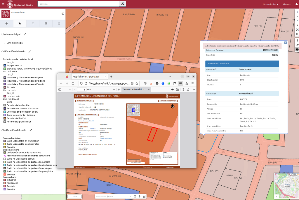
El Ayuntamiento de Alzira es otra más de la administraciones locales que ha apostado por la Suite gvSIG como la tecnología base para poner en marcha su Infraestructura de Datos Espaciales. Un proyecto que, más allá de todos los visores de mapas internos, en poco tiempo ha permitido publicar diversos geoportales como los de planeamiento, infraestructuras, plan local de quemas, etc.
Es interesante reseñar que además de la propia IDE montada con gvSIG Online, se ha integrado gvSIG Mapps para la toma de datos en campo y el gestor de expedientes de Indenova. Entre los desarrollos a medida, destaca el proceso que permite generar de forma automática la cédula urbanística.
Podéis acceder a los distintos visores públicos aquí: [https:]]
Presentación del proyectos:
-
sur GeoSolutions: GeoNode 4.1.0 is out!
Publié: 20 June 2023, 3:04pm CEST
You must be logged into the site to view this content.
-
sur gvSIG Team: Infraestructura de Datos Espaciales de Náquera con gvSIG Online
Publié: 20 June 2023, 9:50am CEST

Compartimos la presentación de la IDE del Ayuntamiento de Náquera, administración local de una población de 7.500 habitantes ubicada en el Parque Natural de la Sierra de Calderona y que multiplica su población en temporada estival. Pese a ser una administración local pequeña dispone de una gran cantidad y variedad de información geográfica que necesita gestionar.
La implementación de una IDE con gvSIG Online les ha permitido cambiar una situación de partida con información no catalogada, no compartida, duplicada, con dificultad para actualizar… por un sistema interoperable, organizado, estandarizado que facilita tanto la gestión interno como aporta un nuevo mecanismo para transmitir la información a los ciudadanos y visitantes del municipio.
-
sur iCarto Blog: Creating a Shareable QGIS Project with PostgreSQL/PostGIS Connections
Publié: 19 June 2023, 7:41pm CEST
One of the numerous features offered by QGIS is the ability to save our projects. We can store all the specific configurations, layers, styles, analyses, and other aspects in a file, allowing us to return to that point at any time. This is particularly useful when dealing with complex project organization. This functionality is also very helpful for collaborative work, as we can exchange projects with other team members.
However, when creating a project for sharing, certain aspects need to be taken into account, such as including connections to a database. In this article, we will discuss some interesting key points for accomplishing this.
Database Connections in QGIS Projects: The Recommended ApproachMost of the time, when creating a QGIS project with PostgreSQL/PostGIS layers, the data connection details are directly written, including storing the password in plain text within the project.
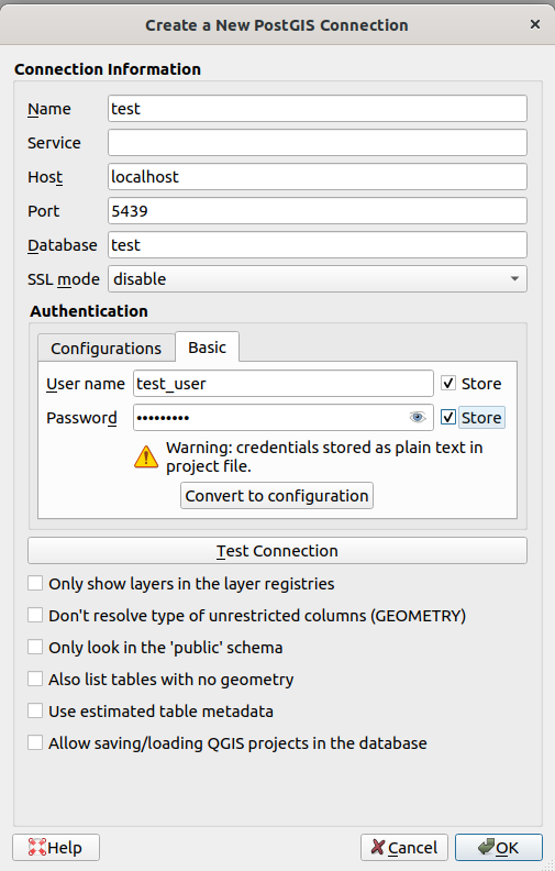
When done this way, within the project file created by QGIS with .qgz/.qgs extension, there will be a line like this:
<datasource>dbname='test' host=localhost port=5439 user='test_user' password='test_user' sslmode=disable key='id' srid=4326 type=Point checkPrimaryKeyUnicity='0' table="public"."cities" (geom)</datasource>This approach creates several problems when it comes to deploying the project or sharing it with others:
- Usernames and passwords need to be shared among several people, making it impossible to establish logical individual or group permissions.
- If we don’t hardcode the username and password, every person using the project will have to enter the data each time.
- Passwords are stored in plain text.
- If the server needs to be changed, for example, from a testing environment to a production one, the project needs to be modified.
- …
Although there are some ways to improve this situation, such as using
.pgpass, using the Authentication Manager, or using custom embedded scripts within the project, they are not the best options and have issues.The best approach, or at least the one we can recommend based on our experience, is to associate the connection details with an identifier (a pre-agreed name) and establish the connection in QGIS using the same identifier.
PostgreSQL allows achieving this through the Connection Service File. It is a text file located in Linux at
~/.pg_service.confand in Windows at%APPDATA%\postgresql\.pg_service.conf, and it would look like this:[test] host=localhost port=5439 dbname=test user=test_user password=test_user sslmode=disable # Avoid hardcode the password in prod [production] host=my.production.server port=5432 dbname=my_project user=my_userIn QGIS, the connection would be established like this:
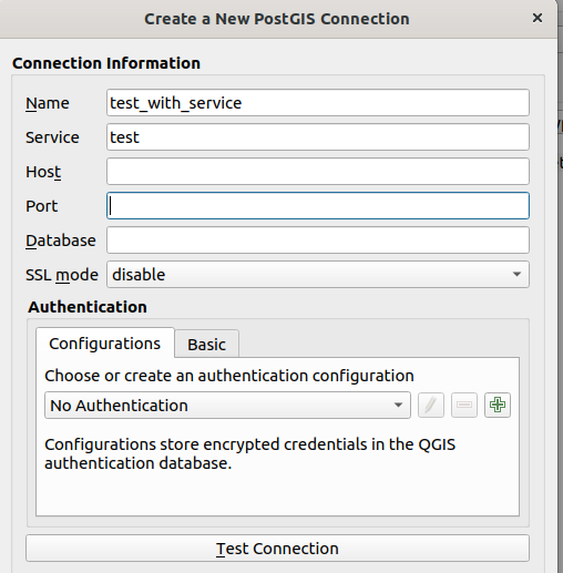
Here, you only need to fill in the connection name and the service name, which will be our identifier (the text within the brackets) in the
.pg_service.conffile. This is explained in more detail in the QGIS documentation.The advantages of using connections with an identifier are clear and solve the aforementioned problems. One person can prepare the project locally, and then, when moving to production, they only need to send the project and indicate the connection name and parameters that the rest of the team should fill in the
.pg_service.conffile.Furthermore, since this file is directly managed by libpq, the standard PostgreSQL client library used by 99% of applications, this strategy will work with any other client that needs to use that database connection, not just QGIS.
For example, in console commands:
ogrinfo PG:"service=test" cities
psql service=test
or in QGIS scripts:
layer = QgsVectorLayer("service=test table=cities (geom)", "Cities", "postgres")
QgsProject.instance().addMapLayer(layer)
The Service File allows defining numerous parameters, and few of them are mandatory. For instance, if we don’t define the password, any application using
libpqwill execute a normal workflow to try to discover it: searching in thePGPASSWORDvariable, checking the existence of the.pgpassfile, or directly prompting us to provide it.La entrada Creating a Shareable QGIS Project with PostgreSQL/PostGIS Connections se publicó primero en iCarto.

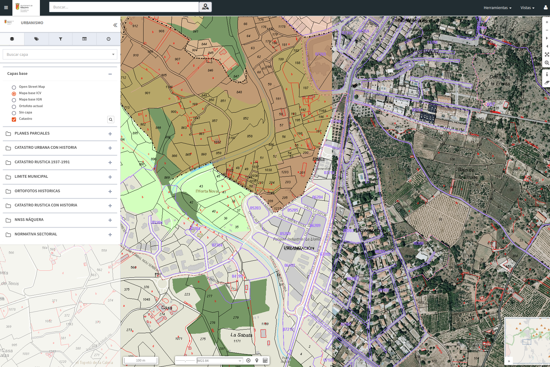