
Vous pouvez lire le billet sur le blog La Minute pour plus d'informations sur les RSS !
Canaux
8172 éléments (3906 non lus) dans 50 canaux
 Dans la presse
(3740 non lus)
Dans la presse
(3740 non lus)
-
 Cybergeo
(3675 non lus)
Cybergeo
(3675 non lus) -
Mappemonde
(60 non lus)
-
Dans les algorithmes
(5 non lus)
Du côté des éditeurs
(28 non lus)
-
Toute l’actualité des Geoservices de l'IGN
(17 non lus)
-
arcOpole - Actualités du Programme
-
arcOrama
(11 non lus)
-
Neogeo
Toile géomatique francophone
(110 non lus)
-
Géoblogs (GeoRezo.net) (5 non lus)
-
UrbaLine (le blog d'Aline sur l'urba, la géomatique, et l'habitat)
-
Séries temporelles (CESBIO)
(2 non lus)
-
Datafoncier, données pour les territoires (Cerema)
-
Cartes et figures du monde
-
SIGEA: actualités des SIG pour l'enseignement agricole
-
Data and GIS tips
-
ReLucBlog
-
L'Atelier de Cartographie
-
My Geomatic
-
archeomatic (le blog d'un archéologue à l’INRAP)
-
Cartographies numériques
-
Carnet (neo)cartographique
-
GEOMATIQUE
-
Évènements – Afigéo
(12 non lus)
-
Afigéo
(12 non lus)
-
Geotribu
(50 non lus)
-
Conseil national de l'information géolocalisée
(9 non lus)
-
Icem7
-
Makina Corpus (1 non lus)
-
Oslandia
(1 non lus)
-
CartONG
(2 non lus)
-
GEOMATICK
(6 non lus)
-
Geomatys
(3 non lus)
-
Les Cafés Géo
(1 non lus)
-
L'Agenda du Libre
(3 non lus)
-
Conseil national de l'information géolocalisée - Actualités
(3 non lus)
Géomatique anglophone
(16 non lus)
Géomatique anglophone (16 non lus)
-
 11:00
11:00 Mappery: Camper van
sur Planet OSGeo
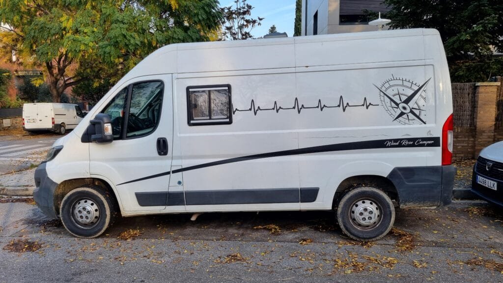
We love camper vans with nappy decoration. This one comes from Raf, photo taken near Sant Cugat del Vallès, Barcelona
-
11:00
Mappery: Knowledge Mile
sur Planet OSGeo
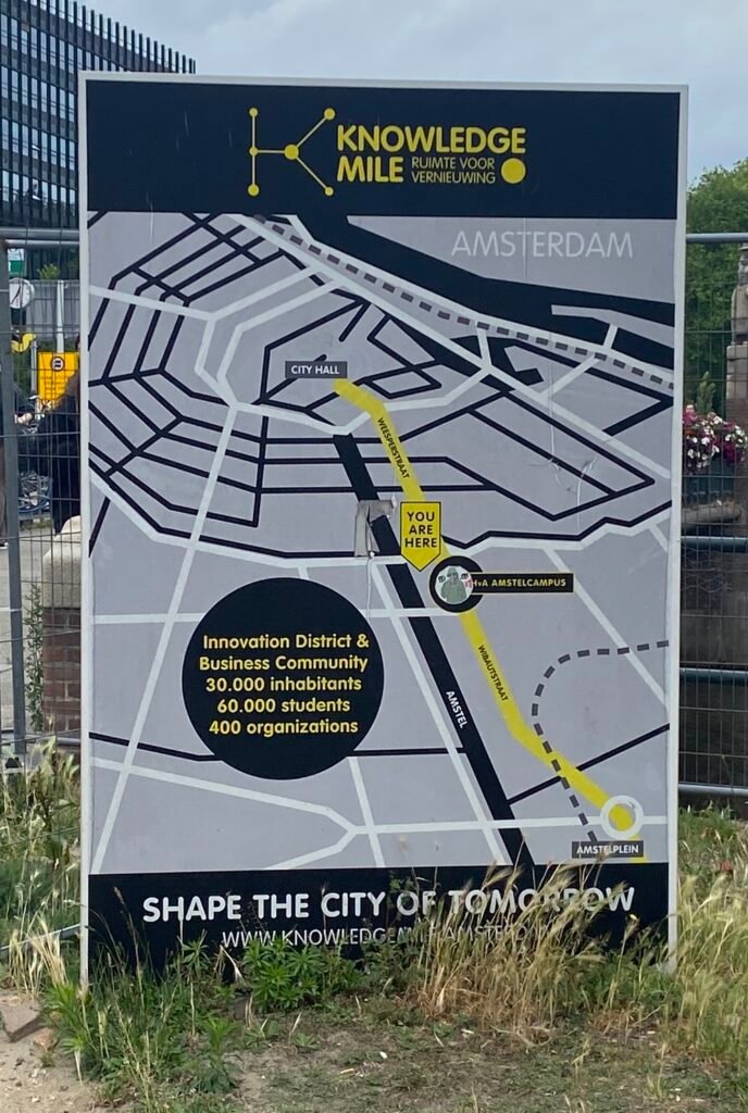
Reinder said “I had never heard of it, but it turns out that there is a knowledge mile in Amsterdam … see [https:]]
-
11:00
Mappery: The Glastonbury Diagram
sur Planet OSGeo
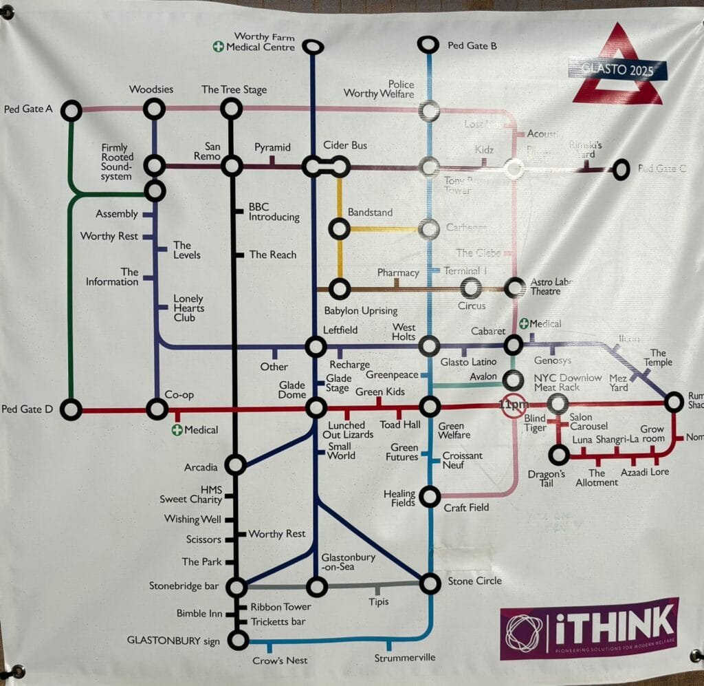
I have ever been to Glastonbury but from the pictures it looks to be a massive site the equivalent of a medium sized town. Getting from stage to stage could be challenging so someone came up with the bright idea to try a bit of Becksploitation and to produce a diagram in the style of the London Tube Map. I don’t think it would be much help but it would have been a nice souvenir.
-
11:00
Mappery: Globes
sur Planet OSGeo
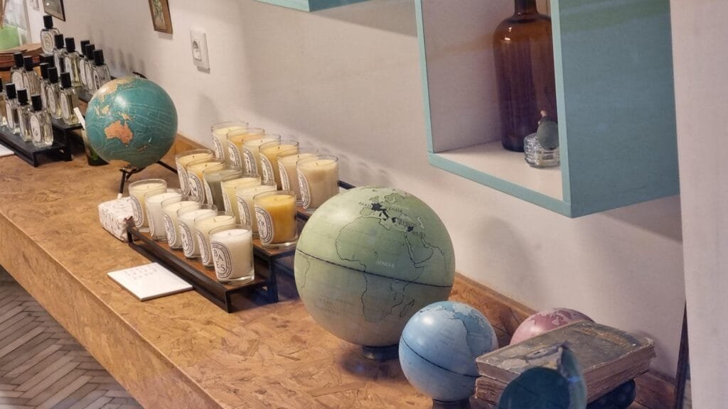
Candles shelf decorated with globes at Les Topettes perfume shop in Barcelona, from Raf
-
11:00
Mappery: Coordinates
sur Planet OSGeoPièce jointe: [télécharger]
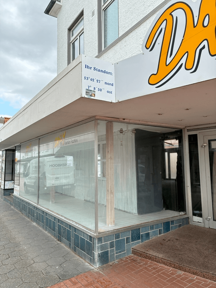
Marc-Tobias sent us this pic of a shop with a sign that says “Your Location” plus the coordinates. I haven’t said where he took this pic because I thought you might enjoy looking up the coordinates.
-
16:38
W3C Maps for HTML Community Group: State of HTML 2025
sur Planet OSGeoWant to shape the future of HTML? The State of HTML 2025 survey is live – and it includes a question about MapML and mapping on the web!
This survey directly influences which web platform features get prioritized by browser vendors and standards bodies. Your 15 minutes could help determine whether native web mapping becomes reality.
Through a series of saveable questions, the survey asks devs to document their use and knowledge of both existing HTML, as well as for new proposed features. Thanks to Lea, we were able to contribute a question into the survey’s Content section that asks developers about MapML, and provides a close-to-default markup of what a MapML web map might look like in an excellent future HTML.
Try it yourself: Experience what the survey’s native HTML maps could feel like with our interactive demo. Explore more possibilities in our documentation.
Take Action Now:
- Fill out the survey (15 minutes)
- Share it with your developer network
- Especially encourage geospatial/mapping developers to participate
The survey closes August 1st 2025 – don’t let this opportunity to influence web standards slip by.
-
11:00
Mappery: Pamplona
sur Planet OSGeo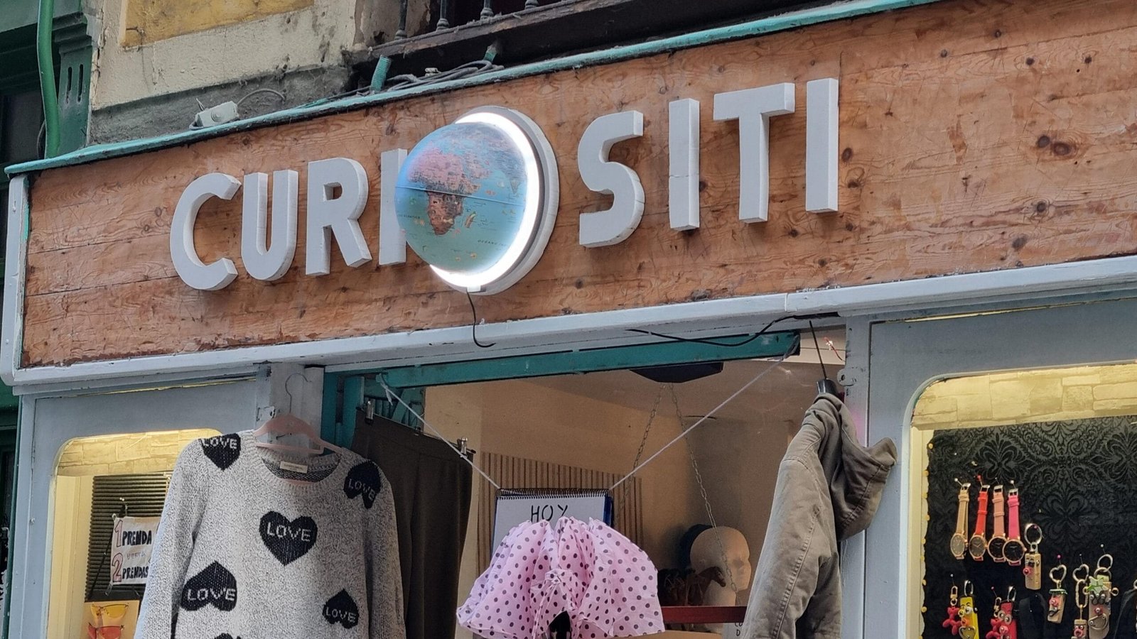

Raf sent us this photo of a local shop in Pamplona with a half globe in its sign
-
12:05
GeoSolutions: Bringing MapStore to the Next Dimension: Highlights from the Cesium Developer Conference 2025
sur Planet OSGeoYou must be logged into the site to view this content.
-
11:00
Mappery: Map Art on the Underground
sur Planet OSGeo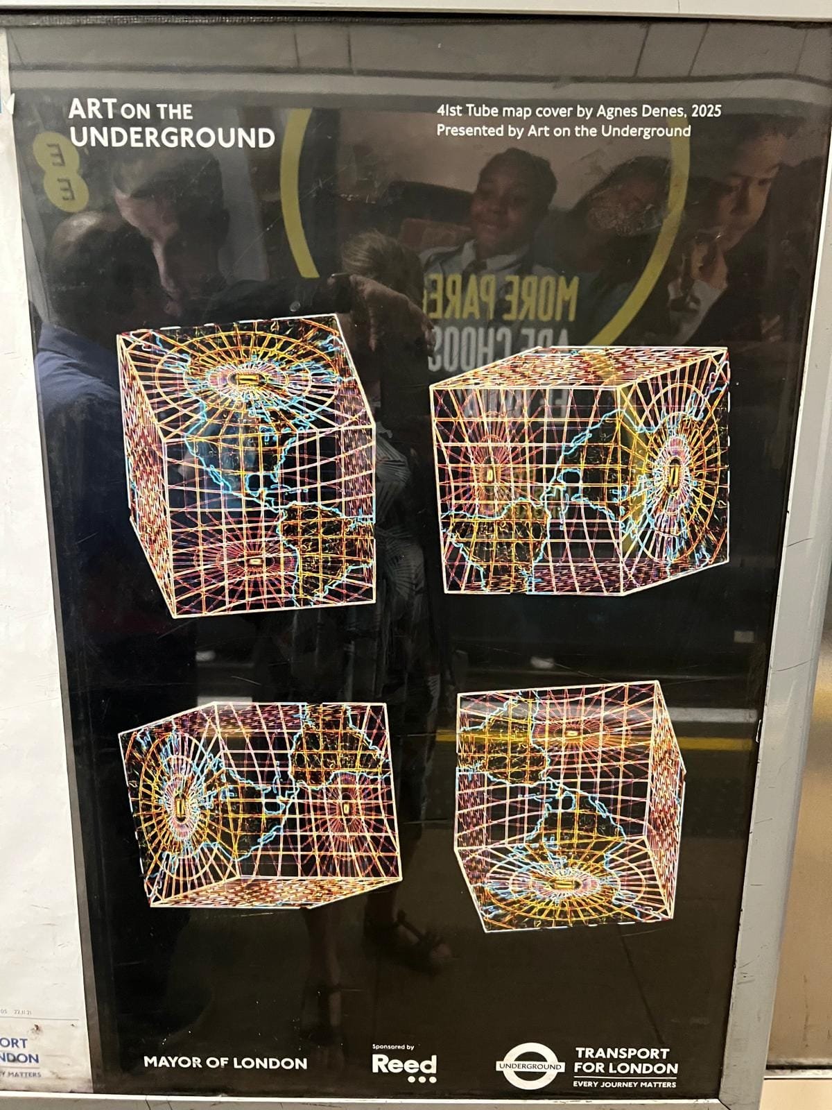

Elizabeth sent me this, I wasn’t sure but I think it just gets over the editorial bar.
-
11:00
Mappery: Yu Garden
sur Planet OSGeo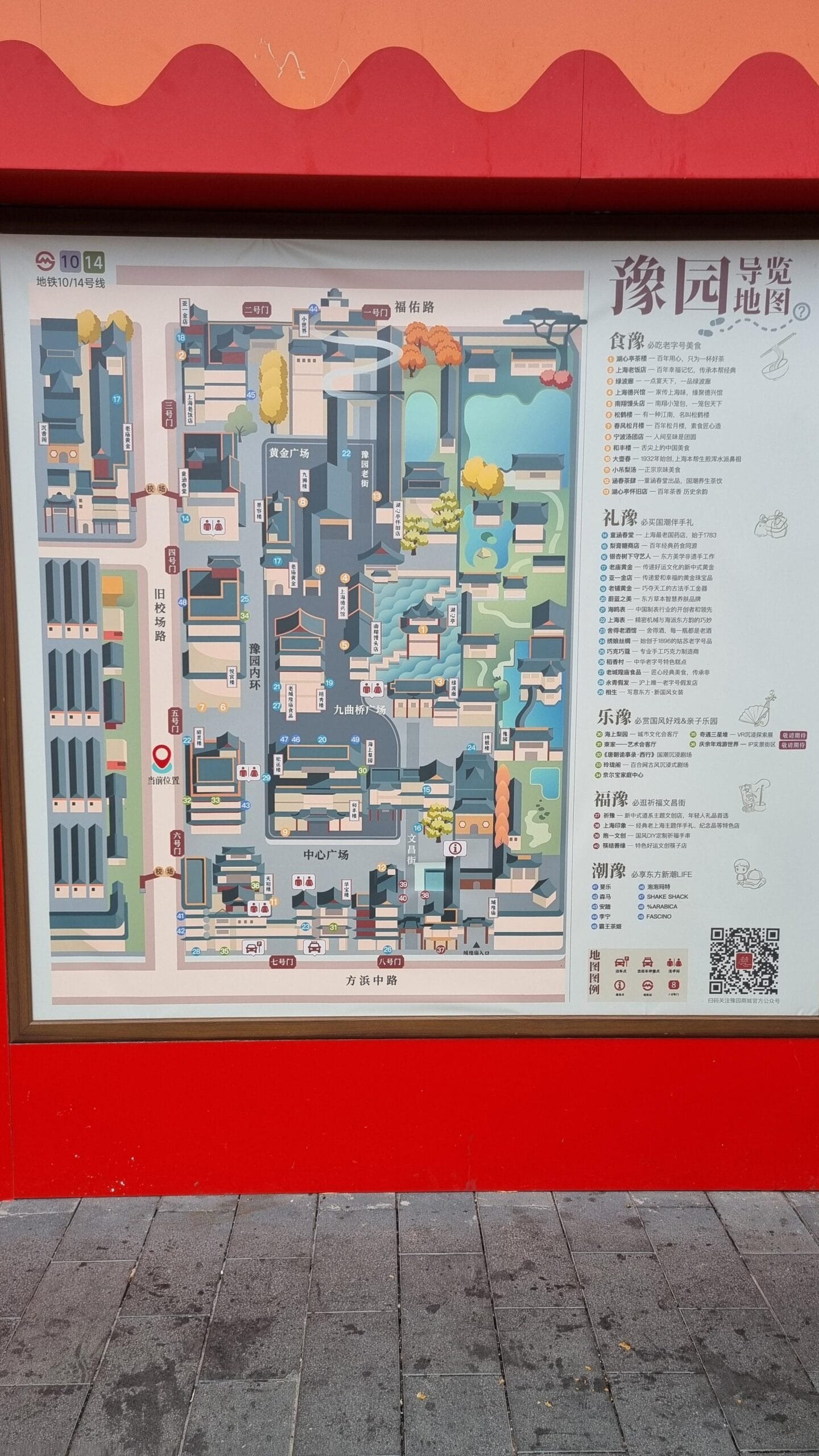

Raf sent us this photo of a map representing Yu Garden and the surrounding area in Shanghai.
-
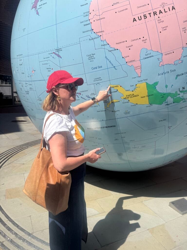
11:00
Mappery: Upside Down World with a Difference
sur Planet OSGeo
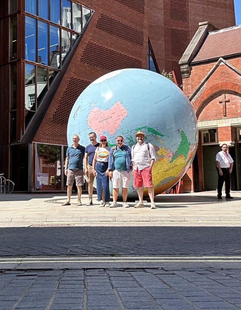
We have a had several pics of the Upside Down World outside LSE, these are different because I was there myself with some of my best geo-nerd mates.
When you get to study this globe up close it prompts lots of conversation. Ed pointed out how big a portion of the globe is without any significant land mass.
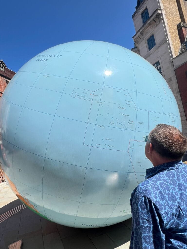
Denise showed us the parts of Papua New Guinea that she visited as a student, it’s much bigger than I realised.
-
2:00
PostGIS Development: PostGIS 3.6.0beta1
sur Planet OSGeoThe PostGIS Team is pleased to release PostGIS 3.6.0beta1! Best Served with PostgreSQL 18 Beta2 and soon to be released GEOS 3.14.
This version requires PostgreSQL 12 - 18beta2, GEOS 3.8 or higher, and Proj 6.1+. To take advantage of all features, GEOS 3.14+ is needed. To take advantage of all SFCGAL features, SFCGAL 2.2.0+ is needed.
3.6.0beta1-
Cheat Sheets:
This release is a beta of a major release, it includes bug fixes since PostGIS 3.5.3 and new features.
-
11:00
Mappery: Fabric
sur Planet OSGeo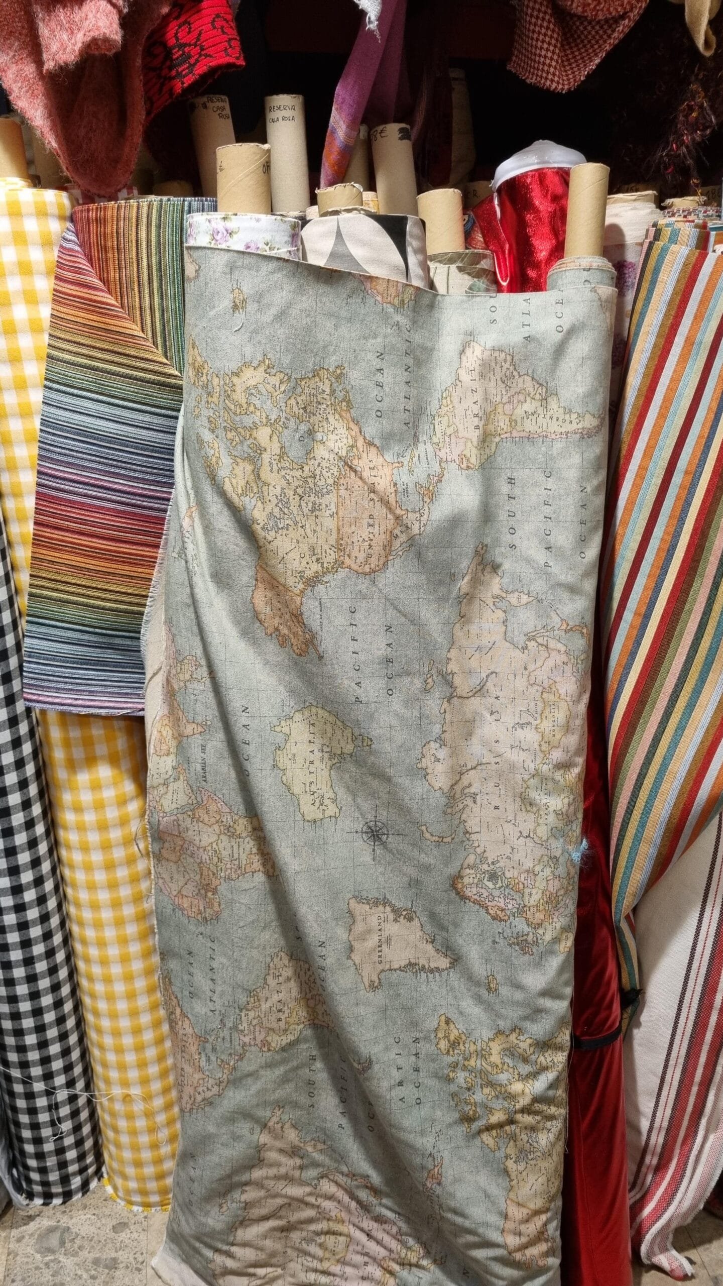

A fabric sold by the meter at El Barato shop in Reus, with a vintage map pattern. Sent by Raf.
-
11:00
Mappery: A shop in Suzhou
sur Planet OSGeo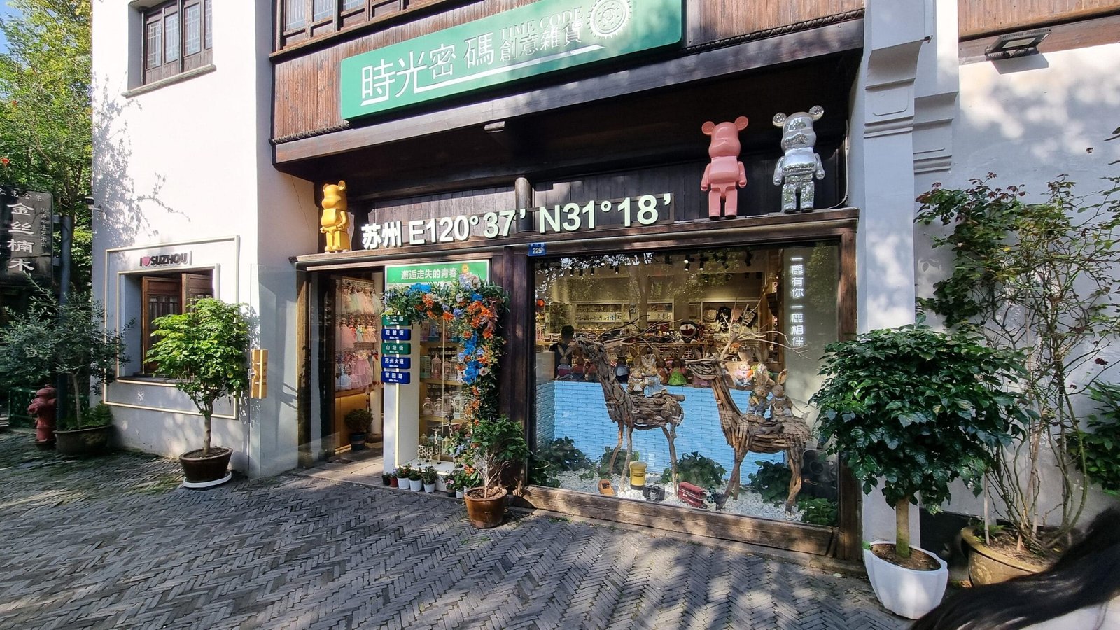

Raf sent us this shop in Suzhou, in the tourist area by the main canal.
-
2:00
GeoServer Team: GeoServer 2.27.2 Release
sur Planet OSGeoGeoServer 2.27.2 release is now available with downloads (bin, war, windows), along with docs and extensions.
This is a stable release of GeoServer recommended for production use. GeoServer 2.27.2 is made in conjunction with GeoTools 33.2, and GeoWebCache 1.27.2.
Thanks to Peter Smythe (AfriGIS) for making this release.
CITE certification achievedThe GeoServer team are really pleased to announce that our long-lost CITE Certification has been regained (for 2.27) over the last 6 months.
OGC CITE Certification is important for two reasons:
- Provides a source of black-box testing ensuring that each GeoServer release behaves as intended.
- Provides a logo and visibility for the project helping to promote the use of open standards.
Many thanks to all who were involved! After approximately 10 years, we can once again officially confirm that GeoServer is OGC compliant. Thank you especially to Gaia3D and OSGeo:UK for sponsorship covering the expense of CITE Certification for 2025.
For more details, please read the separate announcement.
Release notesNew Feature:
- GEOS-11805 Option to disable the management of stored queries
Improvement:
- GEOS-11877 Improve CoverageView composition to support noData fill on missing bands/coverages
Bug:
- GEOS-10728 Cannot download GeoPackage if the source data contains UUID types
- GEOS-11708 STAC breadcrumbs rendering as plain text
- GEOS-11820 WCS spatial sub-setting does not work when native CRS != declared CRS
- GEOS-11832 count=0 service exception for some formats
- GEOS-11857 Random NPE In LocalWorkspaceCallback
- GEOS-11862 Layer Preview and Tile Layers page dropdown links broken after updating table
- GEOS-11865 MapDownloadProcess washes out 1 band gray images when transparency is on
- GEOS-11866 Prevent requests setting variables that should only be set by GeoServer
- GEOS-11879 Xalan causes a java.lang.NoClassDefFoundError
Task:
- GEOS-11831 OseoDispatcherCallback improvements
- GEOS-11834 Update PMD to 7.13
- GEOS-11882 Cleanup postgis-jdbc dependencies
For the complete list see 2.27.2 release notes.
Community UpdatesWe list these community modules purely as a service to the community to raise awareness of interesting add-ons to support, if there is sufficient common interest. They are not “production ready”.
How to make contact: browse the GitHub repo ( [https:]] > module > History) to see who:
- a) made the original commit,
- b) has been making changes (other than refactoring/dependency updates).
If you want to use a community module (in production), YOU need to arrange funding to:
- a) promote it to an official extension (passing tests, etc.) and
- b) maintain it going forward.
Community module development:
- GEOS-11727 OGC API Tiles tests require tile links to be available in the collections resource too
- GEOS-11728 OGC API Tiles returns an invalid content-disposition header
- GEOS-11822 OGC API procesess basic implementation
- GEOS-11829 Features templating ability to override schema
- GEOS-11830 Smart data loader create store page fails when environment variables are in use
- GEOS-11839 New Community Module for WPS Download in NetCDF output format for spatiotemporal coverages
- GEOS-11847 Next link is missing in “Search” OGC API - Features proposal implementation when startIndex is not set
- GEOS-11870 Singlestore(MemSql) datastore community module
- GEOS-11871 Allow native execution of group by in DGGS store, when grouping on geometries
- GEOS-11874 Align OGC API tiles API spec with specification
- GEOS-11875 Execute OGC API Tiles CITE tests
- GEOS-11876 WPS Vertical Longitudinal Profile: Support automatic distance computation
- GEOS-11878 WFS HITS request returns the whole data records on a GML feature templated layer
- GEOS-11880 OGC API Maps is not showing up in GeoServer home page
- GEOS-11883 OGC API process description lacks links
- GEOS-11884 OGC API process HTML input/outputs lack occurrences and formats
Additional information on GeoServer 2.27 series:
-
17:26
GeoTools Team: GeoTools 33.2 released
sur Planet OSGeoThe GeoTools team is pleased to announce the release of the latest stable version of GeoTools 33.2: geotools-33.2-bin.zip geotools-33.2-doc.zip geotools-33.2-userguide.zip geotools-33.2-project.zip This release is also available from the OSGeo Maven Repository and is made in conjunction with GeoServer 2.27.2 and GeoWebCache 1.27.2. We are grateful to -
13:00
Mappery: Geomob NL
sur Planet OSGeo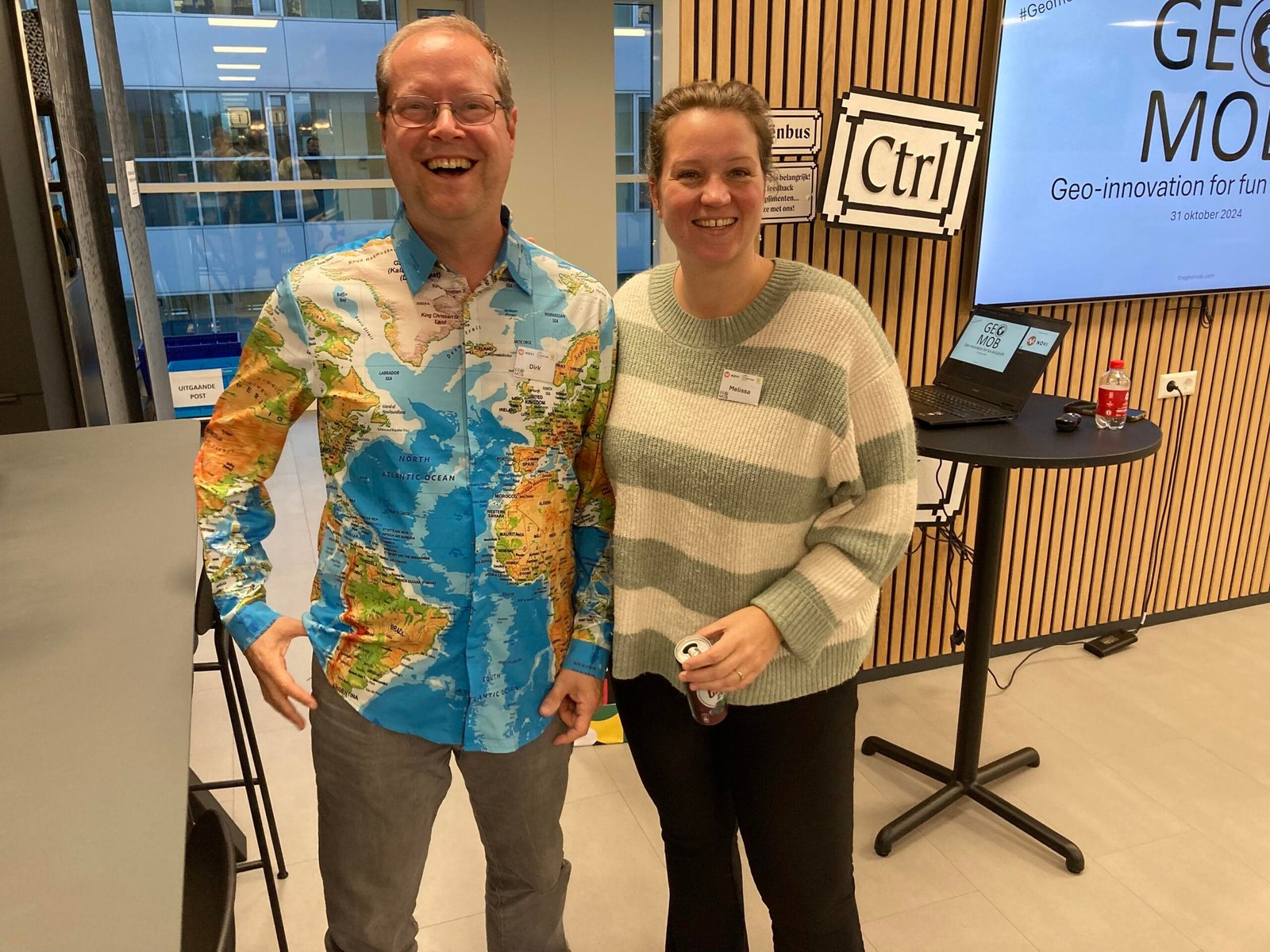

Congrats to Geomob NL
-
18:33
Lutra consulting: Crowdfunding Campaign Completed: QGIS 3D for Open Source Digital Twins
sur Planet OSGeoThe QGIS community has successfully funded the 3D Digital Twins project—thank you for your support! Development begins soon, with updates to follow. -
14:46
GeoCat: GeoCat Map 2025.0 Released
sur Planet OSGeoGeoCat is pleased to announce the initial release of GeoCat Map 2025.0. GeoCat Map 2025.0 Release Notes This first release of GeoCat Map represents a continuation of our GeoServer Enterprise product b... -
13:28
GeoCat: GeoNetwork 5 Crowdfunding
sur Planet OSGeoGeoNetwork is the most popular and loved open-source catalog, trusted by organizations to deliver on their geospatial data management objectives. GeoNetwork is used by 80-90% of European Union countri... -
13:00
Mappery: Buvette
sur Planet OSGeoPièce jointe: [télécharger]
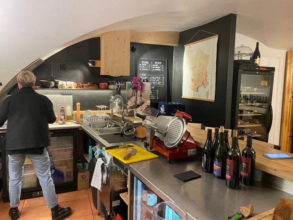
This is another hanging map coming from Embrun, France. Thanks, Mr Le Cartographe, for sharing.
-
4:00
GeoServer Team: CITE Certification achieved
sur Planet OSGeoThe GeoServer team are really pleased to announce that our long-lost CITE Certification has been regained (for 2.27) over the last 6 months.
OGC CITE Certification is important for two reasons:
- Provides a source of black-box testing ensuring that each GeoServer release behaves as intended.
- Provides a logo and visibility for the project helping to promote the use of open standards.
Recent activity:
- As part of a Camptocamp organized
OGC API - Featuressprint Gabriel was able setup a GitHub workflow restoring the use of CITE testing for black-box testing of GeoServer. Gabriel focused onOGC API - Featurescertification but found WMS 1.1 and WCS 1.1 tests would also pass out of the box, providing a setup for running the tests in each new pull request. - Andrea made further progress certifying the output produced by GeoServer, restoring the WMS 1.3, WFS 1.0 and WFS 1.1 tests, as well as upgrading the test engine to the latest production release. In addition, CITE tests that weren’t run in the past have been added, like WFS 2.0 and GeoTIFF, while other new tests are in progress, like WCS 2.0, WMTS 1.0 and GeoPackage.
- Peter set up multiple GeoServers for the testing and to act as reference implementations (hosting graciously provided by the Open Source Geospatial Foundation) and ran the test suites.
- Angelos Tzotsos (OSGeo) submitted the certification request to OGC.
- Gobe Hobona (OGC) approved all of our submissions.
Many thanks to all who were involved! After approximately 10 years, we can once again officially confirm that GeoServer is OGC compliant.
Developer DocumentationFor developers, read more about the certification process and how to expand on it for additional services.
CITE Certification SponsorshipThank you to Gaia3D and OSGeo:UK for sponsorship covering the expense of CITE Certification for 2025.
This certification process is expensive, and we will require sponsorship for 2026 if we wish to maintain certified status.
However, as mentioned above, these CITE tests are automatically run as part of our build process for each new pull request, so we can unofficially verify that we pass CITE tests, but we cannot claim to be compliant.
If you/your organization finds the CITE Certification valuable, please contact the Project Steering Committee to sponsor the annual renewal. The more organizations that are able to sponsor, the lower the expense will be to each organization (sharing the approx USD $1,000 per year cost).
-
13:00
Mappery: Olive oil
sur Planet OSGeo

Another Raf’s contribution with the plots where the olives come from, in gold on top of the orthophotomap, is the label of Lacrima Olea, the Picual variety extra virgin olive oil home-grown and cold-pressed produced by Cooperativa de Godall, Catalunya
-
12:00
WhereGroup: Ein wahres Highlight: Die internationale QGIS-Community trifft sich in Norrköping
sur Planet OSGeoPeter Gipper und Isabelle Korsch aus unserem QGIS-Team waren bei der QGIS User-Konferenz in Schweden. In diesem Beitrag erfahren Sie alles rund um dieses jährliche Highlight der Open-Source-Community mit 317 Teilnehmenden aus 54 Ländern. -
13:00
Mappery: Cafe in Embrun
sur Planet OSGeoPièce jointe: [télécharger]
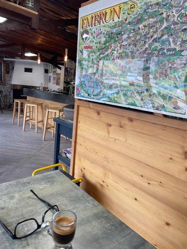
It’s summertime, so if you visit Embrun in France, don’t miss the chance to visit this cafe, approved by Mr Le Cartographe. And I am pretty sure the fireworks tonight to celebrate Bastille Day will be worth the visit as well.
-
13:00
Mappery: Beijing
sur Planet OSGeo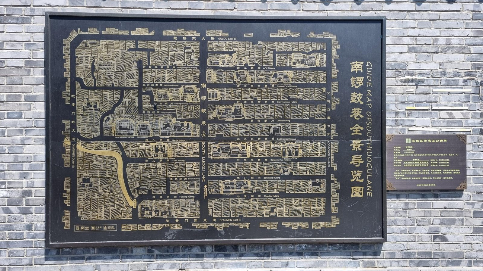

Raf shared this guide map to somewhere in Beijing
-
13:00
Mappery: Raf series
sur Planet OSGeo
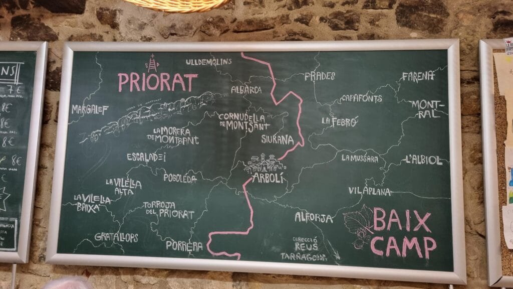
Raf shared a lot of maps. Here is the beginning of the series. Hand-drawn map on a blackboard inside El Refugi, a small eat and drink place in Arbolí, Catalunya
-
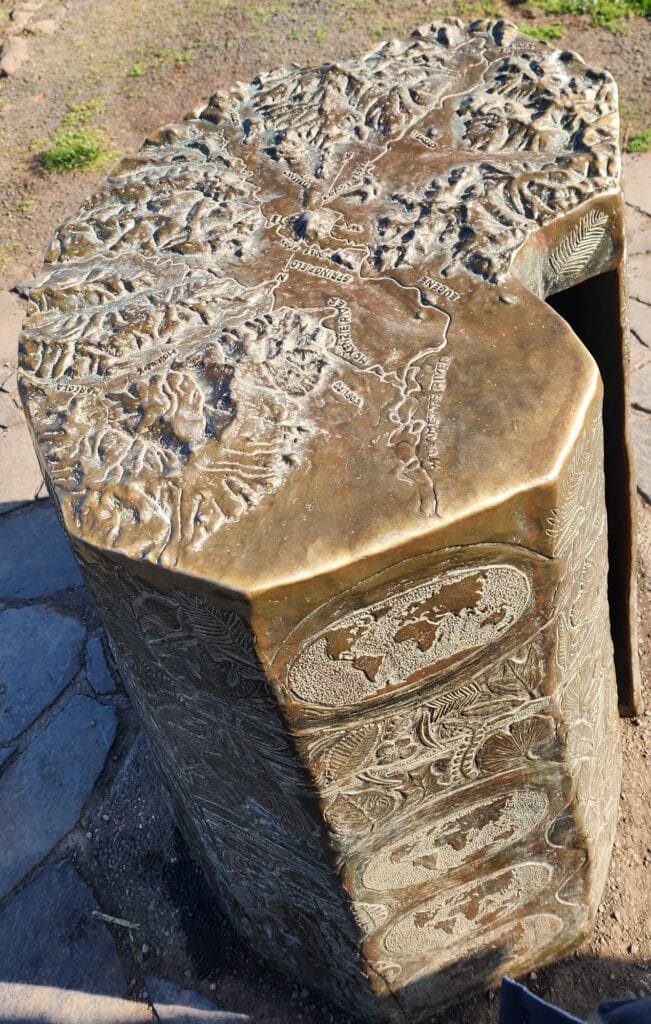
13:00
Mappery: Bronze orientation map
sur Planet OSGeo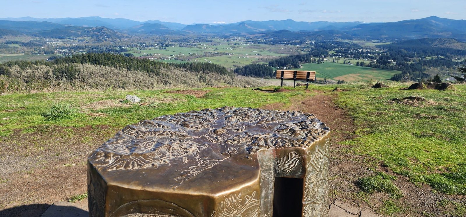

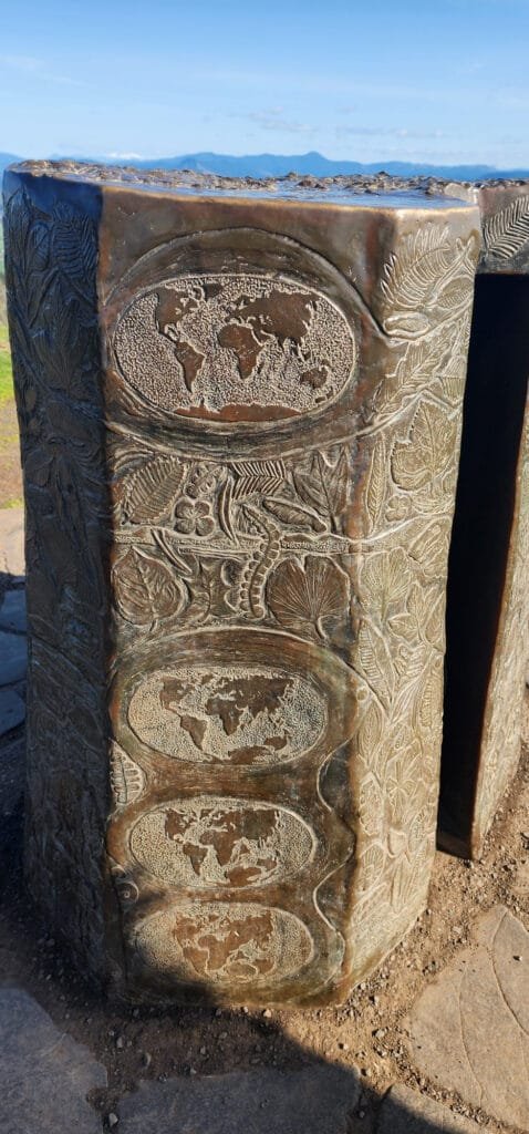
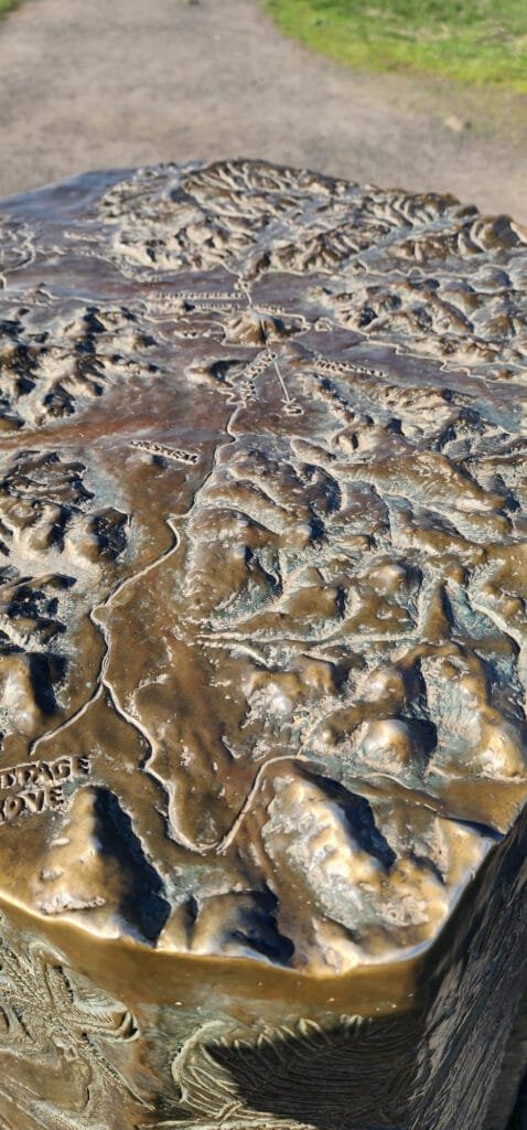
Cartonaut sent us this bronze orientation map on top of Mt. Pisgah in Oregon
-
13:00
Mappery: London Underground Map… in cross stitch
sur Planet OSGeo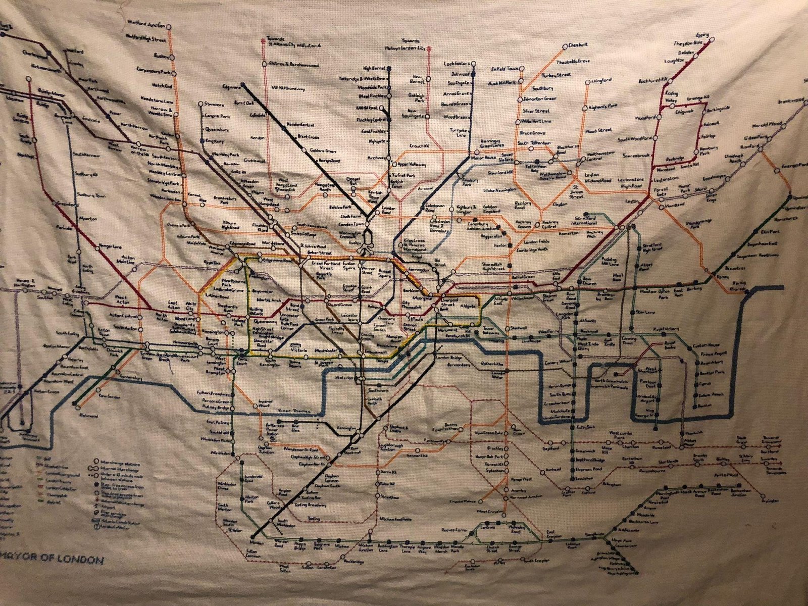


Here is the London Underground Map… in cross stitch. Shared by GirlOnTheNet
-
23:31
Martin Davis: Fast detection of narrow polygons with JTS
sur Planet OSGeoSome spatial use cases require identifying "narrow" or "skinny" polygons. A classic example is the process of cleaning polygonal coverages. Coverages (even clean ones) may contain narrow gaps between polygons which are unwanted. But they may also contain larger gaps which are valid. A geometric test is required to distinguish narrow polygons which are gaps (that can be merged) from wider ones (which should be retained).
Narrowness MeasuresThere are various criteria which can be used to determine if a polygon is "narrow". One approach is to use an estimate of circularity (also called compactness or roundness) such as the Polsby-Popper measure. This is a measure based on the ratio of polygon area to the square of its perimeter. Polygons with a measure closer to 1 are more circular than ones with lower values (which are thus more likely to be narrow). This is easy to implement and fast to compute, but it has significant limitations:
- it is not obvious how to pick a measure value that determines "narrowness"
- it is based on shape-wide metrics (area and perimeter), so it may not accurately reflect the local properties of a shape (i.e. a polygon may have a low circularity measure and still contain a wide "bulge" in one place.)
- because it is a ratio it is size-independent, so very small gaps (which should be removed) may be compact according to the measure, and are thus retained. (Adding an area limit can mitigate this, but that introduces yet another difficult-to-choose parameter.)
Really, the best way is to determine the narrowness of a polygon is to compute its actual width. An effective way to do this is to compute the diameter of the largest circle which lies within the polygon. This is known as the Maximum Inscribed Circle. The JTS Topology Suite provides the MaximumInscribedCircle class to compute the centre point and radius of the required circle (see the blog post). (The algorithm is also available in downstream projects including GEOS, PostGIS and Shapely.) The algorithm uses an iterative approximation, which currently requires specifying an approximation tolerance distance.
However, the real requirement is only to test whether the MIC radius is less than a given length value. The actual value of the radius is not required. Generally, an algorithm that tests for a value can be faster and more robust than one that computes the value explicitly. This is a perfect example of this principle. By formulating the function as a test against a provided radius length execution can be much faster, since computation can terminate as soon as it is known that the radius must be smaller or larger than the required length. (Determining that the MIC radius is larger than the limit is easy: an internal point is found with distance to the polygon boundary which is greater than the limit. The radius is known to be smaller than the limit once the grid size used to generate internal points is less than one-half the limit value. If neither of those situations occurs the approximation tolerance is used to terminate the computation.) This has recently been implemented as the MaximumInscribedCircle.isRadiusWithin predicate.
A further benefit of the isRadiusWithin implementation is that it removes the need to specify the approximation tolerance. The tolerance can be determined automatically, as a fraction of the specified radius limit. This is significant, because selecting an appropriate distance tolerance for a Maximum Inscribed Circle computation is difficult, since it has no relationship to the size of the input geometry (i.e. a geometry may have a large extent, but still be very narrow.) This is particularly challenging when a single tolerance must be chosen for a set of inputs of varying shape - precisely the use case for which this is being built.
DemonstrationAs expected, evaluating the isRadiusWithin predicate is much faster than computing the actual value of the Maximum Inscribed Circle radius. For a demonstration we use this dataset of world country borders (exploded to treat each island as a separate polygon). This dataset has 8,393 polygons containing a total of 366,951 vertices.

Computing the Maximum Inscribed Circle radius for each polygon, with a tolerance of 0.00001 degrees, takes 2.68 seconds.

Evaluating the isRadiusWithin predicate, using a distance tolerance of 1 degree, executes in 0.034 seconds - almost 80 times faster.

Usage in Coverage CleaningThis function is used in the CoverageCleaner class to provide a fast test for narrow polygons (as specified by the user using the gapWidth parameter). To see how this works on a real use case, consider a polygonal coverage dataset of communes in Departement 71 in France (Saône-et-Loire). The dataset has 564 polygons, with 612,238 vertices. As shown in a previous post on coverage cleaning, this dataset has highly non-aligned linework. This creates lots of gaps. The gaps can be found by cleaning the coverage with a gap tolerance distance of 0, which reveals 28,427 gaps, with 349,042 vertices.
 Departement 71 communes showing the many gaps present
 Close-up of gaps (note scale)
Computing the Maximum Inscribed Circle radius explicitly for each gap takes 25.4 seconds. In contrast, using isRadiusWithin with a distance of 0.5 takes only 1.35 seconds - 18 times faster. Since the cleaning process itself takes only 4.9 seconds, the reduction in time for the gap merging phase is significant.
Future WorkIt would be very nice to extend the automatic tolerance setting to the Maximum Inscribed Circle computation. More research is required to see whether this can be done. -
13:00
Mappery: Gin
sur Planet OSGeo -
18:02
GeoSolutions: GeoSolutions presenting at FOSS4G 2025 Europe
sur Planet OSGeoYou must be logged into the site to view this content.
-
13:00
Mappery: Botanical garden in Wellington
sur Planet OSGeoPièce jointe: [télécharger]


CartoDataViz shared this 3d topographic map of a part of the botanical garden in Wellington
-
13:00
Mappery: Destructured projection
sur Planet OSGeo

That is a lovely bag.
-
2:53
Sean Gillies: Bear training weeks 19-20 recap
sur Planet OSGeoWeek 19 was a planned rest week. I did more biking and enjoyed watching or listening to the Western States Endurance Run livestream while gardening and running on a treadmill at the gym.
10.6 miles running
318 ft D+ running
7 hours, 12 minutes all training
In week 20 I ran more than 35 miles! My biggest mileage and elevation gain of the season. Recovering from Achilles tendinopathy while training has been challenging, but it seems like I'm succeeding.
36.8 miles running
6,280 ft D+ running
14 hours, 30 minutes all training
I ran four times and did back-to-back long runs for the first time in ages. 10 miles on Saturday and 14 today in two trips up Towers Trail in Lory State Park. My body is feeling okay afterwards, so I'm optimistic that I'll be able to do more next week. I think I've got the capacity for a 50 mile week with 10,000 ft before Never Summer.

A granite prominence in Colorado's Lory State Park viewed from a lush and green grassy stretch of Howard Trail.
-
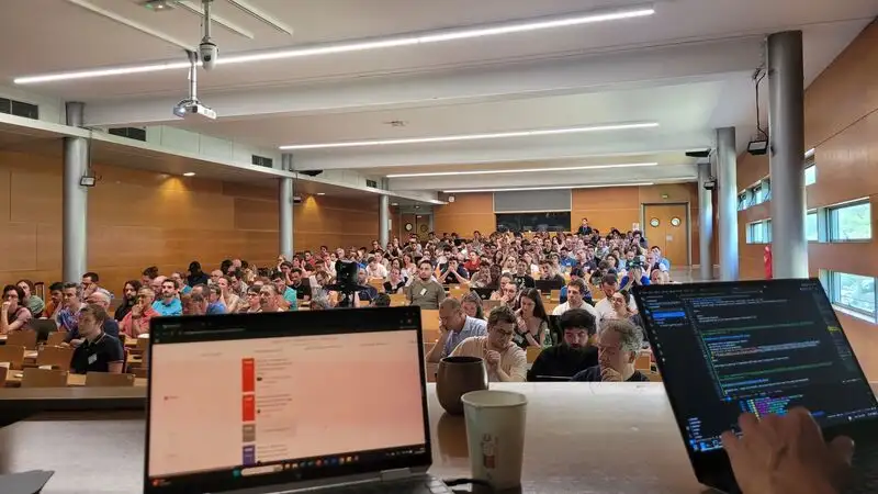
16:20
QGIS Blog: Presentation and feedback from the QGIS-fr Users Meeting in Avignon
sur Planet OSGeoThis is a guest post by Guilhem Allaman.
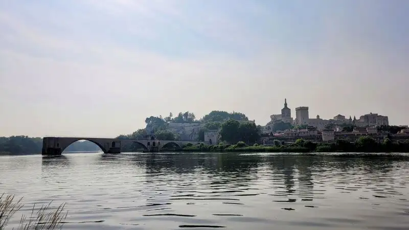
Mid-June, the French-speaking QGIS Users Meeting was held in Avignon, Southern France – a city often described as “the City of the Popes“, thanks to the Popes’ Palace, the city’s number one attraction. Not far from the non-terminated bridge, which has inspired some happy songs around the world as well as the 2025 edition banner :
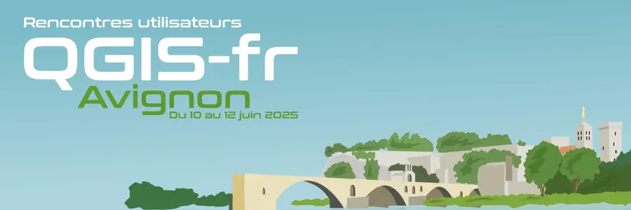
The French-speaking QGIS community could meet, discuss and share some insightful ideas and moments together. The conference brought over 280 people from the 6 corners of France including Guadeloupe, as well as Belgium, Togo, Switzerland. The QGIS-fr Users Meeting, using the #QGISFR2025 hashtag on social media, proposed events during 3 days :
- During day 1, participants were able to take part to the 20 workshops, on a variety of balanced QGIS topics. Approximately 200 people attended that day. On the evening, a shared aperitif and dinner was organized.
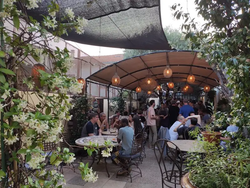
- Day 2 was the conference day, with no less than 12 insightful talks, which showcased interesting usages and strategies around QGIS for the 220 attendants.
- Day 3 was devoted to contributions to the QGIS project, focusing on 5 axes : development, funding, documentation, translation and communication. Approximately 75 people attended that day.
The QGIS-fr Users Meeting is organized by OSGeo-fr, the french local chapter of the OSGeo Foundation. This year’s edition was in partnership and co-organized with Avignon Université, and especially the UMR 7300 ESPACE Unit.
The money raised by participants and sponsors registrations will be used to finance the QGIS project, as well as other projects on which QGIS depends. This year, the sum donated to QGIS.org is around €17,000.
OSGeo-fr is already looking forward to next year : the next edition will be held in March, in Brest – Brittany region, a place often described as “the End of the World“. The 2026 QGIS-fr Users Meeting will be organized in collaboration with the UMR LETG Unit.
-
13:00
Mappery: Église Saint-Étienne-du-Mont
sur Planet OSGeo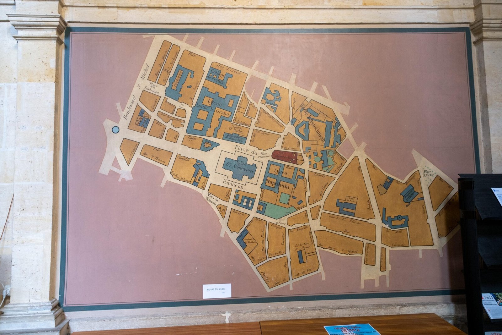

Garett found a map in Église Saint-Étienne-du-Mont, near the Panthéon in Paris.
-
4:00
GeoServer Team: GeoServer WPS Extension Installation Guide
sur Planet OSGeoGeoSpatial Techno is a startup focused on geospatial information that is providing e-learning courses to enhance the knowledge of geospatial information users, students, and other startups. The main approach of this startup is providing quality, valid specialized training in the field of geospatial information.
( YouTube | LinkedIn | Facebook | X )
GeoServer WPS Extension Installation GuideThis session covers the steps to install the WPS (Web Processing Service) extension in GeoServer, enabling advanced geospatial data processing capabilities through standardized web service operations.
If you want to access the complete tutorial, click on the link.
Introduction
GeoServer is a powerful open-source server application that enables users to publish geospatial data and interactive maps on the web. It supports a wide range of data formats and protocols, making it a flexible solution for managing and delivering geospatial content. One of its standout capabilities is functioning as a geoprocessing server.
Geoprocessing involves analyzing spatial data to derive insights and perform operations such as Buffer, Clip, Union, Contour, and more. By default, GeoServer does not include Web Processing Service (WPS) functionality. However, WPS is available as an optional extension that’s easy to install. Adding this extension unlocks advanced geospatial analysis and processing features directly within GeoServer. To get started, download the WPS extension ZIP file that matches your GeoServer version.
Note: This tutorial uses GeoServer version 2.25.3. Be sure to download the WPS extension that corresponds exactly to your GeoServer version—mismatched versions will result in errors.
Installing the WPS ExtensionHere are the steps to install the WPS extension in GeoServer:
- Navigate to the GeoServer website and select the download link.
- Under the Archive tab, choose the version that matches your installed GeoServer.
- Select the WPS option from the Services section. After a few seconds, the extension file will begin downloading automatically.
Prepare for Installation:
- It’s recommended to stop GeoServer before installing any extensions. This will prevent any potential conflicts or problems during the installation process.
- Unzip the downloaded WPS extension file.
- Copy all extracted
.jarfiles directly into theWEB-INF/libdirectory of your GeoServer installation. Ensure the extracted files are placed directly in this directory, avoiding subfolders. - Once the files are in place, restart GeoServer to ensure that the changes take effect. This activates the newly installed WPS extension.
Once GeoServer is running again, open the GeoServer web interface. From the Server Status section, click on the Modules tab to confirm that the WPS extension is in the list of installed modules.
Testing WPS Functionality:
- Navigate to the Demos section in the GeoServer interface.
-
Select WPS Request Builder to access a tool for testing WPS processes.
- The WPS Request Builder consists of a drop-down list containing various processes. It supports many types of processes that are categorized based on prefixes. These prefixes are:
- JTS: Java Topology Suite
- geo: geometry processes
- ras: raster processes
- vec: Vector processes
- gs: GeoServer-specific processes
- The
geoandJTSprocesses return text-based analysis results but do not support internal GeoServer layers as input. - The
gsandvecfunction groups support both text input and GeoServer layers or WFS layer URLs. - For raster data analysis, use processes with the
Rasprefix.
In this session, we took a brief look at how to install the WPS extension in GeoServer. To access the full tutorial, click on this link.
-
13:00
Mappery: OS Water bottle
sur Planet OSGeo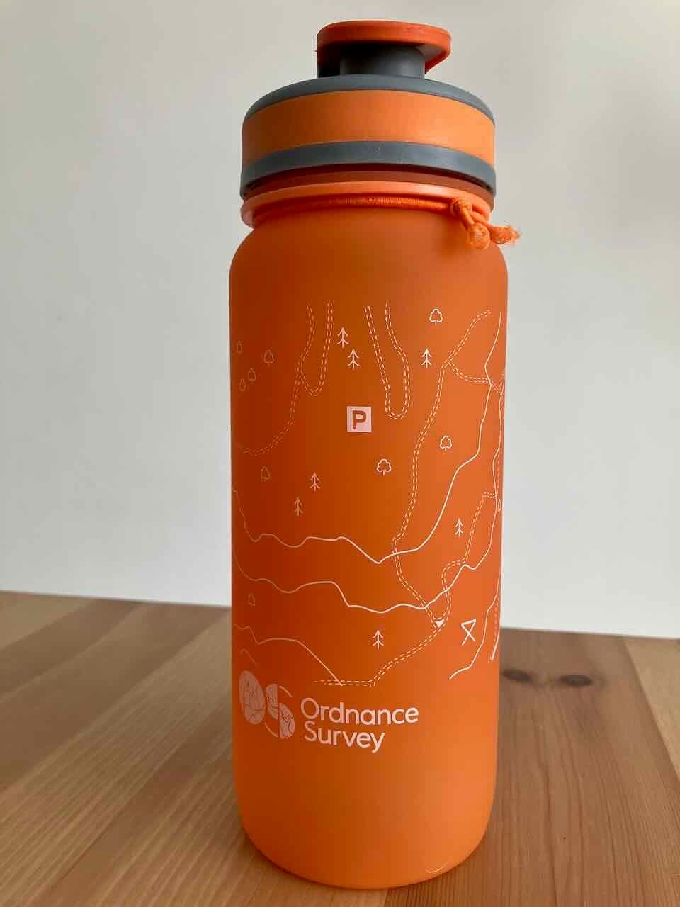

An Ordnance Survey water bottle with contour lines.
-
23:25
OPENGIS.ch: QGIS- & PostGIS-Expert:in | 80–100% (CH)
sur Planet OSGeoStellenbezeichnung: QGIS- & PostGIS-Expert:in
Arbeitsort: Remote (innerhalb der Schweiz von Vorteil)
Pensum: 80–100%
Firma: OPENGIS.ch
Über OPENGIS.chOPENGIS.ch ist ein engagiertes Team von GeoNinjas für Entwicklung und Beratung. Wir setzen auf massgeschneiderte Open-Source-Geodatenlösungen für Schweizer und internationale Kundschaft. Unsere Leidenschaft gilt offenen Technologien – wir entwickeln sie weiter, setzen sie wirkungsvoll ein und engagieren uns aktiv in der Open-Source-Community. Unser verteiltes, agiles Team lebt von Zusammenarbeit, Vielfalt und gegenseitigem Support.
Deine Rolle
Zur Verstärkung unseres Beratungsteams suchen wir eine erfahrene, motivierte Fachperson im Bereich GIS. Du unterstützt unsere Kundinnen und Kunden bei der Erstellung und Pflege von PostGIS-Datenbanken, QGIS-Projekten und QField-Einsätzen. Du arbeitest selbstständig, aber eingebettet in ein kollegiales und kundenorientiertes Umfeld. Wenn du fürs QGIS-Ökosystem brennst, möchten wir dich unbedingt kennenlernen!
Deine Aufgaben- Aufbau und Betreuung von professionellen QGIS-Projekten (inkl. Datenbankanbindungen, Drucklayouts, Modellen usw.)
- Einrichten, Anpassen und Migrieren von PostGIS-Datenbanken
- Leitung kleiner Projekte
- Direkter Austausch mit Kund:innen zur Erfassung und Umsetzung ihrer Bedürfnisse
- Optional: Durchführung von QGIS- und QField-Schulungen (Einsteiger- und Fortgeschrittenenniveau)
- Fundierte Erfahrung mit QGIS und PostGIS
- Gute Kenntnisse im Datenmodellieren
- INTERLIS-Erfahrung von Vorteil
- Kenntnisse in QField und/oder QFieldCloud von Vorteil (Schulung möglich)
- Von Vorteil: Erfahrung mit Python-Scripting, Git und Docker
- Selbständige, lösungsorientierte Arbeitsweise
- Freude an Teamarbeit und klare Kommunikation
- Offen für Neues, neugierig und lernfreudig
- Fliessend Deutsch oder Französisch; gute Kenntnisse der anderen Sprache von Vorteil
- Englischkenntnisse fliessend
- Wohnsitz in der Schweiz bevorzugt
- Welche Erfahrungen bringst du mit QGIS und PostGIS mit?
- Kannst du ein aktuelles Projekt beschreiben, bei dem du fortgeschrittene QGIS-Funktionen und PostGIS genutzt hast?
- Was hast du kürzlich aus persönlichem Interesse gelernt?
So bewirbst du dich:
Wenn dich diese Stelle anspricht und du das passende Profil mitbringst, freuen wir uns auf deine Bewerbung unter opengis.ch/jobs
Werde Teil von OPENGIS.ch – und gestalte mit uns die Zukunft der Open-Source-Geoinformatik!


-
13:00
Mappery: A van on the way to Geomob
sur Planet OSGeo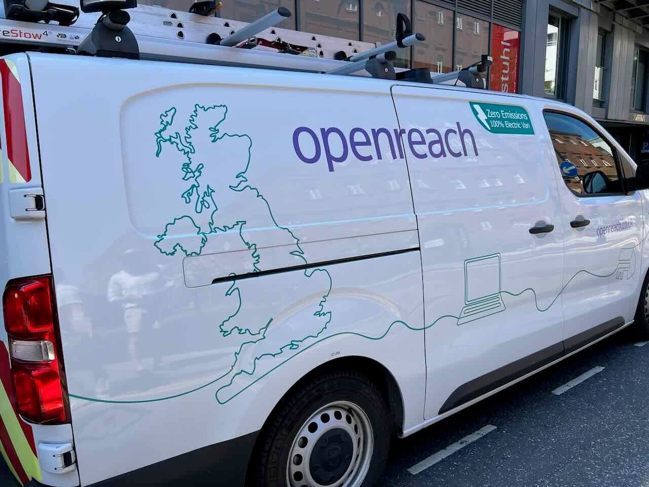

I came across this van on my way to the GeovationHub for Gemob London.
-
13:00
Mappery: Dublin Howth
sur Planet OSGeo

There’s something magical about discovering a beautifully illustrated tourist map like this one from Howth. These pictorial gems transform simple navigation into an adventure, especially this one, where you can imagine yourself hunting a treasure on an Island.
Thanks, Catherine, for sharing it.
-
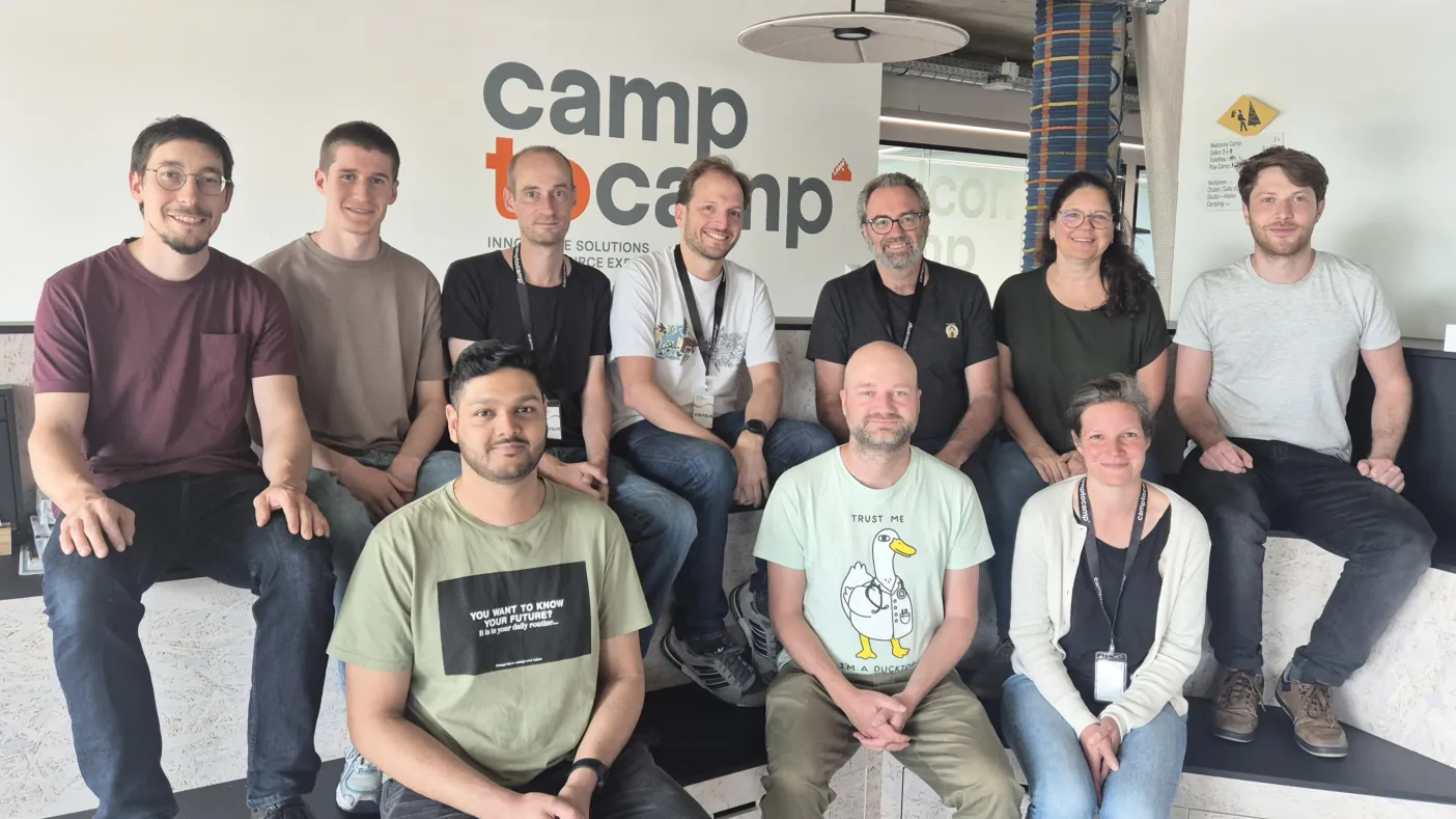
4:00
Camptocamp: Strengthening the French Open Source Ecosystem: Camptocamp Joins the CNLL
sur Planet OSGeoPièce jointe: [télécharger]
We are proud to announce that Camptocamp is now a member of the CNLL (Conseil National du Logiciel Libre), the leading professional organization whose mission is to structure the free software industry in France. -
13:00
Mappery: Manilla
sur Planet OSGeo

Eugene sent us this – A stylized map of Manila, Philippines on the wall at the Sheraton Manila Bay’s restaurant.
-
17:18
GeoSolutions: GeoSolutions at geOcom 2024
sur Planet OSGeoYou must be logged into the site to view this content.
-
13:00
Mappery: Gaia in the Old Library
sur Planet OSGeo


Gaia by Luke Jerram, the sculpture of Earth, is on display at the Old Library of Trinity College in Dublin—photos from Catherine.
-
12:25
GeoCat: Unlocking the Power of Open Standards — GeoCat Featured by OGC
sur Planet OSGeoWe’re proud to share that GeoCat is featured in a recent article by the Open Geospatial Consortium (OGC) : Enabling Open Geospatial Data Spaces: How GeoCat Helps Governments Unlock the Power of OGC St... -
11:20
GeoCat: Exciting News: We've Moved Into a New Office!
sur Planet OSGeoWe're excited to share that our Dutch team has officially moved into a new office space! This move marks an exciting chapter in our GeoCat's growth and reflects the progress we've made over the past f... -
13:00
Mappery: World’s Fair Globe Spotted in Queens
sur Planet OSGeo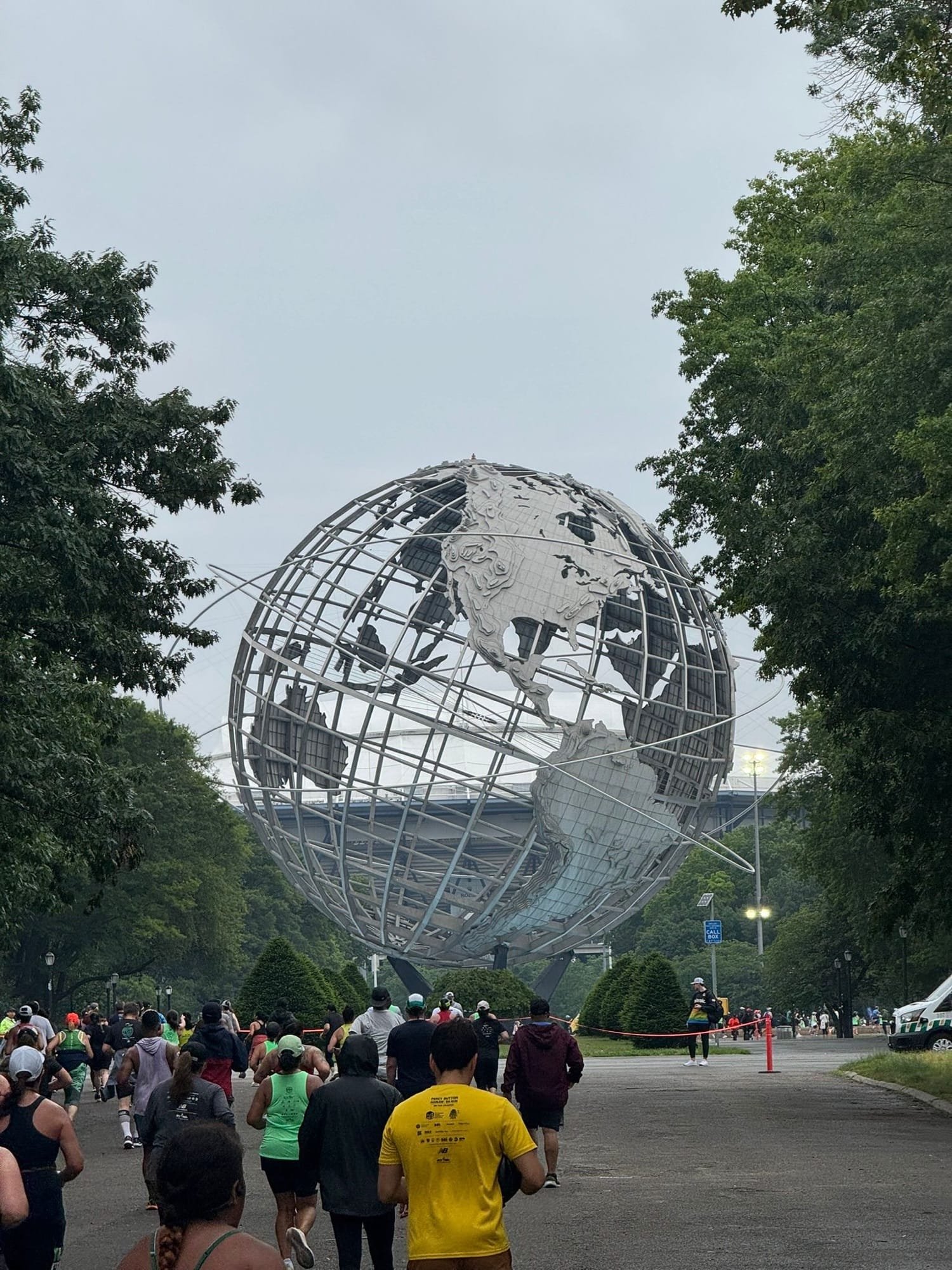
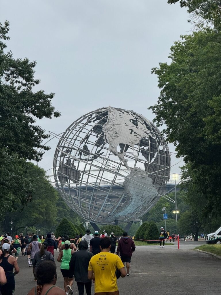
Mark spotted this World’s Fair globe (1964?) on the Queens 10k run today
-
4:00
Kartoza: Agile Project Management for a Geospatial Consultancy
sur Planet OSGeoGIS projects face challenges like data complexity, tech changes, and budget limits. Kartoza uses Agile and Scrum to enhance flexibility, collaboration, and efficiency, ensuring better project outcomes -
13:00
Mappery: You’re Nowhere
sur Planet OSGeo
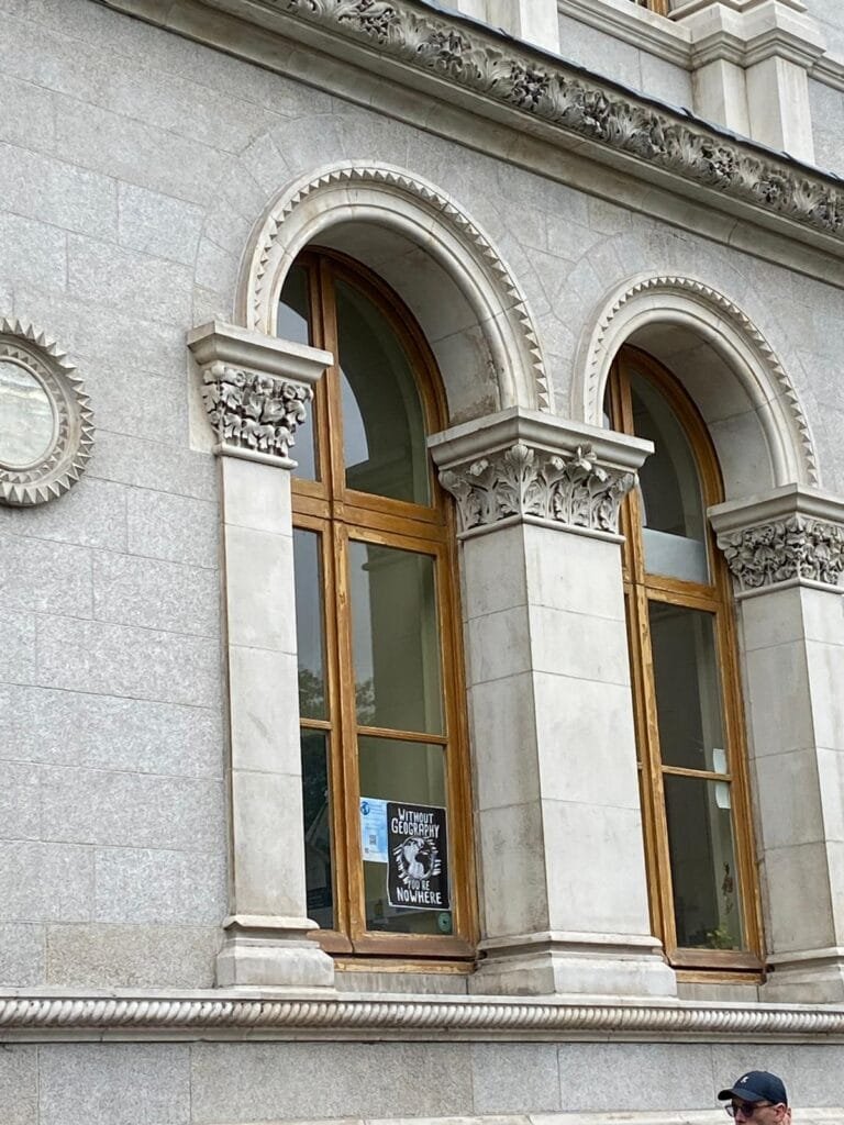
“Without Geography you’re Nowhere”, seen at Trinity College in Dublin by Catherine.
-
13:00
Mappery: Globular Clock
sur Planet OSGeo
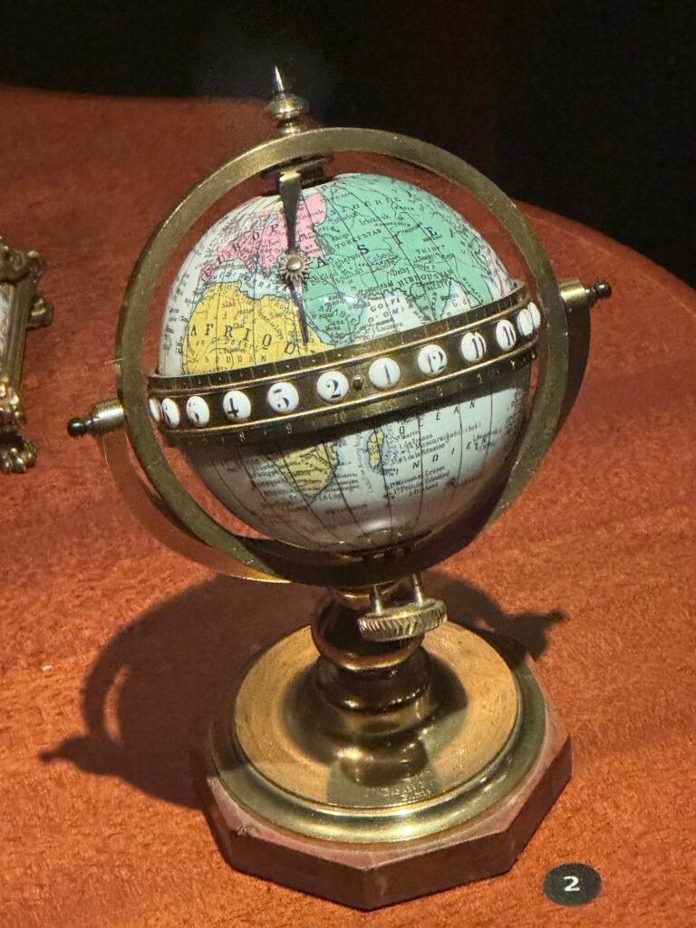
Saw this Globular clock at the Islamic Arts Museum in Jerusalem. It was made for La Fontaine, Paris, c. 1880.
The clock shows the sun’s location at given time on a map of the world
-
13:00
Mappery: Djerba
sur Planet OSGeo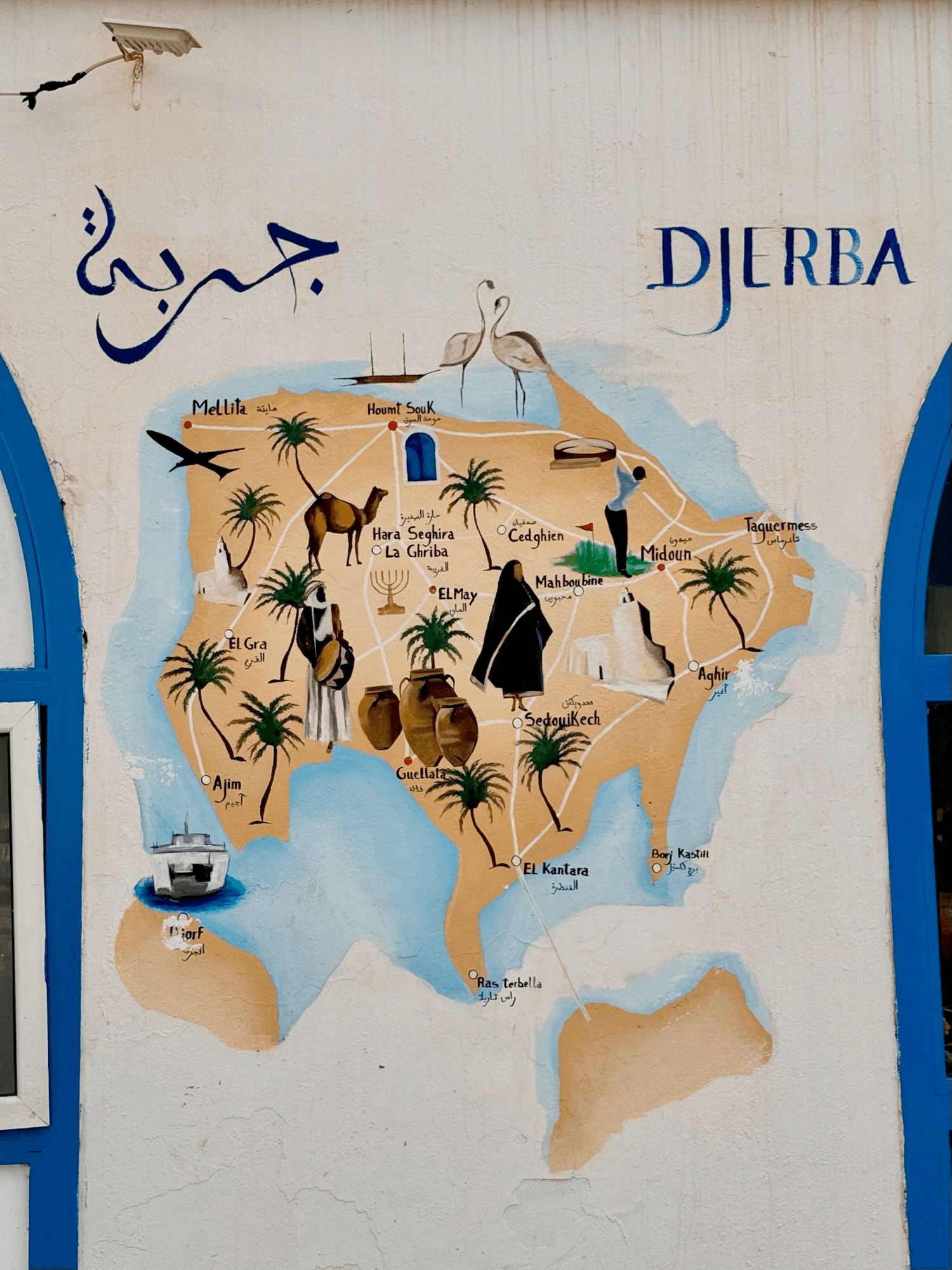
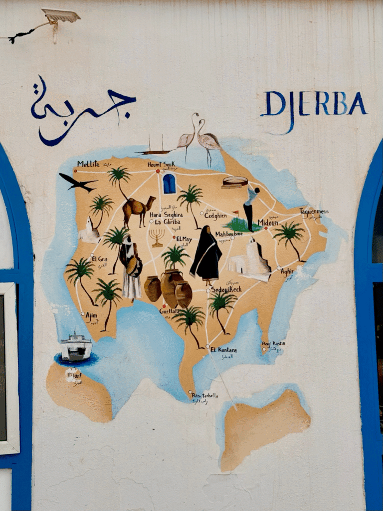
Another one from Jens’ visit to Tunisia
-
0:32
Fernando Quadro: Adicionar idioma Português Brasileiro no GeoNode
sur Planet OSGeoPrezados leitores,
Se você utiliza o GeoNode e gostaria que ele disponibilizasse como opção de idioma o Português Brasileiro, saiba que você mesmo pode adicioná-lo no GeoNode. Lembrando que este tutorial foi realizado com a versão 4.4.2 do GeoNode, então vamos aos passos:
1. Baixar os arquivos de tradução
> wget [https:] > wget [https:]
Você deve baixar esses arquivos em uma pasta do servidor, eu baixei os arquivos e coloquei-os dentro da pasta /opt/geonode_custom/
Feito isso, descompacte os arquivos e você terá 2 pastas: locale e mapstore
2. Acessar o container do Django
> docker exec -it django4my_geonode /bin/bash
3. Alterar o arquivo settings.py
> cd /usr/src/my_geonode/my_geonode
> vim settings.py
Adicione o seguinte trecho de código ao final do arquivo settings.py
LANGUAGES = (
    ('en-us', 'English'),
    ('pt-br', 'Português Brasileiro'),
)

MAPSTORE_TRANSLATIONS_PATH = [
    '/static/mapstore/ms-translations',
    '/static/mapstore/gn-translations',
    '/static/mapstore/project-translations'
]
Após salvar o arquivo settings.py, saia do container e vá para a pasta onde você baixou os arquivos da tradução.
4. Copiar os arquivos de tradução para o container do Django/GeoNode
> cd /opt/geonode_custom/locale
> docker cp pt_BR/ django4my_geonode:/usr/src/my_geonode/my_geonode/locale
> docker cp en_US/ django4my_geonode:/usr/src/my_geonode/my_geonode/locale
> cd ..
> cp mapstore/ django4my_geonode:/usr/src/my_geonode/my_geonode/static/
5. Reiniciar o container do Django
docker restart django4my_geonode
Agora é só você acessar o seu GeoNode e selecionar o idioma Português Brasileiro
-
20:32
OSGeo Announcements: [OSGeo-Announce] Sol Katz Award for Geospatial Free and Open Source Software – Call for Nominations 2025
sur Planet OSGeoThe Open Source Geospatial Foundation would like to open nominations for the 2025 Sol Katz Award for Geospatial Free and Open Source Software.
The Sol Katz Award for Free and Open Source Software for Geospatial (FOSS4G) will be given to individuals who have demonstrated leadership in the FOSS4G community. Recipients of the award will have contributed significantly through their activities to advance open source ideals in the geospatial realm.
Solomon ‘Sol’ Katz was an early pioneer of FOSS4G and left behind a large body of work in the form of applications, format specifications, and utilities while at the U.S. Bureau of Land Management. This early FOSS4G archive provided both source code and applications freely available to the community. Sol was also a frequent contributor to many geospatial list servers, providing much guidance to the geospatial community at large.
Sol unfortunately passed away in 1999 from Non-Hodgkin’s Lymphoma, but his legacy lives on in the open source world. Those interested in making a donation to the American Cancer Society, as per Sol’s family’s request, can do so at [https:]] .
Nominations for the Sol Katz Award should be sent to solkatzaward at lists dot osgeo dot org with a description of the reasons for this nomination (after sending, please wait for the moderator to accept your message). Nominations will be accepted until end-of-day 12th September Anywhere on Earth. A recipient will be decided from the nomination list by the OSGeo selection committee.
The winner of the Sol Katz Award for Geospatial Free and Open Source Software will be announced virtually during the FOSS4G 2025 event in Auckland, New Zealand. The hope is that the award will both acknowledge the work of community members, and pay tribute to one of its founders, for years to come.
It should be noted that past awardees and selection committee members are not eligible.
Past Awardees:
- 2024: Tom Kralidis
- 2023: Howard Butler
- 2022: Sandro Santilli
- 2021: Malena Libman
- 2020: Anita Graser
- 2019: Even Rouault
- 2018: Astrid Emde
- 2017: Andrea Aime
- 2016: Jeff McKenna
- 2015: Maria Brovelli
- 2014: Gary Sherman
- 2013: Arnulf Christl
- 2012: Venkatesh Raghavan
- 2011: Martin Davis
- 2010: Helena Mitasova
- 2009: Daniel Morissette
- 2008: Paul Ramsey
- 2007: Steve Lime
- 2006: Markus Neteler
- 2005: Frank Warmerdam
Selection Committee 2025:
- Jeff McKenna (chair)
- Frank Warmerdam
- Markus Neteler
- Steve Lime
- Paul Ramsey
- Sophia Parafina
- Daniel Morissette
- Helena Mitasova
- Martin Davis
- Venkatesh Raghavan
- Arnulf Christl
- Gary Sherman
- Maria Brovelli
- Andrea Aime
- Astrid Emde
- Even Rouault
- Anita Graser
- Ariel Anthieni
- Sandro Santilli
- Howard Butler
- Tom Kralidis
1 post - 1 participant
-
13:11
WhereGroup: Neue Version des QGIS2Mapbender-Plugins veröffentlicht: Mapbender-Anwendungen einfach direkt aus QGIS heraus erstellen
sur Planet OSGeoQGIS-Desktop-Projekte können nun mit nur wenigen Schritten als WMS und gleichzeitig als Mapbender-Anwendung veröffentlicht werden - mit unserem neuen Plugin QGIS2Mapbender. Jörg Thomsen zeigt in diesem Beitrag step by step wie es geht. -
13:00
Mappery: Whitewater Canyon
sur Planet OSGeo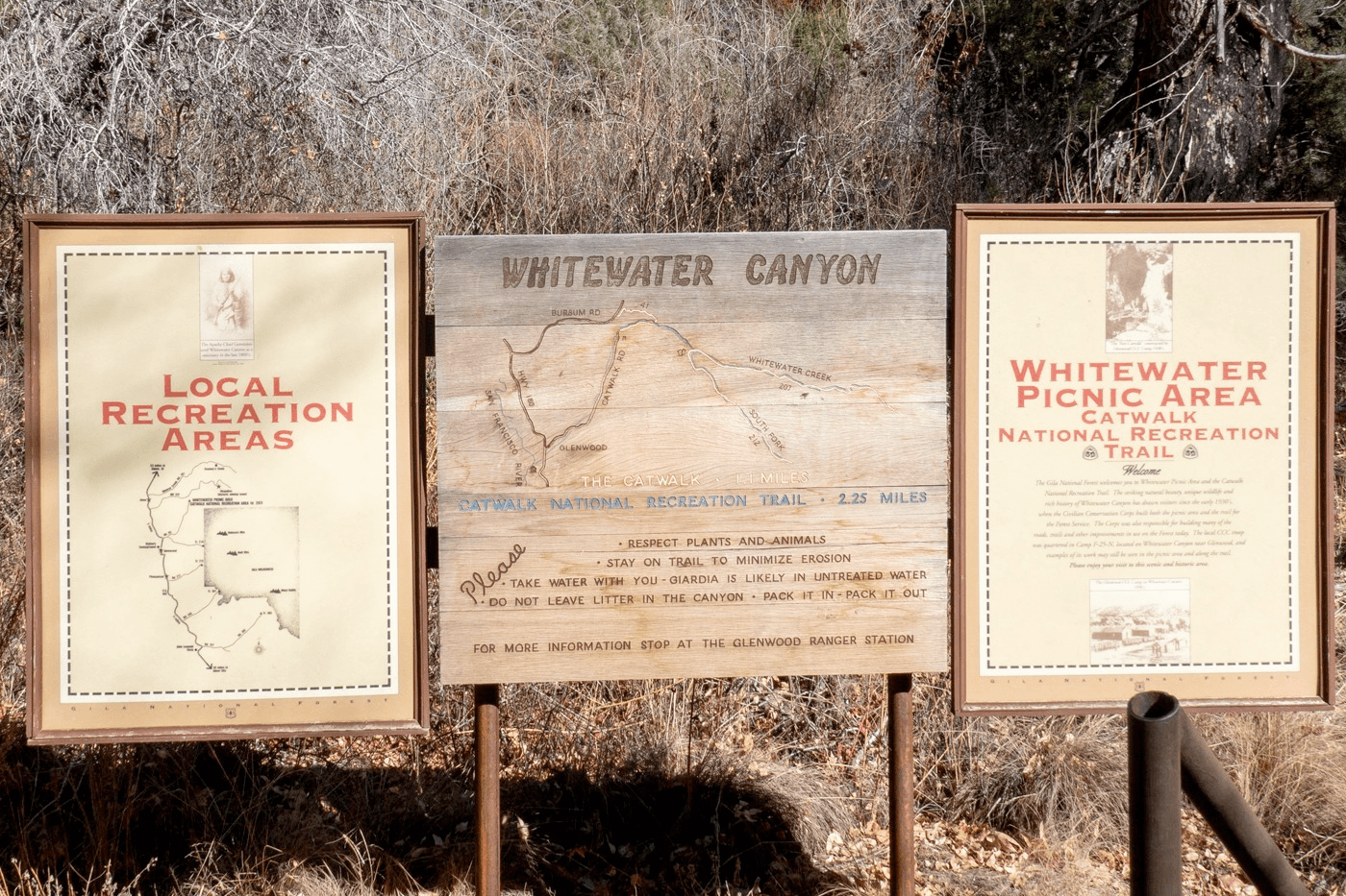

Jami said “Took our latest visitor on a tour of Whitewater Canyon, New Mexico and hiked the Catwalk. Love the maps carved into the sign. You can’t get too lost in a narrow canyon, though, except where the trail is washed out.”
-
4:00
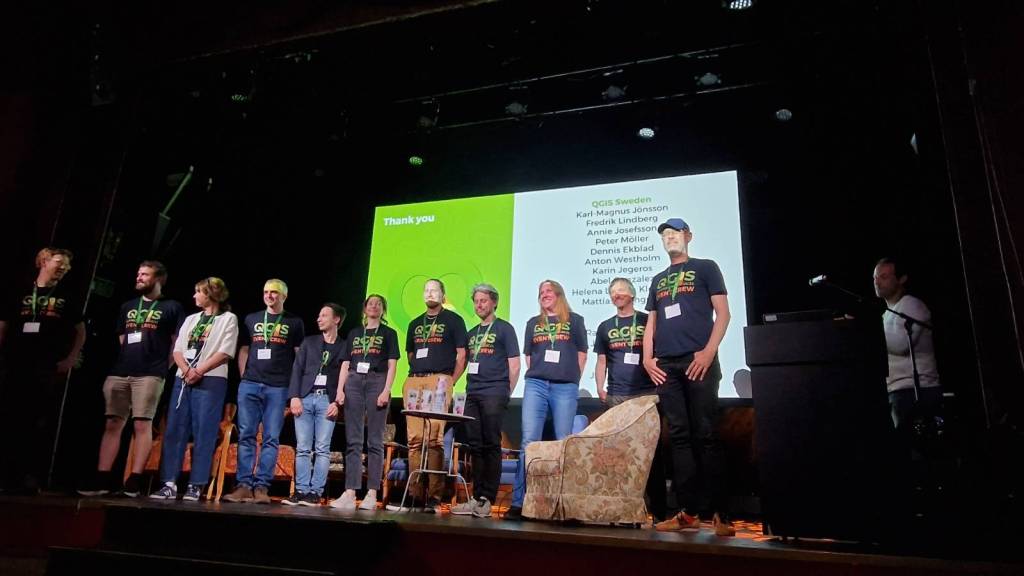
FOSSGIS e.V. News: GeoStyler Code Sprint 2025
sur Planet OSGeoVom 02. bis 06. Juni 2025 fand der GeoStyler Code Sprint in Bussigny statt.
13 Personen aus Deutschland, Frankreich und Schweiz haben teilgenommen.
Die Veranstaltung wurde gefördert durch den FOSSGIS e.V..Unter anderem wurde an folgenden Themen im Rahmen des Code Sprints gearbeitet:
- OGC API Styles für GeoStyler REST API
- Verbesserungen an GeoStyler CLI, UI und Demo Anwendung
- Aufsetzen eines eigenen GeoStyler Servers
- Weiterentwicklung des ArcGIS und OpenLayers Parsers
GeoStyler REST ist somit ab sofort OGC API Styles konform und bietet die Möglichkeit, einen Kartenstil in unterschiedlichen Formaten auszugeben, bspw. mapbox, OpenLayers FlatStyles, SLD, QGIS. Hierdurch können Kartenstile zentral verwaltet und unterschiedlichen Anwendungen zur Verfügung gestellt werden.
Ein ausführlicher und detaillierter Artikel ist hier zu finden: [https:]] .
Teilnehmende GeoStyler Code Sprint 2025 -
22:39
Free and Open Source GIS Ramblings: QGIS User Conf 2025 videos have landed!
sur Planet OSGeoThe QGISUC2025 team has done an awesome job recording and editing the conference presentations. All “presentation” type talks where the presenter has accepted to be published are now available in a dedicated list on the QGIS Youtube channel.
I also had the pleasure of presenting our Trajectools plugin and you can see this talk here:
Thank you to all the organizers, speakers, and participants for the great time!
-
13:00
Mappery: La Medina de Kairouan
sur Planet OSGeo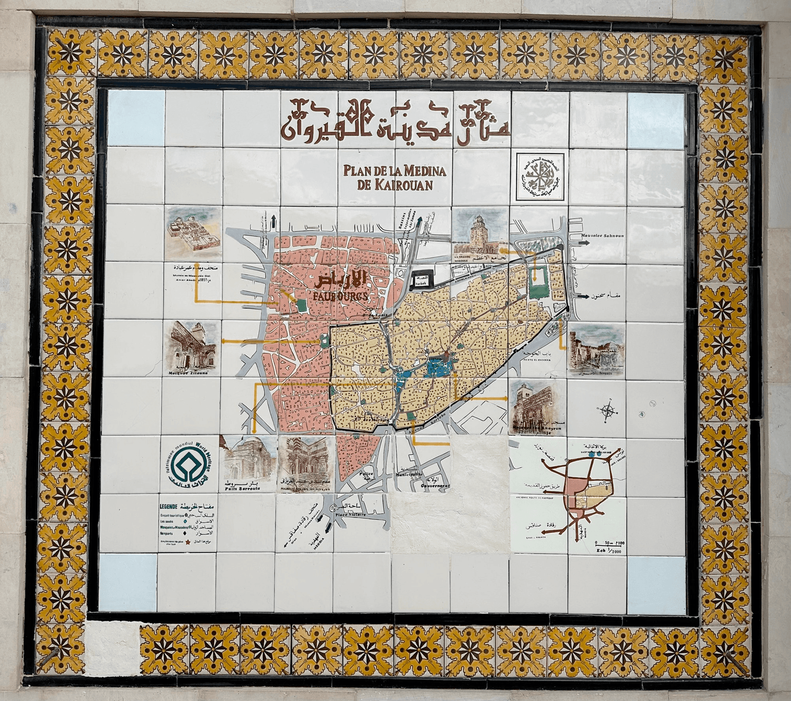

Jens share this tiled map – Kairouan is in the east of Tunisia
-
8:45
OPENGIS.ch: Celebrating community, innovation, and open-source GIS in Sweden – AKA the QGIS user conference 2025
sur Planet OSGeoIt was such a pleasure to be part of the QGIS User Conference 2025 in Norrköping! The event was extremely well organised — a big thank you to the amazing local team for pulling it all together so smoothly. Personally, it felt special to be back in Sweden, almost 20 years after my Uppsala university days. I truly enjoyed giving the opening keynote and sharing the latest from the QGIS project — and of course, showcasing all the QField greatness we’ve been working so hard on


 Talks & Presentations
 QGIS.org updates
As Chair of the QGIS.org association, I had the opportunity to share recent updates from the QGIS community. I spoke about ongoing development efforts, community growth, funding initiatives, and collaborations that help keep the project moving forward.
The focus was on the people who make QGIS possible — contributors, sponsors, local user groups, and everyday users — and how their involvement continues to shape the project’s direction and ensure its long-term sustainability. Slides here (unfortunately keynotes and workshops were not recorded)
 Extending QFieldCloud – Ideas and Practical Examples
In this talk, Michael, one of our Full stack GeoNinja and Web Cartography teacher, explained how QFieldCloud can be extended by integrating additional Django apps. This allowed, for example, the generation of QField projects, reacting to events from fieldwork, adding new websites and APIs, and executing entire QGIS models as QFieldCloud jobs.
After a technical introduction, various practical examples were explored. It was shown how OpenStreetMap data can be fully automated to download offline-capable QField projects. Attendees got inspired by how an own WebGIS is brought to life in QFieldCloud using OpenLayers. Furthermore, he demonstrated how remote sensing data can be downloaded, analysed in a QGIS pipeline, and the results made available in QField projects. Finally, the discussion focused on how these capabilities can be optimally used in combination with QField plugins.
 SIGNALO: An Open-Source Solution for Mapping Road Signs in QGIS
Presented by Denis, our Industry Solution Team Lead, SIGNALO is a QGIS-based solution for mapping road signs, powered by a PostGIS database. It addresses the challenge of representing vertical data on maps while ensuring compliance with Swiss norms, yet remains highly customizable for use at local, regional, or national levels. Moreover, the flexible design allows for easy adaptation to other countries.
In this talk, Denis explored both the technical foundations of the project and the organizational strategies that enable its open-source development.
 1.5 Million Reasons to Use QField
In this talk, I shared our vision for the future of QField — the world’s most popular open-source mobile GIS solution. With over 1.4 million downloads and 500,000 active users, QField is making a real difference for fieldwork around the globe.
I spoke about where we’re headed next, what new features are coming, and how we at OPENGIS.ch are working to empower professionals across all sectors with powerful, flexible, and open tools for mobile geospatial workflows. Standardizing Groundwater Data Collection with QField
We were excited to see Alexandra Nozik from the Leibniz Centre for Tropical Marine Research (ZMT) present her work on a QField project designed to standardize groundwater data collection in remote tropical regions. The setup uses QGIS layers, predefined parameters, and metadata standards to ensure high-quality, consistent field data. Integrated with QFieldCloud, the workflow improves data accuracy, reduces data loss, and enables real-time collaboration. The project will be published on GitHub as a ready-to-use package, supporting reliable and comparable groundwater data collection across the scientific community.
QField and QFieldCloud – seamless fieldwork for QGIS


In this workshop, Zsanett, QField Product Manager, went through the complete fieldwork process: setting up a QGIS project, publishing the project via QFieldCloud, collecting data via the QField mobile app and synchronising the field data back to your main dataset in the office. QField works on top of QGIS and allows users to set up maps and forms in QGIS on their workstation and deploy them in the field. QField uses QGIS’s data providers (OGR, GDAL, PostGIS and others) and supports most common file formats. QField combines a minimal design with sophisticated technology that allows intuitive viewing and editing of data. QField’s map rendering is supported by the QGIS rendering engine, so the results are identical and the full range of styling options available on the desktop is available. Editing forms in QField respect the QGIS configuration and are optimised for touch interaction. QFieldCloud makes field collaboration much easier. Participants learned about configuring users with different rights, collecting offline and online data, and synchronizing field data and QGIS project data.
Our first international QField Day
On June 4th, the first international QField Day took place in Norrköping, right after the QGIS User Conference. This free half-day event was dedicated to QField, QFieldCloud, and the mobile GIS community, bringing together users, contributors, and developers for an afternoon of field-tested workflows, live demos, community stories, and open discussions. It was a great opportunity to connect, exchange ideas, and explore the future of mobile geospatial tools in the open-source ecosystem.
Definitely not our last one.


 Supporting Open Source
We were proud to support QGIS UC25 in Norrköping, Sweden, as Platinum Sponsors — reaffirming our commitment to the open-source geospatial community and the continued growth of the QGIS ecosystem.
 Looking Ahead
We’re already looking forward to the next gathering — QGIS UC26 will take place in Switzerland
 !
!After the conference, I joined the contributor meeting along with four QGIS developers from OPENGIS.ch. It was a fantastic chance to collaborate in person, help shape the future of QGIS, and reconnect with old friends from the community.


-
13:00
Mappery: El Chalten
sur Planet OSGeoPièce jointe: [télécharger]

Robert Simmon shared this, El Chaltén is a village within Los Glaciares National Park in Argentina’s Santa Cruz province.
-
19:09
Fernando Quadro: Instalação do Certificado SSL no GeoNode
sur Planet OSGeoPrezado leitor,
Se você está trabalhando com o GeoNode e está tendo alguma dificuldade para gerar o certificado digital (SSL), vou detalhar como você pode fazer utilizando o Lets Encrypt. Vamos aos passos:
1. Instalar o certbot (para gerar o certificado)
> sudo apt install -y certbot
2. Parar o Nginx
> docker stop nginx4my_geonode
3. Gerar o certificado para o domínio desejado
> sudo certbot certonly -d fernandoquadro.com.br
O certbot irá gerar os arquivos privkey.pem e fullchain.pem na pasta /etc/letsencrypt/archive/fernandoquadro.com.br
4. Copiar os arquivos para o nginx no docker
No container do Ngnix existe a pasta /certificate_symlink, é nela que ficam armazenados os arquivos do certificado SSL. Você precisa então, substituir os arquivos que você criou com o certbot pelos que estão por default nessa pasta. Para isso, entre na pasta onde estão os arquivos que você gerou e execute o seguinte comando:
> docker cp fullchain.pem nginx4my_geonode:/certificate_symlink
> docker cp privkey.pem nginx4my_geonode:/certificate_symlink
Após realizada a cópia confira se está tudo certo. Caso ele tenha criado com o nome fullchain1 ou privkey1, a sugestão é apagar os antigos e renomear os novos.
5. Alterar as variáveis no arquivo .env
Para finalizar é necessário que você altere as seguintes variáveis do seu arquivo .env para [https.] São elas:
– SITEURL
– NGINX_BASE_URL
– GEOSERVER_WEB_UI_LOCATION
– GEOSERVER_PUBLIC_LOCATIONLembre-se de alterar também as variávels [HTTP_HOST] (que ficará em branco) e [HTTPS_HOST:]
– [HTTPS_HOST=fernandoquadro.com.br]
Por último, lembre-se de setar as variaveis abaixo, para production:
– DOCKER_ENV=production
– LETSENCRYPT_MODE=production6. Reiniciar o Nginx
> docker start nginx4my_geonode
Agora é só abrir o navegador e verificar se deu tudo certo e seu GeoNode está com o [HTTPS] ativado.
Dica: Se precisar conferir o nome dos arquivos, a configuração dos arquivos pem, fica na pasta /etc/nginx no docker no arquivo nginx [https.available.conf]
-
18:19
Lutra consulting: QGIS 3.44 Launches 3D Globe View with Enhanced Performance
sur Planet OSGeoQGIS 3.44 now features a 3D Globe View with support for 3D Tiles and point clouds. Improved rendering precision and performance make planet-wide 3D mapping possible. -
13:00
Mappery: Tube Map in Cross Stitch
sur Planet OSGeoPièce jointe: [télécharger]

Girl on the Net received this stunning embroidered tube map as a gift
-
4:00
Camptocamp: Camptocamp Partners with Lutra Consulting to Expand Mergin Maps Deployment
sur Planet OSGeoPièce jointe: [télécharger]
Camptocamp has joined forces with Lutra Consulting to support the wider adoption of Mergin Maps—an intuitive GIS tool for efficient field data collection. Learn how this partnership enhances fieldwork for teams with or without geomatics expertise. -
3:02
Sean Gillies: Bear training week 18 recap
sur Planet OSGeoWeek 18 was my biggest, most social, most fun, and most satisfying week yet. I did a gravel ride with a friend on Wednesday, hiked to the alpine tundra in Rocky Mountain National Park with my daughter on Thursday, ran in 35 °C heat on Friday, and then treated myself to a fast run up and down Horsetooth Mountain early this morning.
Outside of training, I quit taking Naproxen, continued passive and active heating training, and started seeing a physical therapist about my Achilles tendinopathy. I learned that part of the solution will be loading my calf muscles, but without lengthening the muscle and thus stressing the tendon. The therapist also reassured me that I can run when it feels good. I don't need a boot or crutches or anything like that.
Here are the numbers for the week:
20.3 miles running (and hiking)
14 hours, 59 minutes all training
4,187 feet D+ running (and hiking)
The hike to Flattop Mountain in Rocky was super fun. I loved the chance to spend all day with my adult kid and help her kick off a "couch to Fourteener" program. It was my first trip on foot this season to treeline and above, and I felt good. I was also impressed at how well my Salomon Ultra Glide shoes served on an alpine trail. I'll feel confident wearing them at Never Summer or The Bear, as long as conditions are mostly dry.

A human sitting on a rock overlook, facing a gorge and granite peaks with some stripes of snow.

A smooth trail through rocks and tundra well above treeline.
Yesterday (Saturday) I went for a nice long bike ride in the heat of the day. Today I got out of bed early to run in the coolest part of the day. I took just one handheld bottle (2 scoops of Tailwind) and hiked and ran to Horsetooth Mountain via the Spring Creek Trail. I went pretty hard and was just a little off my personal bests (from 2021) for some of the long uphill segments. I'm very excited about this. Consistent training, even if not in my favorite form, has been working.
Coming off the summit, I met a friend and chatted for a while, and then headed down, down, down to my car. I had to take a short walking break after a sharp rock strike on one of my heels, but was otherwise able to run three miles to the bottom without riding my brakes.
Next week is a scheduled rest week. I plan to do some high intensity workouts of shorter duration, some recovery rides, short easy runs, yoga, Pool HIIT, and sauna sessions.

Mount Milner and a green valley south of Horsetooth Mountain.
-
13:00
Mappery: Points of Interest
sur Planet OSGeo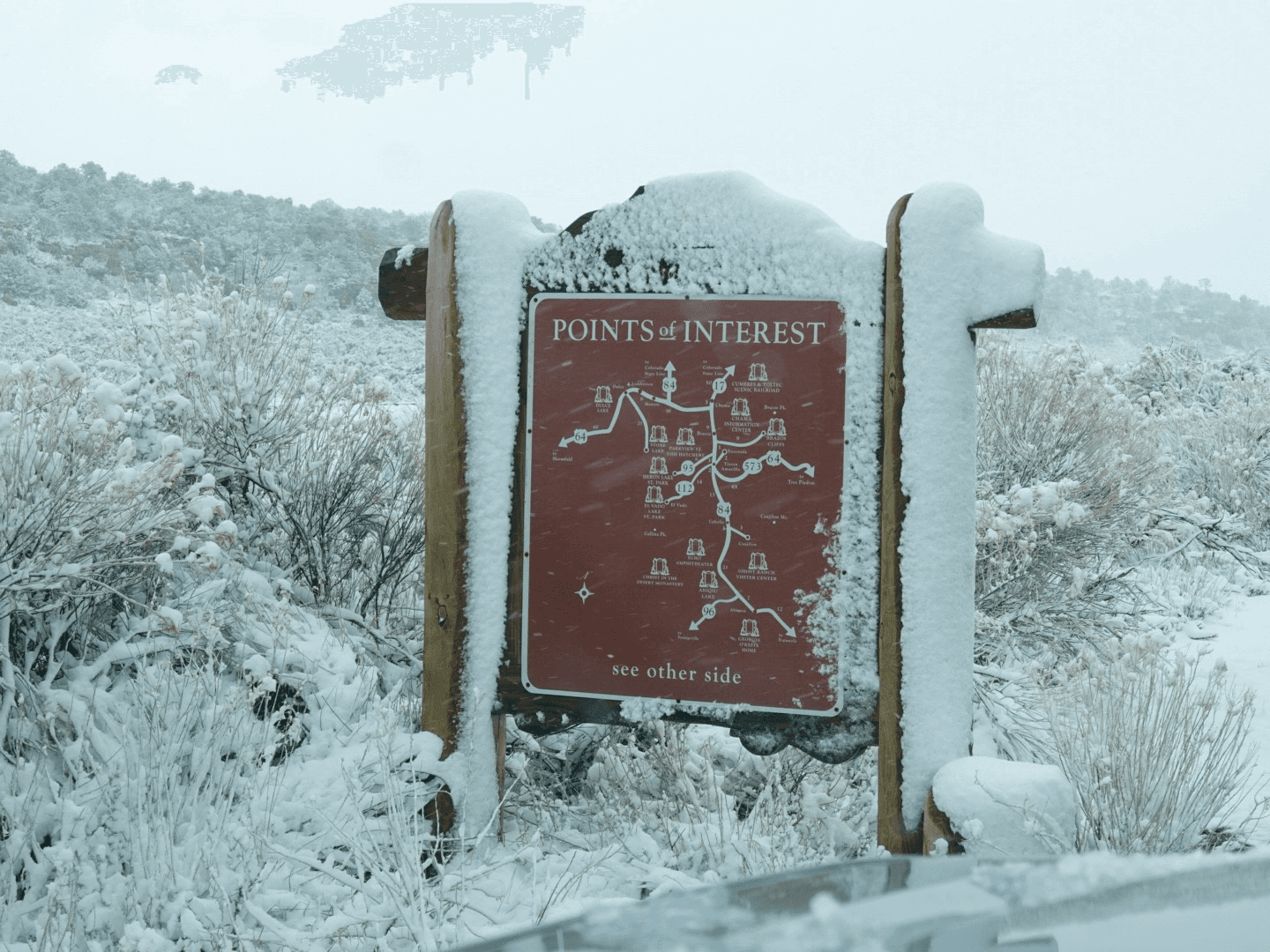

Jami posted this from a chilly Mexico (who knew?)
-
13:00
Mappery: Gare de Lyon
sur Planet OSGeo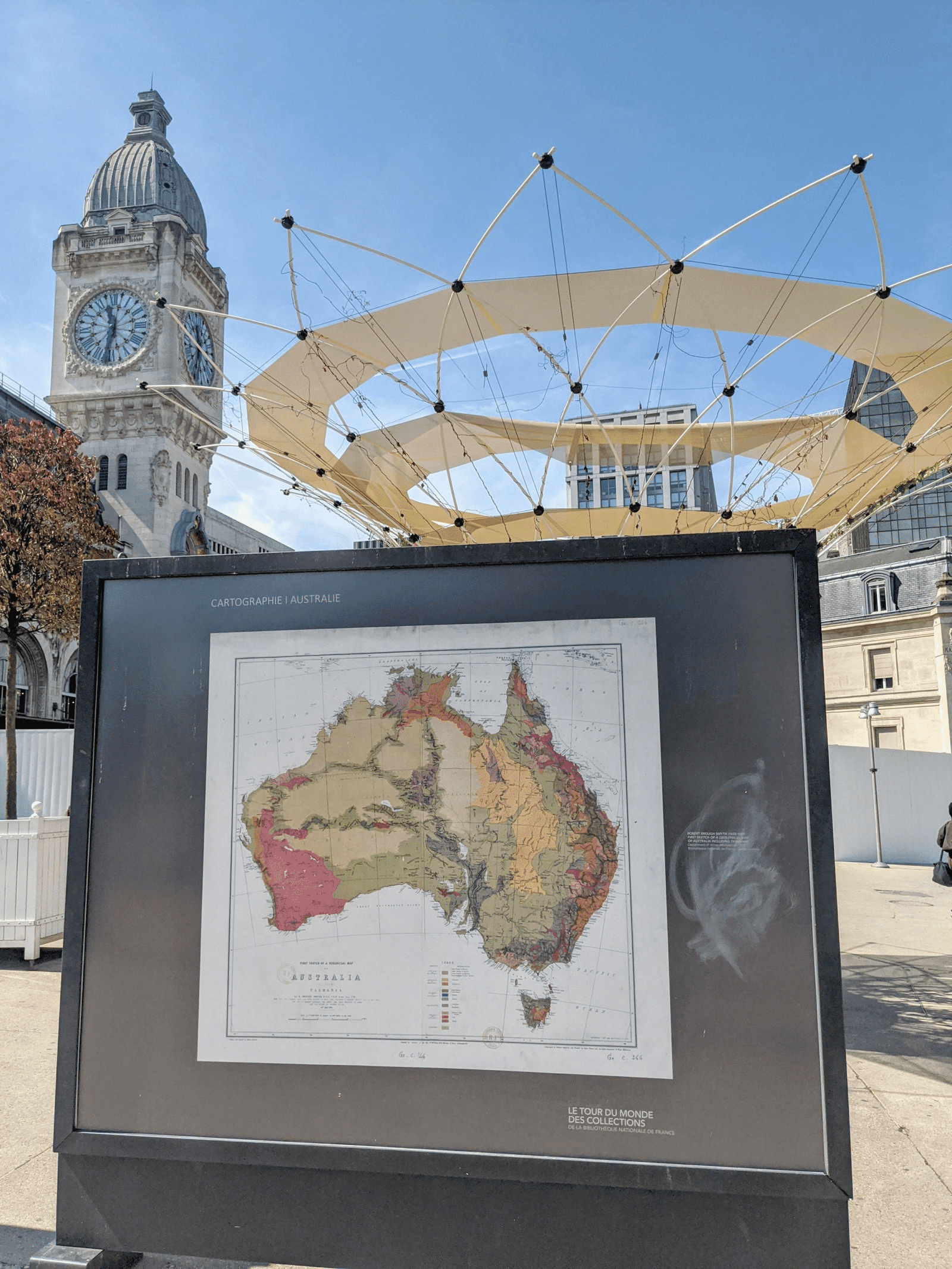

Jeremy Garniaux shared these pics from a display in the forecourt of the Gare De Lyon. “A beautiful series of almost MapsInTheWild was waiting for me this morning on the forecourt of the Gare de Lyon this morning, as I arrived.”

I wonder how they chose the images for this display?

-
4:00
EOX' blog: ESA Living Planet Symposium, Vienna 2025
sur Planet OSGeoWelcome to the Living Planet Symposium 2025 in our hometown Vienna! In an effort to help meet the event's sustainability goals, we are refraining from distributing printed materials. Our handouts are instead provided as the following digital files and websites. Find us at our booth F13, level 0 or ... -
3:00
Nick Bearman: Becoming a Dad
sur Planet OSGeoThis blog post isn’t about GIS, mapping, conferences or travel, so feel free to skip it if you want. However, if you’re interested in my experiences of becoming a Dad, read on. Be warned - it is quite a long post (~3000 words, ~6 pages) and contains details about birth, C-sections and medical treatment.
Picture of Baby, first of many!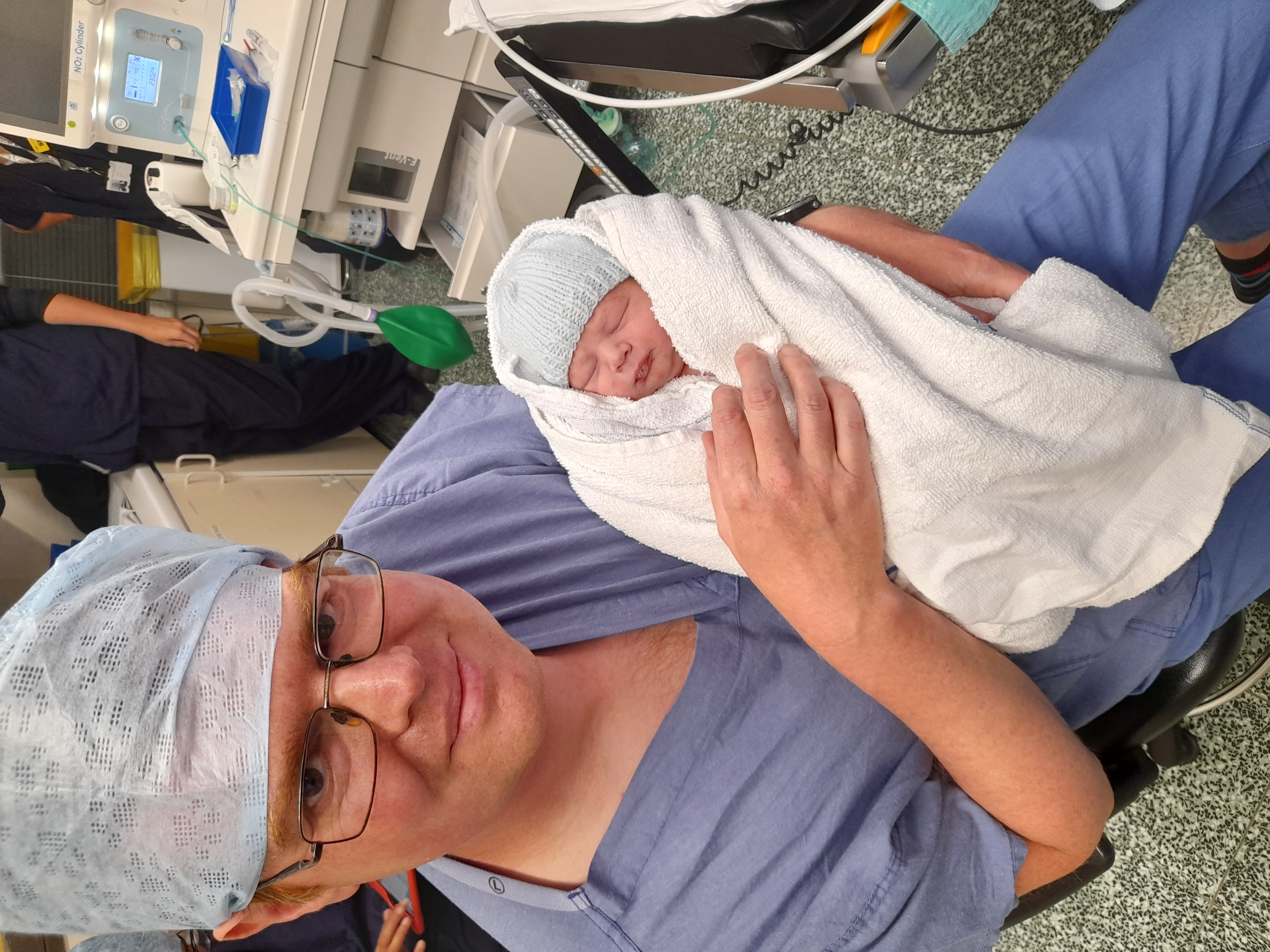
This is the story of bringing our son, Baby Bearman, into the world.
I’m calling him Baby Bearman here a) because we don’t have a name for him yet (you have 6 weeks after birth to decide, and we have been rather preoccupied recently!) and b) I don’t want this blog post to be the first thing that comes up when people search for his name!
Baby Bearman was due on Wed 25th June 2025, but ended up arriving early on Sun 8th June 2025, 2 and a half weeks early (at 37 weeks 4 days). All of us (Baby, Mum and Dad) are now doing well, although it has been quite a struggle at times.
Tue 3rd JuneWe start our journey at our antenatal appointment on Tue 3rd June, my wife, Louise’s blood pressure was borderline high. The reading was just under the threshold for them to worry about, so the midwife said to keep an eye on it and phone if we have questions.
Sun 8th June ~10amOn Sunday, Louise’s blood pressure was still a little high, so we phoned up the maternity advice line at 10am and they advised us to come in. Things started speeding up then, and happened very quickly, compared to the last 37 weeks /8 months!
We came in, and Louise had a blood pressure series done, where her blood pressure was taken every 5 minutes for half an hour. It was a bit high, so they sent blood and urine off for additional tests, and monitored the baby for an hour. The consultant explained a bit about pre-eclampsia, while Louise’s blood pressure was high, her urine dip test for protein was negative. You need to have both for pre-eclampsia to be diagnosed. To preempt further development of pre-eclampsia, the consultant recommended we consider early delivery of the baby. Usually they would wait until 41 weeks to induce (if the birth wasn’t spontaneous), but he recommended we induce at 39 weeks (18th June). Louise was given medication to reduce her blood pressure and we were booked for a followup appointment on the next day.
Sun 8th June ~4pmOn the way home, Louise developed a headache and took paracetamol. She continued to feel worse, and her headache got worse, so we phoned up (4:44pm). They advised us to come back in. She was feeling sick and threw up in the car. We got to Dorchester, and to the maternity unit. A nurse coming off shift took one look at her and took us straight in. We were in a shared ward and they assessed her. She was also suffering from edema (swelling) during pregnancy, but it had suddenly increased by now. Her blood pressure was higher. They tried to get an IV in but it was quite tricky because the pre-eclampsia makes the blood vessels smaller, compounded by the fact she had thrown up, so didn’t have much liquid left in her. She was given pills to reduce blood pressure but just threw them up again. She was also suffering photophobia - aversion to light - all the way from home into Dorchester, which is another symptom of pre-eclampsia. There were five people around Louise at this point, so it was getting rather crowded. We were moved to a private room. There they managed to get an IV in, done by an anesthesiologist with an ultrasound machine.
I would later discover that if the midwife had trouble getting an IV in, or taking blood, they would ask a consultant. If the consultant couldn’t do it, then the anesthesiologist would try. If they had trouble, they would use an ultrasound machine to see the blood vessels to help them gain access. At this point, Louise needed an anesthesiologist and an ultrasound machine!
They gave her IV paracetamol for her headache (which she would later describe as a migraine) and IV medications to lower her blood pressure. The consultant explained that the blood pressure was a result of the pre-eclampsia, and we later discovered that the pre-eclampsia had come on very very quickly. He said that Louise needed the placenta removed, and therefore needed to give birth. For this she needed an emergency C-section (caesarean section) as soon as possible. Louise’s consent was needed, and the consultant managed to explain the options in a way she could understand in the state she was in. Her blood pressure was still quite high at this point (one reading was 164/111, which is very high). The baby was being monitored throughout all of this, and he was fine. For the C-section operation, her blood pressure had to be under control. Therefore they put her on blood pressure medication via IV, and monitored her from about 7pm to about 10pm.
Sun 8th June ~10pmBy about 10pm, Louise’s blood pressure was under control and we were taken in for the C-section. I had to change into scrubs, and was allowed to be in the theatre with her. There must have been at least 10 people in the room and it was quite a busy experience. We had a great anesthesiologist, who talked Louise and myself through the whole process. Louise chose a spinal tap for pain management; less severe than a general anesthetic and so Louise could be conscious throughout the whole procedure. Her blood pressure was a little problematic, and there were a couple of times where she was quite out of it. Everything went well though and Baby Bearman was born at 22:46.
After they had taken the baby out, I was allowed to take some photos, and also cut the umbilical cord. It was quite a surreal experience and I was privileged to be a part of it.
We had about half an hour in recovery after the C-section. Louise recovered very quickly with the major pre-eclampsia symptoms disappearing as soon as the placenta was removed. We were then transferred to a room, with mum and baby having hourly checks. We had a midwife with us all the time, with a second mid wife there most of the time until 8am.
Mon 9th JuneWe stayed in the same room for most of the rest of the day. They still took hourly observations, but in general we were left to sleep. The baby slept a bit, but a lot of the time he wanted to be held, and when you are holding a baby you can’t sleep, so we didn’t get much sleep that day or Monday night. Louise was on fluid restriction, so limited to drinking 75ml per hour.
Monday day and evening progressed in a bit of haze. I did go and get some food from the hospital restaurant: a jacket potato at lunch time, which went down well, and some very spicy sweet and sour for dinner, which I had trouble eating. Louise had food brought to her (as the patient) which she demolished very effectively.
At 6:30pm, we were moved to room 4, where we would be for the rest of our stay. Monday night was really hard for both of us, as the baby wanted a lot of cuddles and wasn’t keen on being put down. I did have a bed, so when Louise had the baby I could lie down, but found it very hard to sleep as I was too stressed.
Tue 10th JuneOn Tuesday morning I went to get cereal in the day room. I sat there to eat it to have a bit of time out of our room, and I was completely overwhelmed. I sat there and cried. I had trouble processing what had happened, and looking back on it now, I was so sleep deprived (no sleep on Sunday night and not much on Monday night) I couldn’t process anything.
Another visitor came over and asked if I was OK. I said both mum and baby were OK (I didn’t realise at this point how serious things had been for Louise or the baby). She said she thought someone had died, based on how I was.
Later on Tuesday morning, one of the midwives visited and we talked a bit. This was mostly how Louise was getting on and how the baby was. Nobody explicitly asked me how I was doing. However, I knew enough about my mental health to realise that I was struggling and that I needed to say something, and this midwife looked like the person to say it to. I said to her I was struggling with everything. She listened and said we could talk. We had a good talk, and I tried to explain how I felt. It was at this point I realised I hadn’t slept for 48 hours+, which contributed to how I was feeling. The midwife explained about how we had to support each other and tag-team with the baby, i.e. I do some feeding and cuddling while Louise rests, and Louise does feeding and cuddling while I rest. She also let us know that it is often the case that the second night after birth (i.e. last night, Monday night for us) was the worst.
Given that we were likely to be in the hospital a bit longer, I was encouraged to go home for a bit of a break. Due to the fact the pre-eclampsia had come on so quickly, and we came in two and half weeks earlier than planned, I had brought no spare clothes with me. We already had stuff packed for the baby (nappies, wipes, etc.) and a couple of bits for Louise (maternity top, change of underwear) but I didn’t have anything. When we left on Sunday I did have the presence of mind to throw some snacks and drinks in a bag which were a life saver.
I went to Sainsbury’s to pick up some muslin and socks for the baby and I had a lovely call from my brother in law, Peter (Louise’s brother). He knew that I was an only child, and he said he knew people would be seeing how Louise and the baby were doing, but he wanted to ask how I was doing. I was touched by this and very grateful for the phone call.
While I was driving home, I had a very deep and meaningful thought. Of course, it seemed deep and meaningful at the time, but I was lacking in sleep, so it could be complete rubbish! I thought that whilst my world has completely changed with the birth of my son, the rest of the world hasn’t changed at all. Everything is exactly the same as it was before he was born. From globally crucial things like the wars in Russia/Ukraine and Israel and climate change, to the mundane and everyday, like the oddly designed set of traffic lights by Asda in Weymouth which you have to be very careful driving through. Since then everything has sunk in a bit more, so I am more used to him being here, and everything seems less “different”.
Tuesday night in hospital was better. We planned a bit and managed to tag-team, with me doing some feeds while Louise rested and Louise doing some feeds while I rested. We both got a bit of rest, although looking back now, we both still slept badly in the hospital, but it was so much better than the night before by comparison! I had jacket potato for dinner that evening.
Of course, Louise was in quite a lot of pain from the C-section. She had been given regular paracetamol, and at this point two doses of ibuprofen. One midwife on Tuesday evening refused to give Louise ibuprofen, despite her having it previously. The midwife said it wasn’t written on her chart, so she couldn’t have it; despite Louise’s protests that she’d had it twice already! She gave Louise dihydrochloride instead which was supposed to be a more powerful painkiller, but it didn’t make much impact on Louise’s pain. In fact the pain got worse, because she didn’t get the ibuprofen. Later on, Louise said this issue with the pain medication set back her recovery.
After the shift change, a new midwife came on and gave Louise ibuprofen when she asked for it, which helped with her pain. Apparently the ibuprofen had actually been written on Louise’s chart, but in “a funny place”. We never established what that meant.
Later on the same evening Louise was given a dose of Nifedipine, medicine to manage her high blood pressure. Her blood pressure had been monitored 4 hourly and was still high, an after effect of the pre-eclampsia. In the early hours of the morning, very suddenly Louise had heart palpitations and a very fast heart rate. It was quite scary for her. She used the call button, but by the time someone had come the palpitations had eased a bit. A cardiac nurse did come in and run an ECG test to check Louise’s heart, and everything looked fine. She didn’t have the palpitations again. Louise had been prescribed Nifedipine every twelve hours after the C-section - 9am and 9pm, 20mg. When 9am came around, the Nifedipine pills looked different to the ones she’d had at 9pm the previous night. At 9am she had two small pink pills which we were told was 20mg; at 9pm night before she’d had two different pills (maybe a different brand), which she was told was 2 x 10mg but we suspect were 2 x 20mg pills. This probably caused the heart palpitations. This was rather worrying and we have tried to keep a close eye on the pills since. This is quite tricky in hospitals, particularly when sleep deprived and when the pills are delivered in a small paper cup, it’s hard to know what they are. Also when they are delivered with a not great bedside manner, this makes it harder to ask and check what you are being given.
Wed 11th JuneLouise had been very unwell with the pre-clampasia and was getting better having given birth, and with our sleep deprived states it was hard to process our emotions, so we were struggling a bit. Later on that morning, we had a visit from the feeding team, and Baby was weighed. He’d lost 12.8% from his birth weight.
It’s usual for babies to lose some weight after giving birth - going from a nice warm, dark womb where food is provided on demand through an umbilical cord, to a bright, (relatively) cold, dry world, where you actually have to suckle and swallow to get food is quite a shock to the system! Particularly if you are born at only 37 weeks and 4 days, so ~2.5 weeks early (although babies are fully developed at 37 weeks).
The 12.8% loss is more than the typical 10% loss that is normal, so they were a bit worried about his weight and feeding. The feeding team talked to us about his feeding. He was happy going on Louise’s breast, but wasn’t suckling so hadn’t really taken on any milk since birth. They put us on a feeding plan, with a specific amount of milk (50ml) to give him every 3 hours. Louise was producing milk, so they introduced us to a breast pump, which we used, and then gave to Baby in a bottle. We then topped it up to 50ml with formula, every 3 hours. I was shown the ropes for sterilising the kit and bottles, and given the task of fetching, cleaning and sterilising the kit for every feed. Louise said that I spent a lot of time looking after the baby on Wednesday, giving her time to sleep and recover.
Louise’s parents visited today and arrived early afternoon. It was lovely to see them, and they stayed until around 5pm. We had dinner down in the hospital restaurant - jacket potato again for me and then they headed off. I slowly was feeling better and the visit made a nice change from the hospital routine.
It is amazing how frequently the advice around birth and newborns changes. One of our midwives, who was a third year student midwife, said that something she had learnt in her first year of study had now changed, with a better technique for feeding directly after birth. The advice changes frequently, and it even changed while we were in hospital! Louise had her C-section dressing checked, and removed this evening. Later on, the same midwife came back and said the advice for C-section dressings had changed, and now they were left on for five days rather than three, as this had been shown to reduce infection, so they replaced Louise’s dressing.
By Wednesday evening, everything was getting better and we were feeling more on top of things. We had some great advice from one of the midwives that evening about bottle feeding and successfully burping a baby - apparently burping is something they actually have to learn how to do!
The feeding plan the baby was on was going well, and Louise was expressing milk well. I was getting used to sterilising the equipment each time, and making the 55 metre walk, each way, twice every three hours (a total of 1.76 km every 24 hours), to get the bottles for Louise to express, and then return them and to wash and sterilise them. Louise was still trying to breast feed but having very limited success.
Later on that evening I had woken up for the ~1am feed and wasn’t feeling particularly with it. We needed the steriliser and bottles for Louise to express and I wasn’t feeling up to the long walk, so we asked one of the staff to get it for us, which they were very happy to do. She returned with the sterilising kit, but not the bottles. We asked her whether the bottles were there and she swore blind that they were not there. She got us some new bottles so Louise could do the expressing. The following feed I was more with it, so I went and checked and discovered the bottles were there, exactly where I said they were!
Thu 12th JuneOn Wednesday I had run around doing lots of things, and I think I had probably over done it: I wasn’t feeling that great. I broke down and cried again. I hadn’t eaten much and I think my brain had processed a bit more of what had happened and was struggling with it. We did have some good news that we were likely to be discharged on Thursday!
One of the midwives came to go through the discharge process, and in the check in, Louise said to her that I had been struggling. She had a chat with me, and asked whether I was looking after myself and whether I’d been eating enough. Thinking about it, I’d not really been eating enough since Sunday. Sunday night I had nothing, being preoccupied with the C-section (although I had had a main meal in the middle of the day). Monday I had toast for breakfast, jacket potato for lunch and a bit of sweet and sour pork for dinner. Tuesday I had cereal for breakfast, risotto for lunch (when I went home to pick up stuff) and jacket potato for dinner. Wednesday was toast for breakfast, jacket potato for lunch and jacket potato again for dinner. So I had been eating much less than normal for me. Discovering this, she essentially kicked me out of the room to go and get some lunch while she went through feeding and baby checks with Louise, which would take a while. I am eternally grateful for this and I took the opportunity to go to a nearby pub and have a decent burger and chips. I felt much better after this and was rather amazed that I had ended up in this position - missing out meals and not eating enough is not at all normal for me.
Louise’s parents arrived about 3pm, while we were getting sorted for discharge. I made various trips back to the car with stuff, and also managed to fit the child seat. We had had the child seat for a little while, but I hadn’t actually fitted it yet as I was planning on having 3 more weeks to work out how to fit it, before Baby was born!
We got out of the hospital about 5pm, and by pure coincidence saw the anesthesiologist from Louise’s C-section. She was thrilled to see us, and to see us leaving - Louise had been quite poorly because of the pre-eclampsia when she last saw us, so she said it was such a massive difference to see her looking so much better.
Over our 4 nights and 5 days in the hospital, we had some great care and met some fantastic staff - I can’t thank them enough for their time, patience and skill in looking after us. However, it was also clear they were massively overworked, short staffed and a couple of them were mediocre or even poor. The NHS is a fantastic institution with some great staff, but it also has some major issues. We can’t wave a magic wand and solve these issues but we need to find solutions that work, whilst keeping all of the fantastic elements that are in it.
-
22:37
TorchGeo: v0.7.1
sur Planet OSGeoTorchGeo 0.7.1 Release NotesThis is a bugfix and maintenance release. While there are no new features or API changes, this release includes important bug fixes, documentation improvements, and minor enhancements across datasets, models, trainers, and testing.
Dependencies- dependabot: update pandas group in unison (#2818)
- jsonargparse: silence deprecation warnings (#2774)
- segmentation-models-pytorch: 0.5+ now required (#2740)
- setuptools: 77.0.1+ now required (#2703)
- NAIP/Chesapeake: fix train/test overlap (#2834)
- SKIPP'D: add to docs (#2778)
- VHR-10: add to docs (#2776)
- Intersection/UnionDataset: simplify crs/res getter/setter (#2754)
- BigEarthNet v2: fix validation directory name (#2825)
- CopernicusPretrain: dataset yields, not returns (#2768)
- EuroSAT: download split file even if image directory already exists (#2840)
- FTW: add predictions to plot (#2731, #2735)
- FTW: add uncompressed test data to git (#2746)
- API: ensure all models are in utility functions/hub (#2733)
- CopernicusFM: fix flaky tests (#2710)
- CopernicusFM: typo fixes (#2770, #2844)
- Classification: apply sigmoid before threshold in plot (#2793)
- Instance Segmentation: denormalize images before plotting (#2744)
- Instance Segmentation: fix support for non-RGB images (#2752)
- Object Detection: fix support for non-RGB images (#2752)
- Semantic Segmentation: apply sigmoid before threshold in plot (#2793)
- Semantic Segmentation: pretrained ViT weights are now supported (#2787)
- README: update TorchGeo paper citation (#2729)
- README: update syntax in VHR-10 example (#2705)
- Related Libraries: add GeoDeep and srai (#2730, #2758)
- Related Libraries: DeepForest used to support TensorFlow (#2734)
- Landsat TM: fix number of channels for pretrained weights (#2836)
- Update PyTorch doc site links (#2794)
- Intro to PyTorch: use transforms (#2723)
- Intro to Geospatial: typo fixes (#2706)
- Earthquake Detection: speed up tutorial testing (#2721)
- Contribute DataModule: typo fixes (#2708)
- Contribute NonGeoDataset: fix sphinx directive (#2784)
This release is made possible thanks to the following contributors:
-
13:00
Mappery: Hello Dolly
sur Planet OSGeo

Matthew Edney spotted this map of Yonkers on the floor of the stage at a performance of Hello Dolly. “Map of Manhattan/Yonkers on floor of stage for Lyric Stage production of Hello Dolly (in Boston) … nifty” Nifty indeed!
-
8:55
OPENGIS.ch: OPENGIS.ch at the QGIS.ch User Meeting 2025 in Bern
sur Planet OSGeoThis past Tuesday in Bern, the Swiss QGIS community came together for the 2025 edition of the QGIS.ch User Meeting — and we at OPENGIS.ch were proud to be deeply involved across the entire event, from presentations to hands-on workshops.
Sharing Insights and InnovationThe day began with our CEO, Marco Bernasocchi, opening the conference with an update on the QGIS project, covering exciting news about the upcoming QGIS 4 release and the ongoing website revamp (slides here). Shortly after, he took the stage again to present the latest improvements in QField, including new features, user experience (UX) enhancements, and under-the-hood upgrades that continue to enable efficient field data collection (slides here).
In collaboration with Timothée Produit from IG Group SA, our colleague Isabel Kiefer presented tools and streamlined processes for installing, managing, and updating TEKSI (and other) modules. These solutions are a testament to our mission of simplifying complex GIS infrastructure in public and private organisations alike.
Later in the morning, our CTO Mathias Kuhn gave a compelling talk on Machine Learning and AI in QGIS, showing real-world use cases and technical innovations that bridge geospatial workflows with intelligent automation.
 Matthias talking AI
 Isabel and Timothée introducing the tool TMMT
Strengthening QGIS Security
Isabel and Timothée introducing the tool TMMT
Strengthening QGIS Security
As part of our commitment to sustainability and professionalisation in open source GIS, we are also proud to be a partner of Oslandia in the QGIS Security Project, which Vincent Picavet presented during the event. This initiative aims to ensure that QGIS continues to meet the highest standards of security — a crucial foundation for its growing adoption in critical infrastructures around the world.
Hands-on with QField – in Three Languages!In the afternoon, OPENGIS.ch hosted a fully booked, multilingual QField workshop, attended by 25 enthusiastic participants. The session provided hands-on experience for users who wanted to take their QGIS projects into the field and was an excellent opportunity to exchange best practices and tips from real-world use cases and get some sun


 Digitising
 Got sun!
 and the winner is…
 OPENGIS.ch Tools in Action
Even outside of our sessions, tools developed by OPENGIS.ch were featured prominently throughout the day:
- QField played a key role in the Zermatt use case presentation, demonstrating its flexibility and robustness in alpine field operations.
- The Model Baker plugin, to which we contribute heavily, was showcased with its new multilanguage support for QGIS models — a significant step forward for the Swiss context and its multilingual projects.
 Model Baker in action
 QField usage in Zermatt
A Thriving Community
QField usage in Zermatt
A Thriving Community
As always, the QGIS.ch user meeting was a reminder of the strength and passion of the Swiss open source geospatial community. A huge thank you to the organizers, speakers, and participants who made the event such a success — we’re already looking forward to the next one!
Stay connected:
QField website QFieldCloud Model Baker plugin -
4:00
FOSSGIS e.V. News: FOSSGIS e.V. auf der KonGeoS in Bonn
sur Planet OSGeoKonGeoS - Konferenz der Geodäsie-StudierendenDie KonGeoS ist die Konferenz der Geodäsie-Studierenden der Hochschulen im DACH-Raum und findet zweimal jährlich statt. Ziel ist es die Studierenden der 24 Geodäsie-Fachschaften aus Deutschland, Österreich und der Schweiz miteinander zu vernetzen. Die KonGeoS tourt, ähnlich wie die FOSSGIS-Konferenz, dabei durch die Universitäten und Hochschulen des DACH-Raumes. Vom 19. bis 22. Juni 2025 fand die KonGeoS an der Universität Bonn statt.
Beim Ausstellerforum am Freitagnachmittag informierten Torsten Brassat, Torsten Friebe, Harald Schwarz und André Henn über Open-Source-GIS und OpenStreetMap. Zahlreiche Studierende kamen mit Interesse oder Fragen am Stand vorbei.
Fotoeindrücke
FOSSGIS-OSGeo-OSM-Stand ist nachgefragt (Foto Torsten B.)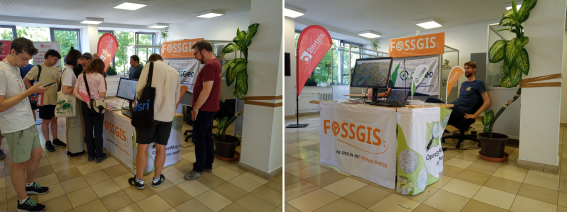
FOSSGIS-OSGeo-OSM-Stand ist gut nachgefragt und hat auch mal Ruhe (Foto Harald S.) -
0:30
KAN T&IT Blog: Alianza Tecnológica
sur Planet OSGeo Estamos orgullosos de sumar nuestra experiencia en geointeligencia a esta alianza con Finnegans SA, integrando datos operativos y territoriales directamente en su ERP.Con soluciones como formularios dinámicos y captura de datos en tiempo real (imágenes, ubicación, trazabilidad, notas de voz), llevamos la digitalización un paso más allá.
Gracias Finnegans por confiar en nosotros para seguir transformando industrias desde los datos.
#AlianzasFinnegans #FinnegansGOAgro #FinnegansGOConstructoras #Geointeligencia #TransformaciónDigital #ERP #KanTerritory
-
13:00
Mappery: La Via Dell’ Ambra
sur Planet OSGeo

Doug spotted this “The amber trail in Europ – Bassano del Grappa Italy
-
13:00
Mappery: The MapWoman at GeomobBER
sur Planet OSGeoPièce jointe: [télécharger]


Chiara Phillips presented at Geomob Berlin with a MapsInTheWild-approved dress code.
Tonight is the Geomob London event, will anyone wear maps in the wild?
-
0:43
Fernando Quadro: Instalação do GeoNode no Ubuntu 22.04
sur Planet OSGeoPrezados leitores,
Neste post irei apresentar como você pode instalar o GeoNode via Docker em uma máquina rodando o Ubuntu Linux 22.04. Ao final dessa instalação você estará com uma instância do GeoNode executando no seu localhost.
Sem enrolação, vamos aos passos:
1. Instalar os pacotes do S.O
> sudo add-apt-repository universe
> sudo apt-get update -y
> sudo apt-get install -y git-core git-buildpackage debhelper devscripts python3.10-dev python3.10-venv virtualenvwrapper
> sudo apt-get install -y apt-transport [https] ca-certificates curl lsb-release gnupg gnupg-agent software-properties-common vim
2. Adicionar os repositórios do Docker
> sudo mkdir -p /etc/apt/keyrings
> curl -fsSL [https:] | sudo gpg --dearmor -o /etc/apt/keyrings/docker.gpg
> sudo chmod a+r /etc/apt/keyrings/docker.gpg
> echo "deb [arch=$(dpkg --print-architecture) signed-by=/etc/apt/keyrings/docker.gpg] [https:] $(lsb_release -cs) stable" | sudo tee /etc/apt/sources.list.d/docker.list > /dev/null
3. Adicionar os pacotes do Docker
> sudo apt-get update -y
> sudo apt-get install -y docker-ce docker-ce-cli containerd.io docker-compose
> sudo apt autoremove --purge
> sudo reboot
4. Adicionar seu usuário ao grupo docker
> sudo usermod -aG docker ${USER}
> su ${USER}
5. Preparar o ambiente
> sudo mkdir -p /opt/geonode_custom/
> sudo usermod -a -G www-data geonode
> sudo chown -Rf geonode:www-data /opt/geonode_custom/
> sudo chmod -Rf 775 /opt/geonode_custom/
Dica: Se o nome do seu usuário não for geonode, substitua pelo nome do seu usuário na linha 2 e 3 acima.
6. Clonar o código fonte
> cd /opt/geonode_custom/
> git clone [https:] -b 4.4.2
Dica: É importante ressaltar que o número que você passar após o -b é na realidade a versão que você quer baixar/instalar do GeoNode
7. Criar uma instância do Django
> source /usr/share/virtualenvwrapper/virtualenvwrapper.sh
> mkvirtualenv --python=/usr/bin/python3 my_geonode
> pip install Django==3.2.13
> django-admin startproject --template=./geonode-project -e py,sh,md,rst,json,yml,ini,env,sample,properties -n monitoring-cron -n Dockerfile my_geonode
> cd /opt/geonode_custom/my_geonode
OBS: Chamaremos nossa instância de my_geonode. Você pode alterar o nome conforme desejar.
8. Criar o arquivo .env
> python create-envfile.py
9. Construa os containers
> docker-compose -f docker-compose.yml build --no-cache
10. Finalmente execute o container
> docker-compose -f docker-compose.yml up -d
Agora é só aguardar todos os containers aparecerem como done, e você já pode acessar o GeoNode no seu navegador digitando [localhost]
Se você quiser mais detalhes sobre a instalação basta acessar a documentação oficial do GeoNode, clicando aqui.
-
13:00
Mappery: Valpolicella
sur Planet OSGeo

Doug shared this “Valpolicella Wine Region @ Tenuta Santa Maria di Gaetano Bertani Winery. Beautiful relief map
-
13:00
Mappery: You arrrr here
sur Planet OSGeo
Anita shared this neat little pirate map which comes with an attached cocktail
-
3:52
Sean Gillies: Bear training week 17 recap
sur Planet OSGeoI didn't do a lot of running in week 17, but none of it was flat. I did a solid uphill treadmill run on Thursday and a hot trail run at Lory State Park on Saturday.
12.8 miles running
10 hours, 40 minutes all training
3,667 ft D+ running
In addition to those two runs, I did a hard elliptical workout and rode a bike three days. I did some weight training at home and at the gym, and did two sauna sessions. I'm trying to do 2-3 20-minute sessions a week in June to get ready for potentially hot weather at Never Summer. Andrew Huberman has a nice long podcast episode about the science of deliberate heat exposure that I found super interesting. If you haven't heard it, it's well worth a listen.
I went out for 2.5 hours in sunny 30 °C conditions yesterday and felt warm, but okay. The modest amount of heat training that I've been doing seems to be working. I'm going to stick with passive heating in the sauna a few times a week and one hot run every week. As much as I enjoy hearing about David Roche's extreme heat traing regimen, I won't be buying a heat suit or core temperature sensor.
Like I said last week, I've found it hard to adapt to downhill running when I'm not doing much downhill running. Today my quads are quite sore after yesterday's three miles of steep descents. I need to do more, that's all there is to it!

A faint 4WD trail through grass and flowers over the top of a small summit under a mostly blue summer sky.
-
13:00
Mappery: Frozen Four
sur Planet OSGeoPièce jointe: [télécharger]

Doug shared this “The location of Western Michigan University on the shoulder of their jerseys”
-
13:00
Mappery: Ukrainian Poems
sur Planet OSGeo

Reinder spotted this in a thrift shop. It’s a book of Ukrainian poems translated into English. We are wondering if the map is Kiev or …? Maybe one of our Ukrainian followers can help us out? Regardless this is a high impact book cover and could become one of my favourites.
-
13:00
Mappery: Walking on the World in Valencia
sur Planet OSGeo

Angel Arenas sent me this pic of his latest giant interactive map in a square in Valencia. The map is 230 square metres, that’s pretty massive. Maybe the biggest ever?
-
6:39
Sean Gillies: Bear training week 16 recap
sur Planet OSGeoWeek 16, the end of the first half of my trail running season. I started out sick, but was able to get back into training pretty quickly. I had a nice gravel ride Wednesday, some tempo treadmill Thursday, a 2.5 hour ride on Saturday with a significant amount of comfortably hard uphill pedaling, and a 90 minute uphill treadmill run on Sunday. I avoided my usual group classes at the gym.
I continued with the therapeutic dose of Naproxen, iced my left Achilles tendon every night, and did no running on pavement or trails. Walking felt better all week, I'm happy to report.
It's seven weeks to Never Summer. It's weird to approach it with a base, a solid base, of cycling, and uphill treadmill and elliptical sessions, without the hundreds of miles of real trail running that I've done in the past.
My fitness level is pretty good. Based on my perceived level of exertion during workouts, my resting heart rate, and my body weight, it seems like I'm back where I was at this point in 2023. That's great, I'm pumped! I'm eager to do some fast downhill running before Never Summer. That's the thing that's hard to simulate in the gym, and I've been feeling soreness after my rare downhill runs this spring.
It'll be interesting to see how I fare on an alpine run like Twin Sisters, for sure. I'm planning that outing now.
-
4:00
FOSSGIS e.V. News: Konferenzorgateam checkt Standort für 2026
sur Planet OSGeoNach dem Motto nach der Konferenz ist vor der Konferenz wollte das Local Team Göttingen zeitnah mit den Konferenz-Vorbereitungen starten.
Janine, Daniel, Maik, Volker und Katja vom Konferenzorgateam und zwei Neumitglieder aus Göttingen trafen sich am 12. und 13. Juni mit den Ansprechpartnern aus der Öffentlichkeitsarbeit und Raumvergabe der Universität Göttingen. Die erste Grobplanung zur Raumnutzung und Positionierung der Catering- und Ausstellerflächen steht nun bereits fest. Beim gemeinsamen Kennlerntreffen an der mitveranstaltenden Fakultät für Geowissenschaften und Geographie wurden Ideen zur Programmgestaltung und zum Rahmenprogramm besprochen.
Die FOSSGIS 2026 wird vom 25.-28.03.2026 in Göttingen stattfinden. Der erste Teil der Konferenz von Mittwoch bis Freitag wird im Zentralen Hörsaalgebäude, welches große Hörsäle und ein großzügiges Foyer bietet, ausgerichtet. Der OSM-Samstag und Codesprint findet voraussichtlich an der Fakultät für Geowissenschaften und Geographie auf dem Nordcampus statt.
Es wird 2026 möglich sein in der Mensa gleich nebenan zu Mittag zu essen.
Unter anderem haben wir mögliche Locations für den Inoffiziellen Start und die Abendveranstaltung erkundet und getestet.
Links: Foyer im ZHG, Mitte: Mensa, rechts: Foyer der Geofakultät am Nordcampus -
13:00
Mappery: Padlock Map
sur Planet OSGeo

Reinder sent us this superb map of Amsterdam made out of padlocks. He said ” map of padlocks in the Groenburgwal (canal) in Amsterdam. To commemorate the 750th anniversary of the city. They do this here because many people attach a padlock to the nearby bridge. To kind of ‘seal’ the eternity of their love. Quite a remarkable example of modern art.”

-
13:00
Mappery: When was Marc-Tobias’ Hat Printed?
sur Planet OSGeoPièce jointe: [télécharger]

Marc-Tobias sent me this picture of his new hat. Can you work out when the map was printed and why?
According to Ian Turton this xkcd may help you date the map
-
13:00
Mappery: Elevator Map
sur Planet OSGeo

Mark shared this impressive map on the entrance to an elevator (lift in English) at the Chicago Hyatt Place.
-
4:00
GeoServer Team: June 2025 Vulnerability Disclosures
sur Planet OSGeoThe GeoServer community has readied the following CVE vulnerabilities for public disclosure.
-
CVE-2025-30220 XML External Entity (XXE) Processing Vulnerability in GeoServer WFS Service (High)
Fixed: GeoServer 2.27.1 | GeoServer 2.26.3 | GeoServer 2.25.7 -
CVE-2025-30145 Denial-of-service (DoS) Vulnerability in Jiffle process (High)
Fixed: GeoServer 2.27.0 | | GeoServer 2.26.3 | GeoServer 2.25.7 -
CVE-2025-27505 Missing Authorization on REST API Index (Moderate)
Fixed: GeoServer 2.26.3 | GeoServer 2.25.6 -
CVE-2024-38524 GWC Home Page exposes sensitive server information (Moderate)
Fixed: GeoServer 2.26.2 | GeoServer 2.25.6 -
CVE-2024-40625 Coverage REST API Server Side Request Forgery (Moderate)
Fixed: GeoServer 2.26.0 -
CVE-2024-29198 Unauthenticated SSRF via TestWfsPost (High)
CVE-2021-40822 SSRF in TestWfsPost for specific targets, e.g. PHP + Nginx (High)
Fixed: GeoServer 2.25.2 | GeoServer 2.24.4This duplication is due to CVE-2021-40822 being generated prior to our use of CVE records.
-
CVE-2024-34711 Improper ENTITY_RESOLUTION_ALLOWLIST URI validation in XML Processing (SSRF) (High)
Fixed: GeoServer 2.25.0
The release announcements listed above have been updated.
Free software is a participation sport - to create a patch for a prior release volunteer with community development.
Q: How often should I upgrade GeoServer?GeoServer operates with a time boxed release cycle, maintaining “stable” and “maintenance” releases, over the course of a year.
-
Upgrade GeoServer twice a year as new stable releases are made.
-
Once the release you are using has entered “maintenance” it is a good idea to upgrade (before the release is no longer supported).
-
GeoServer security policy provides one year of support. You may also contact our service providers for extended support beyond this timeframe.
Stay up to date:
-
Please monitor release announcements for the heading “Security Considerations”.
Security Considerations
This release addresses several security vulnerabilities, and is a recommended upgrade for production systems.
You can review the release announcement, and decide to update.
-
When everyone has had an opportunity to update the details of the vulnerability are announced.
Security Considerations
This release addresses several security vulnerabilities, and is a recommended upgrade for production systems.
- CVE-2024-29198 Unauthenticated SSRF via TestWfsPost (Moderate)
-
Review the full vulnerability to learn more:
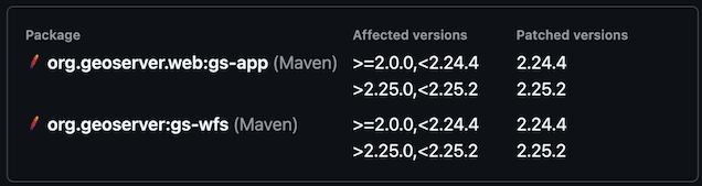
-
Scanning tools also have access to this information when the report is published:
As incoming security reports contain sensitive information they are only shared with representatives of the geoserver-security email list.
Participation in geoserver-security, like commit access, is volunteer based and reflects trust.
Please review GeoServer Security Policy if you are in a position to help out.
-
-
14:38
OSGeo Announcements: [OSGeo-Announce] PROJ 9.6.2 is released
sur Planet OSGeoPROJ 9.6.2 is releasedOn behalf of the PROJ team, we are happy to announce the release of PROJ 9.6.2
The PROJ release includes updates to the the database contents, as well as a number of bug fixes. See the release notes below.
Download the archives here:
[download.osgeo.org]
Updates- Update EPSG to 12.013 Bug Fixes- Database: change ESRI deprecated records back to their deprecated state (#4519)
[download.osgeo.org]- ProjectedCRS::identify(): more robust identification of old ESRI names using _IntlFeet (#4518)
- Fix issue related to D_Unknown_based_on_WGS_84_ellipsoid datum name (#4514)
- proj_trans_bounds(): sample points within the source grid to avoid missing extent such as world-wide coverage from EPSG:4326 to ESRI:54099 (Spilhaus) (#4513)
- proj_trans_bounds(): avoid erroring out, in some cases, when PJ* object is directly constructed from a PROJ pipeline (#4512)
1 post - 1 participant
-
13:00
Mappery: Car Park in The Hague
sur Planet OSGeo
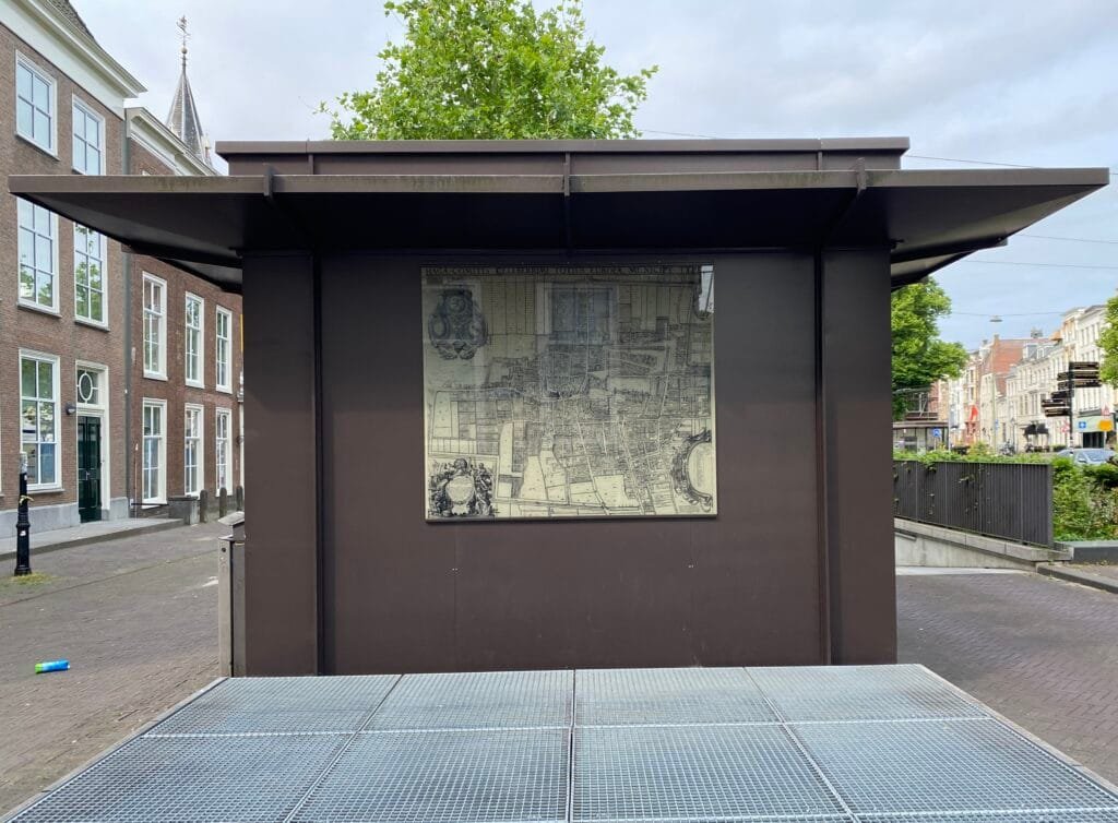
Reinder spotted this beautiful tiled map on the entrance to an underground car park in The Hague.
-
13:00
Mappery: Italian wines
sur Planet OSGeo
Fancy some Italian wines?
-
13:00
Mappery: Souvenir Shop in Italy
sur Planet OSGeo

Legami is a souvenir shop where maps can be found in various forms.
-
16:15
Lutra consulting: Crowdfunding QGIS 3D: Support Open Source Digital Twins
sur Planet OSGeoHelp fund QGIS 3D enhancements for digital twins, including glTF export, CityGML, IFC, and performance upgrades. Campaign ends June 30, 2025. -
13:00
Mappery: Trastevere
sur Planet OSGeo


Back to Rome and the Trastevere.
-
18:37
Jackie Ng: Announcing: MapGuide Open Source 4.0 Beta 3
sur Planet OSGeoA new beta release of MapGuide Open Source 4.0 is now available.
The main driver for this release is updating an assortment of bundled components:
- PHP updated to 8.3.20
- Apache [httpd] updated to 2.4.63
- Tomcat updated to 9.0.104
This release also plugs an assortment of memory leaks found in:- The King Oracle FDO provider
- Rendering of tiles from tile sets
- Rendering of watermarks
- In-memory feature joins
- Render profiling
-
13:00
Mappery: Lecce
sur Planet OSGeo

Lecce is in Italy’s southern Apulia region.
-
4:00
Camptocamp: France Becomes First Government to Endorse UN Open Source Principles, Now What?
sur Planet OSGeoPièce jointe: [télécharger]
In a historic and symbolic step, France has officially endorsed the United Nations' Open Source Principles, becoming the first government to do so, alongside many organizations including the Open Source Initiative, Linux Foundation and the Eclipse Foundation.


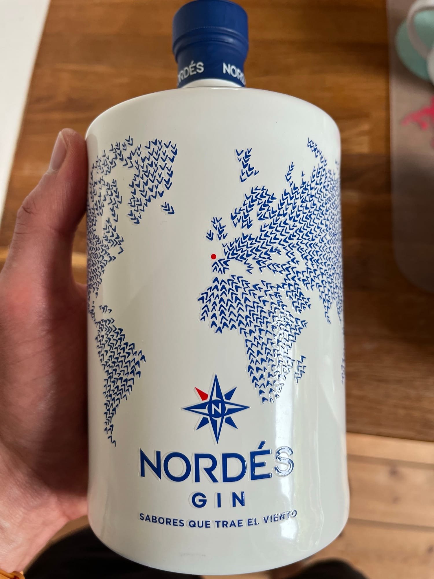
