Vous pouvez lire le billet sur le blog La Minute pour plus d'informations sur les RSS !
Canaux
3529 éléments (2 non lus) dans 55 canaux
-
 Décryptagéo, l'information géographique
-
Cybergeo
-
Revue Internationale de Géomatique (RIG)
-
SIGMAG & SIGTV.FR - Un autre regard sur la géomatique
-
Mappemonde
-
Imagerie Géospatiale
-
Toute l’actualité des Geoservices de l'IGN
-
arcOrama, un blog sur les SIG, ceux d ESRI en particulier
-
arcOpole - Actualités du Programme
-
Géoclip, le générateur d'observatoires cartographiques
-
Blog GEOCONCEPT FR
 Toile géomatique francophone
(2 non lus)
Toile géomatique francophone
(2 non lus)
-
Géoblogs (GeoRezo.net)
-
Conseil national de l'information géolocalisée
-
 Geotribu
-
Les cafés géographiques
-
UrbaLine (le blog d'Aline sur l'urba, la géomatique, et l'habitat)
-
Icem7
-
Séries temporelles (CESBIO)
-
Datafoncier, données pour les territoires (Cerema)
-
Cartes et figures du monde
-
SIGEA: actualités des SIG pour l'enseignement agricole
-
Data and GIS tips
-
Neogeo Technologies
(1 non lus)
-
ReLucBlog
-
L'Atelier de Cartographie
-
My Geomatic
-
archeomatic (le blog d'un archéologue à l’INRAP)
-
Cartographies numériques
-
Veille cartographie
-
Makina Corpus
-
Oslandia
(1 non lus)
-
Camptocamp
-
Carnet (neo)cartographique
-
Le blog de Geomatys
-
GEOMATIQUE
-
Geomatick
-
CartONG (actualités)

Géomatique anglophone
-
sur GeoTools Team: GeoTools 27.5 Released
Publié: 2 July 2024, 6:02am CEST
The GeoTools team is pleased to share the availability GeoTools 27.5:geotools-27.5-bin.zipgeotools-27.5-doc.zipgeotools-27.5-userguide.zipgeotools-27.5-project.zipThis release is also available from the OSGeo Maven Repository and is made in conjunction with GeoServer 2.22.3 and GeoWebCache 1.22.2.Update 2024-07-1: CVE-2024-36404 patch -
sur KAN T&IT Blog: Expo Curitiba 2024 ¡conociendo la ciudad del futuro!
Publié: 1 July 2024, 9:37pm CEST
Queremos compartir la experiencia de nuestro CEO, Ariel Anthieni, en Expocuritiba 2024, la Feria Internacional de Ciudades Inteligentes. Durante los días 17 al 22 de marzo, Ariel tuvo el privilegio de representar a nuestra empresa en este evento único que reunió a destacados actores en el ámbito de las ciudades inteligentes en la hermosa ciudad de Curitiba, Brasil.
Curitiba es reconocida a nivel mundial como un ejemplo de ciudad inteligente debido a sus innovadoras políticas urbanas que han transformado la calidad de vida de sus habitantes. Su eficiente sistema de transporte público, sus áreas verdes bien planificadas y su enfoque en la sostenibilidad la convierten en un modelo a seguir para otras ciudades.
Durante el evento, Ariel tuvo el honor de cruzar unas palabras con Rafael Greca, el alcalde de Curitiba. Se sorprendió gratamente por su calidez e increíble predisposición para conversar y conocer a quienes estábamos allí.
Nuestro CEO participó activamente en las diferentes actividades de la feria, incluyendo la asistencia a charlas y conferencias con reconocidos expertos en el campo de la innovación urbana, la visita a espacios temáticos y la exploración de soluciones tecnológicas innovadoras para el desarrollo sostenible de las ciudades. Tuvo la oportunidad de presentar al MapViewer, un visor digital diseñado por Kan Territory & IT para la supervisión y gestión virtual de las ciudades. Este permite monitorear y controlar diferentes aspectos de ese lugar, como el flujo del transporte público, la actividad de los centros de salud y otros servicios esenciales, a través de la recopilación y visualización de datos geoespaciales.
Ariel también destacó que el MapViewer utiliza un enfoque de catastro multifiduciario, capaz de manejar información de múltiples fuentes y tipos, como datos catastrales, topográficos y de infraestructura, proporcionando así una vista integral de la ciudad. Además, habló sobre la evolución digital de esta tecnología, introduciendo el concepto de «gemelos digitales«, que son representaciones virtuales de una ciudad. Con esta herramienta, los administradores y planificadores urbanos pueden simular escenarios hipotéticos y tomar decisiones más informadas para el desarrollo sostenible.
Sin dudas, su actividad en Expocuritiba 2024 fue una oportunidad invaluable para conocer las últimas tendencias en tecnología urbana, establecer contactos estratégicos y compartir conocimientos con otros líderes en el ámbito de las ciudades inteligentes.Felicitamos a Ariel por su destacada participación en este evento tan significativo y esperamos seguir contribuyendo al desarrollo de ciudades más inteligentes y sostenibles en el futuro. Muchísimas gracias Lucía Bellocchio por haberlo hecho posible ¡Hasta el próximo año!
-
sur Mappery: King David’s Tower 2 – The Clover Map
Publié: 1 July 2024, 11:00am CEST

Bunting’s Clover Map is an archetypal map of the world from a time when only three continents were known to Europeans – Europe, Africa and Asia.
Die ganze Welt in einem Kleberblat
[https:] FL7074006
Woodcut Map showing three continents: Europe, Asia and Africa in the form of a clover leaf with the representation of Jerusalem in the center. America on the lower left corner.
From: Buenting, Heinrich. Itinerarium Sacrae Scripturae. (Travel book covering the entire Holy Scripture) Helmstadt, Jacobus Lucius, 1585. Part I, between pp. 4-5Coincidentally I bought a wooden puzzle based on this clover map in a craft market. Apparently the solution requires over 250 moves, I am still working on it! (this is the solved state)

MapsintheWild King David’s Tower 2 – The Clover Map
-
sur France Surrenders to Facism
Publié: 1 July 2024, 10:41am CEST par Keir Clarke
The far-right National Rally has won 33% of the vote in the first round of France's parliamentary elections. You can view the results in each constituency in Le Monde's French elections: Map of the first round's results.Le Monde's map is a sea of brown, revealing that the National Rally has managed to become the most popular party in electoral districts across the whole country. There is a
-
sur QGIS Blog: Plugin Update – February to March, 2024
Publié: 1 July 2024, 9:04am CEST
From February to March of this year, 58 new plugins were published in the QGIS plugin repository.
Here follows the quick overview in reverse chronological order. If any of the names or short descriptions catches your attention, you can find the direct link to the plugin page in the table below:
Indonesian Multi-scaled Grid System This plugin automate the determination of Indonesia’s Environmental Support and Capacity. NDVI to Variable Nitrogen Application Map This plugin was developed for producing variable nitrogen application maps based on index (e.g. NDVI, EVI) values. Dynamic Flow Compare two datasets of GPKG pointZ geometry based on french legislation formatting “class A”. Stats By Polygon Dynamic Flow is a QGIS plugin to estimate the spatio-temporal 3D gradient flow from the point observation of the attributes values such as aggregated cell-phone mobility data. On-the-Fly-Shortest-Path Interactively find shortest path between points over a line network and calculate the Fiber Loss Budget of a fiber optic network (backbone or FTTH) SMODERP2D This plugin calculates hydrological and erosion processes on individual plots or small catchments. Multifilter Filter multiple layers NDVI and EVI Index Calculator This plugin calculates NDVI and EVI index from Sentinel 2 B02, B04 and B08 Bands. GeoZone QGIS plugin for adding and modifying zone data in compliance with the GeoZone schema, facilitating sharing with partners or uploading to a central web repository. CIGeoE Mirror View Add one or more panels synchronized with the main panel. SIOSE Tools Herramientas SIOSE. RioGIS 2 Export to WinCan. Clasificación de redes hídricas Este plugin clasifica las redes hídricas por medio de una etapa de enriquecimiento y otra de lógica difusa. Advertencia: Versión experimental, algunos procesos pueden ser largos de aplicar. AutoStyler Apply QML style files to new layers. QML files are stored in {qgis_home}\Styles directory. QML files will be applied to a vector layer when the QML file’s basename is found as a substring of the new layer’s name. QML files will be applied to a raster layer when the QML file’s label token is found as a substring of the new layer’s name. The label token is raster_style_{label}.qml. Delta Shares With this plugin you can load data from delta shares Simple ETL A simple ETL for spatial data Flood Path Finder Developed with Python by Emerson N. Santos – 2024 MongoDB Layer This plugin gives the possibility to create a layer from MongoDB datasource Power Pin PL Plugin eksportuje pinezk? do serwiów typu geoportal. Pin to popular polish and world maps portal. Plugin export pin to popular geoportal like serives Mineral Exploration Web Services This plugin connects your QGIS User Profile to many openly hosted web services related to mineral exploration. These include Country and State geological surveys that provide mapped geology and data such as mineral occurence locations, geophysics, geochemistry etc. OrfeoToolbox Provider OrfeoToolbox Processing provider. MitiConnect MitiConnect integrates ecological connectivity in mitigation hierarchy based on landscape graphs. Compare_attributes Compare Attributes Geo Cluster This plugin allows you to cluster different territorial scopes. Estonian Oblique Aerial Photographs Get the oblique aerial photographs of Estonia at the clicked location on the map Two distances intersection Get the intersection of two distances (2D cartesian) Show Corona CAST by click This plugin opens a webpage showing the Corona CAST map in the clicked coordinates on the canvas Roll Design and analysis of 3D seismic survey geometries moniQue Monoplotting oblique images with uncertainty estimation. Modular Layout Grid Guides This plugin creates a modular layout grid for print layouts easyPlugin Plugin which creates a simple QGIS plugin templates ready for install, editing and testing Samon Saisie monoscopique sur la BD Ortho SADI Processor A plugin to Process Standardized Agricultural Drought Index. SciPy Filters Filter collection implemented with SciPy Data Validator Prototype for vector data validation ZUMbox Urban planning related tools UA_NGO_PDF_Parser This plugin parse pdf files with NGO data and create table with result Marine Tools Tools for marine habitat mapping Map tools QGIS plugin for little helpers in map production Style Exporter Plugin export styles of selected layers to individual file with name same as layers name. Aino AI assistant to download data from OSM gis3d This plugins generates a 3D model based on the inputs Zonal Exact Extract Zonal Statistics of rasters using Exact Extract library Verkeersborden Import dutch traffic signs. NVDB Les NVDB (Norwegian Administration Road Database) it’s a plugin to analyse and manipulate road objects, like (road references, trees, light poles, traffic signs, construction area, smart devices like IP Camera, tunnels, bridges, etc) Fluvial Corridor Toolbox Fluvial Corridor Toolbox CIGeoE Reshape Features 3D Reshape a feature in 3D Pixel Purity Index Pixel Purity Index algorithm C-GEO Wizualizacja GML demo Wtyczka wczytuje oraz wizualizuje dane EGiB, GESUT, BDOT500 zapisane w plikach GML. pqkmeans-clustering This clustering algorithm is a quantized version of the K-Means algorithm that is memory and computationaly more efficient. HedgeTools HedgeTools is a plugin for QGIS designed to extract and characterize hedges, aiming to streamline field efforts by providing information about hedge health. PyXel_Sync PyXel_Sync SmartSDI Wtyczka SmartSDI (Geo-System) PL: Pobieranie danych wektorowych: dzia?ki, budynki, adresy EN: Downloading vector data for Poland: parcels, buildings, addresses Quick_search Quick_search Environmental Data Retrieval Environmental Data Retrieval QGIS plugin DigiAgriApp Plugins to work with DigiAgriApp server QTalsim This plugin creates hydrological response units (HRUs) suitable for Talsim ( [www.talsim.de] ) and allows users to connect to a Talsim DB. RubberSheetingEtc Provides Rubber Sheeting and Two Point Transformations, storing to PostGIS, Oracle and MS SQL. The Rubber Sheeting algorithm uses supplied Shift Vectors and calculates the weighted average shift from the 10 nearest Shift Vectors. The Two Point Transformations handles themes with and without a CRS. -
sur Free and Open Source GIS Ramblings: New interactive trajectory plots for MovingPandas & experiments on their interpretation using ChatGPT 4o
Publié: 30 June 2024, 2:52pm CEST

With the release of GeoPandas 1.0 this month, we’ve been finally able to close a long-standing issue in MovingPandas by adding support for the explore function which provides interactive maps using Folium and Leaflet.

Explore() will be available in the upcoming MovingPandas 0.19 release if your Python environment includes GeoPandas >= 1.0 and Folium. Of course, if you are curious, you can already test this new functionality using the current development version.
This enables users to access interactive trajectory plots even in environments where it is not possible to install geoviews / hvplot (the previously only option for interactive plots in MovingPandas).
I really like the legend for the speed color gradient, but unfortunately, the legend labels are not readable on the dark background map since they lack the semi-transparent white background that has been applied to the scale bar and credits label.

Speaking of reading / interpreting the plots …
You’ve probably seen the claims that AI will help make tools more accessible. Clearly AI can interpret and describe photos, but can it also interpret MovingPandas plots?
ChatGPT 4o interpretations of MovingPandas plots
Not bad.
And what happens if we ask it to interpret the animated GIF from the beginning of the blog post?

So it looks like ChatGPT extracts 12 frames and analyzes them to answer our question:

Its guesses are not completely off but it made up the facts such as that the view shows “how traffic speeds vary over time”.
The problem remains that models such as ChatGPT rather make up interpretations than concede when they do not have enough information to make a reliable statement.
-
sur Mappery: King David’s Tower 1 – Adrichem’s Map
Publié: 30 June 2024, 11:00am CEST
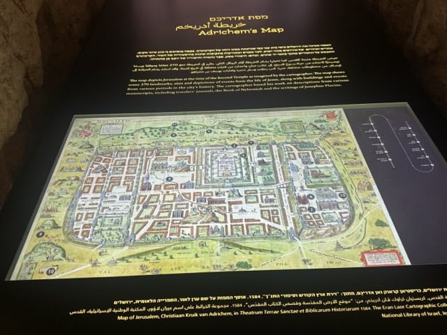
While we were in Israel we spent some time in Jerusalem, friends suggested that we visit the new museum about Jerusalem in King David’s Tower. It is a fantastic museum in an ancient location which reflects the different influences in the city over three millenia. Amongst the many exhibits were a lot of maps, ancient, modern, interactive, over the next few days I will share a few.
Adrichem was a 16th century Dutch cartographer, this map of Jerusalem shows remarkable detail
“A map of Jerusalem created by the Dutch cartographer Christiaan van Adrichem in 1584. In this beautifully illustrated map are drawings that represent events and figures from the Old and New Testaments. Toward the center of the map the Jewish Temple can be seen together with a drawing of the High Priest, the altar and the vessels used in the Temple. To the right of the Temple is the Royal Palace, pictures of King Solomon on his throne, and even Bathsheva bathing on her rooftop. Other drawings on the map, such as the Via Delarosa and images of the Crucifixion, depict the Christian history of Jerusalem.”
[https:]MapsintheWild King David’s Tower 1 – Adrichem’s Map
-
sur Mappery: Globe Escape Alert!
Publié: 29 June 2024, 11:00am CEST
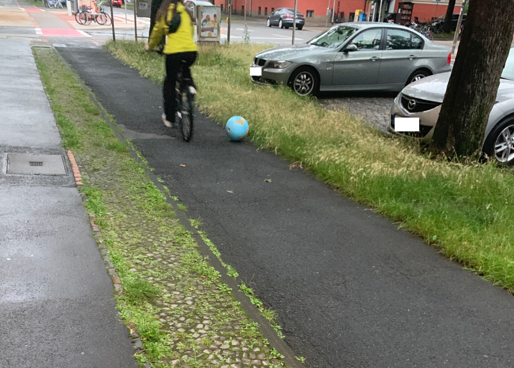
Marc-Tobias spotted this little globe that had set out on a journey to freedom starting in Hannover, I wonder where it will end up?
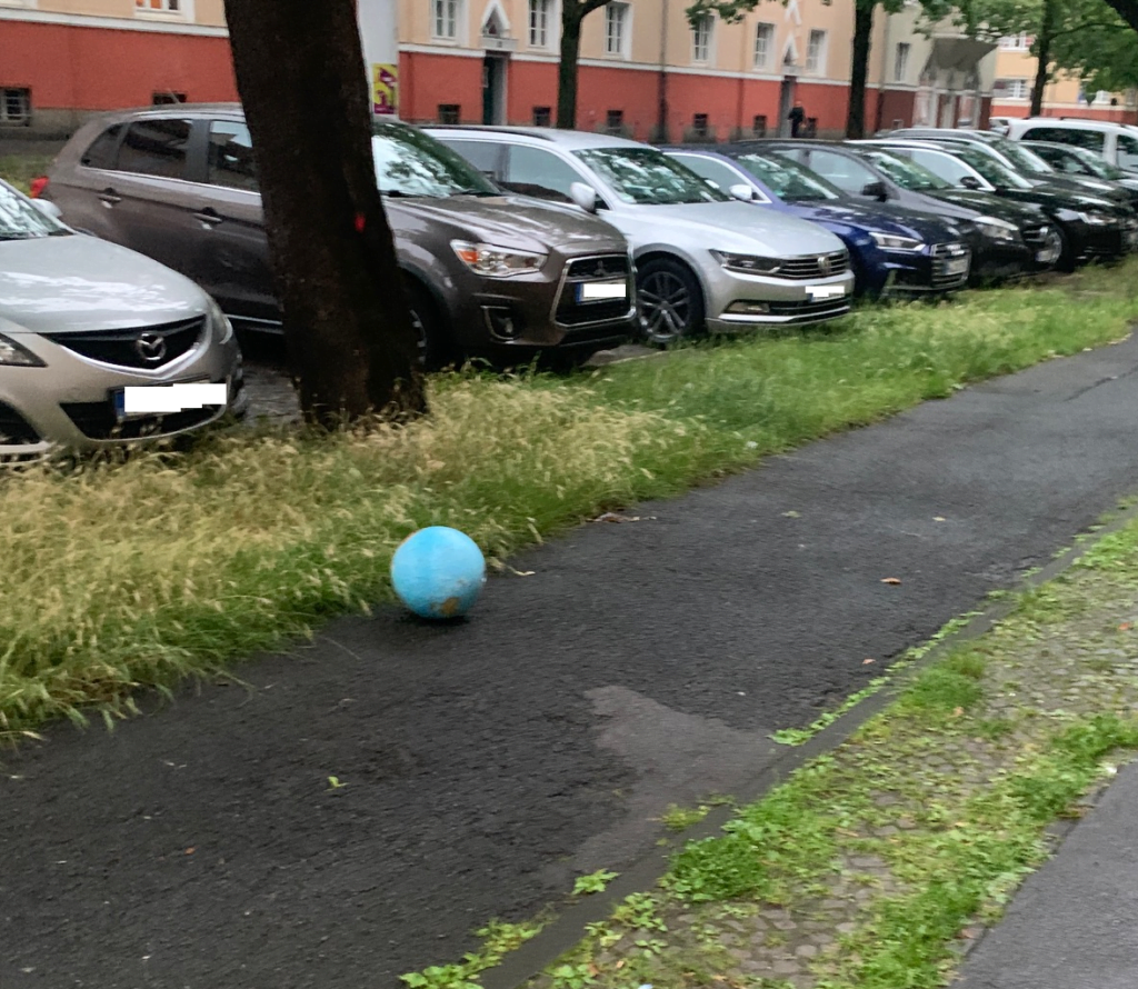
Good luck little globe
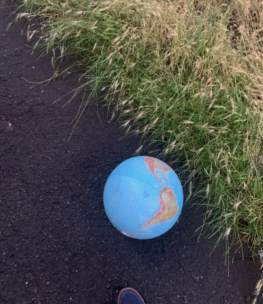
MapsintheWild Globe Escape Alert!

-
sur The 2024 UK General Election Map
Publié: 29 June 2024, 9:53am CEST par Keir Clarke
2024 is a year of elections. Next Thursday it is the turn of the UK to go to the polls. Which means next Friday Maps Mania will be featuring a number of interactive maps, visualizing the collapse of the governing Conservative Party's vote.According to the latest opinion polls the Tories could be heading for a loss that might almost rival the collapse of the Canadian Conservative Party in the
-
sur gvSIG Team: Discurso de aceptación del Premio Nacional de Ciencias Geográficas
Publié: 28 June 2024, 4:13pm CEST
Excmo. Sr. Jesús Gómez, Subsecretario de Transportes y Movilidad Sostenible, distinguidas autoridades, señoras y señores
Es para mi un inmenso honor y una profunda satisfacción recibir, en nombre de la Asociación gvSIG, el primer Premio Nacional de Ciencia Geográficas que se otorga en España. Humildemente confesamos que ser los primeros en recibirlo, con la cantidad de personalidades y entidades que lo merecen, todavía acrecienta más la importancia que le damos a este galardón. Por otro lado, nos asegura que escucharan el mejor discurso de aceptación del premio de los habidos hasta la fecha.
Este galardón supone un reconocimiento extraordinario a la trayectoria y dedicación de un colectivo apasionado por la geografía, la tecnología y el conocimiento, entendidos como motores de cambio.
Empecemos por el término que da nombre a este galardón, la geografía. Tim Marshall, en su excelente ensayo «Prisioneros de la Geografía» concluía que si bien la geografía no dicta el desarrollo de todos los acontecimientos, puesto que las grandes ideas y líderes forman parte del tira y afloja de la historia, todos ellos deben actuar dentro de los confines que marca la geografía. El ex-presidente de los Estados Unidos, Barack Obama, nos decía que la geografía era mucho más que poner nombres en un mapa, que se trataba de entender la realidad. Los que nos han escuchado durante estos años bien saben que en la Asociación gvSIG siempre hemos afirmado que la realidad se manifiesta en el territorio. Todo existe en la medida que está en un lugar y en cómo se relaciona con lo que tiene alrededor. Por tanto, la dimensión geográfica o espacial de las cosas es un atributo fundamental para gestionar la realidad. Lo fue en el pasado, lo será en el futuro y, sin duda, lo es en el presente.
Lo que nos lleva a hablar del segundo concepto que nos apasiona, la tecnología. Con más de dos décadas en el S.XXI todos debemos ser conscientes que la tecnología impregna todo proceso productivo, económico, académico y social hasta el punto de convertirse en una herramienta imprescindible. Sin miedo a equivocarme podría afirmar que en esta sala hay más aparatos tecnológicos que personas. No podemos imaginar esa gestión de la realidad de la que hablábamos sin tecnología. Sabemos que España y la Unión Europea están apostando significativamente por la ciencia, la tecnología y la innovación como pilares fundamentales para su crecimiento y desarrollo sostenible. Por nuestra parte, en la Asociación gvSIG, siempre hemos hablado de la tecnología como un sector estratégico y seguiremos insistiendo mientras sea necesario. Las tecnologías de gestión de información geográfica, englobadas bajo el concepto de geomática, son aquellas que ni más ni menos nos permiten analizar, entender y gestionar el territorio, la geografía.
La geomática se aplica en la gestión de infraestructuras de todo tipo, en sectores como el del medio ambiente, la seguridad, la energía, la movilidad, la educación, la sanidad, la agricultura, el turismo,… es transversal a infinidad de temáticas y aplicable a infinidad de geografías.
Siendo así, deberíamos empezar a ser conscientes de que ser dependientes de un sector estratégico es una debilidad manifiesta. ¿Quién querría que nuestras administraciones, nuestras universidades, nuestras empresas, aquellas que trabajan en y con el territorio, fueran dependientes tecnológicamente? Aquí radica en gran parte la importancia y éxito del proyecto gvSIG, construir y desarrollar tecnologías para gestión de datos espaciales, de su dimensión geográfica, con software libre. Apostando por la soberanía tecnológica mediante el impulso de soluciones que otorgan todos los derechos y libertades a sus usuarios. Que evitan cualquier dependencia ya no de tecnologías, sino de los dueños de estas. No solo eso, la Asociación gvSIG ha impulsado un tejido industrial propio, especializado en geomática, convirtiendo a la Comunidad Valenciana y a España en un centro de referencia a nivel internacional. Hoy día no solo las tecnologías marca gvSIG se utilizan en todo el mundo, hoy día empresas españolas llevan a cabo por todo el planeta algunos de los más grandes proyectos relacionados con los sistemas de información geográfica. Concluyo este apartado reafirmando que apostar por tecnologías propias y libres puede ser, sin duda lo es, una decisión estratégica de primer orden.
Enlazamos con el último concepto que relacionaba con la actividad de la Asociación gvSIG, el conocimiento. Y en este punto quizá valga la pena hacer un recorrido por la historia de nuestra entidad.
No hay que olvidar que si hoy estamos aquí, recogiendo este importantísimo reconocimiento, es porque un día una administración pública, la Generalitat Valenciana, decidió dar el primer paso. El proyecto gvSIG ve la luz en 2004, con una primera versión de un producto de software que hoy forma parte de un completo catálogo de soluciones de geomática. Hoy no solo se habla, sino que se legisla, en España y en Europa, a favor de la reutilización, de compartir, de interoperar entre administraciones y de desarrollar tecnologías propias. En los comienzos de este siglo no era así. La Generalitat Valenciana no solo dio el primer paso, sino que supo compartir los logros con toda la comunidad internacional y dinamizar lo que acabaría siendo la Asociación gvSIG.
Hoy día sigue apostando por el proyecto, utiliza las tecnologías gvSIG en cada vez más áreas, desde agricultura a seguridad vial, desde industria a movilidad sostenible, contribuyendo a su desarrollo y, también, reutilizando todas las mejoras tecnológicas que continuamente se consolidan en el proyecto. Sin ir más lejos, la semana pasada La Agencia de tecnologías del gobierno danés publicó un informe en que ponía como principal caso de éxito del impulso de una tecnología en software libre por una administración pública a la Generalitat Valenciana. Hablaba de gvSIG.
Por tanto, este premio, este galardón, es en gran medida compartido con la Generalitat Valenciana y, en particular, con su Dirección General de Tecnologías de la Información y Comunicación.
A finales de 2009 nació la Asociación gvSIG. Un conjunto de personas, empresas, entidades decidimos escalar el impacto del proyecto. Para garantizar sus sostenibilidad por un lado, para consolidar un tejido industrial incipiente por otro. La premisa puede parecer sencilla, pero no era fácil de implementar. Llevar los valores del software libre a la economía. Desarrollar un nuevo modelo de negocio – un concepto del que tanto se habla – basado en la colaboración, en el conocimiento compartido frente a la especulación con el conocimiento adquirido, en la solidaridad frente a la rivalidad. Por las fechas ya intuirán que nacimos en plena crisis, en momentos complicados, con escasos recursos pero con mucha ilusión. Esos primeros años hicimos nuestro el proverbio inglés de «que ningún mar en calma hizo experto a un marinero». Era preciso soñar y creyendo en nuestros sueños hemos llegado hasta aquí. Pasado este tiempo, no nos olvidamos de seguir soñando.
Hoy, en 2024, la Asociación gvSIG es una entidad reconocida en todo el mundo. La tecnología derivada de un proyecto nacido, no lo olvidemos, en la periferia de Europa se utiliza en más de 160 países. Participamos y colaboramos con los principales foros y organizaciones que promueven las Ciencias Geográficas, el conocimiento abierto y la interoperabilidad. Hemos recibido premios internacionales de entidades como la NASA o la Comisión Europea, que el pasado año reconoció a gvSIG como el proyecto de software libre más importante de Europa. Hemos desarrollado una suite o catálogo de tecnologías libres que permiten abordar cualquier necesidad de gestión de información con dimensión geográfica, para cualquier organización. Colaboramos en proyectos de I+D+i con decenas de universidades, se multiplican las publicaciones científicas que citan el uso de gvSIG. Las redes sociales de gvSIG tienen una influencia notable con miles de seguidores. Y en relación a ese nuevo modelo de negocio del que hablábamos… hemos impulsado la consolidación de empresas españolas y desarrollado proyectos en más de 30 países para entidades de todo tipo, de Naciones Unidas a pequeños ayuntamientos, de grandes empresas privadas del sector de la energía a ONGDs. Somos, en definitiva, un centro de referencia a nivel internacional.
Nuestra historia por tanto pivota alrededor del conocimiento. Desarrollarlo para compartirlo, para reducir asimetrías entre territorios, para generar economía de calidad, para reafirmar a Antonio Machado cuando decía que «en cuestiones de cultura y saber, solo se pierde lo que se guarda; solo se gana lo que se da».
Quiero recordar una anécdota que refleja bien esta frase. Un ejemplo de esos otros valores, no cuantificables, que ocurren alrededor del modelo de conocimiento, desarrollo y negocio que impulsamos en la Asociación gvSIG.
En un evento organizado por Itaipú Binacional en Foz do Iguaçu, en Brasil, se nos invitó a dar cursos de formación tanto al personal de la central hidroeléctrica como, de manera abierta, a aquellos universitarios que quisieran asistir. En el primer curso de formación, un alumno y una alumna que se situaban en primera fila, preguntaron al formador (en este caso, era yo) si podía ponerles en contacto con los organizadores del evento para preguntar por un hospedaje económico. Entonces me contaron su historia…
En la Universidad de Asunción, Paraguay, donde ellos cursaban estudios, los alumnos en su conjunto habían solicitado al profesorado que les dieran formación en gvSIG, ya que consideraban que era una apuesta de futuro para el país el contar con ingenieros formados en tecnologías de software libre, con las ventajas que ello tiene. El profesorado, conocedor solo de productos no libres, se negó. Entre todos los estudiantes se decidió hacer una colecta que permitiera a uno y a una de ellos hacer el largo viaje a Foz do Iguaçu, formarse y así, al regresar, poder replicar la formación para todo el alumnado. Hoy día varios de esos alumnos tienen puestos de responsabilidad en el país.
Si hemos llegado hasta aquí es porque hay mucha gente que piensa que puede haber otros enfoques, otras maneras de hacer las cosas. Por eso, para acabar quiero agradecer a todas las personas que estuvieron, están o estarán en el proyecto gvSIG, trabajadores, entidades, comunidades… y muy especialmente a los compañeros y compañeras por su esfuerzo y compromiso, siempre se han puesto al servicio del proyecto y nunca han puesto el proyecto a su servicio. Nuestro futuro estará llenos de mapas, estándares, algoritmos y líneas de código, pero sobre todo de personas trabajando por un objetivo común. Muchas gracias.
-
sur GIScussions: W3W – It’sGetting.Better.AlltheTime
Publié: 28 June 2024, 2:36pm CEST
Excuse the corny title and associated video but I couldn’t resist it.
What3Words’s accounts for 2023 have just been published and the cynics who have doubted W3W’s commercial model were confounded by the outstanding progress that the company has made in 2023. Here are a few highlights to save you reading through 45 pages.
- Revenues surged by 28% to break through the £1m barrier for the first time
- Employee numbers fell from 152 to 128
- Admin expenses fell by 54% to £21.7m – “primarily driven by the reduction in consumer acquisition activities and the fair value adjustment relating to convertible loan notes” (That’s less advertising and what might be described as “debt swap magic”)
- The loss for the year fell by 48% to £16.4m
- The Directors consider W3W to be a going concern with cash and cash equivalents of £14.8 and term deposits of £12.8 at the end of the year which gives them well over a year’s runway at current revenue and expenditure levels.
- Raised £6.9m via a cash convertible loan instrument – it’s good to see that smart investors with a long term horizon continue to support W3W
- W3W has cumulative losses of £136m so when they do start to make profits in the near future the tax authorities will not be a beneficiary for several years.
You might think that summary was a bit dry so I asked a friendly AI to give me a slightly more positive view:
What3Words absolutely smashed it in 2023!Revenue rockets! They blasted past the £1 million mark for the first time, a whopping 28% increase. That’s impressive growth for any company, but for a young innovator like What3Words, it’s a sign of things to come!
Leaner, meaner, revenue machine! While the team size trimmed down slightly, they achieved amazing things. Admin expenses plummeted by 54%! This financial wizardry involved cutting back on marketing spend and some clever financial maneuvering. Talk about efficiency!
Losses slashed in half! The deficit shrunk by a mighty 48%, proving their business model is tightening its grip.
The future’s bright! With over £27 million in the bank and a year’s worth of runway at current spending, What3Words is well-positioned for continued success.
Smart money says “Yes!” Investors are clearly bullish! A cool £6.9 million was raised through a fancy loan thingy (cash convertible loan instrument, for those keeping score). This shows that big thinkers recognize the long-term potential of What3Words.
Taxman blues? Not anymore! With a hefty pile of past losses, What3Words gets a tax break for years to come. That’s more money to fuel their innovative ideas!
In short, 2023 was a phenomenal year for What3Words. They’re growing, they’re efficient, and they’ve got the financial backing to keep pushing boundaries. If you’re looking for a company on the rise, What3Words is a shining star!
PLEASE NOTE THAT THE ABOVE REVIEW IS NOT A FINANCIAL RECOMMENDATION!
-
sur GeoCat: GeoCat Bridge for ArcGIS Pro has arrived!
Publié: 28 June 2024, 12:39pm CEST
We are super excited to report that the very first official release of GeoCat Bridge for ArcGIS Pro is now available to all our customers.GeoCat Bridge for ArcGIS® Pro is an add-in for Esri’s leading desktop GIS application, that allows you to publish your maps and metadata to your open data space.
All users can try GeoCat Bridge for free using our demo server as your playground. You no longer need a trial license to discover the full potential of Bridge.
GeoCat Live or Enterprise customers can contact us to activate their complimentary GeoCat Bridge licenses, or migrate their old GeoCat Bridge for ArcMap license.
Some of the key features of GeoCat Bridge for ArcGIS Pro version 1.0 are:
- Publish ArcGIS feature and raster layers as GeoCat Map or GeoServer WMS, WFS, and WCS layers
- Publish layer metadata to a GeoCat Find or GeoNetwork catalog service (ISO 19139)
- Automatic links between the map and catalog service(s) to increase discoverability
- Automatic group layers
- Automatic metadata thumbnail generation, so the record looks good
- Convert ArcGIS layer symbology to SLD with GeoServer vendor options
- Preview generated SLD and export it as a style package, containing any referenced PNG or SVG images
- Browse GeoServer workspace contents and add WMS layers on-the-fly
- Create and delete GeoServer workspaces
- Publish whole maps as a workspace or publish selected layers to existing workspaces
For instructions and an overview of all the features this version has to offer, consult our documentation.
Try now Order nowTry out or buy GeoCat Bridge for ArcGIS Pro now and let us know what you think! We value your feedback and suggestions.
Stay tuned for future updates, as more features and improvements will be added!
The post GeoCat Bridge for ArcGIS Pro has arrived! appeared first on GeoCat bv.
-
sur Adam Steer: Cartography as code: Cartopy
Publié: 28 June 2024, 12:24pm CEST
This story calls back a long way to my mapping roots. I started out making scientific maps using the venerable Generic Mapping Tools (GMT) to plot bathymetry, ship tracks, sampling stations. Almost two decades later, I’m still making maps with code! However, this time it’s in Python – with some helpers. Here’s the end product… Read More »Cartography as code: Cartopy -
sur Mappery: New York, mosaic
Publié: 28 June 2024, 11:00am CEST
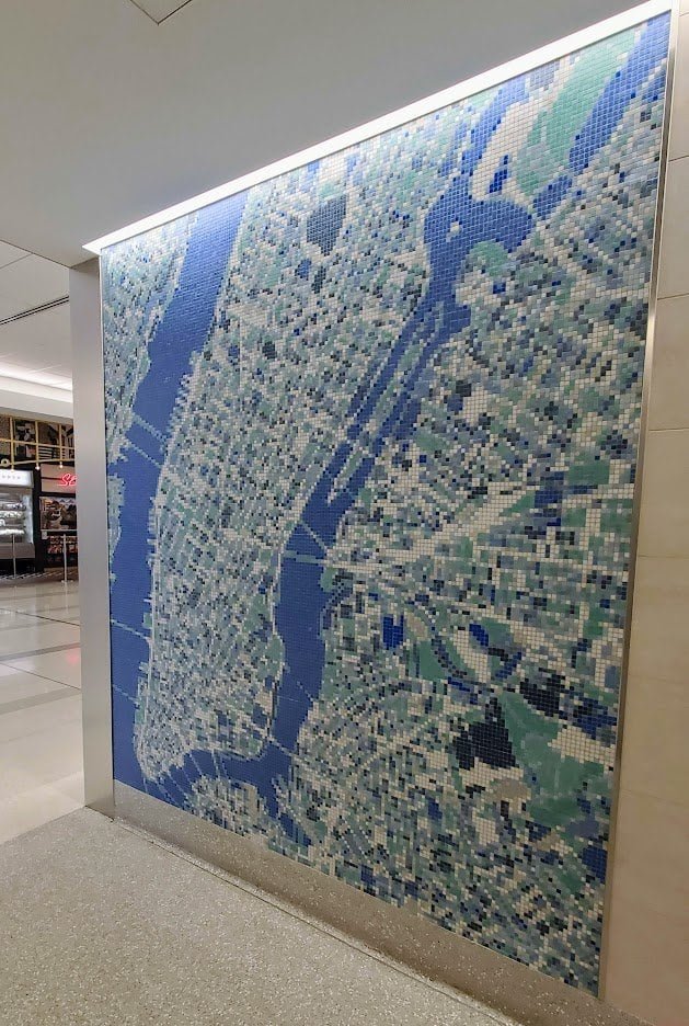
Matt Malone spotted this fantastic mosaic-tiled map of NYC ? at LaGuardia Airport during his first trip there last October. As a geographer, he said he was required to take a picture and share it.
MapsintheWild New York, mosaic
-
sur 1000+ Streets Called Washington
Publié: 28 June 2024, 10:22am CEST par Keir Clarke
George Washington has more streets named after him in America than any other person in history. There are 1,399 streets named for the Founding Father in the United States, including George Washington Memorial Parkway in Washington DC and a number of Washington Streets in the state of Washington.At the other end of the scale Babe Ruth has only 3 U.S. streets named in his honor. There are 11
-
sur A recap of the 129th OGC Member Meeting, Montreal, Canada
Publié: 27 June 2024, 2:00pm CEST par Simon Chester
The 129th OGC Member Meeting was held in Montreal, Canada, from June 17-21, 2024. The meeting was hosted by OGC Strategic Member Natural Resources Canada, with additional support from Esri Canada, CAE, Safe Software, and Bentley Systems. The week saw more than 200 leaders and experts from industry, academia, and government come together—with a further 100 online—to learn about the latest innovations from OGC Members, advance Standards, network, and shape the future of geospatial technology. The meeting was also notable as it marked the beginning of OGC’s 30 year anniversary celebrations, which will culminate at an event in Washington, D.C., this December.
Under the theme “Standards enabling collaboration for global challenges” the 129th Member Meeting focused on discussing, aligning, supporting, and promoting geospatial solutions that address challenges as far reaching as climate change and related disasters, and application domains as diverse as marine, Artificial Intelligence/Machine Learning (AI/ML), and beyond.
Alongside the many OGC Standards and Domain Working Group meetings, there also included a Methane Summit, a Sensor Summit, a two-day meeting of the Canada Forum, a Quantum Computing ad hoc, a Metadata Workshop, and the kickoff of Testbed-20.
Friday’s OGC Executive Planning Committee Meeting was hosted by CAE at their nearby factory, and included a memorable tour of their factory floor. Social occasions included a Monday evening reception and a Wednesday night dinner was held at Northern Italian restaurant, Le Richmond. During the dinner, Andreas Matheus from Secure Dimensions GmbH was presented the 2024 Gardels Award for his persistent efforts to ensure best practices in security and API design in OGC. Congratulations, Andreas!
 Andreas Matheus (L) is presented the 2024 Gardels Award by OGC Chief Standards Officer, Scott Simmons (R).
In addition to the challenges and domains covered by the meeting theme, two additional areas of discussion that stood out during the week: Digital Twins & Sensors, and Ethics in Geospatial.
Digital Twins & Sensors. OGC members are increasingly demonstrating the use of digital twins of the built environment (e.g., city and building models) as the context and framework in which sensors are managed. Sensed information in the real world can be displayed on digital representations of that digital reality to enable better understanding of environmental conditions, human activity, and system responses to those factors. The Urban Digital Twins DWG, 3D Information Management DWG, and the Autonomy, Sensors, Things, Robots, and Observations DWG are each actively discussing and collaborating on this integration.
Ethics in Geospatial. The OGC Executive Planning Committee has established a new subgroup on Ethics in Geospatial to set strategy for how OGC might address/respond to the ethical use of geospatial data or the use of those data for ethical purposes. The group will organize an initial meeting this July. If you would like to contribute to the conversation, you can sign up to the OGC Ethics in Geospatial email list here.
Building on the success of the demonstration at the 128th Member Meeting in Delft, The Netherlands, members of the OGC GeoPose and Points of Interest Standards Working Groups, in collaboration with the Open AR Cloud team, XR Masters, and Augmented City, expanded the GeoPose demonstration to include a native browser developed by OGC member Ethar, Inc. With the Ethar implementation, the team successfully demonstrated that a GeoPose can be encoded into a QR code. You can read more about the demonstration on the Open AR Cloud blog post, which includes a video showing how GeoPose can be used for anchoring content indoors and how it can be recognized by different Augmented Reality Clients.
Opening PlenaryThe Opening Plenary was hosted by OGC’s Dr. Rachel Opitz and featured a keynote presentation from Eric Loubier, Director General of the Canada Centre for Mapping and Earth Observation at Natural Resources Canada. Mr. Loubier highlighted the use of geospatial data and technologies to address the needs of Canadian citizens, with examples including flood and wildfire risk.
Introductory messages were then delivered by Louis-Martin Losier from Bentley Systems, Gordon Plunkett from Esri Canada, Hermann Brassard from CAE, and Dean Hintz from Safe Software. Finally, Prashant Shukle, Chair of the OGC Board of Directors, presented on “Canada and the OGC – 30 years of impact,” which reflected on the important parts that Canadian organizations have played in OGC’s 30 year history.
Special tribute was then paid to an instrumental figure in OGC’s history who sadly passed away in May this year, Dr. John Herring. John was OGC’s first Gardels Award recipient back in 1999, and also received an OGC Lifetime Achievement Award in 2021.
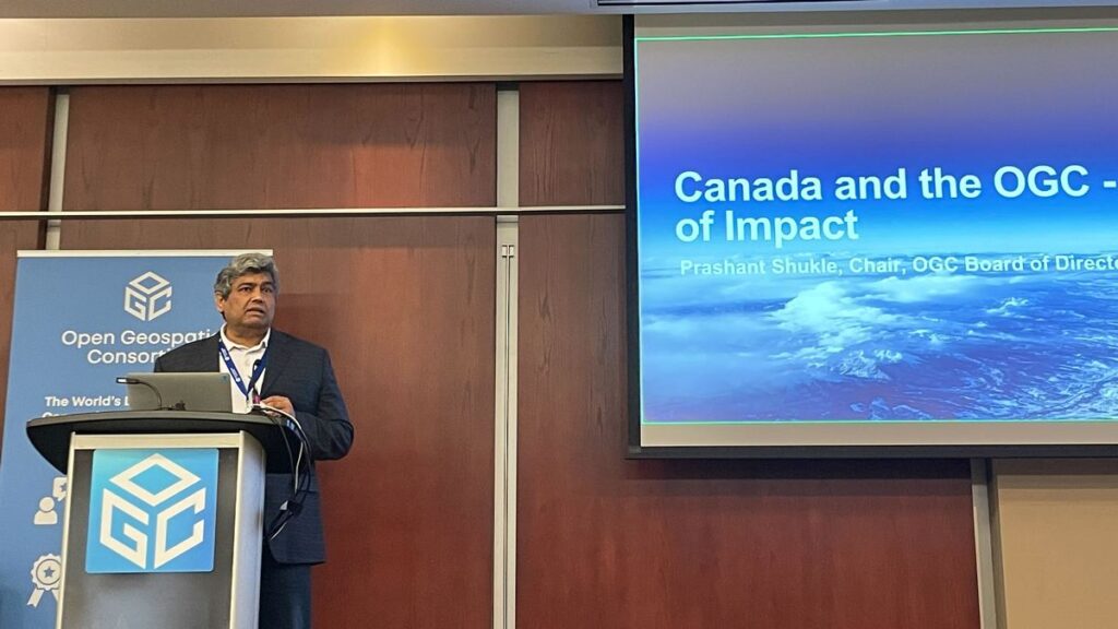 Chair of the OGC Board of Directors, Prashant Shukle, presents “Canada and the OGC – 30 years of impact” during the opening session.
Future Directions
Chair of the OGC Board of Directors, Prashant Shukle, presents “Canada and the OGC – 30 years of impact” during the opening session.
Future Directions
This Meeting’s Future Directions session focused on Artificial Intelligence in Geoinformatics. Four presentations were made to provide updates since this topic was last addressed.
- Leveraging AI for Geospatial Reality Data: Louis-Martin Losier, Jeroen Vermeulen, Arnaud Durante (Bentley Systems)
- Spatial Web: AI agents operating in hyperspace: George Percivall (GeoRoundtable / IEEE GRSS)
- A User-Centric Process to Build AI-Powered Geospatial Applications: Pablo Fuentes (makepath)
- Bringing Geospatial Awareness to Large Language Models Using Spatial Knowledge Graphs: Nathan McEachen (TerraFrame)
The four presenters then engaged in a fascinating panel discussion moderated by Dr. Gobe Hobona of OGC. OGC Members can access the presentations and a recording on this page in the OGC Portal.
Meeting Special SessionsThe Methane Summit focused on the observation, measurement, monitoring, and spatial analysis of methane emissions. Consistent reporting of these emissions in a spatial context is key to effective decision making regarding reduction of emissions and their environmental consequences. Hence, the session also resulted in the proposal of a new OGC Standards Working Group (SWG) for EmissionML as a means to encode emission data. OGC Members can access the presentations and a recording on this page in the OGC Portal.
Directly following the Methane Summit was a linked Sensor Summit to talk more specifically about sensor model and data standardization. The focus of this Summit was on new and emerging Standards activities in OGC, including SensorThings API version 2.0, OGC API – Connected Systems and its dependent updates to the SensorWeb Standards, and the UK SAPIENT sensor architecture. OGC Members can access the presentations and a recording on this page in the OGC Portal.
The OGC Canada Forum held sessions on both Monday and Tuesday. Day 1 included an opening and the Forum Overview, followed by a panel on “The Transformative Role of Industry in National Geospatial Strategy and Spatial Data Infrastructure.” Day 2 started with an Oxford debate on the impact of standards on innovation and then included a panel on “National Geospatial Strategy in a Time of Rapid Change and Growing Challenges.” The day wrapped up with a discussion on partnerships and a closing. OGC Members can access the presentations and a recording on this page in the OGC Portal.
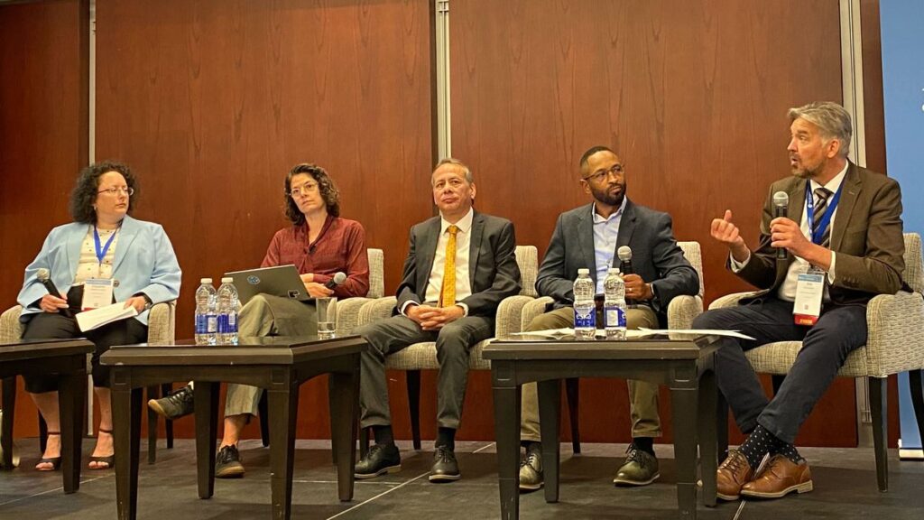 (L-R) Claudine Couture, Linda van den Brink, Bradford Dean, Eldrich Frazier, and Eric Loubier discussing “National Geospatial Strategy in a Time of Rapid Change and Growing Challenges” during the Canada Forum.
The Quantum Computing ad hoc session was a follow-up from the previous Member Meeting to assess whether a new OGC Working Group should be established to assess the geospatial role of quantum computing technologies. OGC Members can access the presentations and a recording on this page in the OGC Portal.
On Friday of the meeting week, a full-day Metadata Workshop was organized by the Metadata and Catalogs Domain Working Group (DWG). The first half of the workshop set the stage with presentations on current and emerging metadata Standards as well as their practical use. The second half of the summit was focused on the candidate OGC GeoDCAT Standard, how GeoDCAT fits within OGC’s building block approach to Standards, and preparation for a metadata-centric OGC Code Sprint later in 2024. OGC Members can access the presentations and a recording on this page in the OGC Portal.
The next OGC Testbed has now begun! The Testbed-20 kickoff session helped participants better understand sponsor requirements and introduced both parties to the process by which OGC will manage the Testbed. As the largest Research & Development (R&D) Initiatives conducted under OGC’s COSI Program, OGC Testbeds exist at the cutting edge of technology, actively exploring and evaluating future geospatial technologies to solve today’s problems.
Testbeds provide an opportunity to engage with and lead the latest research on geospatial system design, concept development, and rapid prototyping. They also provide a business opportunity for stakeholders to mutually define, refine, and evolve service interfaces and protocols in the context of hands-on experience and feedback. The solutions developed in Testbeds eventually move into the OGC Standards Program, where they are reviewed, revised, and potentially approved as new international Open Standards that can reach millions of individuals.
Testbed-20 will drive innovation at the foundations of geospatial data ecosystems. While working across four tasks, participants will collaborate to create mechanisms that improve Integrity, Provenance, and Trust (IPT) in geospatial data systems and workflows; transform Standards for GEOINT Imagery Media for Intelligence, Surveillance, and Reconnaissance (GIMI); enhance the usability of, and investigate new applications for, GeoDataCubes; and explore options for High-Performance Geospatial Computing Optimized Formats.
 The OGC Executive Planning Committee during their visit to the CAE Factory.
Closing Plenary
The OGC Executive Planning Committee during their visit to the CAE Factory.
Closing Plenary
Wrapping up the week, I opened Thursday’s Important Things session with a rapid, 7-minute summary of the entire meeting week. This presentation was followed by some introductory remarks from Ryan Ahola of Natural Resources Canada to identify issues with Spatial Data Infrastructures (SDIs) and domains requiring geospatial standardization. Member discussion focused primarily on ensuring that SDI planning and management be aware of the larger data ecosystems in which the SDI must exist. This topic then led into a more detailed discussion on the mechanics of communicating how users should look to transition from the legacy OGC Web Services to OGC API Standards, where appropriate. OGC Members can access the presentations and a recording, including of the 7-minute overview, on this page in the OGC Portal. Additionally, OGC Members can access as session notes on the “Important-Things-2024-06” Etherpad.
The Closing Plenary then saw a keynote from Jong Tae Ahn of the Republic of Korea’s Ministry of Land, Infrastructure and Transport that briefed the long-term roadmap for spatial information standardization in Korea. The remainder of the session was dedicated to advancing Standardization activities in OGC. Slides and content from a large number of Working Group sessions were included. OGC Members can access the presentations and a recording on this page in the OGC Portal.
Thank you to our communityAs always, it was such a pleasure seeing our community come together to talk about their recent achievements, learn from each other, and drive innovation and Standards development forward. I sincerely thank our members for investing their time and energy, as well as their dedication to making OGC the world’s leading and most comprehensive community of location experts.
The next OGC Member Meeting is scheduled for November 4-8 in Goyang in the Seoul Capital Area of the Republic of Korea. Join members of the OGC Community to learn about the latest happenings at OGC, advance geospatial standards, network with the leaders of geospatial, and see what’s coming next. Registration will open soon on ogcmeet.org. To hear about it when it opens, feel free to subscribe to the OGC Newsletter – a digest of all things OGC, sent every two weeks.
The post A recap of the 129th OGC Member Meeting, Montreal, Canada appeared first on Open Geospatial Consortium.
-
sur WhereGroup: Mapbender-Anwendungen einfach direkt aus QGIS heraus erstellen
Publié: 27 June 2024, 11:30am CEST
Mit unserem neuen Plugin für QGIS ist es nun möglich, QGIS-Desktop-Projekte mit nur ganz wenigen Schritten als WMS und gleichzeitig als Mapbender Anwendungen zu veröffentlichen. -
sur Mappery: Western Hemisphere
Publié: 27 June 2024, 11:00am CEST
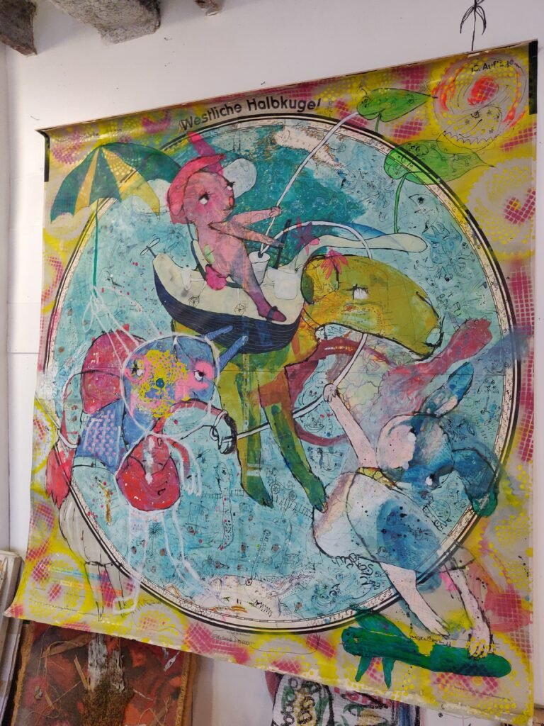
This came from Moritz Schillinger
“This map painting is from David Hardy showing the western hemisphere (artist name Le Suisse Marocain – website [https:]] ). Not sure if it’s a Map in the Wild, it’s hardly recognizable. “
No worries about eligibility Moritz, our standards are very flexible.
MapsintheWild Western Hemisphere
-
sur Where Immigrants are Settling
Publié: 27 June 2024, 8:21am CEST par Keir Clarke
The Washington Post has used immigrant court records from the last ten years to map out where migrants are settling in the United States. The data comes from immigration courts, which are responsible for adjudicating immigration cases. In 4.1 million migrants: Where they’re from, where they live in the U.S. the Post claims that this is "the most detailed publicly available information showing
-
sur Mappery: The Geographic Center of the United States is at …
Publié: 26 June 2024, 11:00am CEST
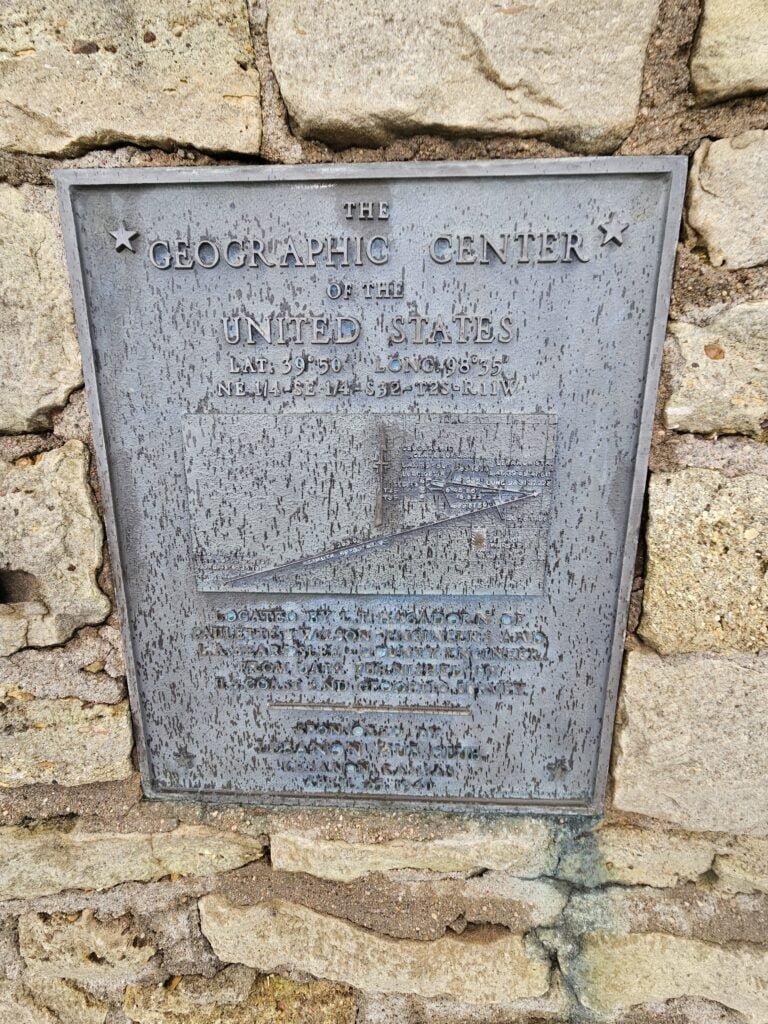
Ander Andersen is another new contributor. He kicks off with marker for the geographic center of the US. UK readers please forgive the US spelling of what should be “centre” but given the location I thought I should follow their convention.
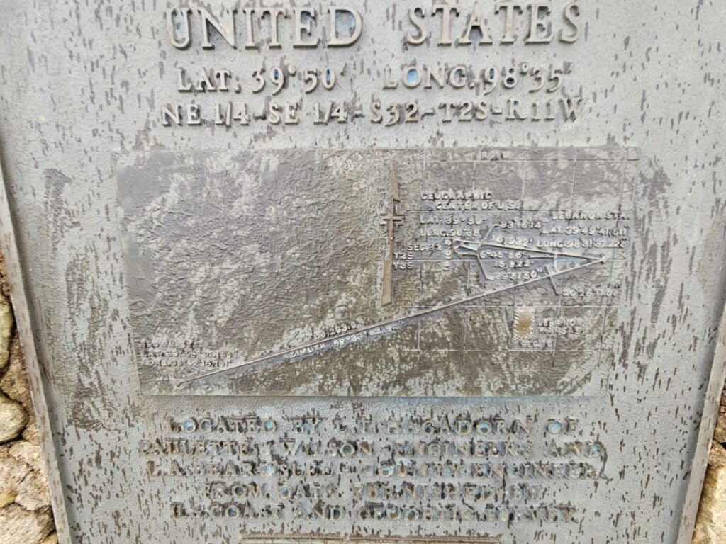
Of course anything that claims to be the geographic centre of a country or polygon is going to prompt some discourse in the geo community. The marker has Lat 39 degrees 50 minutes, Long 98,35 but, as you might expect Wikipedia has a whole article about the different options – this marker is at the centre of the 48 contiguous states and located Lebanon, Kansas
If you include Alaska and Hawaii the centre shifts to Lat 44,58, Long 103,56 which is north of Belle Fourche in South Dakota.
MapsintheWild The Geographic Center of the United States is at …
-
sur The New Nuclear Arms Race
Publié: 26 June 2024, 9:00am CEST par Keir Clarke
As several countries actively expand their arsenals of nuclear weapons, Sweden's SVT has released an investigation into World Nuclear Forces. In recent years, China, Pakistan, India, Israel, and North Korea have all augmented their nuclear stockpiles. In World Nuclear Forces SVT examines the numbers of nuclear weapons owned by countries around the world and the overall and
-
sur Mappery: Berlin, Schoneberg
Publié: 25 June 2024, 11:00am CEST

What a fantastic station signage! Marc-Tobias sent me this which he spotted on his way home from a recent Geomob Berlin event.

Note that it includes coordinates
MapsintheWild Berlin, Schoneberg
-
sur Who is Your Closest Team?
Publié: 25 June 2024, 10:05am CEST par Keir Clarke
If you have ever wondered which baseball team you should support then you need Maptitude's Closest Major or Minor League Baseball Stadium by Drive Time map. The map shows you which affiliated major or minor baseball stadium you can drive to in the quickest time in the contiguous United States.The map is a sort of combination of a voronoi diagram and an isochrone map. However,
-
sur OPENGIS.ch: QGIS Swiss Locator 3.0 brings elevation profiles and vector tiles
Publié: 25 June 2024, 6:43am CEST
Swiss elevation profilesGet high-precision elevation profiles in QGIS right from Swisstopo’s official profile service, based on swissALTI3D data!
Swiss elevation profiles are available with QGIS 3.38.Thanks to this integration, you can take advantage of existing QGIS features, such as exporting 2d/3d features or distance/elevation tables, as well as displaying profiles directly in QGIS layouts.
Tip: Swiss elevation profiles will be available as long as the Swiss Locator plugin is installed and active. Should you need to turn Swiss elevation profiles off to create other profiles with your own data, go to the Plugin manager and deactivate the plugin in the meantime.
For developersWe’re paving the way for adding custom elevation profiles to QGIS. For that, we’ve added a QGIS profile source registry so that plugin developers can register their own profile sources (e.g., based on profile web services, just like we did here) and make them available for QGIS end users. The registry is available from QGIS 3.38. It’s your turn!

Thanks to the QGIS user group Switzerland for funding this feature!
Swiss vector tiles base maps
Loading Swiss vector tiles is now easier than ever. Just go to the locator bar, type the prefix “chb” (add a white space after that) and you’ll get a list of available and already styled Swiss vector tiles layers. Some of them will even load grouped auxiliary imagery for reference.
Vector tiles will be loaded at the bottom of the QGIS layer tree as base maps, so you will see all your data on top of them.
Vector tiles are optimized for local caching and scale-independent rendering. This also makes it a perfect fit for adding it to your QField project.
There are a couple of different vector tile sets available:
leichte-basiskarte Light base map
Similar to the leichte-basiskarte layer, but using an older version of the data source and adjusted styles.
 leichte-basiskarte-imagery (with WMTS sublayer)
 Imagery base map (with WMTS sublayer)
This layer is similar to the leichte-basiskarte-imagery layer, but it uses an older version of the data source and adjusted styles.
 Base map

See the official services documentation for details on data sources and styles.
FixesThanks to your feedback, we’ve also fixed some issues. Don’t hesitate to reach out to us at GitHub if you’d like to suggest or report something related to the Swiss Locator plugin.
Happy (and now more powerful) mapping!


-
sur Mappery: Norrebro Collection
Publié: 24 June 2024, 11:00am CEST

-
sur The Dawn Chorus Map of Birds
Publié: 24 June 2024, 9:01am CEST par Keir Clarke
Each and every morning birds around the world herald the start of a new day by participating in the dawn chorus. While the aural phenomenon of birds singing at dawn is a global one the songs of the dawn chorus can vary greatly depending on where you live and on the make-up of your local avian population. Now, thanks to a new(ish) interactive map, you can tune into this morning serenade at
-
sur QGIS Blog: Plugin Update – December 23? to January 24?
Publié: 24 June 2024, 8:38am CEST
Between December 2023 and January 2024, 45 new plugins were published in the QGIS plugin repository. On top of those, we also included another 4 from the last week of November.
Here follows the quick overview in reverse chronological order. If any of the names or short descriptions catches your attention, you can find the direct link to the plugin page in the table below:
OpenLog High performance drillhole visualization QGIS module supporting 3D, cross-section, and log views. Benthic Terrain Modeler Analyzes benthic terrain for the purposes of classifying surficial seafloor characteristics that may be used in studies of benthic habitat, geomorphology, prediction of benthic fish species distribution, marine protected area design, and more QAnnAGNPS This plugin integrates the AnnAGNPS model into QGIS QSU2 QSU2 for CFD simulations Autofill Attributes Simple screen to fill your attributes table automatically. Eurostat downloader This plugin can be used to get data using the Eurostat API. VectorToDBLoader Loads Active Vector Themes to PostGIS, Oracle and MS SQL MunsellRGB Munsell code to sRBG conversion. WFS Styler Plugin Set a WMS style to a WFS layer CIGeoE Rename Attachment Attribute Rename attachment attribute of selected field on all features QGIS2API-CNIG Complemento que crea un visualizador cartográfico con el contenido del lienzo de QGIS Data Sources Panel Panel/dock with overview of layer data sources GeoFA Gratis og let adgang til GeoFA (Geografiske Fagdata i GeoDanmark) i QGIS.
Free and easy access to GeoFA (Geographical Professional Data in GeoDanmark) in QGIS.Co-Traveler Co-Traveler discovery tools. CoGEOS This plugin enables the user to automatically extract shorelines and compute shoreline change rates. Geovita GIS Processing provider This plugin adds different Geovita custom processing algorithms to QGIS CAV Este plugin realiza cálculos, comparações e análises estatísticas do volume e área de uma cota específica em um modelo digital de terreno. Whitebox Workflows for QGIS Provides access to Whitebox Workflows within QGIS Y!maptool?Yahoo! JAPAN YOLP Web API Yahoo!JAPAN?YOLP Web API??????????????????????????????????????????Web???? by Yahoo! JAPAN ?? [https:] This plugin allows the user to displays the location of search results using Yahoo!JAPAN YOLP Web API.You can search by zip code. QgisToUGCS A Plugin to create UGCS missions from GPKG layers. This is made for drone users that want to lead AreaScan for a drone-line inspection Infra3D plugin This plugin is an integration of the Infra3D application with QGIS CZML Moving Objects This plugin creates CZML files for moving objects described as points Layer Tree Tools Sorts and groups nodes in layer tree, takes layer tree snapshots Localisation Grand Lyon Suite d’outils de localisation utilisés pour les logiciels métiers QGIS de la Métropole Grand Lyon. FIM Forest Inventory and Monitoring Point Cloud Filter Slider GUI panel to change values in simple query builder filter for point clouds. Dokumente verknüpfen With this Plugin documents can be connected to objects. It is designed for sewer system inspection data. Bunting Labs AI Vectorizer Intelligent autocomplete for vectorizing raster maps. CIGeoE Pacman Resolve the intersection of 2 polygons by removing the overlapped area in the second polygon. GSI-AddressSearch ??????API?????????????????????????????????????????????????????????????API?? [https:] plugin allows the user to search for a address and get its coordinates using GSI API. Riverscapes Viewer Explore symbolized Riverscapes projects Feature Z Setter Sets the Z value of each new/edited feature to a specific value, based on a DEM layer plus an offset. BrandGIS BrandGIS Ledningsstöd och geografisk lägesbild vid brand i skog och mark. Oemc Plugin This plugin provides easy access to OEMC STAC catalog Swedigarch Geotools Swedigarch Geotools Urbantracer Urbantracer creates urbanized area polygon over a street map. Geohash Expressions Plugin This plugin adds four expression functions to work with geohash in the field calculator QMetadataLayerHISPANIA Complemento para visualizar y agregar metadatos a las capas. Mesh Flow Tool to extract flow from hydraulic model results contained in a mesh layer. QRiS QGIS Riverscapes Studio (QRiS) SAGis Excel Export Plugin öffnet einen vereinfachten Excel-Export-Dialog SAGis ALKIS Suche Plugin zum Einbinden und Durchsuchen einer ALKIS-Datenbank LandXML to Mesh Conversion of LandXML to Mesh and vice versa QuickCopy Click and Copy WKT. Style to text Converts stylefiles to csv-files R-ABLE plugin R-ABLE plugin, developed within the EUHubs4Data project, providing access to the web services on agricultural land. Python Module Manager Show all the installed packages (distributions); Show modules in a selected package; Install a package/packages; Load a module and get the version. PDD-QGis Tool Tool to download and visualize datasets from Plataforma de Datos by Itrend. Project Full Text Search This plugin generates a full text search index containing all attributes of all layers of a loaded project. The user then can use a single text-input field to search within all available attributes. -
sur Mappery: You are on the Plate
Publié: 23 June 2024, 11:00am CEST
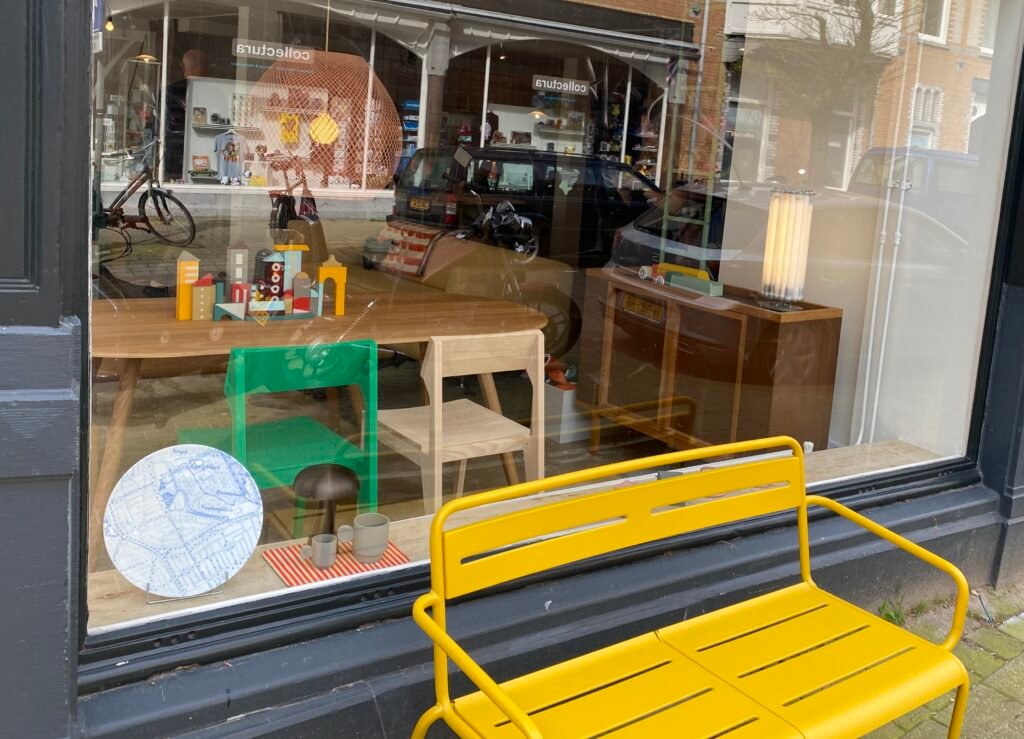
Reinder spotted this plate in a shop window in The Hague.
“Shop window, Piet Heinstraat, The Hague, Netherlands. The spot where one can see this little scene is actually on the plate, down on the right hand side.”

MapsintheWild You are on the Plate
-
sur Mappery: Map Mannequin in Paris
Publié: 22 June 2024, 11:00am CEST

Moritz Schillinger joins the club of Maps in the Wild contributors with his first post of this superb map mannequin.
“Last weekend in Paris I discovered a map in the wild myself. I found these artworks in the art center “59 Rivoli”, a former squat which now hosts really cool (temporary) art studios.
The map mannequin here is from Isabelle Marty (artist’s name @i.m.arty – Instagram). What I can see is that she’s wearing pieces of France, Ireland and the Netherlands. “
Welcome to the club Moritz, keep them coming!

MapsintheWild Map Mannequin in Paris
-
sur Find Your Future Climate Zone
Publié: 22 June 2024, 9:48am CEST par Keir Clarke
In fifty years time Los Angeles will no longer be in a temperate climate zone. As a result of climate change the climate in LA in 2070 will closely resemble the climate of New Delhi today. The average temperature will increase from 59.8°F to 65.2°F and LA can expect hot and arid summers.You can discover if your city will be changing climate zones in the near future (it will) on The Pudding's
-
sur Mappery: Kids on the Map
Publié: 21 June 2024, 11:00am CEST

Reinder sent us this pic from the Maritime Museum in Rotterdam
“The Maritime Museum in Rotterdam has taken the next step in the field of target group approach and public outreach using the Cultural Target Group Model. “This has given us a shared language and a shared image of our Cultural Target Groups. And more awareness about its importance,” says Layla Salamoun, Head of Marketing, Communications & Development.”
Seems that giant maps that you can walk on, play on and explore are appear.ing quite often on Mappery, send us more – we love them!
MapsintheWild Kids on the Map
-
sur The Newest Maps of Mars - in 3D
Publié: 21 June 2024, 9:43am CEST par Keir Clarke
The National Astronomical Observatories, Chinese Academy of Sciences has released a 3D interactive map of Mars, using imagery captured from the Tianwen-1 interplanetary mission. The Gras Mars Map allows you to explore Mars using the navigation tools that you are familiar with using from exploring Earth on Google Maps.The Gras Mars Map uses imagery captured by the 2020 China National Space
-
sur Andreas Matheus receives OGC’s 2024 Gardels Award
Publié: 20 June 2024, 3:00pm CEST par Simon Chester
Last night at the 129th Open Geospatial Consortium (OGC) Member Meeting, held in Montreal, Canada, Andreas Matheus was presented the OGC’s prestigious Kenneth D. Gardels Award. The Gardels Award is presented each year to an individual who has made exemplary contributions to OGC’s consensus standards process. The Gardels Award was conceived to memorialize the spirit of a man who dreamt passionately of making the world a better place through open communication and the use of information technology to improve the quality of human life.
Andreas Matheus, Managing Director at Secure Dimensions GmbH, was selected by previous Gardels Award winners as the 2024 recipient because of his persistent efforts to ensure best practices in security and API design in OGC.
A member of the nominating committee commented that Andreas has “been the go-to security expert for almost as long as OGC has existed.” Another committee member noted that Andreas’ “dedication on security and citizen science has been constant” and that he is “fully focused on promoting OGC solutions and other Standards for security.”
“The OGC Board of Directors thanks Andreas for his work as a chair and active member of many OGC Working Groups and for providing his insight and expertise to several OGC Standards and Collaborative Solutions and Innovation (COSI) initiatives,” commented Prashant J. Shukle, Chair of the OGC Board of Directors. “Your tireless voice of expertise on security matters continues to be critical to OGC activities and exemplifies the values associated with the Gardels Award.”
Andreas Chairs the OGC Security, Citizen Science, and Blockchain & Distributed Ledgers Domain Working Groups as well as the GeoXACML and OWS Common – Security Standards Working Groups. Andreas is also the principal editor for several OGC Testbed Engineering Reports and both the GeoXACML and OWS Web Services Security Standards.
In all this work, Andreas exemplifies the highest values of OGC, and has demonstrated the principles, humility, and dedication in designing, supporting, and promoting spatial technologies to address the needs of humanity that characterized Kenn Gardels’ career and life.
About the OGC Gardels Award
The Kenneth D. Gardels Award is a gold medallion presented each year by the Board of Directors of the Open Geospatial Consortium, Inc. (OGC) to an individual who has made exemplary contributions to OGC’s consensus standards process. Award nominations are made by members – the prior Gardels Award winners – and approved by the Board of Directors. The Gardels Award was conceived to memorialize the spirit of a man who dreamt passionately of making the world a better place through open communication and the use of information technology to improve the quality of human life.
Kenneth Gardels, a founding member and a director of OGC, coined the phrase “Open GIS.” Kenn died of cancer in 1999 at the age of 44. He was active in popularizing the open source Geographic Information System (GIS) ‘GRASS’, and was a key figure in the Internet community of people who used and developed that software. Kenn was well known in the field of GIS and was involved over the years in many programs related to GIS and the environment. He was a respected GIS consultant to the State of California and to local and federal agencies, and frequently attended GIS conferences around the world.
Kenn is remembered for his principles, courage, and humility, and for his accomplishments in promoting spatial technologies as tools for preserving the environment and serving human needs.
More information on the OGC Gardels Award, including previous winners, can be found at: ogc.org/about-ogc/ogc-awards/gardels-awards/The post Andreas Matheus receives OGC’s 2024 Gardels Award appeared first on Open Geospatial Consortium.
-
sur Mappery: Giant China Map in Zaragoza
Publié: 20 June 2024, 11:00am CEST
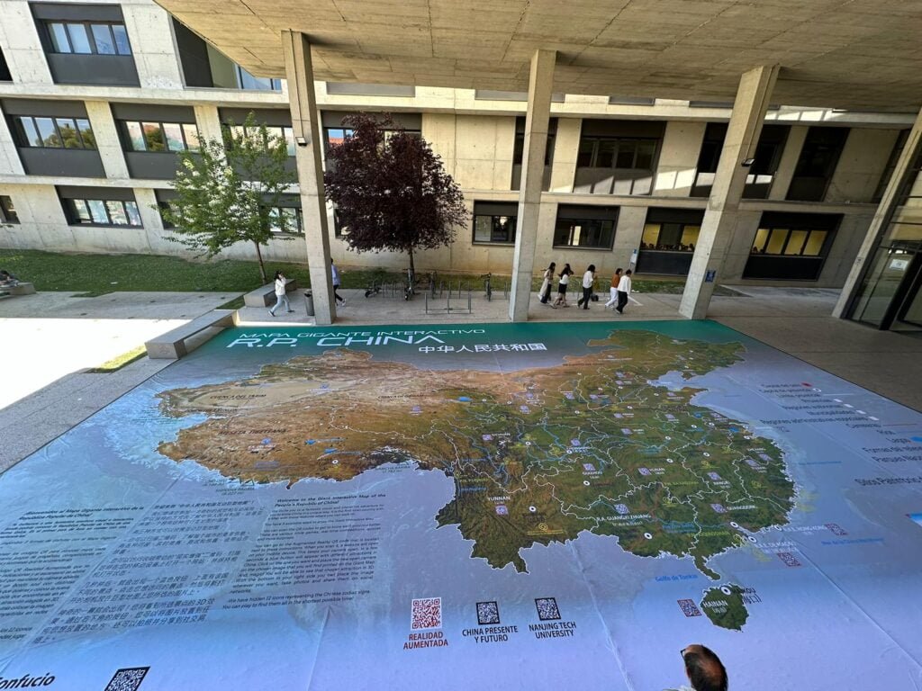
Angel Arenas sent us his latest project. It’s a giant interactive map of China at the University of Zaragoza. The scale of these maps is so impressive, a whole class or more could explore.
MapsintheWild Giant China Map in Zaragoza
-
sur The Worldwide Breaking News Map
Publié: 20 June 2024, 9:37am CEST par Keir Clarke
You can now explore breaking global news stories in real-time on a new interactive map. The Global Alerts Map highlights breaking news stories around the world. Using the map you can filter stories by category, and read the latest news updates. From major political developments to natural disasters, with just a few clicks, you can zoom into any region or country of the world, and read the
-
sur Marco Bernasocchi: QGIS.ch user-day 2024 – A biased review by uber-happy committers
Publié: 20 June 2024, 6:45am CEST
During the pandemic, people noticed how well they could work remotely, how productive meetings via video call could be, and how well webinars worked. At OPENGIS.ch, this wasn’t news because we have always been 100% remote. However, we missed the unplanned, in-person interactions that occur during meetups with a
 or
or  . That’s why we’re very pleased that last week we could join the Swiss QGIS user day for the second time after the pandemic.
OPENGIS.ch has been invested in QGIS since its inception in 2014, actually even before; our CEO Marco started working with QGIS 0.6 in 2004 and our CTO Matthias with version 1.7 in 2012. Since 2019, we have also been the company with the most core committers. We can definitely say that OPENGIS.ch has been one of the main driving forces behind the large adoption of QGIS in Switzerland and worldwide.
 Contributions to the QGIS core measured in commit numbers
Looking at the work done in the QGIS code we’re by far the most prolific company in Switzerland and second worldwide only to North Road Consulting. On top of it, we were the first – and still only one of two- companies to sustain QGIS.org at a Large level since 2021.
This makes us very proud and it is why we’re even happier to see how much that is happening around QGIS in Switzerland aligns with the visions and goals we set out to reach years ago.
The morning started with a presentation by our CTO Matthias “What’s new in QGIS” featuring plenty of work sponsored by the Anwendergruppe CH.
 Our CTO Matthias answering QGIS questions
DXF Improvements, the release of SwissLocator 3.0 with swissalti3d and vector tiles integration, and an update on the advances towards solid curve handling in QGIS, a prerequisite for properly handling AV data in Switzerland, were only some of the many noteworthy points he touched.
The highlight of Matthias’ presentation was the better OGC API Features support in QGIS, which was also highlighted in a subsequent talk about Kablo, showing how the next generation of industry solutions (Fachschalen) will be implemented.
Slides: Neues aus der QGIS Welt - QGIS Anwendertag 2024Following was a short presentation on the project DMAV, Christoph Lauber introduced a project that aims to implement an industry solution for official cadastral surveying with QGIS.
Adrian Wicki of the Federal Office for the Environment (FOEN) and Isabel presented how OPENGIS.ch and the partners Puzzle and Zeilenwerk help the FOEN with the SAM project with assess the hazards of flood, forest fire, or landslides, and warn authorities and the population. With an agile project organisation, the complex project succeeds in fulfilling requirements by applying user-centred development concepts. QGIS is used for visualizing and analyzing data and helping forecasters gain insights into the current situation.
Slides: BAFU_SAMAndreas Neumann from ETH Zurich and Michael presented the qgis-js project. QGIS-js is an effort to port QGIS core to WebAssembly so that it can be run in a web browser. Although still in the early experimentation phase, this project has great potential to leverage interesting new use cases that weren’t even thinkable before.
Slides: [https:]]Olivier Monod from the City of Yverdon presented Kablo, an electricity management proof of concept of the next generation implementation for industry solutions developed in collaboration with OPENGIS.ch.
By applying a middleware based on OGC API Features and Django, Kablo shows how common limitations of current industry solutions (like permission management and atomic operations) can be overcome and how the future brings desktop and web closer together.
Slides: kablo-qgis-user-daysObviously, it wasn’t just OPENGIS.ch. Sandro Mani from Sourcepole presented the latest and greatest improvements on QWC2, like street view integration and cool QGIS features brought to a beautiful web gis. Andreas Schmid from Kt. Solothurn presented how cool cloud-optimized geotiff (COG) is and what challenges come with it. Interested in the topic? Read more in our report about cloud optimized formats. Mattia Panduri from Canton Ticino explained how they used QGIS to harmonise the cantonal building datasets and Timothée Produit from IG Group SA presented how pic2map helps bring photos to maps.
To round up the morning, Nyall Dawson from North Road Consulting did a live session around the world to show the latest developments around elevation filtering in QGIS.
In the afternoon, workshops followed. Claas Leiner led a QGIS expression one while Matthias and Michael showed how to leverage QGIS processing for building geospatial data processing workflows.
The first QGIS model baker user meeting took place in the third room. The participants discussed this fantastic tool we developed to make INTERLIS work smarter and more productive.
 First ModelBaker user meeting
It was a very rich and constructive QGIS user day. We came home with plenty of new ideas and a sense of fulfilment, seeing how great the community we observed and helped grow has become.
A big thanks go to the organisers and everyone involved in making such a great event happen. Only the beer in the sunshine was literally watered by the rain. Nevertheless, there were exciting discussions in the station bistro or in the restaurant coaches on the way home.
See you next time and keep contributing

-
sur Markus Neteler: GRASS GIS 8.4.0RC1 released
Publié: 19 June 2024, 12:18pm CEST
The GRASS GIS 8.4.0RC1 release provides more than 515 improvements and fixes with respect to the release 8.3.2. Please support us in testing this release candidate.
The post GRASS GIS 8.4.0RC1 released appeared first on Markus Neteler Consulting.
-
sur Mappery: Japanese Garage Door
Publié: 19 June 2024, 11:00am CEST

Marc-Tobias spotted this map on a garage door in Yuigahama beach, Kamakura, Japan, [https:]] (beach), part of [https:]]
??????????????
means “For a safe and secure community”???
means Kamakura (city)
I’m left wondering why someone would want this map on their garage door, but I’m glad they did
MapsintheWild Japanese Garage Door
-
sur Mapping the Big Map Index
Publié: 19 June 2024, 10:21am CEST par Keir Clarke
The Economist's Big Mac Index compares the purchasing power parity between the currencies of different countries by examining the price of a Big Mac hamburger sold at McDonalds' restaurants in each country. The Index "is based on the theory of purchasing-power parity, the notion that in the long run exchange rates should move towards the rate that would equalize the prices of an identical
-
sur GeoTools Team: GeoTools 29.6 Released
Publié: 18 June 2024, 8:19pm CEST
GeoTools 29.6 releasedGeoTools team is providing a release of GeoTools 29.6:geotools-29.6-bin.zipgeotools-29.6-doc.zipgeotools-29.6-userguide.zipgeotools-29.6-project.zipThis is an unscheduled release provided to help teams address CVE-2024-36404. Details of this issue will be made available at the end of the month. This is in keeping with our coordinated vulnerability disclosure policy  -
sur GeoTools Team: GeoTools 31.2 Released
Publié: 18 June 2024, 8:19pm CEST
GeoTools 31.2 released The GeoTools team is pleased to announce the release of the latest maintenance version of GeoTools 31.2: geotools-31.2-bin.zip geotools-31.2-doc.zip geotools-31.2-userguide.zip geotools-31.2-project.zip This release is also available from the OSGeo Maven Repository and is made in conjunction with GeoServer 2.24.4 -
sur Mappery: Destination East Finchley
Publié: 18 June 2024, 11:00am CEST
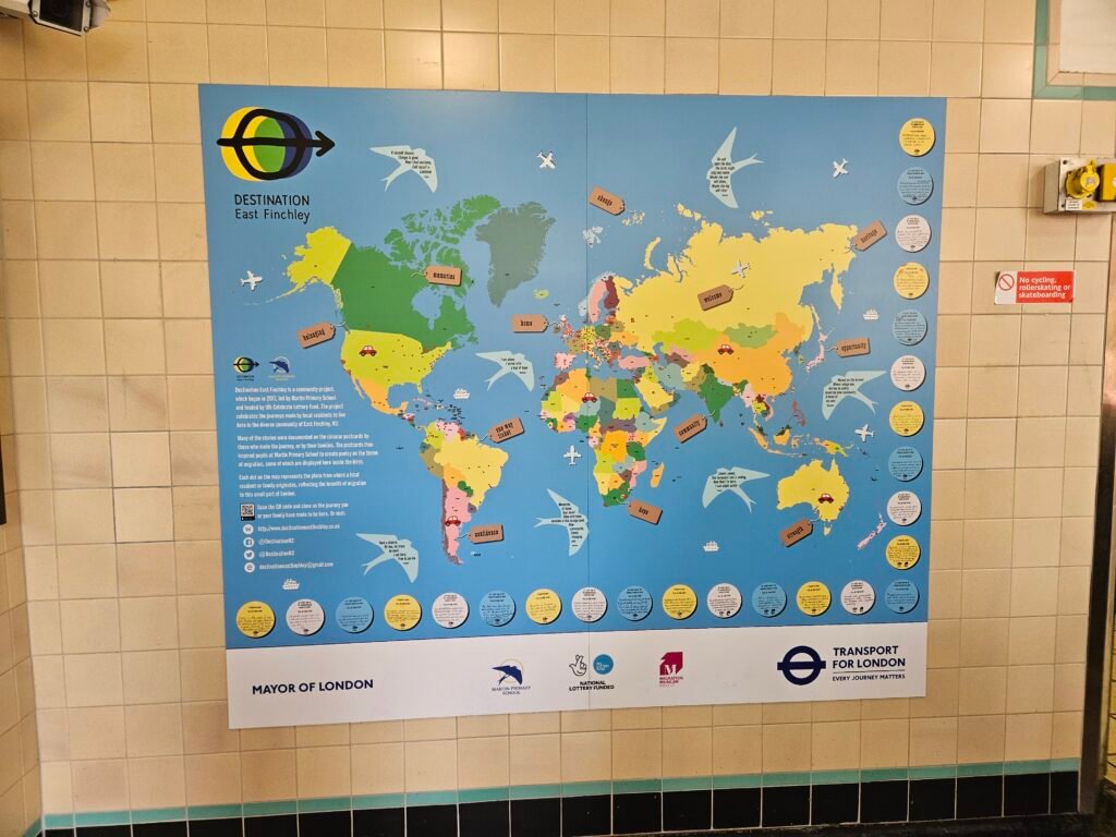
Anthony spotted this at East Finchley underground station.
The blurb says:
“Destination East Finchley is a community project, which began in 2017, led by Martin Primary School and funded by the Celebrate Lottery Fund. The project celebrates the journeys made by local residents to live here in the diverse community of East Finchley, N2.
Many of the stories were documented on the circular posterds by those who made the journey, or by their families. The postcards then inspired pupils at Martin Primary School to create poetry on the theme of migration, some of which are displayed here inside the birds.
Each dot on the map represents the place from where a local resident or family originates, reflecting the breath of migration to this small part of London. More InfoMapsintheWild Destination East Finchley
-
sur Where Mountains Rise From Oceans
Publié: 18 June 2024, 10:18am CEST par Keir Clarke
Last year PeakJut invented the Jut Score in order to rank mountains based on how sharply they rise above their surroundings. Now they have introduced a new OceanJut score - a unique method of measuring where land most dramatically rises from the ocean around the world.The OceanJut interactive map allows you to see how quickly and dramatically the land rises from the sea all around the globe. In
-
sur Marco Bernasocchi: Supercharge your fieldwork with QField’s project and app-wide plugins
Publié: 18 June 2024, 6:45am CEST
This blog post will introduce QField’s brand new plugin framework and walk through the creation of a plugin to support bird watchers in need of a quick way to digitize photos of spotted birds onto a point vector layer.
QField Plugin Snap! in action A plugin framework is born!As announced recently, QField now empowers users through a brand new plugin framework allowing for simple customization on the way the application behaves or looks all the way through to creating completely new functionalities.
The plugin framework relies on Qt’s QML engine and JavaScript, allowing for cross-platform support out of the box. This means that plugins will run perfectly fine on all platforms currently supported by QField: Android, iOS, Windows, Linux, and macOS.
App-wide plugin vs. project pluginFirst, let’s look at the two types of plugins supported by QField: app-wide plugins and project plugins. As their names imply, the main difference is their scope. An enabled app-wide plugin will remain active as long as QField is running, while project plugins are activated on project load and deactivated when the project tied to the plugin is closed.
Project plugins are shipped alongside a given project file (
.qgs/.qgz). Project plugins must share the same name of the project file with a.qmlextension. For example, if your project file isbirdwatcher.qgz, QField will look for the presence of abirdwatcher.qmlto activate the project plugin. For app-wide plugins, installation is done via the plugins manager popup; more on this below.Distribution of project plugins can be greatly facilitated through QFieldCloud. The presence of project plugins within a cloud project environment will be automatically detected and packaged alongside the project file and its datasets when deployed to QField devices.
Starting with a project pluginWe will start with looking into a simple project plugin that offers a new digitizing mechanism focused on snapping photos as a trigger for point feature addition. This plugin will demonstrate how new functionalities and behaviors can be added to QField to serve specific needs. In this case, the new digitizing mechanism could come in handy for bird watchers and other users in need of a quick way to snap photos!
It’s advised to download a version of QField running on your desktop environment while testing plugins. Links to Windows, Linux, and macOS builds are available here. Once installed, download this project archive containing a tiny birdwatcher sample project and extract it into a new directory on your local machine.
The project archive consists of a point vector layer (
observations.gpkg), a project file (birdwatcher.qgz) as well as a project plugin (birdwatcher.qml) which we will look into below. Please note that the point vector layer’s attribute form is already configured to display captured photos. We will not spend time on attribute form setup in this post; see this relevant documentation page if you are interested in knowing how that was achieved.
We can now test the project plugin by opening the project (
Digging into the project plugin filebirdwatcher.qgz) in QField. Users familiar with QField will notice a new ‘camera’ tool button present on the top-right corner of the map canvas. This button was added by the project plugin. You can press on it, to open the QField camera, take a photo (of yourself, a random object on your table, or with a bit of luck a bird), and witness how that leads to a point feature creation.Let’s open the project plugin file (birdwatcher.qml) in your favorite text editor. The first few lines define the QML imports needed by the plugin:
import QtQuick
import QtQuick.Controls

import org.qfield
import org.qgis
import Theme

import "qrc:/qml" as QFieldItems
Beyond the two QtQuick imports, we will make use of QField-specific types and items as well as QGIS ones (registered and declared in this source file), a Theme to retrieve icons and colors as well as QField items such as tool buttons (see this source directory), as well as the QField QML items embedded into the application itself to make use of the camera.
The next line declares an generic Item component which will be used by QField to initiate the plugin. This must be present in all plugins. As this plugin does, you can use the
Component.onCompletedsignal to trigger code execution. In this case, we are using iface to add a tool button on top of the map canvas:Component.onCompleted: { iface.addItemToPluginsToolbar(snapButton) }Just above these lines, the plugin declare a number of properties pointing to items found in the main QField ApplicationWindow:
property var mainWindow: iface.mainWindow()
property var positionSource: iface.findItemByObjectName('positionSource')
property var dashBoard: iface.findItemByObjectName('dashBoard')
property var overlayFeatureFormDrawer: iface.findItemByObjectName('overlayFeatureFormDrawer')
Users can reach through to any items within QField’s ApplicationWindow provided they have an objectName property defined. The string value is used in the
iface.findItemByObjectName()function to retrieve the item.The rest of the file consists of a loader to activate the QField camera, a tool button to snap a photo, and a function to create a new feature within which the current position is used as geometry and the snapped photo is attached to the feature form.
The function itself provides a good example of what can be achieved by using the parts of QGIS exposed through QML, as well as utility functions and user interface provided by QField:
function snap(path) {
  let today = new Date()
  let relativePath = 'DCIM/' + today.getFullYear()
                              + (today.getMonth() +1 ).toString().padStart(2,0)
                              + today.getDate().toString().padStart(2,0)
                              + today.getHours().toString().padStart(2,0)
                              + today.getMinutes().toString().padStart(2,0)
                              + today.getSeconds().toString().padStart(2,0)
                              + '.' + FileUtils.fileSuffix(path)
  platformUtilities.renameFile(path, qgisProject.homePath + '/' + relativePath)

  let pos = positionSource.projectedPosition
  let wkt = 'POINT(' + pos.x + ' ' + pos.y + ')'

  let geometry = GeometryUtils.createGeometryFromWkt(wkt)
  let feature = FeatureUtils.createFeature(dashBoard.activeLayer, geometry)

  let fieldNames = feature.fields.names
  if (fieldNames.indexOf('photo') > -1) {
    feature.setAttribute(fieldNames.indexOf('photo'), relativePath)
  } else if (fieldNames.indexOf('picture') > -1) {
    feature.setAttribute(fieldNames.indexOf('picture'), relativePath)
  }

  overlayFeatureFormDrawer.featureModel.feature = feature
  overlayFeatureFormDrawer.state = 'Add'
  overlayFeatureFormDrawer.open()
}
The QGIS API Documentation site is a good resource for learning what parts of the many QGIS classes are exposed to QML. For example, the QgsFeature documentation page contains a Properties section and a Q_INVOKABLE prefix next to functions indicating their availability within a QML/JavaScript environment.
Deployment of a project plugin via QFieldCloudAs mentioned above, QFieldCloud greatly eases the deployment of project plugins to devices in the field. We will now go through the steps required to create a cloud project environment based on the birdwatcher sample project, and witness it handling the project plugin automatically.
This will require you to registered for a freely available QFieldCloud community account if you haven’t done so yet (it takes a minute to do so, what are you waiting for
 ). We will also need the QFieldSync plugin in QGIS, which can be enabled through the QGIS plugin manager.
Let’s open QGIS, and log into QFieldCloud by clicking on the QFieldSync toolbar’s blue cloud icon. Once logged in, click on the ‘Create New Project’ tool button found at the bottom of the dialog.

In the subsequent panel dialog, choose the ‘Create a new empty QFieldCloud project’ and then hit the ‘Next’ button. Give it a name and a description, and for the local directory, pick the folder within which you had extracted the birdwatcher project, then hit the ‘Create’ button.

QFieldSync will then ask you to upload your newly created cloud project environment to the server. Notice how the project plugin file (birdwatcher.qml) is part of the files to be delivered to the cloud. Confirm by clicking on the ‘Upload to server’ button.

When QFieldSync is finished uploading, you are ready to take your mobile device, open QField, log into your QFieldCloud account and download the cloud project. Once the cloud project is loaded, you will be asked for permission to load the project plugin, which you can grant on a permanent or one-time basis.
Bravo! You have successfully deployed a project plugin through QFieldCloud.
Creating an app-wide plugin directoryLet’s move on to creating a functional app-wide plugin directory. Download this sample app-wide plugin and extract it into a new directory placed in the ‘plugins’ directory, itself found within the QField app directory. The location of the app directory is provided in the ‘About QField’ overlay, take note of it prior to extracting the plugin if you have not done so yet.

As seen in the screenshot above, which demonstrates the directory hierarchy, a given plugin directory must contain at least two files: a main.qml file, which QField will use to activate the plugin, and a metadata.txt file containing basic information on the plugin, such as the plugin name, author details, and version.
Here’s a sample metadata.txt from the birdwatcher project plugin upgraded into an app-wide plugin:
[general]
name=Snap!
description=Digitize points through snapping photos
author=OPENGIS.ch
icon=icon.svg
version=1.0
homepage=https://www.opengis.ch/
Opening main.qml in your favourite text editor will reveal that it has the exact same content as the above-shared project plugin. The only change is the renaming of birdwatcher.qml to main.qml to take into account this plugin’s app-wide scope.
PSA: we have setup this GitHub QField template plugin repository to ease creation of plugins. Fork at will!
Deploying app-wide pluginsWhile currently not as smooth as deploying a project plugin through QFieldCloud, app-wide plugins can be installed onto devices using a URL pointing to a zipped archive file containing the content of a given plugin directory. The zipped archive file can then be hosted on your own website, on a GitHub or GitLab repository, a Dropbox link, etc.
In QField, open the plugins manager popup found in the settings panel, and use the ‘Install plugin from URL’ button to paste a URL pointing to a zipped plugin file.

You should keep the zipped archive file name consistent for a better user experience, as it is used to determine the installation directory. This is an important consideration to take into account when offering plugin updates. If your zipped plugin file name changes, the plugin will not be updated but rather added to a new directory alongside the previously installed plugin.
QField does allow for a version tag to be added to a zipped archive file name, provided it is appended at the end of the file name, preceded by a dash, and includes only numbers and dots. For example, myplugin-0.0.1.zip and myplugin-0.2.1.zip will install the plugin in the myplugin directory.
Empowering users as well as developersHere at OPENGIS.ch, we believe this new plugin framework empowers not only users but also developers, including our very own ninjas! With plugin support, we now have the possibility to develop answers to specific field scenarios that would not necessarily be fit for QField-wide functionalities. We would love to hear your opinion and ideas.
If you would like to supercharge your fieldwork and need some help, do not hesitate to contact us – your projects are our passion

P.S. If you are developing a cool QField plugin, also let us know!
Bird SVG in video CC-BY [https:]] -
sur GeoServer Team: GeoServer 2.25.2 Release
Publié: 18 June 2024, 2:00am CEST
GeoServer 2.25.2 release is now available with downloads (bin, war, windows), along with docs and extensions.
This is a stable release of GeoServer recommended for production use. This release is made ahead of schedule to address an urgent bug or security vulnerability (see CVE-2024-36401 below). GeoServer 2.25.2 is made in conjunction with GeoTools 31.2, and GeoWebCache 1.25.2.
Thanks to Jody Garnett (GeoCat) for making this release on behalf of GeoCat customers.
Security ConsiderationsThis release addresses security vulnerabilities and is considered an essential upgrade for production systems.
- CVE-2024-36401 Critical
- CVE-2024-34696 Moderate
- CVE-2024-35230 Moderate
- CVE-2024-24749 Moderate
The details of this vulnerability will be made available at the end of the month providing an opportunity to update.
The use of the CVE system allows the GeoServer team to reach a wider audience than blog posts. See the project security policy for more information on how security vulnerabilities are managed.
Demo Requests page rewrittenThe Demo Request page has been rewritten to use JavaScript to issue POST examples. This provides a much better user experience:
- Show Result lists the response headers to be viewed along side the returned result (with an option for XML pretty printing).
- Show Result in a New Page is available to allow your browser to display the result.
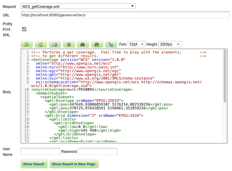
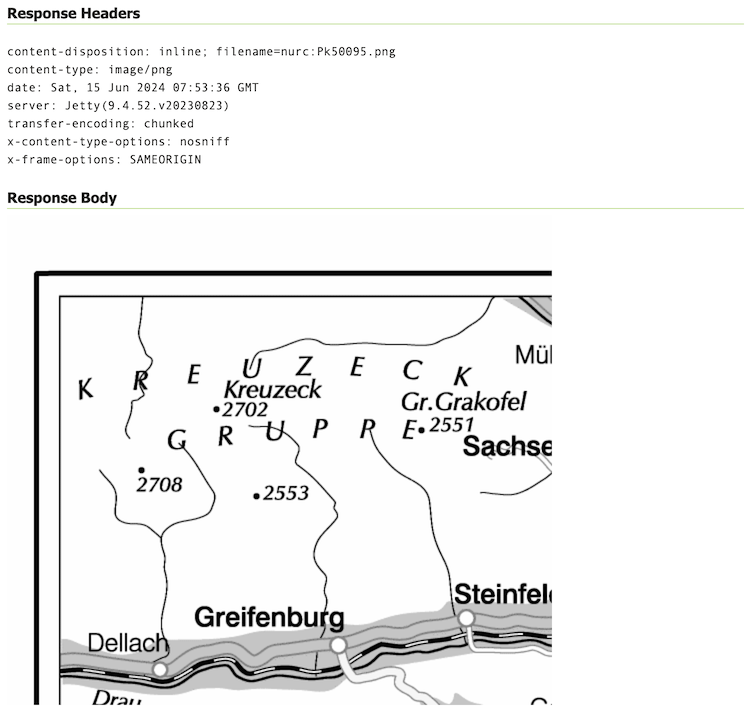
The WCS Request Builder and WPS Request Builder demos now have the option to show their results in Demo Requests page. Combined these changes replace the previous practice of using an iframe popup, and have allowed the TestWfsPost servlet to be removed.
For more information please see the Demo requests in the User Guide.
Thanks to David Blasby (GeoCat) for these improvements, made on behalf of the GeoCat Live project.
- GEOS-11390 Replace TestWfsPost with Javascript Demo Page
New Feature:
- GEOS-11390 Replace TestWfsPost with Javascript Demo Page
Improvement:
- GEOS-11351 Exact term search in the pages’ filters
Bug:
- GEOS-7183 Demo request/wcs/wps pages incompatible with [HTTPS]
- GEOS-11416 GeoPackage output contains invalid field types when exporting content from PostGIS
- GEOS-11430 CiteComplianceHack not correctly parsing the context
Task:
- GEOS-11411 Upgrade to ImageIO-EXT 1.4.11
- GEOS-11426 Rework community dependency packaging to use module’s dependencies
- GEOS-11429 Split COG community module packaging based on target cloud provider
- GEOS-11432 Upgrade to ImageIO-EXT 1.4.12
For the complete list see 2.25.2 release notes.
Community UpdatesCommunity module development:
- GEOS-11412 Remove reference to JDOM from JMS Cluster (as JDOM is no longer in use)
- GEOS-11413 STAC uses inefficient dabase queries when asking for collections in JSON format
Community modules are shared as source code to encourage collaboration. If a topic being explored is of interest to you, please contact the module developer to offer assistance.
About GeoServer 2.25 SeriesAdditional information on GeoServer 2.25 series:
-
sur GeoServer Team: GeoServer 2.24.4 Release
Publié: 18 June 2024, 2:00am CEST
GeoServer 2.24.4 release is now available with downloads (bin, war, windows), along with docs and extensions.
This is a maintenance release of GeoServer providing existing installations with minor updates and bug fixes. It also includes security vulnerability fixes.
GeoServer 2.24.4 is made in conjunction with GeoTools 30.4, and GeoWebCache 1.24.4.
Thanks to Peter Smythe (AfriGIS) for making this release.
Security ConsiderationsThis release addresses security vulnerabilities and is considered an essential upgrade for production systems.
- CVE-2024-36401 Critical
- CVE-2024-34696 Moderate
- CVE-2024-24749 Moderate
The details of this vulnerability will be made available at the end of the month providing an opportunity to update.
The use of the CVE system allows the GeoServer team to reach a wider audience than blog posts. See project security policy for more information on how security vulnerabilities are managed.
Demo Requests page rewrittenThe Demo Request page has been rewritten to use JavaScript to issue POST examples. This provides a much better user experience:
- Show Result lists the response headers to be viewed along side the returned result (with an option for XML pretty printing).
- Show Result in a New Page is available to allow your browser to display the result.
The WCS Request Builder and WPS Request Builder demos now have the option to show their results in Demo Requests page. Combined these changes replace the previous practice of using an iframe popup, and have allowed the TestWfsPost servlet to be removed.
For more information please see the Demo requests in the User Guide.
Thanks to David Blasby (GeoCat) for these improvements, made on behalf of the GeoCat Live project.
- GEOS-11390 Replace TestWfsPost with Javascript Demo Page
New Feature:
- GEOS-11390 Replace TestWfsPost with Javascript Demo Page
Improvement:
- GEOS-11311 Show a full stack trace in the JVM stack dump panel
-
GEOS-11369 Additional authentication options for cascaded WMS WMTS data stores - GEOS-11400 About Page Layout and display of build information
- GEOS-11401 Introduce environmental variables for Module Status page
Bug:
- GEOS-7183 Demo request/wcs/wps pages incompatible with [HTTPS]
- GEOS-11202 CAS extension doesn’t use global “proxy base URL” setting for service ticket
- GEOS-11331 OAuth2 can throw a “ java.lang.RuntimeException: Never should reach this point”
- GEOS-11332 Renaming style with uppercase/downcase empty the sld file
- GEOS-11382 The interceptor “CiteComplianceHack” never gets invoked by the Dispatcher Servlet
- GEOS-11385 Demo Requests functionality does not honour ENV variable PROXY_BASE_URL
- GEOS-11416 GeoPackage output contains invalid field types when exporting content from PostGIS
- GEOS-11430 CiteComplianceHack not correctly parsing the context
Task:
- GEOS-11318 Upgrade postgresql from 42.6.0 to 42.7.2
- GEOS-11374 Upgrade Spring version from 5.3.33 to 5.3.34
- GEOS-11375 GSIP 224 - Individual contributor clarification
- GEOS-11393 Upgrade commons-io from 2.12.0 to 2.16.1
- GEOS-11395 Upgrade guava from 32.0.0 to 33.2.0
- GEOS-11397 App-Schema Includes fix Integration Tests
- GEOS-11402 Upgrade PostgreSQL driver from 42.7.2 to 42.7.3
- GEOS-11403 Upgrade commons-text from 1.10.0 to 1.12.0
- GEOS-11404 Upgrade commons-codec from 1.15 to 1.17.0
For the complete list see 2.24.4 release notes.
Community UpdatesCommunity module development:
- GEOS-11040 Could not get a ServiceInfo for service Features thus could not check if the service is enabled
- GEOS-11381 Error in OIDC plugin in combination with RoleService
- GEOS-11412 Remove reference to JDOM from JMS Cluster (as JDOM is no longer in use)
Community modules are shared as source code to encourage collaboration. If a topic being explored is of interest to you, please contact the module developer to offer assistance.
About GeoServer 2.24 SeriesAdditional information on GeoServer 2.24 series:
- GeoServer 2.24 User Manual
- Control remote HTTP requests sent by GeoTools/GeoServer
- State of GeoServer 2.24.1 (foss4g-asia presentation)
- Multiple CRS authority support, planetary CRS
- Extensive GeoServer Printing improvements
- Upgraded security policy
Release notes: ( 2.24.4 | 2.24.3 | 2.24.2 | 2.24.1 | 2.24.0 | 2.24-RC )
-
sur Guess This City 2.0
Publié: 17 June 2024, 8:01pm CEST par Keir Clarke
My daily map challenge game Guess This City has now been updated to provide a number of clues which should help you identify each day's new location. At the same time the cities which you have to identify have become a bit more obscure.Thanks to Map Channels the game now uses a json feed for each day's map. I think Map Channels realized that the daily scores I was posting to X weren't exactly
-
sur Mappery: Orchids festival
Publié: 17 June 2024, 11:00am CEST

Barry Ruderman from raremaps.com shared this map from the Orchids Festival in Kew Gardens.
MapsintheWild Orchids festival
-
sur Today's Global Heating Forecast
Publié: 17 June 2024, 7:49am CEST par Keir Clarke
Global average temperatures in May broke all previous records. It was the 12th consecutive month in which global temperatures reached a record high. Every three months Climate Central publishes a seasonal analysis of how temperatures around the world have been changed by global heating. Their latest report People Exposed to Climate Change: March-May 2024 confirms that from 'March 2024 to
-
sur GeoTools Team: GeoTools 30.4 released
Publié: 16 June 2024, 6:06pm CEST
GeoTools 30.4 released The GeoTools team is pleased to announce the release of the latest maintenance version of GeoTools 30.4: geotools-30.4-bin.zip geotools-30.4-doc.zip geotools-30.4-userguide.zip geotools-30.4-project.zip This release is also available from the OSGeo Maven Repository and is made in conjunction with GeoServer 2.24.4 and GeoWebCache -
sur Mappery: Marking off the Countries Visited
Publié: 16 June 2024, 11:00am CEST
Marc-Tobias spotted this camper van in Hamburg. It looks as if the owners are marking off the countries that they have visited in it.
MapsintheWild Marking off the Countries Visited
-
sur Mappery: France on the Ceiling
Publié: 15 June 2024, 11:00am CEST
Andy Piper spotted this great collage on a ceiling. He said “Hey there, just in Big Fernand (French hamburger restaurant) in London today – they have France on the ceiling! “
Good spot Andy!
MapsintheWild France on the Ceiling
-
sur Some More Maps of Sounds
Publié: 15 June 2024, 8:21am CEST par Keir Clarke
Yesterday Hacker News featured a thread on Sounds of the Forest, an interactive map of sound recordings made in forests around the world. Also linked in the Hacker News thread was the wonderful Radio Aporee, which, like Sounds of the Forest, has featured on Maps Mania before. Also mentioned in the thread were two interactive sound maps which I haven't seen (or heard) before.Audiomapa
-
sur Oslandia: New release for QField : 3.3 “Darién”
Publié: 14 June 2024, 3:10pm CEST
Oslandia is the main partner of OPENGIS.ch around QField. We are proud today to forward the announcement of the new QField release 3.3 “Darién”. This release introduces a brand new plugin framework that empowers users to customize and add completely new functionalities to their favourite field application.
The plugin framework comes with other new features and improvements for this release, detailed below.
Main highlights
One of the biggest feature additions of this version is a brand new drawing tool that allows users to sketch out important details over captured photos or annotate drawing templates. This was a highly requested feature, which is brought to all supported platforms (Android, iOS, Windows, macOS, and, of course, Linux) with the financial support of the Swiss QGIS user group.
Also landing in this version is support for copying and pasting vector features into and from the clipboard. This comes in handy in multiple ways, from providing a quick and easy way to transfer attributes from one feature to another through matching field names to pasting the details of a captured feature in the field into a third-party messenger, word editing, or email application. Copying and pasting features can be done through the feature form’s menu as well as long pressed over the map canvas. Moreover, a new feature-to-feature attributes transfer shortcut has also been added to the feature form’s menu. Appreciation to Switzerland, Canton of Lucerne, Environment and Energy for providing the funds for this feature.

The feature form continues to gain more functionalities; in this version, the feature form’s value map editor widget has gained a new toggle button interface that can help fasten data entry. The interface replaces the traditional combo box with a series of toggle buttons, lowering the number of taps required to pick a value. The German Archaeological Institut – KulturGutRetter sponsored this feature.
Other improvements in the feature form include support for value relation item grouping and respect for the vector layer attributes’ « reuse last entered value » setting.

Finally, additional features include support for image decoration overlay, a new interface to hop through cameras (front, back, and external devices) for the ‘non-native’ camera, the possibility to disable the 3-finger map rotation gesture, and much more.
User experience improvementsLong-time users of QField will notice the new version restyling of the information panels such as GNSS positioning, navigation, elevation profile, and sensor data. The information is now presented as an overlay sitting on top of the map canvas, which increases the map canvas’ visibility while also achieving better focus and clarity on the provided details. With this new version, all details, including altitude and distance to destination, respect user-configured project distance unit type.
The dashboard’s legend has also received some attention. You can now toggle the visibility of any layer via a quick tap on a new eye icon sitting in the legend tree itself. Similarly, legend groups can be expanded and collapsed directly for the tree. This also permits you to show or hide layers while digitizing a feature, something which was not possible until now. The development of these improvements was supported by Gispo and sponsored by the National Land Survey of Finland.
Plugin frameworkQField 3.3 introduces a brand new plugin framework using Qt’s powerful QML and JavaScript engine. With a few lines of code, plugins can be written to tweak QField’s behaviour and add new capabilities. Two types of plugins are possible: app-wide plugins as well as project-scoped plugins. To ensure maximum ease of deployment, plugin distribution has been made possible through QFieldCloud! Amsa provided the financial contribution that brought this project to life.

Our partner OPENGIS.ch will soon offer a webinar to discover how QField plugins can help your field (and business) workflows by allowing you to be even more efficient in the field.
Users interested in authoring plugins or better understanding the framework, can already visit the dedicated documentation page and a sample plugin implementation sporting a weather forecast integration.
A question concerning QField ? Interested in QField deployment ? Do not hesitate to contact Oslandia to discuss your project !
-
sur Mappery: Babelroth anno 1776
Publié: 14 June 2024, 11:00am CEST
Ekki Plicht sent us this pic from Babelroth in Germany
“Here is a nice mural which can be seen in the village of Barbelroth in
Germany. It is mounted on the wall at the corner of Hauptstraße and
Mühlstraße, and it is already mapped in OSM, object. [https:]]Cheers.
Ekki”MapsintheWild Babelroth anno 1776
-
sur The New Medieval Map of London
Publié: 14 June 2024, 10:23am CEST par Keir Clarke
The Historic Towns Trust has created a modern map of Medieval London. The map depicts London as it existed at the end of the 13th Century using modern mapping techniques. The map is based on archaeological and historical records. You can explore an interactive version of the Medieval London map on Layers of London (check the 'Use this overlay' box and then zoom in on the City of
-
sur QGIS Blog: QGIS Grant Programme 2024 Update no. 2
Publié: 14 June 2024, 8:30am CEST
Thanks to generous supporters, we are in the wonderful position to be able to announce that another project is successfully funded:
Our thanks go out to:
- Gis3W
- QTIBIA Engineering and QCooperative
- QGIS User Group Germany (QGIS Anwendergruppe Deutschland e.V.)
- Hytech-imaging spectral imaging for environmental mapping and monitoring in civil and defence applications
for providing the additional funding to top up the QGIS Grant Programme contribution for QEP#248.
The next proposals on the wait list are:
- QEP#294 Fix access to remote data sources in WebAssembly builds
- QEP#265 Use pre-commit to automate installation and management of all pre-commit hooks
- QEP#295 Embedded end-user feedback
If you want to help make these improvement a reality, please get in touch.
-
sur OPENGIS.ch: Django Full-Stack Engineer with DevOps Affinity – 80 – 100% (Remote)
Publié: 14 June 2024, 6:47am CEST
Location: Remote, preferably with at least 4h overlap to CEST office hours
Employment Type: Full-time (80-100%)

About OPENGIS.ch:
OPENGIS.ch is a team of Full-Stack GeoNinjas offering personalized open-source geodata solutions to Swiss and international clients. We are dedicated to using and developing open-source tools, providing flexibility, scalability, and future-proof solutions, and playing a key role in the free and open-source geospatial community. We pride ourselves on our agile and distributed nature, which allows us to have a motivated and multicultural team that supports each other in working together.
Job Description:
We are seeking a passionate and skilled Django Full-Stack Engineer with a strong affinity for DevOps to join our team. The ideal candidate will work primarily on QFieldCloud, our cutting-edge cloud-based solution that brings QGIS projects to the field. You will help develop and maintain the full stack of the QFieldCloud platform, ensuring high performance and stability and implementing new features.
Responsibilities:
- Develop, test, and maintain the QFieldCloud platform using Django, Python, PostgreSQL and other modern web technologies.
- Collaborate with cross-functional teams to define, design, and ship new features.
- Ensure the performance, quality, and responsiveness of the application.
- Identify and correct bottlenecks and fix bugs.
- Help maintain code quality, organization, and automation.
- Work closely with the DevOps team to manage and optimize deployment pipelines, including Docker, Kubernetes, and other containerization and orchestration technologies.
- Provide technical guidance and support to clients regarding deployment and usage of the platform.
Qualifications:
- Strong experience with Django and Python in a full-stack capacity.
- Proficiency in front-end technologies, including JavaScript, HTML5, and CSS3.
- Experience with Linux, Docker (compose), K8s, Git, and PostgreSQL.
- Familiarity with geospatial concepts and web GIS applications is a plus.
- Good understanding of software deployment, containerization, and continuous integration practices.
- Excellent problem-solving skills and ability to work independently.
- Strong communication skills and ability to work in a distributed team environment.
- Fluency in English; knowledge of German, French, Italian, Spanish, or Romansh is a plus.
Perks:
At OPENGIS.ch, we enjoy a variety of perks that make our work experience rewarding. Here’s what we get:
- Flexible Work Hours: We have the freedom to set our own schedules, which helps us better manage our personal and professional lives.
- Remote Work Opportunities: We can work from anywhere, giving us the flexibility to choose our work environment.
- Learning and Development: We are encouraged to grow professionally with access to training programs and workshops.
- Innovative Environment: We thrive in an atmosphere that’s at the forefront of GIS technology, which keeps our work exciting.
- Collaborative Team: We value teamwork and the exchange of ideas, making our workplace dynamic and supportive.
Questions for Applicants:
- What’s your experience with software deployment and containers?
- What is your favourite Django app? Why? Have you ever upstreamed a patch in Django or an app? if so, please provide a link to the pull request.
- What is the error in the featured image of this post?
- What did you last learn out of interest?
How to Apply:
If you are excited about this opportunity and meet the qualifications, please submit an application at opengis.ch/jobs
Join us at OPENGIS.ch and become a part of our mission to provide innovative open-source geospatial solutions!


-
sur Cable Management
Publié: 13 June 2024, 8:11pm CEST par James
One of the best parts of my iPhone 15 Pro is that it has a USB-C port on it. While I appreciate the lightning port, I have just grown so tired of having to manage so many different ports while traveling. Coupled with my iPad having USB-C and my Apple Watch having a USB-C charging cable, I went ahead and got myself an Anker 3 port USB-C charger (which has a USB-A for those times you need one) allowing me to plug in all my devices at night and just use ordinary USB-C cables.
It is all nice and clean, no longer do I have all different cables for each device. My Kindle is USB-C, my GoPro is USB-C, my battery backup is USB-C and of course my MacBook Pro. I have reduced the cables I travel with because I don’t need one for each device. I do travel with a USB-A to USB-C cable for those times where the airplane doesn’t have USB-C or in an airport or rental car but that tucks away nicely in my travel bag.

But then I just realized my AirPods Pro case is lightning.

Now I could buy a USB-C case for said AirPods, but I want to wait until September and see if there is anything new. So trusty old lightning cable goes back in the bad for now.
Update: I was asked how I charged my AirPods Pro last night, well you can use the Apple Watch charger. Works pretty well but its not a great solution long term.
-
sur Mappery: 17th C Antwerp Street Scene
Publié: 13 June 2024, 11:00am CEST

Reinder sent us this massive 17C repro of a street map of Antwerp on a hoarding. The info on the side says “art historians, developed especially for the festival and pastor of Sint-Andries, a city walk along many landmarks in the city.”
MapsintheWild 17th C Antwerp Street Scene
-
sur Mapping the Census
Publié: 13 June 2024, 8:55am CEST par Keir Clarke
percentage of 0-14 year olds Jacob Weinbren has released an interactive map which allows you to explore data from the 2021 Canadian census by location. Using the map you can view the demographic and economic make-up of towns and cities across the whole of the country using over 2,500 different census variables. The Canadian Census map colors individual building footprints based on the
-
sur Camptocamp: 3D Technology Serving Rennes Métropole's Solar Cadastre
Publié: 13 June 2024, 2:00am CEST
Pièce jointe: [télécharger]
Camptocamp put its expertise to work for the city, by developing a totally customized application, based on an extremely clear user experience. -
sur Camptocamp: 3D Technology Serving Rennes Métropole's Solar Cadastre
Publié: 13 June 2024, 2:00am CEST
Camptocamp put its expertise to work for the city, by developing a totally customized application, based on an extremely clear user experience. -
sur GeoServer Team: GeoServer 2.23.6 Release
Publié: 13 June 2024, 2:00am CEST
GeoServer 2.23.6 release is now available with downloads (bin, war, windows), along with docs and extensions.
This series has previously reached end-of-life, with this release issued to address an urgent bug or security vulnerability (see CVE-2024-36401 below).
This GeoServer 2.23.6 update is provided as a temporary measure. Rather plan to upgrade to a stable GeoServer 2.25.2 or maintenance GeoServer 2.24.4.
GeoServer 2.23.6 is made in conjunction with GeoTools 29.6, and GeoWebCache 1.23.5.
Thanks to Jody Garnett (GeoCat) for making this release on behalf of GeoCat customers.
Security ConsiderationsThis release addresses security vulnerabilities and is considered an essential update for production systems.
- CVE-2024-36401 Critical
- CVE-2024-24749 Moderate
The details of this vulnerability will be made available at the end of the month providing an opportunity to update.
See project security policy for more information on how security vulnerabilities are managed.
Release notesImprovement:
- GEOS-11327 Add warning about using embedded data directories
- GEOS-11347 STAC Landing Page links should include root link
Bug:
- GEOS-11331 OAuth2 can throw a “java.lang.RuntimeException: Never should reach this point”
Task:
- GEOS-11316 Update Spring version to 5.3.32
- GEOS-11318 Upgrade postgresql from 42.6.0 to 42.7.2
For the complete list see 2.23.6 release notes.
Community UpdatesCommunity module development:
- GEOS-11348 JMS cluster does not allow to publish style via REST “2 step” approach
- GEOS-11358 Feature-Autopopulate Update operation does not apply the Update Element filter
- GEOS-11381 Error in OIDC plugin in combination with RoleService
- GEOS-11412 Remove reference to JDOM from JMS Cluster (as JDOM is no longer in use)
Community modules are shared as source code to encourage collaboration. If a topic being explored is of interest to you, please contact the module developer to offer assistance.
About GeoServer 2.23 SeriesAdditional information on GeoServer 2.23 series:
- GeoServer 2.23 User Manual
- Drop Java 8
- GUI CSS Cleanup
- Add the possibility to use fixed values in Capabilities for Dimension metadata
- State of GeoServer 2.23
- GeoServer Feature Frenzy 2023
- GeoServer used in fun and interesting ways
- GeoServer Orientation
Release notes: ( 2.23.6 | 2.23.5 | 2.23.4 | 2.23.3 | 2.23.2 | 2.23.1 | 2.23.0 | 2.23-RC1 )
-
sur Camptocamp: 3D Technology Serving Rennes Métropole's Solar Cadastre
Publié: 13 June 2024, 2:00am CEST
Pièce jointe: [télécharger]
Camptocamp put its expertise to work for the city, by developing a totally customized application, based on an extremely clear user experience. -
sur Mappery: Anne Hathaway’s Garden
Publié: 12 June 2024, 11:00am CEST
Berl spotted this map sculpture he found in the grounds of Ann Hathaway’s cottage just outside Stratford-on-Avon. It is described as:
A sculpture inspired by Shakespeare’s history plays, designed for Anne Hathaway’s Cottage Tree Garden. The sculptor is Jane Lawrence.
Not sure how this connects to the history plays with no towns depicted?
MapsintheWild Anne Hathaway’s Garden
-
sur The Treats of San Francisco
Publié: 12 June 2024, 9:13am CEST par Keir Clarke
The California Migration Museum is celebrating one of the wonderful benefits of living in a multi-cultural city with a new interactive map of San Francisco’s food scene. Melting Spots: An Immigrant Map of San Francisco Food showcases some of the many immigrant-inspired dishes in the city which have added richer flavors to the city's food scene.Did you know, for example, that the Mai Tai, the
-
sur Apple Maps Gets Topographical
Publié: 11 June 2024, 9:26pm CEST par James
GIS and Topo maps go hand in hand. From the classic Quad maps, to the National Geographic TOPO! product, to just basic Esri Topo map services, these topographic maps have been part of GIS since the beginning. Google Maps has had their “terrain” layer for a long time (though it seems to be fading out for some reason). Apple with the release of Watch OS 10 and the Ultra 2 added topographical maps to at least the watch ecosystem, but still required an iPhone to download the offline maps.
But yesterday Apple finally closed that hole and added topographical maps (including the trails feature) to iOS.

Now this is very user centric at this point. I expect to see these maps start appearing in apps that use MapKit but to what extent I’m not sure. I use onX Offroad quite a bit and suspect it will continue to use their own
-
sur Mappery: A Wild Map in Spitalfields
Publié: 11 June 2024, 11:00am CEST
Elizabeth spotted this cool looking bike in Spitalfields market in London
MapsintheWild A Wild Map in Spitalfields
-
sur OPENGIS.ch: QField 3.3 “Darién”: It is just the beginning
Publié: 11 June 2024, 6:50am CEST
QField 3.3 has been released, and with it, we are proud to introduce a brand new plugin framework that empowers users to customize and add completely new functionalities to their favourite field application. That’s on top of a bunch of new features and improvements added during this development cycle. What preceded this moment was just the beginning!
Main highlights
One of the biggest feature additions of this version is a brand new drawing tool that allows users to sketch out important details over captured photos or annotate drawing templates. This was a highly requested feature, which we are delighted to bring to all supported platforms (Android, iOS, Windows, macOS, and, of course, Linux) with the financial support of the Swiss QGIS user group.
Also landing in this version is support for copying and pasting vector features into and from the clipboard. This comes in handy in multiple ways, from providing a quick and easy way to transfer attributes from one feature to another through matching field names to pasting the details of a captured feature in the field into a third-party messenger, word editing, or email application. Copying and pasting features can be done through the feature form’s menu as well as long pressed over the map canvas. If copy pasting ain’t your style, a new feature-to-feature attributes transfer shortcut has also been added to the feature form’s menu. Appreciation to Switzerland, Canton of Lucerne, Environment and Energy for providing the funds for this feature.

The feature form continues to gain more functionalities; in this version, the feature form’s value map editor widget has gained a new toggle button interface that can help fasten data entry. The interface replaces the traditional combo box with a series of toggle buttons, lowering the number of taps required to pick a value. If you enjoy this as much as we do, send a virtual thanks to German Archaeological Institut – KulturGutRetter, which sponsored this feature.
Other improvements in the feature form include support for value relation item grouping and respect for the vector layer attributes’ “reuse last entered value” setting.

Finally, additional features that are sure to please include support for image decoration overlay, a new interface to hop through cameras (front, back, and external devices) for the ‘non-native’ camera, the possibility to disable the 3-finger map rotation gesture, and much more.
User experience improvementsLong-time users of QField will notice the new version restyling of the information panels such as GNSS positioning, navigation, elevation profile, and sensor data. The information is now presented as an overlay sitting on top of the map canvas, which increases the map canvas’ visibility while also achieving better focus and clarity on the provided details. While revisiting these information panels, we’ve made sure all details, including altitude and distance to destination, respect user-configured project distance unit type.
The dashboard’s legend has also received some attention. You can now toggle the visibility of any layer via a quick tap on a new eye icon sitting in the legend tree itself. Similarly, legend groups can be expanded and collapsed directly for the tree. This also permits you to show or hide layers while digitizing a feature, something which was not possible until now. The development of these improvements was supported by Gispo and sponsored by the National Land Survey of Finland.
Plugin frameworkLast but far away from least, QField 3.3 introduces a brand new plugin framework using Qt’s powerful QML and JavaScript engine. With a few lines of code, plugins can be written to tweak QField’s behaviour and add breathtaking capabilities. Two types of plugins are possible: app-wide plugins as well as project-scoped plugins. To ensure maximum ease of deployment, we have enabled project plugin distribution through QFieldCloud! We extend our heartfelt thanks to Amsa for the financial contribution that brought this incredible project to life.

Stay tuned for an upcoming webinar and a dedicated post that will dive into how QField plugins can revolutionize your field (and business) workflows by allowing you to be even more efficient in the field.
Users interested in authoring plugins or better understanding the framework can already visit the dedicated documentation page, a sample plugin implementation sporting a weather forecast integration and our latest blog article.
-
sur Out of Africa - The Story of Human Migration
Publié: 11 June 2024, 1:30am CEST par Keir Clarke
History Maps has created an interactive map showing the locations of the earliest human fossils found around the world. Early Homo Sapiens Fossil Sites uses data from Wikipedia's List of human evolution fossils to show the locations of the earliest 'notable finds of hominin fossils and remains relating to human evolution'.The fossil sites shown on the map can be filtered using the
-
sur Mappery: Eshkol
Publié: 10 June 2024, 1:00pm CEST
Spotted this map in a cafe in Tel Aviv.
Eshkol is the region adjacent to the Gaza Strip where the attack of 7/10 took place.
It’s a map in the wild not an endorsement of either side in this conflict
MapsintheWild Eshkol
-
sur The Lost Pathfinder Game
Publié: 10 June 2024, 7:50am CEST par Keir Clarke
The Lost Pathfinder is a new online game which requires players to connect a path from one side of map to the other.At the beginning of each round of The Lost Pathfinder you are presented with an isometric grid on which all the road tiles have been mixed up. All you have to do is to rearrange the road tiles in order to complete a path from one side of the map to the other. To help you restore
-
sur Mappery: Breweries of the World
Publié: 9 June 2024, 11:00am CEST
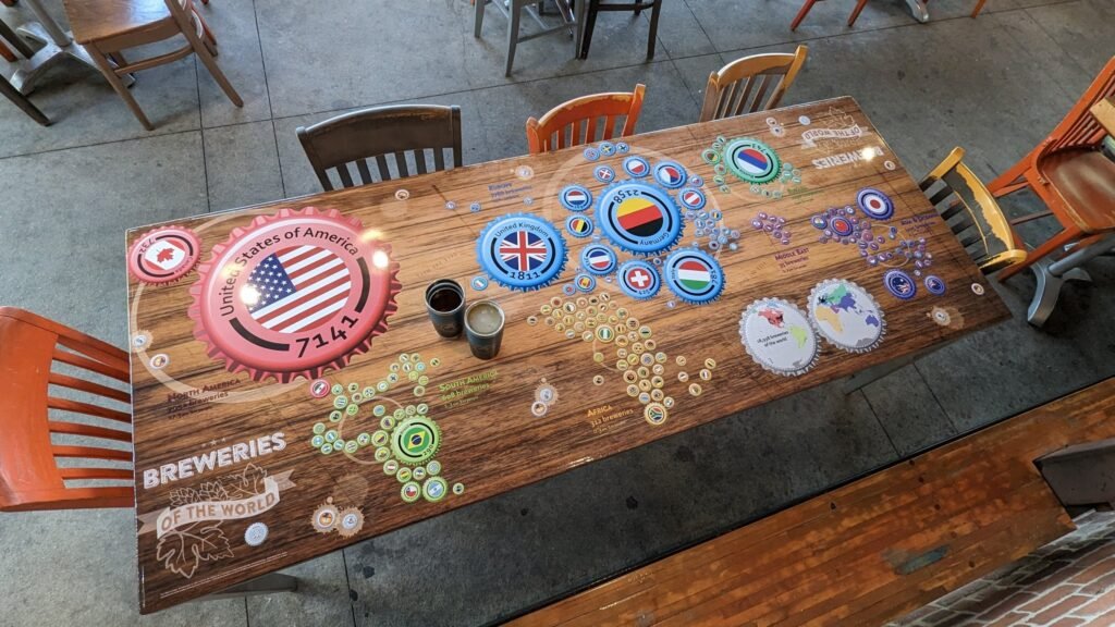

And to end the week nicely, refreshingly, I would say, here is our co-founder, who is back with some art in a bar. This is a version of Kenneth Field’s Breweries of the World.
MapsintheWild Breweries of the World
-
sur Mappery: « C215 autour de l’Inguimbertine »
Publié: 8 June 2024, 11:00am CEST

From the 8th of June to the 31st of October 2024, a temporary exhibition at the Inguimbertine, Carpentras (FR) Chrisitan Guémy, alias C215, exhibits these works, including the maps.
Chrisitan Guémy’s website (link to the English version).
About the exhibit, follow this other link (FR)
MapsintheWild « C215 autour de l’Inguimbertine »
-
sur The Vespa Map of Rome
Publié: 8 June 2024, 9:59am CEST par Keir Clarke
This is yet another map I discovered via the ever fascinating Web Curios, which is a weekly roundup of interesting things found online (very often with an AI bent). This week Web Curios reviewed Dolce Activation, 'a very content-lite website' but one in which you get to drive 'A TINY VESPA AROUND ROME!!!'In truth Dolce Activation is little more than a marketing campaign for Dolce and Gabbana
-
sur Standards Enabling Collaboration For Global Challenges
Publié: 7 June 2024, 3:00pm CEST par Simon Chester
The Open Geospatial Consortium (OGC) is a membership organization dedicated to solving problems faced by people and planet through our shared belief in the power of geography. OGC is one of the world’s largest data and technology consortia and—at 30 years old—one of its longest standing. OGC works with new and established partners and stakeholders to develop and apply accelerated, practical, and implementable solutions to today’s biggest issues, from climate resilience, emergency management, and risk management & insurance, to supply chain logistics, transportation, and health care and beyond.
OGC holds regular member meetings across the globe where geospatial professionals convene to develop standards and advance innovation initiatives led by OGC Members. Most sessions are open to the public and offer valuable opportunities to network with leaders from industry, academia, and government, define future technology trends, and contribute to the open geospatial community.
OGC’s 129th Member Meeting will be held in Montreal, Canada, from June 17–22, 2024. The event kicks off OGC’s 30th anniversary celebrations and carries the theme ‘Standards Enabling Collaboration for Global Challenges.’ Support for the meeting comes from OGC Strategic Member Natural Resources Canada, with additional support from Esri Canada, CAE, Safe Software, and dinner sponsor Bentley Systems.
Eric Loubier, Director General of the Canada Centre for Mapping and Earth Observation at Natural Resources Canada (NRCan) will open the week with a keynote, followed by a 30-year Canadian retrospective by OGC Board Chair Prashant J. Shukle.
“The 129th Member Meeting provides a great opportunity to hear from our incredible Canadian partners and community,” said OGC CEO Peter Rabley. “Some of OGC’s earliest—if not our first—and longest-running supporters have been Canadians and Canadian firms. Our keynote from Eric Loubier and the exciting 30-year Canadian retrospective by Prashant Shukle will serve well to kick off the week’s exciting sessions and discussions.”
“Throughout the 30 years of OGC’s history, Canadians have played a foundational role,” said OGC Board Chair Prashant J. Shukle. “My friend and mentor Dr. Bob Moses, who founded PCI Geomatics, was one of OGC’s first funders and a long-time supporter of OGC. As an emergency room doctor, Bob saw the power of new technologies and data. Critically, he understood that technologies had to work together seamlessly and effectively to really address complex problems.
“Like Bob, many other Canadians instantly saw the powerful role and impact that OGC could have, and I am constantly amazed at their leadership and vision. It is my privilege to honor those Canadians who have gone almost unnoticed here in Canada, but who have fundamentally changed how the world uses technology across so many industries.”
Other highlights of the week will include a Methane Summit, a meeting of the OGC Canada Forum, the popular Future Directions session (this meeting’s topic is AI), as well an abundance of working group sessions on diverse topics such as marine, climate & disaster resilience, and beyond.
The Methane Summit is organized by Steve Liang, Professor and Rogers IoT Research Chair at the University of Calgary and Founder and CTO of OGC Member SensorUp. Steve is spearheading this summit to tackle the critical global challenge of monitoring and tracking methane emissions. The event will feature speakers from McGill University and Environment and Climate Change Canada (ECCC), who will discuss the challenges and opportunities of data management in methane emissions management. Attendees will also be introduced to the Methane Emissions Modeling Language (MethaneML)—a new tool designed to enhance the accuracy and efficiency of methane emissions tracking & reduction. This summit promises to be a significant step forward in our collective efforts to address climate change through innovative data solutions.
The meeting of the OGC Canada Forum is scheduled for June 17 & 18. The Canada Forum is open to all Canadian organizations, regardless of OGC membership status. The sessions have the aim of facilitating collaboration to address Canada’s geospatial needs through capacity building, innovation, standards, and economic growth. Cameron Wilson, Project Manager at Natural Resources Canada (NRCan), will delve into the history, progress, and future priorities of the forum, highlighting key issues crucial for the Canadian community.
Another highlight of the Forum will be a debate addressing the topic: In an era of ever-increasing data availability, there is a pressing need for digital interoperability to solve today’s biggest problems through rapid innovation. Standards only slow this down and are therefore no longer necessary. Debaters include Ed Parsons, Geospatial Technologist at Google, the aforementioned Steve Liang, Will Cadell, CEO of Sparkgeo, and Bilyana Anicic, President of Aurora Consulting. This session promises to offer diverse perspectives on the role that standards can, should, or won’t play in today’s rapidly evolving geospatial landscape.
This meeting’s Future Directions session, held Tuesday morning, is all about AI, with presentations and a panel from Bentley Systems, GeoRoundtable/IEEE GRSS, makepath, and TerraFrame.
Participation in the 129th OGC Member Meeting is welcomed both in-person and remotely. This event is an exciting opportunity to engage in sessions that celebrate three decades of geospatial collaboration and innovation. Attendees will have the chance to learn from, and network with, leading experts from around the world.
Register now for the 129th OGC Member Meeting to be part of OGC’s continued efforts to advance location data and technology and collaboratively address critical global challenges.
The post Standards Enabling Collaboration For Global Challenges appeared first on Open Geospatial Consortium.
-
sur ARC/INFO Manuals
Publié: 7 June 2024, 11:21am CEST par James
If there is one regret in my life, it is that I didn’t steal the ARC/INFO manual binders from one of the jobs I used to use ARC/INFO. I’ve had an eBay search going for years in hope that someone will give them up. I suspect every binder set that still exists will never be given up. It’s like owning a Picasso, you’d never sell it and ask your relatives to bury you with it.
-
sur Mappery: Globe clock
Publié: 7 June 2024, 11:00am CEST
-
sur Every Ship Sunk in WWII
Publié: 7 June 2024, 7:51am CEST par Keir Clarke
Over the course of the Second World War more than 20,000 ships were sunk around the world. Esri's Paul Heersink has spent the last ten years scouring historical records to create and map the 'most comprehensive dataset' of ships sunk in WWII.Resurfacing the Past is a fascinating story map which not only visualizes where Allied and Axis ships were lost in WWII, it also explores the WWII sunken
-
sur QGIS Blog: Danish User Group becomes Flagship Member
Publié: 7 June 2024, 7:34am CEST
QGIS User Groups all over the world have become an essential component of the QGIS community. They provide a point of contact for local users and developers and help people connect through localized communication channels or by organizing events.
Another important aspect of users groups is that many of them also have become sustaining members of QGIS.ORG. In total, their contributions account for a significant share of our project budget.
The Danish User Group now has opened a new chapter by becoming the first user group supporting QGIS on the Flagship level. And that’s a reason to celebrate
 and to reminisce. For example, about the awesome time we had at the first QGIS User Conference organized at the University of Copenhagen campus in Nødebo.
And who can forget how we all struggled to pronounce QGIS 2.16 “Nødebo”?
And how the “ø” upset some services? Good times.
Thank you very much to everyone from the Danish user group and to all the other user groups, small and large, who support QGIS our project and help make it even better for everyone.

-
sur Impact of Microsoft SQL Server 2008 on Geospatial Innovation
Publié: 6 June 2024, 6:17pm CEST par James
We were talking (or typing) on Slack last week and I was asked what I thought was the single greatest software innovation while I’ve been working. A ton of things came to mind from from Apple’s HyperCard (more than anything this made me a programmer) and I even wrote a post about it back in 2006. I don’t think anything on that list is technically incorrect, but I wouldn’t put ArcView 3.x in that list anymore.
BUT, let’s get real here. Each of those software products are amazing in their own right, but I don’t think any of them really moved the needle on spatial like the one I really think impacted the trajectory of what we used to call GIS.
Now I know what you’re going to say, why isn’t it PostGIS??? Now PostGIS has been clearly the leader since SQL Server 2008 arrived, but I believe it was SQL Server which changed expectations on paying for a geospatial database (Oracle, SDE or others). I mean I used to have Esri SDE on Oracle, I can’t even remember how expensive that was and how buggy it all was. Microsoft even put spatial into their free version.
I can’t recall the last time I used stand alone SQL Server, mostly my days are PostGIS or some cloud based spatial geodatabase engine. But, the line before SQL Server 2008 and after is clear as day. All of a sudden enterprise grade geodatabase when from niche to normal and spatial ceased to be special. Using Oracle Spatial or Esri ArcSDE always ended with me tossing the server in the trash.

-
sur Mapgears: Mapgears wins the regional MercadOr award in the category ‘Sustained Growth in Exportation’
Publié: 6 June 2024, 5:24pm CEST
On June 5th, SERDEX International awarded prizes to four companies that stood out in the region. Mapgears was one of the winning companies in the “Sustained Growth in Exportation” category. As mentioned by Daniel Morissette, President of Mapgears:
This award is a recognition for the entire Mapgears team: we sell software, and our raw materials to make it are the brains, skills, and creativity of the team members… without all the team members, none of this would have been possible.
Photo Credit: Journal Le Quotidien
To learn more about this wonderful evening and the incredible companies that were honored, we invite you to read the article in Le Quotidien newspaper right here! (French only)
The post Mapgears wins the regional MercadOr award in the category ‘Sustained Growth in Exportation’ appeared first on Mapgears.
-
sur Tim Waters: Vaisigano
Publié: 6 June 2024, 5:14pm CEST
Vaisigano is a prototype citizen science project focused on fresh water resources by National University of Samoa and The Übersee Museum. On Instagram @s_vaisigano and on Facebook Citizen Science Vaisigano. Vaisigano is the name of the river in Samoa by the University.
Last year I was involved to help develop the prototype mobile-first web app for geolocated data collection ahead of a visit to the field with biologists and students.
Aimed at non specialist university students to use in the field to help survey and record measurements and observations for river quality health along a river in Samoa. The purpose of this first app is to show possibilities and demonstration for future solutions. River and water quality measurements can involve surveys for invertebrates (aquatic insects), pH of the water, turbidity, velocity, temperature etc. Traditionally such surveys were taken, recorded on paper and input later back in the laboratory. A mobile device out in the field can also have documents, multimedia and tutorials to guide users. The project involved research into Citizen Science projects. Many good platforms exist, for example ODK or Kobo which can have very complex and detailed logic for forms but it was decided that a more user friendly and casual approach would be better.
The front page gives a brief outline, a call to action button “Start Collecting”, two summary tables of the latest observations and the latest active users.

The main aims:
- Sustainable – able to run on its own
- Collect data in a continuous manner
- Accessible and easy to use
- Handheld
- Benefit learning for curriculum
- Incorporate reinforcement rewards, feedback
- Surveys should be georeferenced
- Review of previous surveys
Some of the challenges included GPS variability in forest, using mobile devices and water, and bandwidth requirements in the field.
The app showed tips before starting.

The application was designed around 3 types of data forms. physical, biological and chemical
Each form had a time and location which used browser / GPS geolocation. Users could move the location if they wanted.

Physical
- River width
- River depth
- Has it been raining or not?
- What evidence of water user can you see (fishing, boats, use for homes, irrigation, etc)
- What man made structures can you see (e.g. weirds, dams, wells, bypass channels etc
- On the surface. Can you see foam, litter, oil on the surface?
- What land use is around the site (pasture, town, forest etc)
- Flow regime. (pools, ripples, waterfalls, rapids, cascade etc)
- What is the colour of the water (clear, murky etc)
- Estimate the water flow (still, slower, or faster than walking speed etc)
- Turblence of water (calm, turbulent)
- Images looking down stream showing both banks
Chemical
These needed a kit to help complete- Water temperature
- Water acidity
- Conductivity
- Nitrates
- Phosphates
Biological
- Description of the river bank and vegetation and what % of the river is shade
- What evidence of aquatic life: plants below surface, emerging, floating. Fish, insects etc
- Substrates – boulders, stones, gravel, sand, organic matter etc
- Macroinvertables
- From kick sampling
- These allowed users to add a name with a count and attach images.
- Some species would be pre-populatated in the boxes.

The site has an admin page which allows editing and reviewing of contributions and allows them to download all the data as a spreadsheet and to download the images zipped up.
The site has a simple scoring for users based on number of contributions, and shows feedback of their contributions so that people can see the reports coming in and the nature of them


code on github
-
sur GRASS GIS: Results of the GRASS GIS student grant
Publié: 6 June 2024, 1:12pm CEST
Easy command history navigation through the History browser panel Linda’s work in her own words During my master’s studies, I began contributing to the enhancement of the GRASS GIS user interface (GUI). My main goal was to increase its user-friendliness, making GRASS accessible not only to experienced users with scripting knowledge but also to GIS beginners. Over the years, I have worked on several projects, including: “Creation of a new GRASS GIS startup mechanism”, “First steps towards a new GRASS GIS Single-Window GUI “, “Redesigning a map display status bar combo box into a new settings dialog “, “Improving Single-Window GUI user experience”. -
sur Mappery: D-Day Landings
Publié: 6 June 2024, 11:00am CEST

Elizabeth spotted this advert for a special commemorative coin for the D-Day landings which took place on June 6th, 1944. The coin has a map illustrating the five landing sites – Utah, Omaha, Gold, Juno and Sword
MapsintheWild D-Day Landings


-
sur The Sound of the City
Publié: 6 June 2024, 8:44am CEST par Keir Clarke
Every city in the world has a unique sound. On Sonicity that unique sound is generated by each city's map. Select a city on Sonicity (currently limited to 10 global cities) and you can listen to its map being played by various instruments. To be honest I have no idea what is going on here. The only info that Sonicity provides is that 'Each city has its own unique geographical data. These
-
sur OPENGIS.ch: QField receives prestigious recognition as a digital public good from the Digital Public Goods Alliance
Publié: 6 June 2024, 8:28am CEST
We are thrilled to announce that the Best of Swiss Apps Enterprise winner 2022, QField, has been officially recognized as a Digital Public Good by the UN-endorsed Digital Public Goods Alliance. This prestigious recognition highlights QField’s significant contributions to six key Sustainable Development Goals (SDGs): SDG 6 (Clean Water and Sanitation), SDG 9 (Industry, Innovation, and Infrastructure), SDG 11 (Sustainable Cities and Communities), SDG 13 (Climate Action), SDG 15 (Life on Land), and SDG 16 (Peace, Justice, and Strong Institutions). The “Swiss Made Software” QField is the leading fieldwork application with almost 1 Million downloads worldwide.
Leading the Way in Fieldwork TechnologyQField stands out as the leading fieldwork app, designed to bring the power of geospatial data collection and management to the fingertips of users worldwide. Developed with a user-centric approach, QField allows seamless integration with QGIS, providing a robust and intuitive platform for data collection, visualization, and analysis directly in the field. This recognition as a Digital Public Good underscores QField’s vital role in advancing digital solutions for sustainable development.
 QField 3.2 Statistics
Accessible for Everyone
QField 3.2 Statistics
Accessible for Everyone
One of QField’s key strengths is its ease of use, making it accessible not only to professionals but also to students, researchers, and community members. Its intuitive interface ensures that users with varying levels of technical expertise can efficiently collect and manage geospatial data. This inclusivity promotes wider adoption and engagement, enhancing the app’s impact across different sectors and communities.
 Land surveying project Tonga
Exemplary Open Source Project
Land surveying project Tonga
Exemplary Open Source Project
At the heart of QField’s success is its commitment to technological excellence and open-source principles. As an exemplary open-source project, QField fosters a collaborative environment where developers and users alike contribute to continuous improvement and innovation. QField frequently contributes back to its upstream project, QGIS, ensuring mutual growth and enhancement of both platforms. This community-driven approach not only enhances the app’s functionality but also ensures that it remains accessible and adaptable to diverse needs across the globe.
Supporting Sustainable Development GoalsQField’s capabilities extend beyond just one aspect of the United Nations Sustainable Development Goals (SDGs); they intersect with multiple goals, enhancing efforts towards a sustainable future:
- SDG 6: Clean Water and Sanitation: QField facilitates efficient water quality monitoring and management, ensuring communities have access to clean and safe water.
- SDG 9: Industry, Innovation, and Infrastructure: By providing cutting-edge tools for infrastructure planning and development, QField drives innovation in various industries.
- SDG 11: Sustainable Cities and Communities: QField supports urban planning and sustainable development, contributing to the creation of resilient and inclusive cities.
- SDG 13: Climate Action: The app enables precise data collection for climate research and environmental monitoring, aiding in climate action initiatives.
- SDG 15: Life on Land: QField aids in biodiversity assessments and conservation efforts, promoting the sustainable use of terrestrial ecosystems.
- SDG 16: Peace, Justice, and Strong Institutions: Through its reliable and transparent data management capabilities, QField supports the development of strong institutions and governance systems.
 Post-disaster assessment Tonga
A Future of Innovation and Sustainability
Post-disaster assessment Tonga
A Future of Innovation and Sustainability
As we celebrate this recognition, we remain committed to pushing the boundaries of what is possible in fieldwork technology. QField will continue to evolve, driven by the needs of its global user base and the imperative to support sustainable development. We invite all stakeholders to join us on this journey towards a more sustainable and equitable future.
 Land surveying project Tonga
For more information about QField and its contributions to the SDGs, please visit [https:]]
Media Contact:Marco Bernasocchi is happy to receive interview requests or queries about the project.
Email: marco@opengis.ch
Phone: +41 79 467 24 70 (14:00 – 18:00 CET)OPENGIS.ch GmbH
About the OPENGIS.ch product “QField” application
Via Geinas 2
CH-7031 LaaxQField is an open-source fieldwork app that integrates seamlessly with #QGIS, providing a powerful platform for data collection, visualization, and analysis. Designed for professionals across various sectors, QField empowers users to efficiently manage and analyze geospatial data in the field, contributing to sustainable development and innovation worldwide. Link: https://qfield.org
 About the OPENGIS.ch service QFieldCloud
#QFieldCloud is a spatial cloud service integrated in #QField that allows remote provisioning and synchronisation of geodata and projects. Although “QFieldCloud” is still in an advanced beta stage, it is already being used by many groups to significantly improve their workflows. Link: https://qfield.cloud
About OPENGIS.ch:OPENGIS.ch GmbH is a Swiss software development company based in Laax. OPENGIS.ch employs 19 people and works mainly in the field of spatial software development, geodata infrastructure deployments and professional support. Personalised open-source GIS solutions are often planned and developed as desktop or mobile applications. OPENGIS.ch finances itself through tailor-made customer solutions, professional support and adaptations. Link: https://opengis.ch
 OPENGIS.ch
About Digital Public Goods Alliance (DPGA)
OPENGIS.ch
About Digital Public Goods Alliance (DPGA)
The Digital Public Goods Alliance is a multi-stakeholder initiative endorsed by the United Nations Secretary-General, working to accelerate the attainment of the Sustainable Development Goals in low- and middle-income countries by facilitating the discovery, development, use of, and investment in digital public goods.
For more information on the Digital Public Goods Alliance please reach out to hello@digitalpublicgoods.net.
Images for editorial purposes are freely available for download if the copyright ©OPENGIS.ch is mentioned: [https:]]
-
sur 19 Years and 2,362 Posts
Publié: 5 June 2024, 10:17pm CEST par James
I mean we’ve been saying it since Elon had bought Twitter, but the deed is done.
The social network formerly known as Twitter has officially adopted X.com for all its core systems. That means typing twitter.com in your browser will now redirect to Elon Musk’s favored domain
I was talking to a good friend over email last month and he had this to say:
The fun days of early twitter and before that blogging certainly made our industry more fun — thanks so much for your key role in that. Sadly those days seem to be gone and I don’t know where to find the modern equivalents.
He is so right, I’m not sure how important my role was in the whole Twitter Geospatial world was, but that grouping we had back then was some of the best sharing of ideas and opinions I’ve ever been part of. I find myself rarely sharing anything spatial on Twitter anymore, mostly it is where I go to complain about the San Francisco Giants, Los Angeles Lakers or Arizona State Sun Devils. And most of that is just shouting into the abyss. This leaves no space for any outlet of my thought and feelings on spatial and the such.
Hence I’m back to blogging, I feel like this has always been the best format for longer form thoughts and given I control the content vs some insane emerald mine heir this is better for my sanity. I am laughing at some of your still using RSS readers (heck I’m one) and having this post show up in your feed after many years. Thanks for never unsubscribing and stay tuned!
-
sur Mappery: Change the World sip by sip
Publié: 5 June 2024, 11:00am CEST
-
sur The Warlord Map Game
Publié: 5 June 2024, 8:43am CEST par Keir Clarke
Are you ready to conquer Europe in a battle of Computer Classic Warlord? In this game of military conquest only the strongest survive. So get ready to engage in a thrilling battle of supremacy to take over the entire map of Europe.Readers of a certain age may remember the board-game The Warlord. The Warlord is a 1970's game of nuclear conquest, in which players attempt to conquer countries
-
sur GeoServer Team: How to Implement Basic Security in Geoserver
Publié: 5 June 2024, 2:00am CEST
GeoSpatial Techno is a startup focused on geospatial information that is providing e-learning courses to enhance the knowledge of geospatial information users, students, and other startups. The main approach of this startup is providing quality, valid specialized training in the field of geospatial information.
( YouTube | LinkedIn | Facebook | X )
How to Implement Basic Security in GeoserverIn this session, we want to discuss the Security section in GeoServer, Defining Users, Groups, and Roles, and Granting rights to created users. If you want to access the complete tutorial, simply click on the link.
Introduction
GeoServer has a robust security subsystem. Most of the security features are available through the Web Administration interface. In the Security panel, you can find links to set user properties and bind data to security rules. The basic idea is that you create users and roles, and then combine them with data rules to enable a specific set of access policies. You can also limit read and write access by role.
Defining users, groups, and rolesSecurity in GeoServer is based on a role system where each role defines a specific set of functions. You can assign roles to users and groups; that is, assign functions to real people using your system. To ensure data security, you must identify who is accessing your layers and services.
To organize your real users, GeoServer provides you with the user, group, and role concepts. With the first two, you can insert real people into the GeoServer security subsystem, and with roles, you can grant rights to real users.
User definitionIn GeoServer, a user is someone entitled to use the system; it may be another software or a real person. When you add a user to the security system, GeoServer stores a username, uniquely identifying the user, a password, and a set of key/value pairs to store general information about it. You can disable a user at any time, preventing him from using the system.
Group definitionA group in GeoServer is a collection of users. It consists of a list of usernames that are part of the group, along with a unique group name that identifies it. Since GeoServer may have a large number of users, assigning roles to each individual user can be challenging. Therefore, groups can be created to simplify the process, allowing roles to be assigned based on the group membership of users.
Note. Considering that there are no dependencies between users, groups, and roles. A group can be disabled, but note that this only removes the roles deriving from the disabled group and does not disable the users belonging to the group.
Roles definitionGeoServer roles are associated with performing certain tasks or accessing particular resources. Roles are assigned to users and groups, authorizing them to perform the actions associated with the role.
Creating users and groupsTo fully understand how security works in GeoServer, we will use a typical scenario. We want to restrict access to this data to only the organization’s members. Inside the organization, there are a few people editing data to create new data sets or to update existing ones, and many more members who need to read data to compose maps. There is also a need for an administrator to keep it all working. Lastly, we need to consider that our GeoServer site also contains data that should remain freely available. We will now create the security organization from an unsecured GeoServer as follows:
- In the Security section of the left pane, click the Users, Groups, and Roles link. This link shows you the User Group Services configured. You will find the default service shipped with GeoServer. Click on the Name to edit it.
- Select the Groups tab, then click on Add a new group.
- Enter
group_readersas a group name and leave the group Enabled. Do not assign any role to the new group as we will create specific roles later. Press the Save button. - Repeat the previous step to create the
group_editorsandgroup_adminsgroups. Your list should now show the three groups. - Now switch to the Users tab. Obviously, it lists the only existing user, that is, admin, as shown in the screen.
- Click on the Add new user link, and add
user_adminwith a password of your choice, as Data Administrator. - Add “user_admin” to the “group_admins”, then press the Save button.
- Repeat the previous step to create a user,
user_editoras a member of the “group_editors” group, anduser_readeras a “group_readers” group member. Your list now shows the three users.
We just created three users for the three groups and this may seem overkill to you. Consider them as templates for real users. In the real world, we do not want to have too many administrators; we will probably need several “user_readers” and “user_editors” processing the data. Now, we need to define what they can do on GeoServer.
Defining rolesA user or a group without any role assigned is useless. Now it is time to create roles and assign them to our users. Please refer to the following points:
- From the User, Groups, and Roles section, select the Roles tab. You will find that two roles already exist. They are the administrative roles assigned to the admin account, and they grant access to all GeoServer configurations. Click on the Edit link
- Switch to the Roles tab, then click on Add new role.
- Enter
role_readeras a new role name. We do not need a Parent role. A child role inherits all the rights from the Parent role, making it useful when you want to extend a basic role with more rights. Indeed, we will do this in the next step. - Press the Save button and then repeat the previous step to create the
role_editorrole. This time, select “role_reader” as the Parent role. - Press the Save button and then repeat the previous step to create the
role_adminrole. This time, select “role_editor” as the Parent role. - The final step is to associate a role to users or groups. Select the User, Groups, and Roles page from the left pane, then select the Groups list and click on the “group_readers” group to edit it. Add the “role_reader” role to the group and save it.
- Now click on the “group_editors” group and associate it with the role_editor role.
- Finally, associate the “group_admins” group to the “role_admin” role.
By defining roles and associating them to the users, we completed the definition of our organization. Now, we need to explore how data is bound to roles and users.
Accessing data and servicesGeoServer supports access control at both the service level and at the per-layer or per-workspace level, allowing for restriction of service operations to authenticate users with specific roles. This helps in ensuring data security and controlling access to different layers or workspaces within the server. When working with layers, you can define rules that specify what a role can do on any specific layer.
The operations controlled are the view, write, and admin access. When granting read access on a layer, you enable a user to add it on a map; while granting write access you enable the user to update, create, and delete features contained in the layer. The admin access level enables the user to update the layer’s configuration.
Layer SecurityWe want to protect the dataset contained in the
testworkspace from unauthorized access while leaving the remaining layers freely available to all users. In this section, we will associate layers and roles:- Navigate to the Data > Security page. The rules list shows the two shipped with the default GeoServer configuration.
The
*.*.rrule is associated with the*roles. This means that “any user”, including the anonymous one, can access “any layer” from “any workspace” configured on GeoServer. The general format of the rules is: workspace.layer.accessMode. - Now click on the Add new rule link. In the rule editing page, select
testas the Workspace and leave “*” as a Layer. Since we want to protect all layers in this workspace, the Access mode should be Read. Select the “role_reader” role and move it to the right list by clicking on the arrow. Press the Save button to create the reading rule. - Repeat the previous step to create a writing rule. Select Write as the access mode and “role_editor” as the role.
- Repeat the previous step, then create the administration rule. In other words, select Admin as the Access mode and “role_admin” as the Role.
- Press the Save button, on the rule list page, and then log off from the GeoServer web interface. If you try to access the layer preview anonymously, you won’t see any layers from the
testworkspace while all the others are still listed. - Now, log on as “user_reader”, with the password you assigned to him. Going back to the layer preview, you should see the
testlayers listed. Try the Open Layers preview page for theriverlayer. It works and you can use the data to compose maps. - However, “user_reader” can’t edit the styles associated with the layer or any other property. He would need admin rights granted for it; can you guess who the proper user will be?
- Log on to GeoServer as “user_admin”. Now, the left pane is richer than it was when you were “user_reader”, but with fewer features than those visible to the GeoServer’s default admin role. Click on the Layer link; you will see only the layers belonging to the
testworkspace. - If you go on Layer preview and select the
riverslayer again, can you see the map? Of course, you can. Because of roles inheritance, which you set when creating the roles. So, “role_admin” inherits all the rights from “role_editor”, and hence from “role_reader”.
In this session, we took a brief journey through GeoServer security. we discussed the Security section, Defining Users, Groups, and Roles, and Granting rights to created users in GeoServer. If you want to access the complete tutorial, simply click on the link.
-
sur Mappery: The Mountain Goats Tour 2019
Publié: 4 June 2024, 11:00am CEST

-
sur Indian Election Maps
Publié: 4 June 2024, 9:26am CEST par Keir Clarke
Counting is now underway of the votes in the world's largest election. Over 642 million people are expected to have voted in the 2024 Indian General Election, the result of which will be declared today (June 4th). Based on the earliest results it appears that current prime minister Narendra Modi is likely to keep his job, but that his party, the BJP, will win less seats than in 2019.The Times
-
sur Mappery: Clerkenwell Design Week
Publié: 3 June 2024, 11:00am CEST
A few weeks ago, Clerkenwell Design Week took place. The website offers an interactive virtual map, but luckily, we could find some real ones, in the wild, wandering in the street during the event.
MapsintheWild Clerkenwell Design Week
-
sur Find Your Nearest Hurricane
Publié: 3 June 2024, 8:36am CEST par Keir Clarke
As this year's hurricane season gets underway StarNews has released an interactive map which allows you to see how many tropical storms have passed near your home since 1851. Enter your address into the Hurricanes that passed near me map and you can view the tracks of all the hurricanes and tropical storms that have occurred near your home since the middle of the 19th Century. The StarNews
-
sur Mappery: Shirts
Publié: 2 June 2024, 11:00am CEST
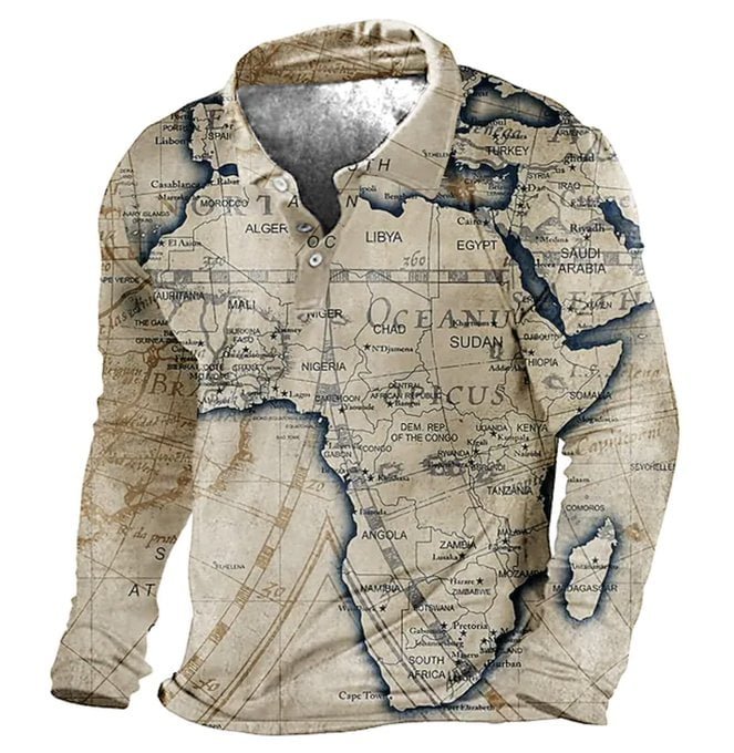
Alex Selby-Boothroyd sent us these shirts; thank you for sharing. Let’s do a bit of commercial, here is a link men-s-golf-shirt. And some other options below
MapsintheWild Shirts
-
sur The 46 States of America & Each State Flower
Publié: 2 June 2024, 10:37am CEST par Keir Clarke
Close-up of the Flying Donkey map game Yesterday I had a lot of fun browsing through the Osher Map Library. The Osher Map Library and Smith Center for Cartographic Education, at the University of Southern Maine has a wonderful collection of vintage maps. Many of which you can view online.There are lots of curiosities in the collection, including the Flying Donkey Game, Yaggy's Nature in
-
sur Mappery: Netherlands in a Sushi
Publié: 1 June 2024, 11:00am CEST
Reinder sent us a while ago this sushi roll; for a long time, I hesitated to publish it; is this real? Let’s have a conversation on our social. And for now let’s enjoy the sushis.
MapsintheWild Netherlands in a Sushi
-
sur Paul Ramsey: Cancer 10
Publié: 1 June 2024, 2:00am CEST
Back to entry 1
So, I got the news from pathology.
There is no cancer left in me, I am officially “cured”.
Since I am still recovering from surgery and relearning what my GI tract is going to do for the future, I don’t feel entirely cured, but I do feel the weight of wondering about the future lifted off of me.
The future will not hold any more major cancer treatments, just annual screening colonoscopies, and getting better post-surgery.
I truly have had the snack-sized experience, not that I would recommend it to anyone. Diagnosed late February, spit off the back of the conveyor belt in late May. Three months in Cancerland, three months too many.
A few days ago NBA great Bill Walton died of colorectal cancer. It’s the second most common cancer in both men and women, and you can avoid a trip to Cancerland through the simple expedient of getting screened. Don’t skip it because you are young, colorectal cancer rates amount people under 50 are going up fast, and nobody knows why (there’s something in the environment, probably).