Warning: Undefined array key "georezo_cookies_accepted" in /var/www/html/web/inc/menu.php on line 10
Nous utilisons des cookies pour vous garantir la meilleure expérience sur notre site. Si vous continuez à utiliser ce dernier, nous considèrerons que vous acceptez l'utilisation des cookies. J'ai compris ! ou En savoir plus !.

Planet GeoRezo

Agrégateur de flux RSS - Actualités et contenus géomatiques


Rencontres d’affaires 100% SIG & Spatial en Cîte d’Ivoire, novembre 2026

Rencontres d’affaires 100% SIG & Spatial en CĂŽte d’Ivoire, novembre 2026 Rencontres d’affaires 100% SIG & Spatial en CĂŽte d’Ivoire, novembre 2026 AfigĂ©o

Afin de renforcer les relations entre les entreprises françaises et les autoritĂ©s SIG/spatiales de CĂŽte d’Ivoire, Business France avec le soutien du Club International de l’AfigĂ©o organise du 8 au 10 nov. 2026, une rencontre d’affaires sur les technologies françaises dans le secteur des SystĂšmes d’Information GĂ©ographiques et du Spatial Ă  Abdijan. Les opportunitĂ©s en CĂŽte d’Ivoire  Anicet Bousson [
]

...
Lire l'article complet ↗

GT CICCLO – Lancement d’EuroCommons 30 Techsprint

GT CICCLO – Lancement d’EuroCommons 30 Techsprint GT CICCLO – Lancement d’EuroCommons 30 Techsprint AfigĂ©o

Eurocommons 30 est une initiative europĂ©enne pour dĂ©velopper des alternatives europĂ©ennes open-source aux grands logiciels propriĂ©taires et sortir de la dĂ©pendance. Elle fonctionne par coalitions thĂ©matiques pour rassembler des DSI de grandes organisations, des Ă©diteurs, et des acteurs de l’open-source et des communs numĂ©riques ; afin de mettre en communs leurs moyens et dĂ©velopper Ă  grande [
]

The post GT CICCLO – Lancement d’EuroCommons 30 Techsprint first appeared on AfigĂ©o.
Lire l'article complet ↗
Where does the North Begin?

Where does the North Begin?

One of the perennial questions in UK politics and geography is “where is the border between the North and South?” I can now definitively answer that question thanks to MapSplit.

Giuseppe Sollazzo’s MapSplit interactive map allows you to map any UK-specific dataset and then “draw a movable straight line across the UK” to view a statistic for each side. This means I was able to upload all the Greggs outlets in the UK onto Giuseppe's map and instantly discover the dividing line across the country where there are an equal number of Greggs north and south of the line. Ending, forever, the debate about the border between the North and South.

...
Lire la suite →

Kartoza: Kartoza's QGIS Plugins: Extending QGIS for Real-World GIS Workflows

QGIS is powerful out of the box, but its real superpower is extensibility. For over a decade, Kartoza has been building, sponsoring, and maintaining QGIS plugins that solve genuine geospatial problems — from cadastral surveying in South Africa to monitoring land degradation for the United Nations Sustainable Development Goals. This post is a quick tour of the plugins we ship, where to find them, and how they fit into a modern open source GIS workflow.

Lire l'article complet ↗

L’AfigĂ©o aux Assises du Newspace 2026

L’AfigĂ©o aux Assises du Newspace 2026 L’AfigĂ©o aux Assises du Newspace 2026 AfigĂ©o

Les organisateurs des Assises du NewSpace ont invitĂ© l’AfigĂ©o Ă  dĂ©couvrir l’évĂ©nement phare de l’innovation du spatial, dont la 5Ăšme Ă©dition s’est dĂ©roulĂ©e les 7 et 8 juillet Ă  Paris au Centre des congrĂšs de la Villette. Retour sur les moments forts de la premiĂšre journĂ©e qui a rĂ©unit plus de 1 000 participants autour [
]

The post L’AfigĂ©o aux Assises du Newspace 2026 first appeared on AfigĂ©o.
Lire l'article complet ↗
How to Find the Best Sunset Views

How to Find the Best Sunset Views

If you want to discover the best spots nearby to watch the sunset, then you need the Sunset Atlas. Choosing a good local spot to watch the sun disappear below the horizon can involve a fair amount of trial and error. Sunset Atlas takes some of the guesswork out of finding the perfect sunset viewpoint by mapping sunset viewing conditions across Europe.

The interactive map uses a colourful heatmap to show the quality of sunset views, with warmer colours indicating locations where the setting sun has a more unobstructed line of sight. You can click on the map to see the Sunset Score for any location, rated from 0 to 100. Or click on the 'Find Best Spots' button to instantly discover the highest-scoring sunset spots near your location.

...
Lire la suite →
Trains and Termini

Trains and Termini

tokyo-trains

It is a truth universally acknowledged, that a city in possession of a good railway network, must be in want of an animated train map. Yet, having once beheld the grandeur of Mini Tokyo 3D and the intricate labyrinth of the Shinjuku Station Indoor, one might reasonably despair of any further elegance in the art.

Mr. Gregg Tavares, however, was of a different mind entirely. Reader, he married them.

...
Lire la suite →

Correction d’un bug à la lecture de l’encodage TIFF en 2 canaux en WMS-Raster + modification sur l’entrepît

Changements #

Modification de la gestion du stockage d’une livraison au niveau de l’entitĂ© upload

Le stockage est directement portĂ© par l’upload et plus par le datastore. Ce qui va permettre aux administrateurs de changer le stockage des livraisons du datastore sans impacter les livraisons en cours.

Ainsi les nouvelles livraisons se crĂ©eront sur le nouveau stockage tandis que les anciennes livraisons resteront sur l’ancien stockage jusqu’à leur suppression.

Ajout du champ extra dans la réponse de la route /catalogs/organizations

...
Lire la suite →

Sandro Santilli: Suspended from FLOSS.social for Using LLMs

My account on FLOSS.social, @strk, has been suspended. Not for writing toots with an LLM, but for writing toots about LLMs - mostly. One of the thirteen cited toots was not mine at all: it was my boost of a toot written by my AI minion. This is how it happened, and why I think the whole thing stinks.

The Freeze

On July 27, 2026 I received an email from admin@floss.social with subject “Your account @strk@floss.social has been frozen”. It said my behavior was “found to be in violation of our FLOSS.social Community Code of Conduct” and cited thirteen of my toots. All of them were about LLMs and AI coding agents. Examples:

@cm@chaos.social using LLM is too fun to stop. Scratching your own itch is just a matter of asking your computer to do it.

...
Lire la suite →
Finding the Falcon 9 Crash Site on the Moon

Finding the Falcon 9 Crash Site on the Moon

Last week Elon Musk's SpaceX Falcon 9 rocket crashed into the Moon. You can view its estimated impact site on azmth Luna, an interactive 3D map of our nearest neighbour. Enter “Falcon 9” into the map's search box and the crash site is highlighted on the lunar surface, near the Einstein crater on the Moon's western limb.

The Falcon 9 crash is just one of 44 landing and impact sites mapped by azmth Luna. These range from the Soviet Union's Luna 2 in 1959 to the latest commercial lunar missions, with successful landings, failed missions and accidental impacts all represented. The resulting collection provides a comprehensive visual history of humanity's attempts to reach the Moon.

...
Lire la suite →

ArcGIS

ArcGIS Earth #

Cette section dĂ©crit l’intĂ©gration des flux IGN dans l’application ArcGIS Earth. Les dĂ©marches sont regroupĂ©es par familles afin de limiter les rĂ©pĂ©titions, tout en tenant compte des spĂ©cificitĂ©s du web : authentification, performances, limites de volumĂ©trie et contraintes de partage.

ArcGIS Earth vous permet gratuitement d’utiliser divers Ă©lĂ©ments provenant de ArcGIS Online, de ArcGIS Enterprise, de donnĂ©es locales et de services Web.

Téléchargement du tutoriel ArcGIS Earth

ArcGIS_Earth_et_les_Geoservices.pdf PDF - 2,20 Mo

...
Lire la suite →

Initialisation d’une donnĂ©e vecteur pour des mises Ă  jour postĂ©rieures

Livraison des informations d’initialisation # DĂ©clarer la livraison # POST "https://data.geopf.fr/api/datastores/{datastore}/uploads" https://data.geopf.fr/api/datastores/{datastore}/uploads Corps de requĂȘte JSON { "description": "Seule la structure est dĂ©finie : une table et une vue", "name": "Installations classĂ©es pour la protection de l’environnement", "type": "VECTOR", "srs": "EPSG:4326" } Corps de rĂ©ponse JSON { "name": "Installations classĂ©es pour la protection de l’environnement", "description": "Seule la structure est dĂ©finie : un...
Lire la suite →
TorchGeo: v0.9.0

TorchGeo: v0.9.0

TorchGeo 0.9.0 Release Notes

TorchGeo 0.9 includes 13 new datasets and a number of improvements required for better time series support, encompassing 3 months of hard work by 15 contributors from around the world. We are now trying to make more frequent releases to get exciting new features out to users as quickly as possible!

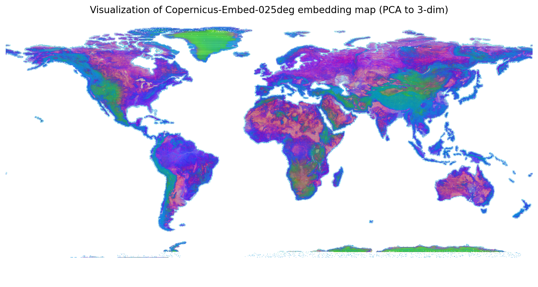
Highlights of this release Embeddings datasets

TorchGeo was the first library to provide pre-trained geospatial foundation models, and offers more GeoFMs than all other GeoML libraries combined [1]. Users have always had the ability to generate their own embeddings using TorchGeo. However, using FMs requires considerable expertise and compute, preventing widespread adoption.

...
Lire la suite →
Mapping the Hollowing of the United States

Mapping the Hollowing of the United States

The American population is moving south and west. You can see that migration writ large in the US Population Growth Atlas, an interactive map showing how the populations of every US county and state have changed between 1980 and 2025.

The most striking feature of the map is the broad band of population decline running through the middle of the country. From the Dakotas and Montana, south through Nebraska, Kansas and Oklahoma and into parts of West Texas, large numbers of counties are coloured red or orange. It is an “Emptying Middle” separating the rapidly growing populations of the coasts and the Sun Belt.

...
Lire la suite →

PostGIS Development: PostGIS 3.7.0beta2

The PostGIS Team is pleased to release PostGIS 3.7.0beta2! Best Served with PostgreSQL 19 Beta2 and GEOS 3.15.0beta2.

This version requires PostgreSQL 14 - 19beta2, GEOS 3.10 or higher, and Proj 6.1+. To take advantage of all features, GEOS 3.15+ is needed. To take advantage of all SFCGAL features SFCGAL 2.3.0+ is needed.

This release contains fixes and enhancements since 3.7.0beta1 release.

...
Lire l'article complet ↗
QField: Faster Project Creation: Introducing Cloning and XLSForm Imports in QFieldCloud

QField: Faster Project Creation: Introducing Cloning and XLSForm Imports in QFieldCloud

We’ve overhauled the project creation flow in QFieldCloud to make getting your field data campaigns off the ground faster than ever. Along with a clean new web interface, we are introducing two highly requested features to boost your team’s productivity: more advanced project creation, with native XLSForm imports and 1-click project cloning! 🚀

Revamped basic project creation

When creating a new project, you can now define the initial extent field right away. You can also configure a basemap using OSM or a custom XYZ layer. What is more, you can set whether you prefer to keep the original color, or convert the basemap into dark or light themes.

XLSForm imports: a new path of survey creation

We are also thrilled to introduce a completely new way to generate projects: XLSForm support.

...
Lire la suite →
GIScussions: Mapping Maps in the Wild – a complex collaborative project

GIScussions: Mapping Maps in the Wild – a complex collaborative project

Maps in the Wild

Mappery has been my side project for 8 years, for the last 5 or 6 years Arnaud Ferrand has been my co-editor and the tech brain that keeps the site running. Mappery is a large WordPress site with 2,500 posts and 3,500 images of Maps in the Wild (pictures of maps in the street, on clothes, furniture, alcohol etc).

For several years we had a map plugin that allowed us to enter a coordinate pair for a post and to render a clustered map with pins representing each post, click on a pin and the post image and some text appears in the popup with a link to the post. It worked ok but the map used the Google Maps API which had cost implications and we also had several complications with the map not rendering and the plugin wasn’t being maintained.

...
Lire la suite →
Free and Open Source GIS Ramblings: MovingPandas 0.23 released!

Free and Open Source GIS Ramblings: MovingPandas 0.23 released!

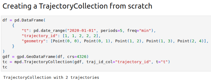
The new MovingPandas release 0.23 has just landed in pypi and conda-forge and I want to share with you two highlights:

New HTML representations

The new HTML representations for Trajectory & TrajectoryCollection objects aim to make interactive data exploration in notebooks more convenient by providing commonly required descriptive data summaries and data previews in a structured way.

Before 0.23

New in 0.23

...
Lire l'article complet ↗

Du terrain aux cartes : raconter les parcours de migration

Les matins d’étĂ©, une Ă©mission de BĂ©rengĂšre Bonte, produite et prĂ©sentĂ©e par Julie Gacon, qui propose « des entretiens sur l’actualitĂ© pour informer, approfondir, dĂ©caler le regard ! ». L’émission du jeudi 06 aoĂ»t 2026, de 07h40 Ă  8h45, intitulĂ©e Du Terrain aux cartes : raconter les parcours de migrations, fut consacrĂ©e aux questions d’immigrations en lien avec ce qu’il s’est passĂ© Ă  Ceuta au Maroc, les 30 et 31 juillet 2026.

Le contexte

Les 30 et 31 juillet, un afflux important de migrants est entrĂ© dans l’enclave espagnole de Ceuta. Environ 50 000 Ă  60 000 personnes, majoritairement des hommes, ont traversĂ© la frontiĂšre Ă  la nage depuis la ville de Fnideq. Au-delĂ  des flux, comment raconter les parcours de migration ?

...
Lire la suite →
7 Billion People Are Awake Right Now

7 Billion People Are Awake Right Now

At the moment (as I write), 6.962 billion people are awake, while another 2.1 billion are fast asleep. Awake Globe visualizes this constantly shifting global rhythm of sleep and wakefulness, revealing where people around the world are currently awake, asleep, or somewhere in between.

The map presents the Earth as a glowing, rotating globe. Daylight sweeps across its surface at around 1,000 miles per hour (at the equator), while millions of tiny coloured points show where people are currently awake or asleep. Blue represents people who are tucked up in bed, while green indicates those who are awake, with a spectrum of colours in between showing the gradual transition from sleep to wakefulness.

...
Lire la suite →
Limites d’usage des API

Limites d’usage des API

Principe de fonctionnement #

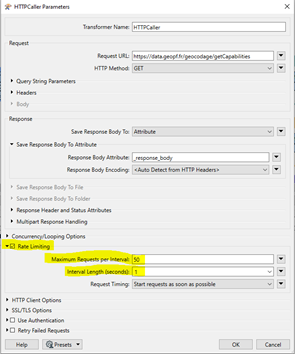
Pour certaines API, une limite d’usage fixĂ©e en nombre de requĂȘtes par seconde et par IP est mise en place.

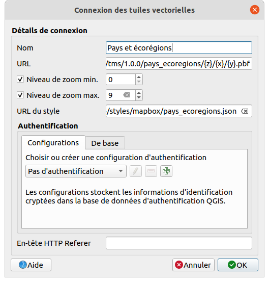
Ce mĂ©canisme, dit de « rate limiting », concerne la plupart des API de la GĂ©oplateforme Ă  l’exception notable de l’API « Diffusion d’images tuilĂ©es WMTS » et son pendant « Diffusion de tuiles vectorielles TMS ». Il a pour objectif de garantir les engagements de disponibilitĂ© des API, en bloquant les usages individuels les plus massifs qui seraient susceptibles de mettre Ă  mal l’infrastructure.

Lorsqu’une IP sollicite une API au-delĂ  de la limite d’usage fixĂ©e :

...
Lire la suite →

Statistiques d’utilisation

Présentation #

L’API de statistiques d’utilisation de la GĂ©oplateforme permet d’obtenir, entre deux dates, le nombre de requĂȘtes (hits) ayant sollicitĂ© la GĂ©oplateforme et le volume de donnĂ©es (octets) que la GĂ©oplateforme a Ă©mis en rĂ©ponse.

Les nombres de hits et d’octets sont agrĂ©gĂ©s par mois. Des agrĂ©gats par pas de 5 minutes sont Ă©galement disponibles mais uniquement sur les 30 derniers jours par rapport Ă  la date du jour.

L’API propose des requĂȘtes destinĂ©es aux producteurs de donnĂ©es (qui diffusent leurs donnĂ©es depuis leurs datastores) et aux utilisateurs (qui accĂšdent aux donnĂ©es via les gĂ©oservices).

Elle est interrogeable en méthode GET en étant authentifié via son compte Géoplateforme/cartes.gouv.fr.

...
Lire la suite →
CastleGuessr

CastleGuessr

I had determined not to post about Castle Map despite it being written about extensively elsewhere. There are already hundreds of maps of castles around the world and, although I have nothing against AI-generated maps, this one struck me as particularly uninteresting.

That first impression wasn't helped by the site's design. Castle Map takes the illegible grey-text-on-a-black-background AI design trend to even greater lengths by applying the same colour scheme to the map itself, with dark grey land set against a black sea. Not only are the menu options in the legend almost impossible to read, but the map itself is barely legible.

However, today I discovered that Castle Map includes a neat GeoGuessr-style game: CastleGuessr. 

...
Lire la suite →
Ecodiv.earth: m.printmap, a new addon to create maps in GRASS

Ecodiv.earth: m.printmap, a new addon to create maps in GRASS

For reports, presentations, and websites, I regularly need maps: a raster layer, contextual boundaries, a legend, and maybe a logo. Nothing requiring an elaborate page layout. And I often need more than one. For the COMBINED project, for example, I map the same study area in Rotterdam over and over. The extent, the boundaries, and the logo stay put; only the raster and its legend change. Exactly the kind of repetition worth automating.

...
Lire la suite →
Fernando Quadro: Curso de Geotecnologia com InteligĂȘncia Artificial

Fernando Quadro: Curso de Geotecnologia com InteligĂȘncia Artificial

A InteligĂȘncia Artificial jĂĄ estĂĄ transformando a maneira como profissionais GIS analisam dados, automatizam processos e desenvolvem soluçÔes geoespaciais.

Neste curso, vocĂȘ aprenderĂĄ a aplicar IA generativa, agentes inteligentes e automação em ferramentas como QGIS, PostGIS, GeoServer e GeoNode, por meio de cases, exercĂ­cios prĂĄticos e problemas inspirados em projetos reais.

VocĂȘ verĂĄ como utilizar IA para gerar e revisar consultas SQL espaciais, detectar inconsistĂȘncias, corrigir geometrias, automatizar publicaçÔes no GeoServer, criar estilos SLD, produzir metadados, analisar dados no QGIS e desenvolver fluxos geoespaciais mais inteligentes.

...
Lire la suite →
A World of Plane Crashes

A World of Plane Crashes

If you are already afraid of flying then you might want to give CrashAtlas a miss. This interactive map of aircraft accidents is unlikely to do much for your aerophobia. On the other hand, if you've ever wondered whether a plane has crashed near your home, then CrashAtlas may prove to be a fascinating, if slightly macabre, diversion.

CrashAtlas is a global interactive map dedicated to documenting the history of aviation accidents and incidents around the world. The map plots thousands of crash locations, allowing you to explore where aviation accidents have occurred geographically. 

...
Lire la suite →
Utiliser les outils de mesure

Utiliser les outils de mesure

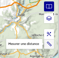
Mesurer une distance #

L’outil « Mesurer une distance » permet de dessiner une ligne sur la carte et d’en connaĂźtre en temps rĂ©el la longueur.

Cliquez sur l’icîne de l’outil :

Vous pouvez alors cliquer sur la carte pour commencer Ă  crĂ©er la ligne. Chaque nouveau clic permet d’ajouter un sommet supplĂ©mentaire Ă  la ligne :

Pour finir, double-cliquez Ă  l’endroit oĂč vous souhaitez terminer la ligne (attention : cliquer sur le point prĂ©cĂ©dent ou Ă  un endroit trĂšs proche finira Ă©galement la ligne). Cela figera la ligne, et vous pourrez en crĂ©er une nouvelle de la mĂȘme façon :

...
Lire la suite →
Isometric San Francisco

Isometric San Francisco

Following the success of Isometric NYC, it was probably only a matter of time before another city received the same pixel-art treatment. Now Isopolis - San Francisco has recreated the City by the Bay as a sprawling isometric world that looks as though it has been lifted straight from the golden age of SimCity.

From the skyscrapers of the Financial District to the city's famous hills, bridges and waterfront, San Francisco has been transformed into a giant retro cityscape that invites endless exploration. SimCity fans will immediately recognize the aesthetic. The map captures San Francisco as a dense tapestry of tiny buildings, winding streets, parks and piers, all rendered in a consistent pixel-art style. 

...
Lire la suite →
OSGeo Announcements: [OSGeo-Announce] OSGeo joins new GeoCommons Fund to strengthen geospatial community

OSGeo Announcements: [OSGeo-Announce] OSGeo joins new GeoCommons Fund to strengthen geospatial community

https://www.osgeo.org/foundation-news/osgeo-joins-new-geocommons-fund/

OSGeo joins new GeoCommons Fund to strengthen geospatial community!

Largest European investment to date into open geo tooling

The European Commission is making a strategic investment of 6 million Euro into an ambitious new programme to support free and open source software in the geospatial domain.

The new GeoCommons programme will be handing out grants directly to researchers and developers working on geospatial commons.

...
Lire la suite →

Présentation de l'association

L’association OSGeo-fr est la ReprĂ©sentation Francophone de la Fondation Open Source Geospatial.

Sa mission est d’aider et de promouvoir le dĂ©veloppement collaboratif des donnĂ©es et des technologies gĂ©ospatiales ouvertes. L’association est une entitĂ© lĂ©gale permettant aux membres de la communautĂ© de contribuer au code, aux finances et autres ressources, garantissant que leurs contributions seront maintenues au bĂ©nĂ©fice du public.

L’OSGeo-fr sert Ă©galement d’organisation de rĂ©fĂ©rence et d’assistance pour la communautĂ© gĂ©ospatiale libre, et fournit un forum commun et une infrastructure partagĂ©e pour amĂ©liorer la collaboration entre les projets.

Lire l'article complet ↗
Don't Miss the Eclipse!

Don't Miss the Eclipse!

On August 12, 2026, a total solar eclipse will cross Greenland, Iceland and northern Spain. While eclipse chasers in Spain can enjoy totality, there is one potential problem. By the time the Moon's shadow reaches the Iberian Peninsula, the Sun will be hanging just above the western horizon. If there's a mountain between you and the setting Sun, you could miss part - or even all - of the eclipse.

Alessio Zanol's EclipseMap is designed to solve exactly that problem. Rather than simply showing the path of totality, the interactive map calculates how the surrounding landscape affects your view of the eclipse, helping you find locations where the horizon remains clear.

...
Lire la suite →
The Map of Global Friendship

The Map of Global Friendship

Social Connectedness Index Map
St. Louis, Missouri and Bosnia and Herzegovina are separated by more than 5,000 miles. Yet Facebook friendship data reveals that the two places share remarkably strong social ties. An unusually large number of people in St. Louis have Facebook friends in Bosnia and Herzegovina.
The explanation lies in the Bosnian War of the 1990s. Tens of thousands of Bosnian refugees settled in St. Louis, creating the largest Bosnian community per capita outside Europe. Decades later, those family relationships, friendships and community networks remain so strong that they stand out as one of the most striking patterns in Meta's global dataset of social connections.
The Social Connectedness Index (SCI), developed by Meta's Data for Good team, was designed to measure these otherwi...
Lire la suite →
Arrivée de MCP dans ArcGIS, pourquoi c'est important ?

Arrivée de MCP dans ArcGIS, pourquoi c'est important ?


ArcGIS et MCP : donner une conscience gĂ©ographique aux agents d’intelligence artificielle
L’intelligence artificielle gĂ©nĂ©rative est en train de changer profondĂ©ment la maniĂšre dont nous interagissons avec les applications numĂ©riques. Jusqu’à prĂ©sent, les utilisateurs devaient apprendre les interfaces, connaĂźtre les menus, manipuler des formulaires ou Ă©crire des requĂȘtes structurĂ©es. Avec l’arrivĂ©e des agents IA, cette relation Ă©volue : l’utilisateur formule un objectif en langage naturel et l’agent orchestre les actions nĂ©cessaires pour y rĂ©pondre.
Mais une question essentielle apparaßt rapidement : comment donner à ces agents une capacité réelle à comprendre le monde qui nous entoure ?
Pour...
Lire la suite →
Mapping Meals Under $10

Mapping Meals Under $10

CheapFoodMap is an interactive map that highlights restaurants across the United States where you can still find meals for under $10. Rather than focusing on national chains, it celebrates local diners, neighborhood taquerias, family-owned cafés and other hidden gems.

Every listing includes the featured meal, its current price and the date that the price was last verified, allowing users to judge how reliable the information is in an age of inflation, when menu prices seem to change every few months.

...
Lire la suite →

RĂ©usage des eaux usĂ©es traitĂ©es pour l’agriculture en contexte de changement climatique, stratĂ©gies de sĂ©curisation de la ressource en eau et vulnĂ©rabilitĂ© des territoires locaux, une Ă©tude de cas en Salanque

Cet article propose une Ă©tude monographique du rĂ©usage des eaux usĂ©es traitĂ©es pour l’irrigation agricole. L’étude concerne un projet portĂ© par une commune de la plaine de la Salanque, situĂ©e dans la basse vallĂ©e de l’Agly en Roussillon, une rĂ©gion mĂ©diterranĂ©enne particuliĂšrement affectĂ©e par les effets du dĂ©rĂšglement climatique sur la disponibilitĂ© de la ressource en eau. L’approche gĂ©ographique se fonde sur l’hypothĂšse que les configurations de l’espace influencent les stratĂ©gies des acteurs sociaux dans la maniĂšre de concevoir et de recevoir le projet. L’analyse s’appuie sur la cartographie thĂ©matique et l’enquĂȘte par entretiens semi-directifs pour interroger le rĂ©usage des eaux rĂ©siduaires comme moyen de rĂ©duire la vulnĂ©rabilitĂ© des activitĂ©s agricoles Ă  l’alĂ©a climatique. Elle montre comment l’introduction d’une innovation technique qui modifie les formes de prĂ©lĂšvement et d’usage de la res...

Lire l'article complet ↗

Mise à disposition anticipée de l'Ortho Express Guyane 2025

Afin de répondre aux besoins des acteurs du territoire, l'IGN met exceptionnellement à disposition l'Ortho Express Guyane 2025 avant sa publication en libre accÚs sur Cartes.gouv.fr.

Les organismes souhaitant accéder à cette donnée peuvent effectuer leur demande via le formulaire dédié.

AprÚs validation de la demande, les paramÚtres de connexion au serveur FTP seront transmis par l'IGN. La diffusion des données est réservée à l'organisme demandeur et ne doit pas faire l'objet d'une rediffusion à des tiers.

Pour toute question, vous pouvez contacter Eric Cajoly, délégué régional Outre-mer, à l'adresse suivante : eric.cajoly@ign.fr.

Lire l'article complet ↗
German Döner, English Curry & American Pizza

German Döner, English Curry & American Pizza

German Döner Kebab restaurants have started popping up all over London. For some reason, the idea of a German kebab still strikes me as slightly incongruous - a bit like a Swiss curry or a French taco. However, according to a recent analysis of OpenStreetMap food venues, there are far more döner kebab restaurants in Germany than there are in Turkey. In fact, 51% of the world's döner shops are located in Germany.

The surprising truth is that restaurant names often tell us more about migration and language than they do about the birthplace of a dish. That's the premise behind Flavor Lines, an ingenious interactive map that uses millions of restaurant names from OpenStreetMap to reveal the invisible cultural boundaries that shape the world's cuisine.

...
Lire la suite →

Cartopartie OpenStreetMap en Vallée d'OSSAU !, Le lundi 14 septembre 2026 de 14h00 à 17h00.

Bonjour, 

📱Bonne nouvelle, la 2Ăšme cartopartie de la Montagne bĂ©arnaise dĂ©diĂ©e Ă  la mobilitĂ© active et durable est reprogrammĂ©e !

Organisée dans le cadre du projet européen LIFE Pyrenees4CLIMA et en continuité du programme européen SYSTOUR, elle se tiendra : 

le lundi 14 septembre de 14h00 Ă  17h00

En vallée d'OSSAU (le lieu de rencontre sera confirmé en fonction des inscriptions)

đŸ—ș Une cartopartie, qu’est-ce que c’est ?

...
Lire la suite →
Bigfoot's Giant Step Forward for Tourism Maps

Bigfoot's Giant Step Forward for Tourism Maps

Tourism websites often present destinations using static maps, brochures and carefully curated lists of attractions. Bigfoot's BC demonstrates that there is a much more engaging alternative. By turning British Columbia into a playful 3D world that visitors can explore as a giant Sasquatch, it transforms the traditional tourist guide into an interactive adventure.

Built with three.js and powered by open geographic data, this map recreates the province of British Columbia as a charming low-poly landscape. The terrain follows British Columbia's real topography, while roads, lakes, parks and settlements are all positioned using real-world geographic data. The result is a map that resembles an open-world video game.

...
Lire la suite →
The Most Optimal Road Trip Maps

The Most Optimal Road Trip Maps

In 1954, a landmark paper in computer science famously solved the Traveling Salesman Problem (TSP) by proving the exact, shortest route to visit all 48 contiguous state capitals plus Washington D.C. The underlying puzzle is deceptively simple: given a list of destinations, what is the shortest possible route that visits each location once before returning to the start? 
That breakthrough kicked off a long tradition of mathematical road trips, inspiring some wonderfully bizarre optimal road trip maps of the United States:

...
Lire la suite →

Restaurations Ă©cologiques, reconnexions et connectivitĂ©s socio-spatiales dans le sud de l’Arizona : le cas de la Santa Cruz

La riviĂšre Santa Cruz, dans le bassin du Colorado, est la principale riviĂšre intermittente du sud de l’Arizona. Unique source d’eau de surface de cette partie du dĂ©sert de Sonora, elle a Ă©tĂ© intensivement exploitĂ©e (tout comme les eaux souterraines associĂ©es) d’abord pour l’irrigation, puis pour le dĂ©veloppement urbain : la population de la rĂ©gion passant de 34 000 habitants en 1920 Ă  plus d’un million en 2020, notamment autour de la ville de Tucson.
Comme beaucoup d’autres cours d’eau dans le monde, la Santa Cruz a Ă©tĂ© l’objet de mesures de restaurations Ă©cologiques depuis une trentaine d’annĂ©es. À partir d’enquĂȘtes de terrain menĂ©es dans le cadre du projet HYDECO du LABEX DRIIHM (Dispositif de Recherche Interdisciplinaire sur les Interactions Hommes-Milieux), cet article montre les spĂ©cificitĂ©s de ces actions Ă  partir de trois cas d’étude : la restauration « accidentelle » du haut bassin...

Lire l'article complet ↗
The Many Maps of the Odyssey

The Many Maps of the Odyssey

Since the launch of the Google Maps API back in 2005, two fictional journeys have been mapped over and over again: Phileas Fogg’s global circumnavigation in Around the World in Eighty Days, and Odysseus’ long voyage home in the Odyssey.

For some reason Homer’s hero is having a bit of a moment - and a sudden surge of new Odyssey maps means Odysseus seems to have pulled ahead of Phileas Fogg in the fictional journey mapping contest.

The Odyssey Journey

The latest entry in this sudden wave of Homeric cartography is The Odyssey Journey, an animated, narrated retelling of Odysseus' decade-long voyage back to Ithaca.

...
Lire la suite →
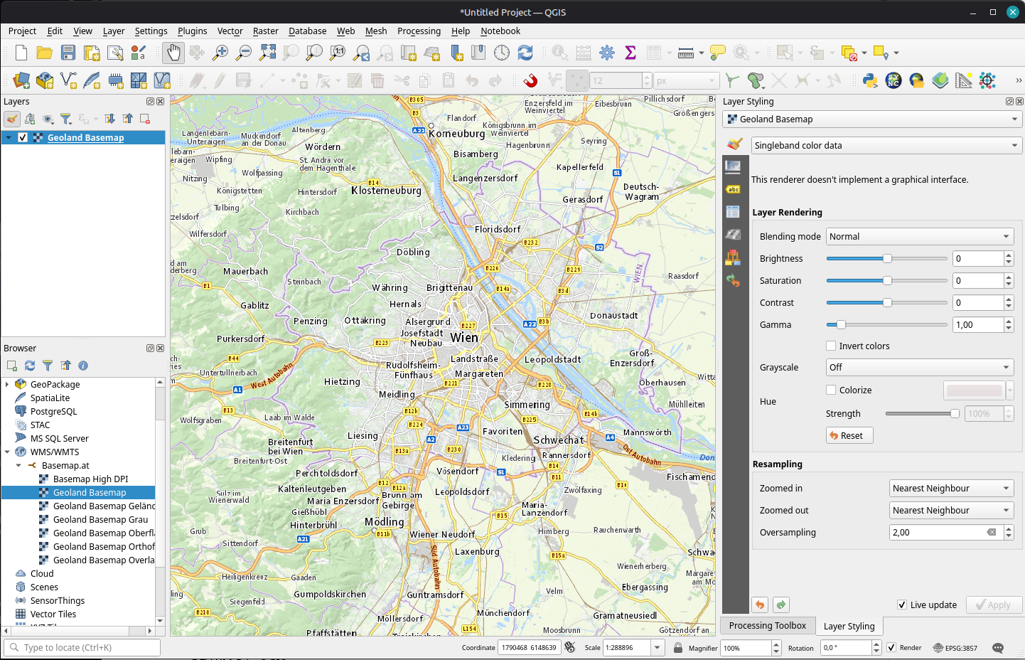
Free and Open Source GIS Ramblings: New Open Basemaps for Austria

Free and Open Source GIS Ramblings: New Open Basemaps for Austria

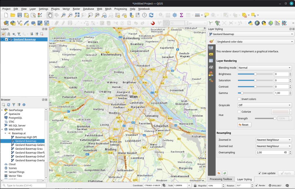
For many years now, we have been enjoying the basemap.at service with it’s various basemap options (color, gray, with/without labels, 
) in WMTS and vector tiles.

Basemap.at Standard WMTS in QGIS (instructions here)

For a few weeks now, there is an additional service by BEV: Their cartographic models “Kartographischen Modelle (KM)” are now available as raster (KM-R) in COG-TIFF format.

...
Lire la suite →

CartONG rejoint le projet PARCIT aux cĂŽtĂ©s d’Acting for Life

CartONG est heureux d’annoncer le lancement d’un nouveau partenariat avec Acting for Life (AFL) dans le cadre du projet PARCIT (Projet d’Appui Ă  la RĂ©silience des populations et Ă  la CohĂ©sion Intercommunautaire dans les territoires transfrontaliers). FinancĂ© par l’Union europĂ©enne, ce programme de 42 mois (2025-2029) vise Ă  renforcer la rĂ©silience des populations et la cohĂ©sion intercommunautaire


Source

Lire l'article complet ↗
Gestion des clés de consommation des services de diffusion

Gestion des clés de consommation des services de diffusion

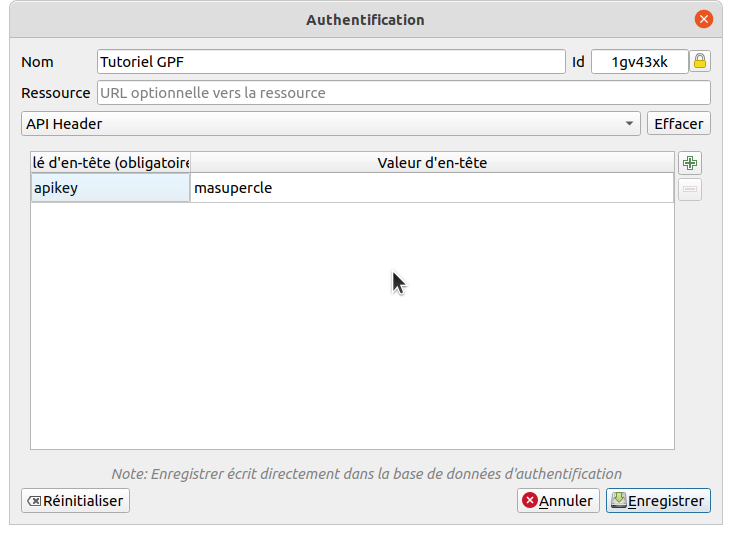
En tant que consommateur de donnĂ©es, c’est Ă©galement via l’API que l’on va pouvoir configurer ses clĂ©s d’accĂšs. Cela n’implique pas d’avoir accĂšs Ă  un entrepĂŽt, ni mĂȘme d’ĂȘtre membre d’une communautĂ©.

Consultation des permissions #

L’ensemble des permissions qui m’ont Ă©tĂ© personnellement donnĂ©es ou qui ont Ă©tĂ© donnĂ©es Ă  une communautĂ© Ă  laquelle l’utilisateur appartient constitue une sorte de catalogue de donnĂ©es qu’il va ĂȘtre possible de consommer.

...
Lire la suite →
Rédiger sa documentation

Rédiger sa documentation

Avant de commencer vos modifications, pensez Ă  effectuer les Ă©tapes prĂ©alables indiquĂ©es page prĂ©cĂ©dente. Vous Ă©viterez ainsi d’éventuels conflits.

Modifier et prévisualiser avec VS Code #

À la suite de l’installation de VS Code, vous pouvez prĂ©visualiser l’écriture de contenu de plusieurs facons. NĂ©anmoins, cette prĂ©visualisation n’englobera pas les composants DSFR. Il faudra dĂ©ployer le site en local pour avoir une image complĂšte de prĂ©visualisation (cf. page prĂ©cĂ©dente).

Cliquez sur le bouton de prévisualisation (ou utilisez les raccourcis claviers « crtl+k » puis « V ») :

...
Lire la suite →
Free Map Tiles for Everyone

Free Map Tiles for Everyone

Free Map Tiles Providers:

One of the biggest barriers to building web maps has always been the cost and complexity of map tiles. Services such as Google Maps and Mapbox offer excellent infrastructure, but commercial pricing can quickly become prohibitive as projects grow. Self-hosting OpenStreetMap vector tiles is an alternative, but maintaining a global tile server yourself is far from trivial.

...
Lire la suite →
Can You Date the Map? - Daily Challenge

Can You Date the Map? - Daily Challenge


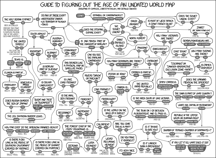
Randall Munroe's famous xkcd comic Map Age Guide distilled two centuries of global geopolitics into a wonderfully simple flowchart for dating maps. Does the map show Germany divided into East and West? Is there a Yugoslavia? Does South Sudan exist? By answering a handful of such questions about borders and country names, the comic demonstrates how you can usually work out when almost any modern map was made.

Date the Globe turns this idea into a really fun daily map game.

...
Lire la suite →

Benjamin BĂŒrbaumer, 2024, Chine/États-Unis, Le capitalisme contre la mondialisation, Paris, La DĂ©couverte, 304 p.

La politique interventionniste des États-Unis, au mĂ©pris du droit international, ne manque pas de faire pleuvoir nombre de commentaires en ce dĂ©but d’annĂ©e 2026. Quand certains, sidĂ©rĂ©s – à juste titre – par l’enlĂšvement du prĂ©sident vĂ©nĂ©zuĂ©lien NicolĂĄs Maduro ou par les bombardements en Iran, y voient l’Ɠuvre d’un fou agissant de maniĂšre impulsive, d’autres, adoptant une lecture matĂ©rialiste des faits, font valoir des enjeux plus profonds. Le discours mĂ©diatique parle dĂ©sormais de dĂ©dollarisation, de corridors terrestres, du dĂ©troit d’Ormuz, de pipelines, du pĂ©trole vĂ©nĂ©zuĂ©lien et des hydrocarbures russes, mais surtout de la Chine, puissance miroir des États-Unis, Ă  chaque fois impactĂ©e, si ce n’est indirectement ciblĂ©e. Bien que publiĂ© en 2024, l’ouvrage de Benjamin BĂŒrbaumer, Chine/États-Unis, le capitalisme contre la mondialisation, semble plus que jamais d’actualitĂ© pour dĂ©mĂȘler c...

Lire l'article complet ↗

CartONG publie son rapport annuel 2025

En 2025, CartONG a poursuivi sa mission auprĂšs des acteurs de la solidaritĂ© internationale en mettant l’accent sur un enjeu central : renforcer l’autonomie des organisations locales grĂące Ă  une meilleure gestion des donnĂ©es. –> DĂ©couvrez le rapport annuel 2025 Cette ambition s’est notamment concrĂ©tisĂ©e Ă  travers plusieurs projets de localisation. En RDC, CartONG a accompagnĂ© le rĂ©seau


Source

Lire l'article complet ↗
How Close is Everything You Need?

How Close is Everything You Need?

One of the biggest challenges when moving home is deciding which compromise you are prepared to make. You might want to live close to work, a good school, a supermarket, a park, a gym and your favourite coffee shop - but finding somewhere that sits within easy reach of everything is rarely possible.

Close is an interactive travel-time map of the United States designed to solve exactly that problem. Instead of measuring access to just one destination, it allows you to select up to six different amenities and then colours every census block according to the travel time to the furthest of those destinations.

Using Close is refreshingly straightforward: 

  1. Search for a city or neighbourhood
  2. Add the destinations that matter to you
  3. Choose how you would travel to each one - walking, cycling or public transport

...
Lire la suite →

Clarification du message de demande de réinitialisation de mot de passe/réactivation de compte

Changements #

Clarification du message de la page de demande de réinitialisation de mot de passe/réactivation de compte

  • Modification du message affichĂ© aprĂšs avoir appuyĂ© sur le bouton « Envoyer un lien de rĂ©initialisation/rĂ©activation »
  • PossibilitĂ© de rĂ©activer son compte en rĂ©initialisant son mot de passe
Lire l'article complet ↗

OSGeo Announcements: [OSGeo-Announce] OSGeo establishes a European legal foundation

Wageningen, The Netherlands, 21 July 2026.

The Open Source Geospatial Foundation (OSGeo) has established a legal foundation in Europe. The founding documents were signed yesterday. The new entity, Stichting Open Source Geospatial, has its statutory seat in Wageningen and operates under the OSGeo name and mission. It gives the foundation a legal presence in the European Union alongside its existing entity in the United States.

The step fits a wider move toward digital sovereignty. Governments and organisations across Europe want control over the software and data they depend on, and open-source geospatial technology gives them that control. A European foundation lets OSGeo take part in that shift as a recognised local partner, and gives the people and companies who build OSGeo projects a stronger voice in it, along with better business opportunities that follow from working close to European institutions and funding.

...
Lire la suite →

Une enquĂȘte mondiale pour cartographier les lacunes des Ă©cosystĂšmes d’information humanitaires

Dans chaque crise humanitaire, les dĂ©cisions ne sont efficaces que dans la mesure oĂč elles s’appuient sur des informations fiables. Pourtant, Ă  travers le monde, les acteurs humanitaires continuent de faire face Ă  des obstacles persistants pour accĂ©der aux donnĂ©es dont ils ont besoin, les produire, les partager et les utiliser. C’est pour rĂ©pondre Ă  ce dĂ©fi qu’a Ă©tĂ© conçue l’Évaluation du


Source

Lire l'article complet ↗
Wikifier la cartographie : atelier de contribution sur Wikipédia à la BnF-Richelieu, 26 octobre 2026 (9h30-13h30)

Wikifier la cartographie : atelier de contribution sur Wikipédia à la BnF-Richelieu, 26 octobre 2026 (9h30-13h30)

L’exposition “Cartes imaginaires” de la BibliothĂšque nationale de France vient de s’achever. Pour diffuser plus largement les Ɠuvres et les connaissances qui y ont Ă©tĂ© prĂ©sentĂ©es, nous vous proposons un atelier de contribution sur WikipĂ©dia.
9e site internet le plus consultĂ© de France, l’encyclopĂ©die reste pourtant mĂ©connue. Cet atelier est l’opportunitĂ© d’enrichir le contenu dĂ©diĂ© Ă  la cartographie et de diffuser largement les recherches en gĂ©ographie avec une perspective de science ouverte !
L’atelier se compose d’une formation et d’un large temps dĂ©diĂ© Ă  la contribution.

Lundi 26 octobre, 9h30-13h30 (deuxiùme lundi des vacances d’automne), gratuit.
Lieu: salle de lecture des départements des Cartes et plans / Estampes et photographie, sur le site de Richelieu.
En partenariat avec le projet Wikifier la science”

...
Lire la suite →
The 5 Best 3D Subway Maps

The 5 Best 3D Subway Maps

Shinjuku Station has a well-earned reputation as one of the world's largest and most bewildering transport hubs. The  Shinjuku Station Indoor interactive 3D map tackles that complexity by turning the station's official indoor mapping data into a clean, schematic three-dimensional blueprint. This map strips everything back to the essential geometry of corridors, platforms and rooms, making it much easier to understand how the station's many levels fit together.

Navigation is simple and intuitive. Users can pan across the station, zoom in and out, and hold Ctrl while dragging the mouse to rotate the view, making it easy to examine the station from almost any angle. Individual floors can be toggled on and off using the built-in control panel, allowing users to isolate a single level or view multiple floors stacked vertically. 

...
Lire la suite →

Kartoza: GeoAI: Building Smarter Spatial Decision-Making Systems

What is GeoAI?

It is 2:07 AM, heavy rain is pounding the city, and emergency teams need to know one thing fast: Which neighbourhoods will flood first?

This is where GeoAI shines.

GeoAI (Geospatial Artificial Intelligence) is the combination of AI and geospatial science to understand patterns in data tied to place and time. In simple terms, GeoAI does not just answer what might happen, it answers what, where, and when.

Lire l'article complet ↗

PostGIS Development: PostGIS 3.7.0beta1

The PostGIS Team is pleased to release PostGIS 3.7.0beta1! Best Served with PostgreSQL 19 Beta2 and GEOS 3.15.0beta2.

This version requires PostgreSQL 14 - 19beta2, GEOS 3.10 or higher, and Proj 6.1+. To take advantage of all features, GEOS 3.15+ is needed. To take advantage of all SFCGAL features SFCGAL 2.3.0+ is needed.

This release contains fixes and enhancements since 3.7.0alpha1 release.

...
Lire l'article complet ↗

GRASS GIS: GRASS Community Meeting 2026 Report

The GRASS Community Meeting 2026 was held at Fondazione Edmund Mach (FEM) in San Michele all’Adige, Trentino, Italy, from July 11 to 19. The event brought together users, supporters, contributors, power users and developers from around the world for a week of focused, in-person collaboration. As is tradition for these meetings, a large part of the week went into maintenance that simply doesn’t happen at the same pace when the team is scattered across time zones: reviewing, testing, and merging or closing pull requests and issues, following up on stale discussions, and cleaning up long-standing rough edges across the GRASS repositories.
Lire l'article complet ↗

HELLO CATI : la nouvelle plateforme des Centres AutomatisĂ©s du Traitement de l’Information de l'INRAE

Plus de 18 collec­tifs d’in­for­ma­ti­ciens regrou­pĂ©s dans des CATI (Centres Auto­ma­ti­sĂ©s du Trai­te­ment de l’In­for­ma­tion) accom­pagnent les commu­nau­tĂ©s scien­ti­fiques d’IN­RAE.

Lire l'article complet ↗
Street Names - As Ranked by the Internet

Street Names - As Ranked by the Internet

Streetnames by Elo is a fascinating interactive map which colours streets according to how highly the internet rates the people, places or things they are named after. The map combines OpenStreetMap's `name:etymology:wikidata` tags with EloEverything's crowd-sourced Elo rankings to create a surprisingly revealing view of the world's street names.

EloEverything asks users to choose which of two randomly selected things they prefer, building an Elo rating for everything from the Sun to headaches. By matching those ratings to OpenStreetMap's street etymology data, Streetnames by Elo turns road networks into a colour-coded map of collective internet opinion.

...
Lire la suite →

À la conquĂȘte de l'Est

En vingt ans, la Chine a construit le premier réseau ferroviaire à grande vitesse du monde. Son déploiement relie les grandes métropoles, gagne progressivement les provinces de l'intérieur et transforme la carte des circulations. Chaque nouvelle ligne répond aussi à une logique de planification : elle oriente les investissements, inscrit une ville dans les priorités nationales et fait du rail l'un des principaux instruments de l'aménagement du territoire.

Voir en ligne : /cartes/tgv-chinois
Lire l'article complet ↗

Le pĂ©trole au cƓur de la guerre

Le détroit d'Ormuz concentre prÚs d'un cinquiÚme du commerce mondial de pétrole. Cette carte montre pourquoi cet étroit passage occupe une place centrale dans les rapports de force au Proche-Orient : producteurs d'hydrocarbures, bases militaires américaines, oléoducs et routes maritimes s'y superposent. La puissance s'y mesure autant par la capacité à faire circuler le pétrole que par celle à interrompre sa circulation.

Voir en ligne : /cartes/ormuz-petrole
Lire l'article complet ↗

Fractures géopolitiques au pÎle Nord

Le recul de la banquise ouvre progressivement de nouvelles routes maritimes et facilite l'accĂšs aux ressources arctiques. Dans cet espace longtemps rĂ©gi par la coopĂ©ration, la guerre en Ukraine accĂ©lĂšre une recomposition stratĂ©gique oĂč s'entremĂȘlent ambitions militaires, revendications territoriales et concurrence Ă©conomique.

Version rĂ©duite et mise Ă  jour de « À la conquĂȘte des ocĂ©ans polaires ».

Voir en ligne : /cartes/geopolitique-pole-nord
Lire l'article complet ↗
50 kilomÚtres, 5 heures de route

50 kilomÚtres, 5 heures de route

Depuis 1967, les axes routiers des territoires occupĂ©s sont contrĂŽlĂ©s par IsraĂ«l. Le rĂ©seau de « checkpoints » et d'entraves Ă  la circulation, illĂ©gal au regard du droit international, s'est considĂ©rablement dĂ©veloppĂ© au dĂ©but des annĂ©es 1990. Ces postes militaires assurent le maillage des territoires palestiniens, fractionnĂ©s par l'enchevĂȘtrement de colonies et le mur de sĂ©paration. Selon les Nations unies, une centaine de « checkpoints » sont rĂ©partis Ă  travers la Cisjordanie, sans compter les quelque quatre cents obstacles matĂ©riels – barriĂšres, blocs de bĂ©ton, monticules de terre
 Pour un Palestinien, se dĂ©placer en Cisjordanie relĂšve de la prouesse. Les kilomĂštres deviennent de longues heures harassantes.

...
Lire la suite →

Toile de cĂąbles et hubs sensibles

« 99 % des communications Ă©lectroniques intercontinentales transitent par les cĂąbles sous-marins », Ă©crivaient en juillet Charles Perragin et Guillaume Renouard. SouverainetĂ©, sĂ©curitĂ©, renseignement, les enjeux sont majeurs et les États tentent de reprendre la main. Dans la carte publiĂ©e simultanĂ©ment dans le numĂ©ro de juillet et dans le « ManiĂšre de voir » La mer, histoire, enjeux, menaces, CĂ©cile Marin dĂ©voilait la distribution et les propriĂ©taires de ces cĂąbles ; cette version animĂ©e d'Elsa Delmas permet dĂ©sormais de suivre individuellement les routes et les acteurs.

Voir en ligne : /cartes/cables-sous-marins
Lire l'article complet ↗
SimCity Meets AI: Exploring New York’s New Digital Twin

SimCity Meets AI: Exploring New York’s New Digital Twin

NYCSim is a truly impressive digital twin for New York City. Part real-time spatial platform and part living sandbox, this browser-based simulator allows you to explore a virtual Manhattan from the comfort of your own home. By pulling in live municipal transit data, real-time air quality metrics, and local weather feeds, the platform transforms a static city plan into a living, breathing map. 

...
Lire la suite →
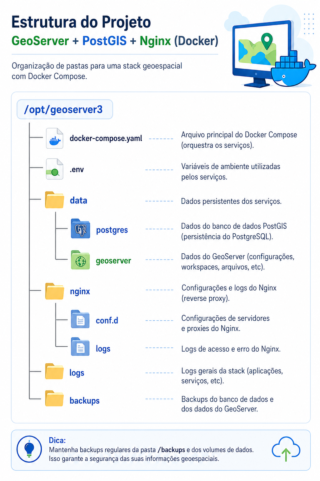
Fernando Quadro: Instalação do GeoServer 3 com PostgreSQL/PostGIS utilizando Docker

Fernando Quadro: Instalação do GeoServer 3 com PostgreSQL/PostGIS utilizando Docker

Prezado leitor,

Neste post irei apresentar como instalar o GeoServer 3 juntamente com o PostgreSQL 18/PostGIS utilizando Docker em um servidor executando Ubuntu Linux 26.04.

Ao final deste tutorial vocĂȘ terĂĄ um ambiente pronto para desenvolvimento, testes ou treinamentos, contendo:

  • PostgreSQL 18 + PostGIS 3.6
  • GeoServer 3.0.0
  • Nginx como proxy reverso
  • Estrutura organizada para persistĂȘncia dos dados
  • Instalação totalmente baseada em containers Docker

Pré-requisitos:

  • Ubuntu 26.04
  • Acesso sudo
  • ConexĂŁo com Internet
  • Pelo menos 4 GB RAM (8 GB recomendado)

Sem enrolação, vamos aos passos:

1. Atualizar o Ubuntu

Antes de instalar qualquer software Ă© recomendĂĄvel atualizar os repositĂłrios e aplicar as Ășltimas atualizaçÔes do sistema operacional.

...
Lire la suite →
The Global Map of Agricultural Decline

The Global Map of Agricultural Decline

This animated map reveals how agricultural productivity is expected to be affected by climate change around the world throughout this century. It uses the new Climate-Driven Agricultural Decline Index (CADI) to show where and how global heating is likely to alter crop-growing conditions.

According to the Climate-Driven Agricultural Decline Index, more than 640 million people already live in agricultural regions where food production has fallen by over 10% compared with 30 years ago. Looking ahead, the map suggests these declines will accelerate, with almost half of the world's population expected to be living in areas experiencing reduced agricultural productivity by the middle of the century under a high-emissions scenario.

...
Lire la suite →
Emergence des modÚles de fondations géospatiaux dans ArcGIS

Emergence des modÚles de fondations géospatiaux dans ArcGIS

L'intelligence artificielle transforme progressivement la compréhension que nous avons la planÚte. AprÚs le succÚs des grands modÚles de langage (LLM), une nouvelle génération de modÚles géospatiaux fondamentaux émerge, qui apprennent non pas des corpus habituels de données des modÚles d'IA traditionnels et généralistes (GPT, Mistral, Llama, Gemini,...) mais directement à partir de cartes, d'images satellites, d'informations démographiques et d'autres données géographiques. 

Contrairement aux modĂšles d'IA traditionnels, entraĂźnĂ©s pour une tĂąche unique, les modĂšles gĂ©ospatiaux de base apprennent des reprĂ©sentations riches et rĂ©utilisables de l'information gĂ©ographique. Une fois entraĂźnĂ©s, ils peuvent ĂȘtr...
Lire la suite →
Kartoza: How to Use Custom Icons in Maputnik (Sprite Sheet Guide)

Kartoza: How to Use Custom Icons in Maputnik (Sprite Sheet Guide)

The Missing SVG Button

If you have ever tried styling a vector map in Maputnik, you have probably hit this wall: you have a folder full of perfectly designed SVG icons, but there is no simple “Upload SVG” button for your symbol layers.

Unlike desktop GIS software, web mapping specifications (like MapLibre and Mapbox GL) are optimised for rendering speed. Loading hundreds of individual SVG files requires too many HTTP requests and bogs down performance. Instead, the style specification requires a sprite sheet : a single raster image (PNG) containing all your icons, paired with an index file (JSON) that tells the map exactly where each icon sits on that image.

Lire l'article complet ↗
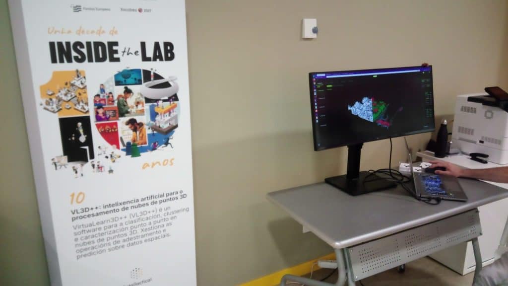
geomatico: Inside the Lab: 10 años celebrando la ciencia y la tecnología en el CITIUS

geomatico: Inside the Lab: 10 años celebrando la ciencia y la tecnología en el CITIUS

El Inside the Lab CITIUS ha cumplido 10 años y hemos vuelto a asistir para vivirlo de cerca. El Centro Singular de Investigación en Tecnoloxias Intelixentes (CITIUS) es un centro tecnológico de la USC (Universidad de Santiago de Compostela), ha celebrado una nueva edición de su jornada de puertas abiertas para enseñar los demostradores de los proyectos que desarrollan en sus instalaciones. Es un día para, directamente, venirse arriba con la ciencia que se hace aquí al lado.

Este año la cita era todavía mås especial por alcanzar esa cifra redonda de una década de divulgación y tecnología.

...
Lire la suite →

Propulsé par FreshRSS | 1522 articles au total