hebdoOSM 842
03/09/2026-09/09/2026
...Agrégateur de flux RSS - Actualités et contenus géomatiques
03/09/2026-09/09/2026
...
Randhawa, S., Randhawa, G., Langer, C. et al.  (2026). The changing surface of the worldâs roads [LâĂ©volution du revĂȘtement des routes dans le monde]. Nature Communications, 17, 9345.  https://doi.org/10.1038/s41467-026-76234-8
What is the world listening to today? Rotation's Music Map offers a wonderfully simple way to explore that question, with a globe showing the songs currently charting in 166 countries and 174 cities.
Each place on the globe highlights a record that the rest of the world isn't playing. Click on a country or city and the record starts playing, turning the map into a kind of interactive global jukebox. You can also switch between different chart sources, including Spotify, Apple Music and Shazam, to see how the picture changes.
One of my favourite features is the Shuffle option. Rather than simply choosing a random country, it works like a loaded die: it picks a record, then a place, and explains why that particular combination has been selected. It is a nice way of discovering music from places you might otherwise never think to explore.
...FOSS4G is the annual global event of free and open source geographic technologies and open geospatial data hosted by OSGeo. In 2026 it took place in Hiroshima, Japan.
On September 7, 2026, I gave a keynote at State of the Map Asia 2026 in Osaka.
The title was:
What if the Map itself became the Web?
The talk looks back at the thirty-year journey of Hyper-Layering Architecture (HLA), from its origins in 1995 to its current implementation as Layers as Web Apps.
The central idea is simple: instead of collecting and integrating information into a central system, independent Web resources can remain independent while users compose them together as map layers in the browser.
...
The craze for building age maps seems to have faded in recent years, which is a shame because I think they can reveal a surprising amount about how a city has grown and changed over time. When you map the age of every building, patterns of development, expansion and redevelopment can suddenly become much easier to see in a way that is hard to grasp from standard historical records.
...
Number sixteen was my peak volume week. My biggest training week in three years (not counting the Bear races of 2023 and 2025).
17 hours, 27 minutes all training
52.2 miles hiking and running
14,938 ft D+ hiking and running
I went out on steep mountain trails five times to prepare for the big initial climb, high altitude, and big finishing descent of Run Rabbit Run (RRR). I did more power hiking than running on the climbs, and worked on descending with fast feet and momentum. I'm not planning to use poles at RRR, so I left them behind all week.
Tuesday I hiked and ran up the Round Mountain trail in the Big Thompson Canyon. 3,000 feet of climbing in less than five miles is a good simulation of the climb up Steamboat Mountain. There is some very pretty scenery on the trail, too.
...Weeks twelve through fifteen had a little better air quality and I increased my training volume steadily, transitioning to more uphill outings and more power hiking.
56 hours, 15 minutes all training
125.8 miles running and hiking
26,420 ft D+ running and hiking
In week fifteen, I logged 10,000 feet of elevation gain (D+) for the first time this year. And I felt good after eight consectutive days of hiking and running.
Week eight began in Glacier National Park and week eleven finished in Steamboat Springs.
51 hours, 47 minutes all training
116 miles running and hiking
16,903 ft D+ running and hiking
Hiking with my oldest kid in Glacier and Grand Teton Nation Parks was one of the highlights of this year. Arabelle has become a strong hiker (summiting nine of Colorado's fourteeners this summer) and is great company on the trail. Hiking options were limited in Glacier, which was recovering from torrential rain and washed out trails, but the Tetons were wide open to exploring. Our big hike was to trendy Delta Lake below Teton Glacier.
A sprawling four-story wooden lodge on the edge of a greenish lake with big peaks in the background. Glacier National Park, Montana, U.S.A.
...
Au quotidien, le GIP ATGeRi  conçoit des outils sur-mesure pour Ă©clairer lâaction publique et privĂ©e : dĂ©veloppement dâapplications, Ă©tudes stratĂ©giques, cartographies et mutualisation des donnĂ©es. Son expertise sâadapte aux enjeux environnementaux, sanitaires, territoriaux et numĂ©riques pour une gestion optimisĂ©e et partagĂ©e des territoires. Il transforme la donnĂ©e en un levier stratĂ©gique pour anticiper, dĂ©cider et agir. En tant que tiers [âŠ]
...
Since the UN General Assembly voted to promote equal-area projections such as Equal Earth as an alternative to the familiar Mercator projection, there have been a number of interesting attempts to show just how much our perception of the relative size of countries changes when we switch between the two.
(my attempt was this animated tween between a Mercator vs Equal Earth projection)
...Le groupe local OpenStreetMap de Grenoble vous propose un atelier d'initiation à destination de celles et ceux qui veulent découvrir la carte coopérative libre OpenStreepMap.
Programme de la soirée
En pratique
...
I recently posted about the build of my âA Pint Near Meâ app. When I had finished the build I asked Claude âCan you give me a few interesting stats from the pubs data?â
Pause for a minute and see if you can guess the answers, maybe have a play with the map to test your guesses before you scroll down.
AnswersThese answers were all generated by Claude based on the prompt above.
...
A while after I blogged about my Pub Density Map it got picked up by Hacker News and the map got a big spike in views. Some of the comments were complaints that a pub was missing or that the pubs data was not searchable, some were less helpful. I had used the Open Pubs data from GetTheData, which in hindsight, was maybe not the best choice, the data was quite rough and a bit out of date but it seemed fit for my purpose of illustrating the areas of the country with highest pub density (pubs per 10k population), I had included the pub points just because I had them and that had attracted the most criticism.
...
TripGeo Snaps is a new GeoGuessr type game with a difference. Instead of being dropped into a Street View panorama that you can explore, you are shown a static Street View snapshot. You can't pan around, follow the road or search for clues elsewhere. You have to identify the country purely from the visual clues contained in the image in front of you.
Every game presents you with five locations. Each image initially appears through a small spotlight, so you only get a limited glimpse of the scene. You then have three chances to identify the country from a list of eight possibilities.
...Rencontre du groupe local Mapadour.
Ouvert Ă toutes et Ă tous.
On se retrouve dans la salle de l'épicerie coopérative Otsokop.
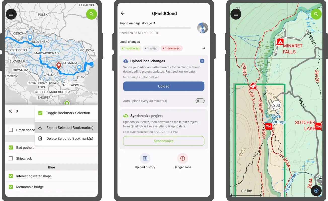
The next version of QField is here. While this time of the year is a well-deserved holiday period for many, weâve dedicated ourselves to improving the stability and refining of your favorite field mapping tool.
Weâre calling this effort the âsummer of stabilityâ, a sprint we will undertake on a yearly basis. But there are plenty of improvements to cover, so letâs go over them.
Main highlights Bookmark managerFirst, weâve introduced a new bookmark manager to make QFieldâs experience around spatial bookmarking feel more complete. With the manager accessible via the dashboardâs main menu â users will be able to browse their bookmarks as a full list with the ability to quickly jump to a bookmarkâs location by tapping its name, as well as edit its properties.
...The PostGIS Team is pleased to release PostGIS 3.7.0rc2! Best Served with PostgreSQL 19 Beta 3 , GEOS 3.15.0 , postgis_tiger_geocoder 2025.2 , and address_standardizer.
This version requires PostgreSQL 14 - 19beta3, GEOS 3.10 or higher, Proj 6.1+, and libgmp. To take advantage of all features, GEOS 3.15+ is needed. To take advantage of all SFCGAL features SFCGAL 2.3.0+ is needed. To use postgis_raster extension GDAL 3+ is required.
...
Ce court billet pour signaler la publication ce jour dans le blog (e)space&fictions animĂ© par Thierry Joliveau, que je remercie vivement pour lâaccueil, dâun long billet portant sur lâune des toutes premiĂšres apparition (Ă lâĂ©cran) des procĂ©dĂ©s dâanimations cartographiques.Â
...LâAPI de calcul altimĂ©trique de la GĂ©oplateforme permet dâobtenir lâaltitude dâun ou de plusieurs points et un profil altimĂ©trique le long dâune courbe.
Son usage est limitĂ© Ă 5 requĂȘtes par seconde depuis une mĂȘme adresse IP.
Elle sâappuie sur des ressources altimĂ©triques pour fournir des altitudes. Ainsi, lancer un calcul en sollicitant une ressource altimĂ©trique basĂ©e sur la donnĂ©e RGE ALTIÂź donnera un rĂ©sultat diffĂ©rent du mĂȘme calcul sollicitant une ressource altimĂ©trique basĂ©e sur la donnĂ©e BD ALTIÂź, en raison des diffĂ©rences de rĂ©solution et de prĂ©cision entre ces deux produits.
LâAPI est interrogeable en mĂ©thodes GET et POST.
...
How closely related are the world's populations?Â
The Genetic Distance Map offers a fascinating way to explore that question by putting genetic similarity onto a map. Click on this map and the surrounding areas are then colored according to genetic distance. The result is a visual landscape of genetic similarity, with similar colours indicating populations that are genetically closer to one another.
For most populations, the Genetic Distance Map displays smooth, concentric rings radiating outwards. In many locations, geographic distance mirrors genetic distance (e.g., clicking on central France highlights neighboring regions in Western Europe). As you might suspect populations that live close together are often genetically similar.
...
27/08/2026-02/09/2026
[1] Photo de groupe prise lors du SotM 2026 à Paris | © SotM Paris| Données cartographiques © contributeurs et contributrices OpenStreetMap.
...
The latest release is available at Github. For discussions on the release here. To see all issues & pull requests closed by this release see the Git closed milestone for 4.0.2 on GitHub. Summary of changes by function pgr_dijkstraVia Fix: ⊠Continued
Est. reading time: 1 minute
Hello pgRouting community,
The pgRouting Team is pleased to announce the release of pgRouting version 4.0.2
The latest release is available at [1]. For discussions on the release, go to [2]. To see all issues & pull requests closed by this release see the Git closed milestone for 4.0.2 on Github. [3]
## Summary of changes by function
...
27/08/2026-02/09/2026
Campagnes de cartographieHiki a présenté le projet « Deutsche Bahn Metadata Cleanup », une initiative visant à améliorer la qualité des données OpenStreetMap relatives aux gares allemandes.
...
27/08/2026-02/09/2026
Campagnes de cartographieHiki a présenté le projet « Deutsche Bahn Metadata Cleanup », une initiative visant à améliorer la qualité des données OpenStreetMap relatives aux gares allemandes.
...
The UN General Assembly has just endorsed a new position on world maps that aims to represent the relative size of the world's land masses more accurately, with the difference being particularly obvious when you compare Africa and Greenland. The resolution, backed by 164 countries, promotes the use of equal-area projections such as Equal Earth as an alternative to the familiar Mercator projection.
So, naturally, I made a map.
Mercator vs Equal EarthRather than simply putting the two projections side-by-side, this interactive map lets you watch one transform into the other. Click Mercator or Equal Earth to switch between them, or sit back and let the map automatically tween between the two.
And the transformation is quite revealing.
...
Yesterday the UN General Assembly voted to replace its traditional world maps - based on Mercator - with a map that more accurately reflects the size of Africa - based on the 2018 Equal Earth map.
My Equal Earth vs Web Mercator map allows you to compare how these two maps depict the world side-by-side. Drag the handle in the middle of the map and you can switch between the two projections. You can also pan and zoom around the map and the two views will move together.
Equal Earth vs Mercator
The problem with Mercator isn't that it is a "bad" map. Quite the opposite: Gerardus Mercator's 1569 projection was designed for sea navigation, where preserving angles and directions is enormously useful. The problem is that it is a rather unfortunate choice when you want to compare the size of countries and continents.
...
Venez participer à la 2éme journée de la donnée territoriale organisée par GéoBretagne et Mégalis Bretagne pour partager vos expériences, poser vos questions et participer à une dynamique bretonne autour de la donnée territoriale !
đ
 Date & horaires
Mercredi 7 octobre 2026, de 9h30 à 16h30
đ Lieu
LycĂ©e Le Gros ChĂȘne, Rue des Pommiers - 56300 Pontivy
(đ Covoiturage disponible via le formulaire d'inscription).
đ Le programme prĂ©visionnel
MATINÂ
Accueil café
Introduction
Résilience et souveraineté, par l'Agence nationale de la sécurité des systÚmes d'information (ANSSI) et la direction interministérielle du numérique (DINUM).
Retour d'expérience des partenaires
DEJEUNERÂ
APRES-MIDIÂ
Les outils souverains et résilients de G...
Source : Valentin Ledroit, « Le salaire des enseignants dans l'Union européenne, de l'école primaire au lycée », 1er septembre 2026 (Toute l'Europe).
...
I use Organic Maps every day. Currently, I'm using it to follow the London Loop, with the route loaded as a GPX track on the map.
I often get annoyed with the London Loop route - particularly when it takes me along a busy road when I can see what looks like a much more pleasant alternative just a few metres away. What I need is a simple tool that will allow me to draw my own alternative routes for the sections I don't like and save them as GPX files, which I can then add to Organic Maps.
...Sous la forme dâune Ă©valuation territoriale Ă dominante sociogĂ©ographique, lâarticle propose un regard critique sur la fabrique des politiques publiques du sport dans lâarchipel français de Mayotte â territoire situĂ© Ă lâentrĂ©e du Canal du Mozambique et sans nul autre pareil dans la RĂ©publique. Il Ă©value et corrĂšle trois dimensions symptomatiques du dysfonctionnement de lâaction publique Ă destination des sports : les inĂ©galitĂ©s sociales (offre de services, engagement dans les pratiques, taux de pĂ©nĂ©tration des licenciĂ©s, etc.), lâabsence de justice spatiale (destination dâusage, rĂ©partition et accessibilitĂ© des Ă©quipements) et lâincurie dâune gouvernance fragmentĂ©e (jeux dâacteurs, nĂ©gociations, stratĂ©gies et concurrences institutionnelles, etc.). La contribution identifie toutefois des pistes de rĂ©flexion et trace des perspectives eu Ă©gard Ă la dĂ©mocratisation, la diversification et la planification du...
Ian has been a member of our community from the very beginning, as an original voting member who gathered in Chicago in February 2006 to establish OSGeo. He also is a co-founder of GeoTools, the Java library that is the ⊠Continued
Est. reading time: 2 minutes
We are honoured to announce that Ian Turton is the recipient of the
2026 Sol Katz Award (the 22nd year of the award), at the recent FOSS4G
event in Hiroshima, Japan.
Ne ratez pas la 9Ăšme Ă©dition de lâĂ©vĂšnement national de rĂ©fĂ©rence pour la filiĂšre gĂ©onumĂ©rique organisĂ© par lâAfigĂ©o et ses nombreux partenaires.ÂUne occasion unique de dĂ©battre, de bĂ©nĂ©ficier de solides retours dâexpĂ©riences, de rencontrer lâensemble de lâĂ©cosystĂšme et des experts de divers horizons, de faire le point sur les derniĂšres avancĂ©es techniques, scientifiques et rĂšglementaires afin de [âŠ]
The post J-15 AVANT LES GEODATADAYS 2026 đ first appeared on AfigĂ©o.
Â
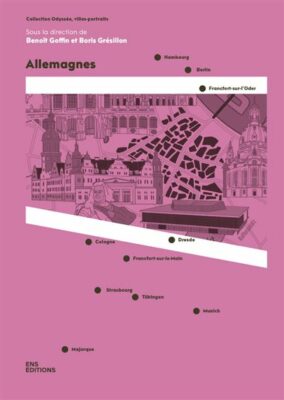
DĂšs la parution en 2021 des deux premiers volumes, nous avons saluĂ© lâoriginalitĂ© et la rĂ©ussite de la collection « OdyssĂ©e, villes-portraits » publiĂ©e par ENS Editions sous la direction de BenoĂźt Goffin et Nicolas Escach.Allemagnes, le cinquiĂšme volume de la collection, paru en 2025, garde le cap de marier de maniĂšre judicieuse la gĂ©ographie, la littĂ©rature de voyage et les propositions graphiques innovantes pour faire cette fois-ci le portrait de lâAllemagne contemporaine. Une Allemagne qui reste mĂ©connue des Français malgrĂ© la coopĂ©ration institutionnelle mise en place par le couple franco-allemand depuis lâaprĂšs-guerre. (Daniel Oster)
...ChĂšres lectrices, chers lecteurs,
Vous trouverez ici la prĂ©sentation du livre Cartographia, rĂ©alisĂ©e dans les locaux de lâINSEE le 13 janvier 2026.
Au cours de cette prĂ©sentation, nous parcourons uns Ă uns les diffĂ©rents chapitres de lâouvrage et revenons sur notre dĂ©marche, les choix qui ont guidĂ© sa conception ainsi que les principales rĂ©flexions qui le traversent.
Â
Â
La page originale de lâĂ©vĂ©nement, ainsi que les diapositives de la prĂ©sentation, sont disponibles ici : https://ssphub.fr/event/2026-01-cartographia/index.html
My home town of Crawley is apparently the undisputed heavyweight champion of British music.
At least, that is what you might conclude from the UK Music Cities Explorer. When the interactive map's results are normalized by population, Crawley appears as the largest circle on the map, giving it the highest Spotify-listener footprint per resident of any UK urban area in the explorer.
Not bad for a small town in the south of England.
The UK Music Cities Explorer is an interactive exploration of the geographical origins and global popularity of British bands. Using the map, you can search for individual bands or places, explore where artists were formed, compare Spotify monthly listeners and followers, and switch between raw totals and results normalized by the population of each urban area.
...
Oslandia participera à la Conférence des utilisateurs de QGIS 2026, qui se tiendra cette année les 5 et 6 octobre à Laax, en Suisse
Atelier « Expressions QGIS : des étiquettes aux générateurs de géométrie » (par Benoit de Mezzo | lundi 5 octobre, 11 h 30)
DĂ©ploiement de QGIS dans les grands systĂšmes informatiques â bonnes pratiques (par Vincent Picavet | lundi 5 octobre, 14 h 30)
Santé mentale et Open Source, un sujet délicat pour les ingénieurs (par Vincent Picavet | lundi 5 octobre, 16 h 00)
Des utilisateurs aux contributeurs : repenser la participation Ă QGIS (par Jean Felder | lundi 5 octobre, 16 h 30)
Depuis le lancement de OneGeo Chat, notre chatbot RAG dĂ©diĂ© Ă lâexploration de donnĂ©es gĂ©ographiques, la solution nâa cessĂ© dâĂ©voluer.
AprĂšs plusieurs itĂ©rations sur lâarchitecture RAG, lâinterface et lâintĂ©gration Ă Â OneGeo Suite, voici la v2.2 : une refonte complĂšte de lâinterface, de nouvelles fonctionnalitĂ©s de recherche gĂ©ographique et des outils dâadministration intĂ©grĂ©s Ă lâapplication. Tour dâhorizon de ce qui change !
...ClimaÂdiag AgriÂculÂture et ForĂȘt est un service climaÂtique en accĂšs libre, fruit du parteÂnaÂriat entre MĂ©tĂ©o-France et SolaÂgro, spĂ©ciaÂliste des quesÂtions agriÂcoles et sylviÂcoles liĂ©es au chanÂgeÂment climaÂtique.
En 2026, le Conseil dĂ©parÂteÂmenÂtal de la Haute-Vienne choiÂsit Geotrek-admin pour strucÂtuÂrer et gĂ©rer plus faciÂleÂment son offre dâacÂtiÂviÂtĂ©s de pleine nature.
Have you ever watched a film and thought, âWait, I know that streetâ? A new interactive mapping project makes it easy to find out which iconic movie scenes were filmed right around the corner from your house.
Movie Scene Map turns the globe into an open-air film set. It allows you to explore real-world locations from your favourite movies and TV shows, making it easy to track down specific filming locations - and maybe even visit them in person on your next walk or weekend getaway.
...
Le tableau de bord du tourisme de l'UE propose des visualisations interactives de données et des indicateurs pour étudier l'écosystÚme touristique européen. Son objectif principal est « de promouvoir et de suivre les transitions écologique et numérique ainsi que la résilience socio-économique du tourisme européen, et d' aider les décideurs et les opérateurs du secteur à élaborer des politiques et des stratégies fondées sur des données probantes ».
1) Présentation du tableau de bord du tourisme de l'UE
...Prise en compte des fichiers GĂ©oparquet dans lâintĂ©gration vecteur
Les fichiers GĂ©oparquet peuvent maintenant ĂȘtre intĂ©grĂ©s en base pour ensuite ĂȘtre utilisĂ©s dans les configurations WFS et WMS-Vecteur.
...Discussion entre contributeurs lyonnais du projet OSM et acteurs intéressés.
Toute personne intéressée par OpenStreetMap peut s'intégrer à cette rencontre, tout particuliÚrement les débutants qui souhaiteraient des conseils pour se lancer.
Ordre du jour à compléter: https://wiki.openstreetmap.org/wiki/FR:Lyon/Reunion-2026-10-20
Lieu de réunion: Tubà , 15 boulevard Vivier-Merle, Lyon 3e.
Discussion entre contributeurs lyonnais du projet OSM et acteurs intéressés.
Toute personne intéressée par OpenStreetMap peut s'intégrer à cette rencontre, tout particuliÚrement les débutants qui souhaiteraient des conseils pour se lancer.
Ordre du jour à compléter: https://wiki.openstreetmap.org/wiki/FR:Lyon/Reunion-2026-09-15
Lieu de réunion: Tubà , 15 boulevard Vivier-Merle, Lyon 3e.
Petit apĂ©ro pour discuter OpenStreetMap Ă l'Ătape 84 : tour de table des sujets et contributions de chacun et chacune, retours du State of the Map 2026 avec quelques goodies ! Nous devrions ĂȘtre dans la salle de rĂ©union, Ă droite en entrant.
Tout le monde est bienvenu, mĂȘme si vous dĂ©butez ou n'ĂȘtes pas (encore) venu·e Ă une rencontre locale !Â
(Il est nécessaire de prendre au moins une consommation par personne.)
Depuis 25 ans, le dispositif de Vigilance mĂ©tĂ©orologique permet d'informer les citoyens, les mĂ©dias et les pouvoirs publics des dangers mĂ©tĂ©orologiques Ă venir. Ce dispositif Ă©volue rĂ©guliĂšrement, et en 2026, MĂ©tĂ©o-France franchit une nouvelle Ă©tape en introduisant une information gĂ©ographique plus fine que le dĂ©partement pour les phĂ©nomĂšnes Vent, Pluie-inondation, Orages, et Neige-verglas. La Vigilance, le dispositif dâavertissement sur les phĂ©nomĂšnes mĂ©tĂ©orologiques dangereux de MĂ©tĂ©o-France, intĂ©grait dĂ©jĂ des informations infra-dĂ©partementales pour les phĂ©nomĂšnes Avalanches et Vagues-submersion. Cette possibilitĂ© sâĂ©tend dorĂ©navant pour l'Hexagone et la Corse Ă quatre nouveaux phĂ©nomĂšnes : Vent, Pluie-inondation, Orages, Neige-verglas.
...
Aside from maps, I would say my next biggest obsession is coffee. For the last couple of months, my favourite bean, Finca La Bolsa, has been out of season and unavailable from my local roasters. I've therefore been using the opportunity to experiment with beans from different regions, different taste profiles and different processing methods.
For some reason, it has only just dawned on me that there might be some coffee maps I can use to help me discover new beans to add to my coffee repertoire.
...
Source : Patty Heida, « Redessiner le monde pour mieux le comprendre : le pouvoir politique des contre-cartes » (The Conversation, 3 août 2026).
...While working on a recent client project involving a PostgreSQL and PostGIS database, I was working with just a few hundred spatial records. Everything ran relatively smoothly, but a slight lag during query execution got me thinking: If an unoptimised query takes noticeable time on a dataset this small, what happens when the project scales to tens of thousands or millions of features?
In spatial databases, performance problems rarely scale linearly. An unoptimised query that takes a fraction of a second on a few hundred points can easily take hours or freeze your system entirely at production scale. Imagine you eventually scale up to 5 million building footprints and 50,000 points of interest (POIs) in your PostGIS database. You want to find out which buildings contain a POI, so you write a standard spatial join:
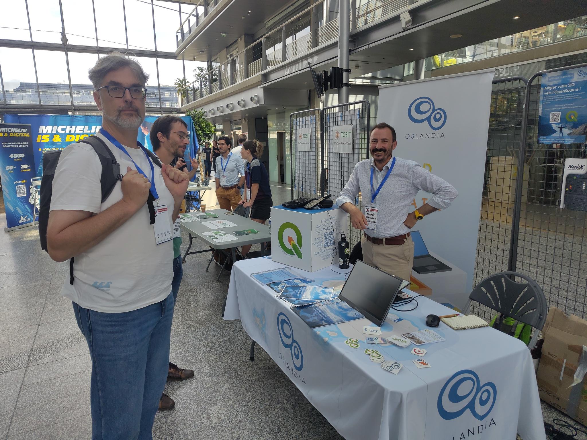
Oslandia a eu le plaisir de participer Ă State of the Map 2026, qui sâest dĂ©roulĂ© du 28 au 30 aoĂ»t Ă Paris.
Vendredi, Vincent Picavet a pris part Ă une interview au Village de la FĂ©dĂ©ration des pros dâOSM aux cĂŽtĂ©s de Julien Coupey, de Verso, sur la maniĂšre dont ils utilisent OpenStreetMap, avant dâanimer samedi une confĂ©rence intitulĂ©e « Immersing Panoramax in the 3D World ».
Et tout au long du week-end, Bertrand Parpoil a rĂ©pondu Ă vos questions sur le stand dâOslandia !
Merci Ă la FĂ©dĂ©ration des pros dâOSM de nous avoir accueillis au Village !
Les replays des conférences et interviews by Oslandia sont disponibles !
Replay de la confĂ©rence sur Panoramax 3D Interview « Panoramax 3D » Interview « la plateforme QGIS Oslandia » Interview croisĂ©e sur lâutilisation dâOpenStreetMap
A lot of the posts that we share on Mappery come via our social feeds at Mastodon and Bluesky as either an @ message or a hashtag #MapsintheWild. Up till now our workflow to turn the social posts into blog posts on Mappery was something like this:
...LâAPI de tĂ©lĂ©chargement de la GĂ©oplateforme permet de dĂ©couvrir et tĂ©lĂ©charger des fichiers.
Elle est conforme au format Atom RFC 4287.
Elle sâappuie sur 3 mĂ©thodes :
Son usage est limitĂ© Ă 10 requĂȘtes par seconde depuis une mĂȘme adresse IP.
Attention, les rĂ©sultats des requĂȘtes sont paginĂ©s. Pour parcourir les rĂ©sultats, les paramĂštres sont :
...
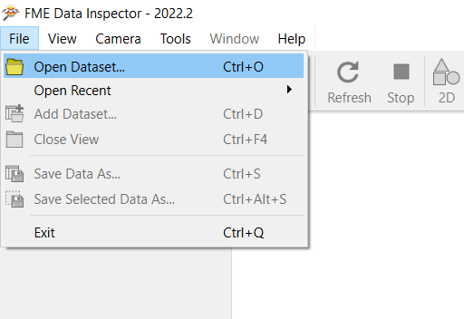
Dans le menu « File », cliquez sur « Open Dataset ».
Déroulez la liste de formats pour choisir « More Formats » ou accédez à « OGC WMS (Web Map Service) » ou « OGC WMTS (Web Map Tile Service) » si vous avez déjà utilisé un tel format dans FME récemment.
Sélectionnez « OGC WMS (Web Map Service) » ou « OGC WMTS (Web Map Tile Service) » et cliquez sur « Parameters ».
Dans la partie « URL », utilisez les services libres IGN :
WMS-Raster :
...Ce service sâappuie sur le protocole WMS en version 1.3.0
Il est limitĂ© Ă 40 requĂȘtes/s.
Il permet un affichage dâimages avec des possibilitĂ©s de personnalisation (style, systĂšme de rĂ©fĂ©rence, emprise, format et taille dâimage).
Il propose les méthodes suivantes :
...Ce service sâappuie sur le protocole WMS en version 1.3.0.
Il est limitĂ© Ă 50 requĂȘtes/s.
Il permet un affichage dâimages de donnĂ©es vectorielles avec des possibilitĂ©s de personnalisation (style, systĂšme de rĂ©fĂ©rence, emprise, format et taille dâimage).
Il propose les méthodes suivantes :
...Ce service sâappuie sur le protocole WMTS en version 1.0.0.
Il permet un affichage rapide dâimages prĂ©calculĂ©es dans un format, un systĂšme de rĂ©fĂ©rence et des niveaux de zoom prĂ©dĂ©finis.
Il propose les méthodes suivantes :
La requĂȘte a pour caractĂ©ristiques :
...LâAPI de gĂ©ocodage de la GĂ©oplateforme a pour but de fournir des coordonnĂ©es Ă partir dâune adresse ou dâune parcelle cadastrale (ou Ă lâinverse de fournir le localisant le plus proche Ă partir de coordonnĂ©es).
Son usage est limitĂ© Ă 50 requĂȘtes par seconde depuis une mĂȘme adresse IP.
Elle sâappuie sur des donnĂ©es BAN, BD TOPOÂź et Parcellaire Express (PCI).
Son swagger est accessible ici : swagger du géocodage.
...
Go on. Have a guess.
It sounds like the sort of question that should have a straightforward answer. Surely someone, at some point, has walked around Britain with a very long tape measure and worked it out.
Unfortunately, the coastline has other ideas.
The problem is that Britain's coast is full of bays, headlands, inlets and innumerable little squiggly bits. Measure it using a fairly large ruler and you'll skip over much of that detail. Use a smaller ruler and suddenly you're measuring around all those extra twists and turns - and Britain's coastline mysteriously gets longer.
This is the Coastline Paradox: the awkward fact that there isn't really one definitive answer to the question How long is the coastline of Great Britain?
...
20/08/2026-26/08/2026
[1] Certains outils, cartes et autres Ă©lĂ©ments proviennent de la communautĂ© française dâOpenStreetMap | © Jean-Louis Zimmermann | donnĂ©es cartographiques © cartographes dâOpenStreetMap.
...
Une nouvelle version de Klimarisk France, outil de cartographie du risque climatique, est désormais disponible. Cette version gagne en précision et simplifie la mobilisation des données.
La plateforme permet désormais la génération de rapports par collectivité :
20/08/2026-26/08/2026
...
20/08/2026-26/08/2026
...
The 15-Minute City has become one of the most influential ideas in contemporary urban planning. Popularised by urbanist Carlos Moreno, the concept is beautifully simple: cities should be designed so that people can reach the things they need for everyday life - shops, healthcare, schools, green spaces, culture and leisure - within around 15 minutes of where they live, ideally on foot or by bicycle.
...Datavisualisation sur la couverture nuageuse quotidienne en Inde. Source : diagramchasing.fun
Les prĂ©visions mĂ©tĂ©o pour chaque ville sont converties en petits nuages qui Ă©voluent tout au long de la journĂ©e.Â
...
You don't have to wait for Donald Trump to rename Lake Ontario. Thanks to MapQuest, you can now direct all your small dick energy into hitting Canada where it really hurts - by taking a Sharpie to Canada's geography yourself.
Canada's slow-witted response to the latest U.S. trade war has been to impose tariffs on a range of American imports, thereby increasing the cost of goods for American consumers. Donald Trump, meanwhile, has once again demonstrated why he is known as the "master of the deal" by halting trade talks with Canada and striking back where it really hurts - in the "feels" - with an announcement that he intends to rename Lake Ontario as "Lake America."
...Qu'est-ce qui dĂ©finit vraiment une rĂ©gion ? Ganesh Babu, urbaniste et architecte qui travaille Ă amĂ©liorer les villes, propose d'Ă©tudier les rĂ©gions des Pays-Bas Ă travers leurs systĂšmes urbains comme lieux de vie et de travail au quotidien. Le site regio.toekom.st est un explorateur interactif qui montre comment les rĂ©gions des Pays-Bas se forment rĂ©ellement Ă partir des choix des habitants : oĂč ils travaillent, Ă©tudient et vivent. Le principe des « Daily Urban Systems » est simple : si 10 % ou plus des actifs d'une commune font la navette vers une ville, cette commune appartient au systĂšme urbain de cette ville. On peut dĂ©placer le seuil, survoler une ville pour voir son bassin de navetteurs, et faire dĂ©filer prĂšs de vingt ans d'Ă©volution.
Qui Ă©met le plus de CO2 ? Aujourd'hui, aucun doute : la Chine, qui, seule, est responsable d'un tiers du total annuel. Mesurer les Ă©missions cumulĂ©es depuis 1850 conduit toutefois Ă un tableau diffĂ©rent, oĂč le Vieux Continent apparaĂźt comme le principal responsable des Ă©missions de dioxyde de carbone. L'OcĂ©anie ne compte que pour 0,1 % du total, mais se trouve en premiĂšre ligne face aux dĂ©gĂąts engendrĂ©s par le rĂ©chauffement climatique : montĂ©e des eaux et cyclones, dont la puissance va croissant au fil des ans.
Voir en ligne : /cartes/cyclones-oceanieQui Ă©met le plus de CO2 ? Aujourd'hui, aucun doute : la Chine, qui, seule, est responsable d'un tiers du total annuel. Mesurer les Ă©missions cumulĂ©es depuis 1850 conduit toutefois Ă un tableau diffĂ©rent, oĂč le Vieux Continent apparaĂźt comme le principal responsable des Ă©missions de dioxyde de carbone. L'OcĂ©anie ne compte que pour 0,1 % du total, mais se trouve en premiĂšre ligne face aux dĂ©gĂąts engendrĂ©s par le rĂ©chauffement climatique : montĂ©e des eaux et cyclones, dont la puissance va croissant au fil des ans.
Voir en ligne : /cartes/co2-responsabilite
Ă lâoccasion de la 13e Ă©dition de la Nantes Digital Week les contributeurs·trices nantais·es vous invitent Ă une collecte ludique dâinformations destinĂ©es Ă amĂ©liorer la carte OpenStreetMap, projet collaboratif de crĂ©ation dâune carte mondiale libre.
Cette sortie se prĂ©sentera sous la forme dâune « balade cartographique » en extĂ©rieur.
Ă lâaide dâapplications pour smartphones, simples dâusage, vous apprendrez Ă enrichir la carte directement depuis le terrain. Dâautres mĂ©thodes plus « classiques » avec prise de notes, croquis et photos, vous seront Ă©galement montrĂ©es.
Ă l'occasion de la 13e Ă©dition de la Nantes Digital Week les contributeurs·trices nantais·es vous proposent de venir dĂ©couvrir l'« univers » OpenStreetMap selon vos goĂ»ts, envies et centres dâintĂ©rĂȘt, câest Ă dire « Ă la carte » !
OpenStreetMap est un projet collaboratif de crĂ©ation dâune carte mondiale libre.
Cette « libertĂ© » de la carte indique que tout le monde peut l'utiliser pour nâimporte quel usage mais aussi que chacun a la possibilitĂ© de lâamĂ©liorer en lâĂ©ditant.
...
On Monday I reviewed two animated maps that simulate one day's worth of train travel in countries across the world. Both of these simulations used conventional geographic maps, with the trains shown in their real-world geographical locations. But wouldn't it be cool to see this data animated on a proper schematic transit map?
...Discussion entre contributeurs.trices viennois.es du projet OSM et acteurs intéressés.
Toute personne intéressée par OpenStreetMap peut s'intégrer à cette rencontre, tout particuliÚrement les débutant.e.s qui souhaiteraient des conseils pour se lancer (pas besoin de s'inscrire pour venir).
Ordre du jour à compléter: https://wiki.openstreetmap.org/wiki/FR:Vienne_(Is%C3%A8re)/R%C3%A9union_du_16_septembre_2026
Lieu de réunion: MJC de Vienne, 2, Rue Florentin Laurent, 38200 Vienne - à partir de 18h30
This might be a long post, it was a pretty challenging project.
I wrote last week about my Amazing Animals in Crisis map of 50 endangered species, I got some bad news on Friday that my usage of the IUCN polygon data was in breach of their licencing conditions and a request that I take the map down, which I promptly did. This was a big disappointment as I was just about to expand the map to almost 400 species and now I had no data.
Learning â even if data is apparently free and open, carefully read the license conditions before you use it. Obvious, I know, but I had to learn the hard way.
...Depuis la rentrée 2023, les temps de rencontre autour d'OpenStreetMap sont relancés.
L'occasion de se rencontrer (ou de se retrouver), d'échanger sur OpenStreetMap et de lancer des projets en commun.
Here's a little thing I discovered about Chicago: the higher a street's number, the further south it is from the city center.
You can see this very clearly on North America's Numbered Streets. This interactive map colors "all streets with a '#st', '#nd', '#rd', or '#th' in their name in North America, as drawn from OpenStreetMap."Â
...
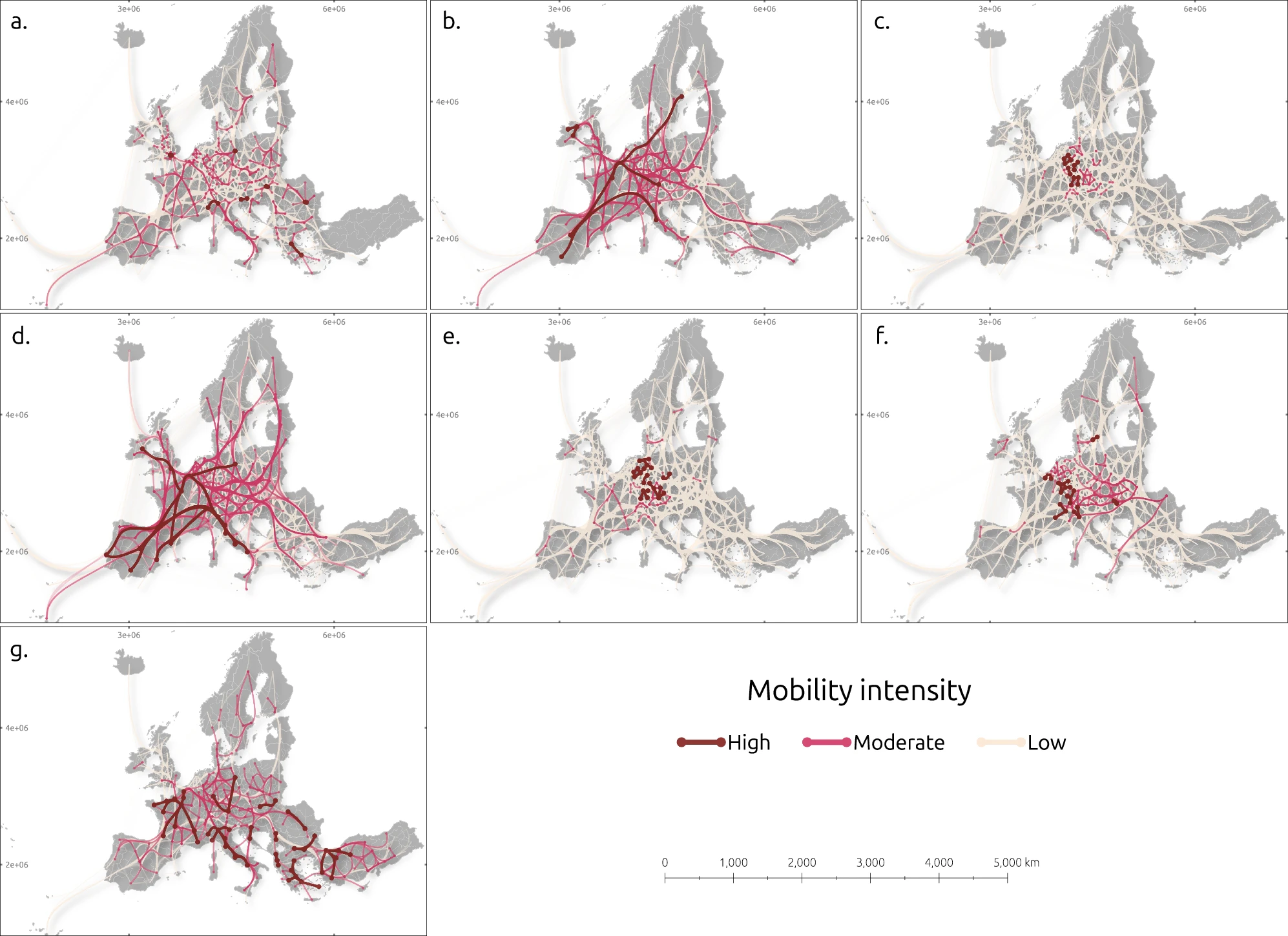
Source : Malekzadeh, M., VÀisÀnen, T., Panori, A. et al. (2026). How regional characteristics drive various human mobility types across Europe [Comment les caractéristiques régionales influent sur les différents types de mobilité humaine en Europe]. Nature Communications, 17, 6667. https://doi.org/10.1038/s41467-026-73288-6
...Propulsé par FreshRSS | 1566 articles au total